The Butter Works
It’s all about the butter…
Nigel and his team are passionate to the point of obsession. More than just experts in their field; they are true butter virtuosos. Our job was to distil this character and skill into a fresh new brand.
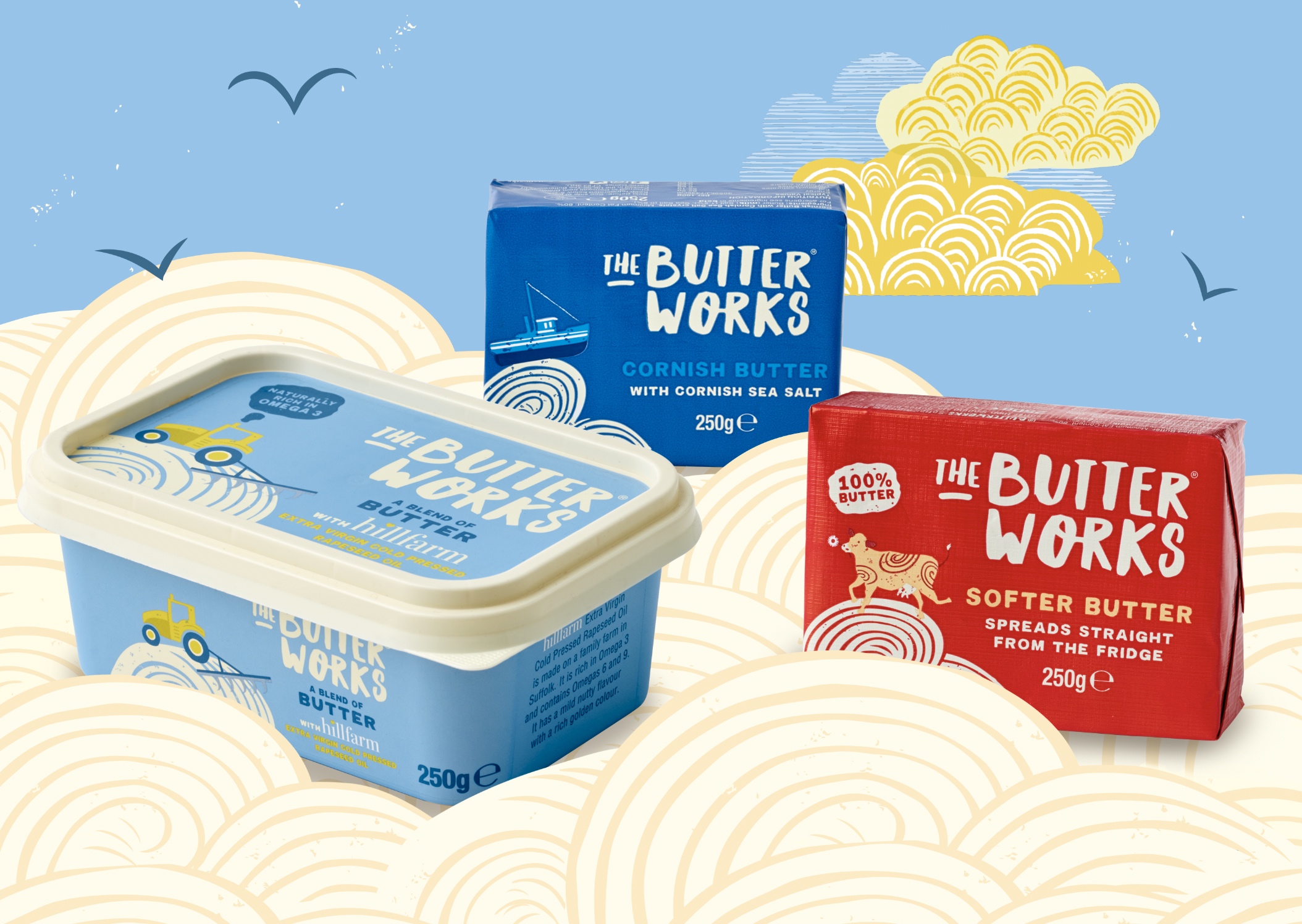
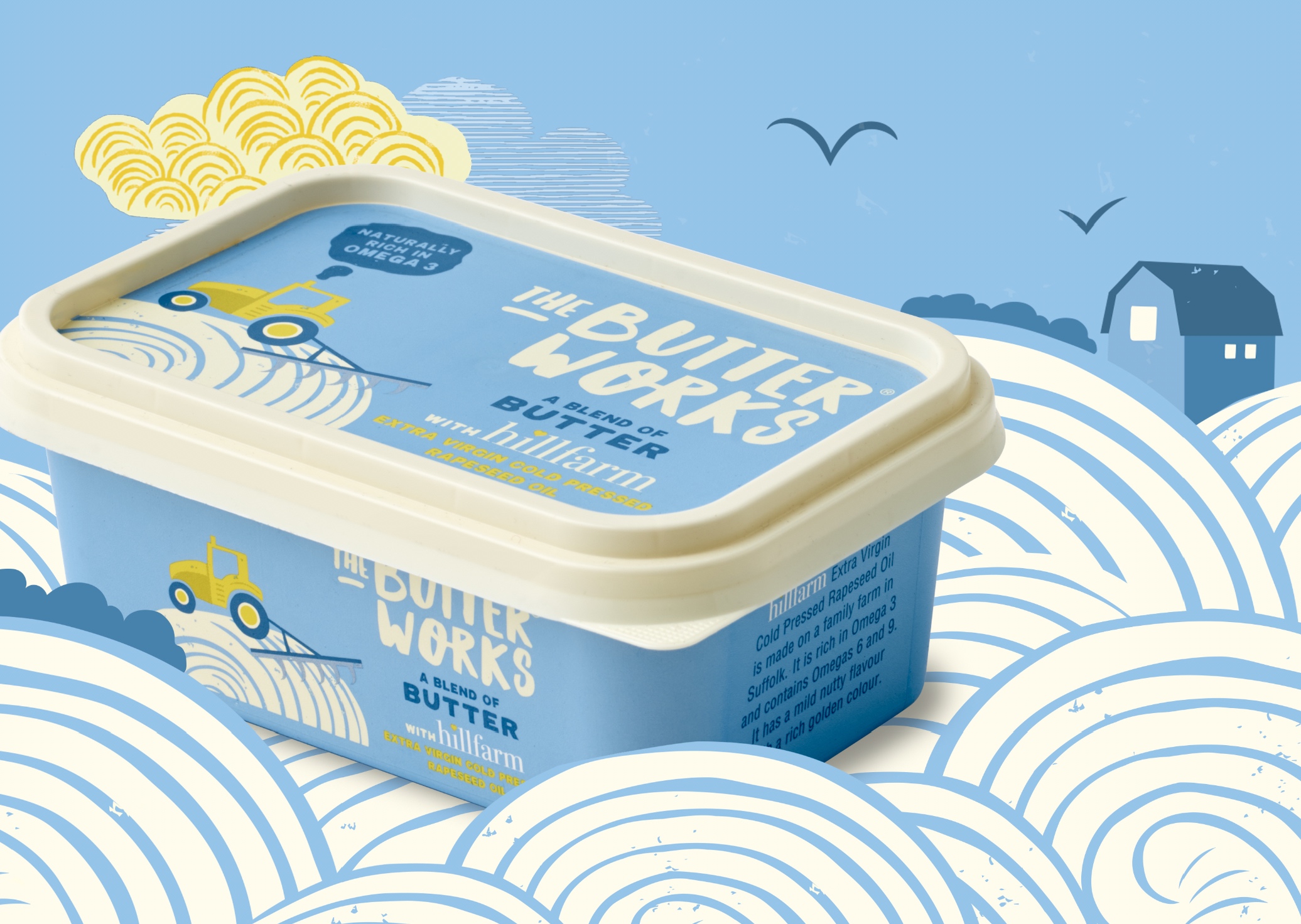
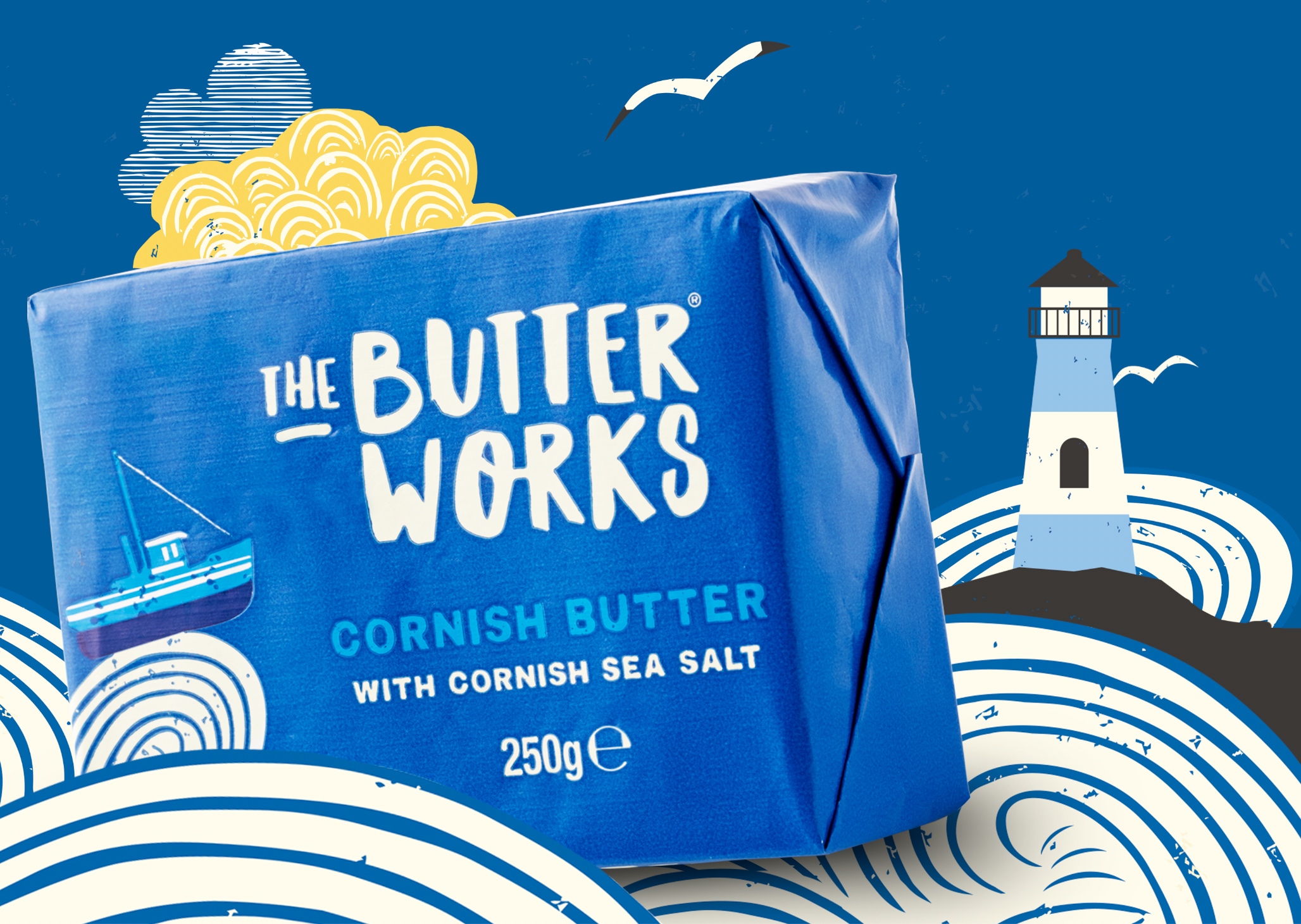
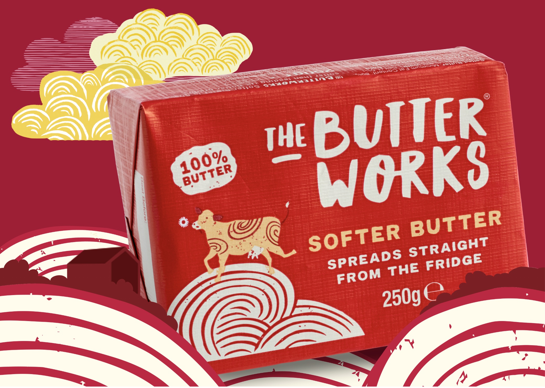
“The Butterworks” was inspired by the experimental HQ where all of Nigel’s better butter creations are imagined. We crafted a collection of icons for each flavour. A cow for their soft churn blend, a rosette for British butter, a tractor for the rapeseed blend and a fishing boat for their Cornish variant. Our hand-drawn butter curls form fields and waves depicting the British countryside for the icons to live within.
To add more standout, we chose unusual bold rich colours, not the predictable yellow or gold butter foil colour.
When it came to their tone of voice, we didn’t want to sound like every other butter brand. We ramped up the quirkiness with unconventional jaunty lines and refreshingly eccentric phrases.
The result is butter with bells on! A fun, memorable brand brimming with positivity. Already lining the shelves of Waitrose with a swathe of 5-star reviews.

CREDIT
- Agency/Creative: The Collaborators
- Article Title: The Butterworks Brand Creation
- Organisation/Entity: Agency, Published Commercial Design
- Project Type: Packaging
- Agency/Creative Country: United Kingdom
- Market Region: Europe
- Project Deliverables: Brand Creation, Brand Guidelines, Brand Identity, Brand Naming, Brand Strategy, Brand World, Branding, Graphic Design, Illustration, Packaging Design, Photography, Product Architecture, Product Naming, Research, Tone of Voice
- Format: Pot, Wrap
- Substrate: Metal, Plastic


