The new image of Vinho Verde “Quinta das Almas” is bright, attractive and colourful. The briefing’s purpose was to valorize the wine through its image, making a commercial repositioning of the brand and elevating its price. This change contemplated a new bottle type, that went from a normal bordeaux to an especial burgundy.
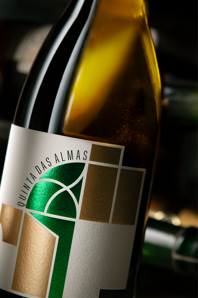
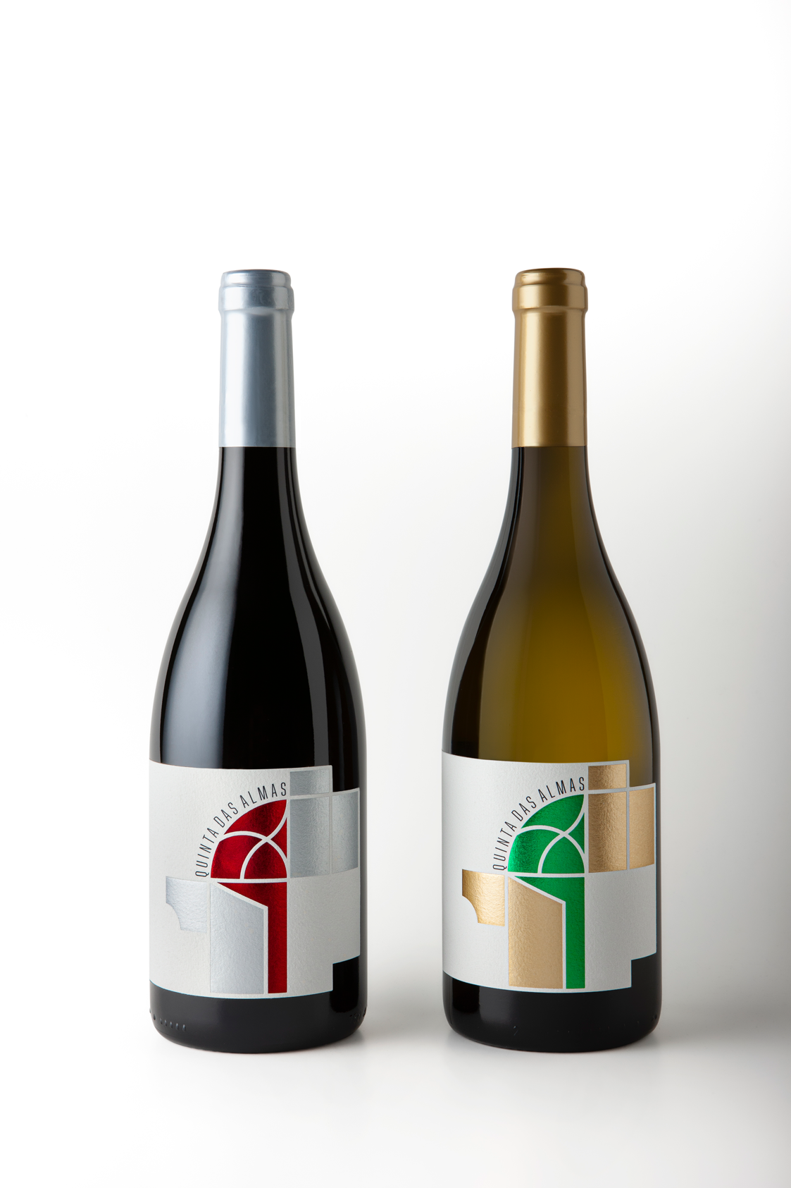
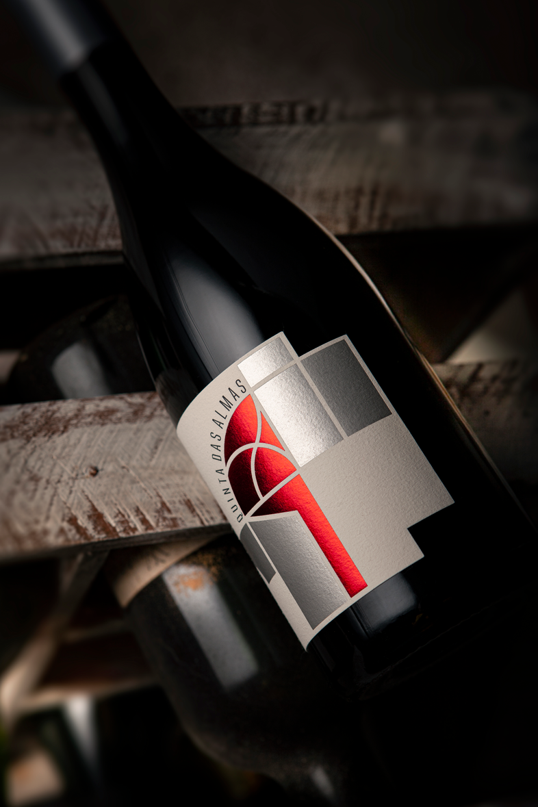
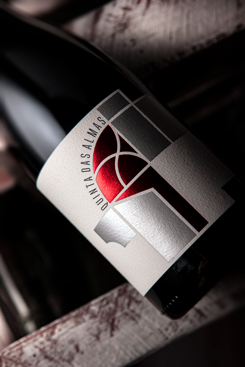
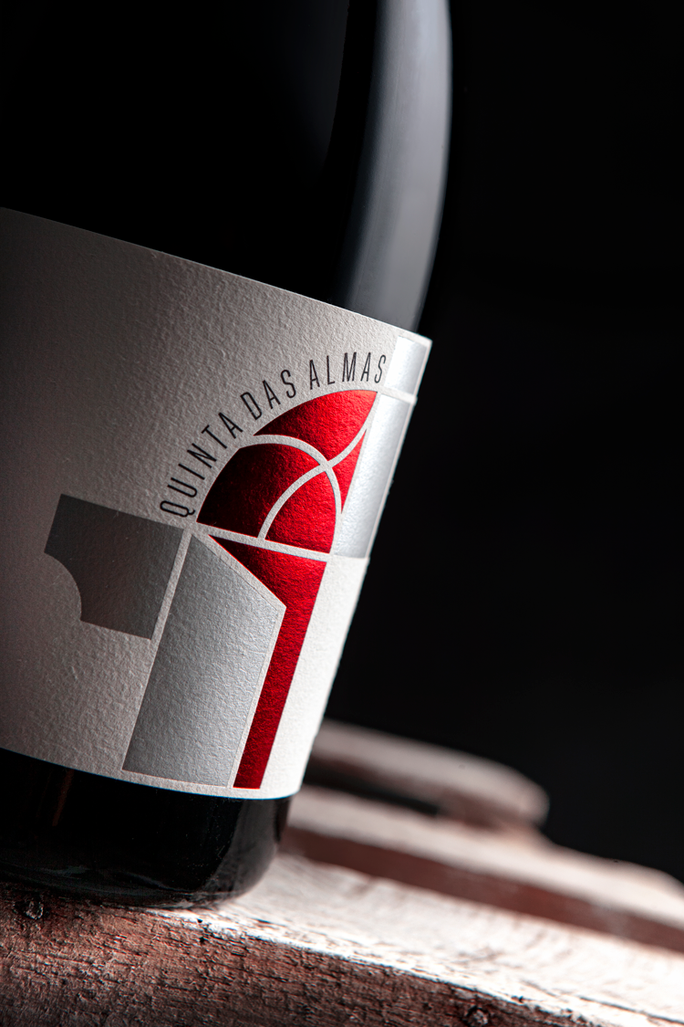
The label is a deconstructed geometric representation of the property’s house. The two colour combination of each reference seek to reinforce the freshness of this type of wine. This colours were printed through the thermoset technique on a Fasson® Cotton Extra White paper and due its thickness and granularity it was possible to achieve a high quality graphic work that highlights the premium look defined to this wine repositioning.
The elements’s deconstruction on the label represents an ajar door topped by a reproduction of a draw that belongs to the property’s house. Through the door’s pane and its opening space, it was applied the red colour (foil stamping) for the red wine, and the green colour for the white wine (foil stamping). Silver and gold colours (foil stamping) were the second color for each wine and reinforce the light intensity of the more vivid colours.
CREDIT
- Agency/Creative: MPFXdesign
- Article Title: Agency Design creates new branding for wine commercial repositioning
- Organisation/Entity: Agency, Published Commercial Design
- Project Type: Packaging
- Agency/Creative Country: Portugal
- Market Region: Europe
- Project Deliverables: Brand Naming, Branding, Graphic Design, Packaging Design, Rebranding
- Format: Bottle
- Substrate: Pulp Paper


