


Double D Creative – Stamfrey Farm Yorg
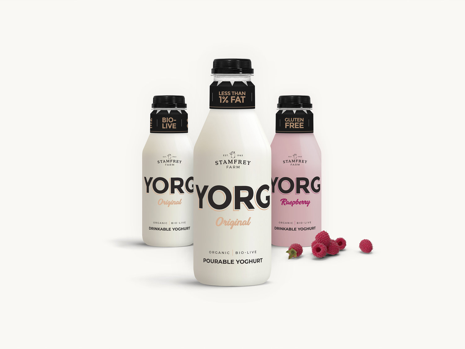
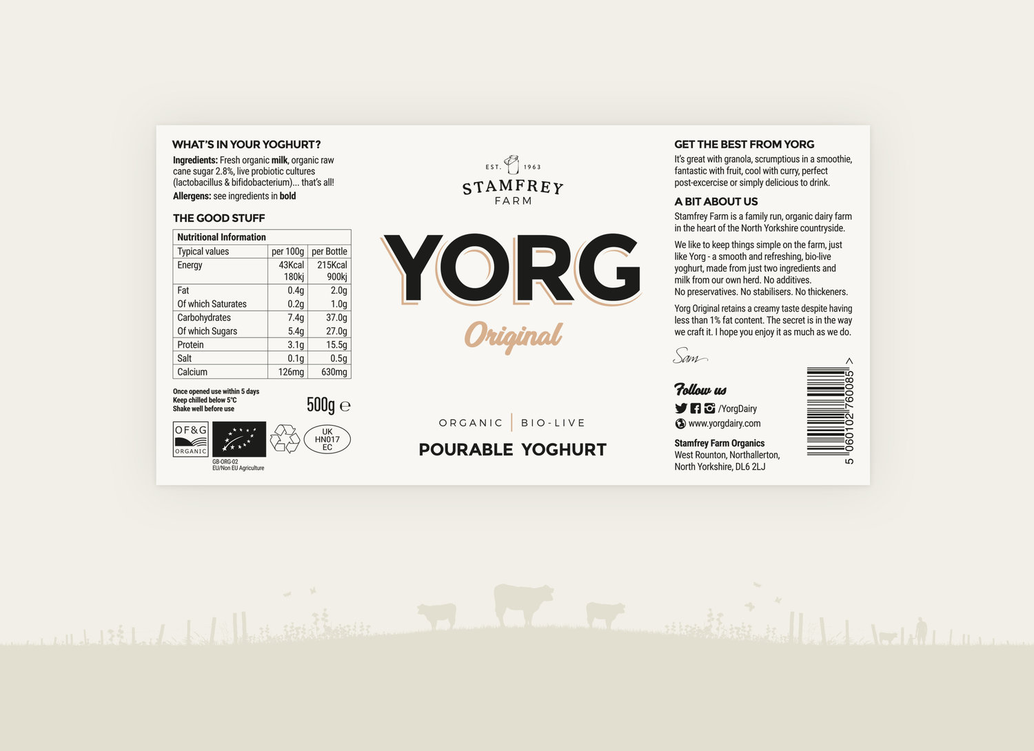
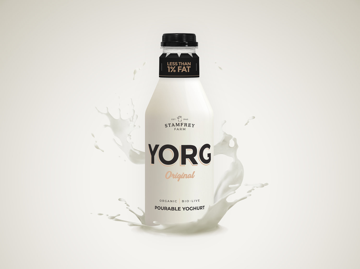
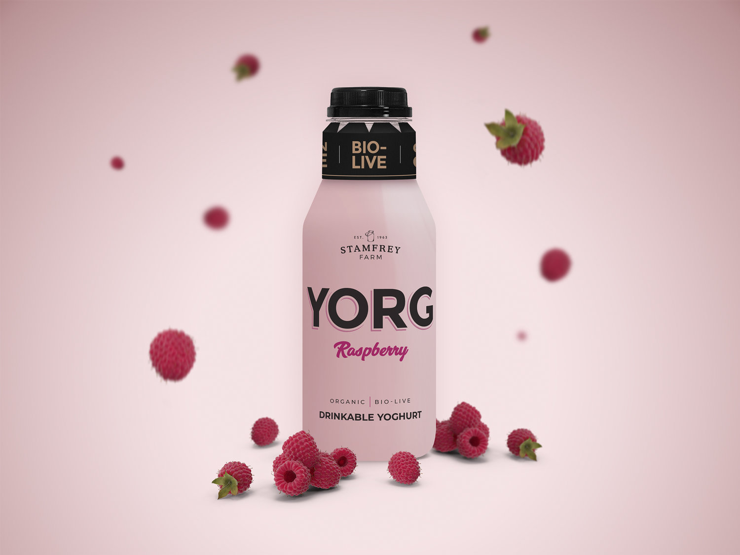
Stamfrey Farm Organics are a family-run farm from Yorkshire who pride themselves on their ‘simple ingredients, simple methods’ mantra. The client came to us with their yoghurt which was already being sold in local farm shops. They felt it wasn’t selling as well as it should in light of the overwhelmingly positive customer feedback. This lead to us being tasked with creating a completely new brand. This included a full branding exercise from name generation to packaging across three bottle sizes, as well as a website and other marketing collateral.Yorg was chosen as it encompassed a number of the key points from the original brief – Yorkshire, Organic and Yoghurt all feature in some way within the word.The vivid colour of the yoghurt was an ideal canvas to work with and contrasted nicely with the black logo and fonts. The subtle beige accents were added to give the brand a softer, more contemporary look whilst maintaining a traditional feel.
CREDIT
- Agency/Creative: Double D Creative
- Article Title: Brand and Packaging Design for Yorg
- Organisation/Entity: Agency, Published Commercial Design
- Project Type: Packaging
- Agency/Creative Country: United Kingdom
- Market Region: Europe
- Format: Bottle
- Substrate: Plastic


