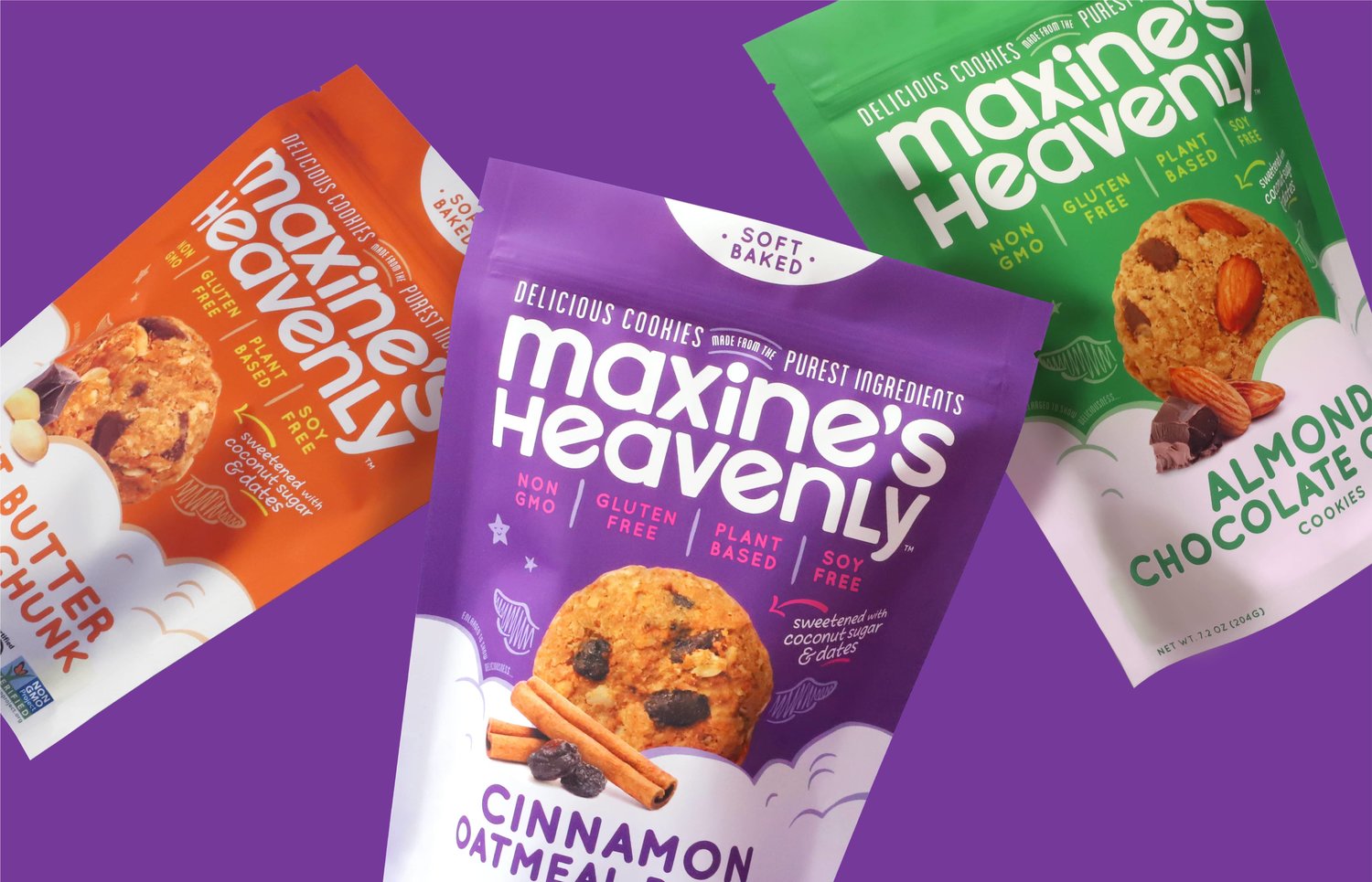
Riser – Maxine’s Heavenly
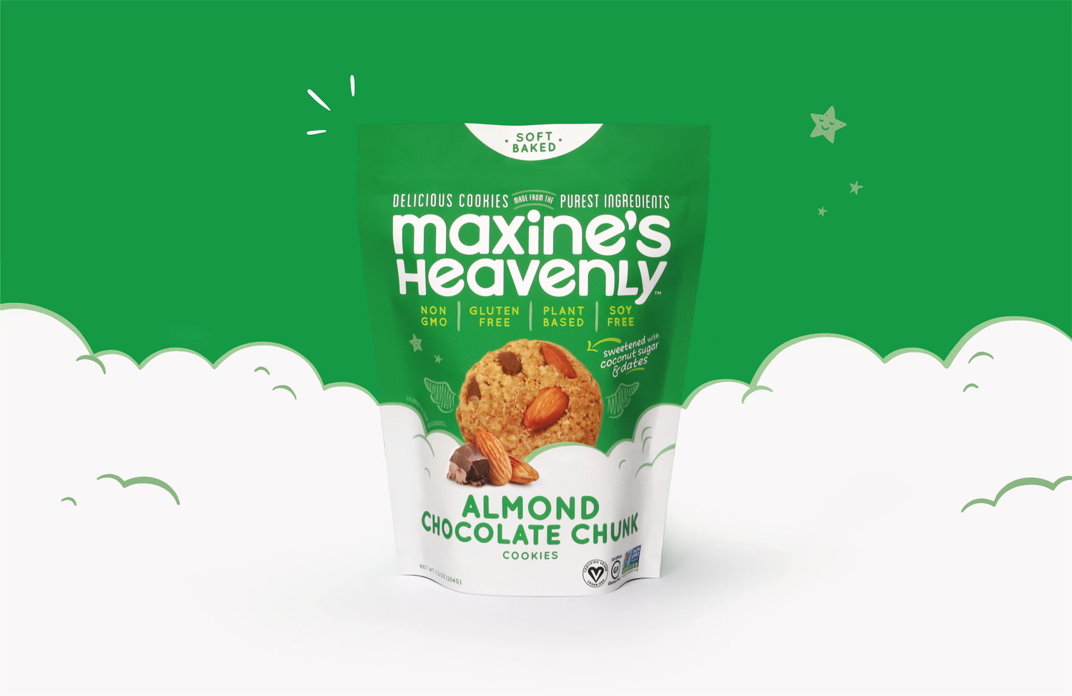
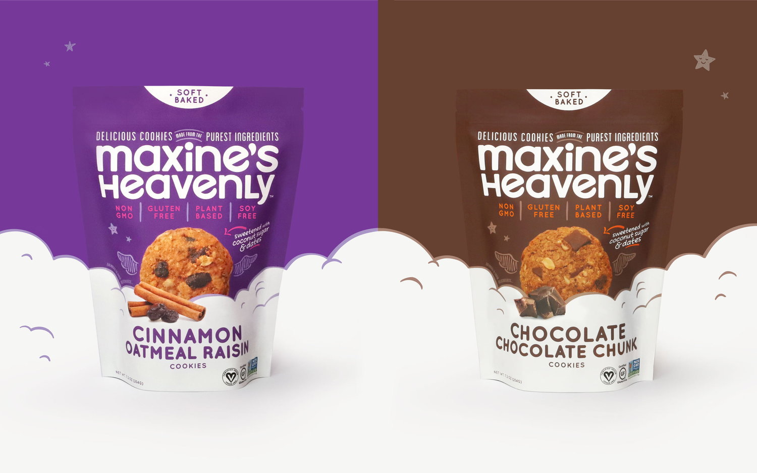
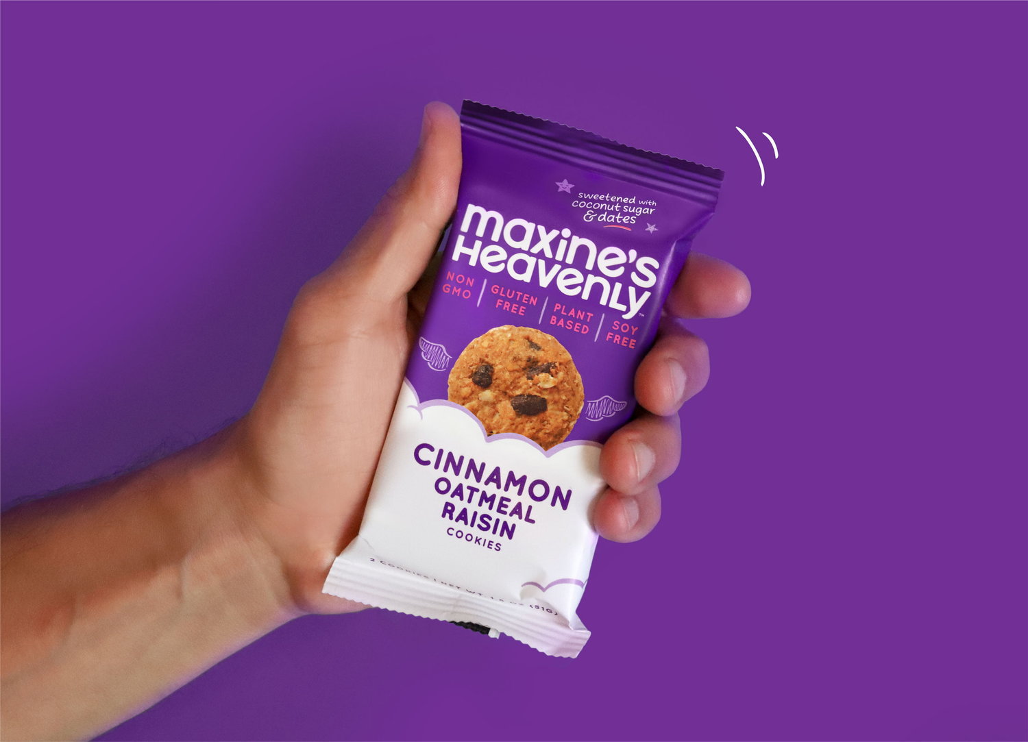
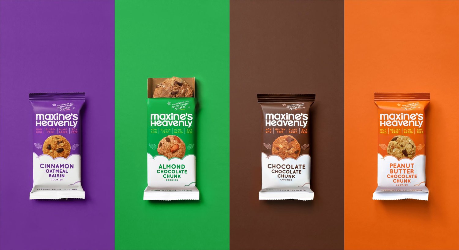
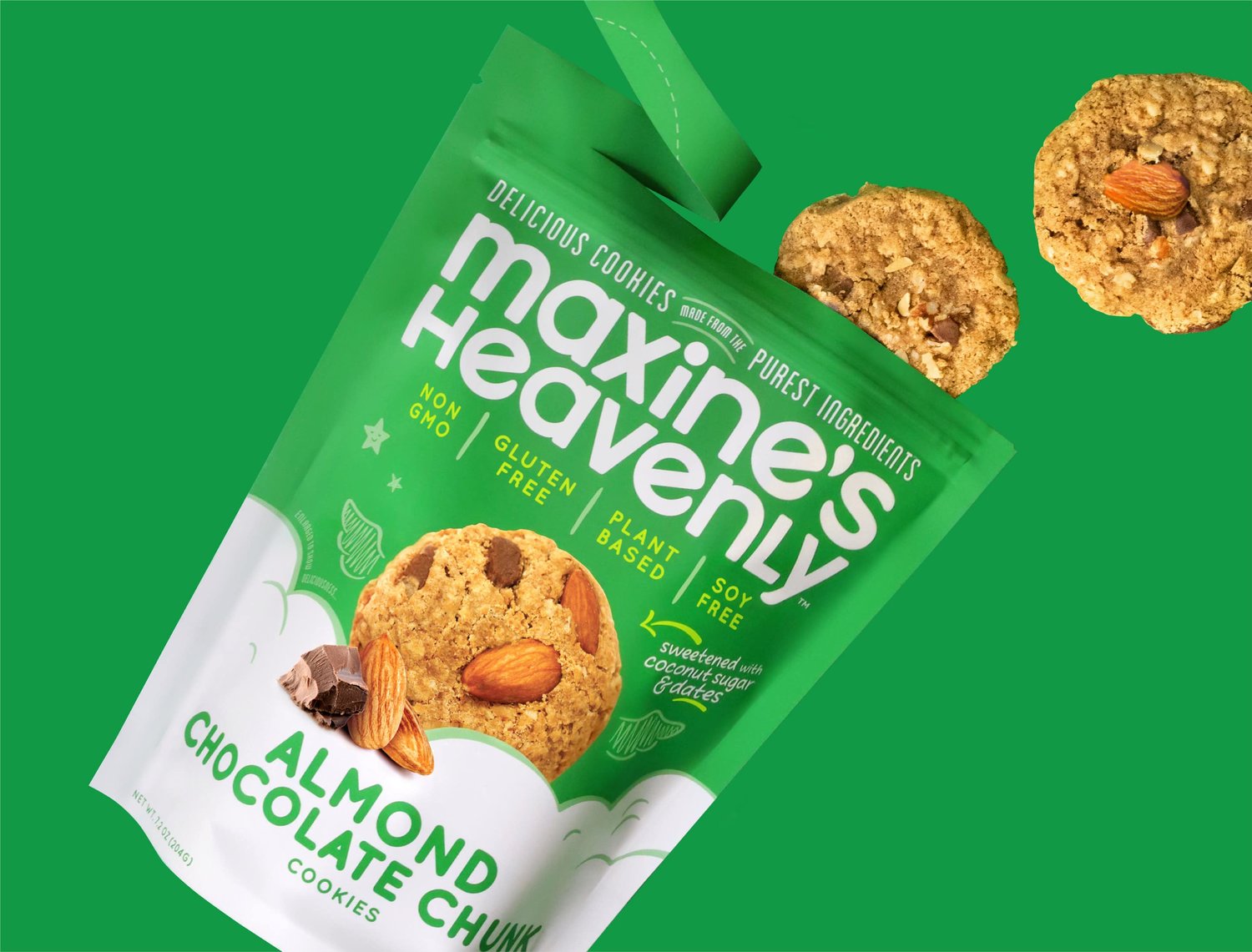
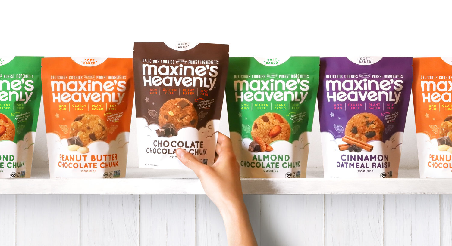
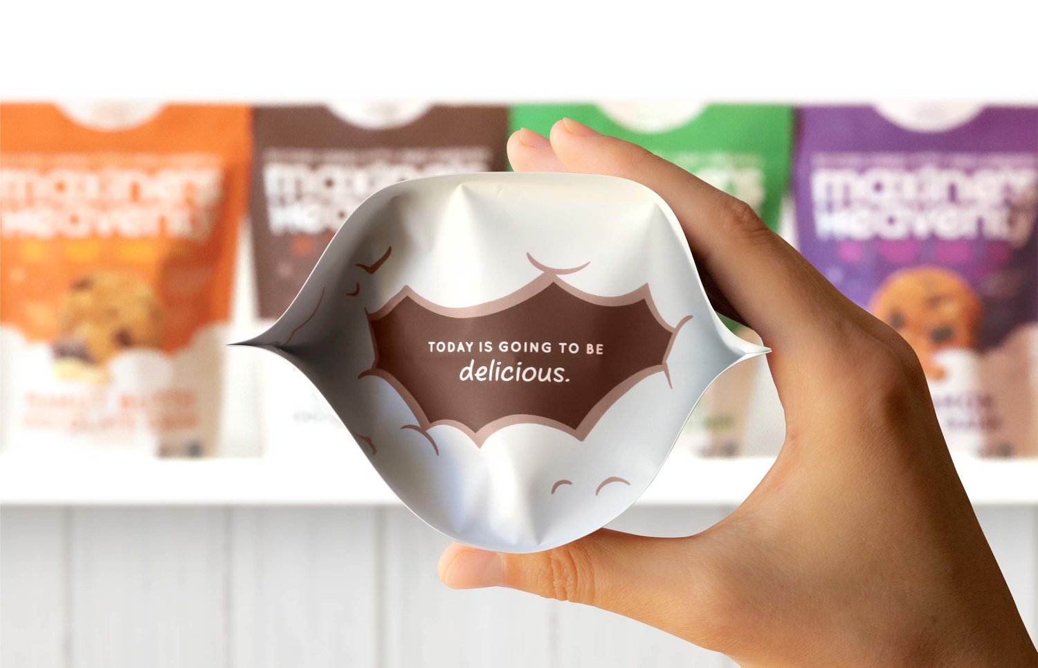
Inspired by a family recipe from the 1950s, Maxine’s Heavenly set out to create a cookie that would appeal to today’s health-conscious consumer. Using only clean, quality ingredients, they created a cookie that tastes great, but won’t weigh you down.Maxine’s current packaging was lacking the fun, cheeky tone-of-voice and personality that was clear on the company website and social platforms. So with the redesign, we wanted to highlight those qualities, giving them a new look that could stand out and connect with their audience. To bring the brand to a more modern, fresh, and visually-appealing place, we kept some of its bold, vibrant colors, while also bringing more focus to flavor and ingredients. We also added small touches of hand-drawn elements to bring in some playfulness. There’s now a distinct lightheartedness that connects all parts of the brand – tying into the company name, the language and the product and packaging itself. The new look better reflects the high-quality, health aspect of the product, while remaining fun and optimistic.From the start, the Maxine’s Heavenly team was thinking big and the new look has helped the brand to grow its presence and expand its offerings. We support them on their mission to be a household name for cookie lovers everywhere.
CREDIT
- Agency/Creative: Riser
- Article Title: Brand and Packaging Design for Maxine’s Heavenly
- Organisation/Entity: Agency, Published Commercial Design
- Agency/Creative Country: United States America
- Market Region: North America


