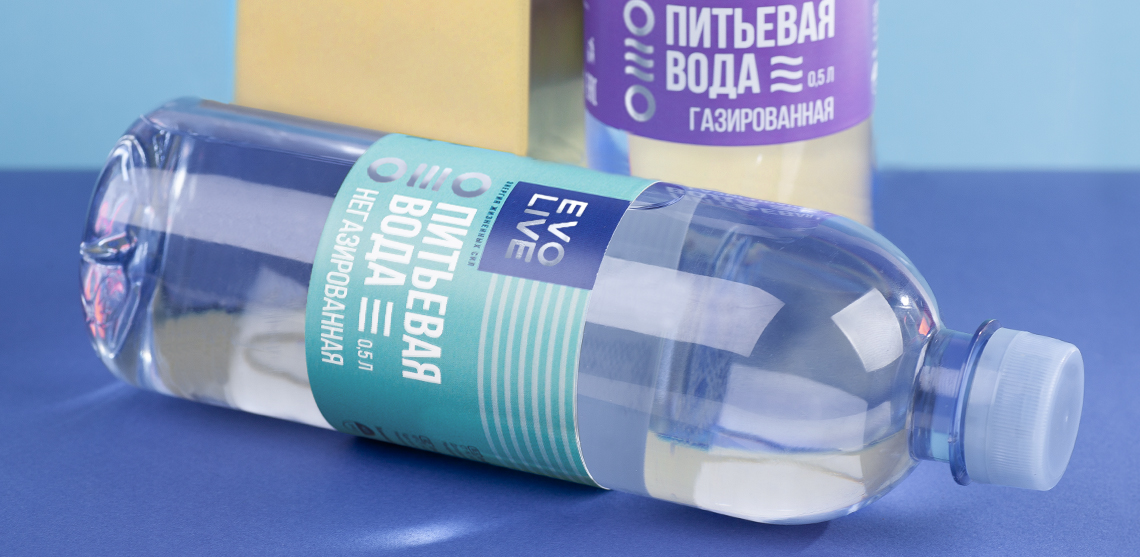
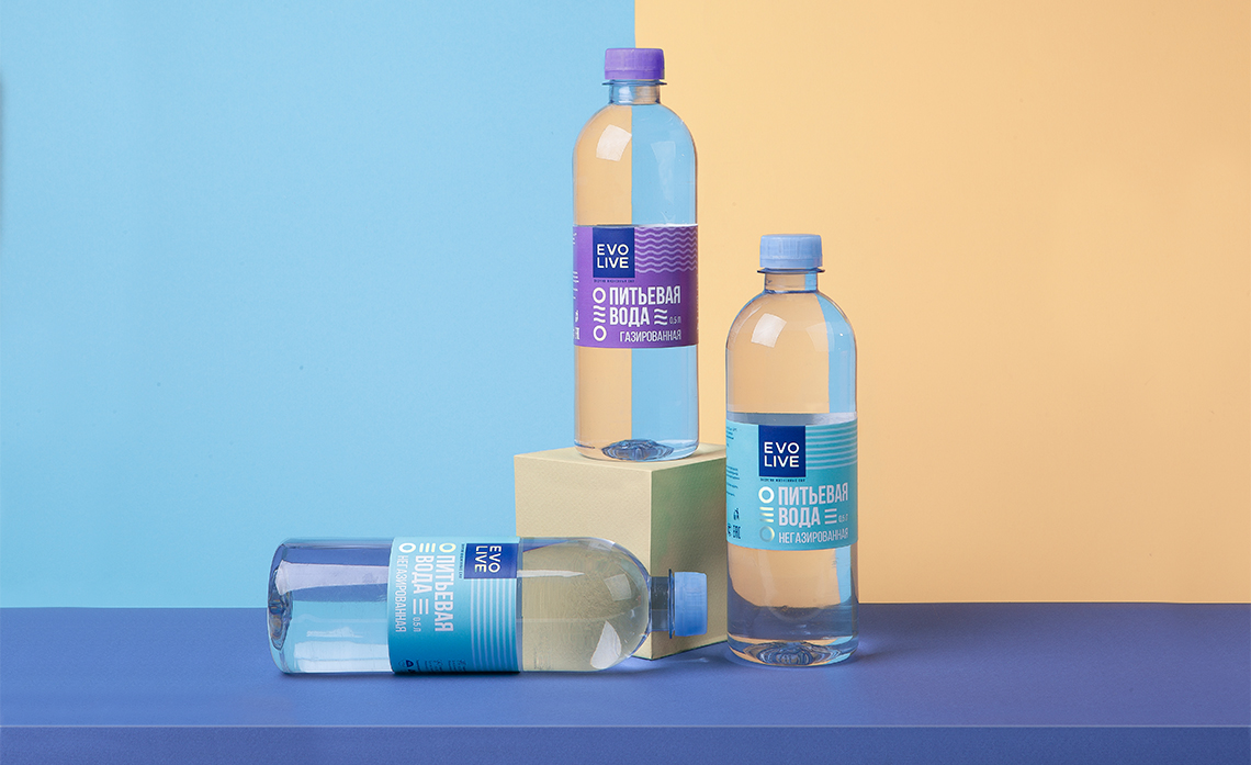
Water empowers your body with purity, energy and vigor, raising your spirit. We’ve focused on water’s emotional benefits, while developing this concept.
When working on the design, the agency studied the competitive environment in the targetted East Kazakhstan region – and suggested solutions that will help to distinguish the brand on the shelf and create an image of a high-end, unique product.
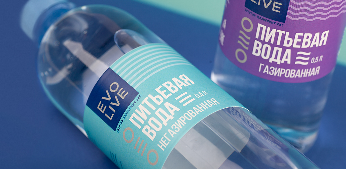
The colour palette, unusual for this product category, instantly distinguishes the brand on the shelf and makes it easier to navigate between products. Due to the large font, the customer can read the brand name and the product name from a certain distance quickly. To facilitate navigation between the still and sparkling water varieties, we’ve created a unique Evolive visual language, which appears on each item.


CREDIT
- Agency/Creative: A.STUDIO
- Article Title: Packaging design for the Evolive brand of drinking water
- Organisation/Entity: Agency, Published Commercial Design
- Project Type: Packaging
- Agency/Creative Country: Russia
- Market Region: Global
- Project Deliverables: Branding, Packaging Design, Product Architecture, Product Naming, Research
- Format: Bottle
- Substrate: Plastic


