Mauro Simeon – Muta Orchester
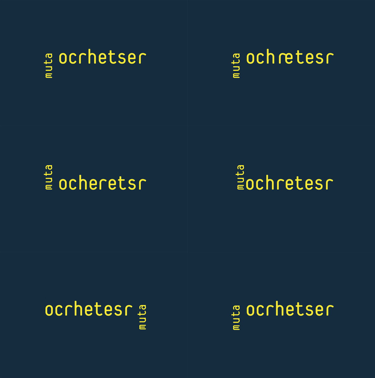
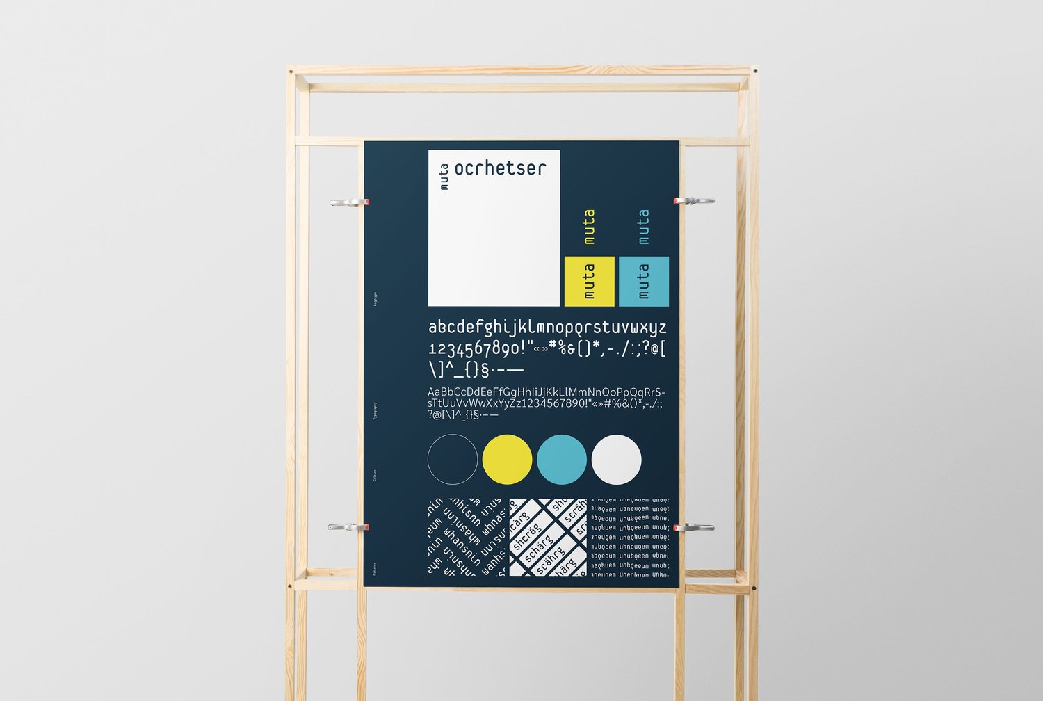
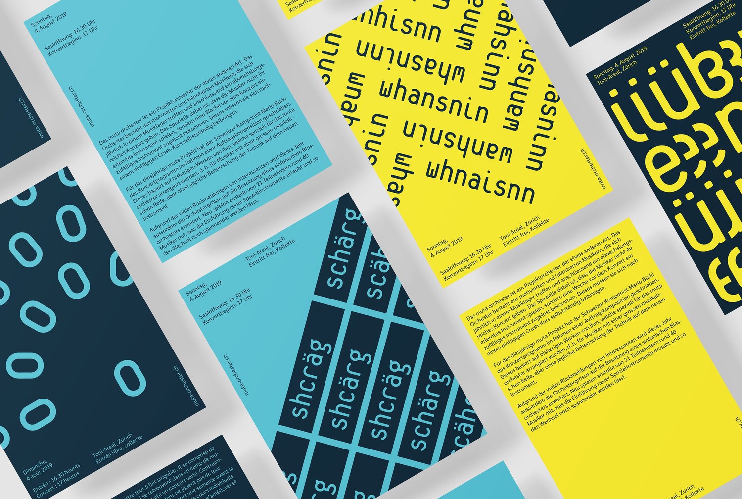
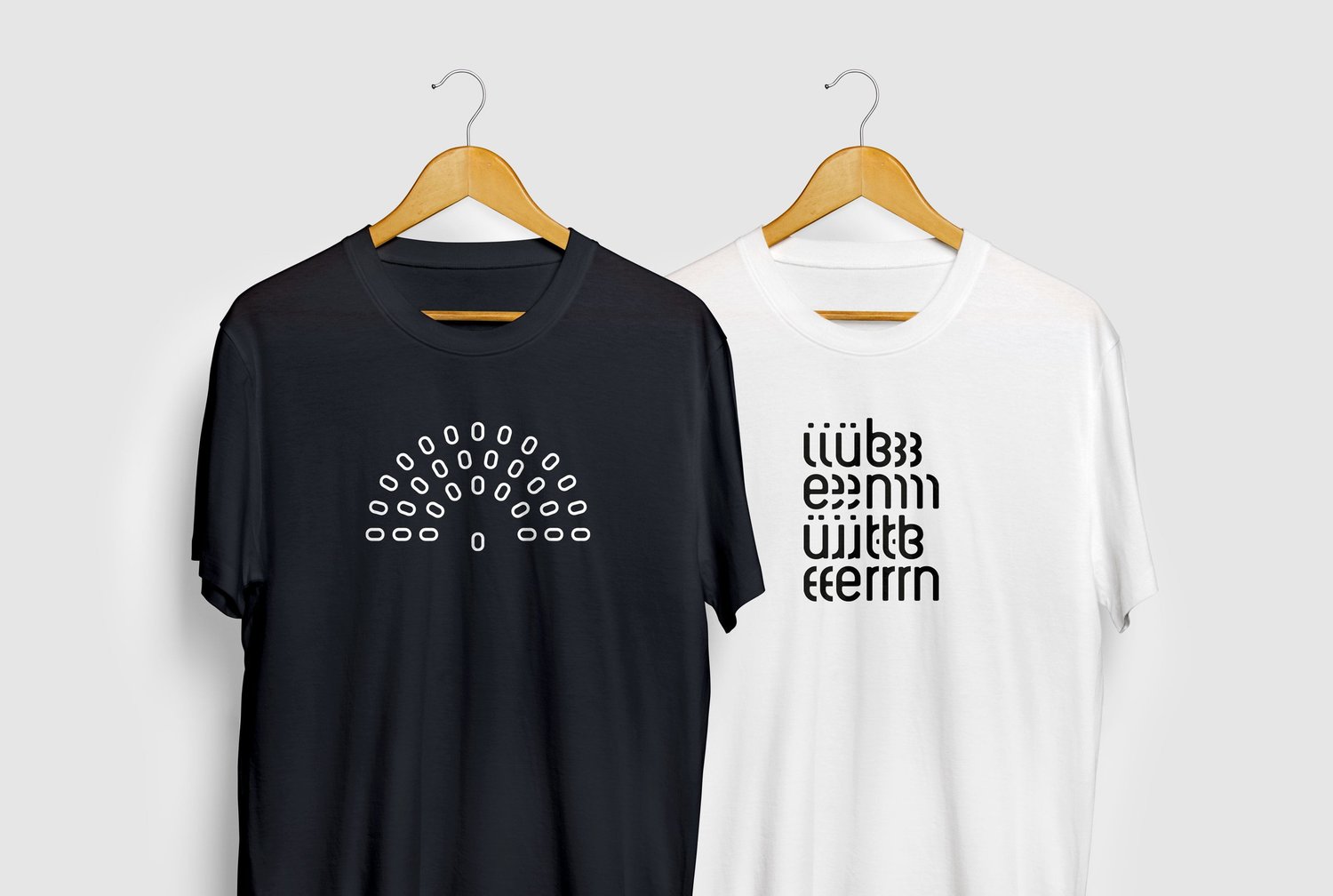
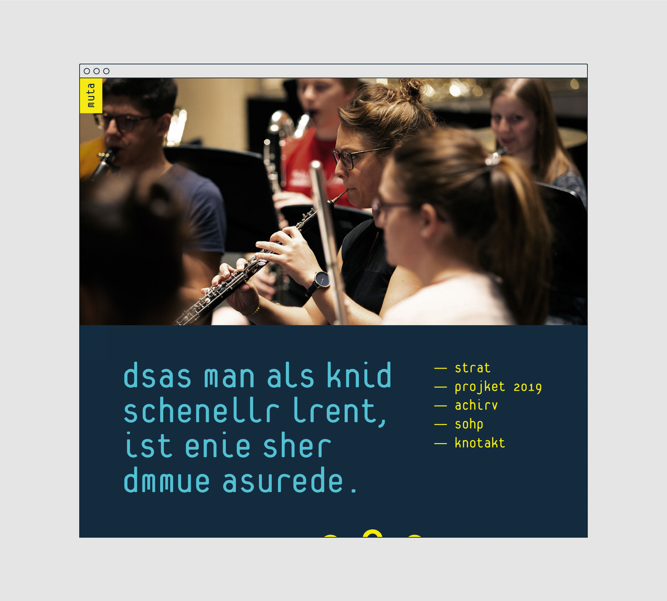
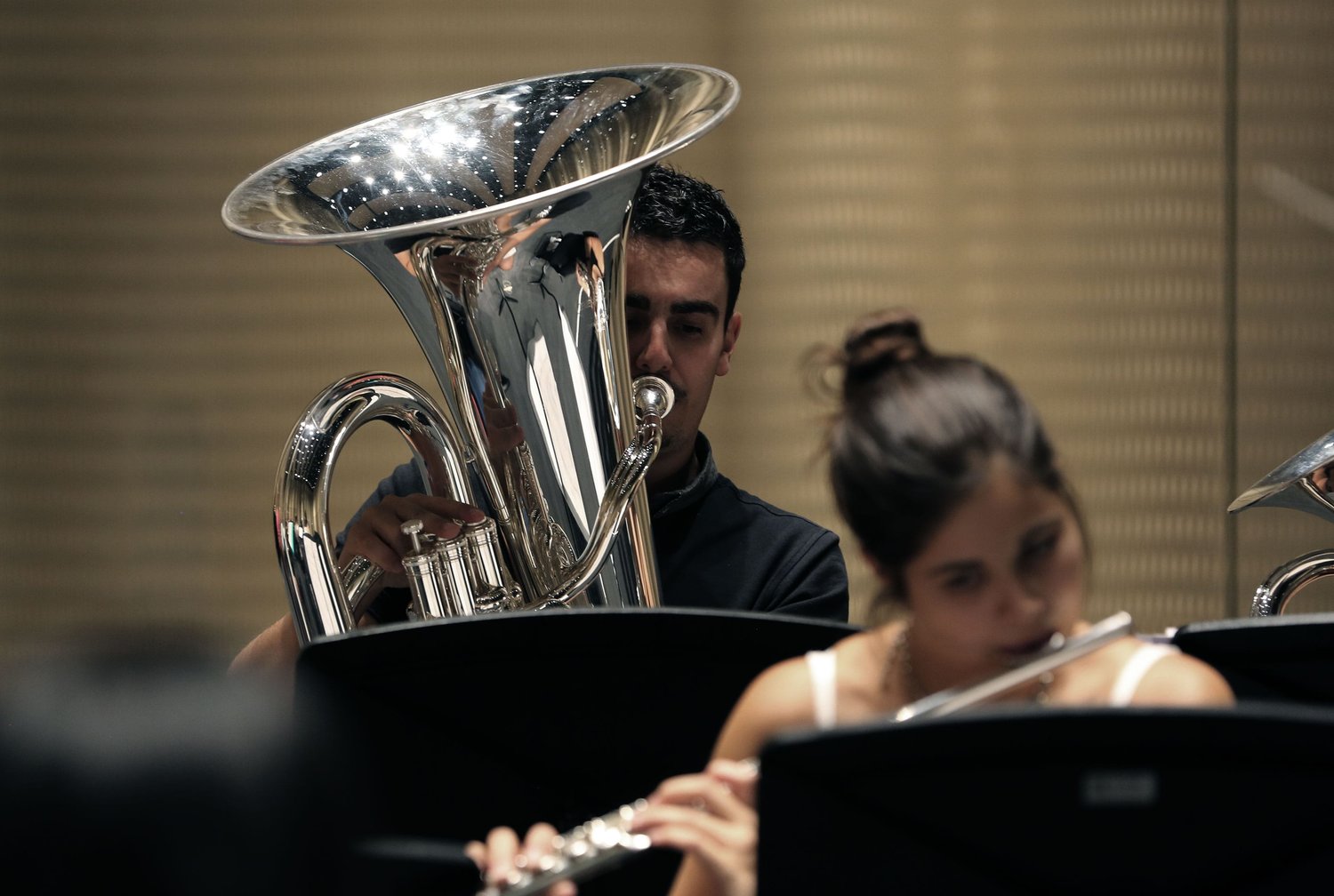
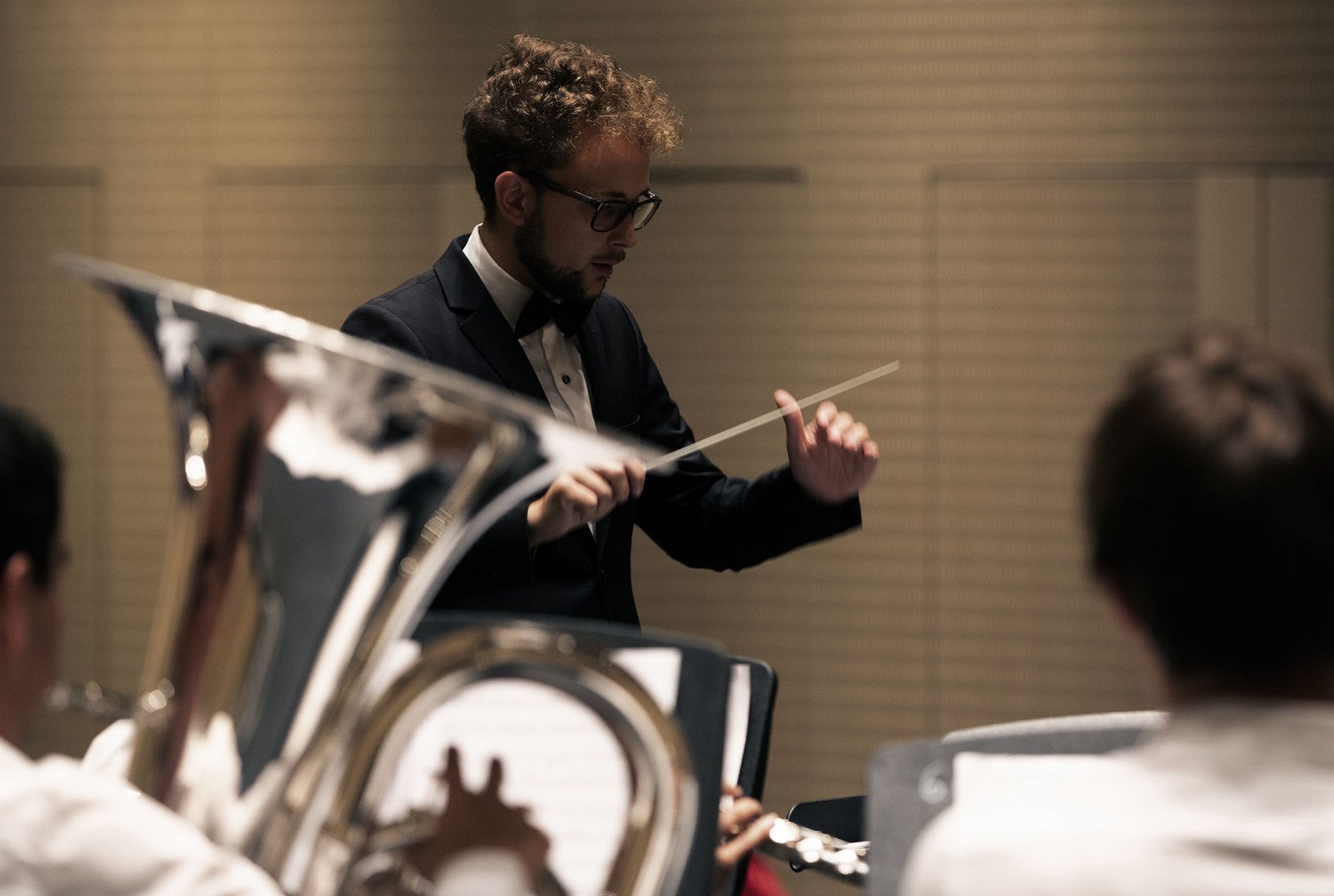
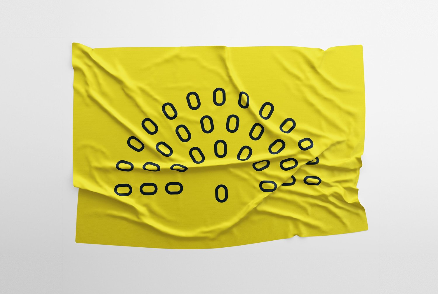
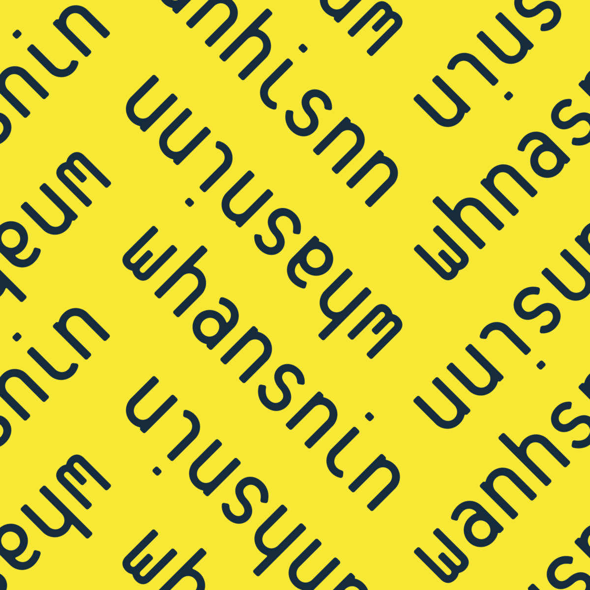
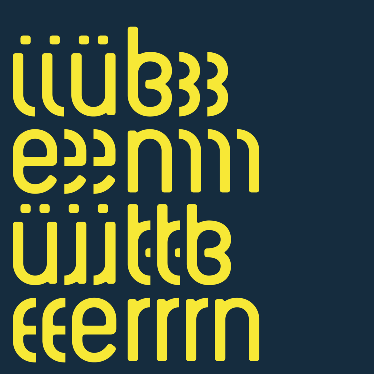
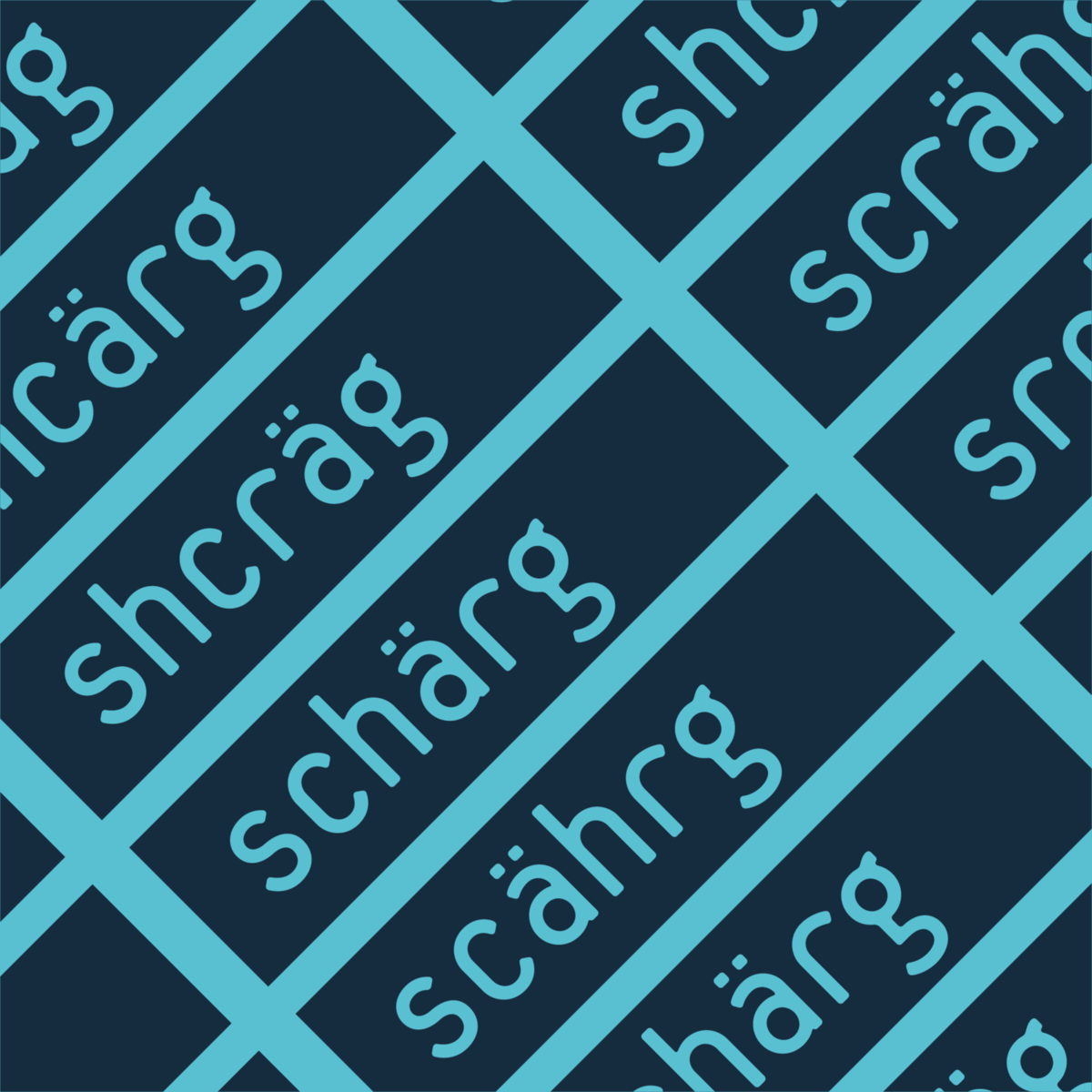
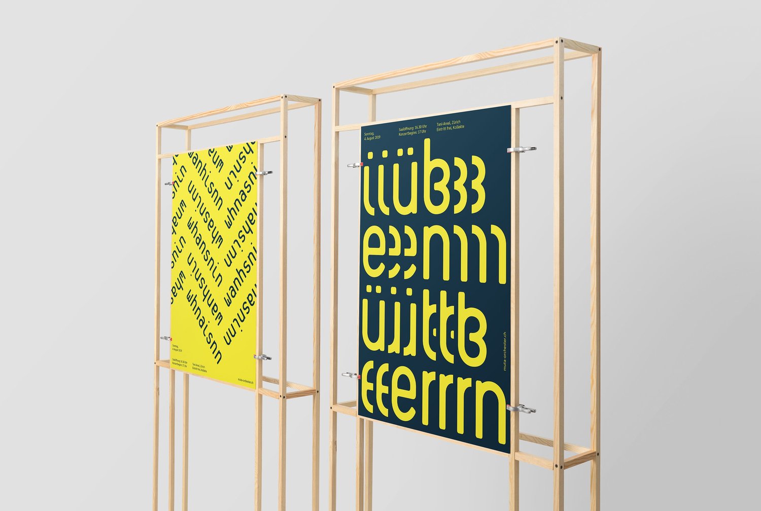
Imagine how it would be to get an instrument you have never played before, with the mission to prepare yourself for a concert in exactly one week. This is muta – instruments will be changed for one week and one concert – completely crazy and extreme fun.The change of the instruments has been used as the core of the brand. So have the letters in the words been changed. The words are still readable, but not with the same easiness – just like muta.The name muta is a musically expression mark, which stands for the change of an instrument during a piece of music – quite perfect for this project.Typographic patterns are the core elements for the muta campaign 2019. They illustrate in a playful way how it feels to play in this orchestra.The website is also built to let the user feel the muta experience. All the elements are constantly changing their places and the visitor has to search for the navigation on every page. Yes, quite lousy from a UX perspective – but that’s muta.

CREDIT
- Agency/Creative: Mauro Simeon
- Article Title: Corporate Branding for Muta Orchester
- Organisation/Entity: Freelance, Published Commercial Design
- Agency/Creative Country: Switzerland
- Market Region: Europe
- Project Deliverables: Clothing/Uniforms, Digital Website, Photography, Print Advertising, Print Publication, Social Media


