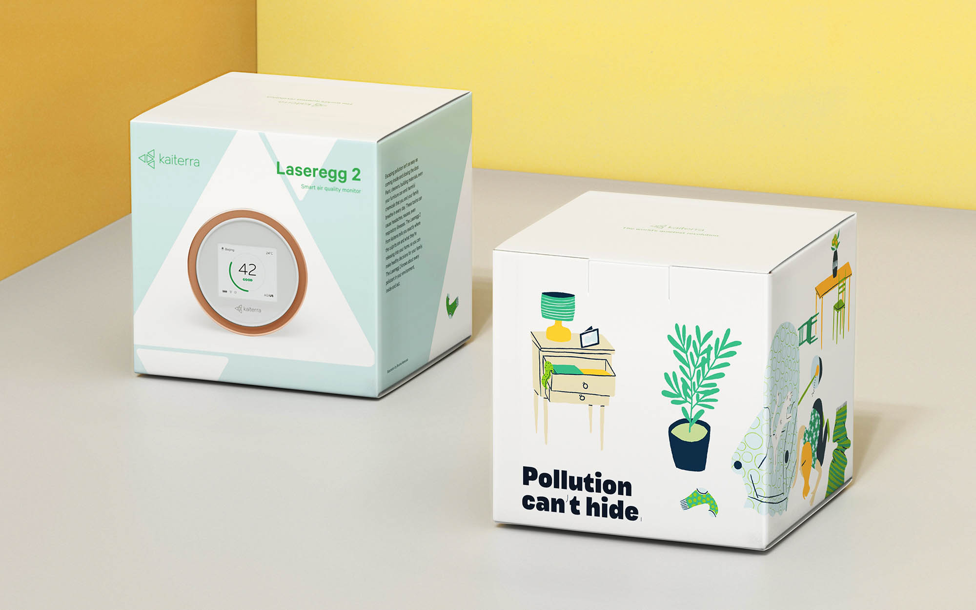
It’s easy to feel powerless in the face of big problems like air pollution. As China and India’s #1 air quality monitor, Kaiterra knew this problem intimately. Kaiterra needed to challenge the status quo, empower users, and inspire grassroots discussions about air.
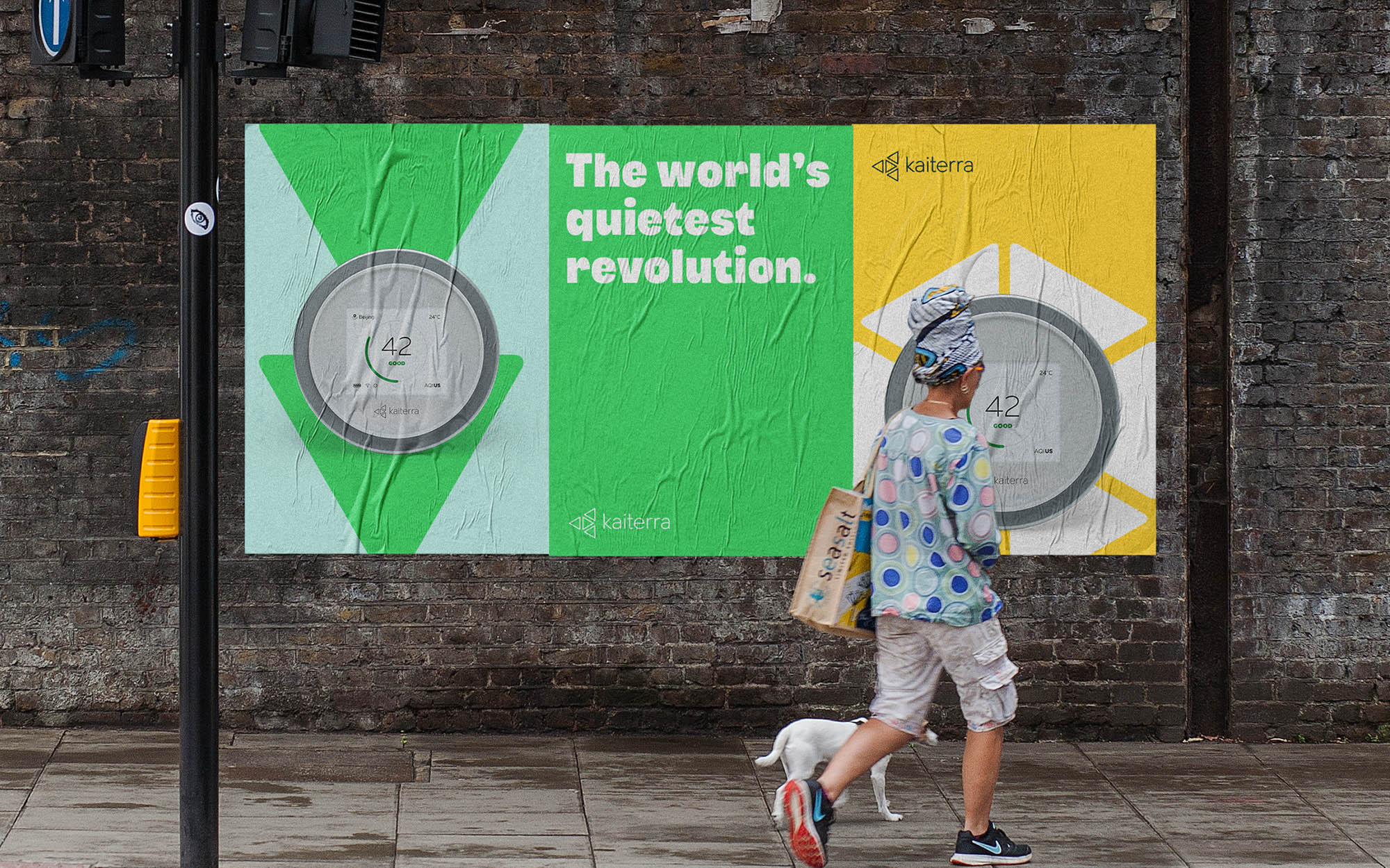
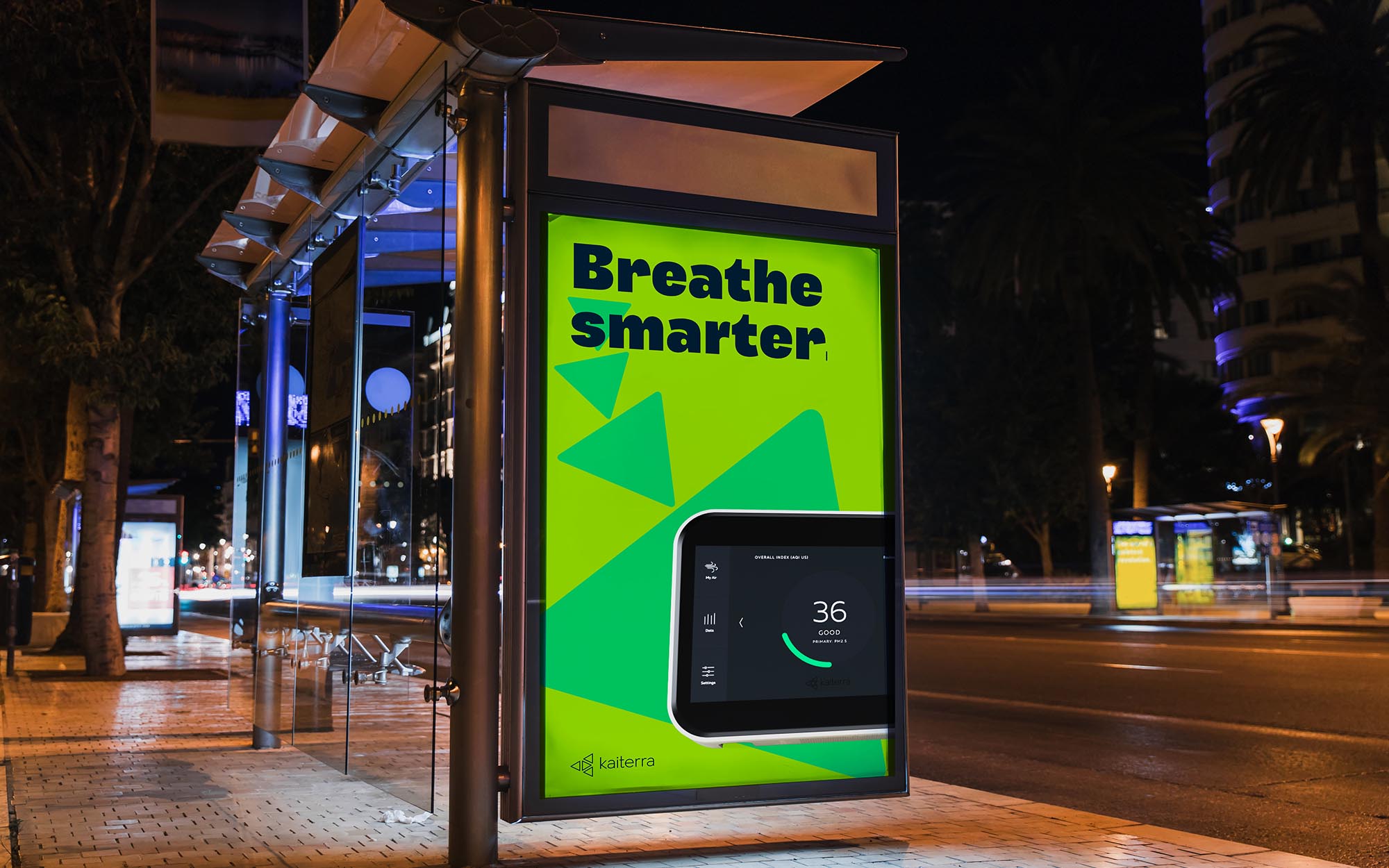
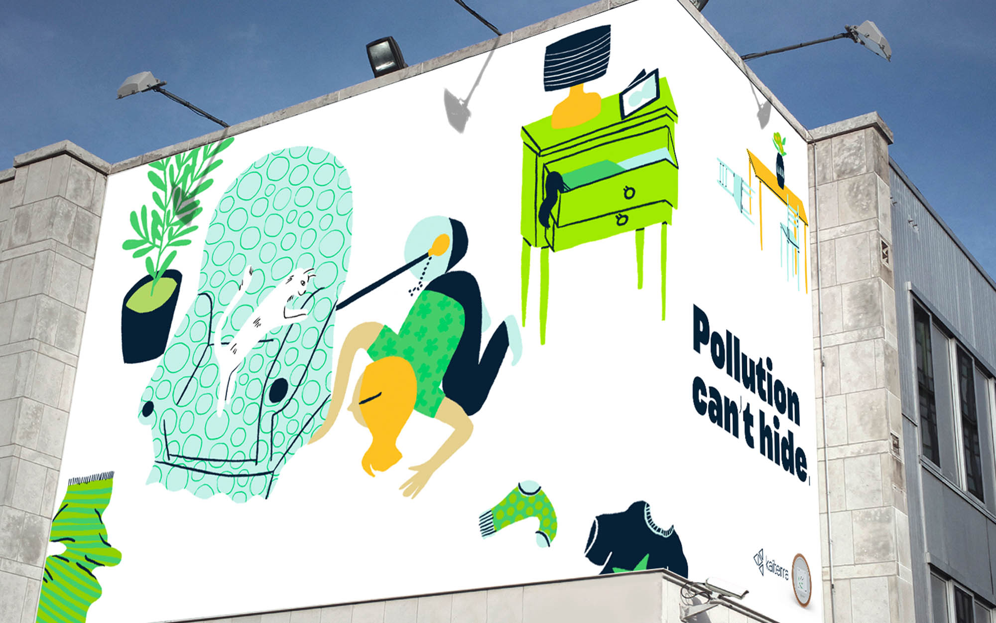
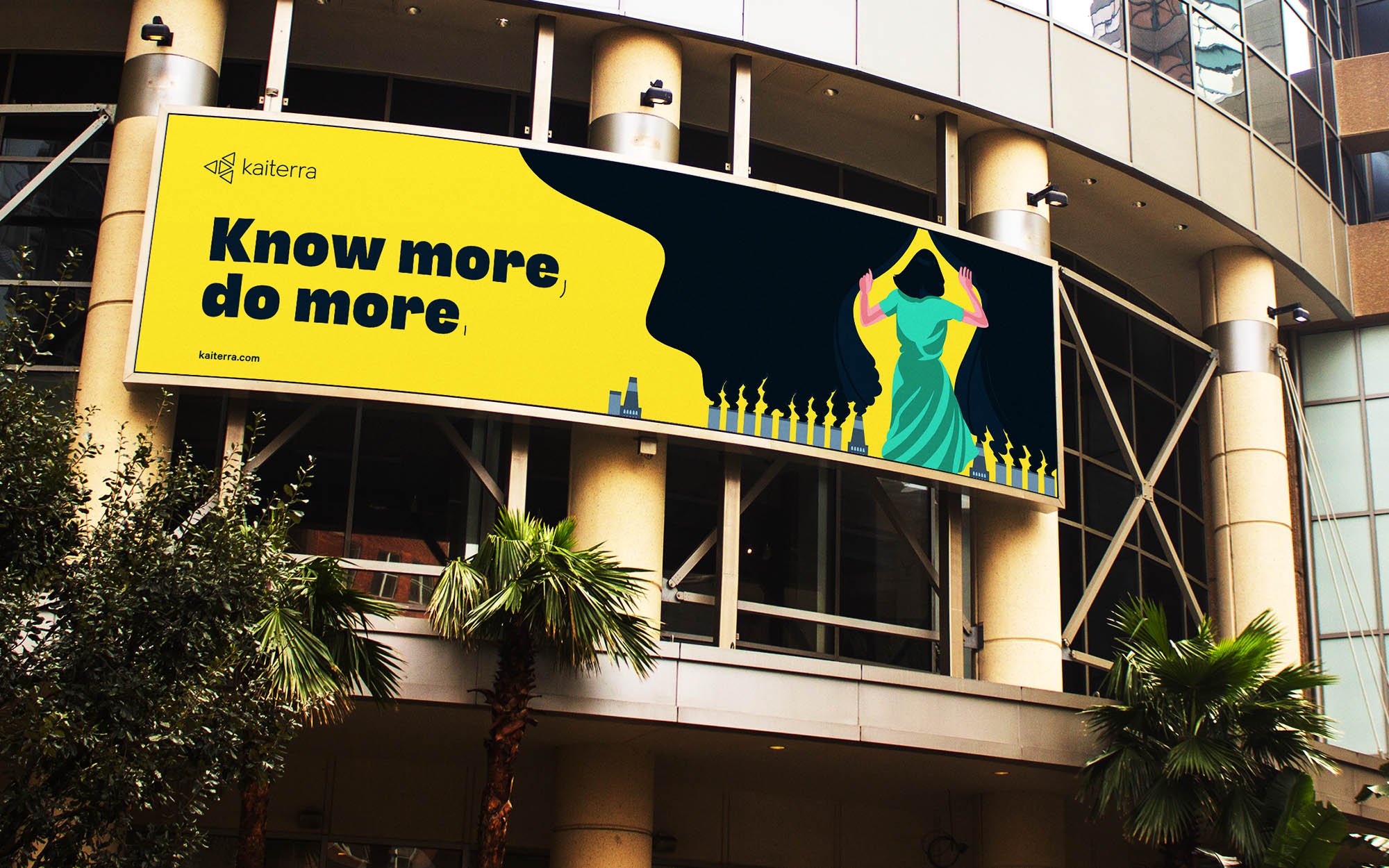
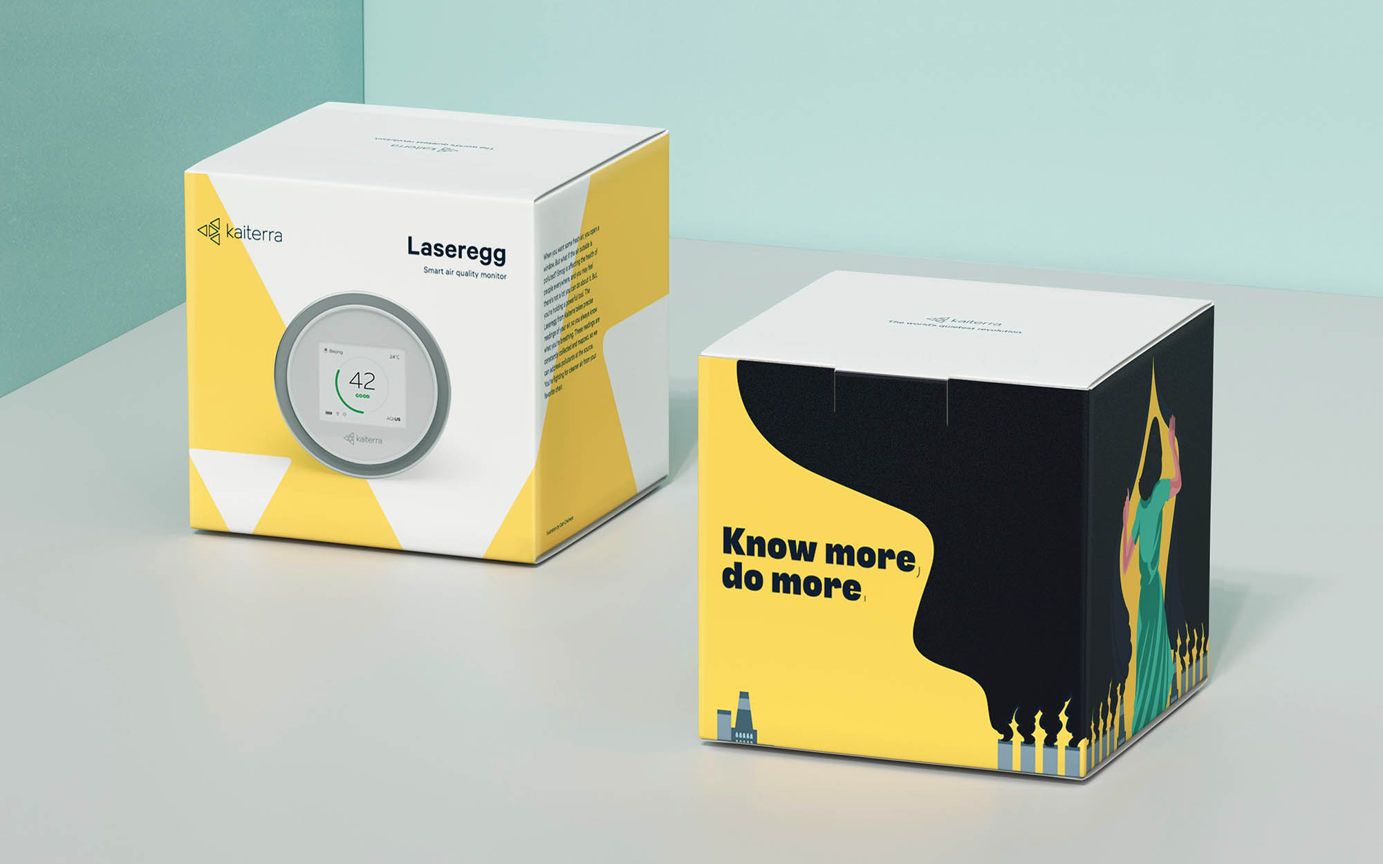
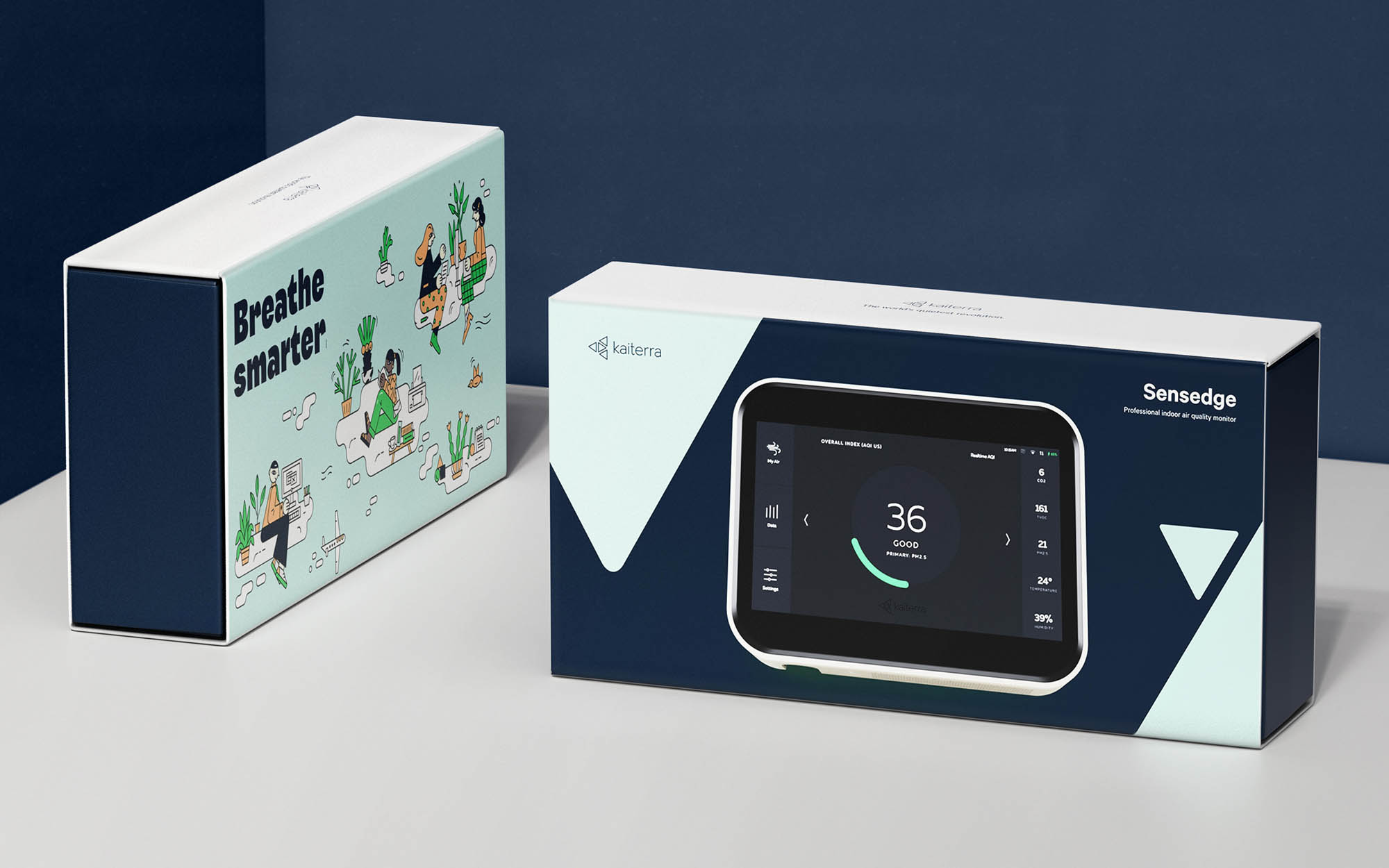
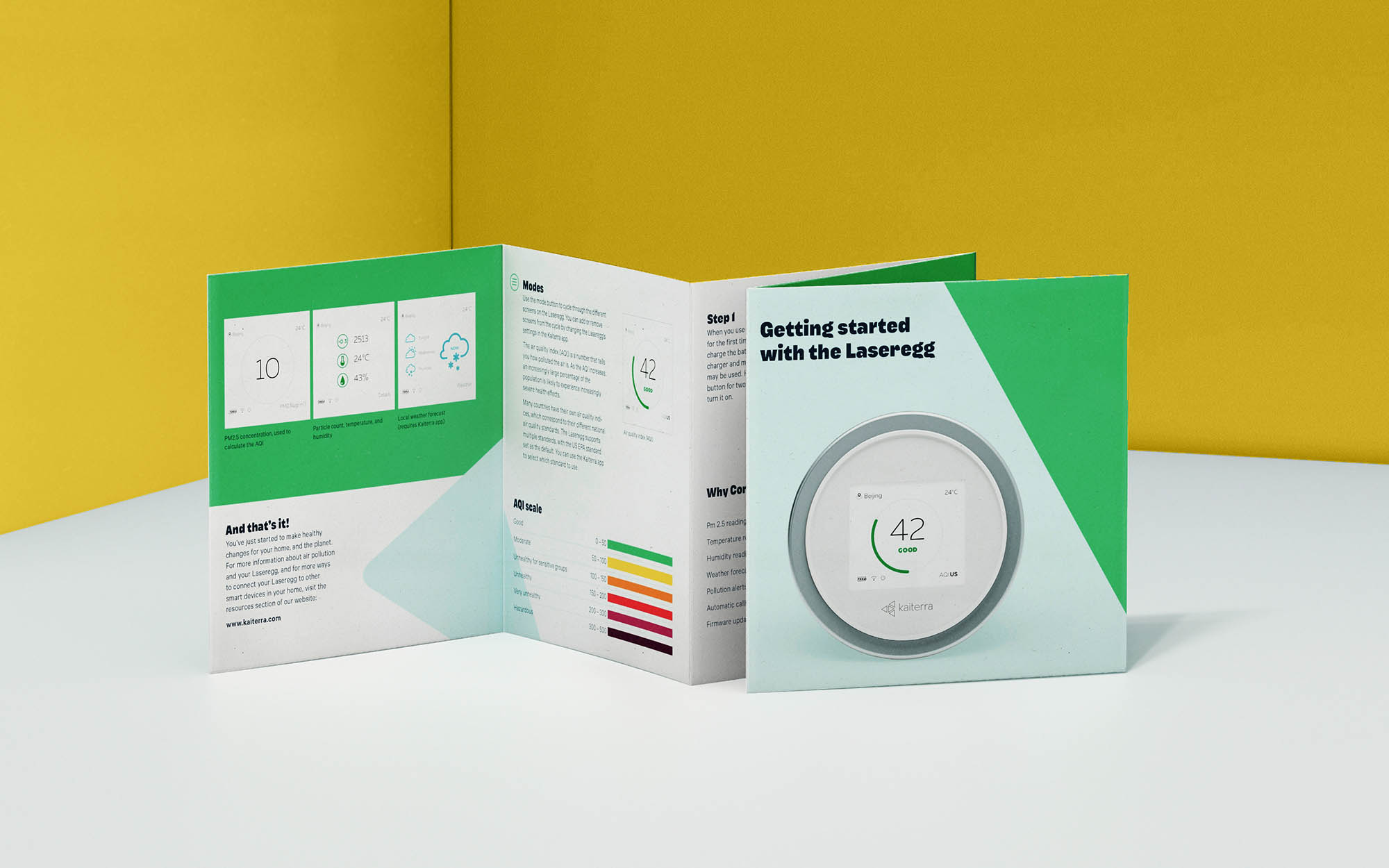
With people exhausted by visions of doom and statistics of gloom, the brand engages users emotionally instead of factually. A big part of this is a no-infographics approach. Bold statements and visual metaphors keep a large problem accessible. To do this, we developed a brand language inspired by editorial masters of the New York Times and New Yorker, who use a variety of illustrators and illustrations to humanize complex issues.
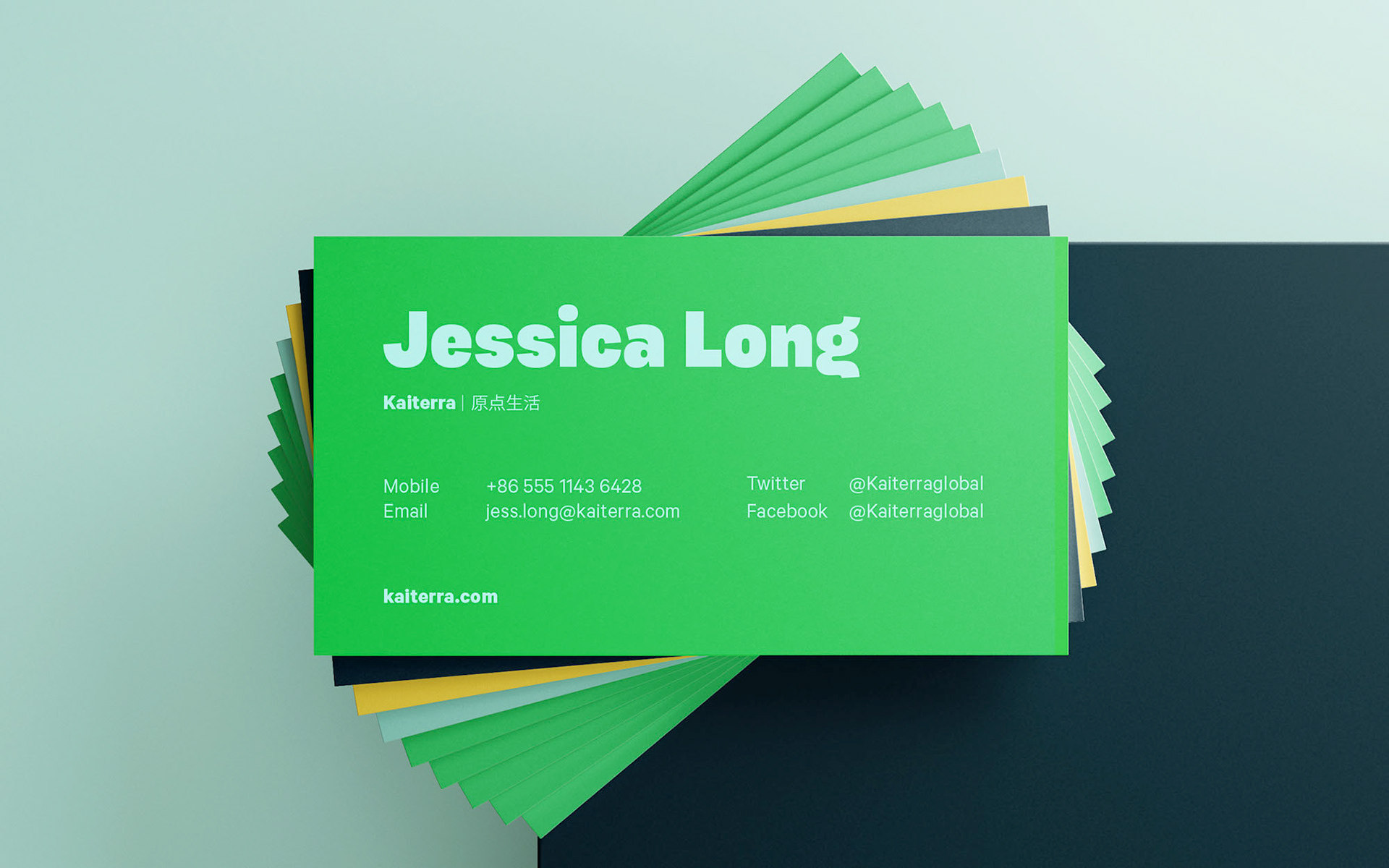
For major campaigns and emotions-led provocations, Kaiterra now works in visual metaphors for even larger impact. Colours and type give cohesion; a changing cast of illustrators adds constant new energy and intelligence.




CREDIT
- Agency/Creative: Joel Derksen
- Article Title: A Better Story of Clean Air Kaiterra Rebrand
- Organisation/Entity: Freelance, Published Commercial Design
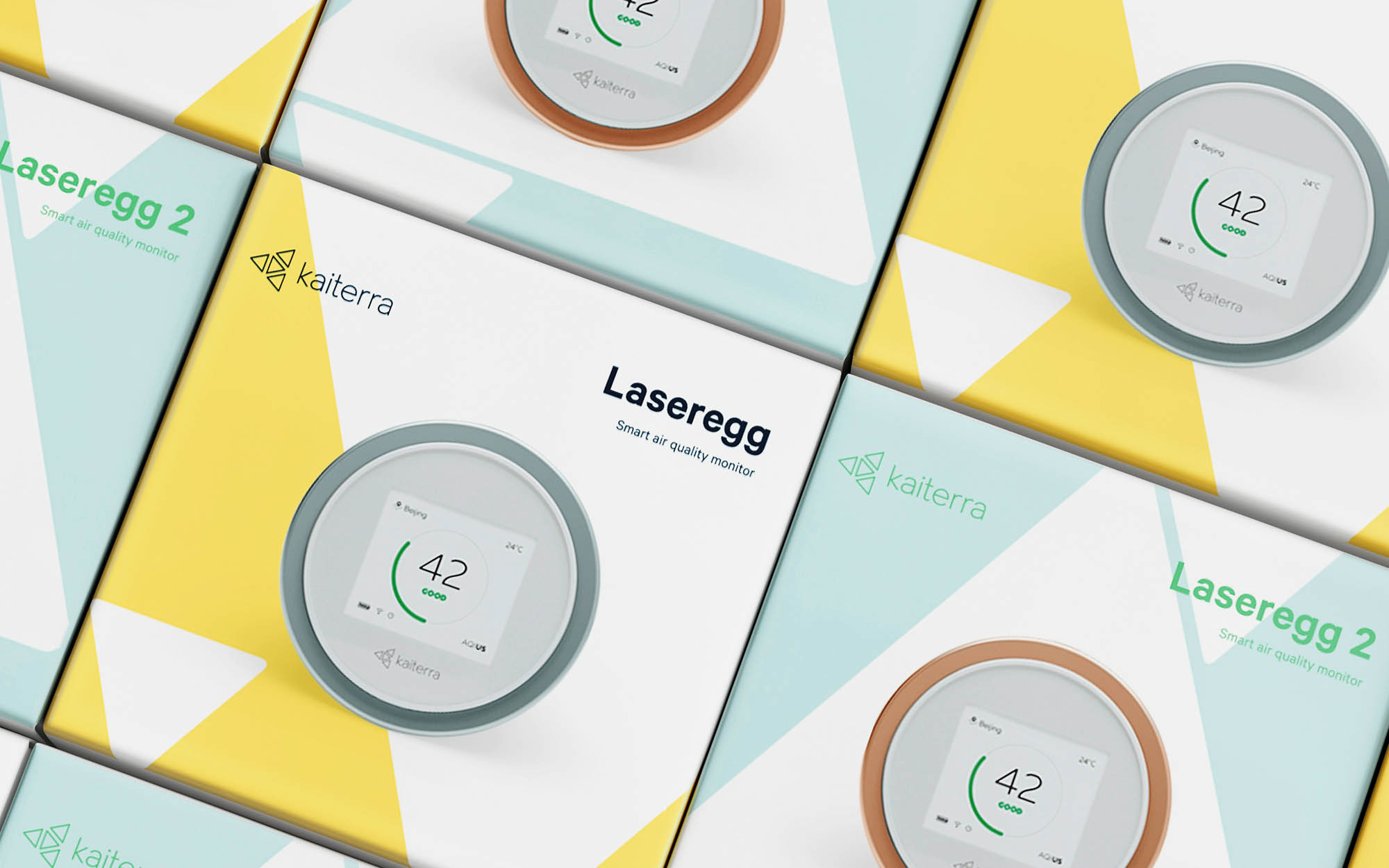
- Project Type: Packaging
- Agency/Creative Country: Netherlands
- Market Region: Asia
- Project Deliverables: Brand Advertising, Brand Architecture, Brand Creation, Brand Guidelines, Brand Identity, Brand Redesign, Brand Refinement, Brand Rejuvenation, Brand Strategy, Brand World, Branding, Graphic Design, Identity System, Illustration, Packaging Design, Product Architecture, Rebranding, Research, Tone of Voice
- Format: Box
- Substrate: Pulp Paper


