Stratedgy – Beard Hood Brand Project
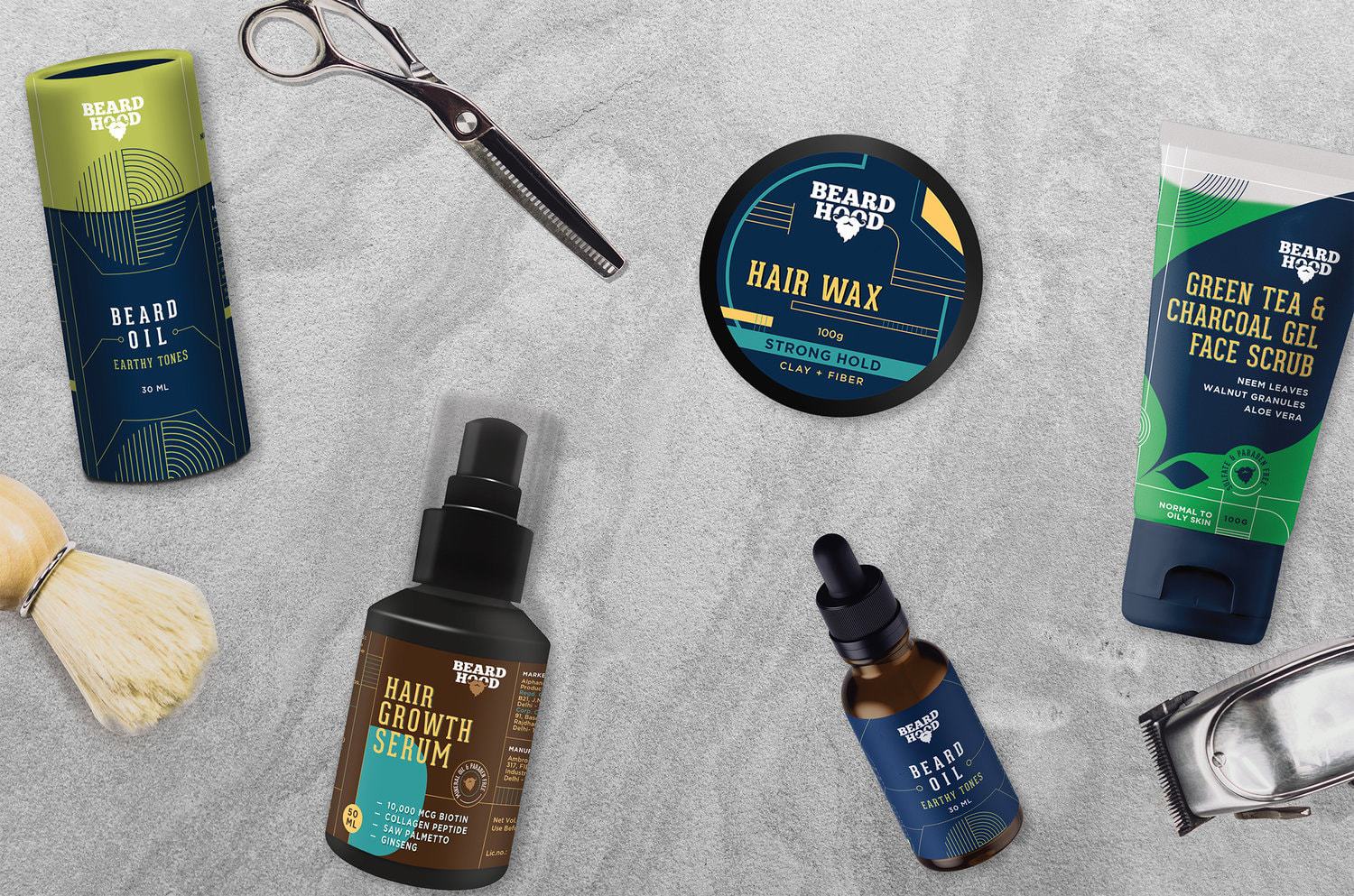
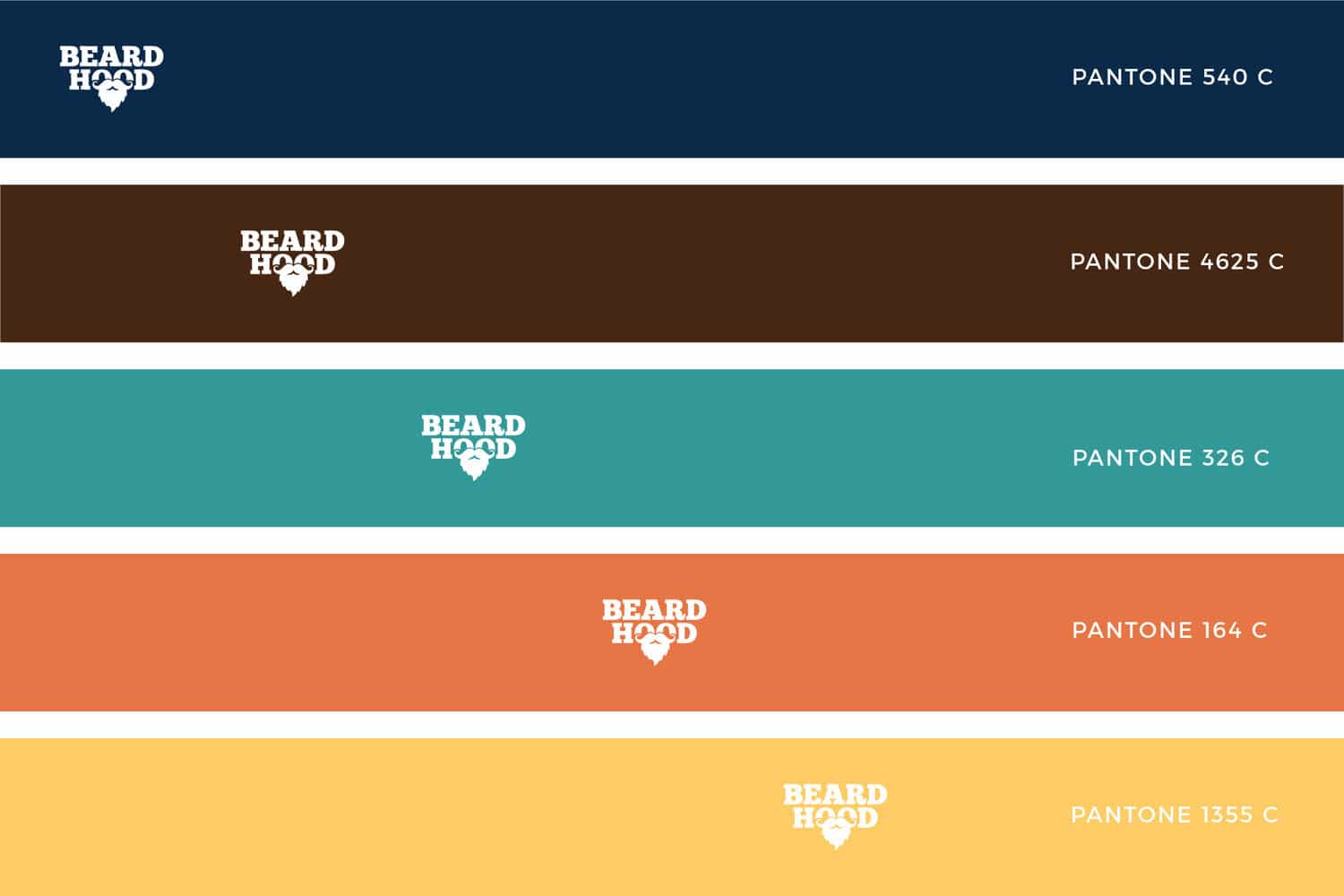
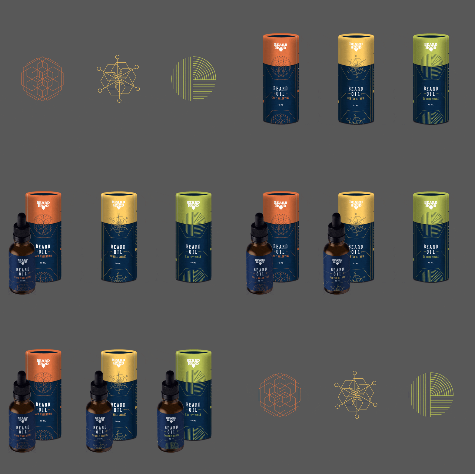
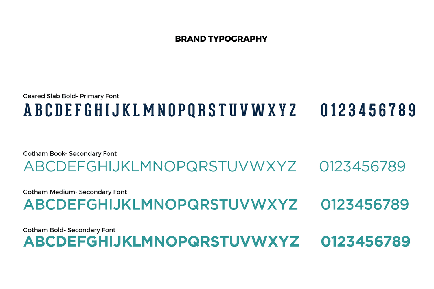
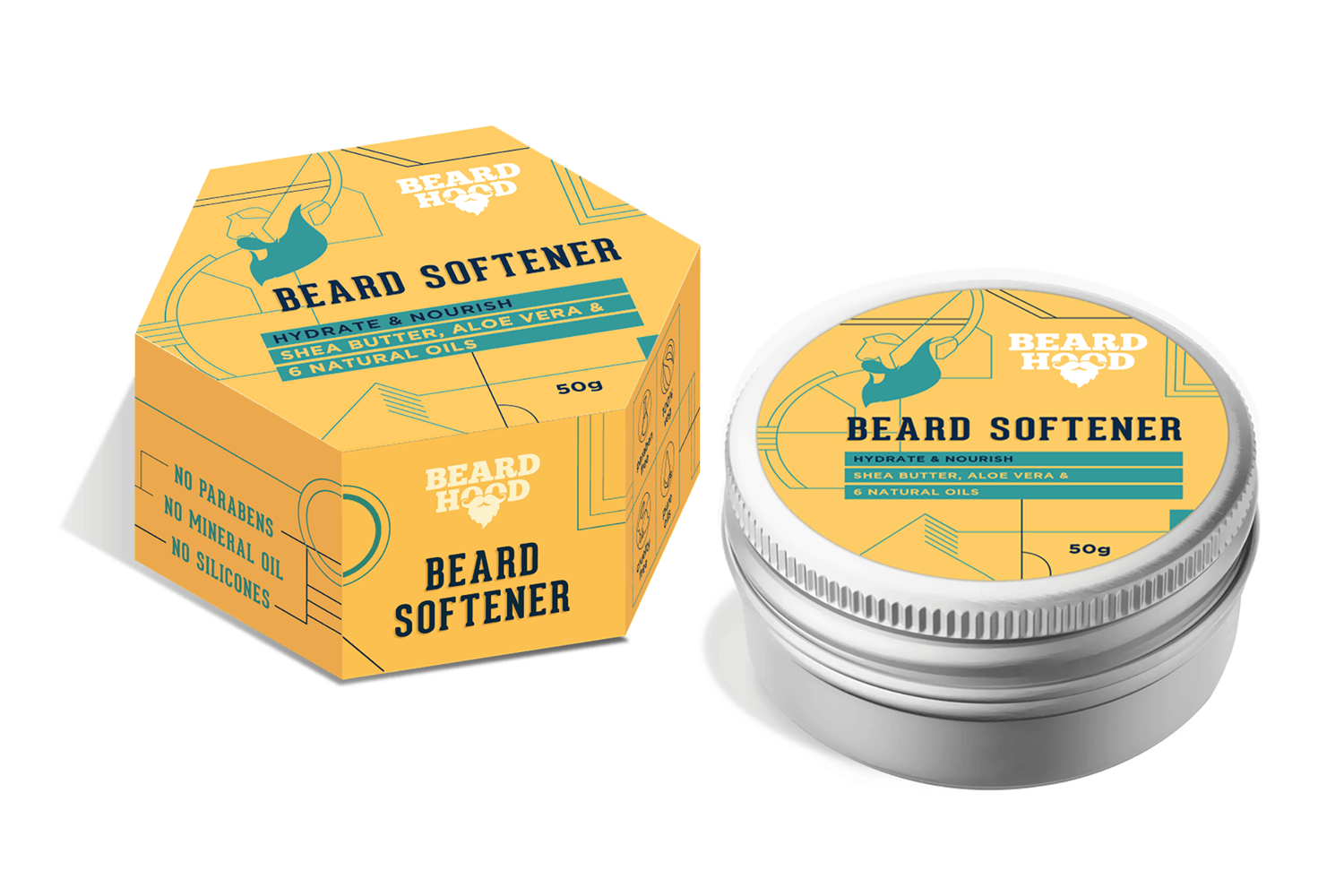
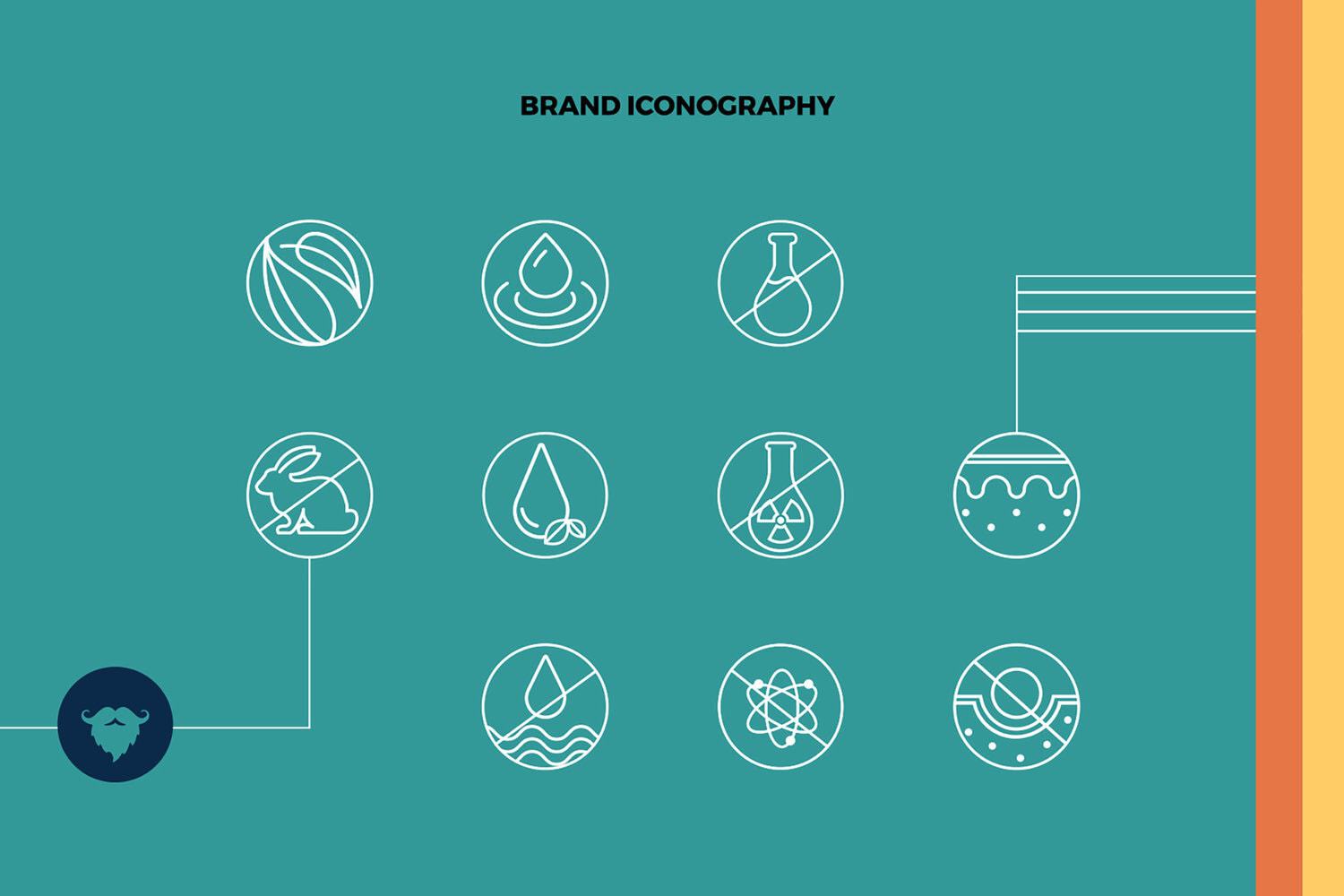
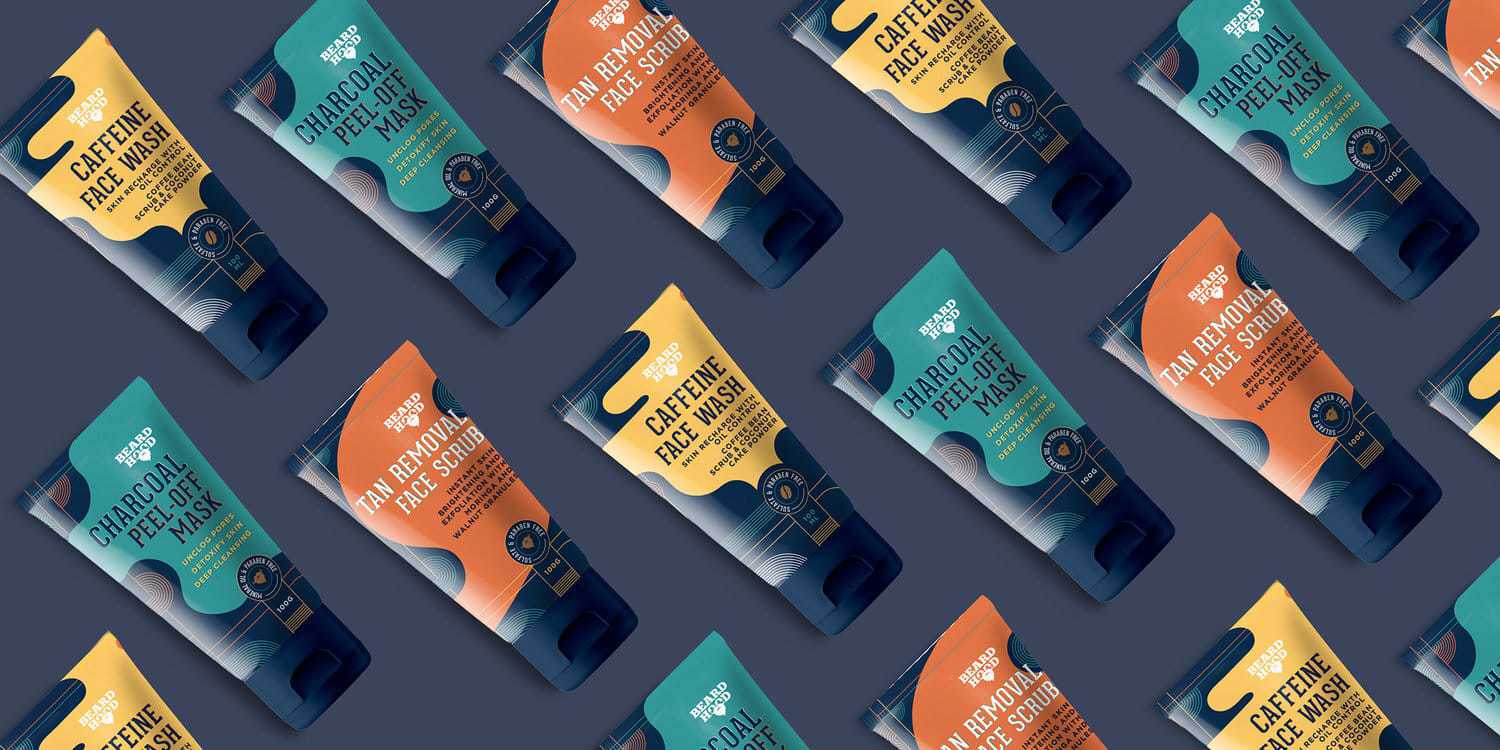
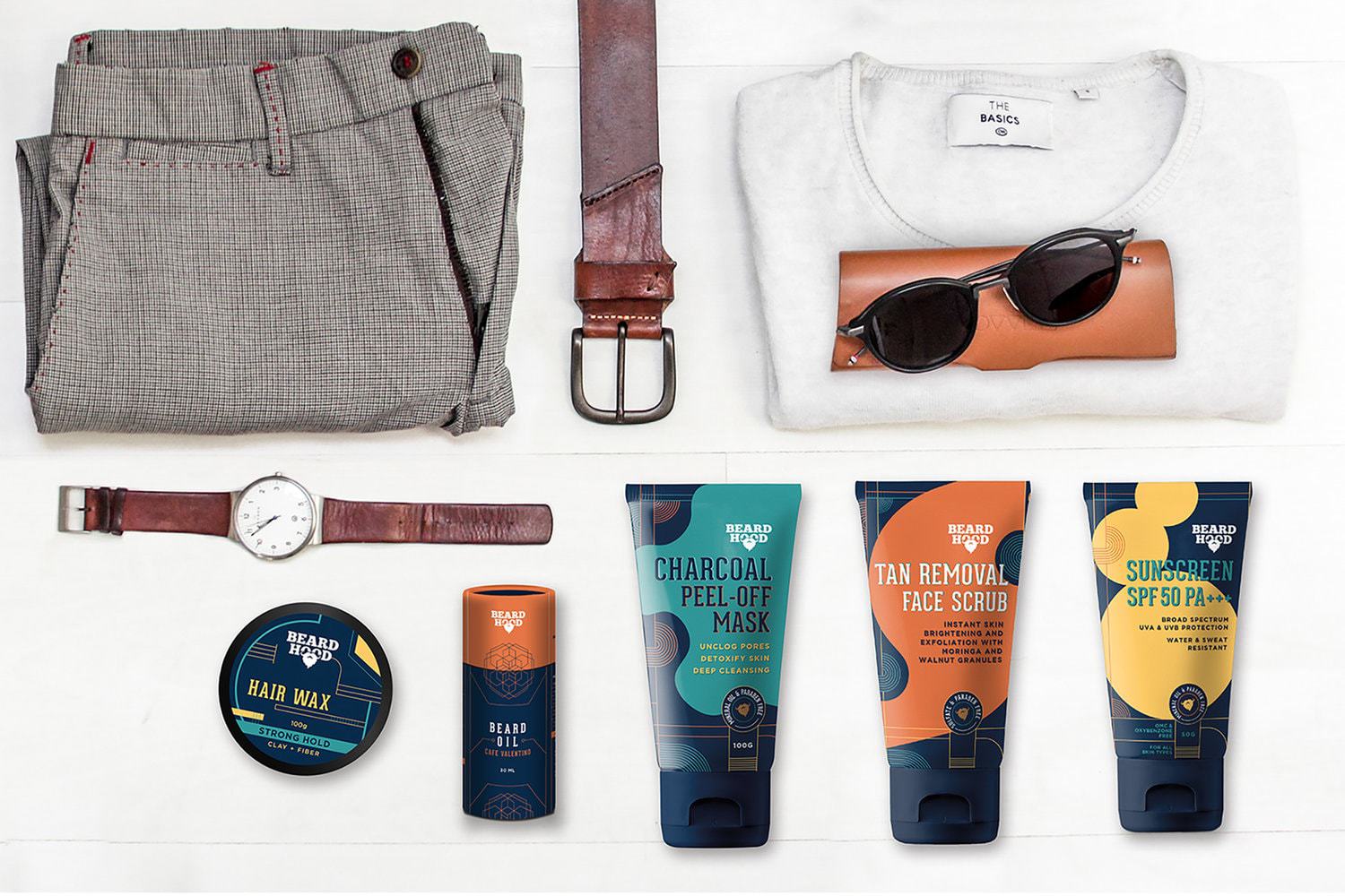
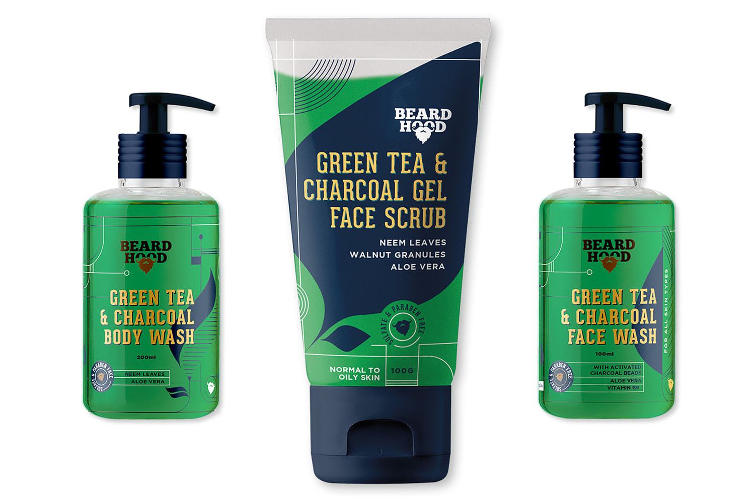
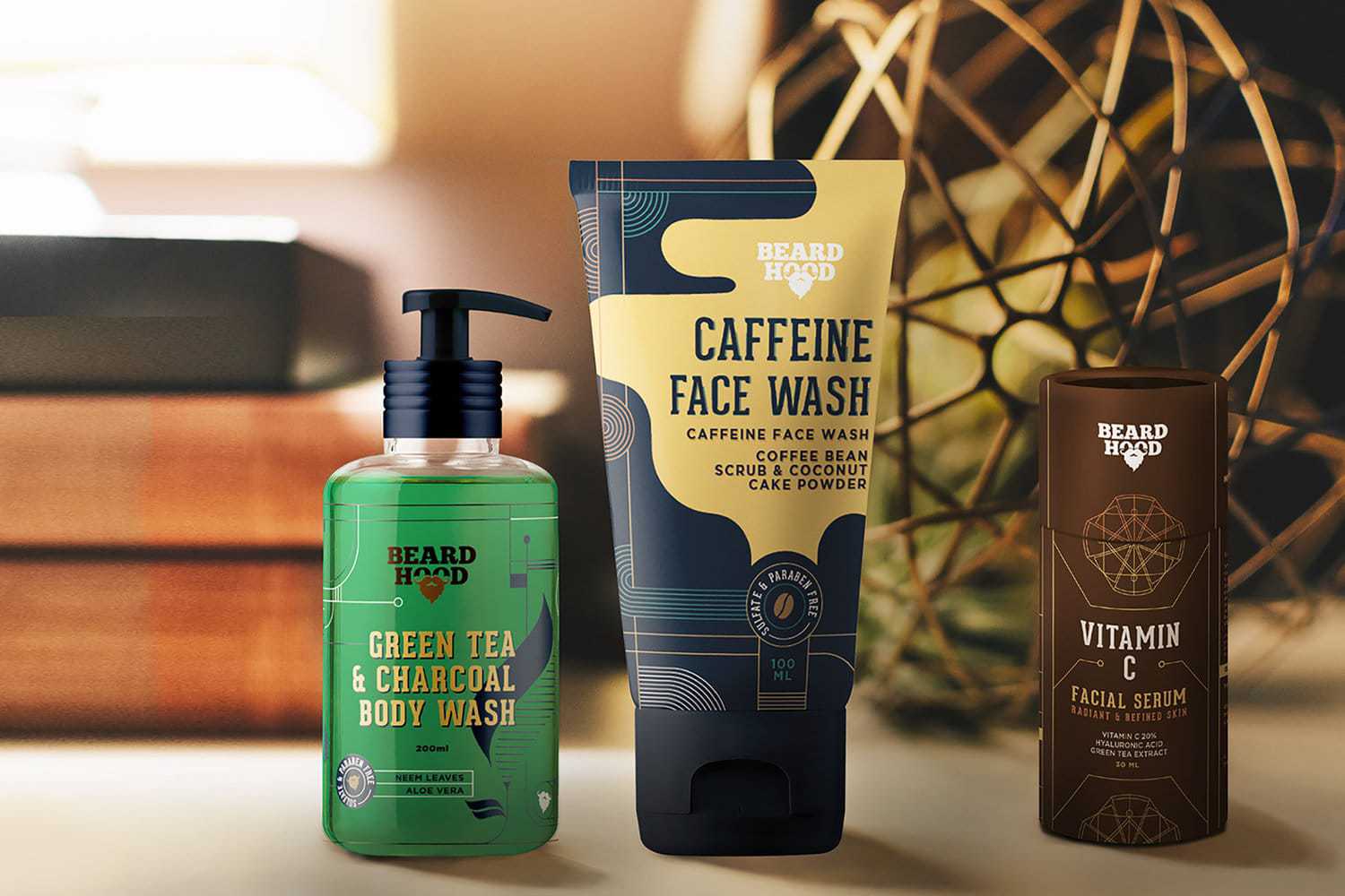
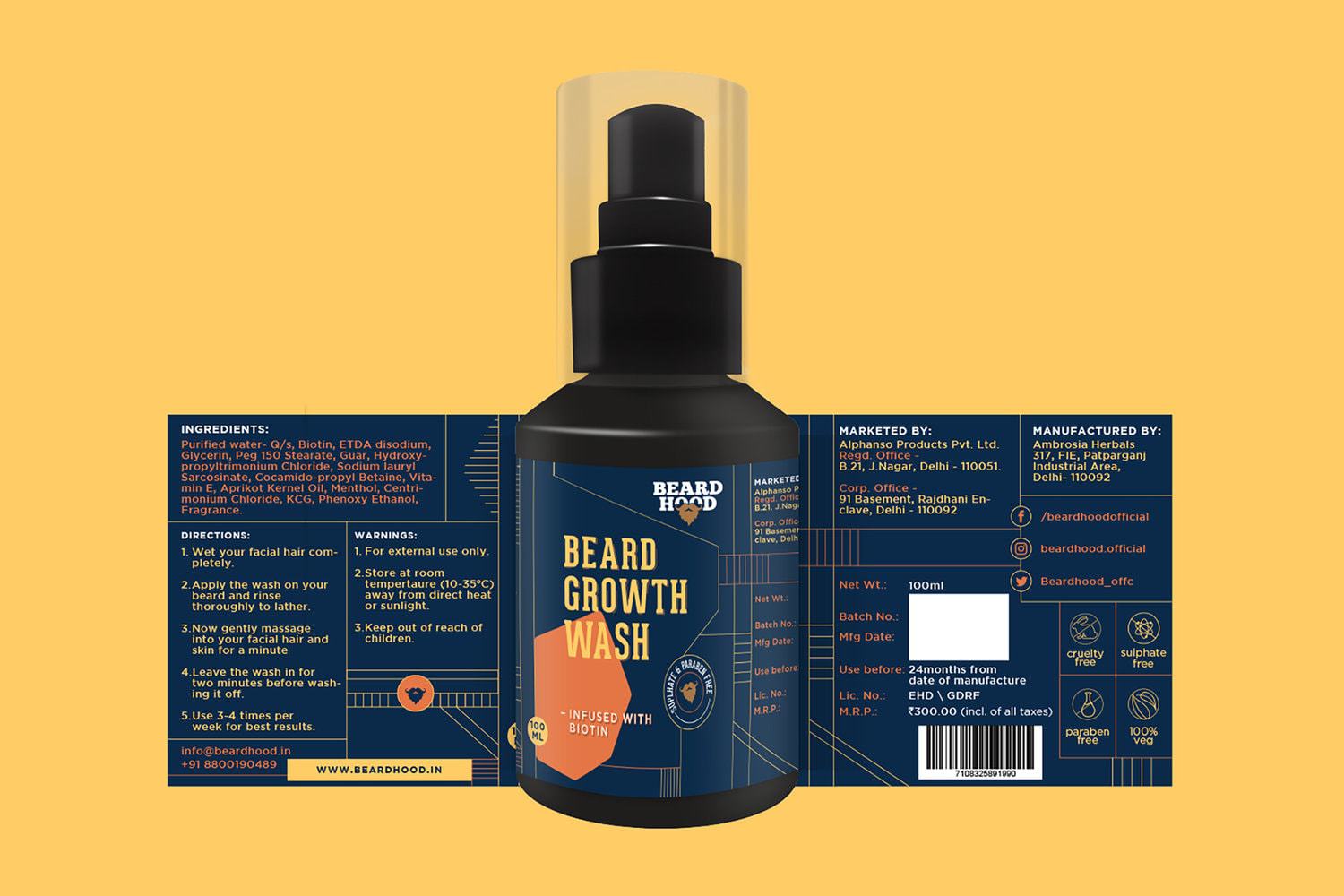
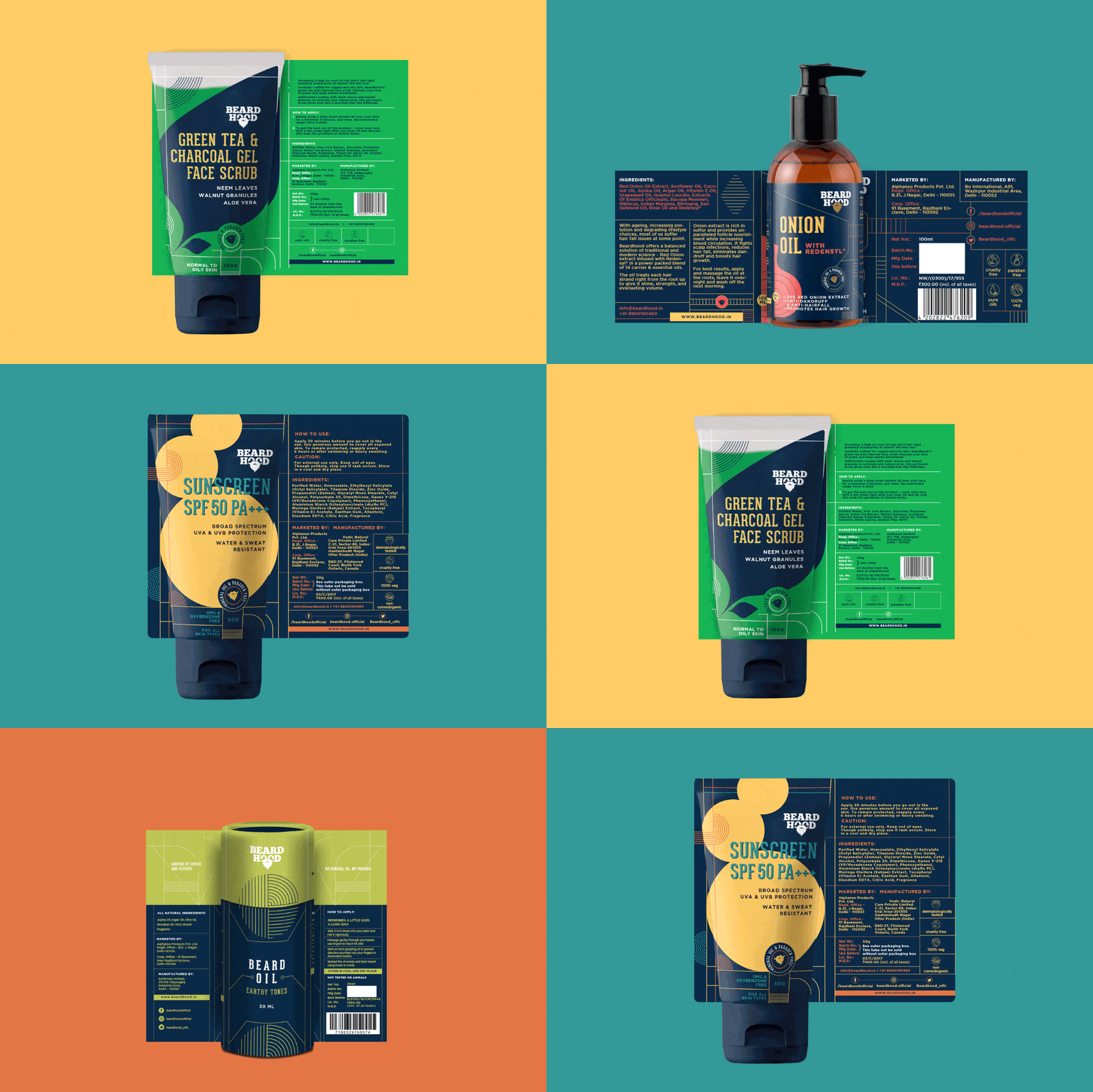
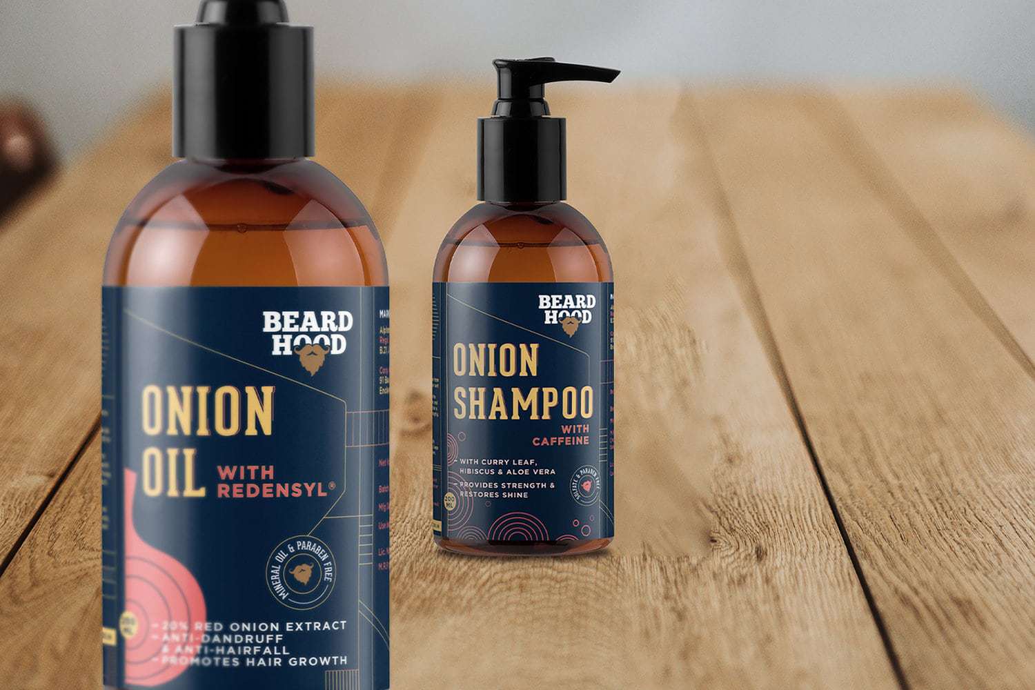
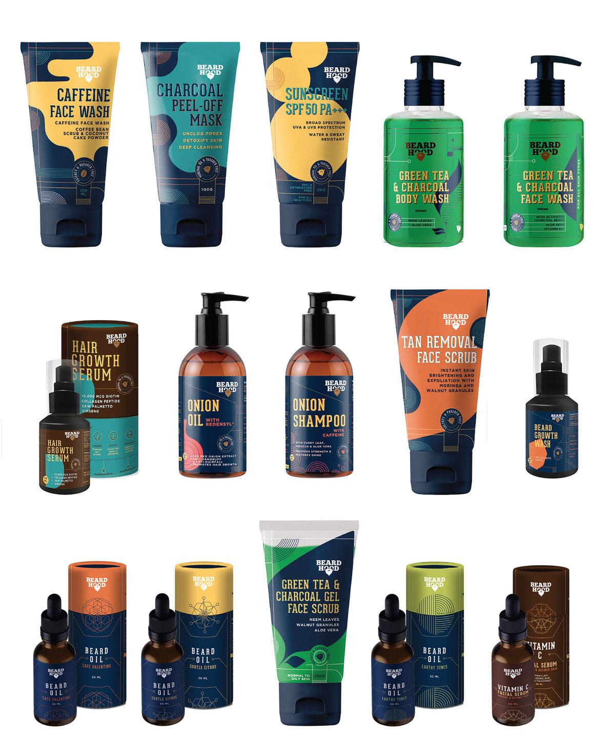
Taking forward a quintessential Men’s skin and hair care product into a non-quintessential design space, using bright colours, geometric forms and simple typographyPackaging DesignWith a market that is saturated with all sorts of brands and products, BeardHood wanted to do something that is different. Our brief was no blacks, no images and no bold fonts. With a range of products starting from Face Masks, Scrubs to Hair Serum, the challenge was to create a design language that could be extended across all. With an in-depth understanding of the market scenario we delved into a design language that could meet all these requirements.With BeardHood our strategy was to create a design pathway that was offbeat and not-so quintessential. The colour palette was bright, earthy and bold. The geometric forms were extended, flexed and bended as per the structures of the products. The typography is simple, clean and compliments the design elements.With a product range that extends such a myriad canvas, we envisioned a brand language that is easily extendable and adaptable.


CREDIT
- Agency/Creative: Stratedgy
- Article Title: Packaging Design for Beard Hood, a Men’s Personal Care Brand in India
- Organisation/Entity: Agency, Published Commercial Design
- Project Type: Packaging
- Agency/Creative Country: India
- Market Region: Asia
- Format: Bottle, Box, Tube
- Substrate: Glass, Plastic, Pulp Paper


