Lavernia & Cienfuegos – Zara Parfum Intense
Graphic design is closely linked to local cultures because the intervention of the text, in each country in its language, and of the images, that have different meanings in different cultures. This often makes it difficult for multinational companies to communicate through packaging of their products. But the same does not happen with the structural design, because a cologne bottle, for example, communicates through the materials, their finishes, the volumetric shapes, the color or the texture of the surfaces and this is an almost universal language.
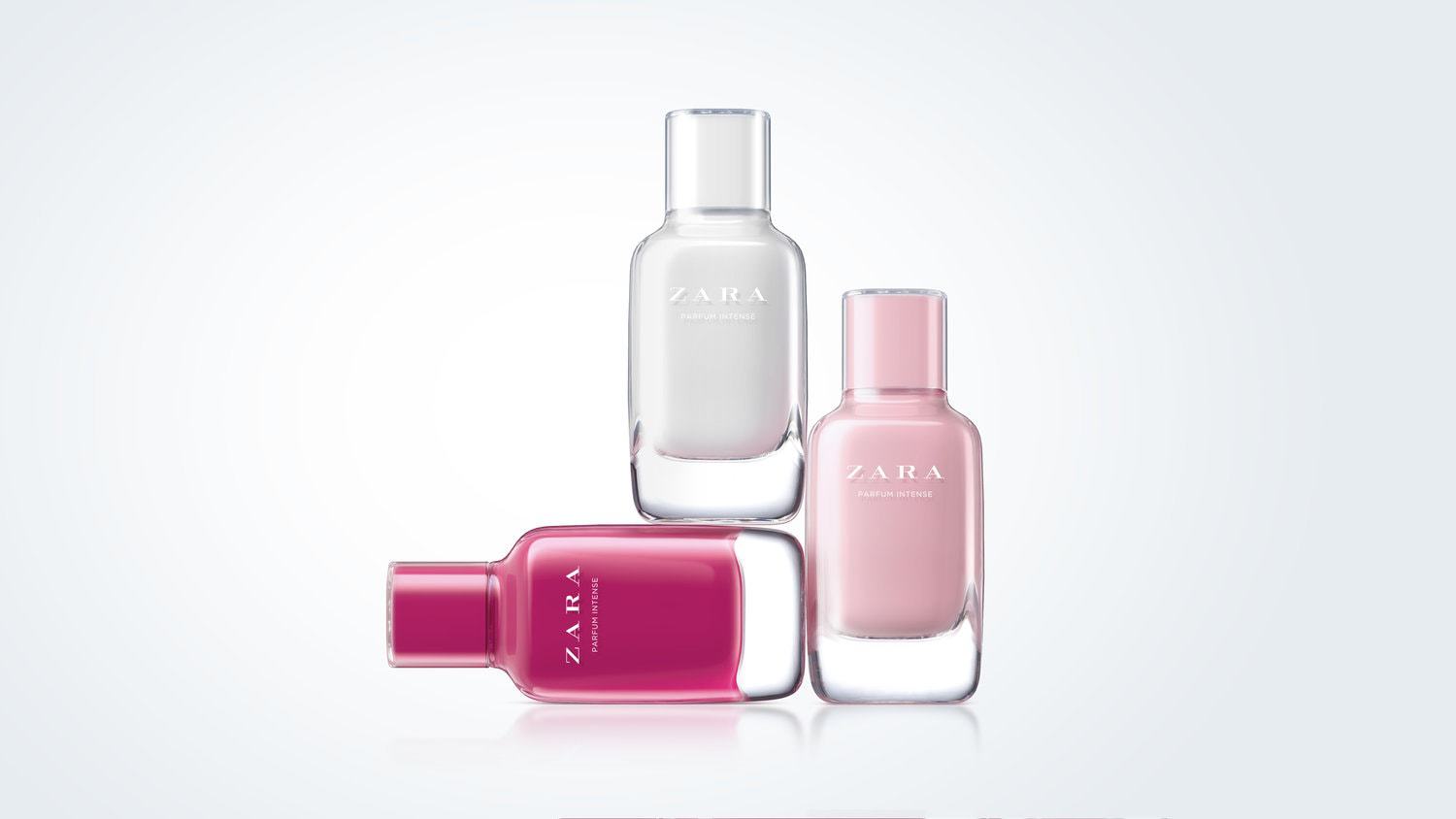
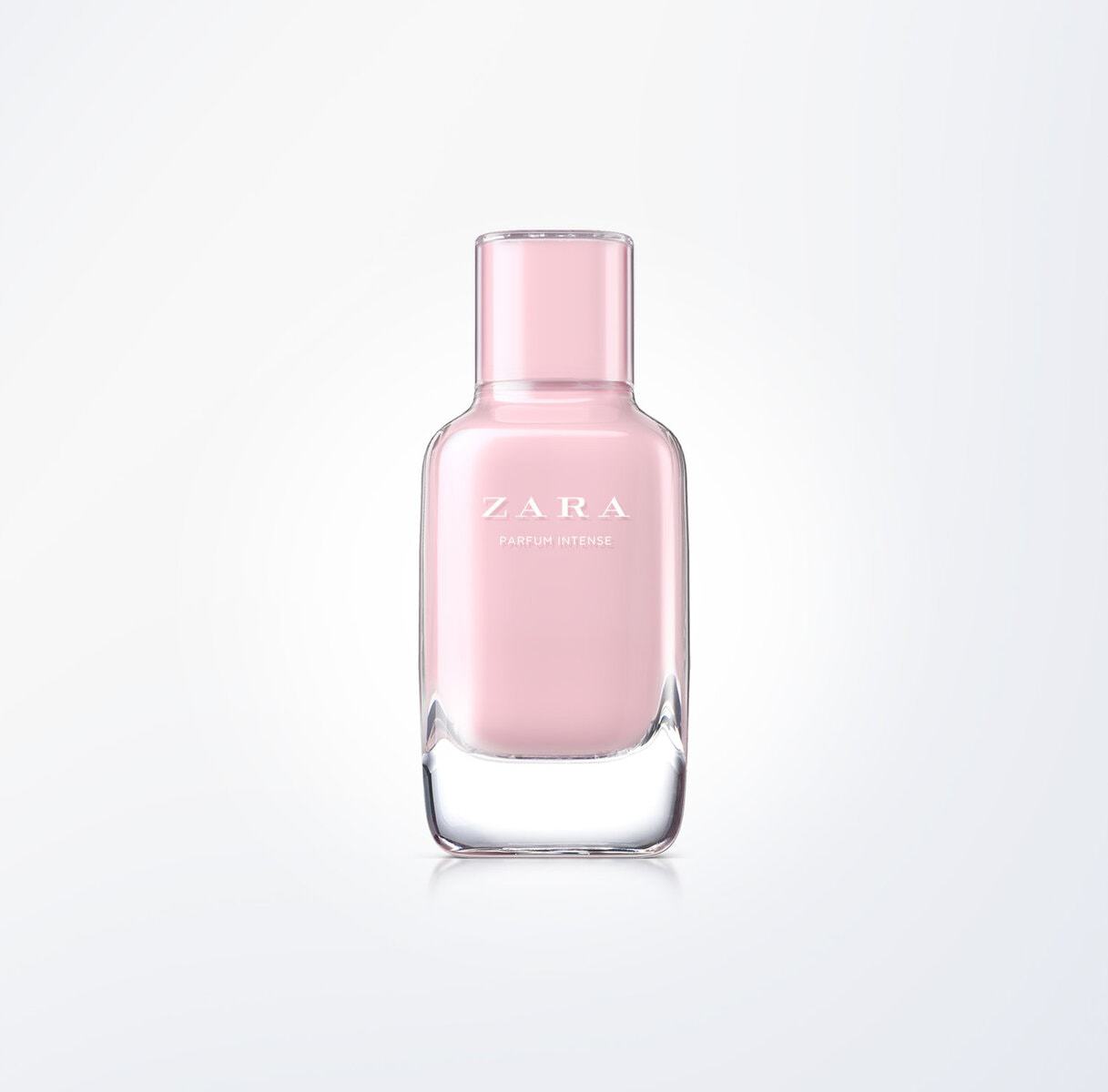
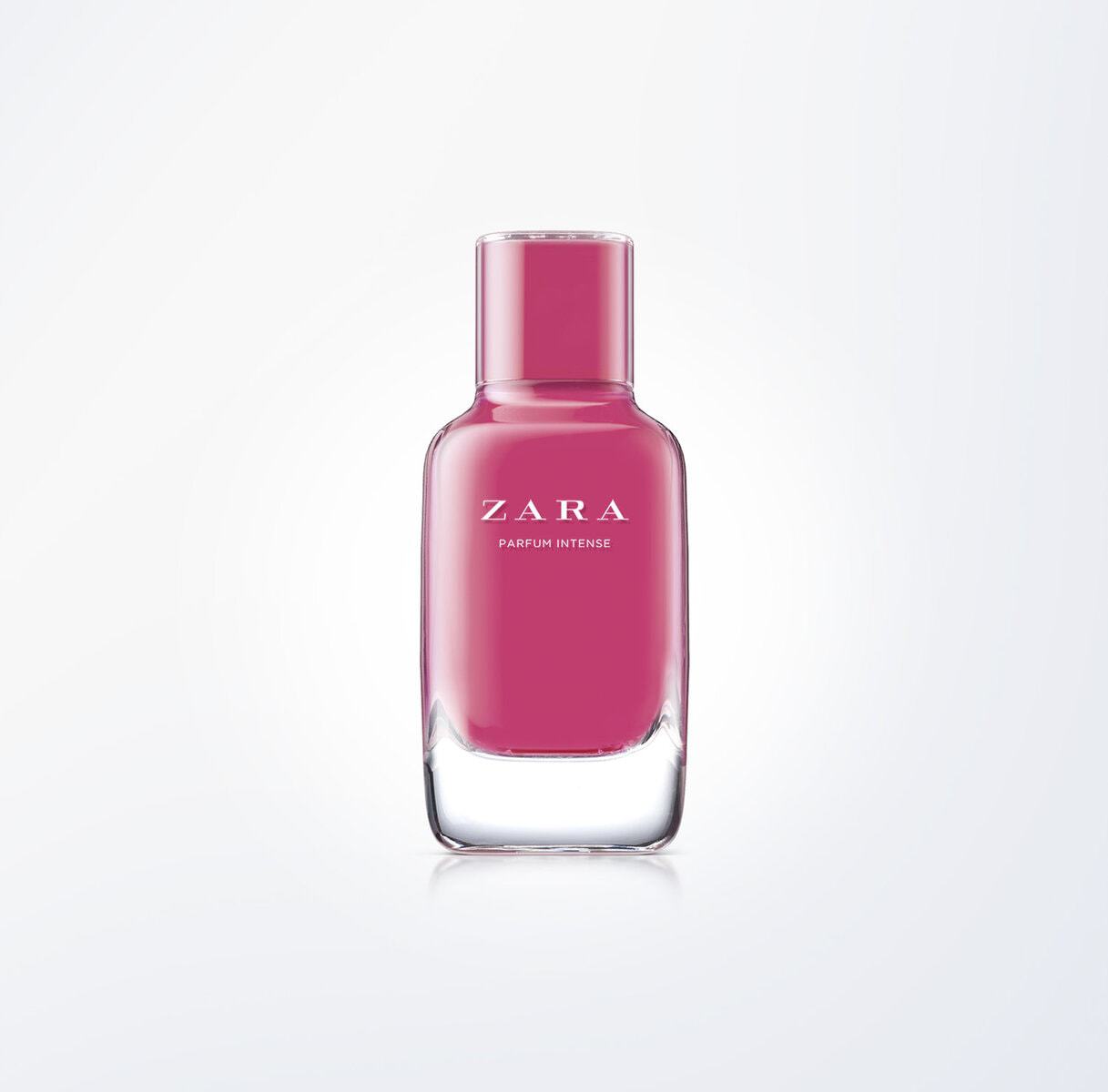
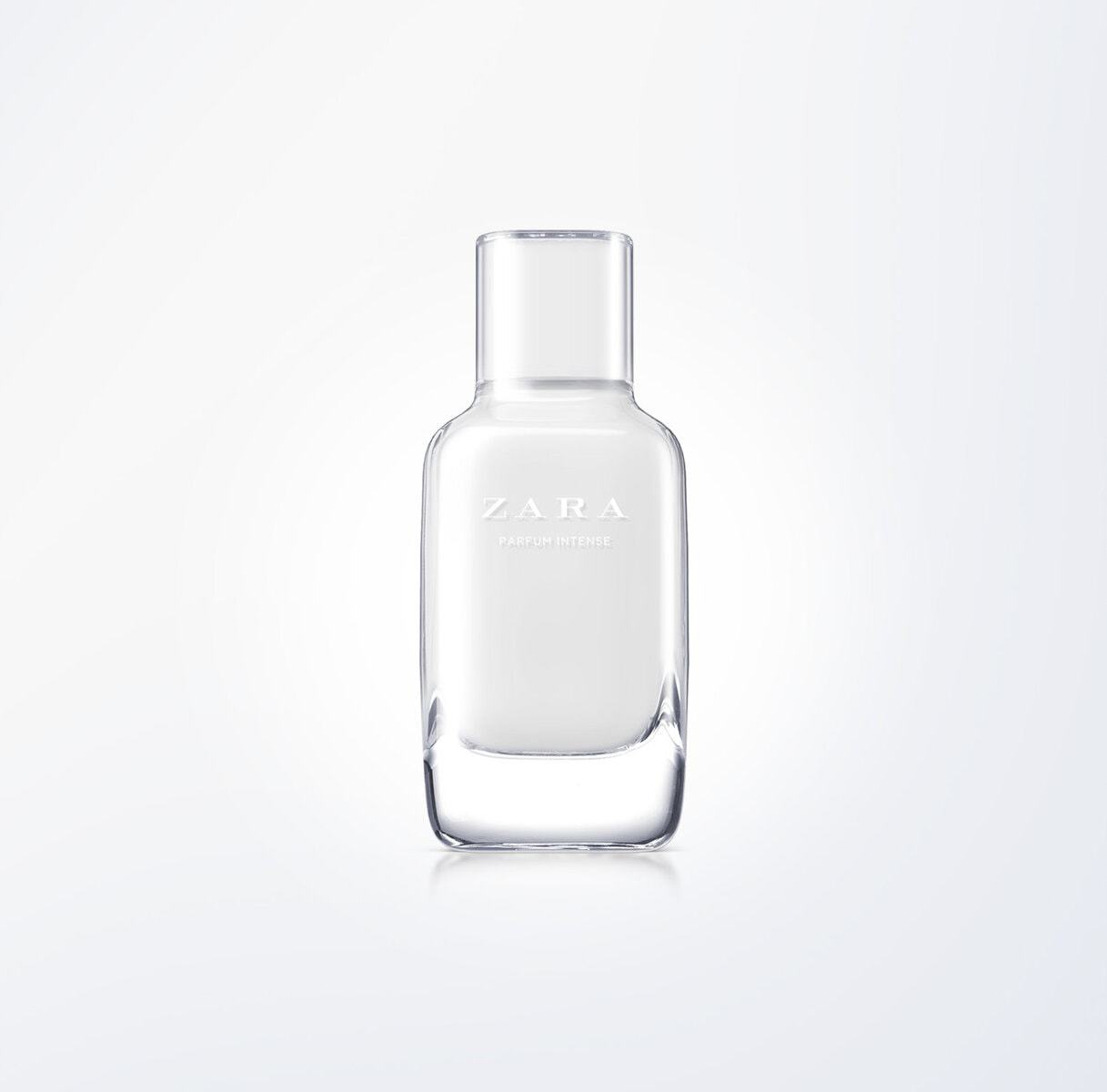
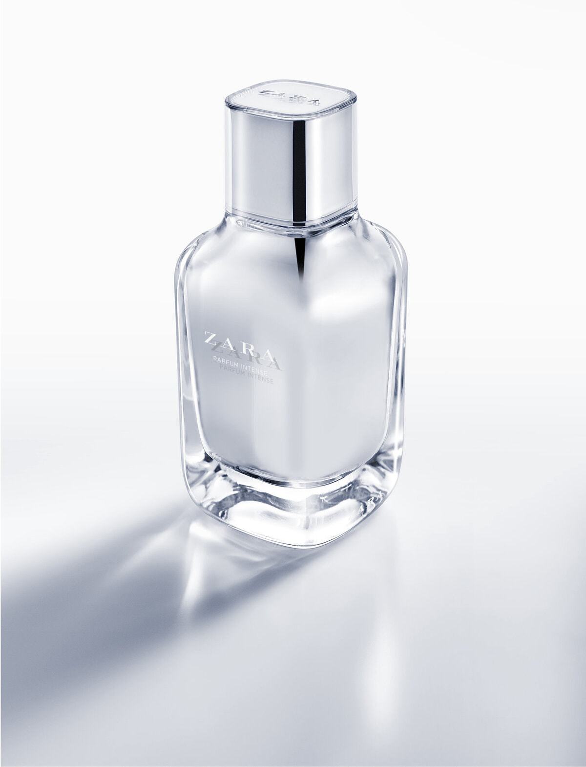
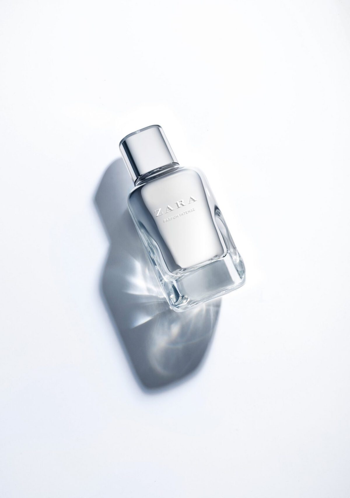
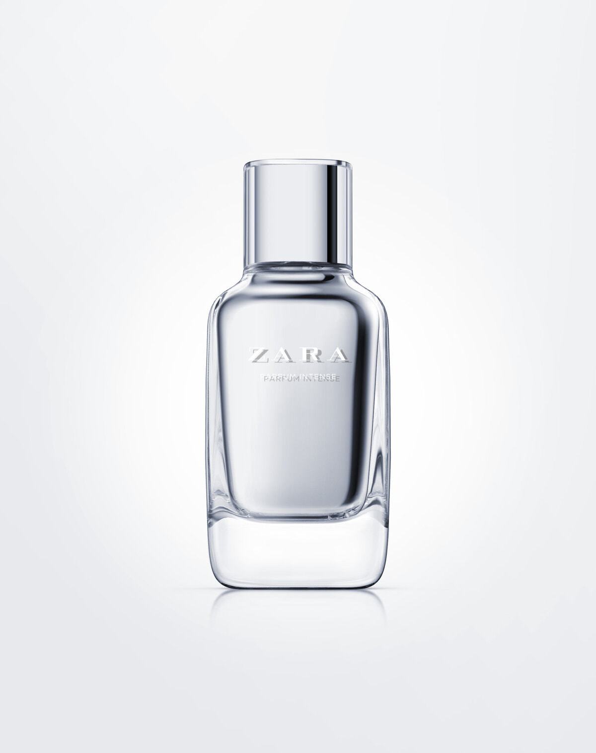
We had already designed the bottle for Zara Basics, the range of basic fragrances, when they asked us to design the bottle they would assign to their top fragrances, while maintaining the same design language. We made a taller bottle, incorporating a rounded-off square cross-section, like the basic range, and with the same design solution in the meeting of the shoulders with the neck. On this occasion we proposed using a greater density of glass and painting the inner walls, so the bottle would appear to have two skins: a transparent outer one and an interior one in silver (later versions have been made in other colours such as red, pink, etc.). The lid was designed with the same volumetry as the basic range, but adding a transparent outer cover so that it had a matching set of double skins, like the body.
CREDIT
- Agency/Creative: Lavernia & Cienfuegos
- Article Title: Bottle Design for a Woman’s Fragrance. Inditex (Zara)
- Organisation/Entity: Agency, Published Commercial Design
- Project Type: Packaging
- Project Status: Published
- Agency/Creative Country: Spain
- Market Region: Global
- Format: Bottle
- Substrate: Glass
- Keywords: WBDS Agency Design Awards 2020/21


