” Riley®
Riley & Riley Ltd.
The brief
‘Create a brand for the Riley brothers’ drink. You’ll need to consider everything, from the branding strategy to the design to the packaging.’
Riley&Riley Ltd. sell a drink that promises to prevent hangovers – it’s a mix of vitamins, rehydration salts, amino acids that break down toxins, caffeine and one secret ingredient. The company was founded by two brothers from Yorkshire – Tom and James Riley. They moved to London after graduating, set up their company and started manufacturing the drink.
The approach
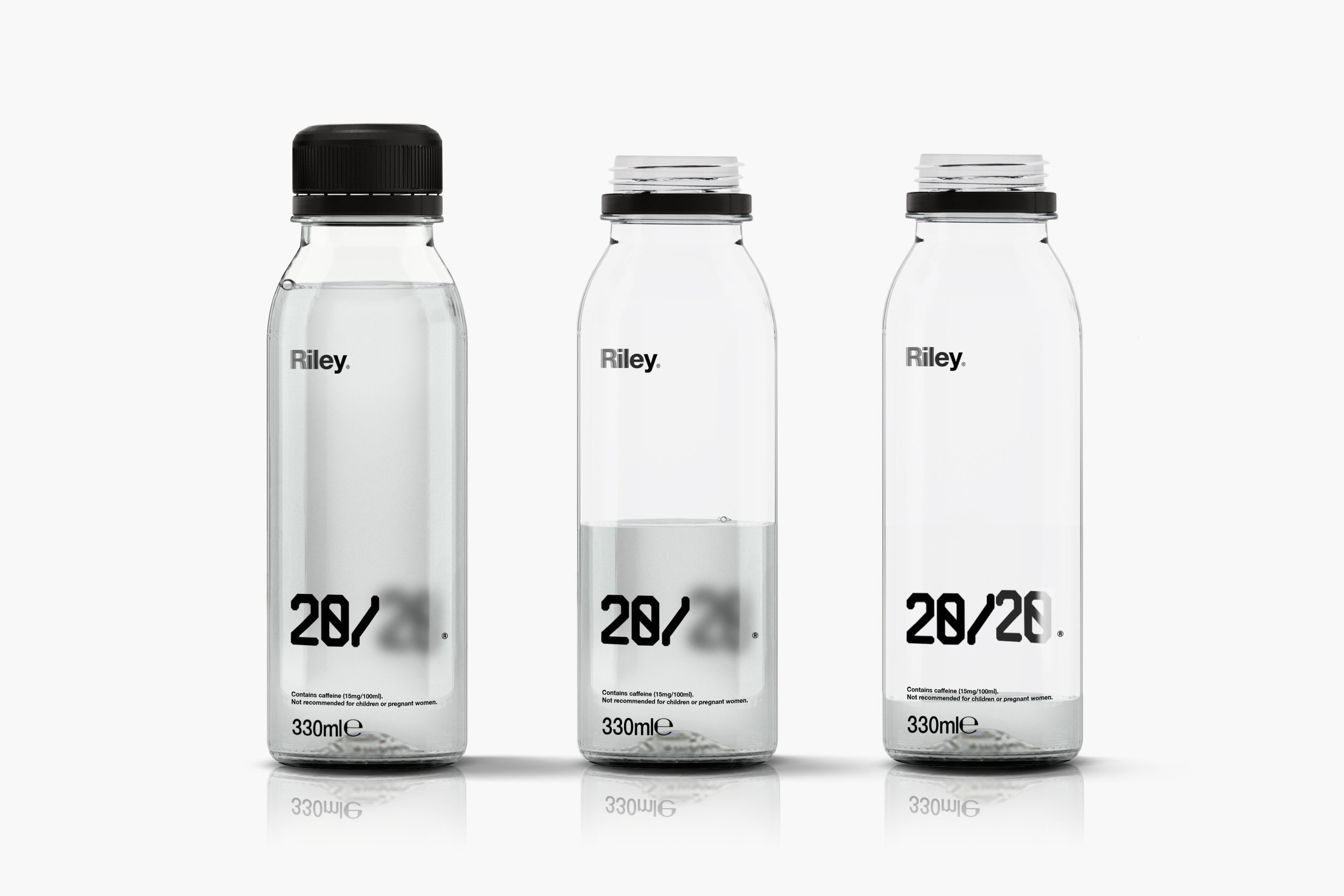
The main inspiration for this project was the effect alcohol has on the brain and consequently the eyesight. The typeface and graphic elements were created based on this very idea.
The process
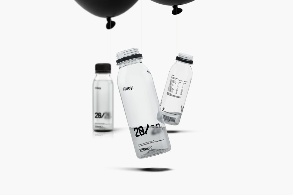
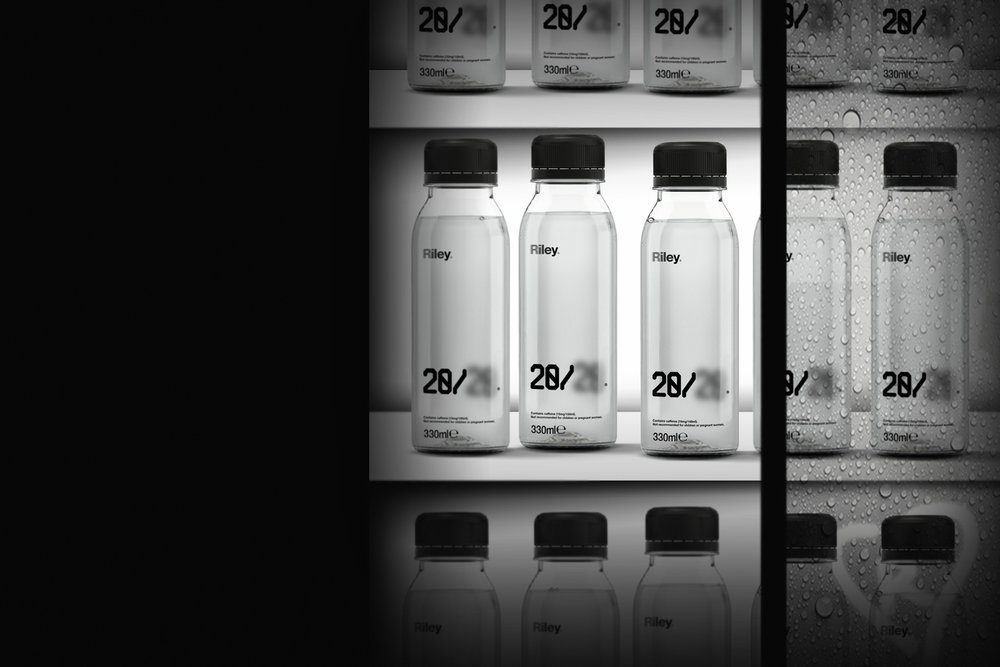
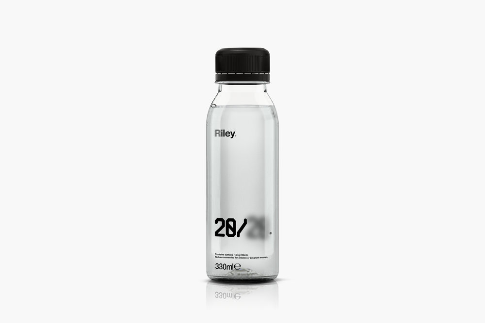
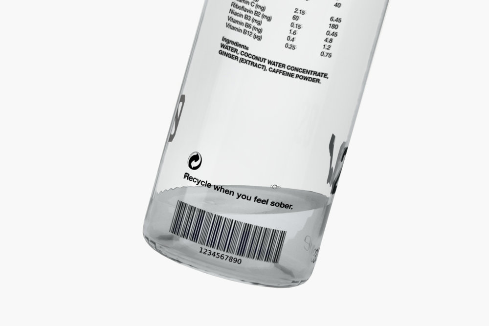
The name of the drink (20/20) is placed partially on the front and on the back of the bottle label. The more the user consumes the more visible the logo gets. When the amount reaches the lowest point, the logo gets clear; this subsequently means the user has absorbed all the required ingredients. The most important thing anyone should do to avoid next day’s hangover is to rehydrate. That is the reason why 20/20 logo has been placed near the bottom rather than the middle or top of the bottle. The user is ‘forced’ to drink in order to rehydrate. Also, the bottle is made out of recycled, recyclable thinner than usual plastic that would prevent any accidents from happening when someone is a bit tipsy.
The result
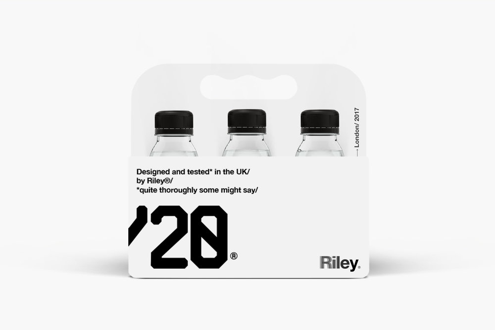
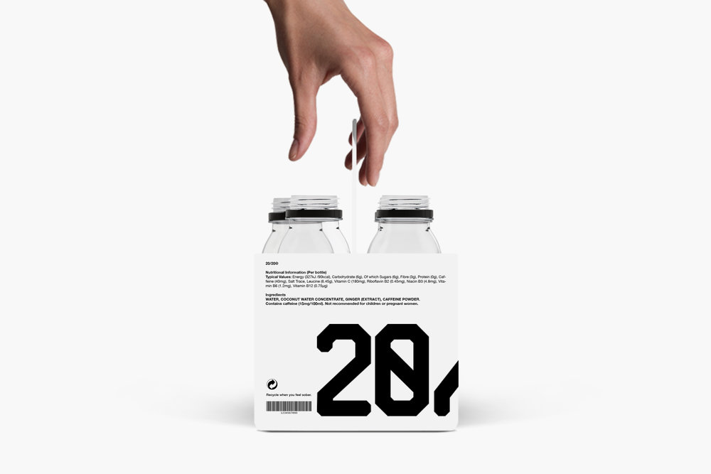
A system of clever graphic elements is designed in order to support a bold, fresh and elegant brand launch for the Riley brothers.”
CREDIT
- Agency/Creative: Panos Tsakiris
- Article Title: Panos Tsakiris – 20/20 Riley® (Concept)
- Project Type: Packaging
- Format: Bottle
- Substrate: Plastic


