Cocoon Prague – Ožujsko 2019 Redesign
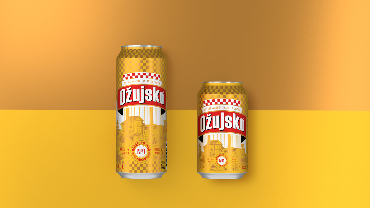
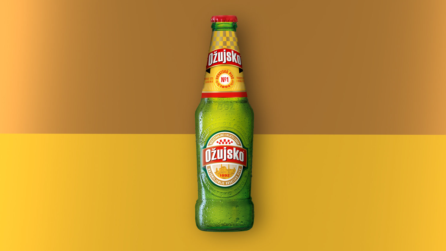
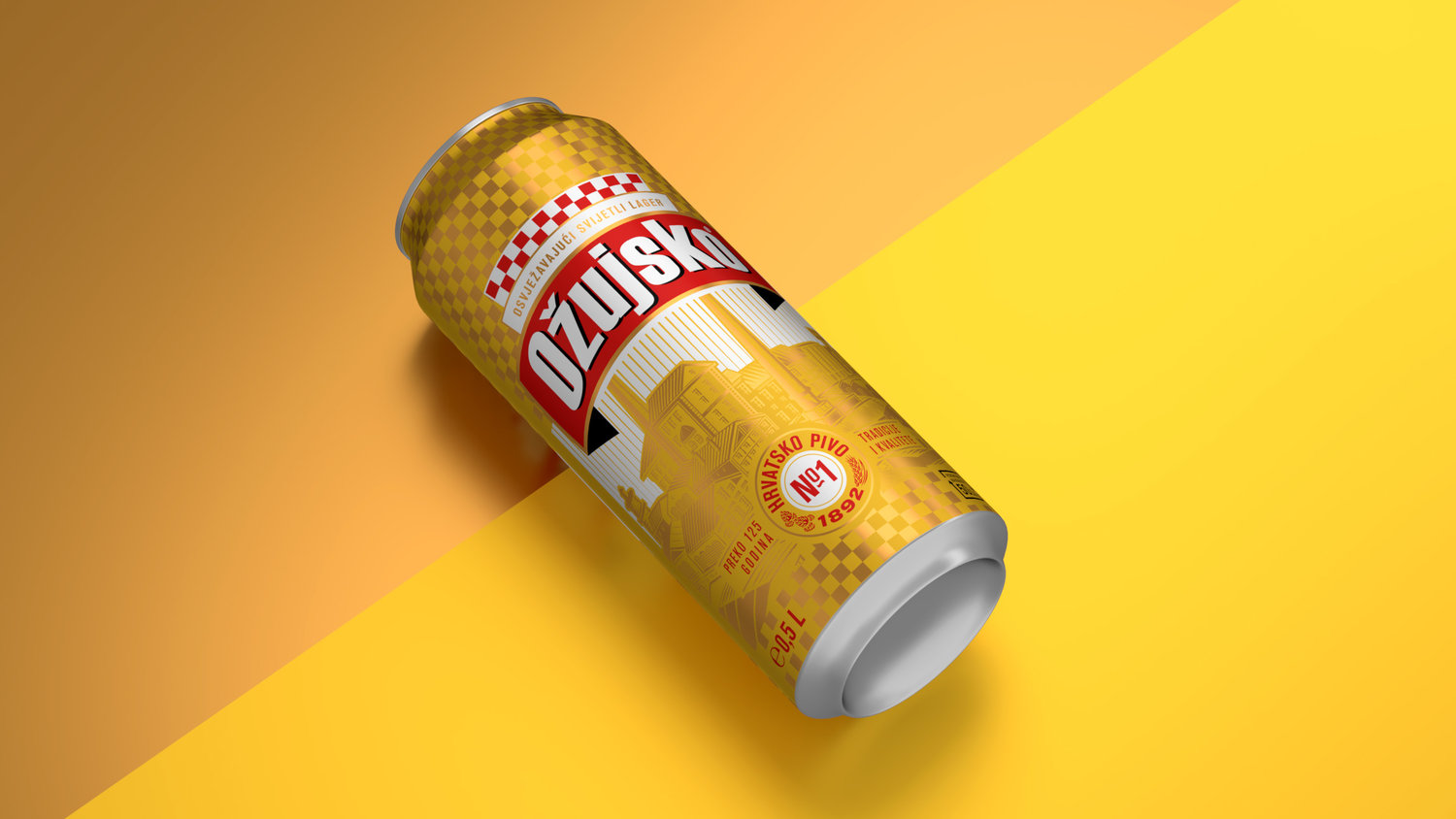
If you ever had the pleasure of visiting the beautiful country of Croatia, Ožujsko beer could not be overlooked. This is a beer with a long history, a strong loyal fan base, a confident national spirit, and a great brewing tradition… No wonder it proudly claims to be the Number 1 beer in Croatia. This culture has always been reflected within the identity and label designs. But after just a few years passed since the last design update, Ožujsko knew to claim these values even more visibly and confidently.The Ožujsko marketing team approached Cocoon Prague with a task. To refresh the label design, modernise the brand, and emphasize the core values of tradition, authenticity and pride. Additionally, we saw this as an opportunity to further unify the core lager portfolio and keep the masculine character of the brand.The wordmark remained untouched. But the rest of the labels gained something new.As part of the redesign, one important task was to achieve a bigger consistency in colour along the touchpoints. Yellow dominated on the previous designs, but only on the cans and PET labels, while white and gold with touches of red were significant for the RGB labels. We incorporated yellow on the RGB labels, as it could be more identified as an ownable, strong brand colour.The second task was to bring more confidence and authenticity to the design. An image of the traditional Zagrebačka Pivovara brewery became the new hero of all packaging. This demonstrated their long heritage of brewing since 1892 in the heart of the country. A hand-drawn, crafted illustration was used to underline the brand’s authenticity. The next visible element is the Croatian national checkerboard pattern, which is used in a sophisticated, yet proud fashion. The traditional colour combination of red and white is placed above the logo as a confirmation of the national belonging. As a secondary element, we used the checkerboard in a yellow-gold pattern as the background underprint. With this colour combination, which is quite prominent in the design, we achieved more uniqueness and differentiation from other Croatian beer brands which also use this typical national symbol.The winning redesign (tested and approved by its most loyal fans) gives the brand a solid, authentic feel, but uses a contemporary visual language that a modern brand deserves. Last but not least, the label incorporates a bold usage of Thermoink technology, which emphasises the brewery visual, illuminates the sky in blue when the beer is cold and, of course, serves a great (the greatest!) purpose: telling the consumers, “Now your Žuja is ready to be served at its best”. According to Core Brands Marketing Manager Vanja Bartolec, “As always, cooperation with Cocoon was very efficient, easy and full of attention paid to our needs. You can tell that the agency grasped our brief because they hit the nail on the head in the first wave of creative solutions. Consumer reaction was excellent, especially towards the can that went through a big change. Ever since the redesigned packaging was launched, we have measured a steady growth in the Ožujsko volume compared to last year.“So, cheers to the newer, bolder and more confident look of Croatia’s Number 1. beer!


CREDIT
- Agency/Creative: Cocoon Prague
- Article Title: Redesigned to Proudly Proclaim: Ožujsko is a Legend!
- Organisation/Entity: Agency, Published Commercial Design
- Project Type: Packaging
- Agency/Creative Country: Czechia
- Market Region: Europe
- Format: Bottle, Can, Wrap
- Substrate: Glass, Metal, Plastic


