Brown&co – Natakhtari Beer
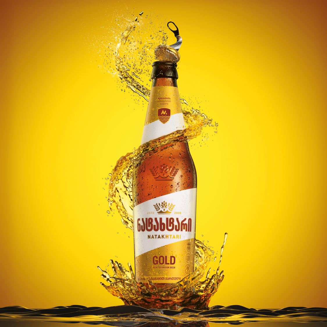
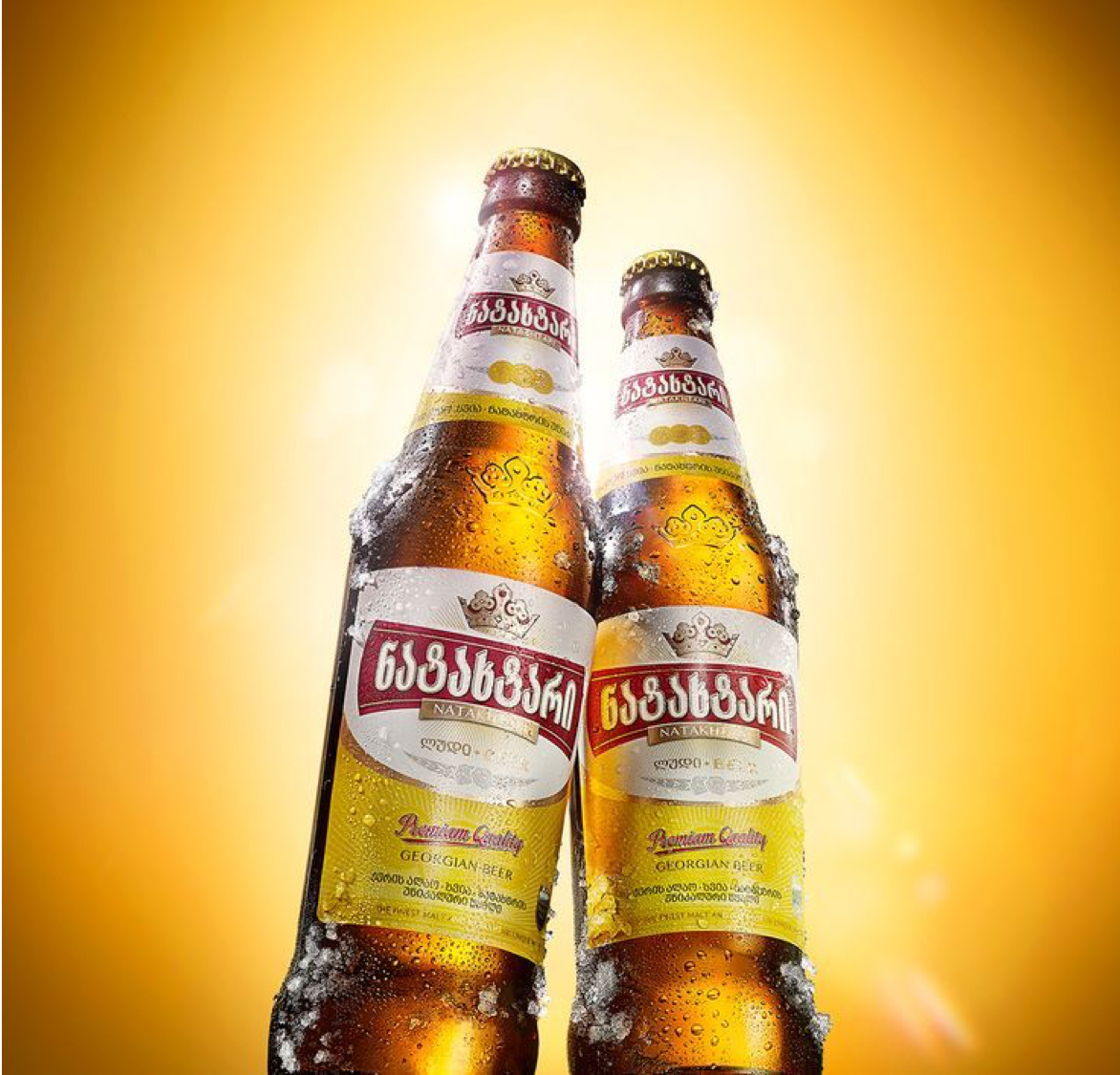
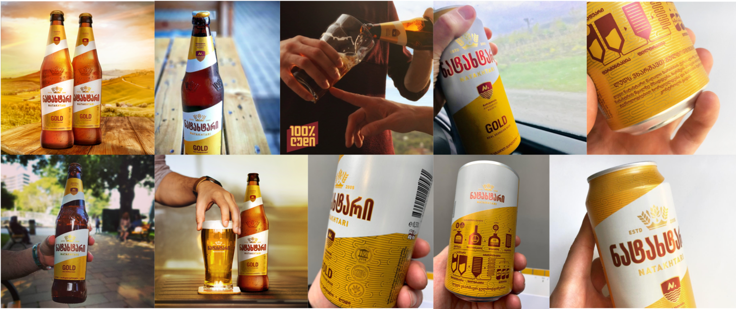
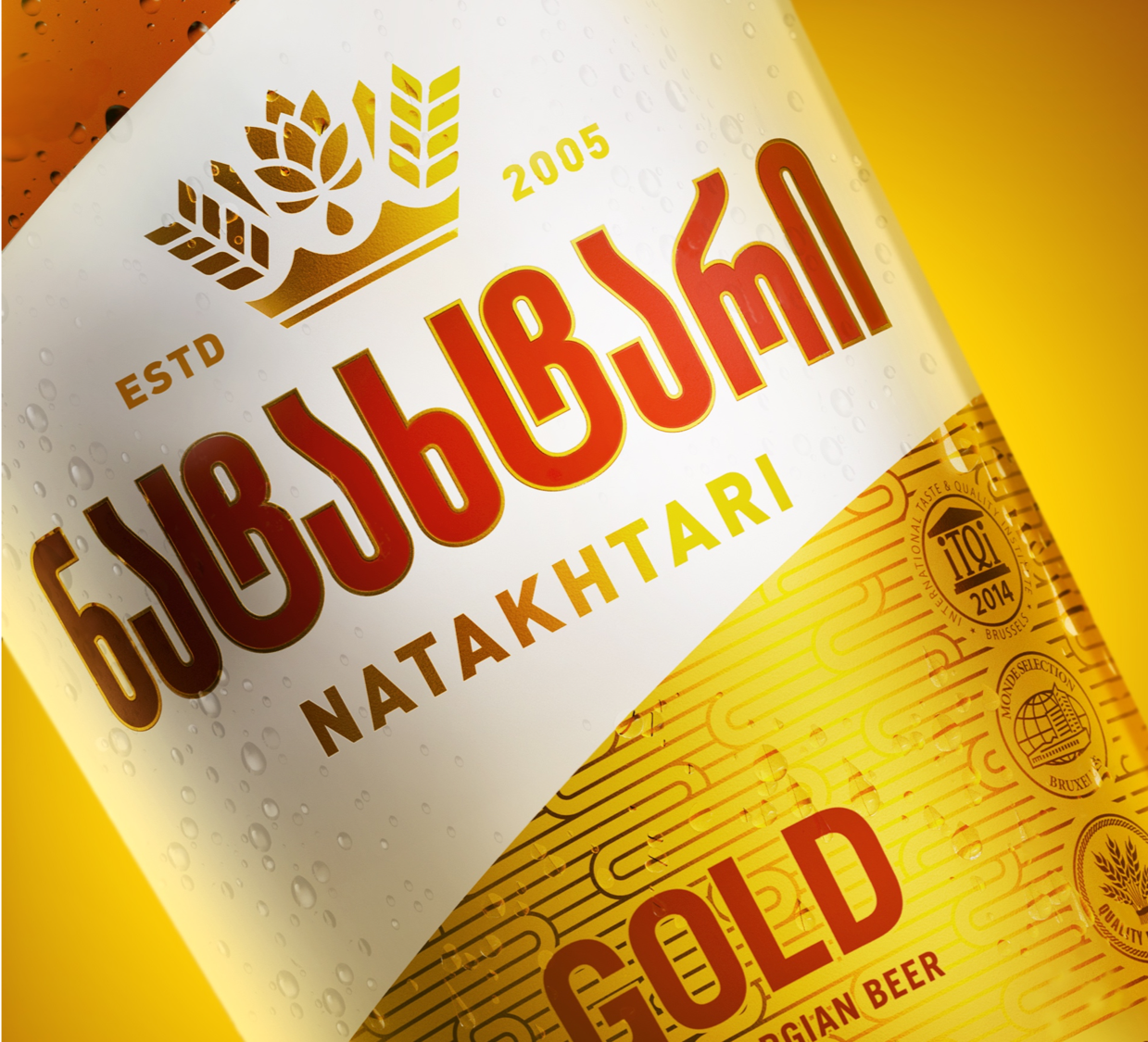
BriefReposition and package the product so that local perceptions would change, and Georgians might feel they had a local beer brand they could be proud of.ProblemGeorgia is a wine-drinking country, with beer traditionally being considered an unpretentious, cheap and cheerful drink. However, with an increase in imported beers, perceptions are slowly changing – but not for the local brands. Even though it is the biggest beer in Georgia by volume, and outstanding in quality, Natakhtari – as a locally produced beer – is still seen to be of a low standard and made in an artificial way.SolutionWe addressed the brand’s challenges with the positioning: Real. Georgian. Beer. As an authentic Georgian product – made from only natural ingredients and pure spring water – Natakhtari exists to share what it means to be real, and to creatively (and humorously) inspire a world where people are real.We retained core equity assets for recognition, but evolved them to be imbued with more relevant meaning. A crown, for example, is historically a symbol of the past, and irrelevant for the brand’s positioning. We created a new and unique crown from the core ingredients (barley, hops, water) to both look more contemporary and highlight the naturalness and quality of the product. The brand’s primary yellow colour (which looked artificial, warm and insipid) was changed to two metallic gold tones, better cuing quality and refreshment.The word mark was custom redrawn by a National lettering artist to be more contemporary and ownable. Natakhtari, the place, is renowned for its pure water, so we created a water purity symbol that only we (as Natakhtari beer) could own.The old packaging was not helping the brand overcome the current challenges, with the design lacking in natural quality cues, and flavour and refreshment appeal. What makes the packaging design special?A unique and distinctive neck and body label set were created using an angled cutter-guide that would stand out dynamically on shelf and disrupt the fixture.A background texture was developed for the labels by modernising traditional Georgian patterns. By printing the pattern in satin and matt golds, the beer medals were made to feel more like a hallmark in real gold, and overall quality perceptions were dramatically improved.