


Auge Design – Pedon
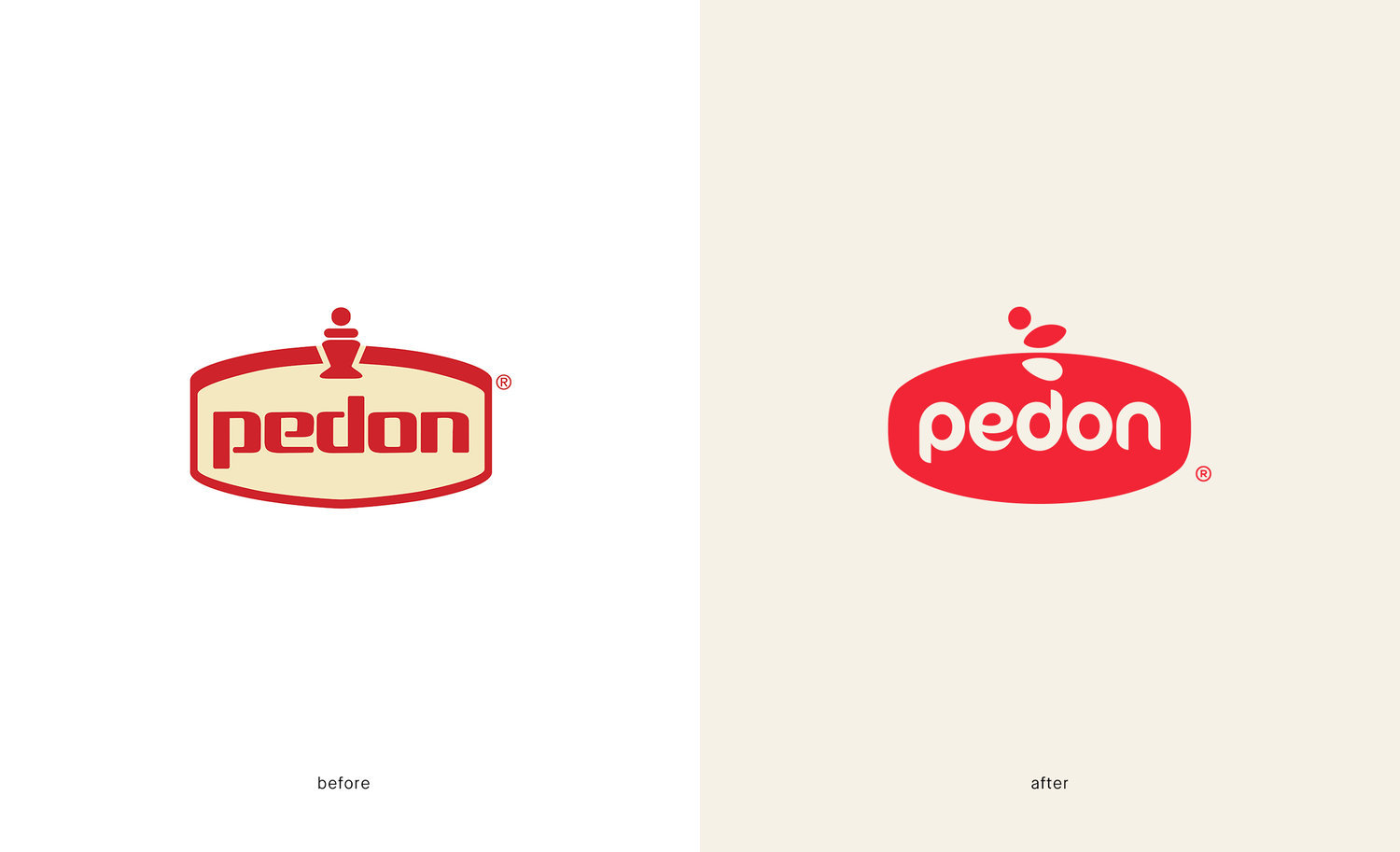
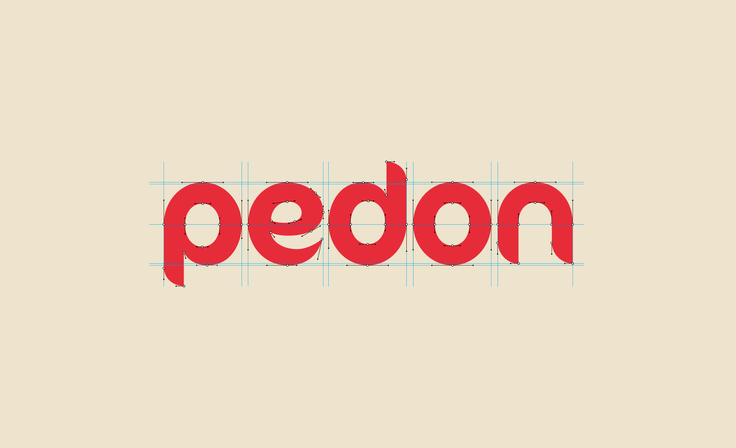
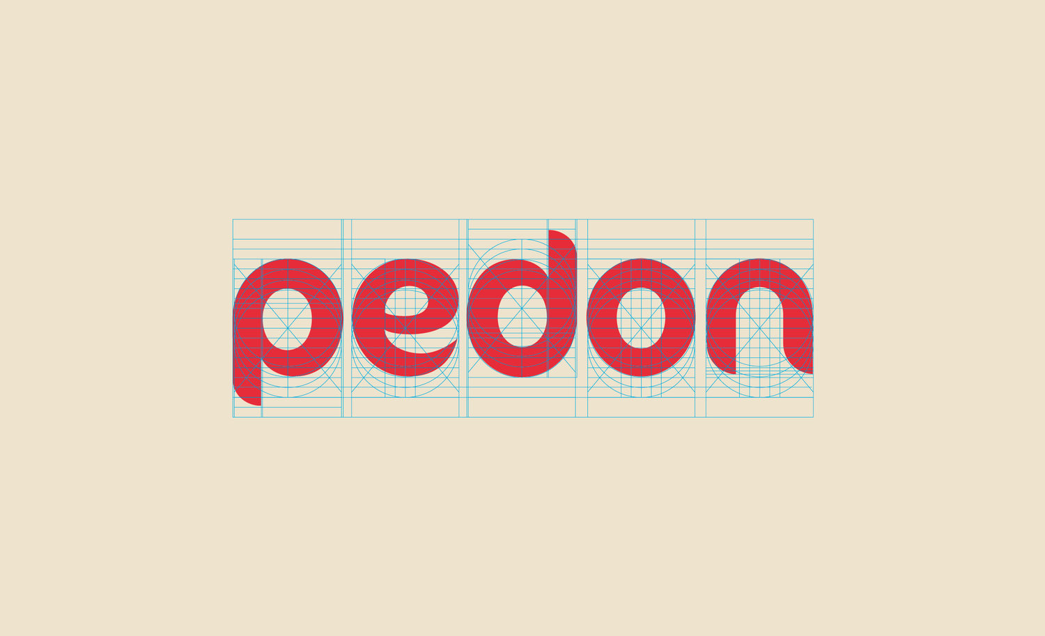
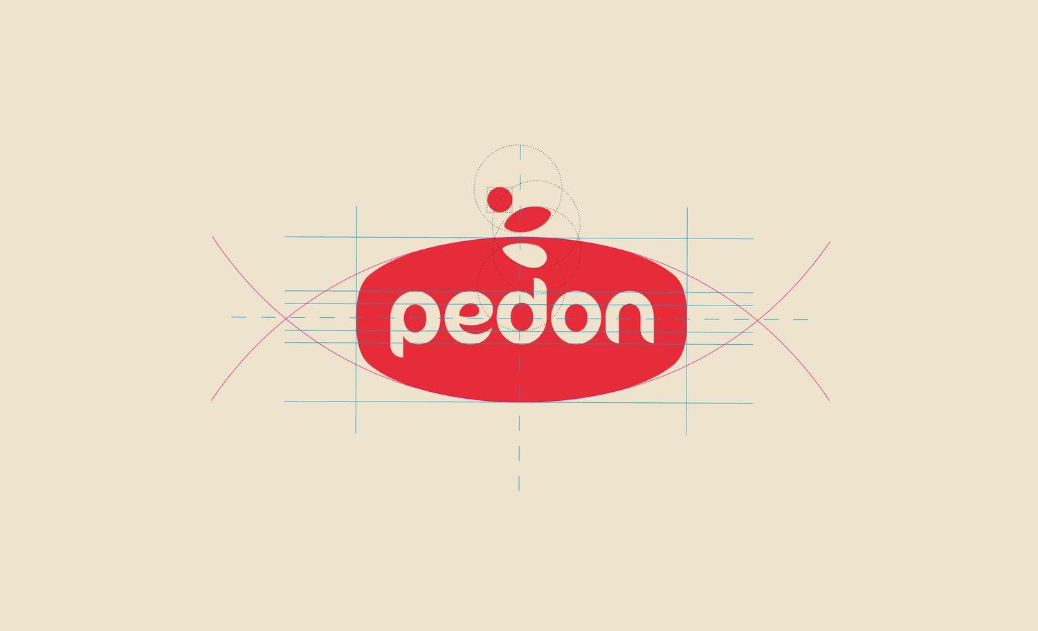
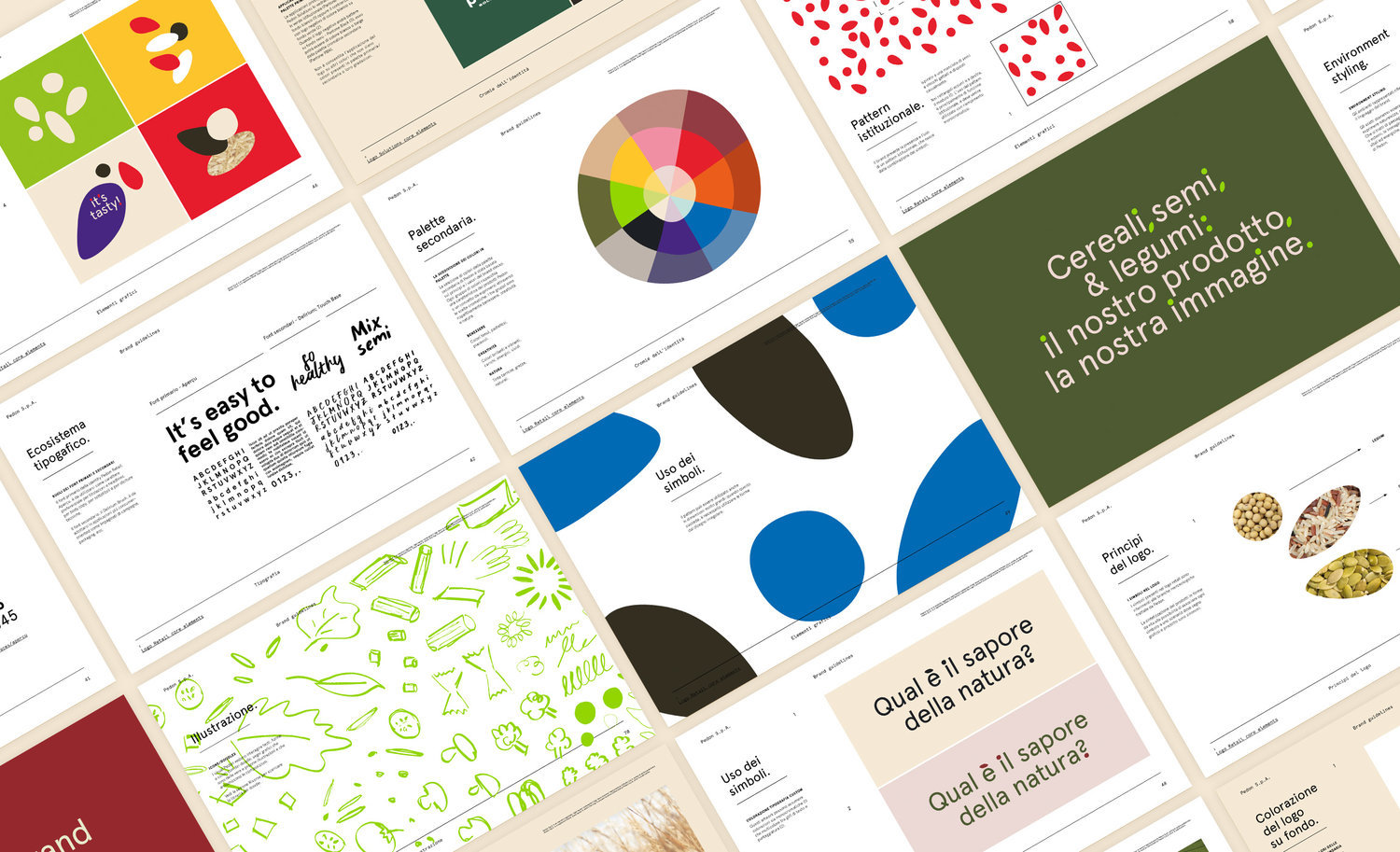
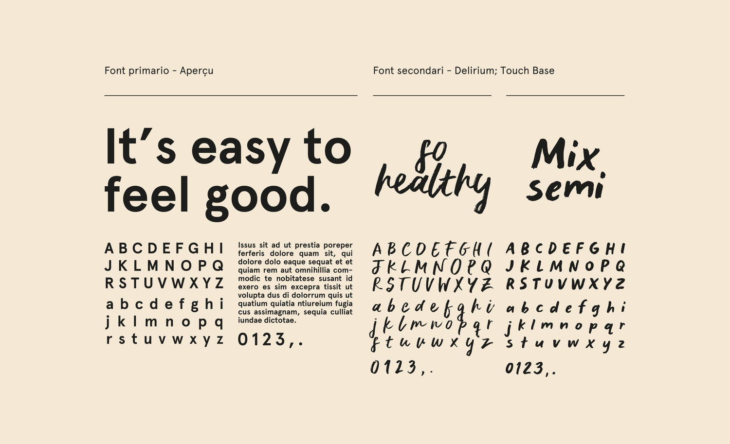
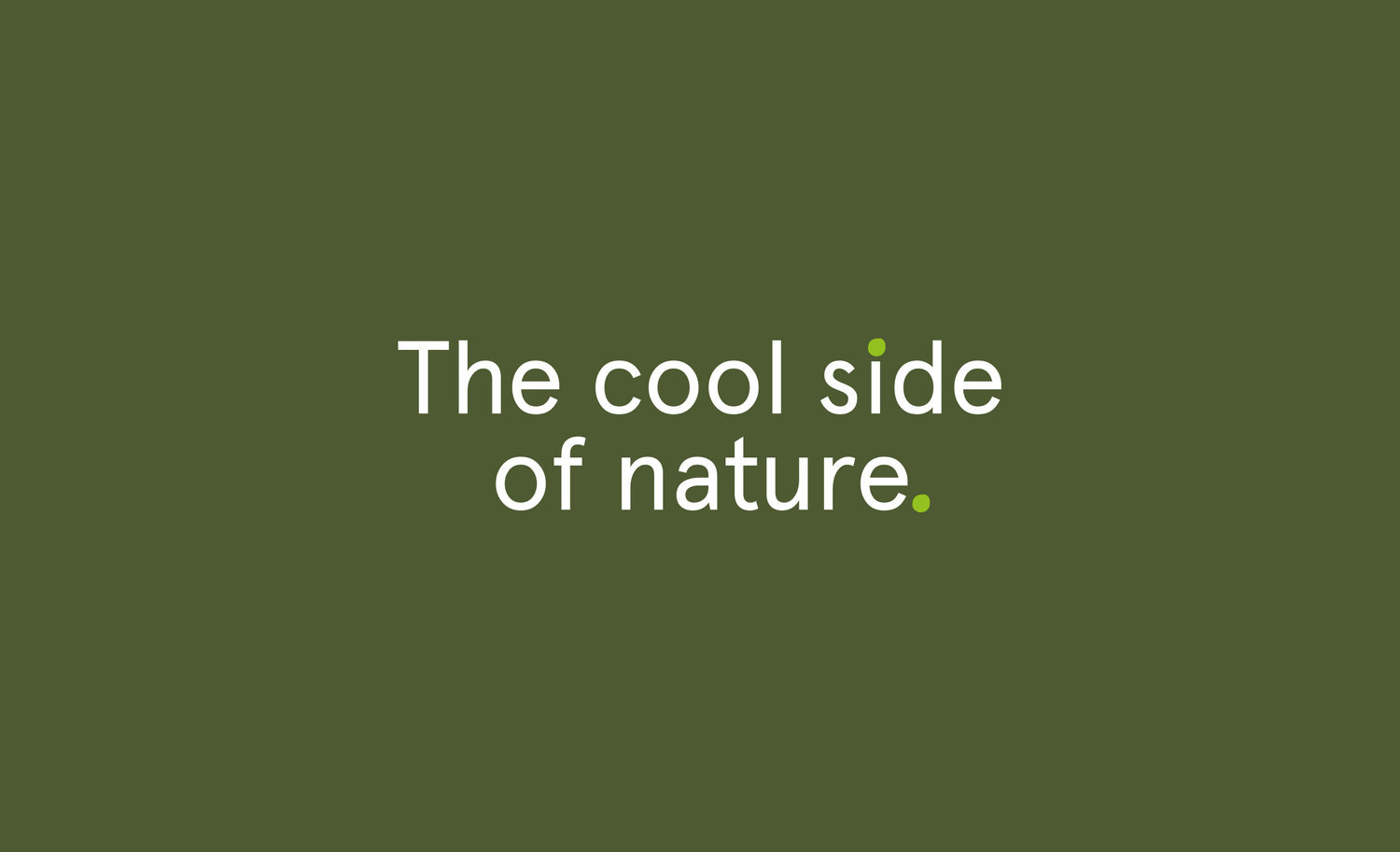
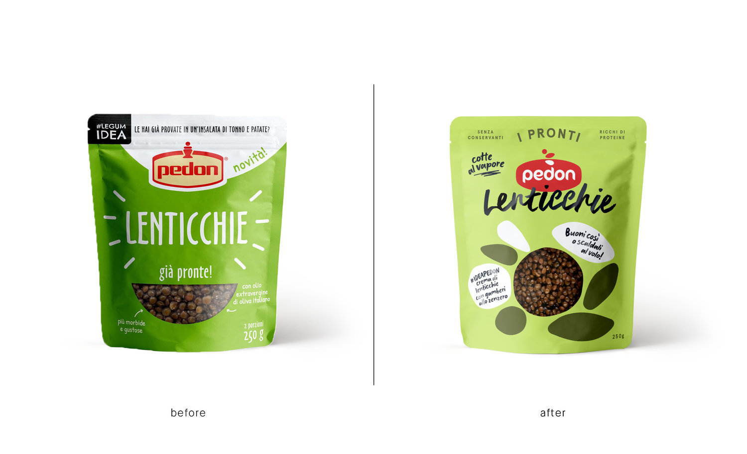
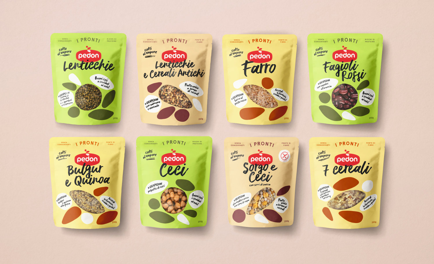
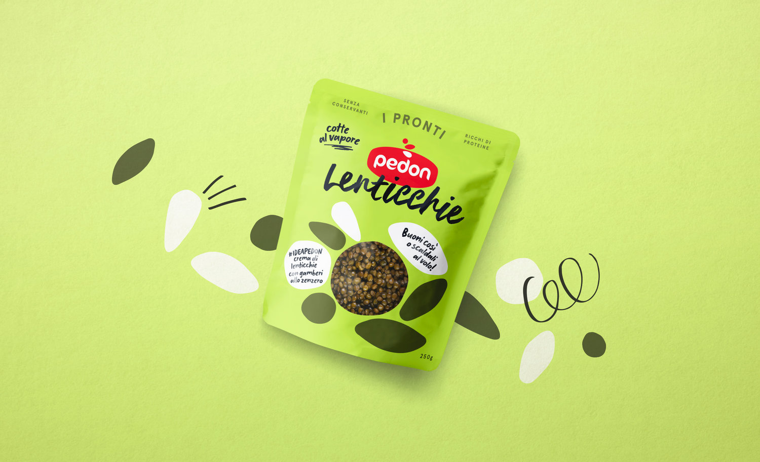
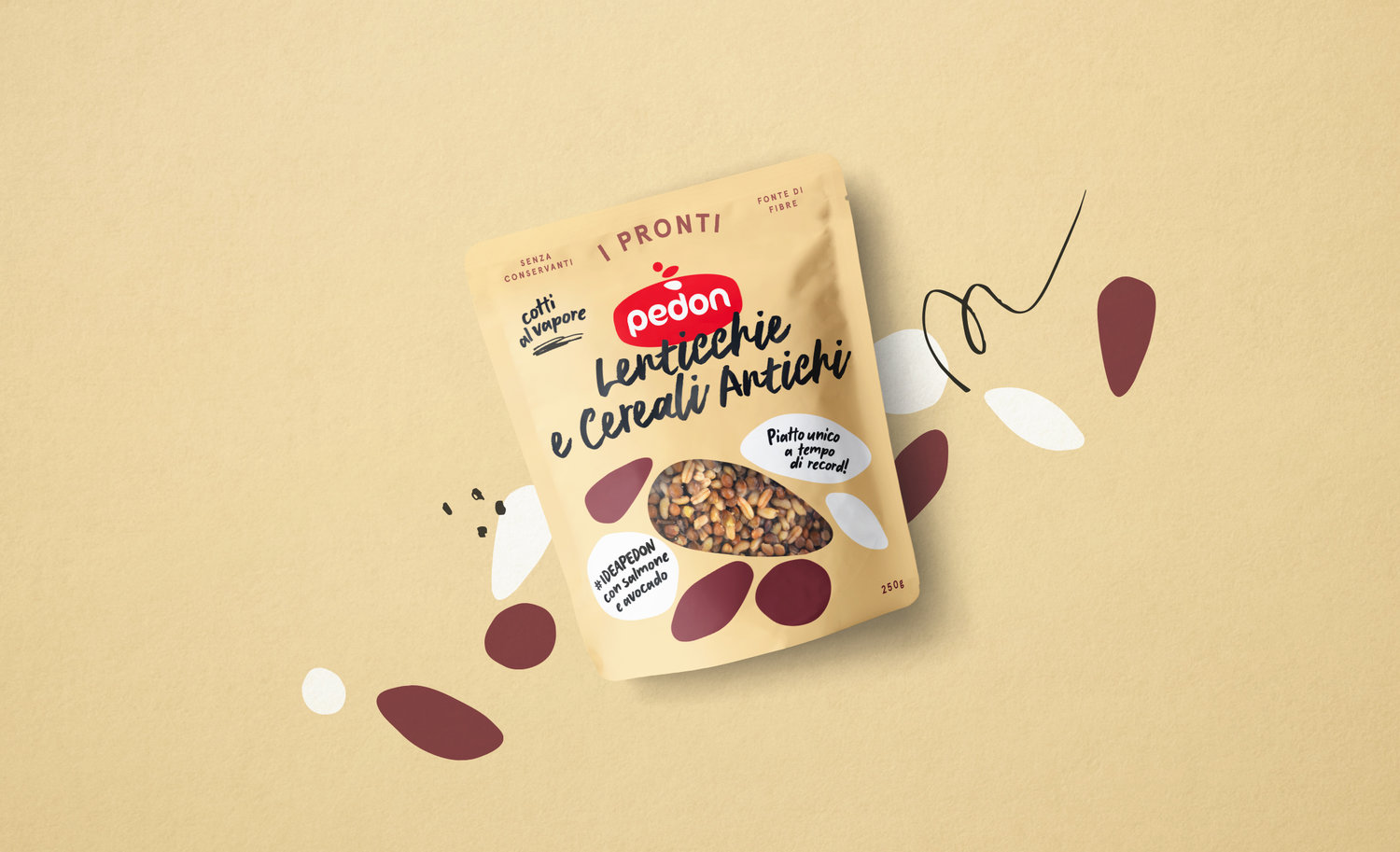
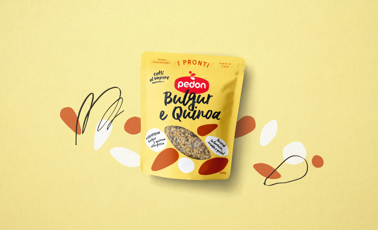
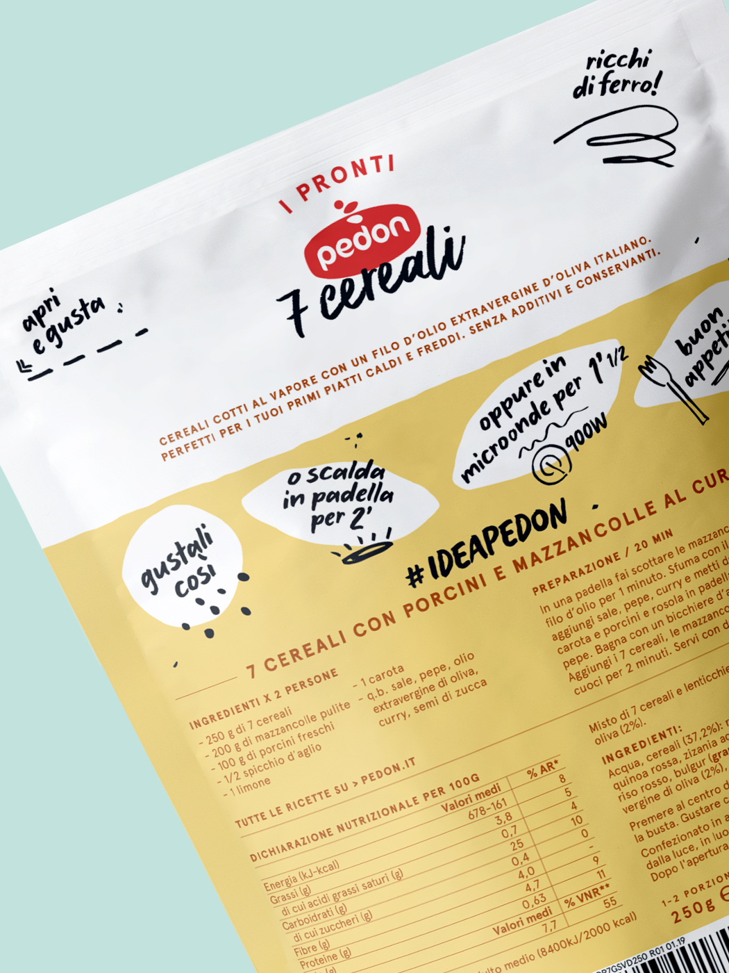
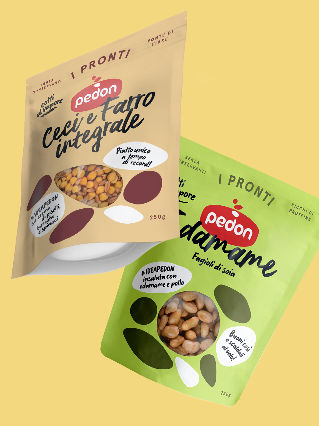
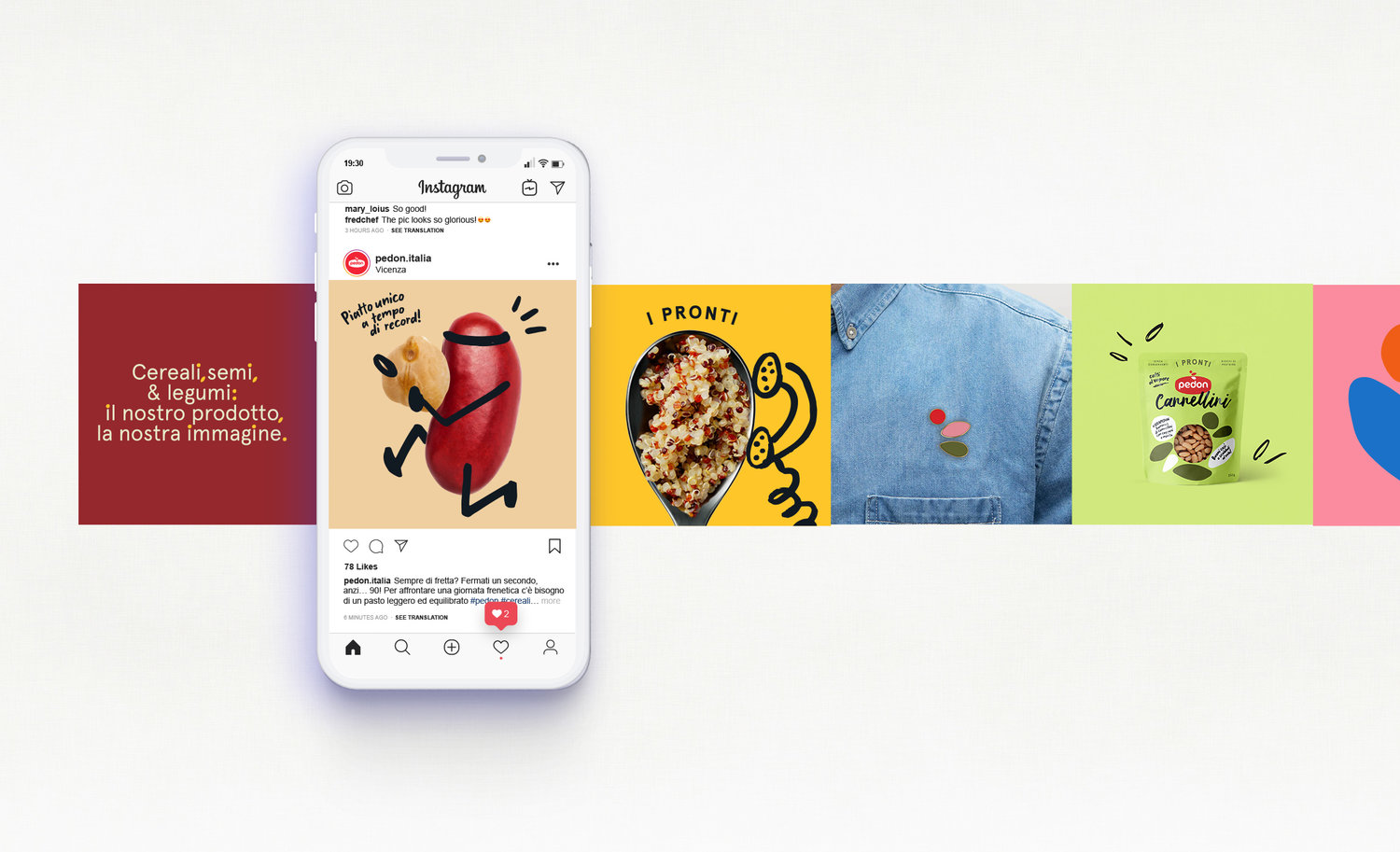
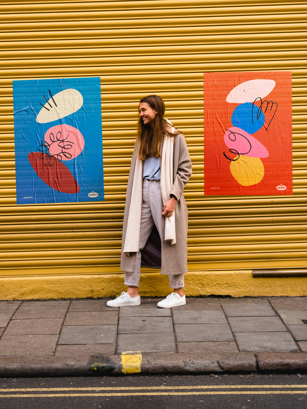
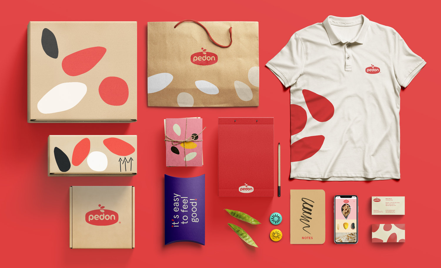
Pedon works, packages and distributes cereals, legumes and seeds, in Italy and around the world. Its attention to taste, quality and nutrition in addition to an offer of over 100 lines and 3000 products make the Brand one of the international leaders in this area.We completely restyled the Brand’s image, including identity and packaging. Naturalness and innovation find now their expression through the usage of three iconic shapes mixed together representing the variety of Pedon products (legumes, cereals and seeds). Visuals are always dynamic and playful thanks to the colorful palette, a handmade Typography and a happy tone of voice. The result is an impactful balance between reliability and creativity, in a packaging that does not go unnoticed on the shelf.A bright and positive tone of voice, narrated trough a new visual language that is detached from the current proposal on the shelf of Italian supermarkets and that embodies the Brand philosophy. The fresh and modern colour palette adopted makes the packaging emerge among the competitors in the supermarket context.
CREDIT
- Agency/Creative: Auge Design
- Article Title: Pedon Rebranding
- Organisation/Entity: Agency, Published Commercial Design
- Project Type: Packaging
- Agency/Creative Country: Italy
- Market Region: Europe
- Format: Sachet
- Substrate: Plastic


