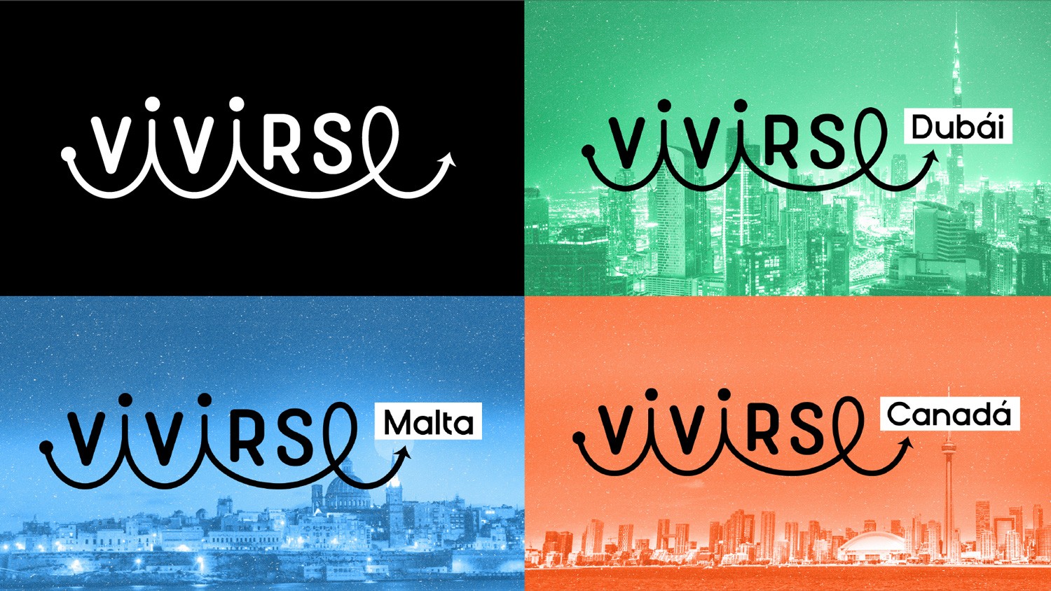
Vivirse is an exchange language company in Malta which opened its borders not only to Malta but also to Dubai and Canada. The real challenge started when they told us what they wanted to transmit, confidence and safety, but at the same time they wanted to look fun and youthful. (young). “Vivirse has a very dreamy, easy going but specially curious soul.”
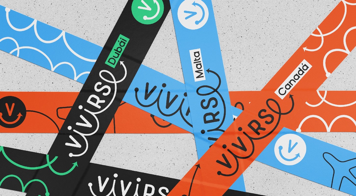
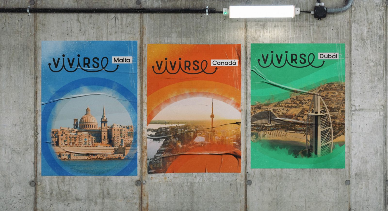
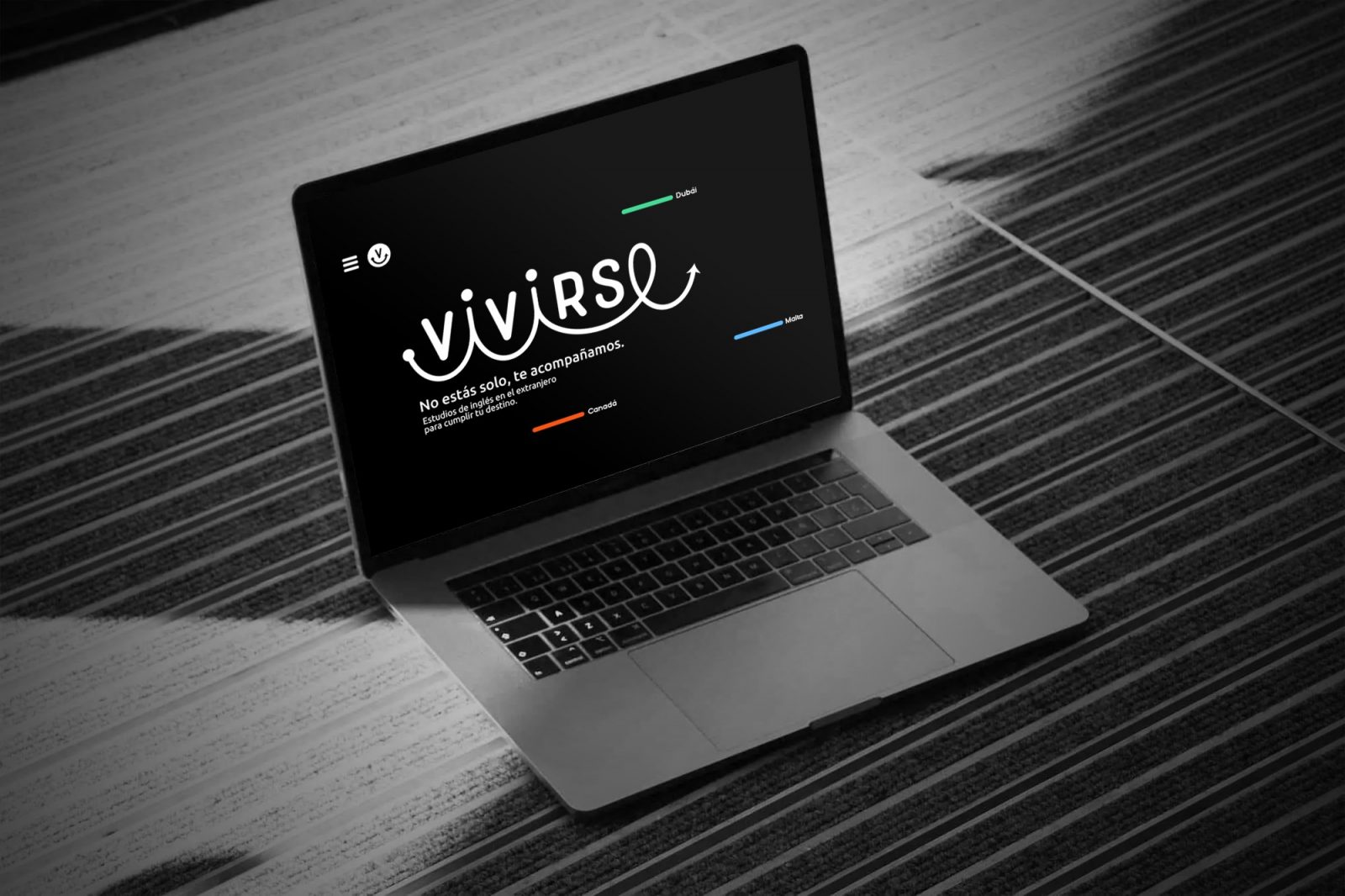
So, after a long research we found in their letters the trust and the certain combined with a simple typography, giving it movement and colors that were chosen according to every country. This was the perfect touch of youth and fun that we wanted to communicate.
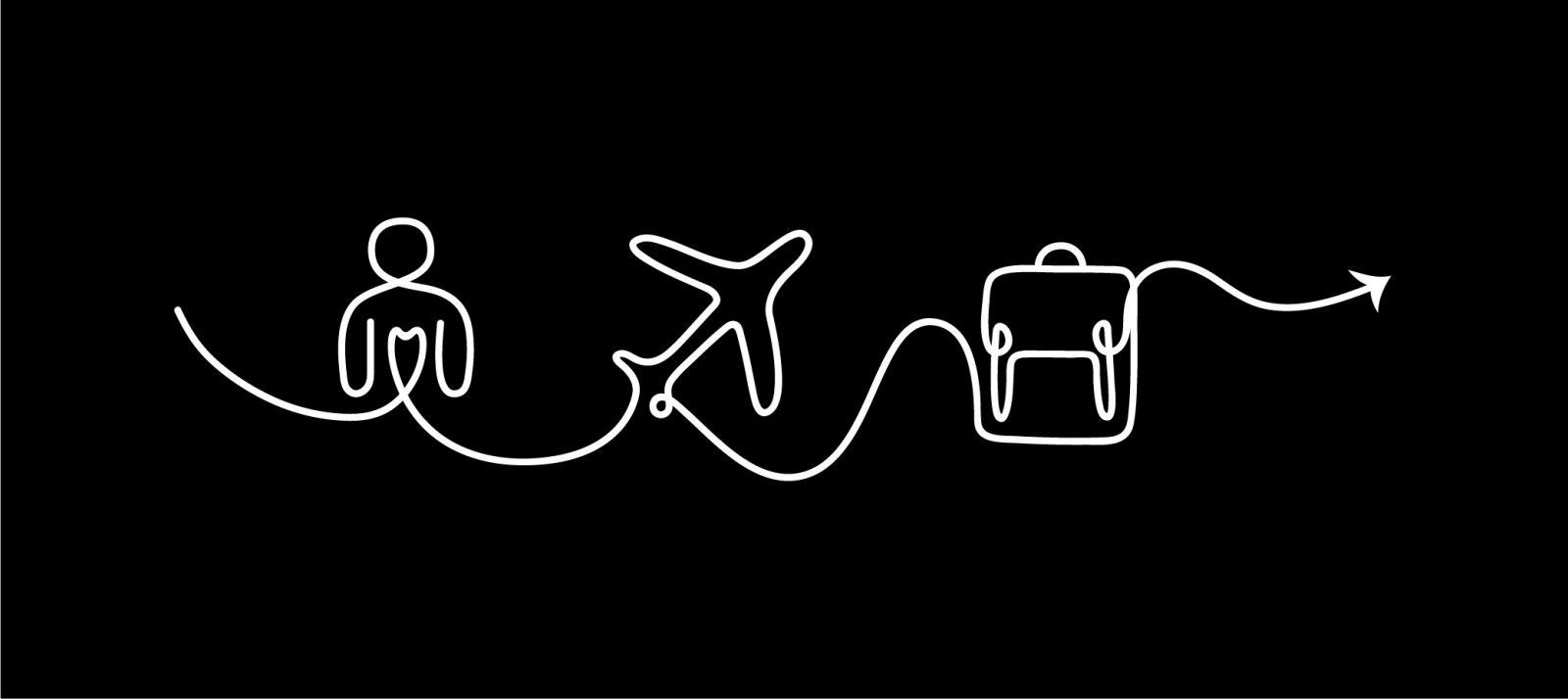
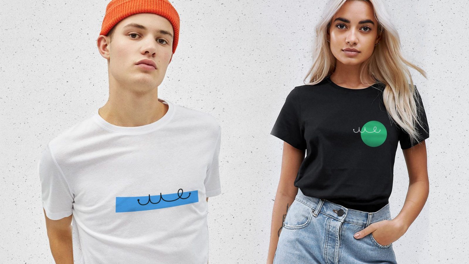
As a result, we worked on a path that connects the letters “íes” to the “e” creating the concept of “people who travel for living new experiences” beside this, a whole world of graphic elements, including geometric shapes and minimalist illustrations that completely enriched the project.

CREDIT
- Agency/Creative: 781studio
- Article Title: 781studio Creates Brand Design for Vivirse
- Organisation/Entity: Agency
- Project Type: Identity
- Project Status: Published
- Agency/Creative Country: Colombia
- Agency/Creative City: Medellín
- Market Region: Global
- Project Deliverables: Brand Architecture
- Industry: Education
- Keywords: brand architecture, malta, dubái, canadá, design
-
Credits:
Designer: 781Studio


