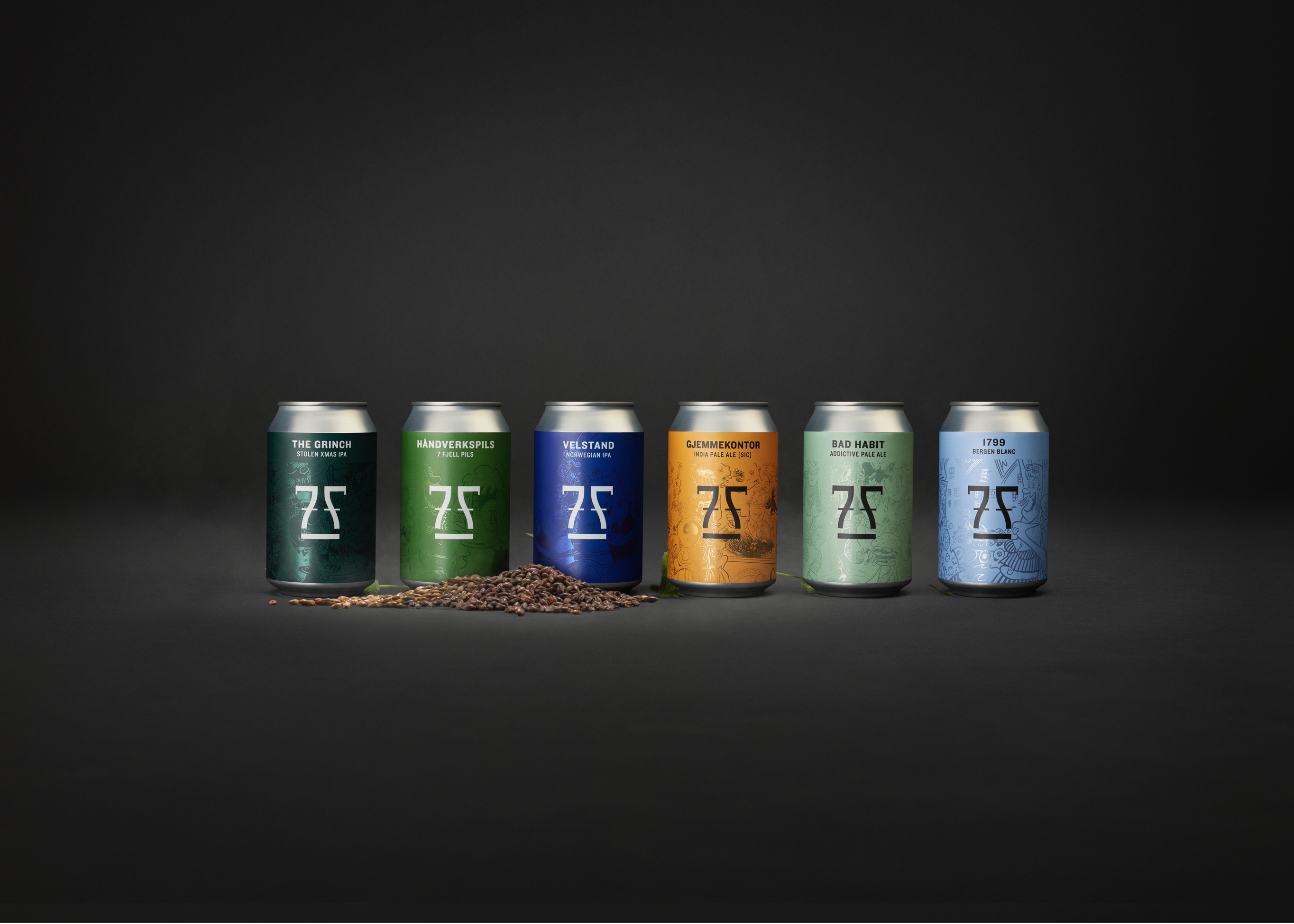
Packaging for Scandinavian’s leading microbrewery.
7 Fjell Brewery is Scandinavian’s leading microbrewery. They combine a fundamental passion for great beer with decades of experience from the industry. Kind has been responsible for the communication strategy, concept development and overall branding for the 7 Fjell Brewery and has now redesigned the entire range.
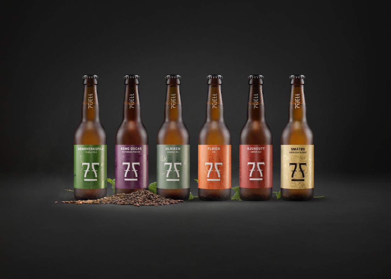
Strong growth of the craft beer market, and the ever-increasing product portfolio available in stores, led to a need for a refreshment of the package design. The main goals for the redesign were to strengthen the 7 Fjell brand by creating an iconic can, draw more attention to the products, increase visibility and ease navigation on the shelves. We wanted to create an expression that was authentic and accessible with strong roots from Bergen town and at the same time a can that was oozing of quality and exquisite craftsmanship.
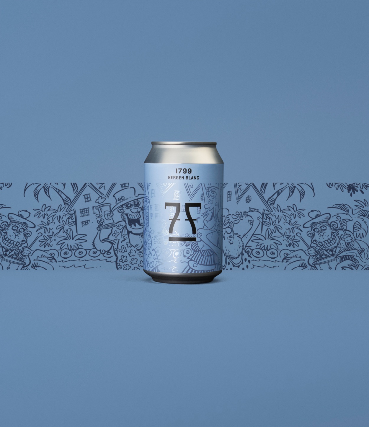
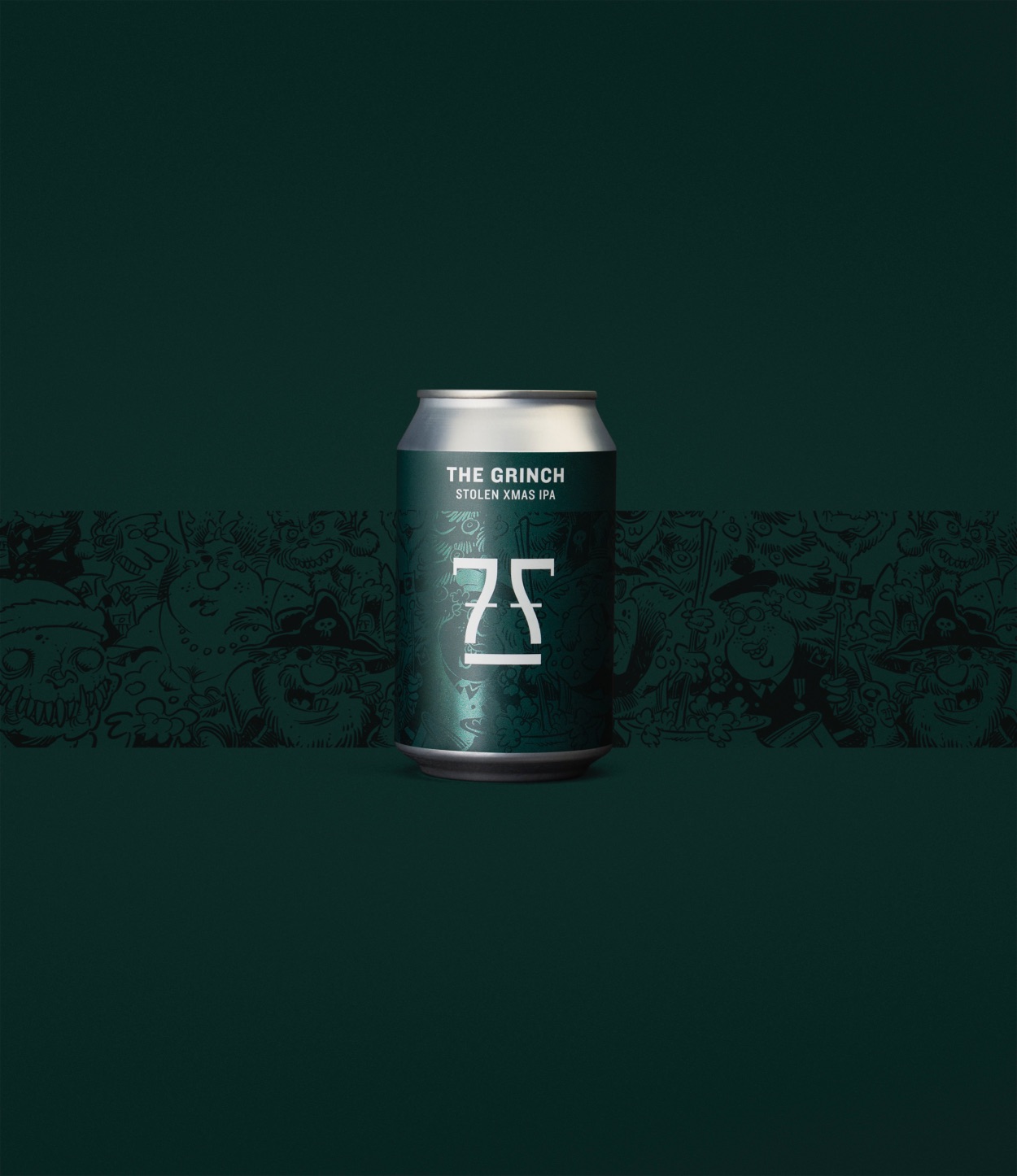
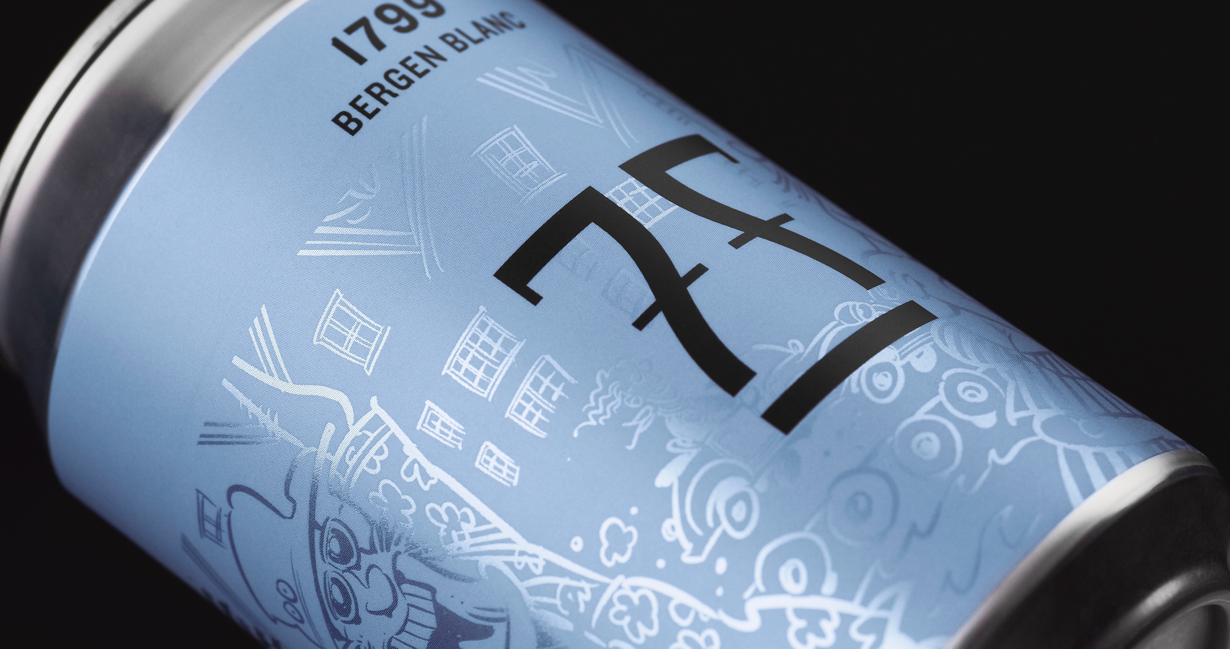
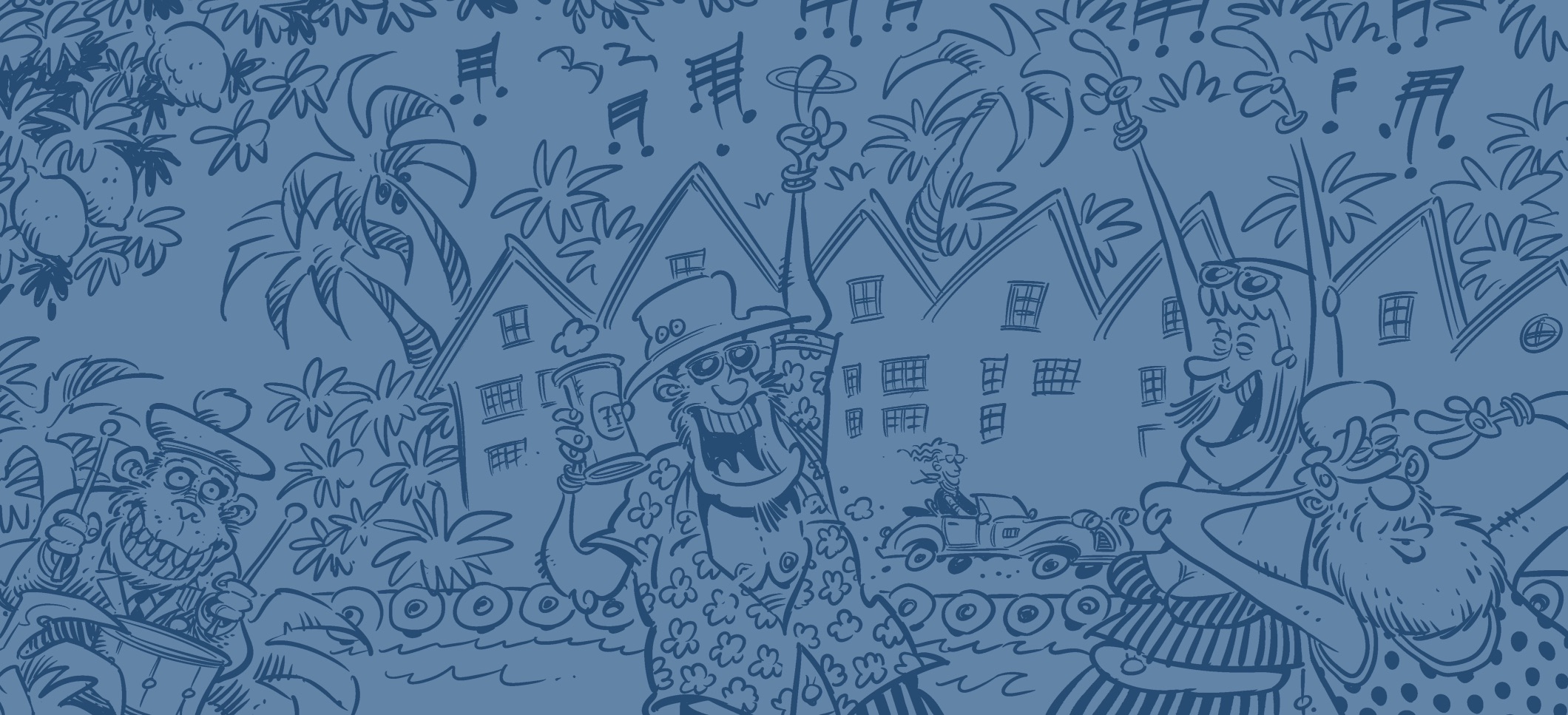
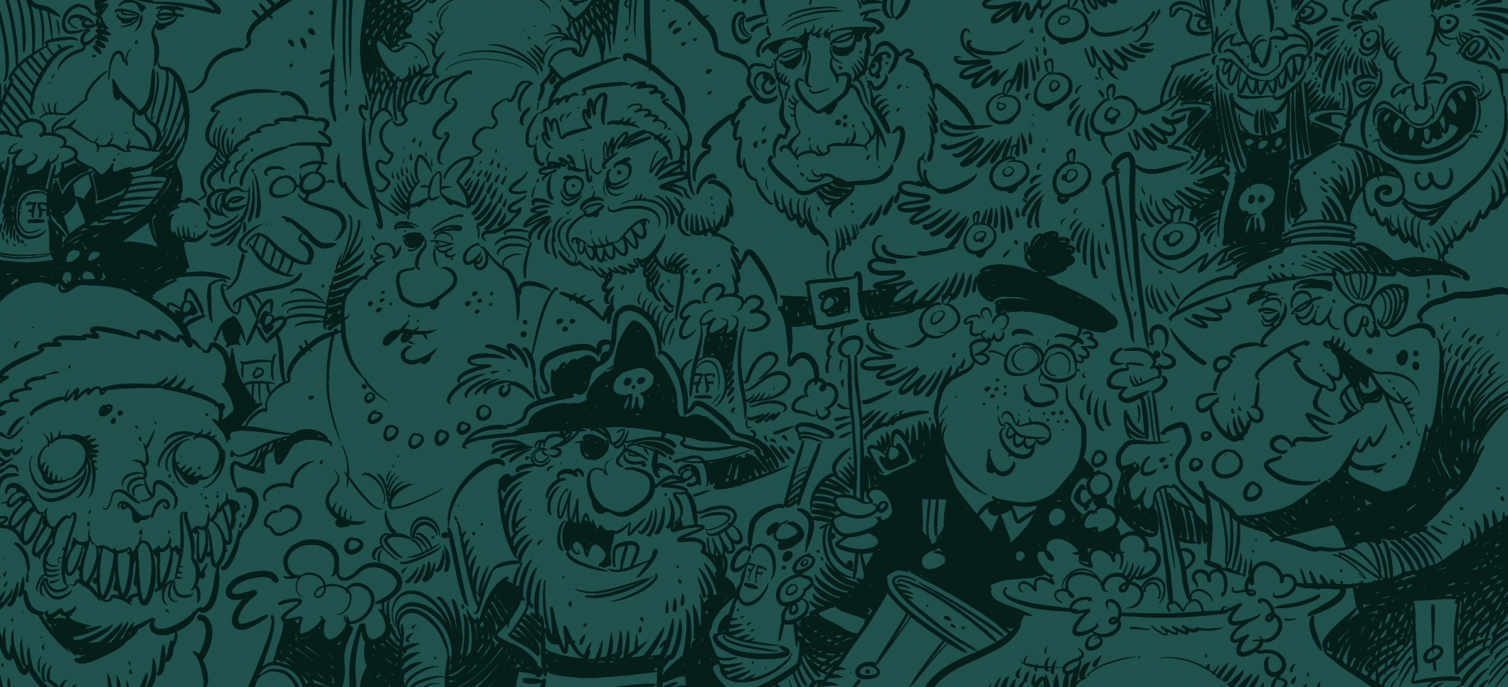
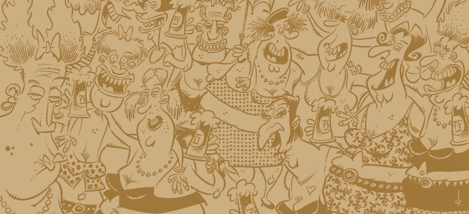
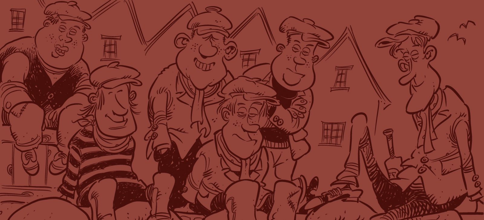
To achieve these goals we have introduced a new layer of ingenuity, humor, and authenticity with Frode Øverli’s characteristic illustrations. The “Pondus” cartoonist and creator, has managed to bring out the different beer’s own character and personalit with his incredibly characteristic line. We wanted the illustration to appear timeless and exclusive from a distance, but exciting and authentic on closer inspection. Just like Bergen – scenic and beautiful at first glance, down-to-earth and authentic on closer inspection.
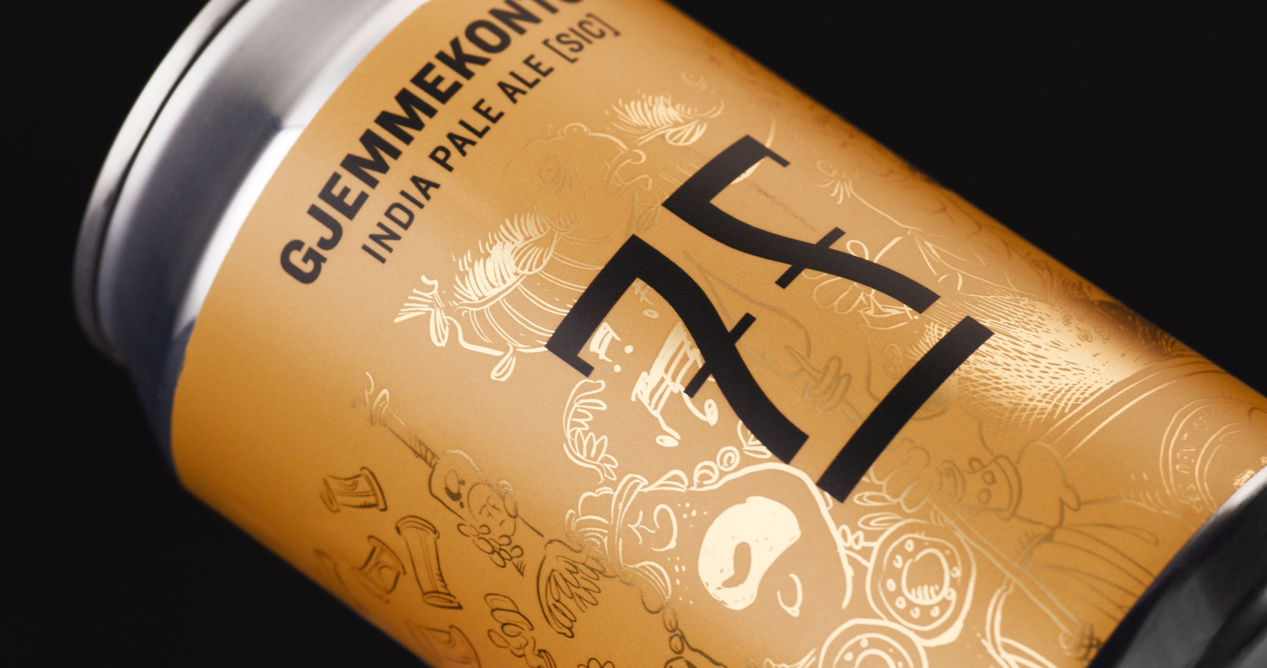
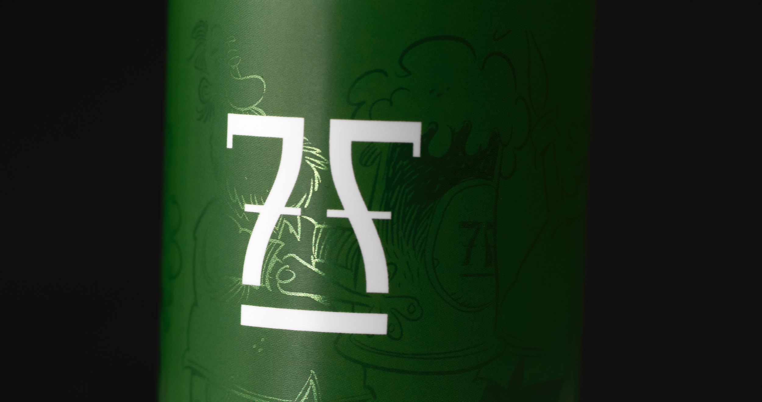
The illustrations are applied with a metallic finish. This gives the cans a delicate and elegant look. Through it, we managed to keep the pure expression that is easily identifiable. The exciting and humorous universe of Frode Øverli is revealed up close. The illustrations are full of details, both mischievous, authentic, rough, naughty and humorous. There are layers upon layers of storytelling in each unique scene. Many of the beers have references from Bergen, and Øverli has captured this in the lines, but without it becoming a pure tourism advertisement. The extra layer of storytelling captures the spirit of 7 Fjell Brewery, builds more attention, and creates engagement around products giving the consumer some good entertainment to their beer.
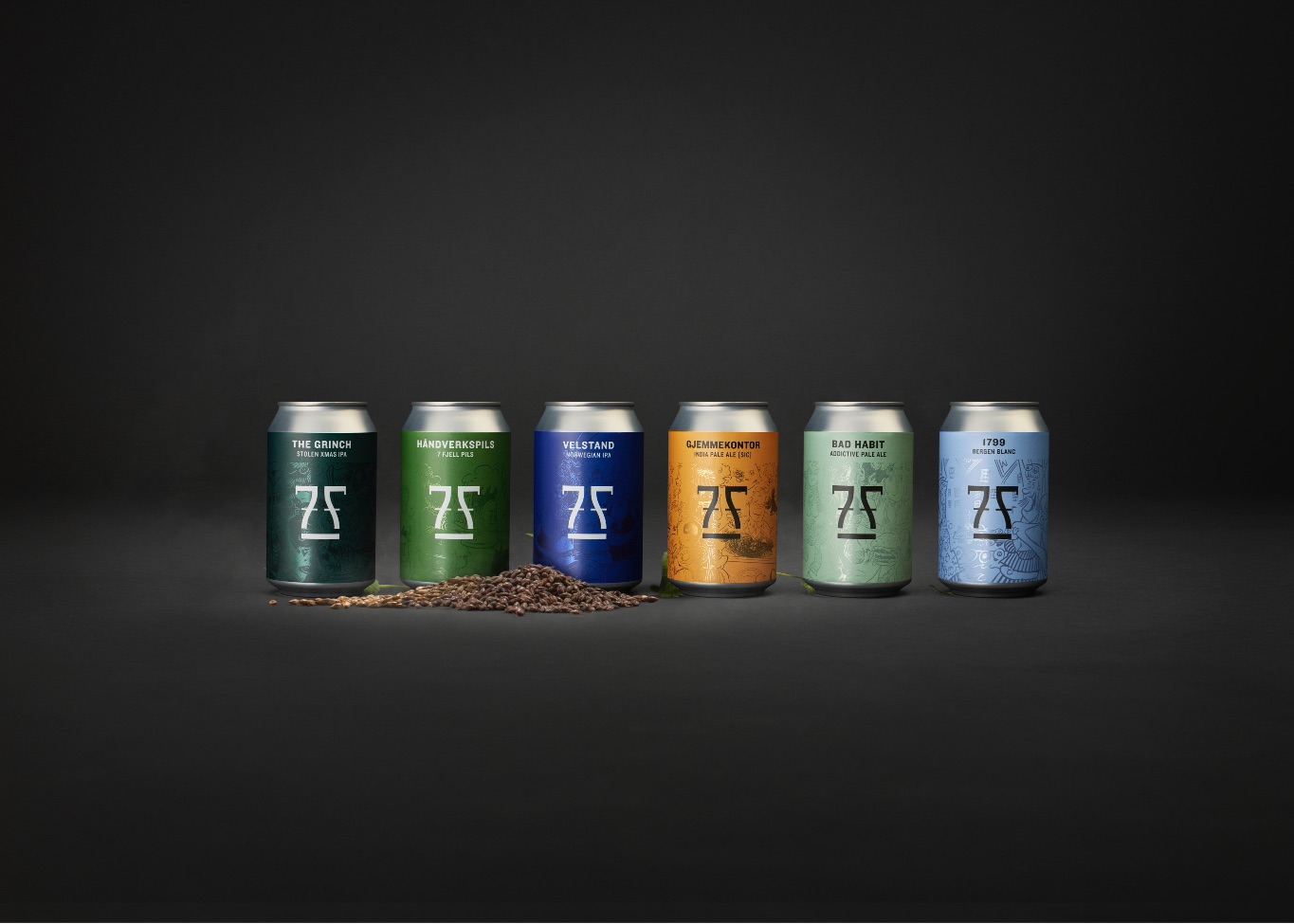
The colours are set in a system based on the beer’s level of lightness or darkness. The colour system takes into account already established colours, so that one could avoid confusing the established customer base.
The design has been tightened to be more uniform throughout the line. The iconic 7Fjell symbol is the main element of the boxes, which makes it easy to recognize the beer on the shelf.
CREDIT
- Agency/Creative: KIND
- Article Title: 7 Fjell Packaging Redesign and Illustration for Packaging Design by Kind
- Organisation/Entity: Agency
- Project Type: Packaging
- Project Status: Published
- Agency/Creative Country: Norway
- Agency/Creative City: Bergen
- Market Region: Global
- Project Deliverables: Illustration, Packaging Design
- Format: Bottle, Can
- Substrate: Glass, Metal
- Industry: Food/Beverage
- Keywords: WBDS Agency Design Awards 2021/22
-
Credits:
Creative Director: Tom Emil Olsen
Design Director & Senior Designer: Knut Harald Longva
Senior Designer: Agnieszka Gawlik
Photographer: Christoffer Meyer
Photographer: Isak Theodor Norum
Project Manager: Marianne Erdal Holm
Project Manager: Beate Myren Romslo
Strategic Brand Consultant: Thomas Danielsen


