


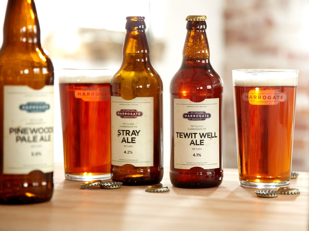
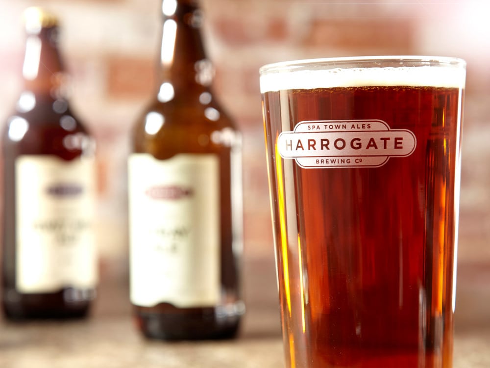
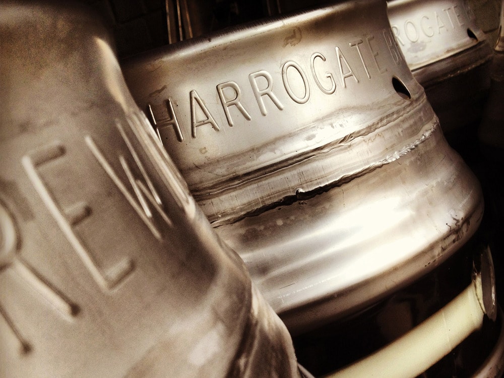
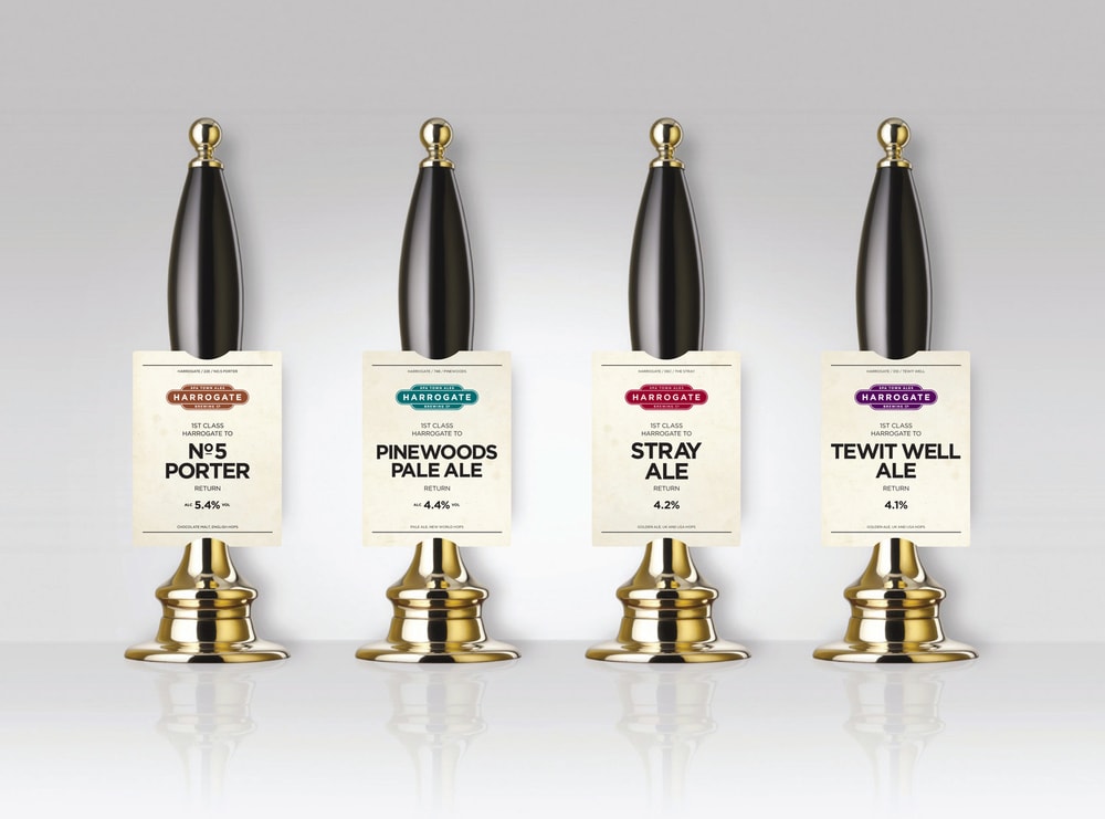
Inspired by the town of Harrogate, North Yorkshire – The Harrogate Brewing Co. is inspired by art deco rail travel imagery. The color scheme is a dark palette that is prominently integrated with the logo. The typography in all mediums is bold and gracefully placed on the label to indicate the type of beer.”The Harrogate Brewing Co. is a microbrewery based in the famous spa town of Harrogate, North Yorkshire – the very first beer brand in Harrogate.Brewing traditional cask conditioned beers, with a nod to the past and an eye to the future, using the finest ingredients and hops from around the world. 10’s brief was to create a brand that shone in the drinking circles of Harrogate, embraced by locals, bars and restaurants in the region which is already famed for great names such as Bettys and Taylors Tea.The finished creative takes its inspiration from the wonderful art deco rail travel imagery that is prevalent in Harrogate with its outstanding and iconic architecture. The brandmark itself is aligned with the traditional railway destination signs and the pump clips and bottle labels utilise a train ticket shape and language inspired by the great rail posters of the 1930’s – ‘it’s quicker by ale’. The website also reflects the essence of a railway station and provides the perfect platform (!) for our striking brand… with bags of personality, stylishly executed.
CREDIT
- Agency/Creative: 10 Associates
- Article Title: 10 Associates – The Harrogate Brewing Co.
- Project Type: Packaging
- Substrate: Glass, Pulp Paper


