


4th Street Ltd – the Pulse of the City
THE BRIEF:
Heineken Beverages approached Just Design to develop a bold Limited Edition campaign for 4th Street’s 3L Bag-in-Box and 1L Tetra formats. The objective was clear: create undeniable shelf standout while reinforcing the brand’s cultural relevance and premium wine credentials. The concept needed to feel expressive and energetic, resonating with younger adult consumers who identify with nightlife and street culture. However, it could not tip into soft-drink territory. The design had to feel fun and youthful, yet unmistakably adult. It also needed to amplify quality cues, justify its price positioning, and integrate key brand assets such as the crest and Limited Edition callout with greater authority.
“The Pulse of the City” became the chosen platform, a campaign celebrating the rhythm, individuality, and after-dark energy of South Africa’s most iconic cities.
THE CHALLENGE:
The core challenge lay in balancing two seemingly opposing worlds: the vibrancy of street-art culture and the credibility of premium wine. The design needed to capture the raw, electric energy of South Africa’s nightlife without tipping into a space that felt overly playful or juvenile. It had to feel expressive and culturally relevant, yet grounded, confident, and unmistakably wine.
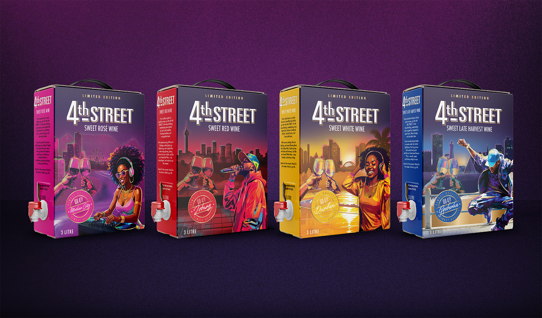
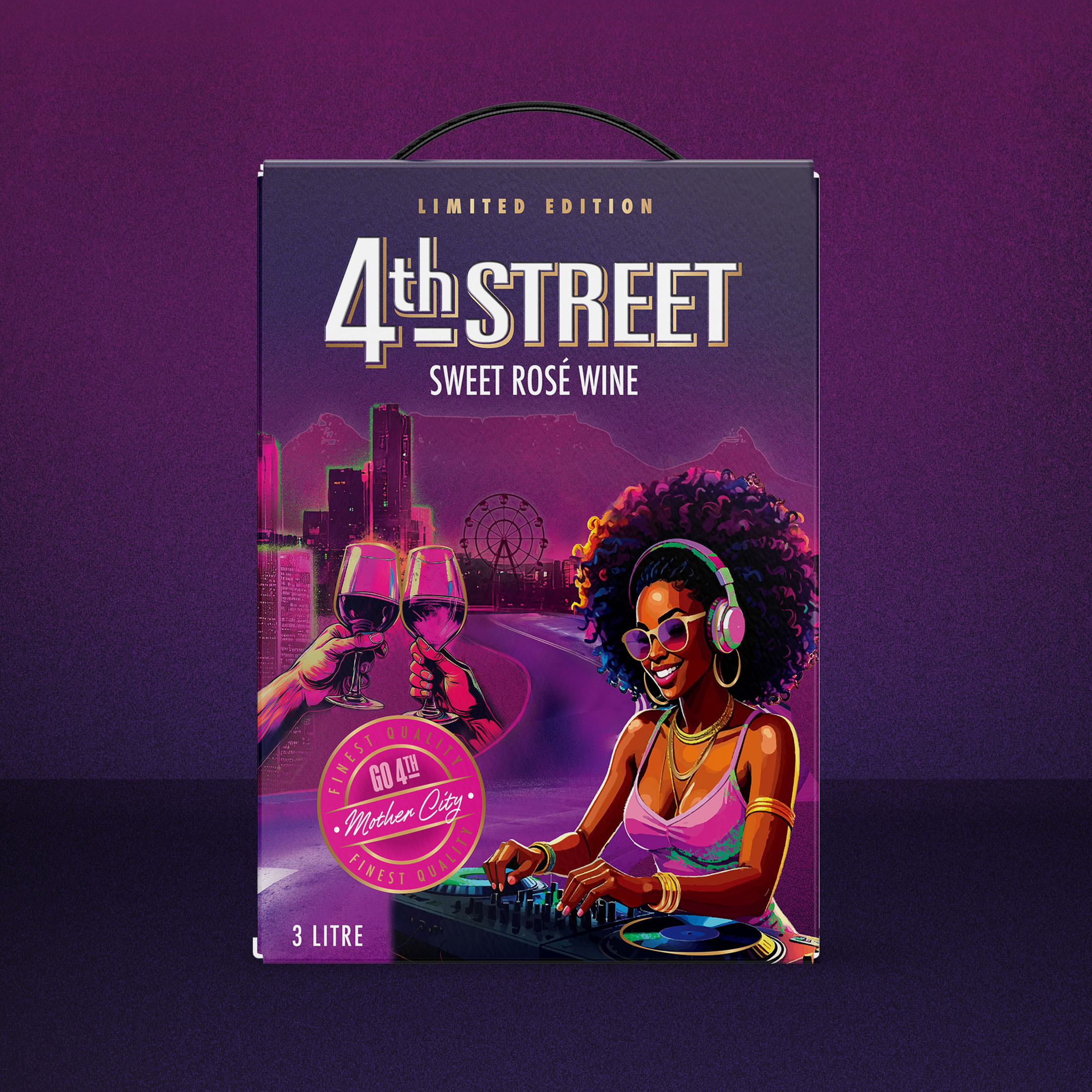
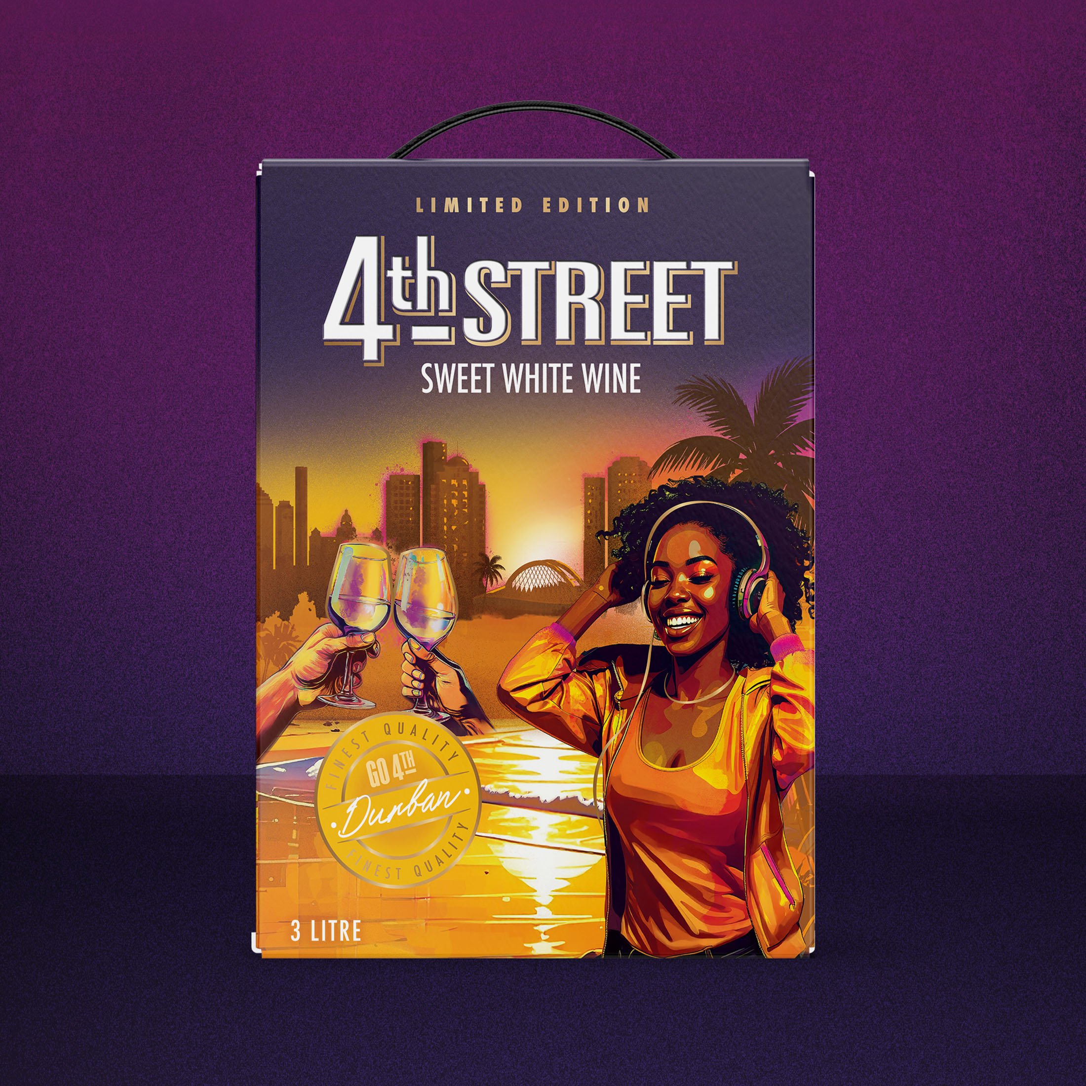
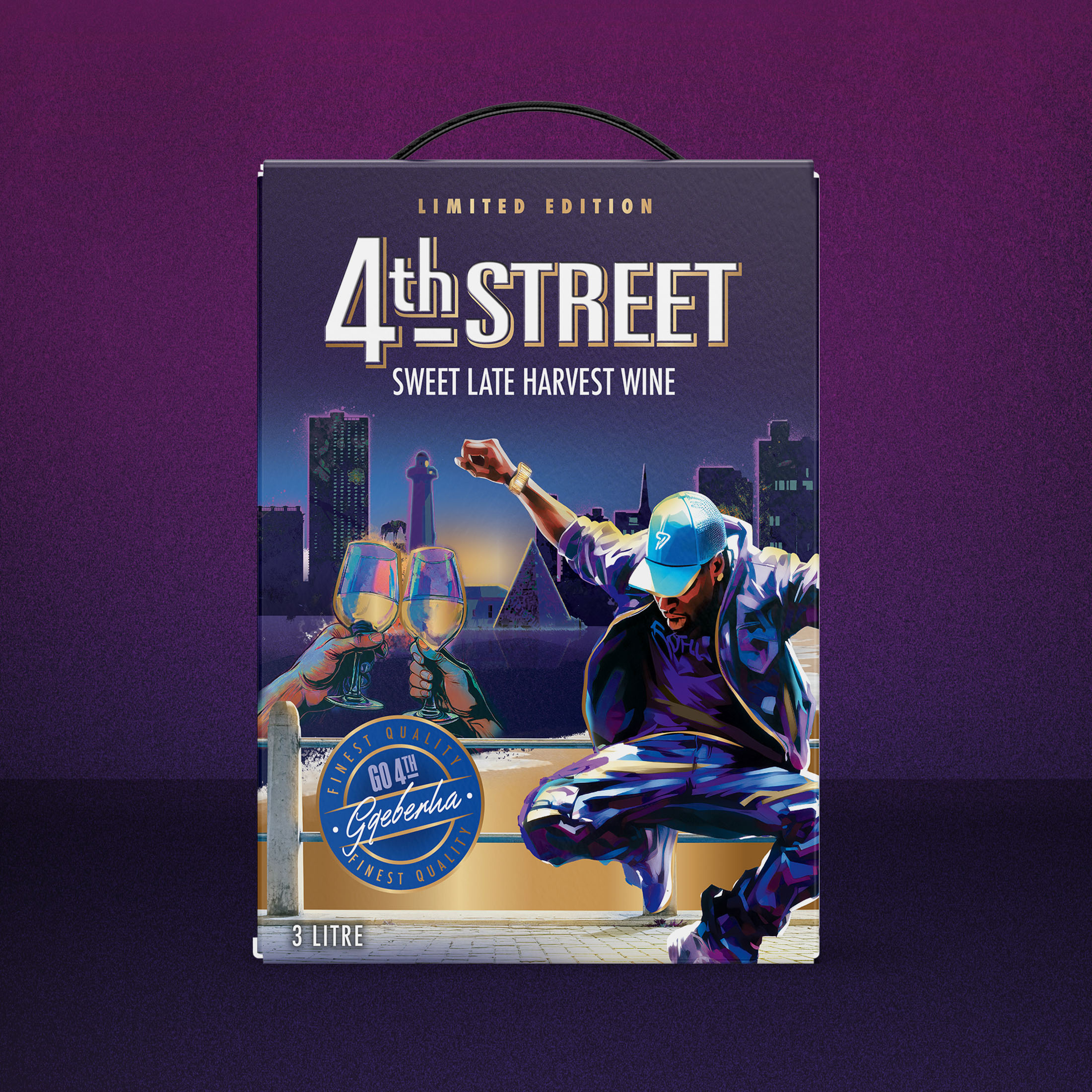
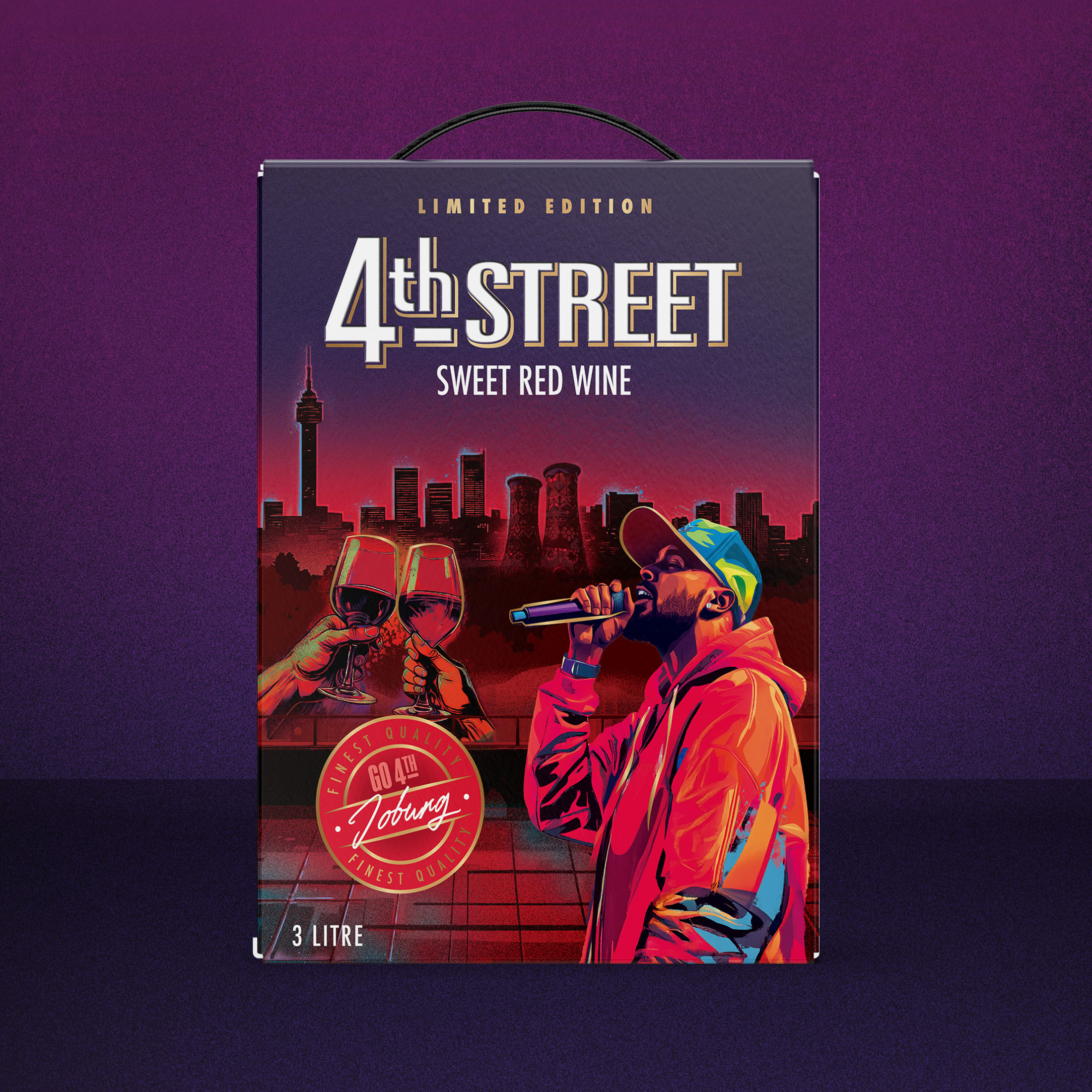
Visually, this required discipline. The composition had to deliver high-impact shelf presence while maintaining clarity and brand hierarchy. The 4th Street logo area and seal placement were structurally fixed, demanding careful orchestration of movement, colour, and focal points within defined boundaries. Each city expression needed to feel authentic and rooted in real urban identity. Not a stereotype, but a genuine tribute to the rhythm, style, and character of Cape Town, Johannesburg, Durban, and Gqeberha.
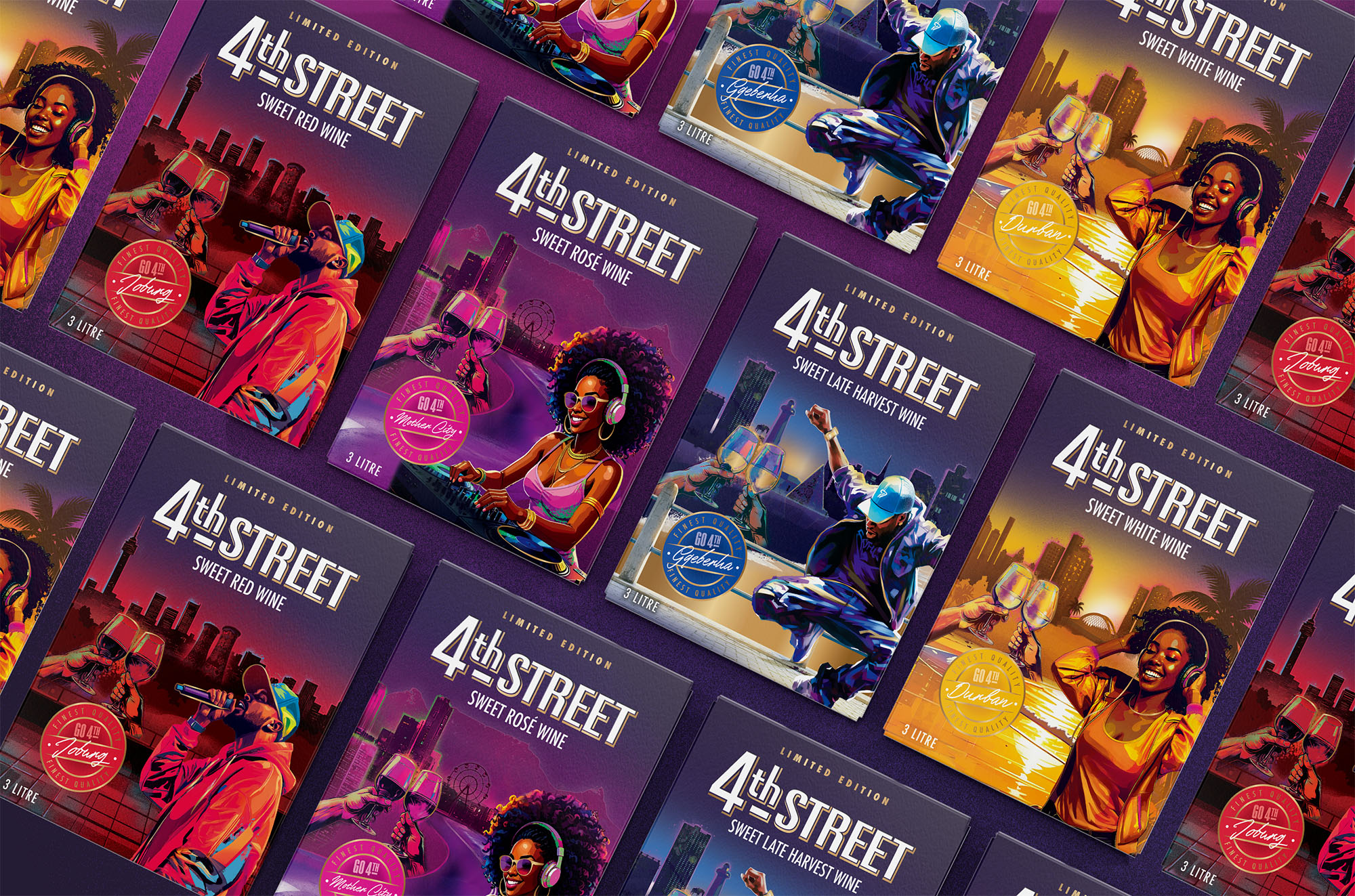
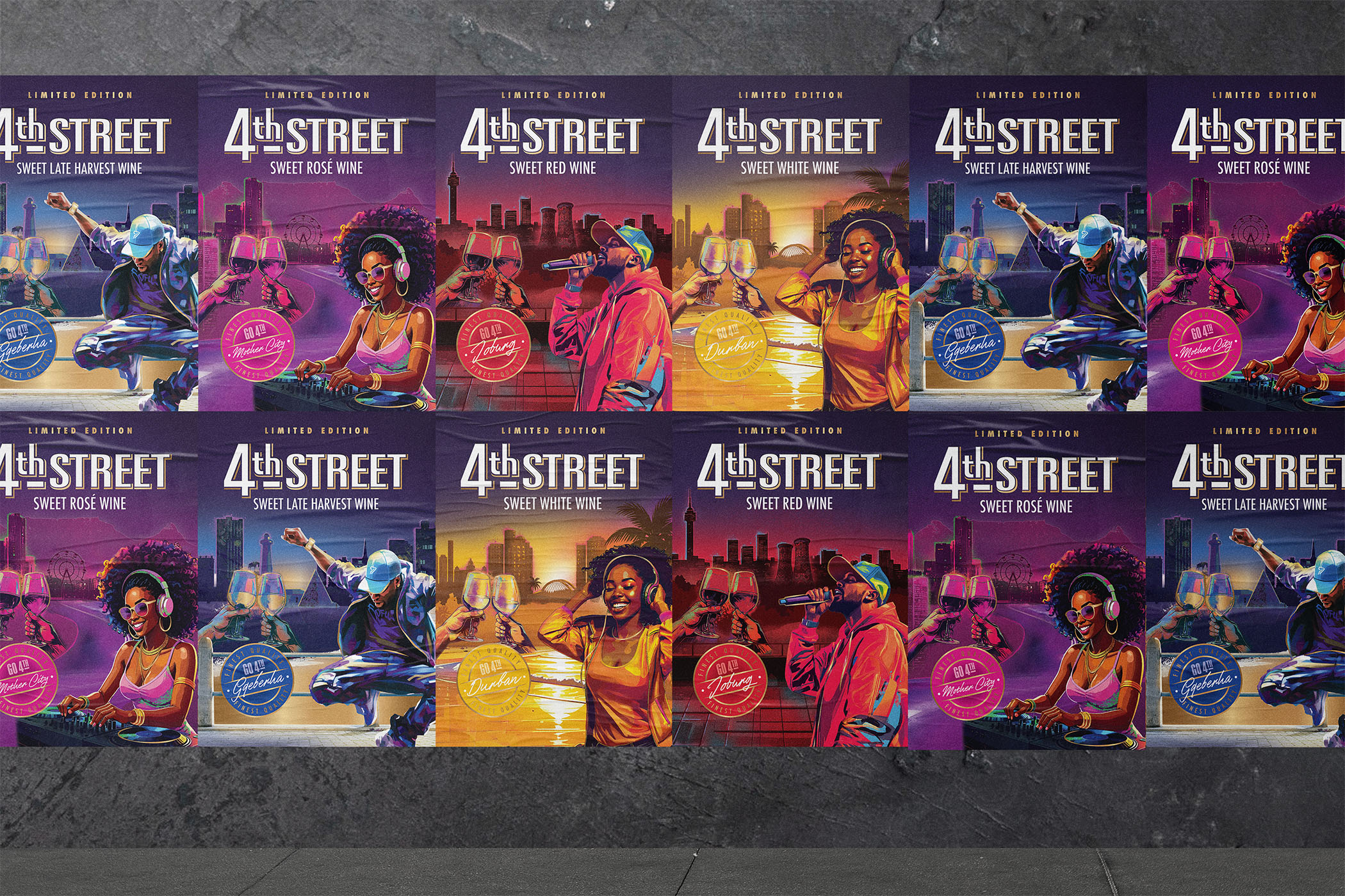
The result had to unify as a collectible series while allowing every SKU to retain its own distinctive pulse.
THE DESIGN INSPIRATION:
The city never sleeps. It vibrates. It glows. It pulses.
“The Pulse of the City” draws inspiration from neon skylines, rooftop gatherings, DJ culture, golden-hour moments, and the electric hum of South Africa after dark. Each variant captures a different city’s personality. Cape Town’s coastal cool and creative confidence, Johannesburg’s bold, relentless hustle, Durban’s sun-drenched rhythm, and Gqeberha’s smooth coastal soul.
The illustration style was rooted in realism but layered with graffiti textures, glowing linework, and spray-paint energy. It needed to feel contemporary and urban, but refined and mature rather than cartoonish. Our studio developed bespoke city scenes using a hybrid creative process, combining art direction, studio design craft, and AI-assisted illustration generation. This allowed us to build layered, mural-like compositions that feel immersive and cinematic while maintaining brand control and hierarchy.
THE DESIGN SOLUTION:
Each pack centres around a strong focal character, a DJ, performer, or creative, grounded in a moment of celebration. Toasting wine glasses subtly anchor the wine occasion, reinforcing category cues without overpowering the artwork.
Behind each character, iconic skyline silhouettes glow against a deep purple night sky that unifies the range. Neon gradients, layered textures, and subtle light play create depth and movement, evoking the feeling of music travelling through the streets. The composition is carefully structured to protect the 4th Street logo at the top of pack, ensuring clean hierarchy and brand dominance.
Across both 3L and 1L formats, the result is a cohesive city series that blocks beautifully on shelf while allowing each SKU to maintain its own distinctive personality. The packs feel bold, immersive, and culturally relevant yet confidently wine.
THE RESULT:
4th Street Limited Edition transforms the Bag-in-Box into more than packaging. It becomes a canvas. A cultural statement. A celebration of South Africa’s nightlife told through colour, rhythm, and city pride.
The final range delivers powerful shelf standout without sacrificing maturity. It balances urban expression with brand clarity. It feels collectible, premium, and culturally tuned-in. Most importantly, it reinforces 4th Street’s place at the centre of shared moments, where glasses clink, music rises, and every city finds its pulse.
From Cape Town to Jozi, Durban to Gqeberha, each pack tells a story.
And together, they don’t just sit on shelf.
They move with the beat.
CREDIT
- Agency/Creative: Just Design
- Article Title: 4th Street Ltd The Pulse of the City Packaging by Just Design Turns Limited Edition Wine Into Urban Nightlife Art
- Organisation/Entity: Agency
- Project Type: Packaging
- Project Status: Published
- Agency/Creative Country: South Africa
- Agency/Creative City: Cape Town
- Market Region: Africa
- Project Deliverables: Illustration, Packaging Design
- Format: Box
- Industry: Food/Beverage
- Keywords: #4thStreet #LimitedEdition #PackagingDesign #WinePackaging #JustDesignAgency
-
Credits:
Designer: Jolize Jacobs
Designer: Estee Oberholzer
Designer: Khaleel Khan
Designer: Marzanne Smith
Creative Director: Thelmarie Toerien


