4Rotte – And the haze, finally, becomes clear.
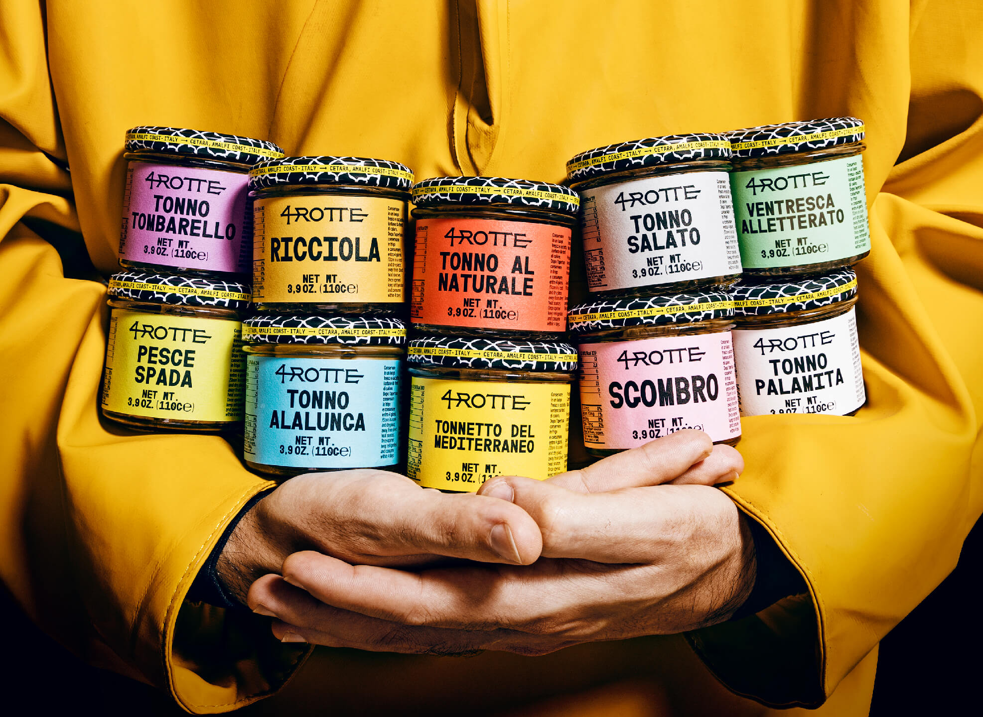
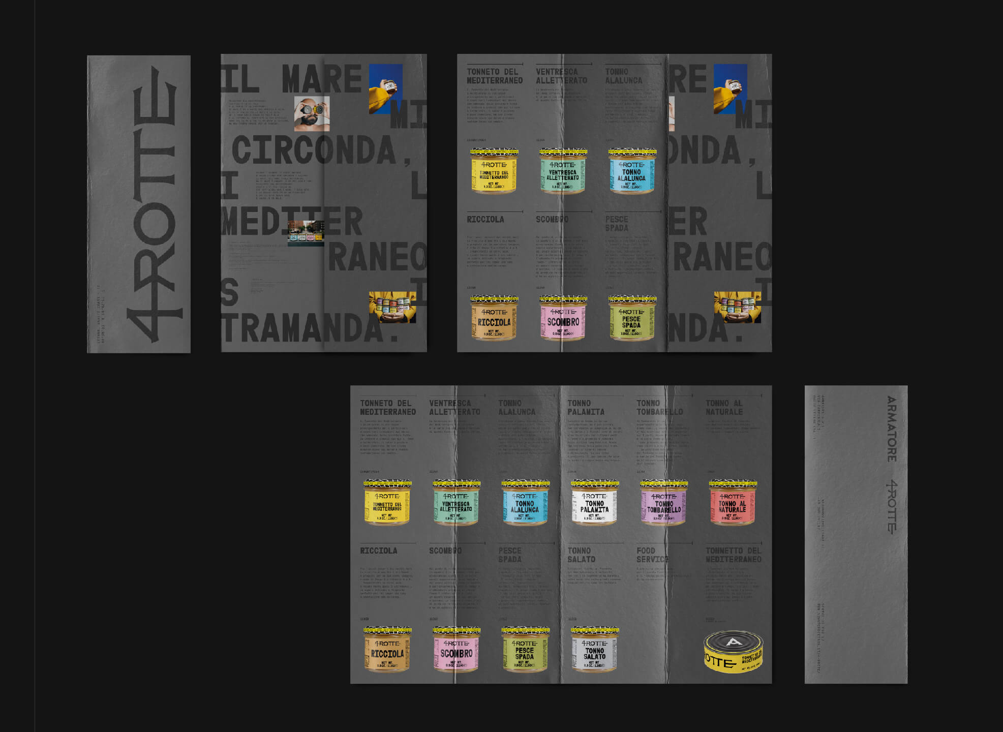
Armatore explores new routes. After the affirmation and positioning of the brand with anchovies, colatura and bluefin tuna, Armatore discovers new horizons with a wider and more heterogeneous offer.
Four are cardinal points and the temporal dimensions related to fishing and its stories, traditions and mysteries. The mist clears and the Armatore’s compass indicates a clear and unprecedented path, in line with the “market” destination: becoming perceptible and usable.
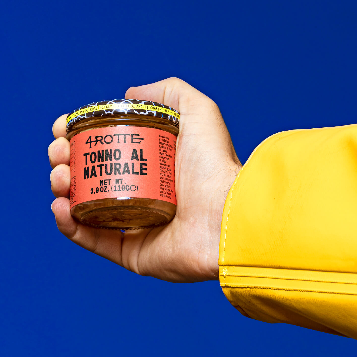
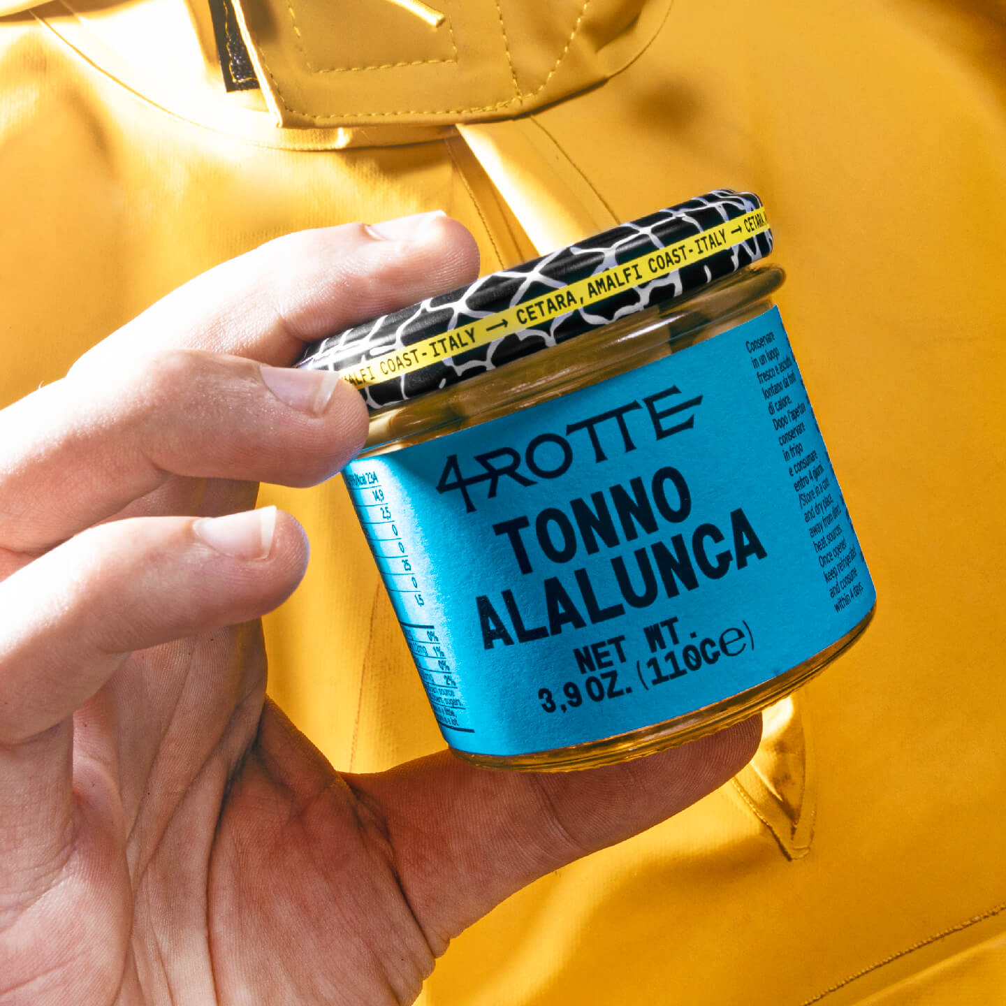
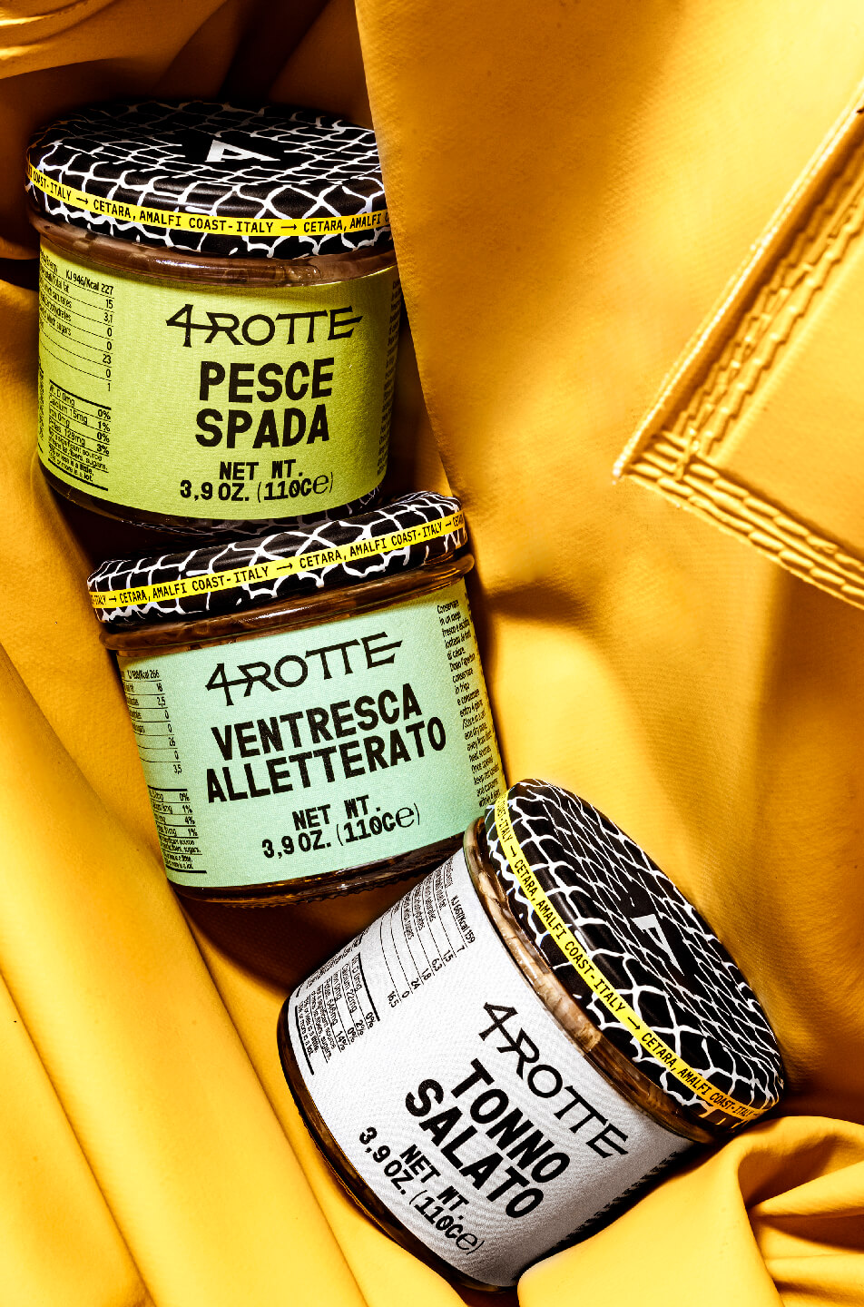
The diversification of the offer assumes a signposting and explanatory design, whose typography takes inspiration from the American orientation system, characterized by clear words, on pastel backgrounds. The 4Rotte adventure is rational: symbols and graphics become synthesis, with essential and impactful paths.
Now the nights at sea are a clear picture, devoid of mysteries and esotericisms.
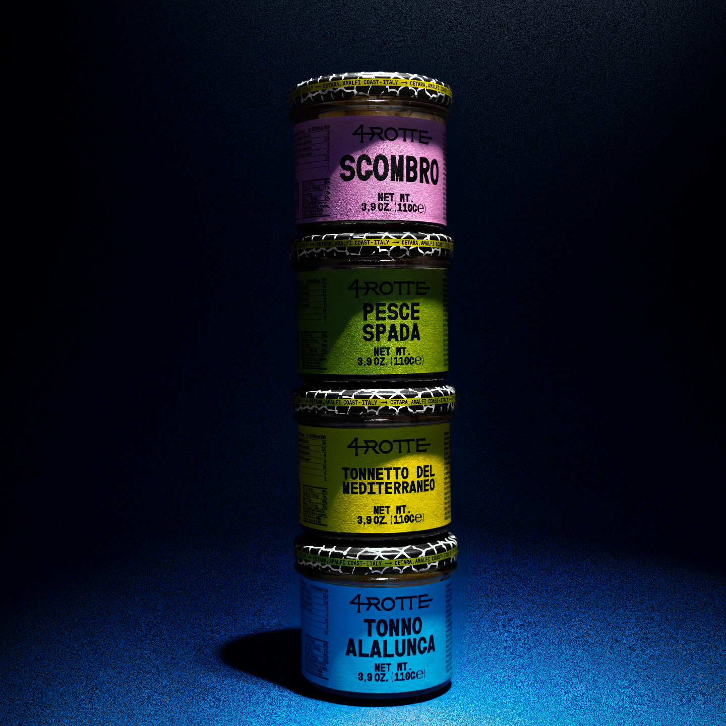
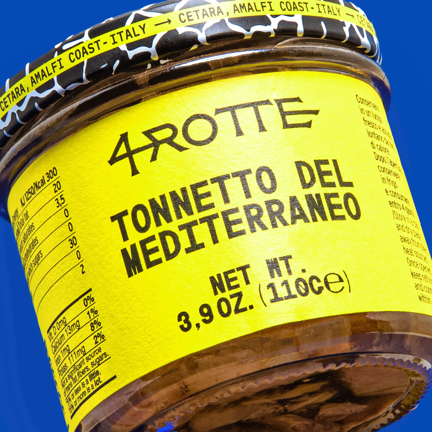
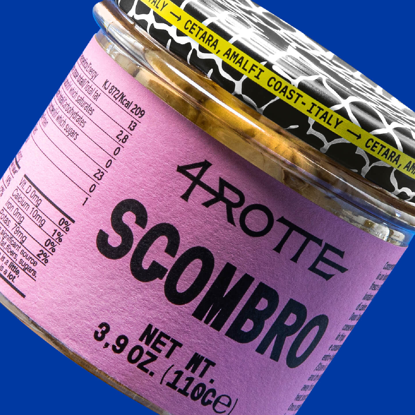
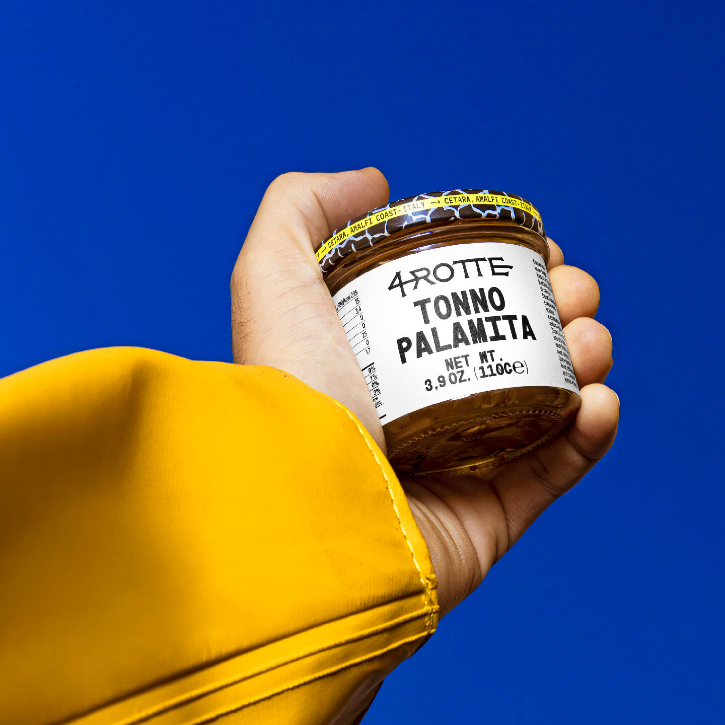
CREDIT
- Agency/Creative: Lettera7
- Article Title: 4Rotte Packaging Design by Lettera7
- Organisation/Entity: Agency
- Project Type: Packaging
- Project Status: Published
- Agency/Creative Country: Italy
- Agency/Creative City: Salerno
- Market Region: Europe
- Project Deliverables: Label Design
- Format: Jar
- Substrate: Glass Jar
- Industry: Food/Beverage
- Keywords: #lettera7 #ufficina #etichette #label #design #visualdesign #brand #branding #labeldesign #fedrigoni #fedrigonipaper #bottledesign #elevatingcreativity #selfadhesives #labelling #labeldesign #primelabels #ritrama #manter #labels #armatore #armatorecetara # cetara #amalficoast #cetaraamalficoast #4rotte
-
Credits:
Art Director: Dario Volpe


