


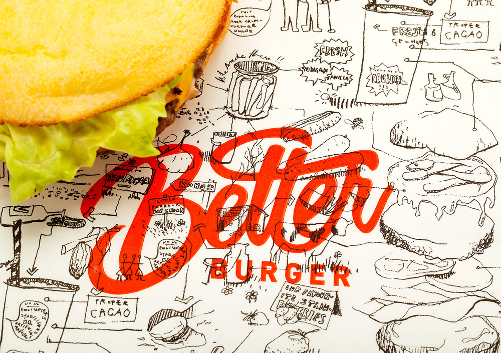
“Better Burger has been created because they reckon other fast food burgers in New Zealand are shit!
Burgers taste better when they’re made with fresh, local ingredients. The clients strategy was to create a better burger so we gave them a name that said exactly who they are and what they stand for. And what better name than Better Burger. The promise and the delivery. ”
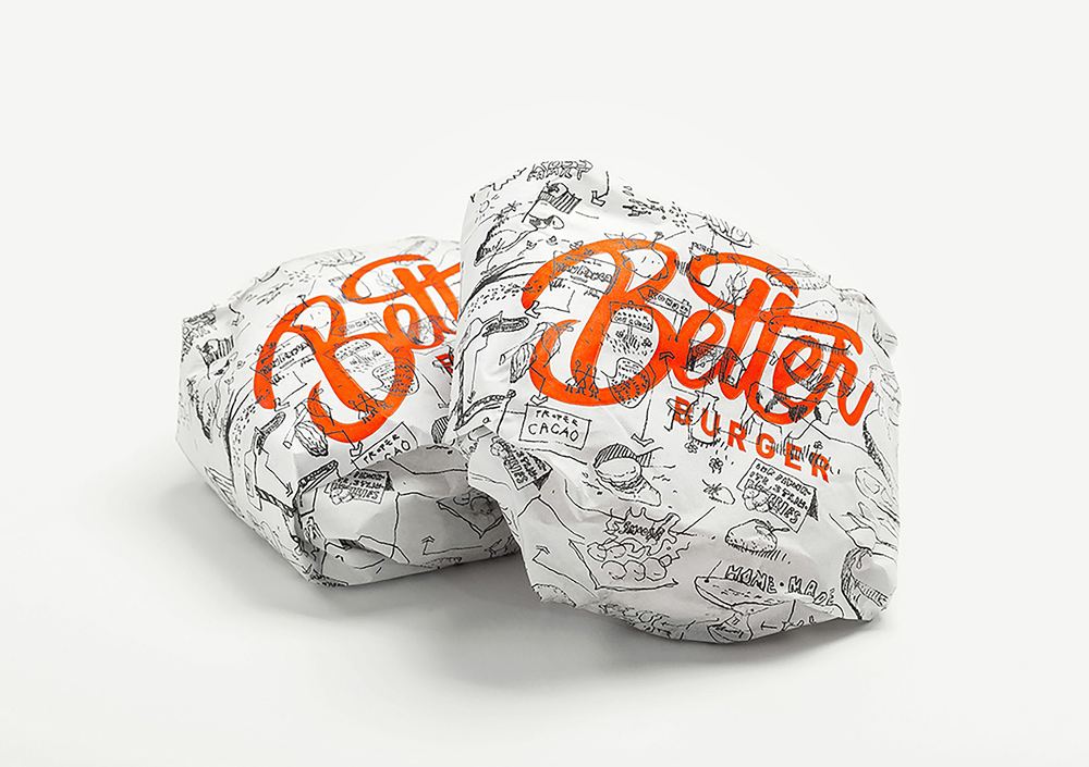
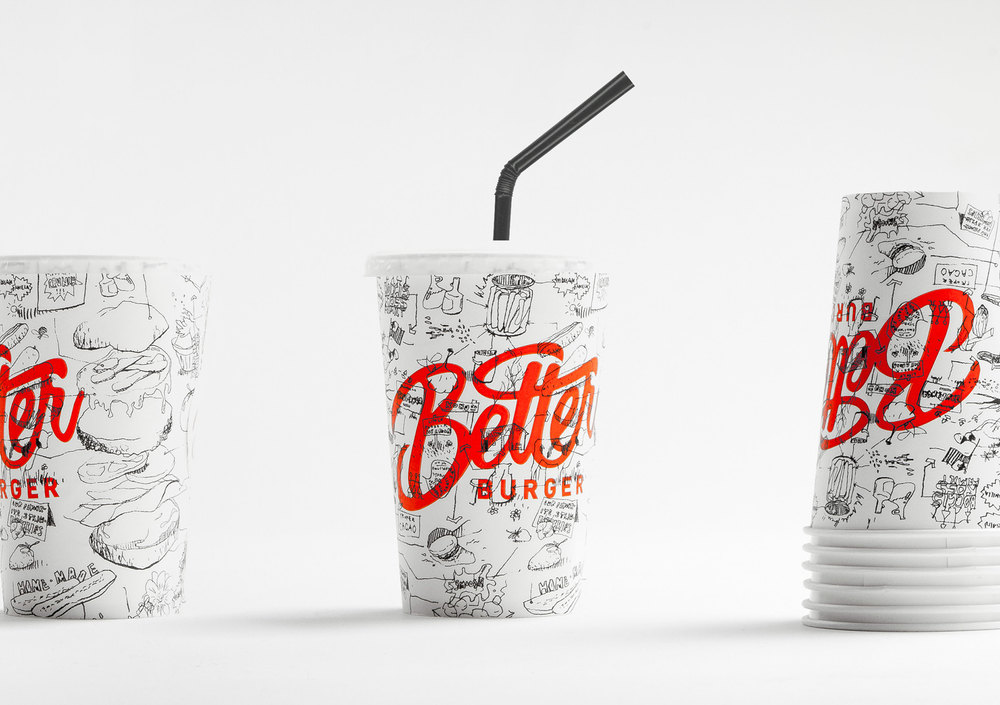
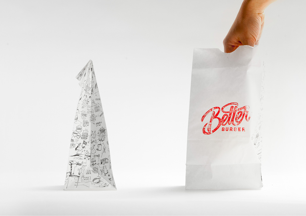
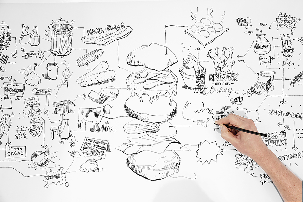
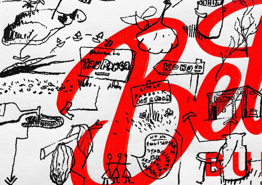
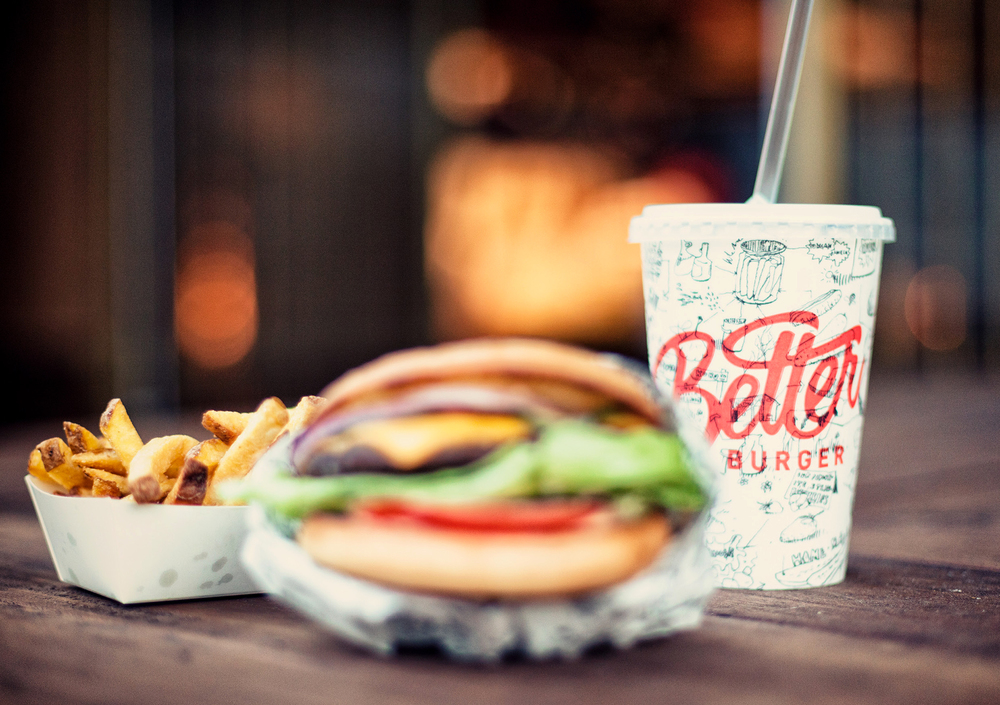
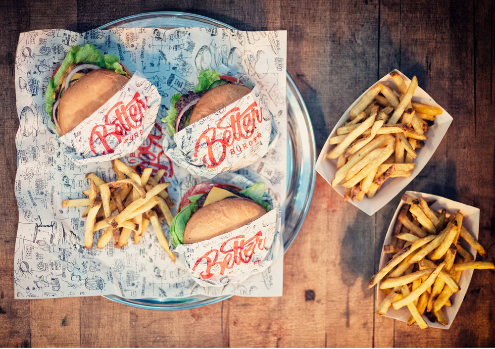
“We wanted the artwork and packaging to compliment the brand marque by illustrating the journey of the simple, fresh ingredients, and the enjoyment of the product. The detail and variation of the illustration allows us to create unique items everytime we apply the brand. This also allows customers to interact with the packaging whilst they are experiencing Better Burger. Every time you look at the detail you will see something fresh, whilst eating something fresh.
Not gourmet burgers – just better burgers that are light on the wallet!”
CREDIT
- Agency/Creative: 485 Design
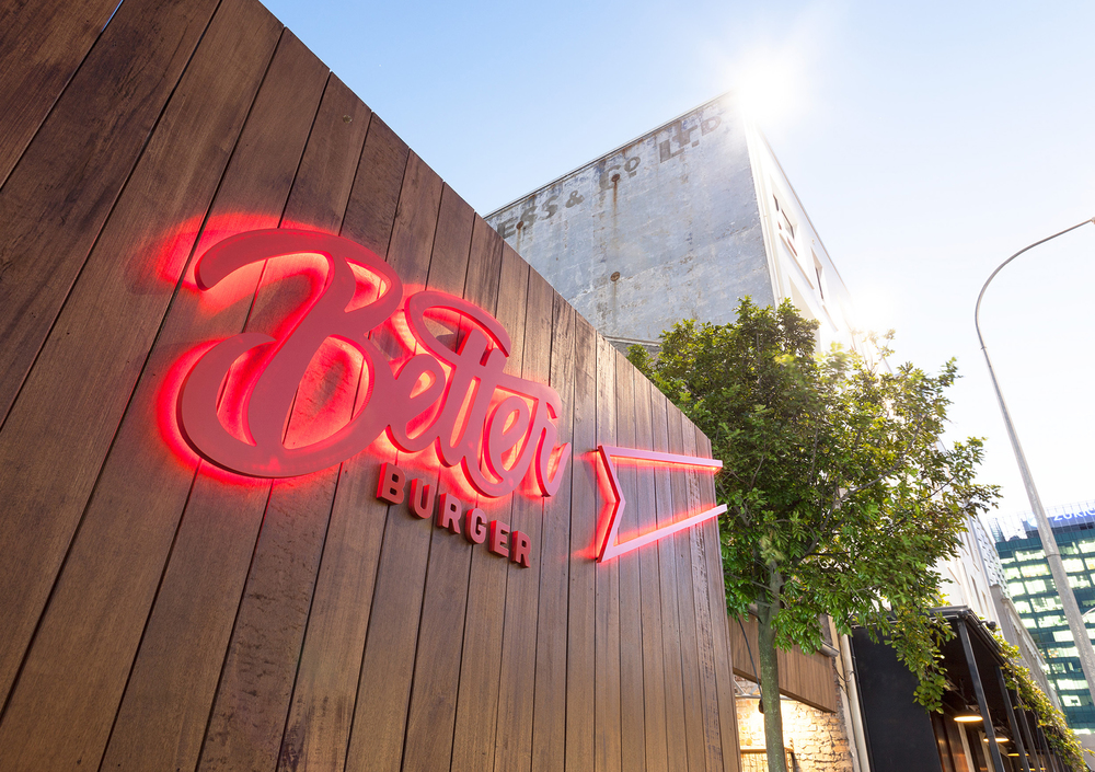
- Article Title: 485 Design – Better Burger
- Project Type: Packaging
- Substrate: Pulp Paper


