


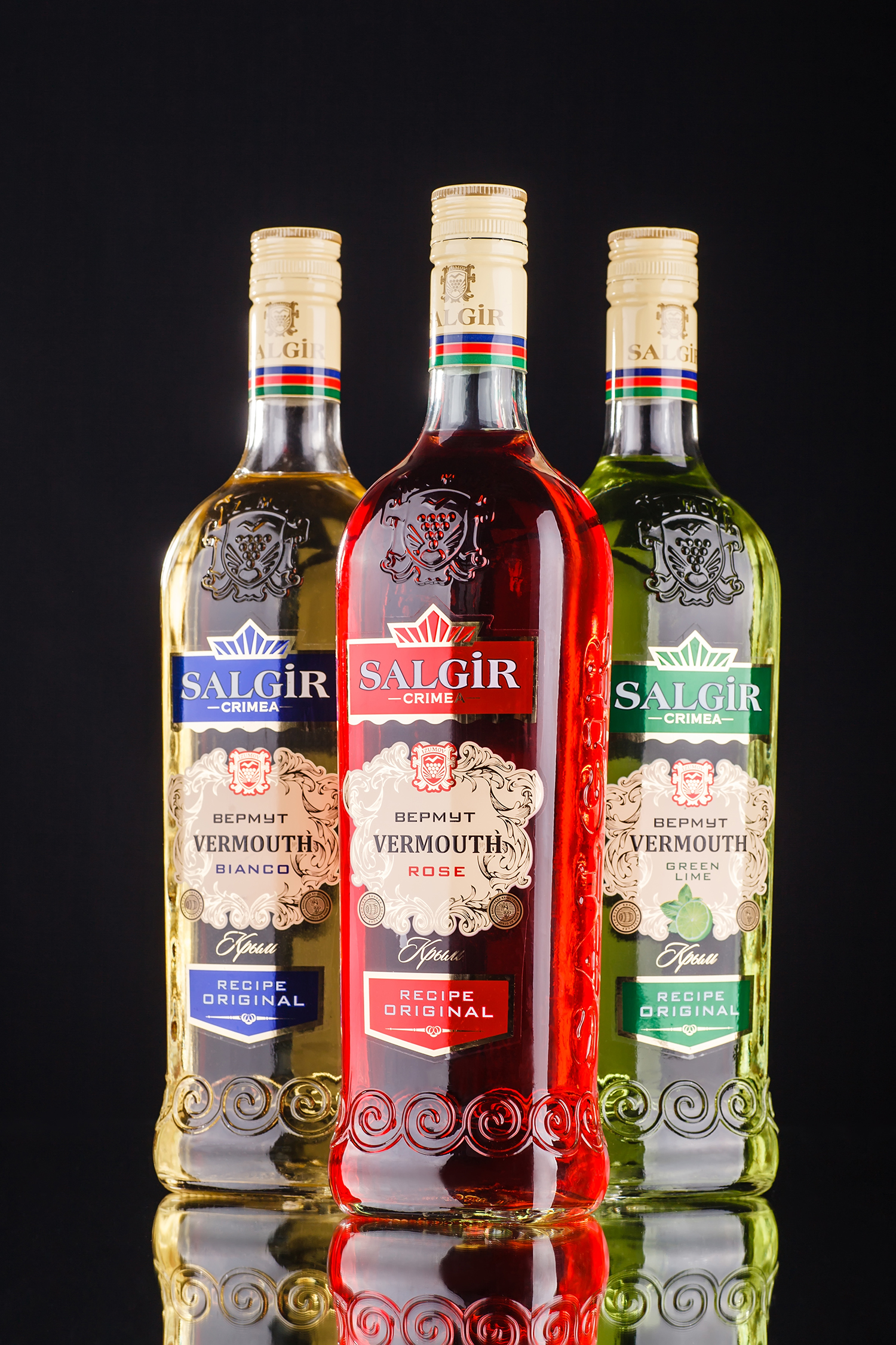
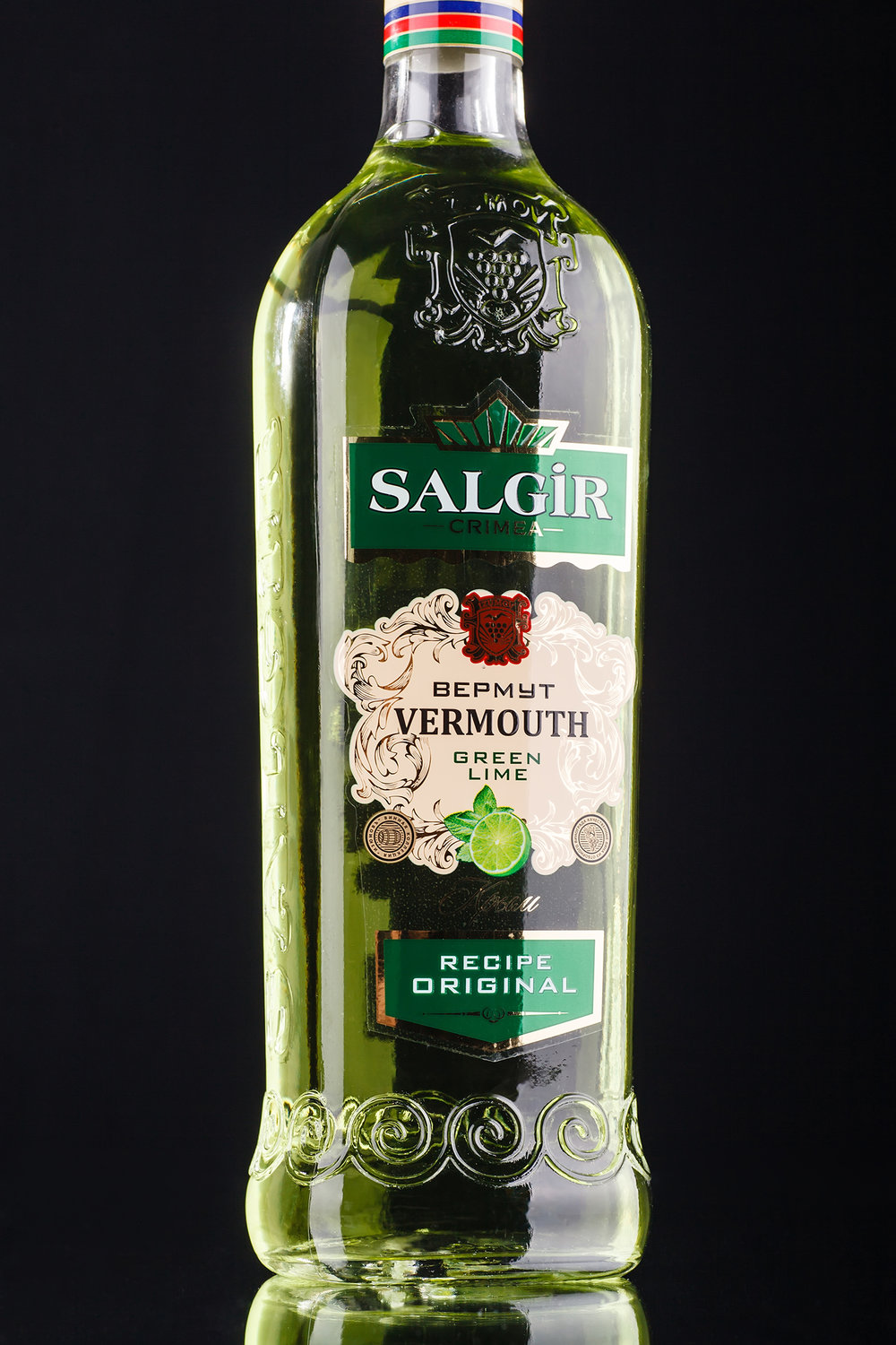
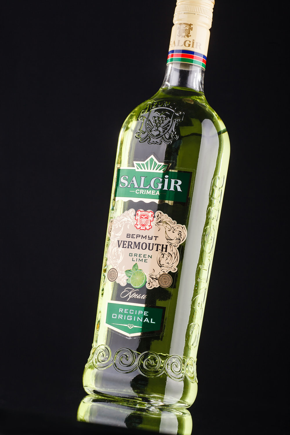
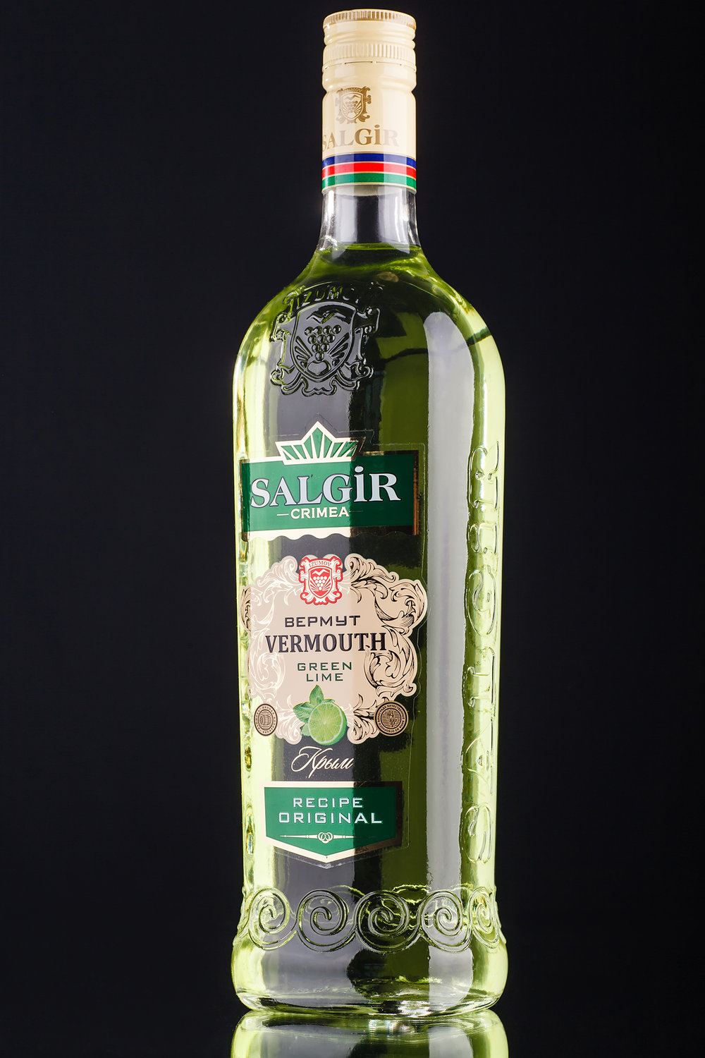
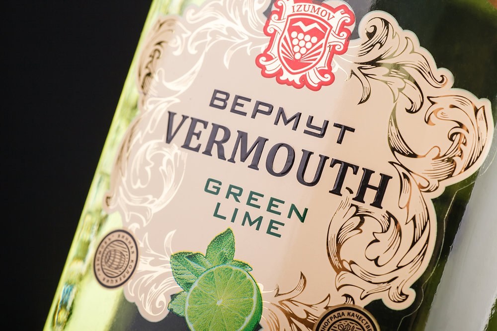
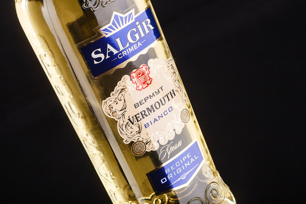
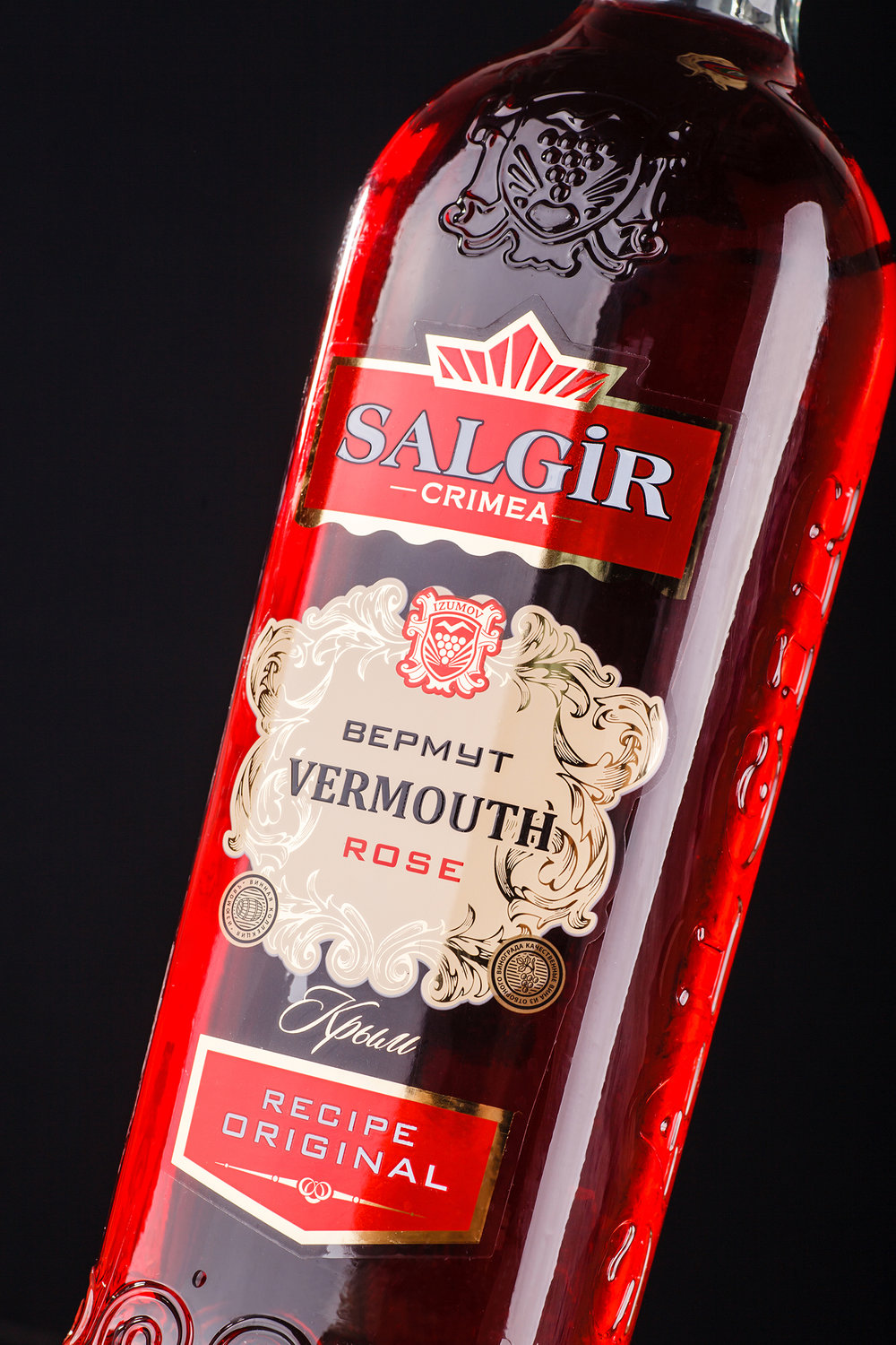
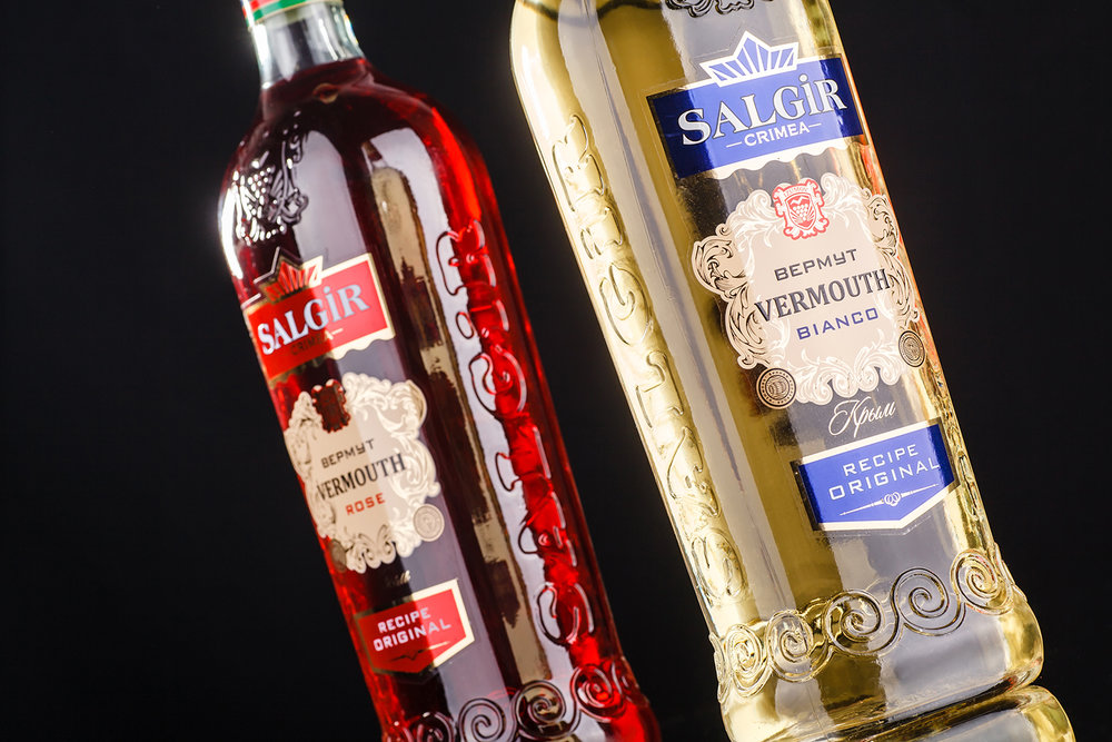
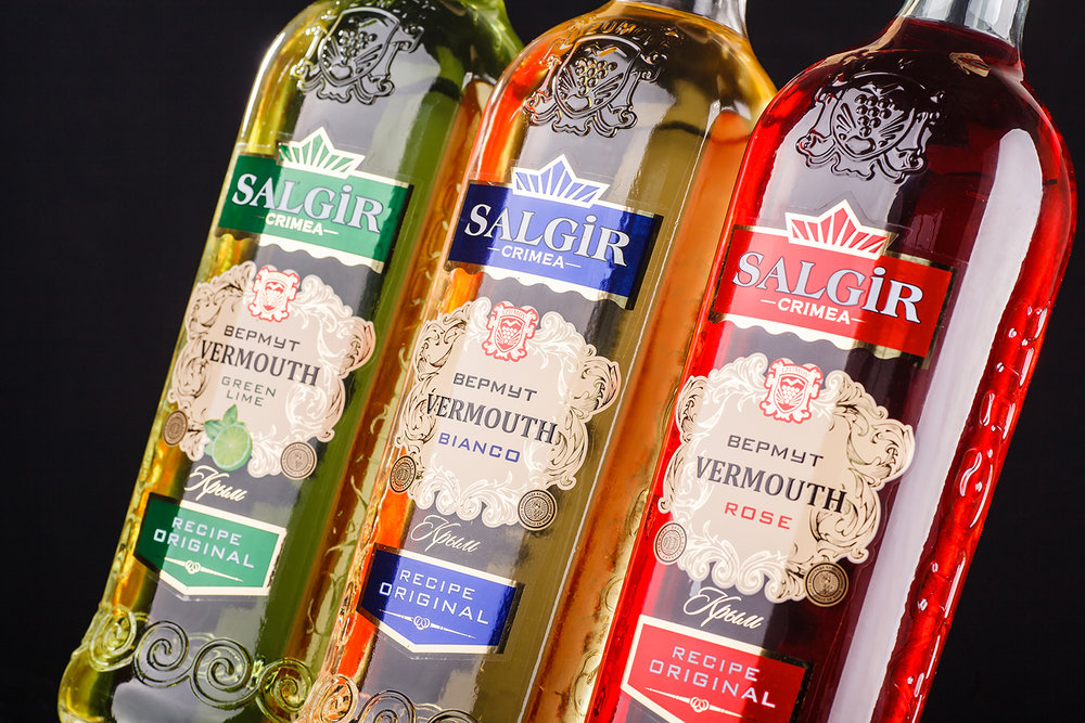
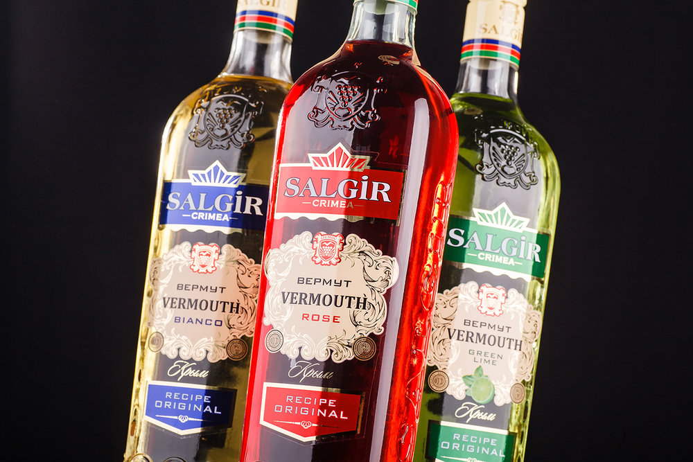
” Salgir is a line of aromatic fortified wines produced by vermouth technology, which makes part of the Izumov brand. The unique feature of this product is the fact, that the process of its production employs herbs and aromatic plants that grow exclusively in the Crimean and Southern Russia regions. Moreover, the diversity and quantity of natural aromatic additives exceeds that used in the famous Italian Maritini vermouths, making the drink more flavorful, rich, and interesting. That’s why the agency had to created a packaging design, which would, on one hand, emphasize the product’s adherence to a certain class, and on the other, outline its unique geographic character.
The drink’s identification as a quality vermouth is carried out, at first, through the use of a personalized bottle with embossing, common for such wines. The general style of the packaging also corresponds to the standards of aromatic wines, with common elements and vivid color schemes, as well as a set of certain visual elements, which in conjunction creates a unique image that corresponds to a pleasant and intense drink. The geographic character of the drink is executed through its identification in two languages on the front label, while the differentiation of the products in the line is carried out through the application of different color schemes. Additional engraving of the product’s logo and trademark allow to identify it easily on the shelf.”
CREDIT
- Agency/Creative: 43oz.com Design Studio
- Article Title: 43oz.com Design Studio – Salgir
- Project Type: Packaging
- Format: Bottle
- Substrate: Glass


