


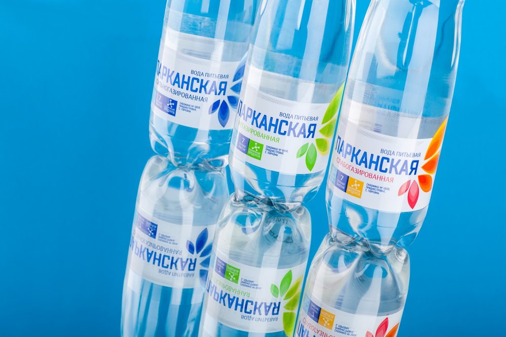
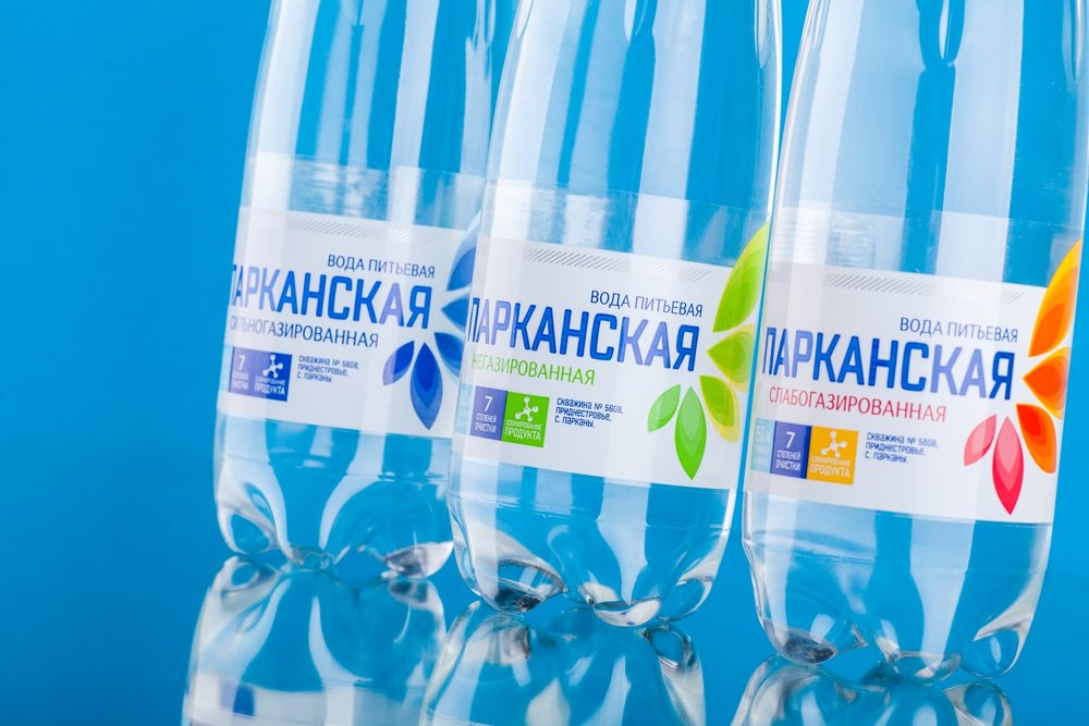
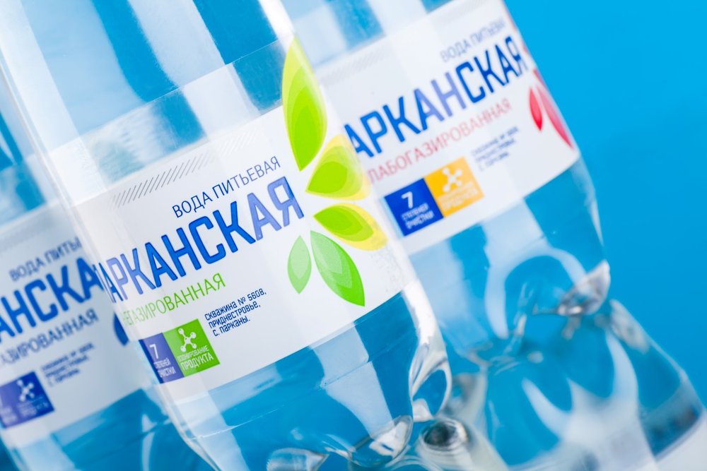
” The development of packaging design for Parkanskaya drinking water became a part of a large-scale rebranding effort undertaken by Tiraspol Bread Factory, which owns the brand. The client wished to get away from the old packaging and renew the visual aspect of the bottled water, making it more attractive in modern context. Our agency has put the effort for creating a fresh image, which would also carry a certain local flair, allowing to iidentify the product on the shelf.
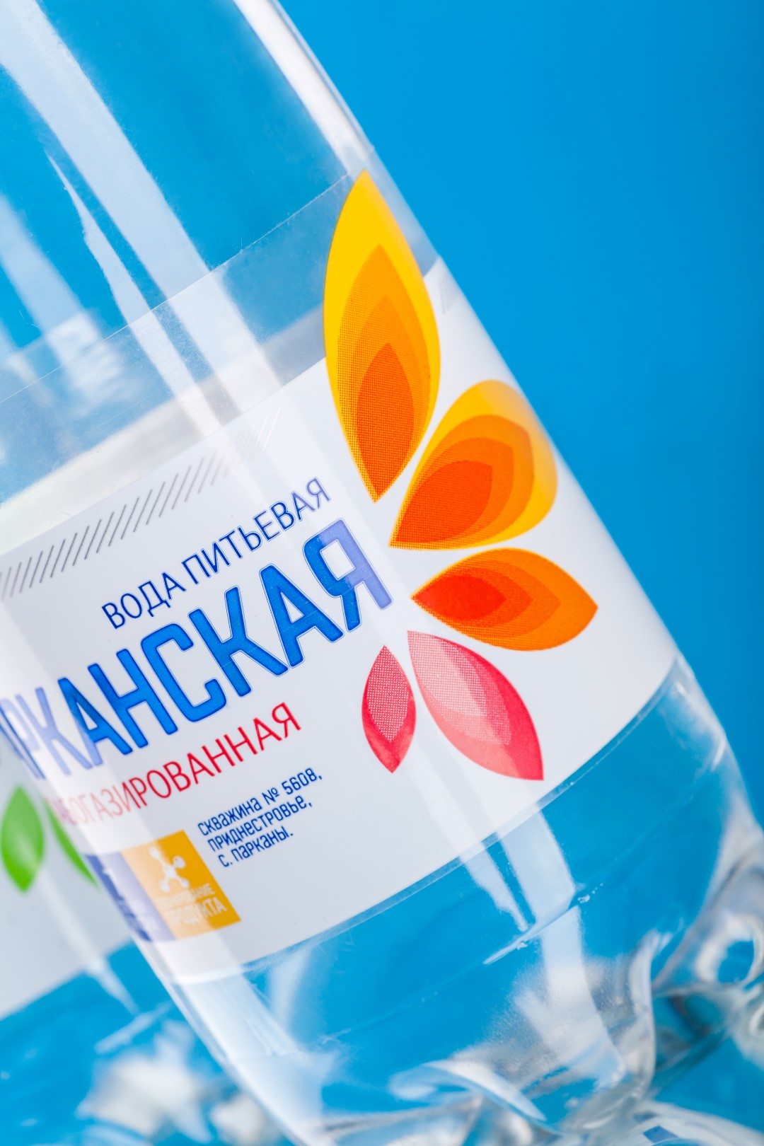
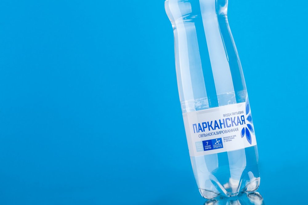
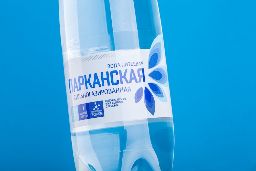
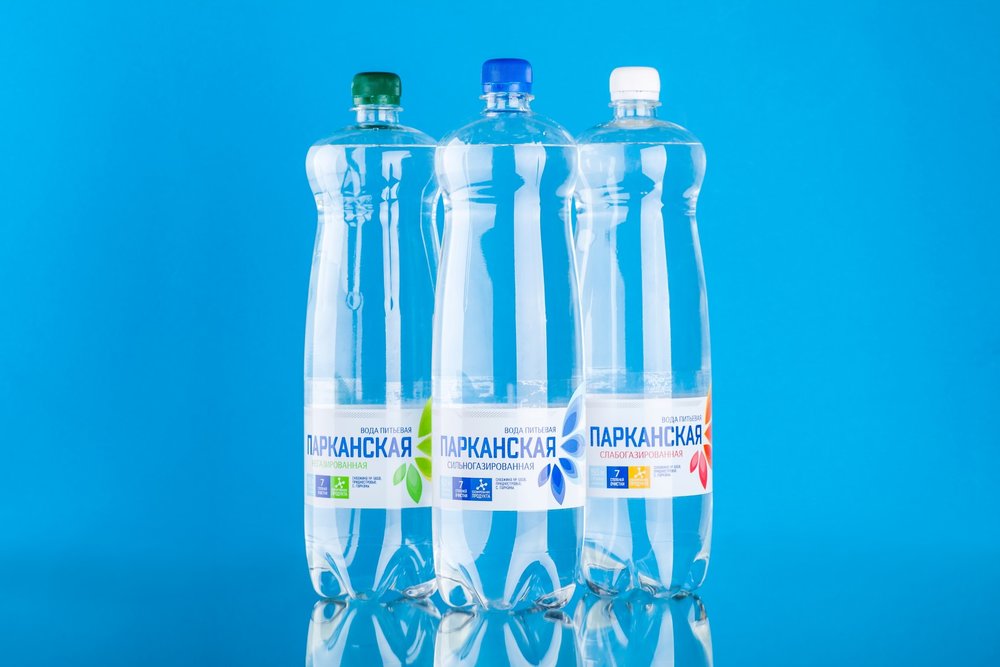
The main source of inspirtation for the Parkanskaya drinking water was the abundance of flowers blooming virtually everywhere across the Parcani village, where the water is being extracted and processed. The image of a flower became the base for the visual aspect of the packaging, which uses a special type of bottle developed by the producer. The overall color scheme uses light hues in order to emphasize the refreshing and natural character of the product, while the differentiation of the different water types is executed through the use of different colors in the stylized flower illustration, located to the right of the trademark.”

CREDIT
- Article Title: 43oz.com Design Studio – Parkanskaya
- Project Type: Packaging
- Format: Bottle
- Substrate: Plastic


