


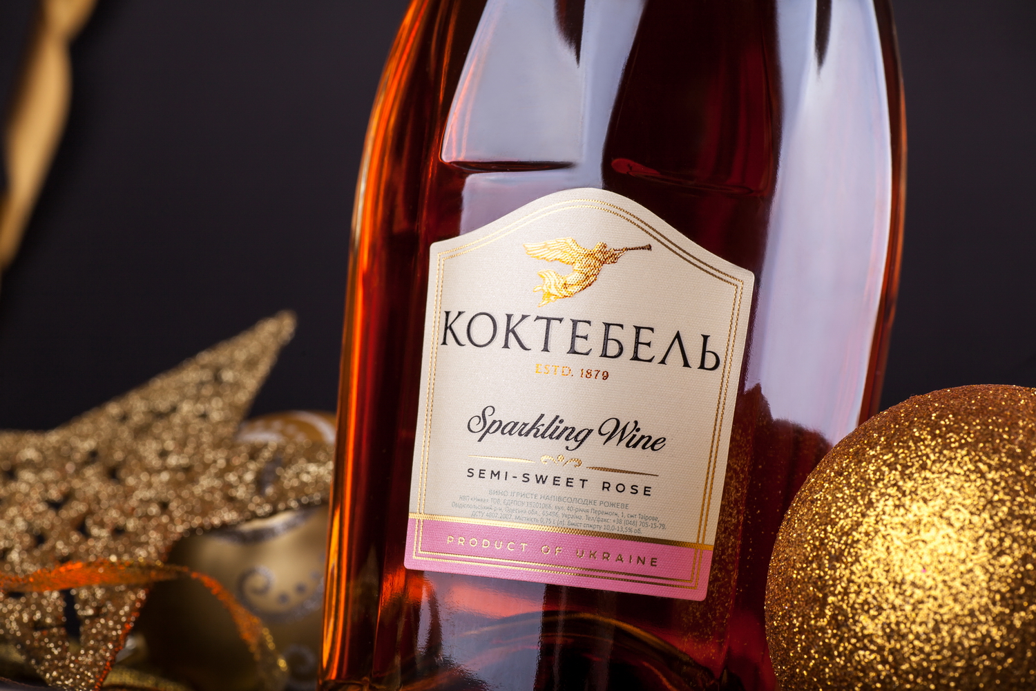
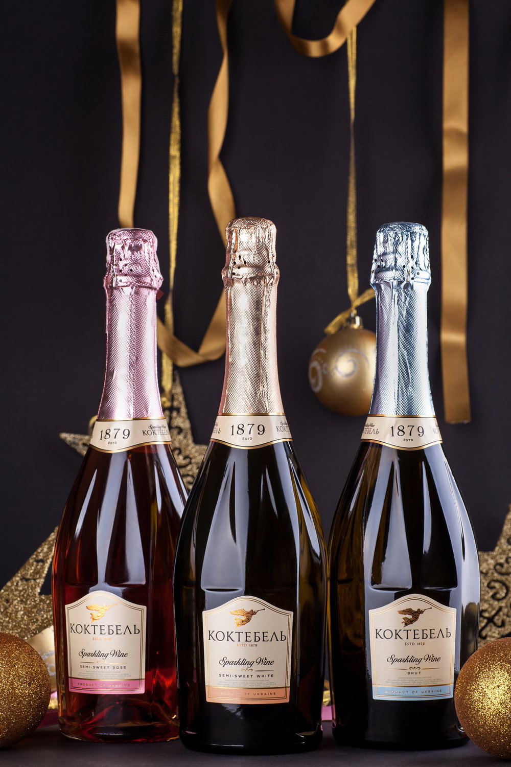
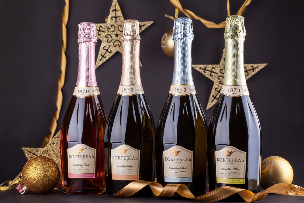
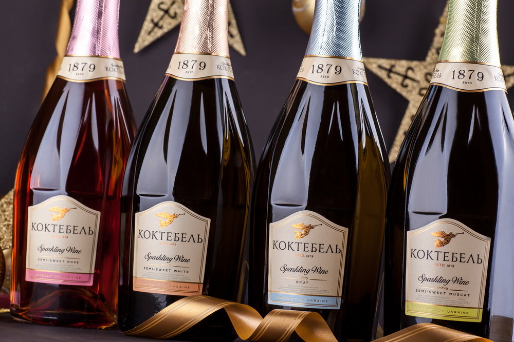
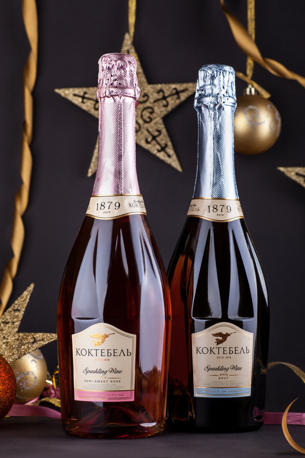
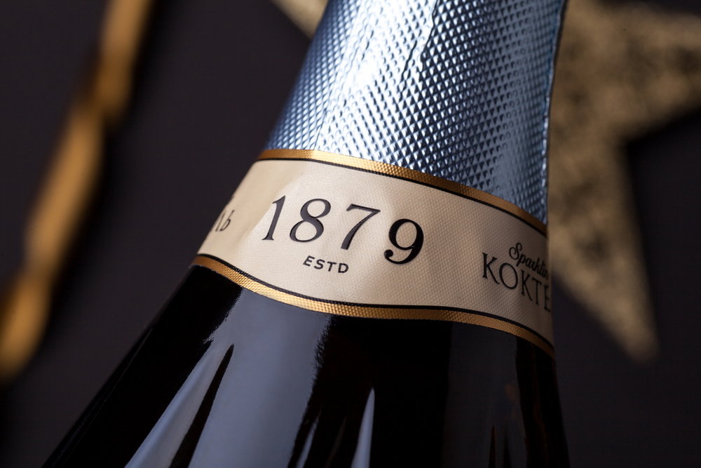
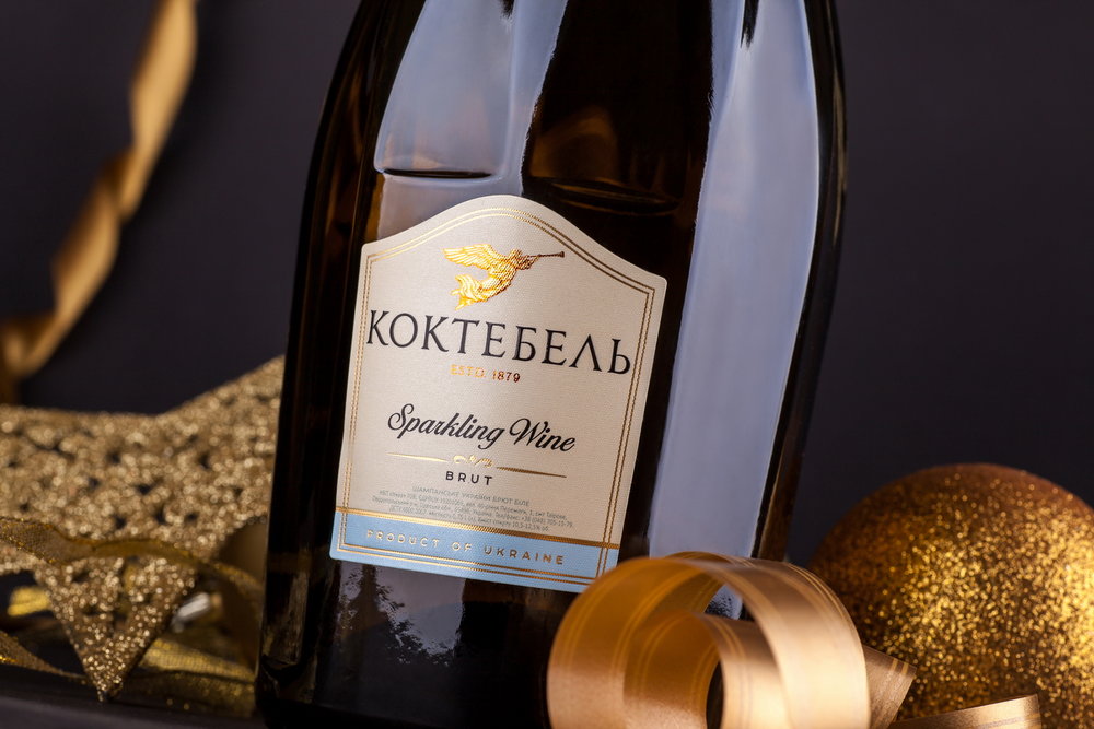
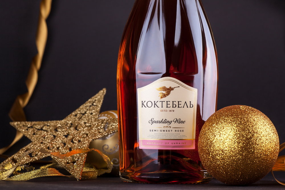
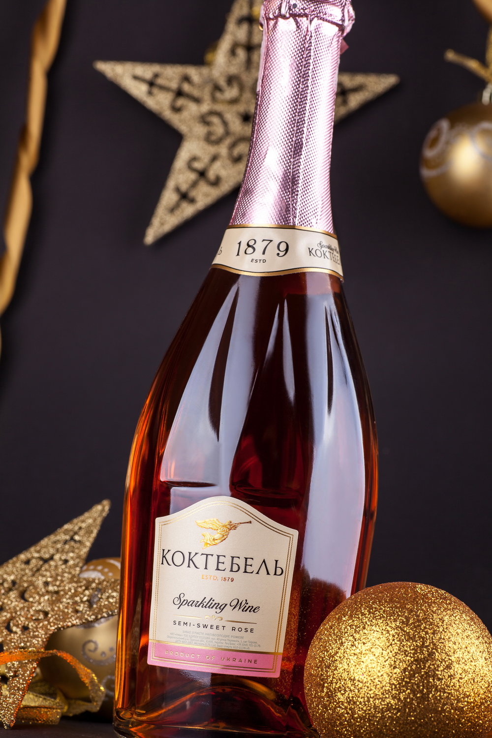
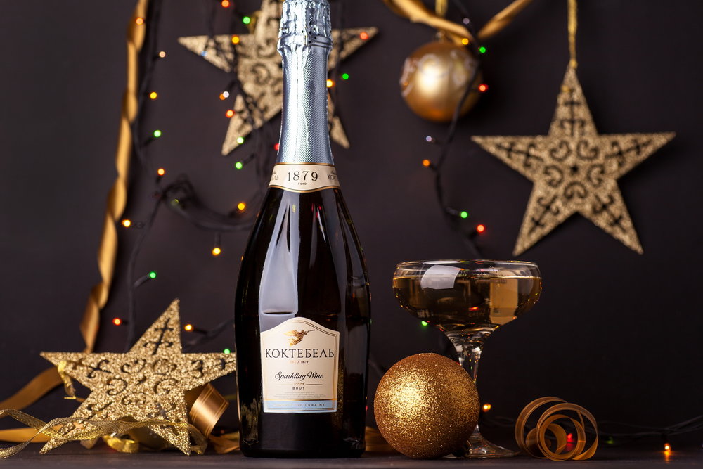
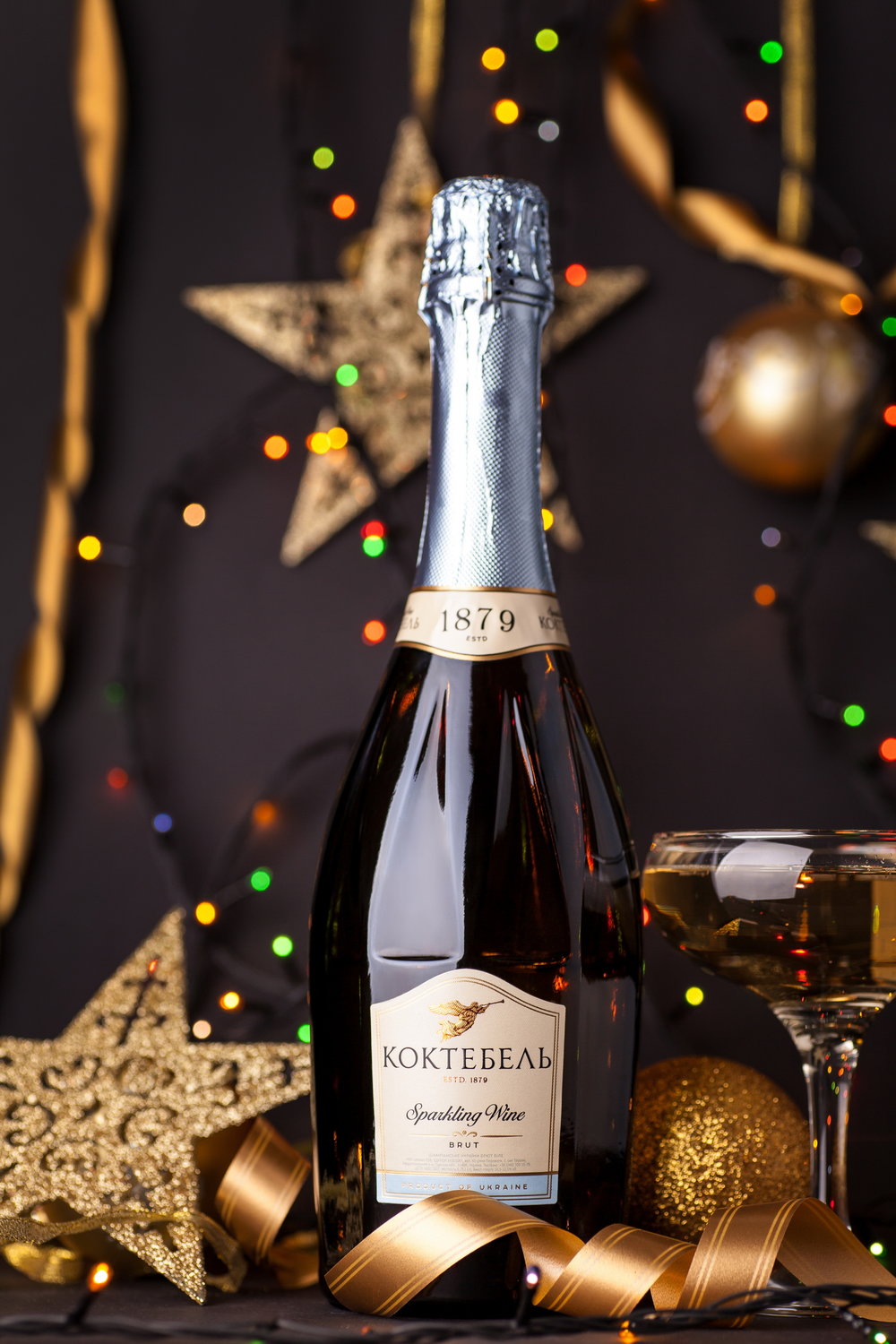
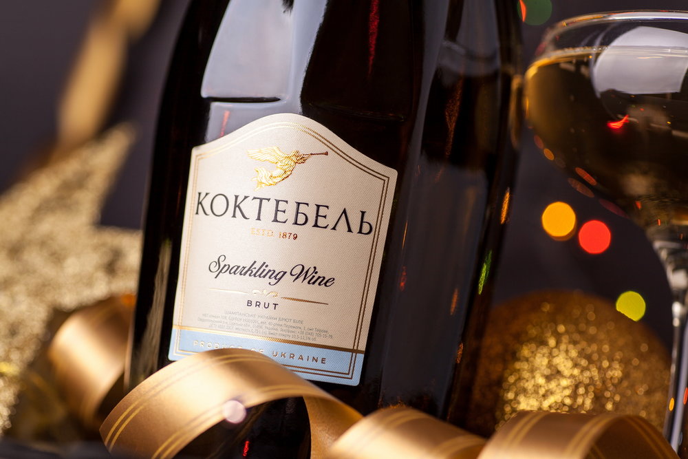
” The development of packaging design for Koktebel sparkling wine was part of a global trademark redesign project performed by our agency. Since sparkling wine is traditionally considered a festive drink in the post-Soviet area, the packaging for this product line had to reflect the mood of the drink, while also corresponding to the renewed style of the brand. Modern, stylish, and at the same time, festive and vivid – this is how the client has envisioned the packaging design for Koktebel sparkling wine.Considering the client’s wishes, we’ve developed a packaging design that echoes the general look of the packaging for Koktebel still wines, while communicating the special character of the product through certain details. Temperate pastel colors, font selection, and the stylized image of an angel at the top of the label – these aspects correspond to the renewed packaging design for still wines. Meanwhile, the use of special pearl paper and the application of post-printing techniques make the packaging more vivid, voluminous, which emphasizes the festive, sparkling character of the drink.”

CREDIT
- Agency/Creative: 43oz.com Design Studio
- Article Title: 43oz.com Design Studio – Koktebel Sparkling Wine
- Project Type: Packaging
- Format: Bottle
- Substrate: Glass


