


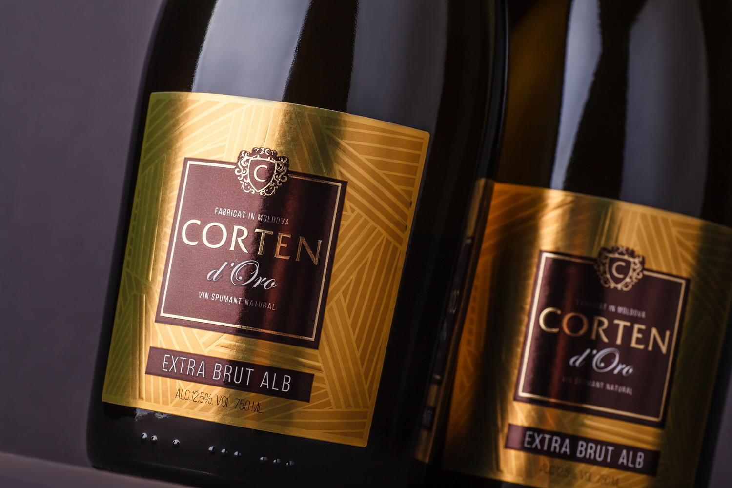

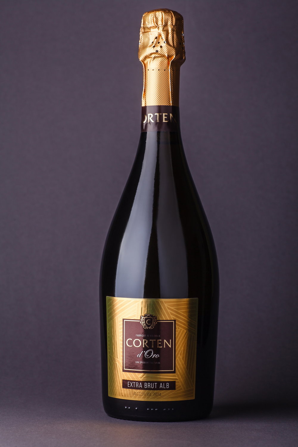
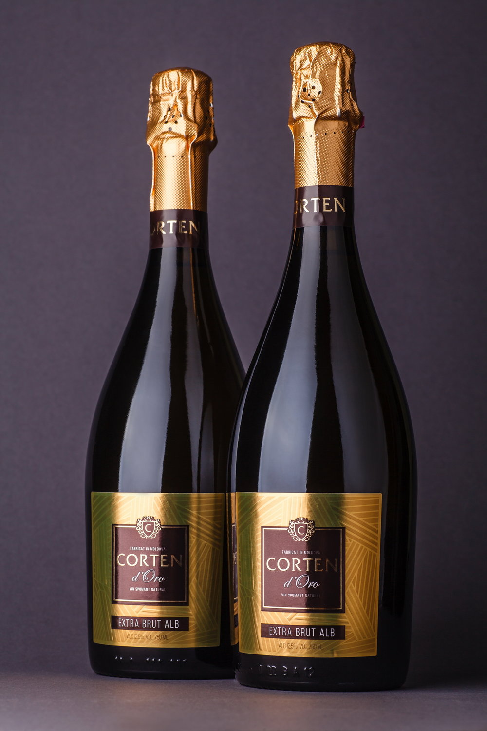
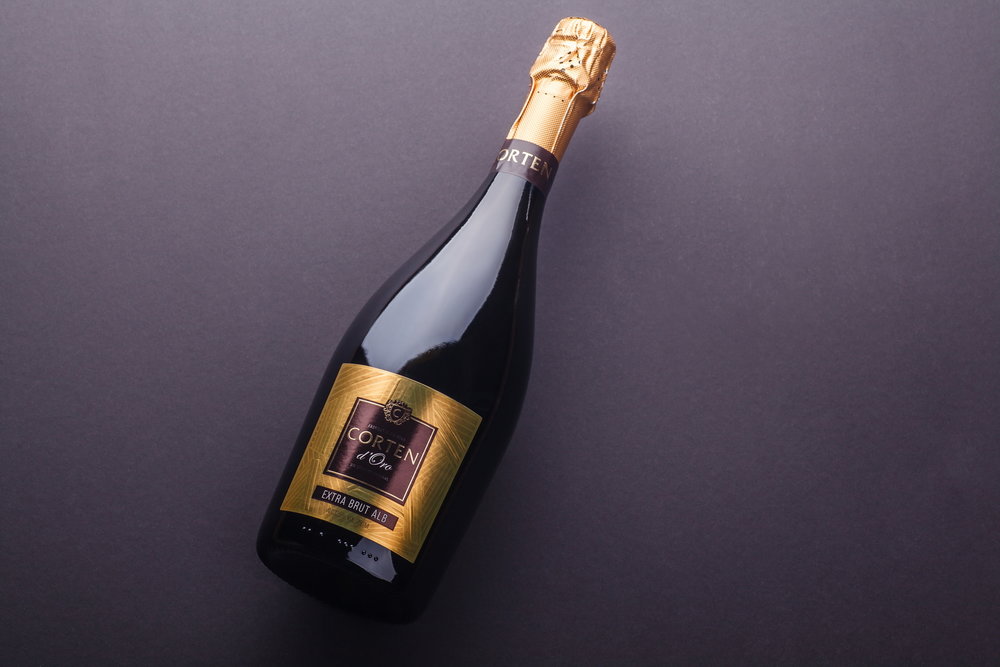
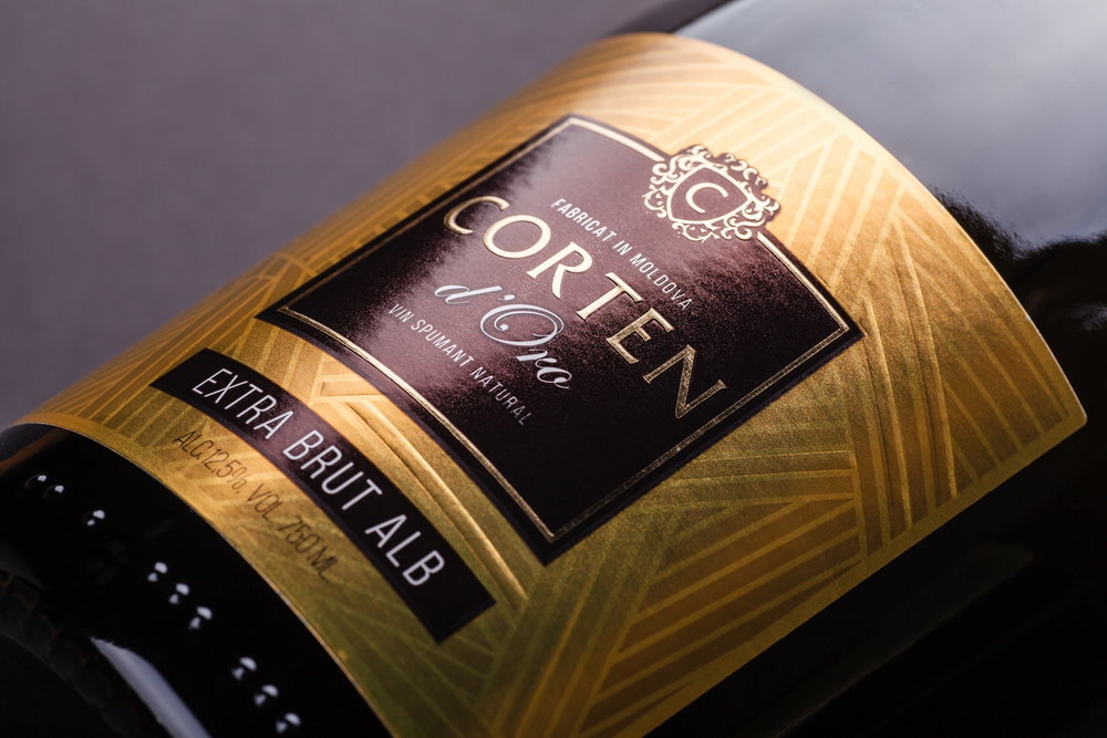
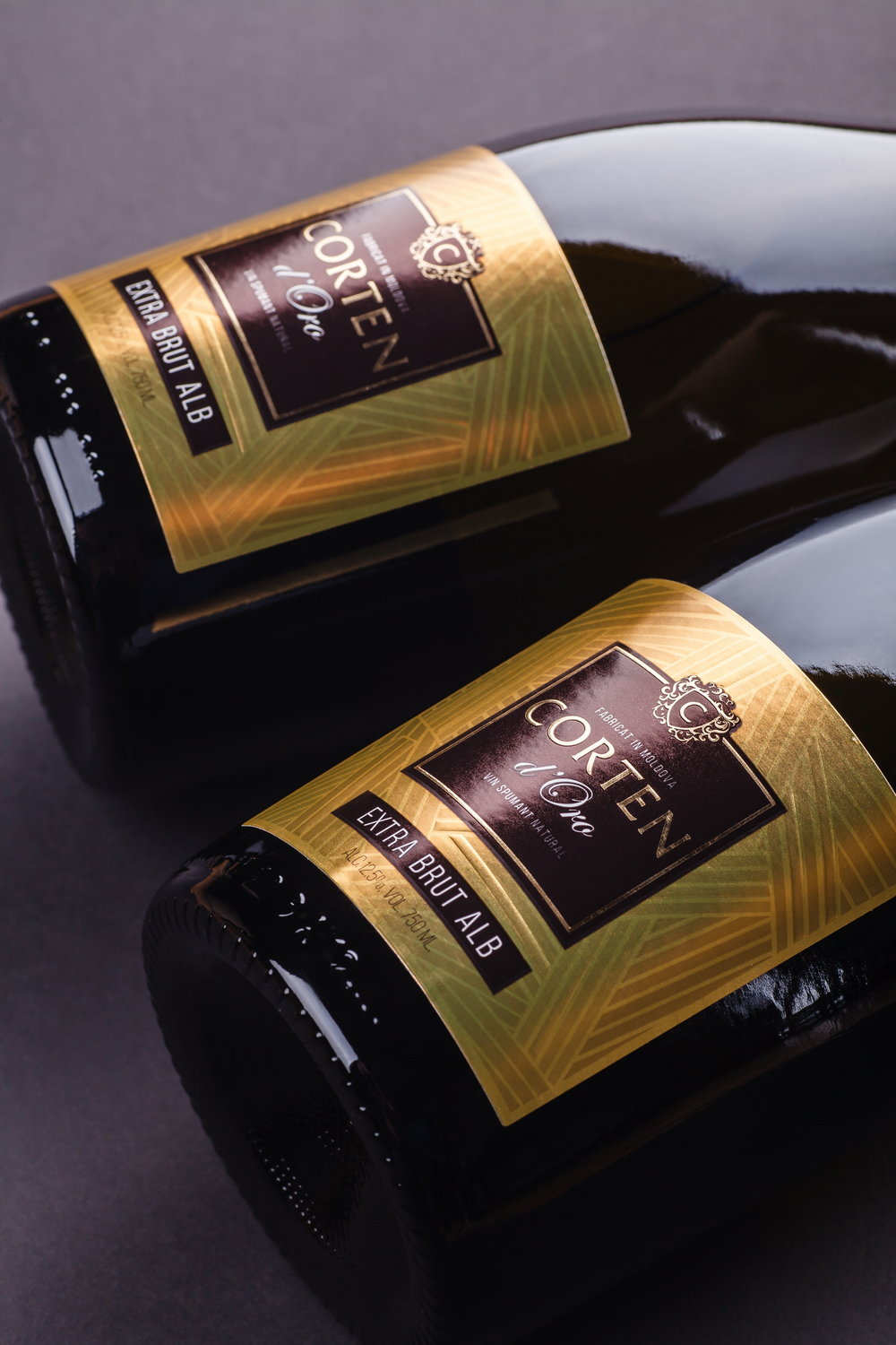
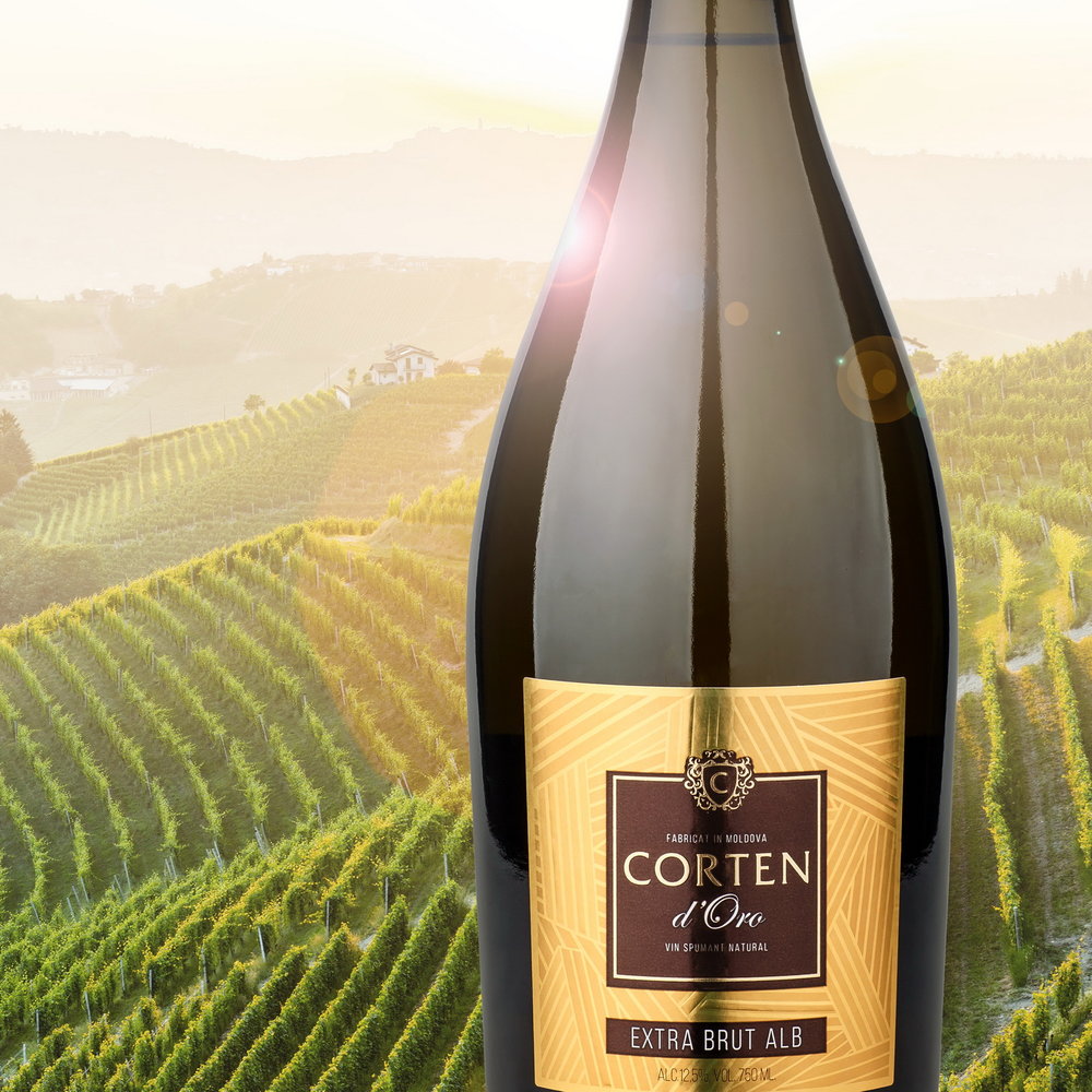
” Corten d’Oro is a logic succession of the product line under the Corten brand. In this case the producer has decided to create a sparkling wine by employing the classic Italian prosecco production technique. As a result, Corten d’Oro is a dry extra brut, light, refreshing, ideal for various occasions. These characteristic were exactly what the packaging design for this product had to reflect.The design concept follows the common graphic elements in the packaging of other Corten products. The main graphic pattern that serves as the base element for the label, is a stylized metaphor of the geometric character of the fields located near the production area of the wine. However, unlike other Corten products, this label was printed on metalized paper, which is rather common for prosecco wines, and used a golden color scheme that emphasizes the effervescent and festive character of the drink. As a result, the packaging design for Corten d’Oro looks both neat and vivid, which fully corresponds to the trademark’s spirit.”
CREDIT
- Agency/Creative: 43oz.com Design Studio
- Article Title: 43oz.com Design Studio – Corten D’Oro
- Project Type: Packaging
- Format: Bottle
- Substrate: Glass


