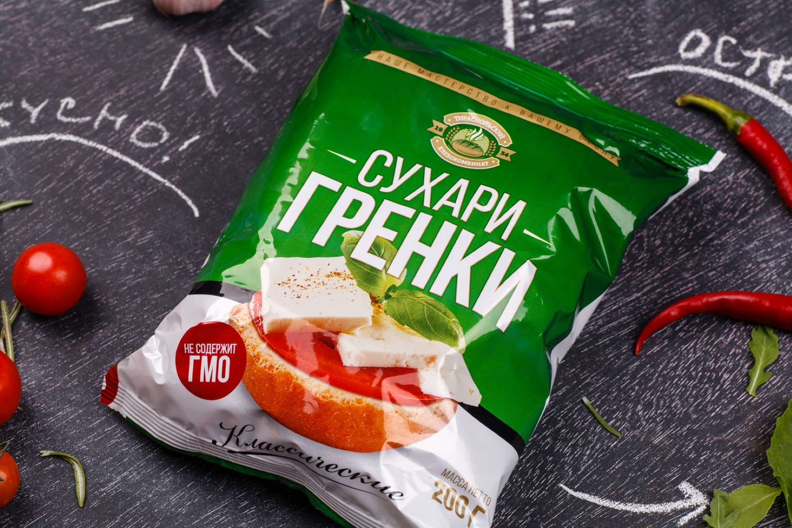
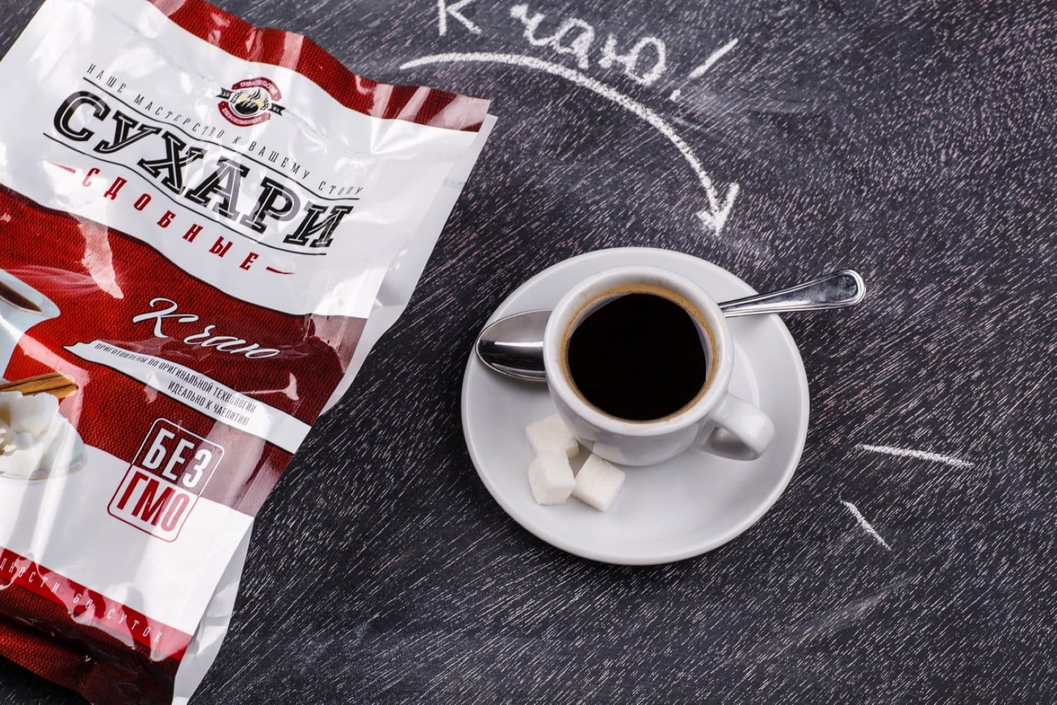
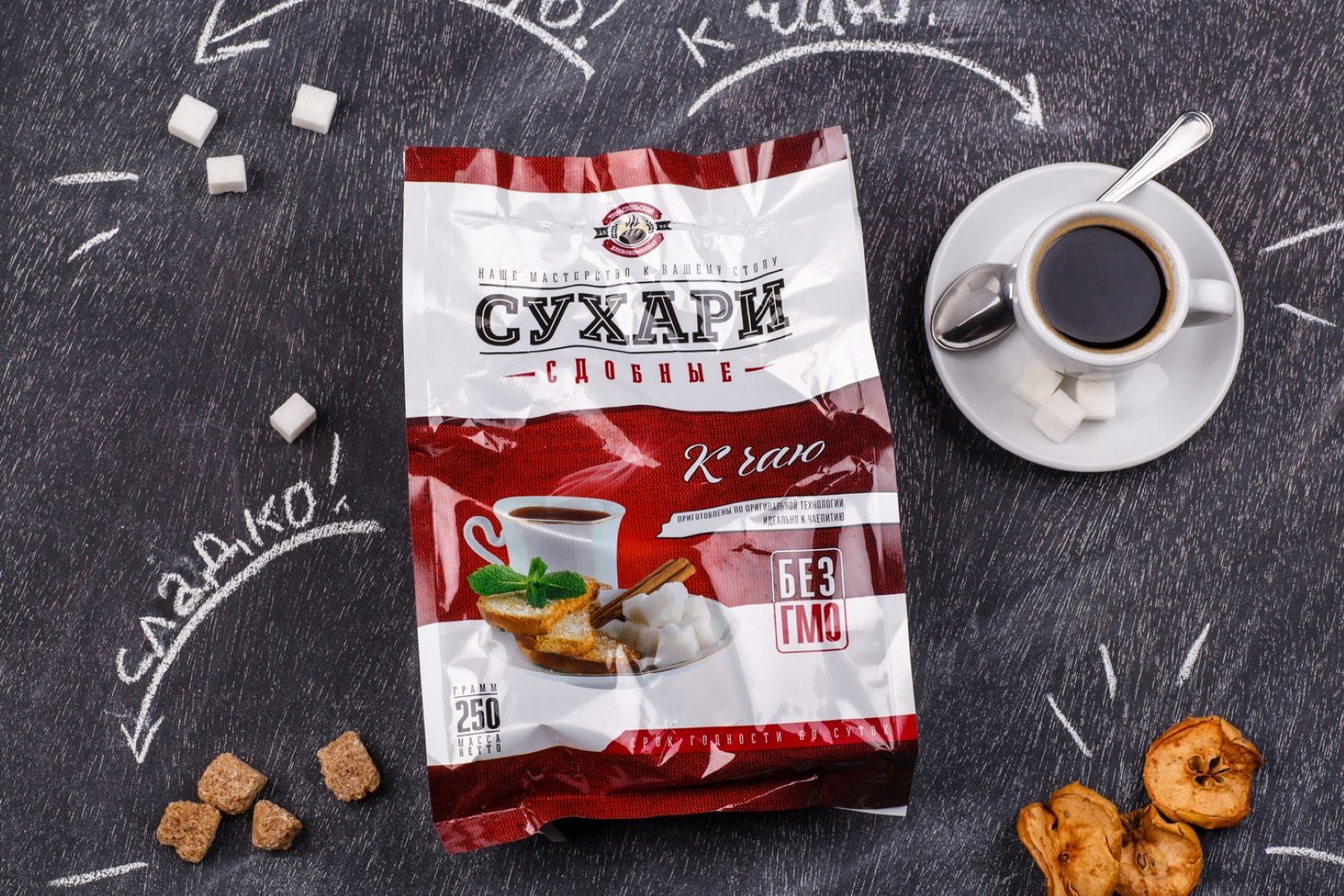
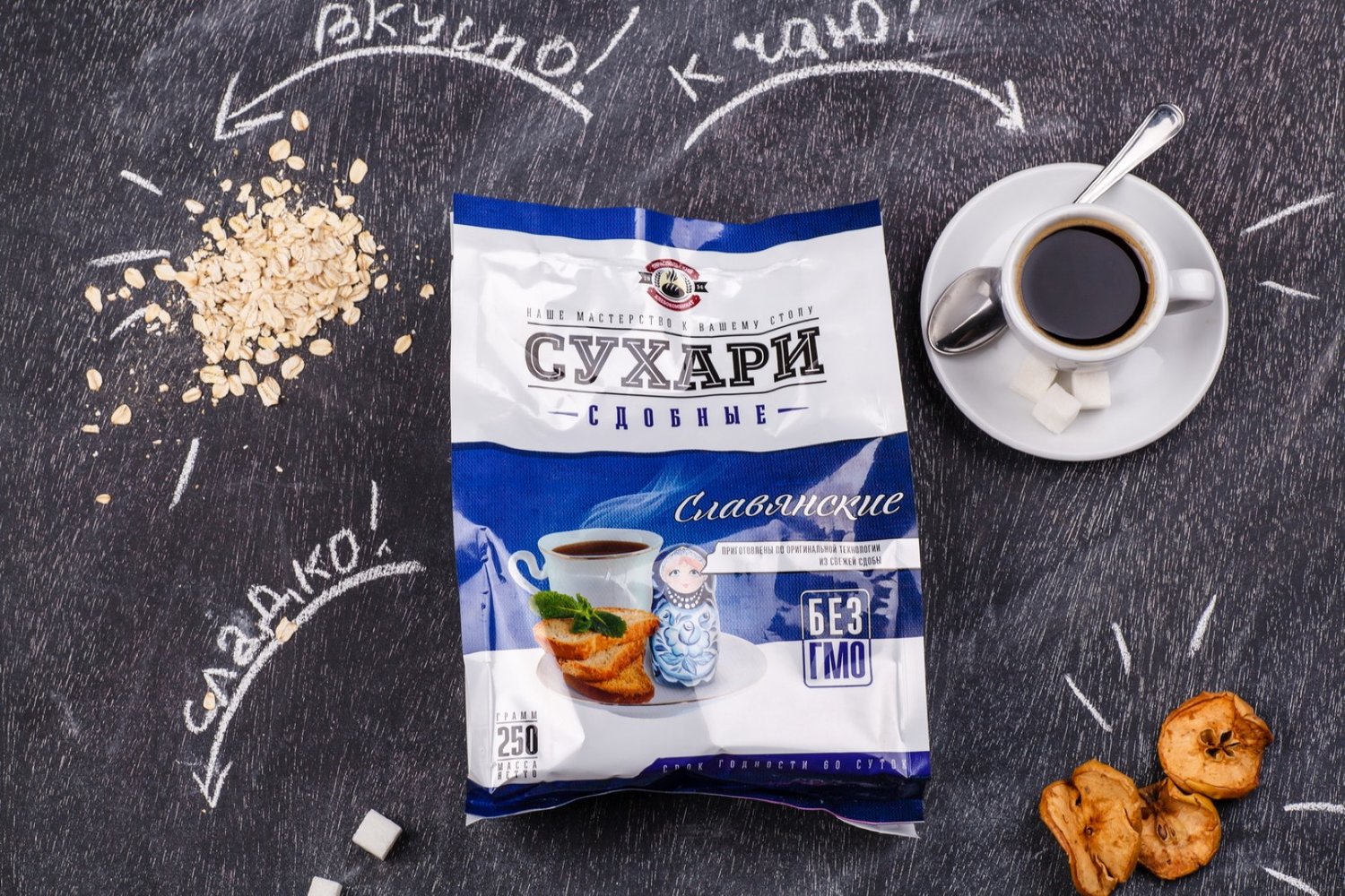
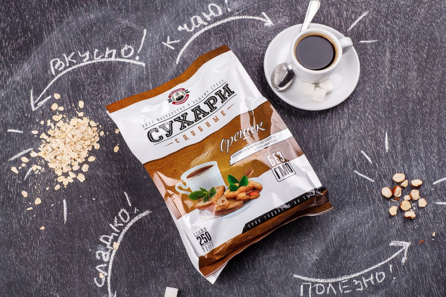
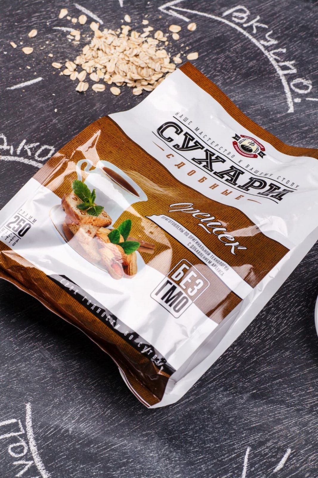
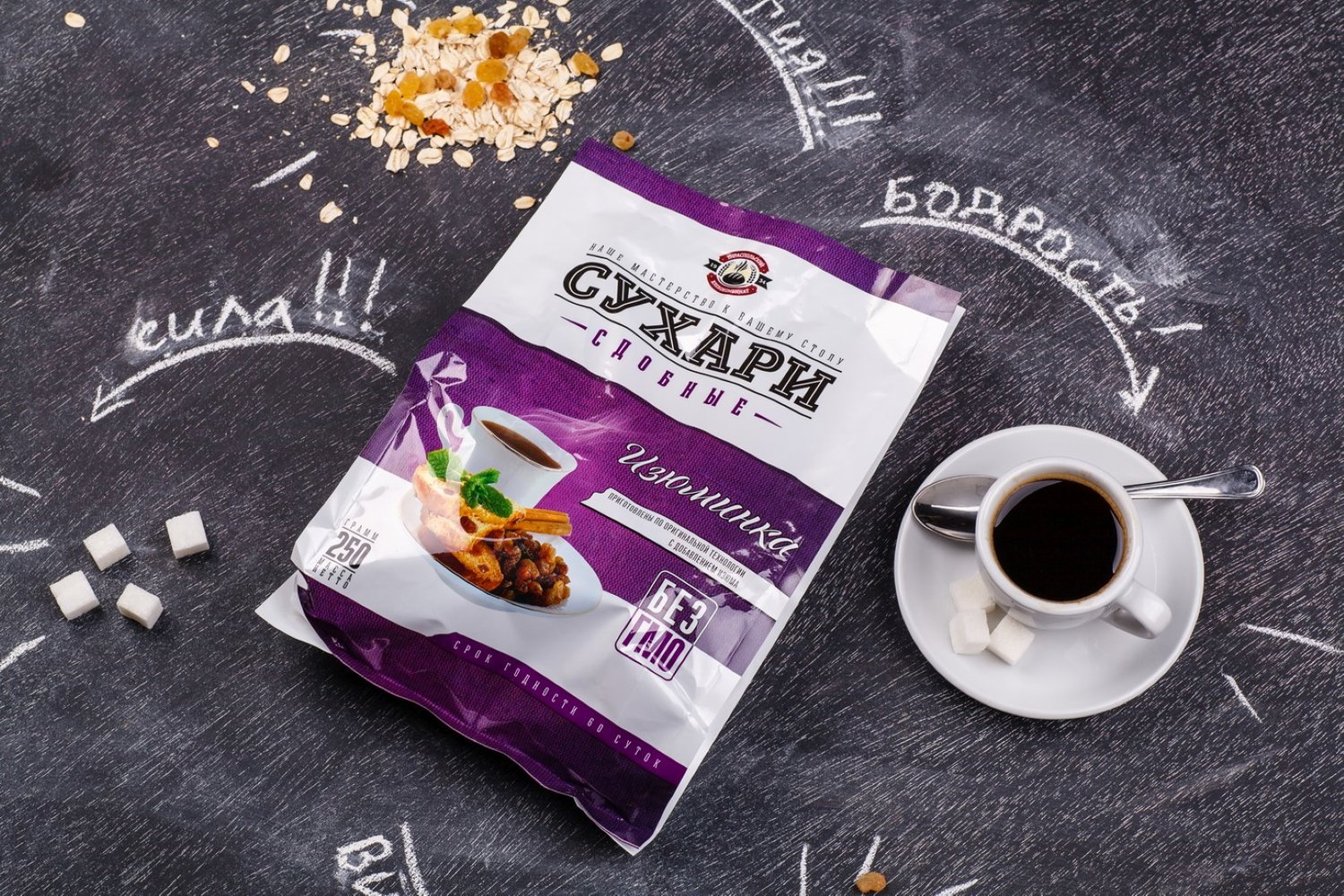
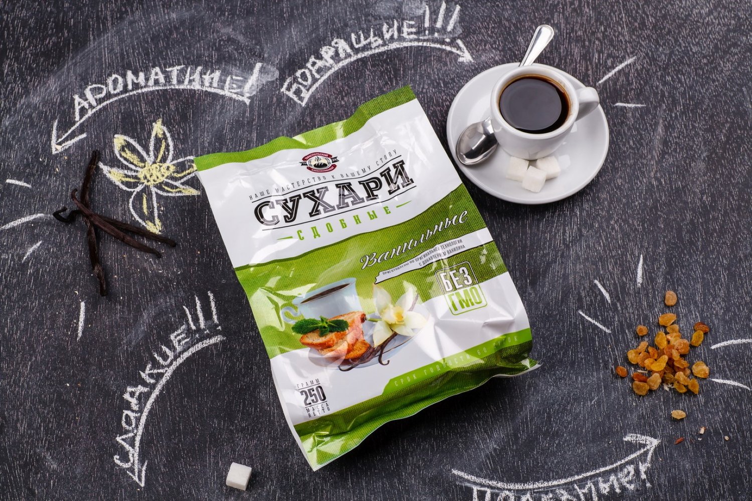
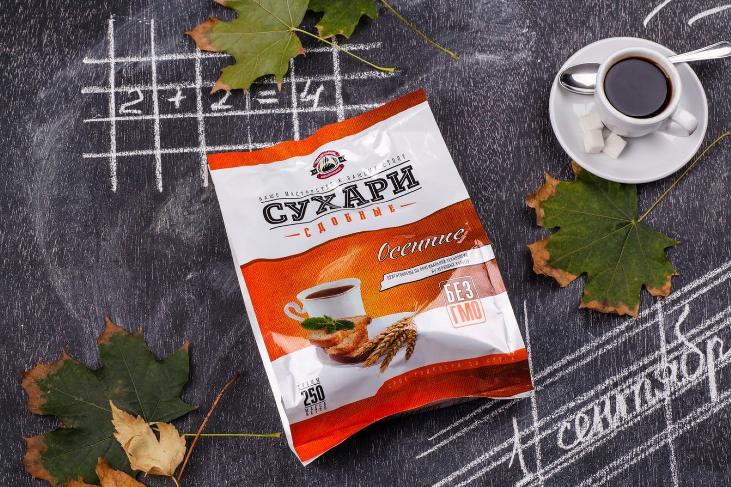
” The Tiraspol Bread Factory has been poducing various bread rusks for years, selling them in a rather simple packaging on the local market. So when a few of their products were contracted for a redesign, it became apparent that the rusks need a modern packaging that would reflect the quality and diversity of the product. Vivid, informative, and interesting – that’s how the product should look, and these were the variables the agency focused on when creating the new packaging design for the bread rusks produced by Tiraspol Bread Factory.
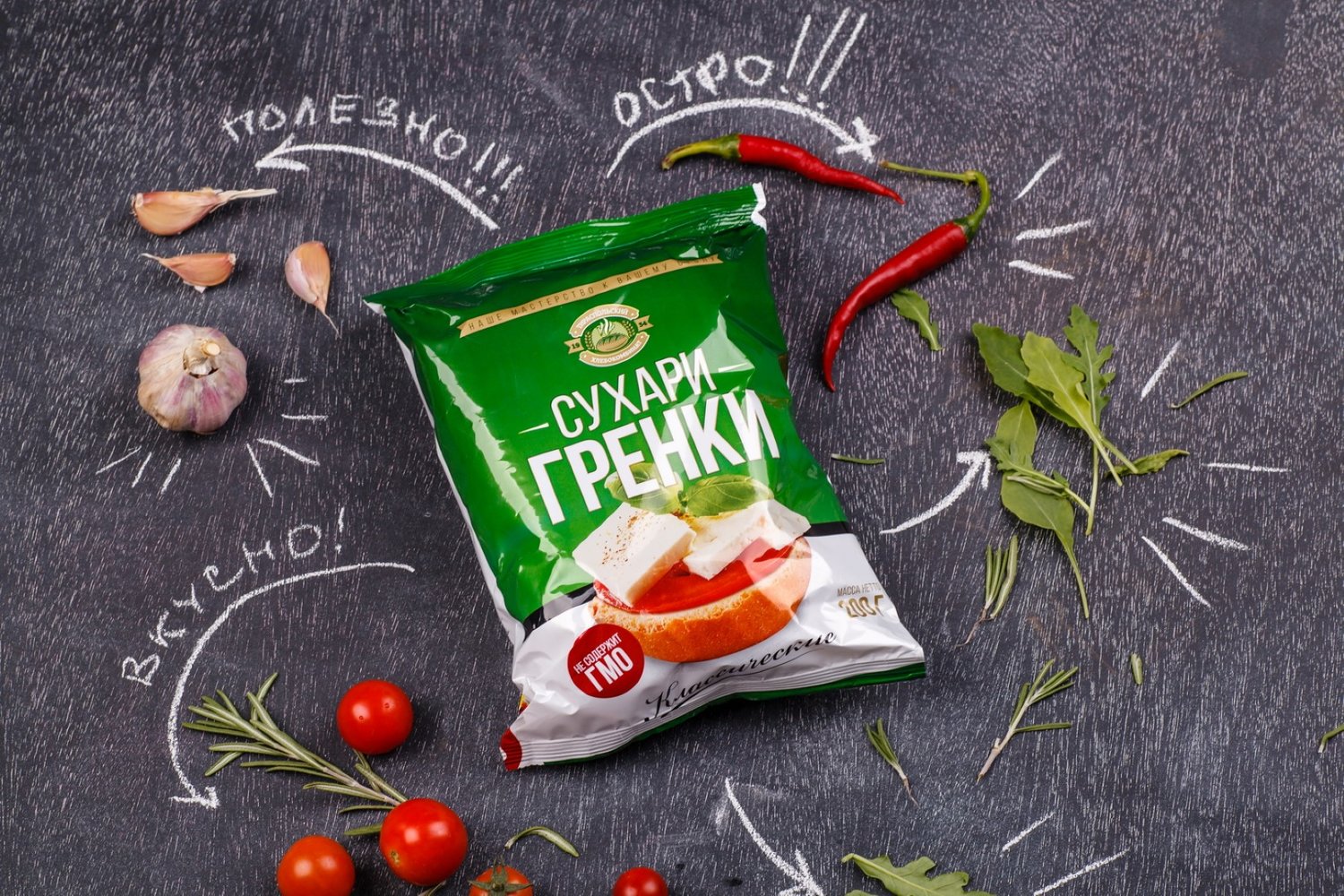
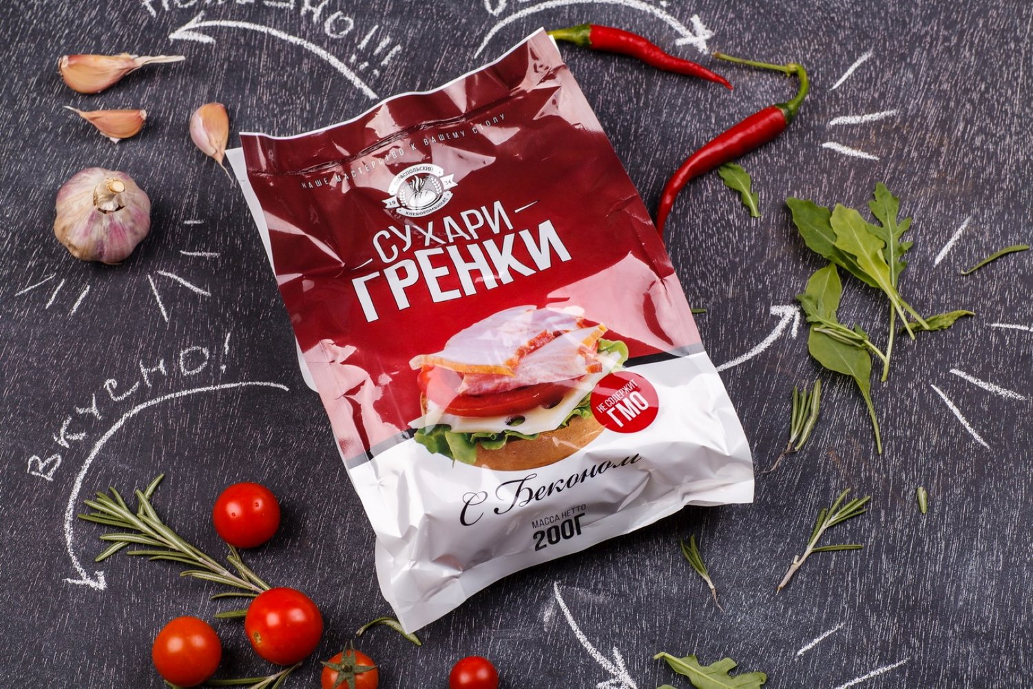
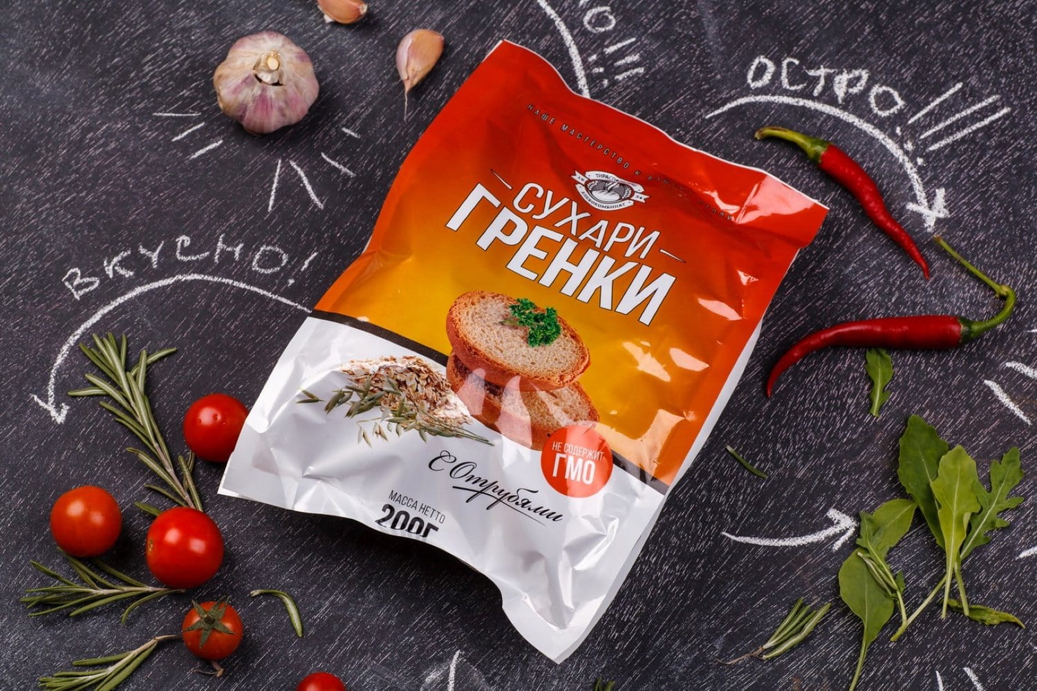
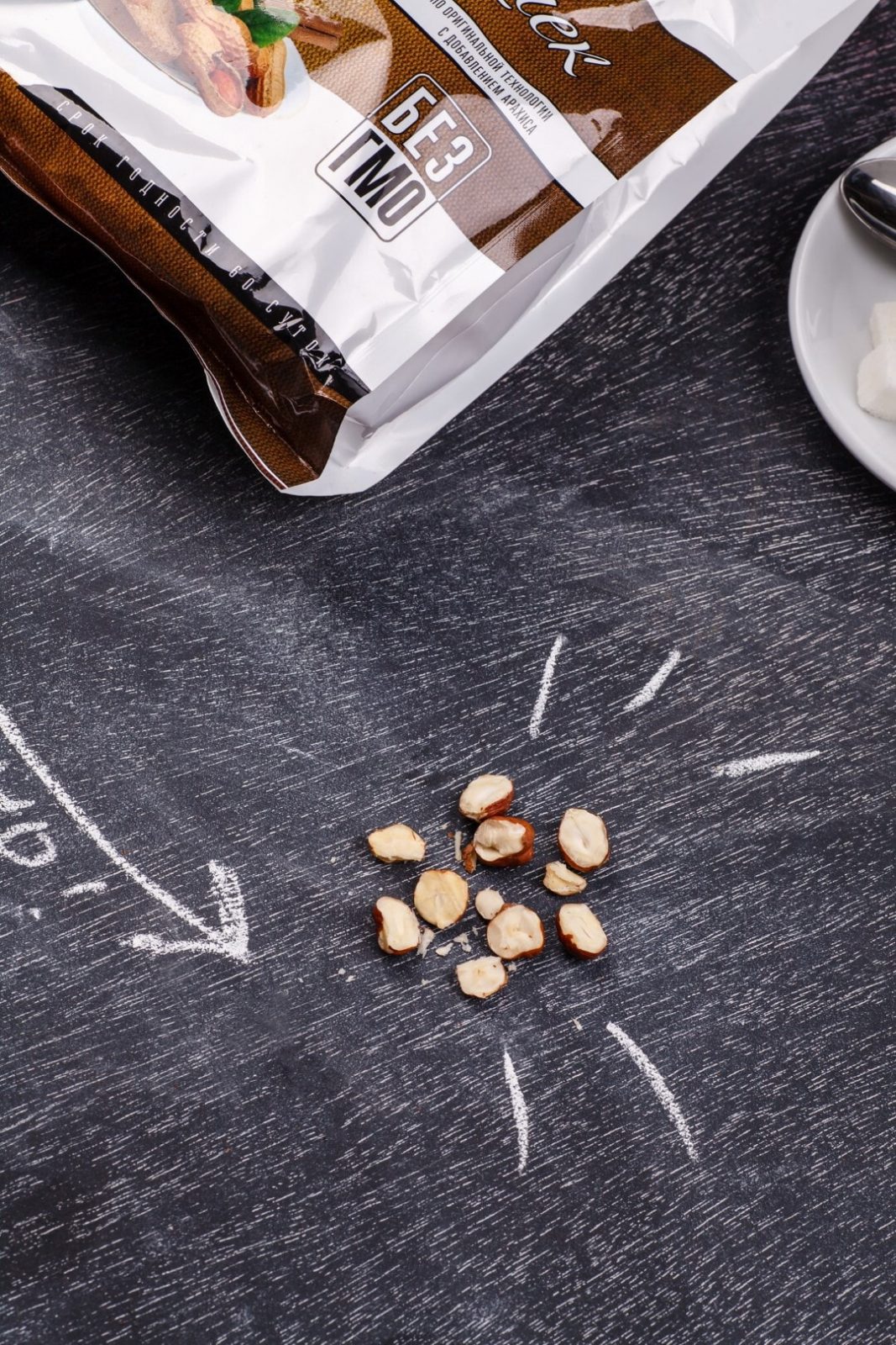
The main trait of the design created by our agency is its informative and graphic character. One of the main elements in the packaging is the photorealistic illustration of the product presented in the context of its possible consumption. For example, rusks with raisins are shown with whole raisins and a cup of tea, with which the product will probably be consumed. Rusks with bacon depict a sandwich with bacon, which reflects the general flavor. Thus, each product in the line is represented graphically through photo images, while the clear and bright graphic elements and color schemes make the packaging more attractive and informative.”

CREDIT
- Agency/Creative: 43oz.com - Design Studio
- Article Title: 43oz.com – Design Studio – Bread Rusks Packaging Design – Tiraspol
- Project Type: Packaging
- Format: Bag
- Substrate: Plastic


