We, as a design studio, are always pleased to see how our projects evolve, and how over time, the brand, which we invested our skills and effort into, grows from a small undertaking into something bigger. The family-owned Gogu Winery is a great example of such a relationship. Starting small, this company has already taken up a solid place in the Moldovan wine market, and has won several dozen awards at international wine competitions. And we are very happy to be responsible for the visual component of this brand in sync with their evolution and ceaseless experimentation. Therefore, when winemaker Ilie Gogu shared his plans to release a limited series of dry sparkling wines produced by traditional method, we realized that we had to create a design that would personify the next stage in the development of Gogu Winery.
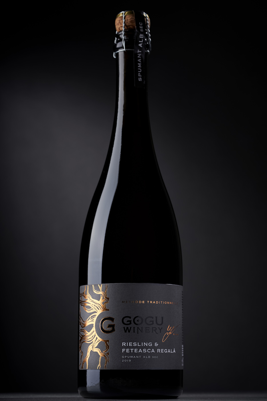
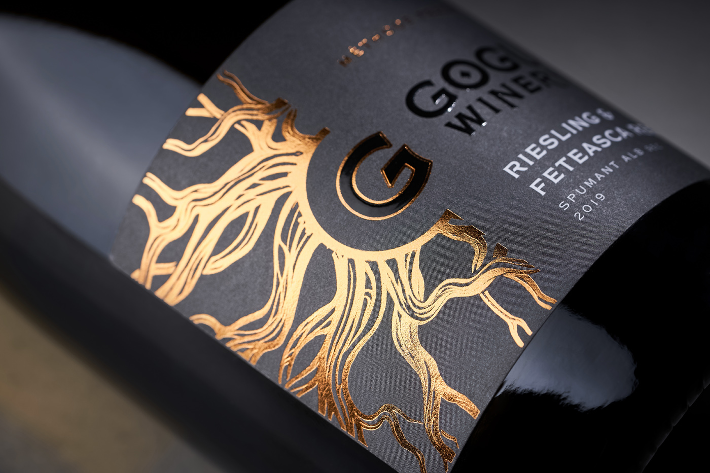
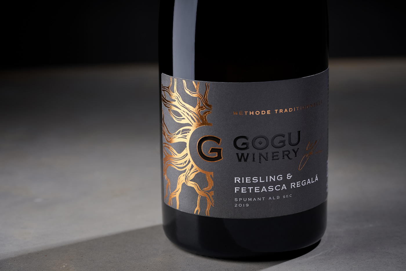
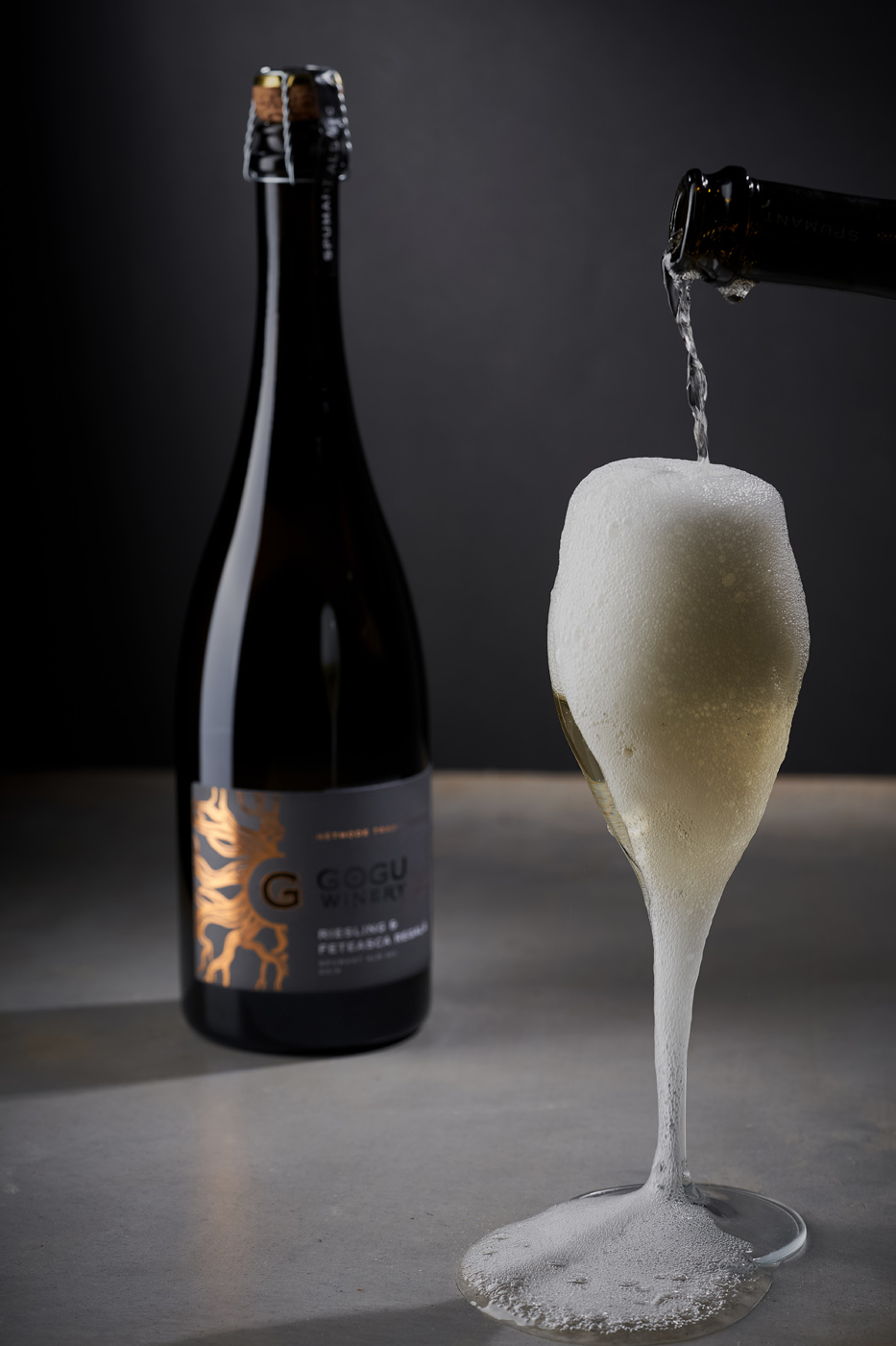
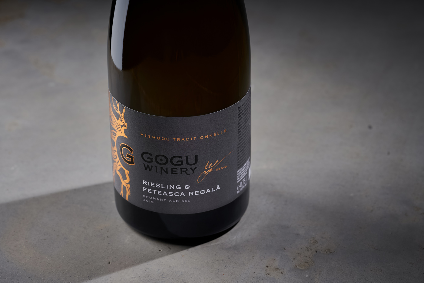
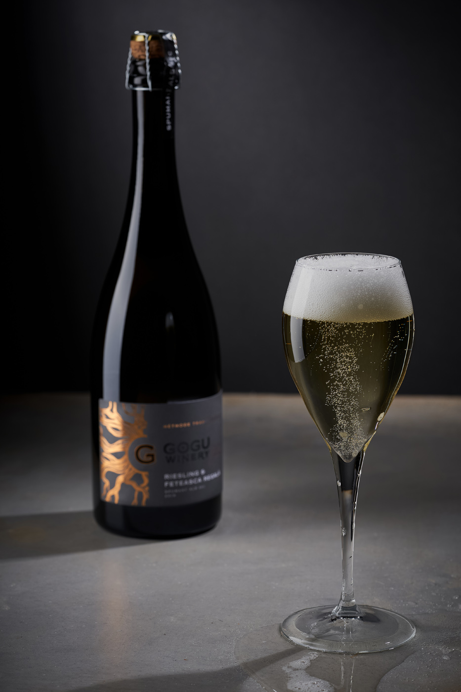
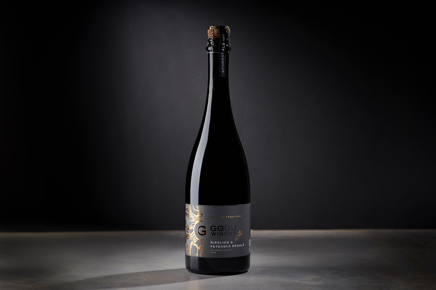
The label design for Gogu Spumant is both a familiar image and a complete rethinking of the entire brand concept. On the one hand, the label contains the already familiar image of roots, which personifies the connection with the land, with native places, with the terroir of the winery. However, this element has been transformed in such a way that it can also be viewed as the sun, which gives warmth and life – an effect enhanced by intense gold foil stamping. Discreet and minimalistic informational elements support this bright element and enhance the feeling of exclusivity and premium character of the product. As a result, the visual component of Gogu Spumant organically fits into the overall portfolio of the winery, retaining the key brand elements, while also emphasising the special character of this wine.
CREDIT
- Agency/Creative: 43oz - Design Studio
- Article Title: Gogu WInery Sparkling Wine Lable Design
- Organisation/Entity: Agency, Published Commercial Design
- Project Type: Packaging
- Agency/Creative Country: Moldova
- Market Region: Europe
- Substrate: Glass, Pulp Paper


