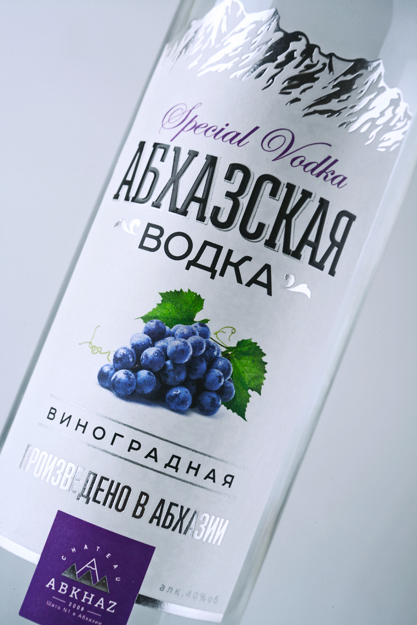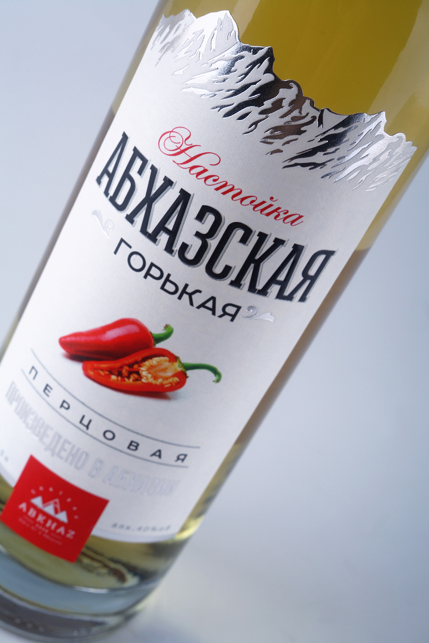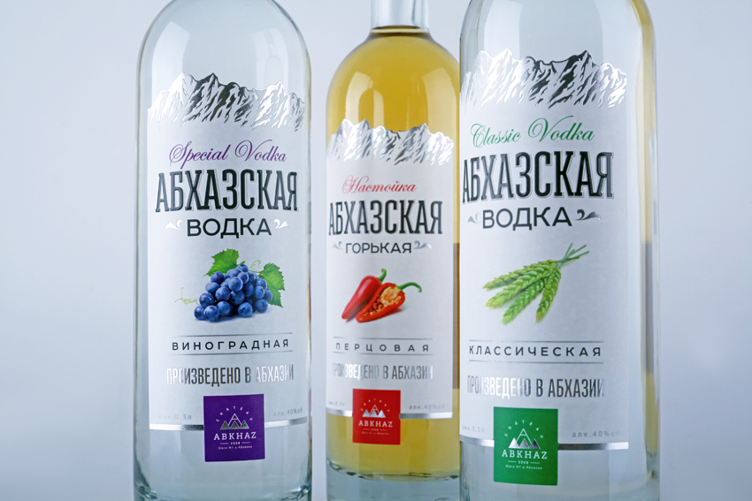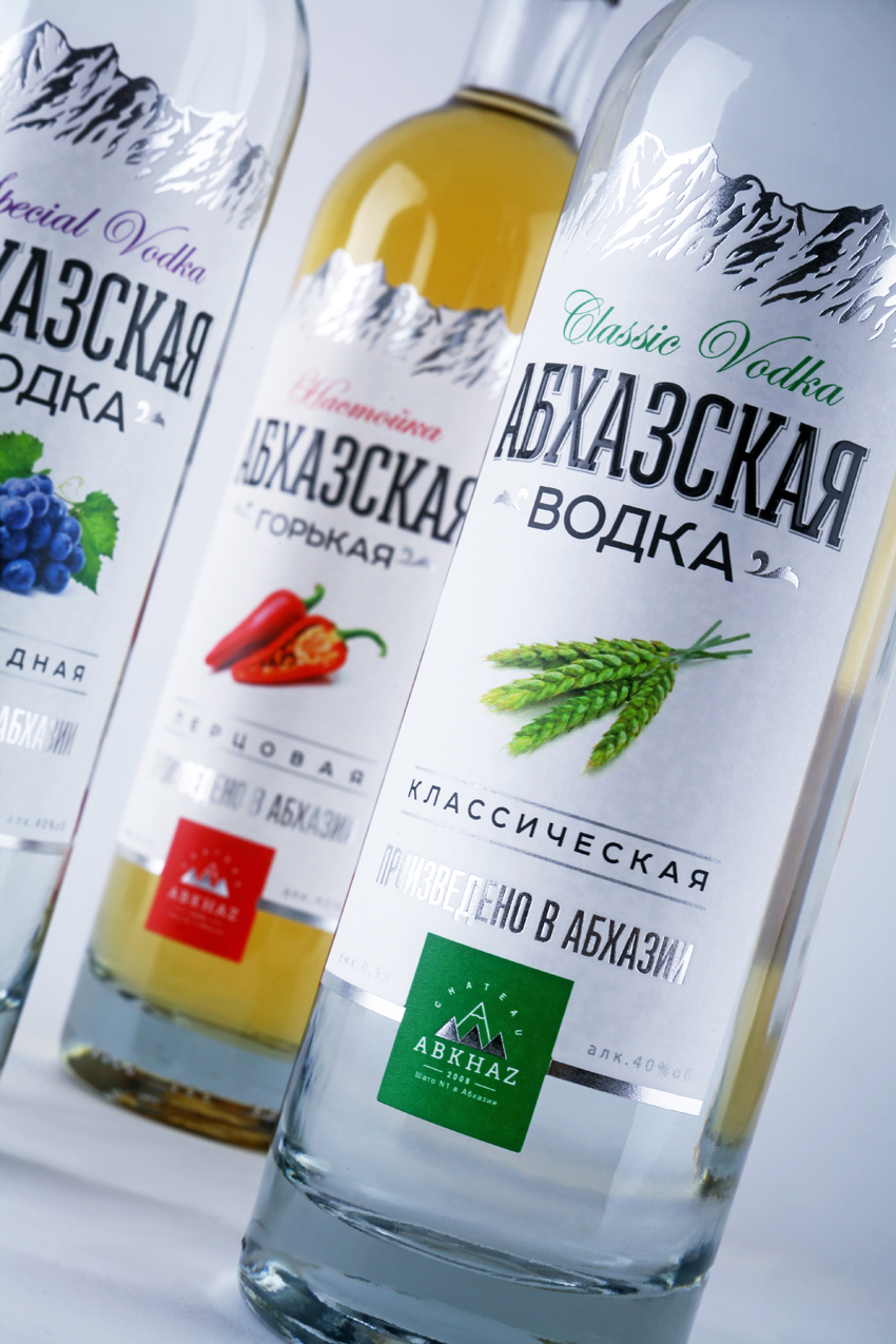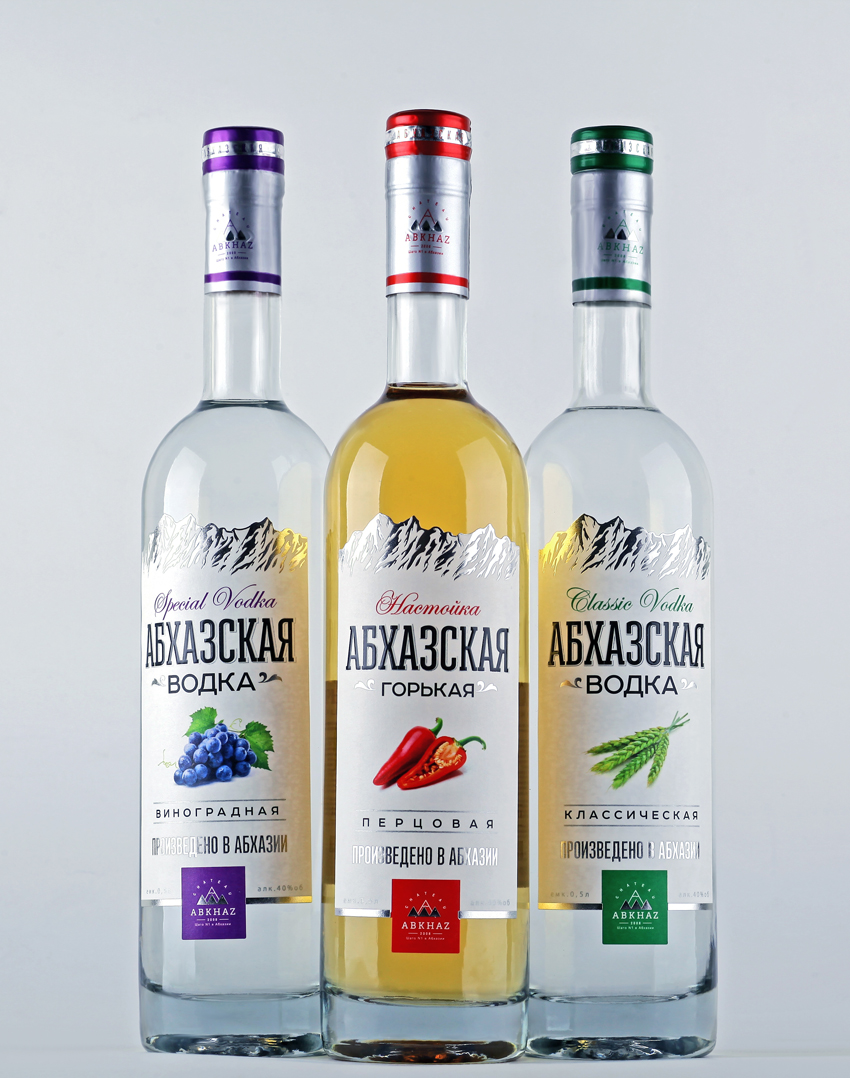
“Design studio 43’oz was tasked to develop visual concept for a series of top-grade vodka “Abkhazskaya”. Because of the name we create and image/identity based on ethnicity, history, cultural and national values of Abkhazia.White colour as a symbol of purity and transparency together with the silver (foil) emphasizes the high state of a product. Product line is presented by 3 flavours where bright, colourfull solid plate together with juicy illustrations allows customer to differ the favourite taste easily.”