


When kids talk, brands listen. The rebranding for Pharmasept Kids personal hygiene products was motivated by the fact that kids grow faster than we think.
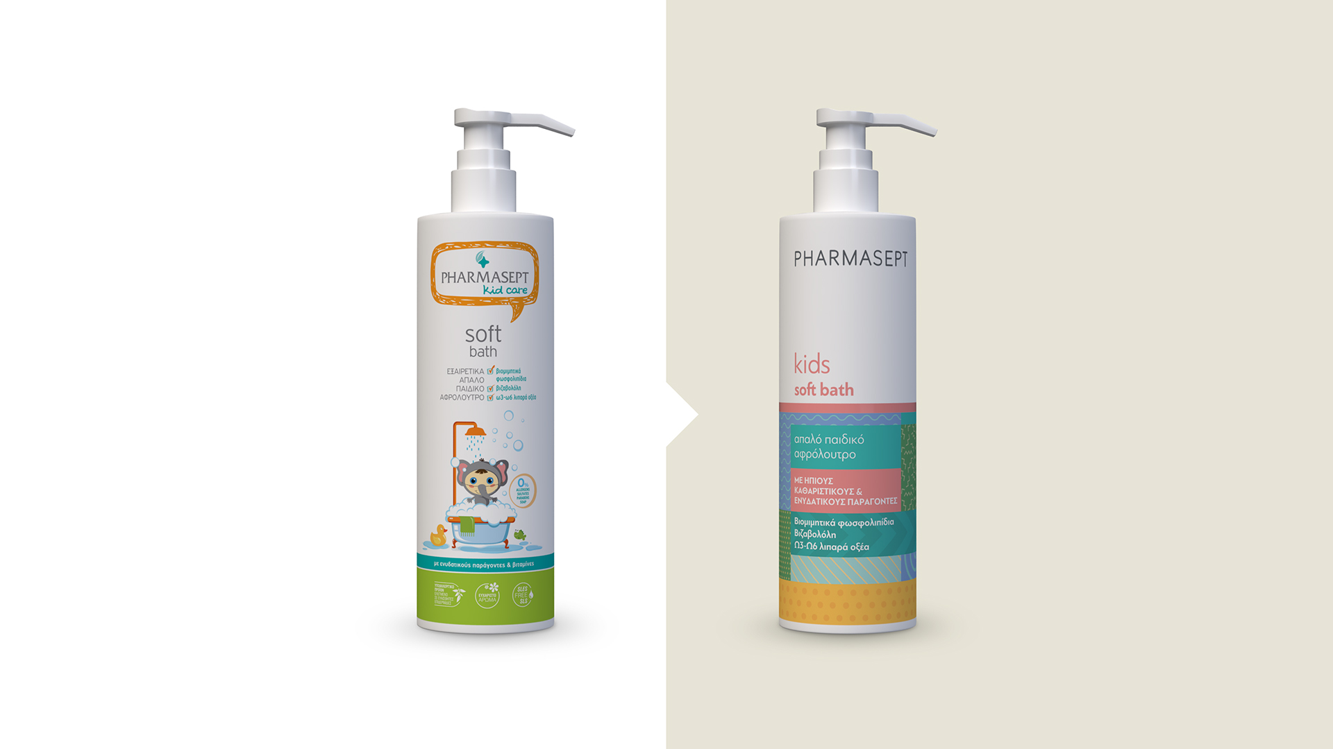
Pharmasept is a leading Greek company, with a range of top-quality pharmacy products. Having a best-seller in its range of infant hygiene and care products, the brand wished to maintain its fan-base among the mothers of older children. However, the packaging of the kids’ sub-brand failed to meet with children’s approval, as being too “childish”. Today’s kids mature rapidly, and quickly get over the symbols of childhood, while it seems that everything around them (technology, SoMe) is pushing them towards puberty. Pharmasept’s previous packaging meant that kids felt uncomfortable about their mothers choosing a “childish” product for them.
We responded to the brief by working on two elements:
a. by designing packaging that would launch the brand new Pharmasept house-style to be adopted by all of the brand’s ranges;
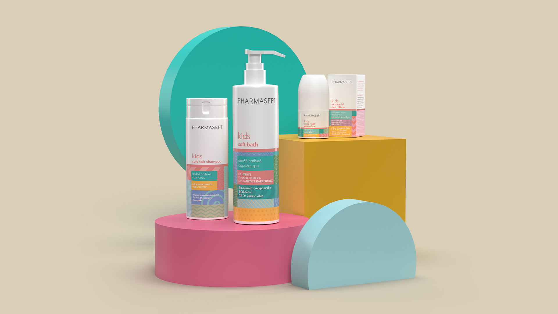
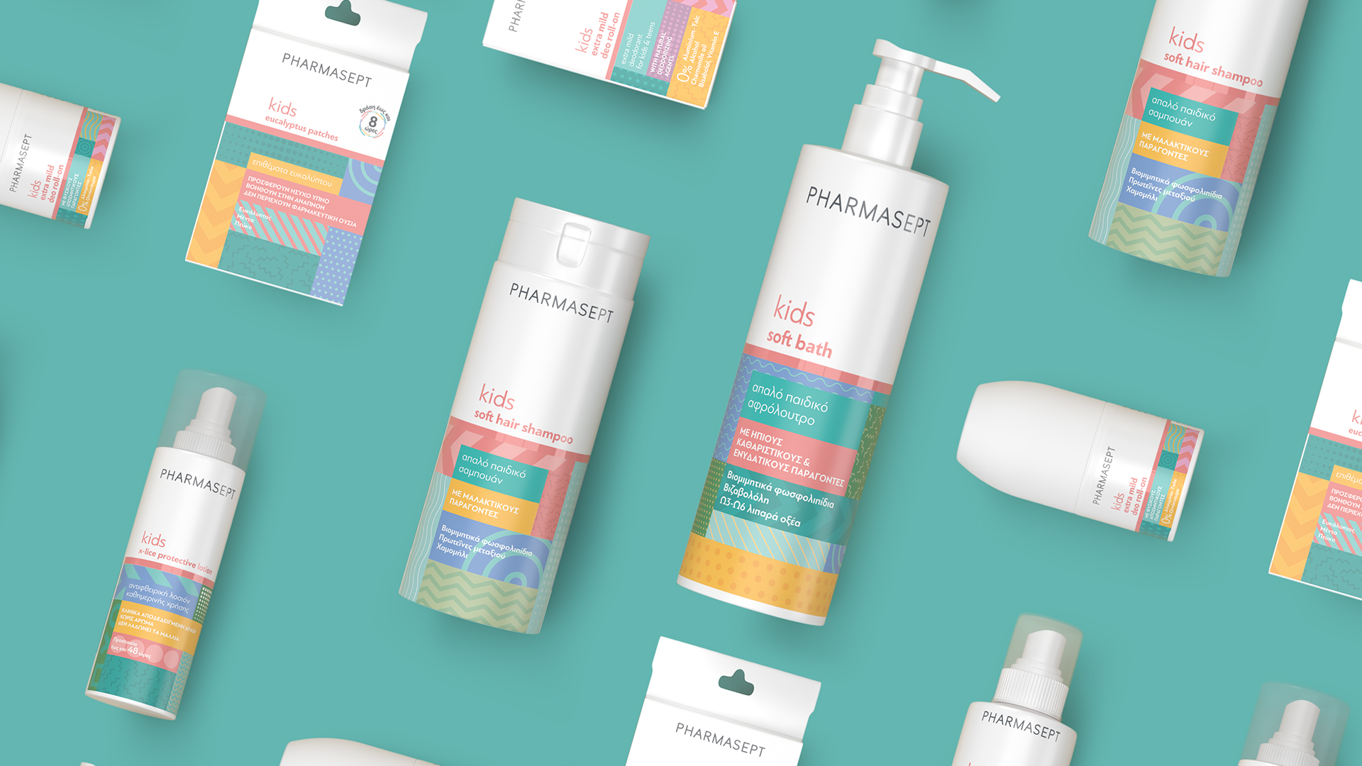
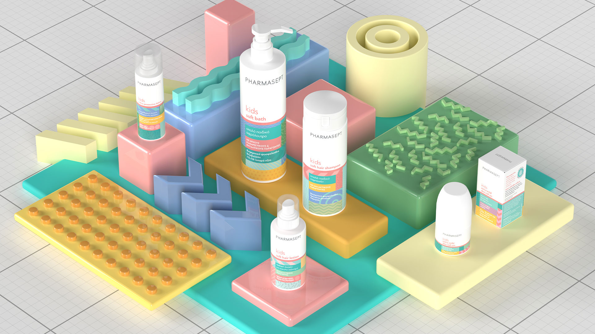
b. by giving the kids’ range an independent, pop character that would attract older children.
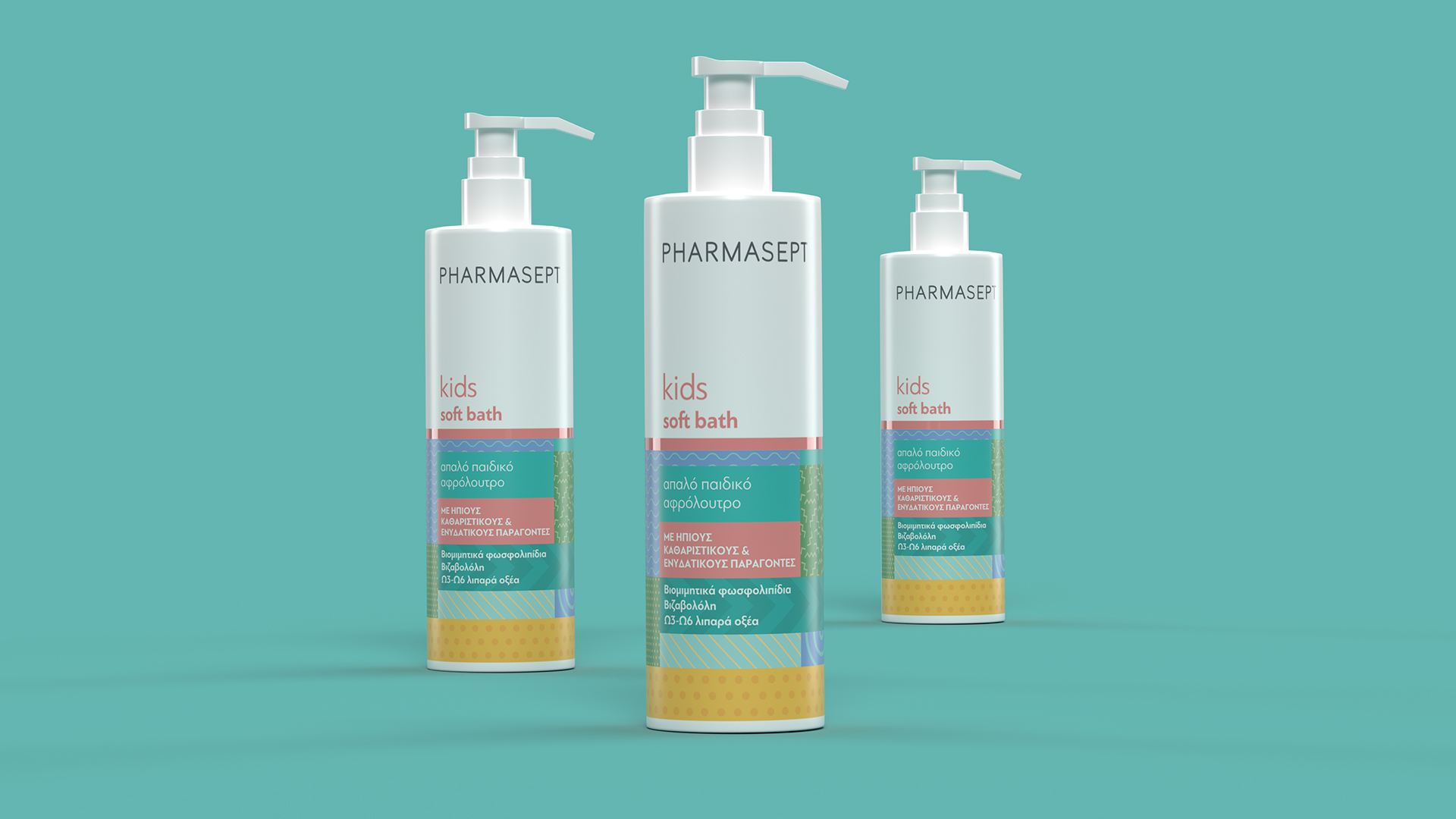
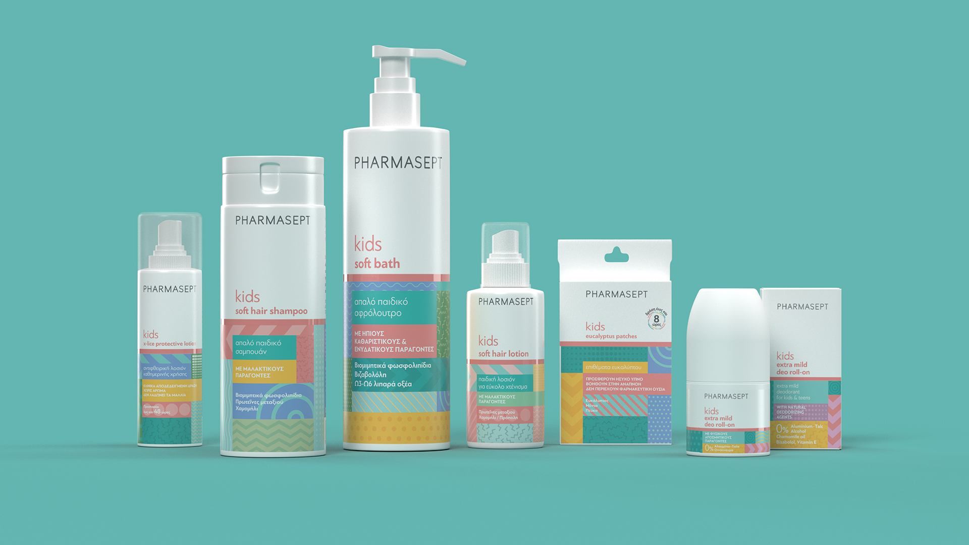
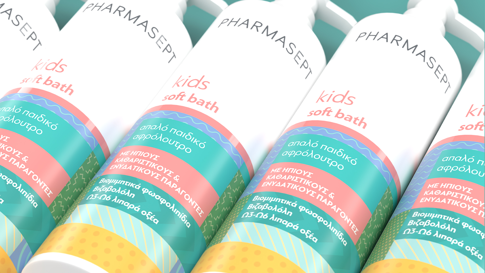
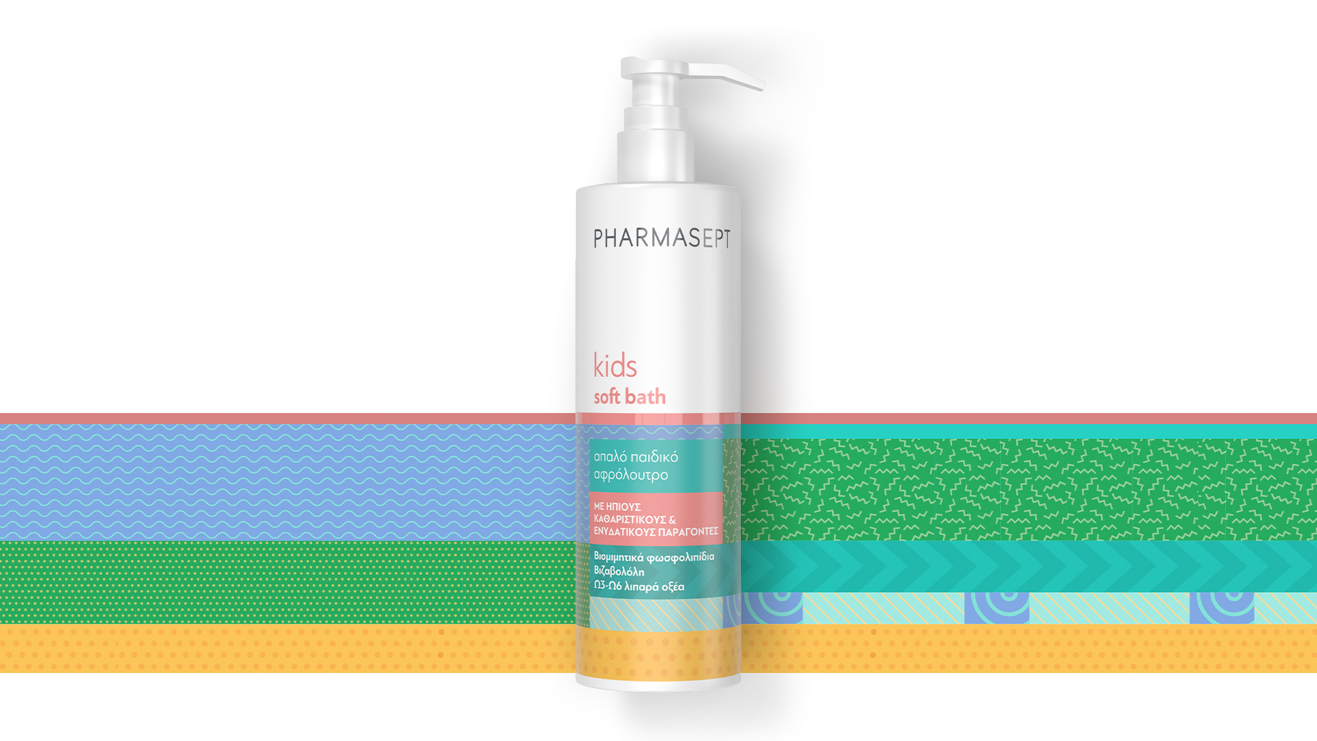
We implemented the new Pharmasept house style, which divides the packaging in two parts: the upper part belonging to the brand logo and the variant name, and the lower part containing the claims and the main design element of each range. The new packaging of the kids line does not lack youthfulness or fun. Those feelings were though translated into color, motion and a pinch of pop mood. We were inspired by the Memphis Group design movement of the ‘80s, and we made the most of color blocking and layering. While the dominant blue/purple hues were selected as a link to Pharmasept’s successful infant range.
The rebranding of Pharmasept kids line was certainly a boost for the brand, as in the first semester after the launch, there was a remarkable 25% increase in sales.
CREDIT
- Agency/Creative: 2yolk
- Article Title: 2yolk Creates Pharmasept Kids Rebranding
- Organisation/Entity: Agency
- Project Type: Packaging
- Project Status: Published
- Agency/Creative Country: Greece
- Agency/Creative City: Athens
- Market Region: Europe
- Project Deliverables: Packaging Design, Rebranding
- Format: Bottle, Box
- Substrate: Plastic
- Industry: Health Care
- Keywords: rebranding, personal care, packaging design
-
Credits:
Founding Managing Partner: Emmanouela Bitsaxaki
Founding Creative Partner: George Karayiannis
Senior Designer: Fillipos Avgeris
Studio Manager: Alexandra Papaloudi
Brand Strategist: Eliza Nehama


