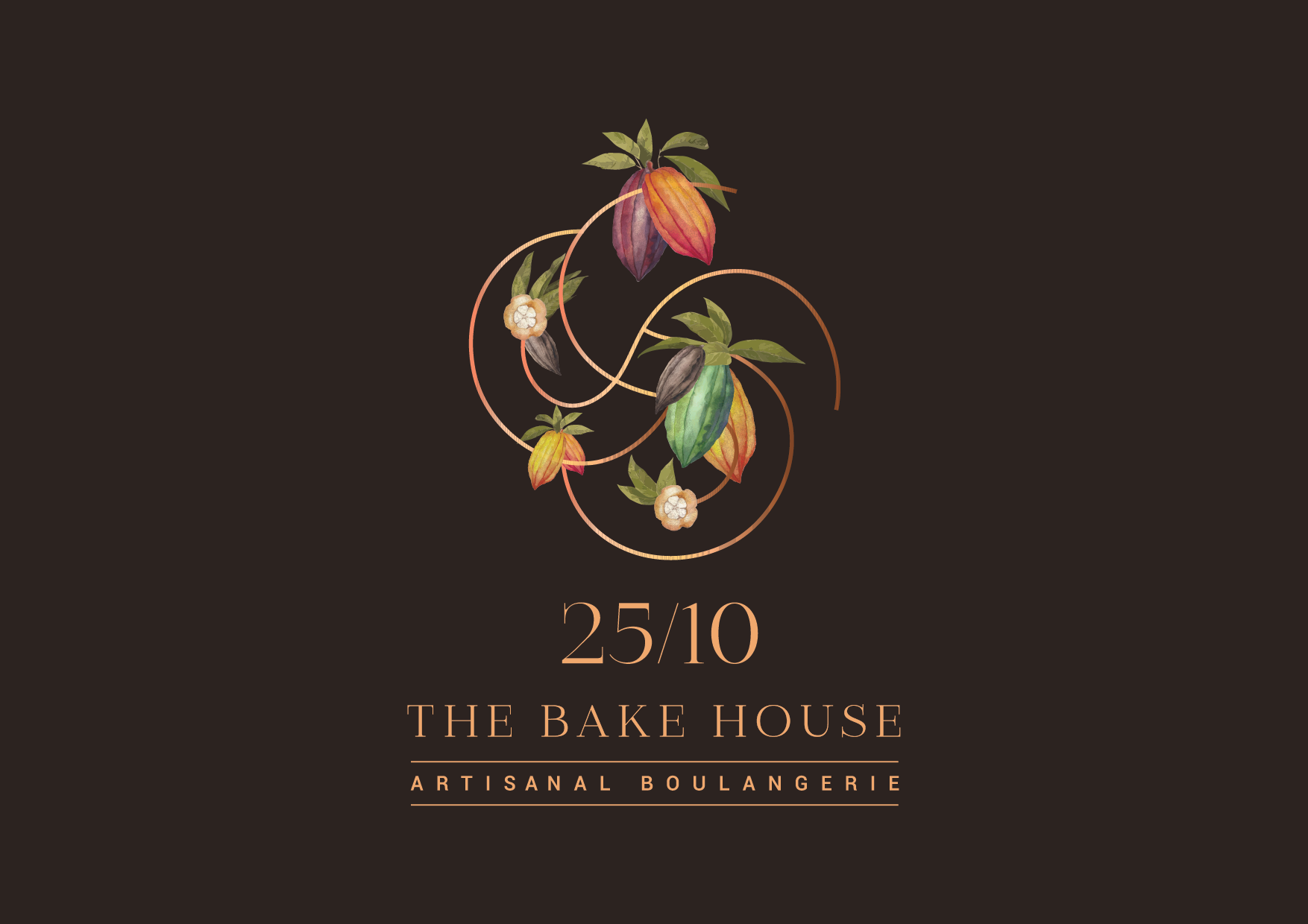
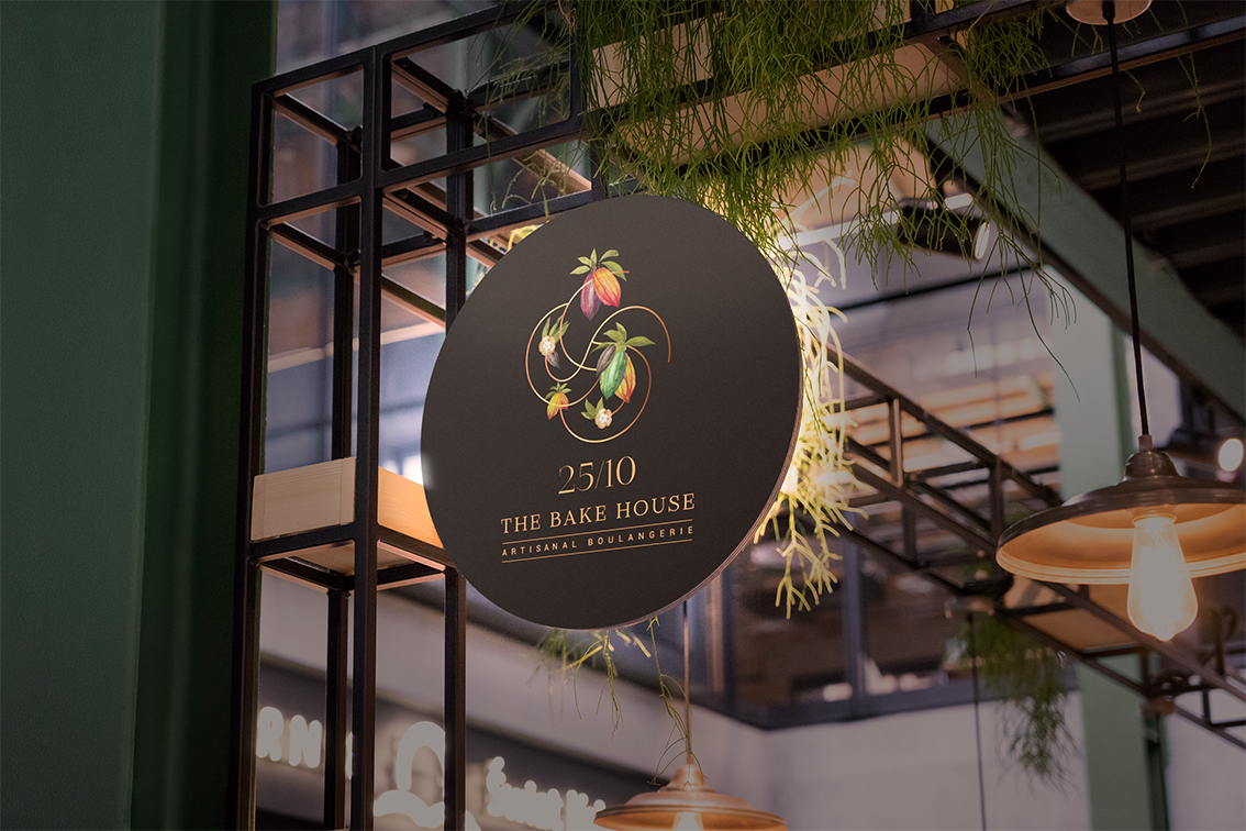
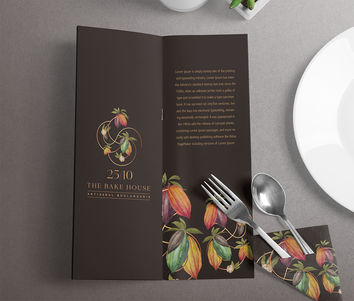
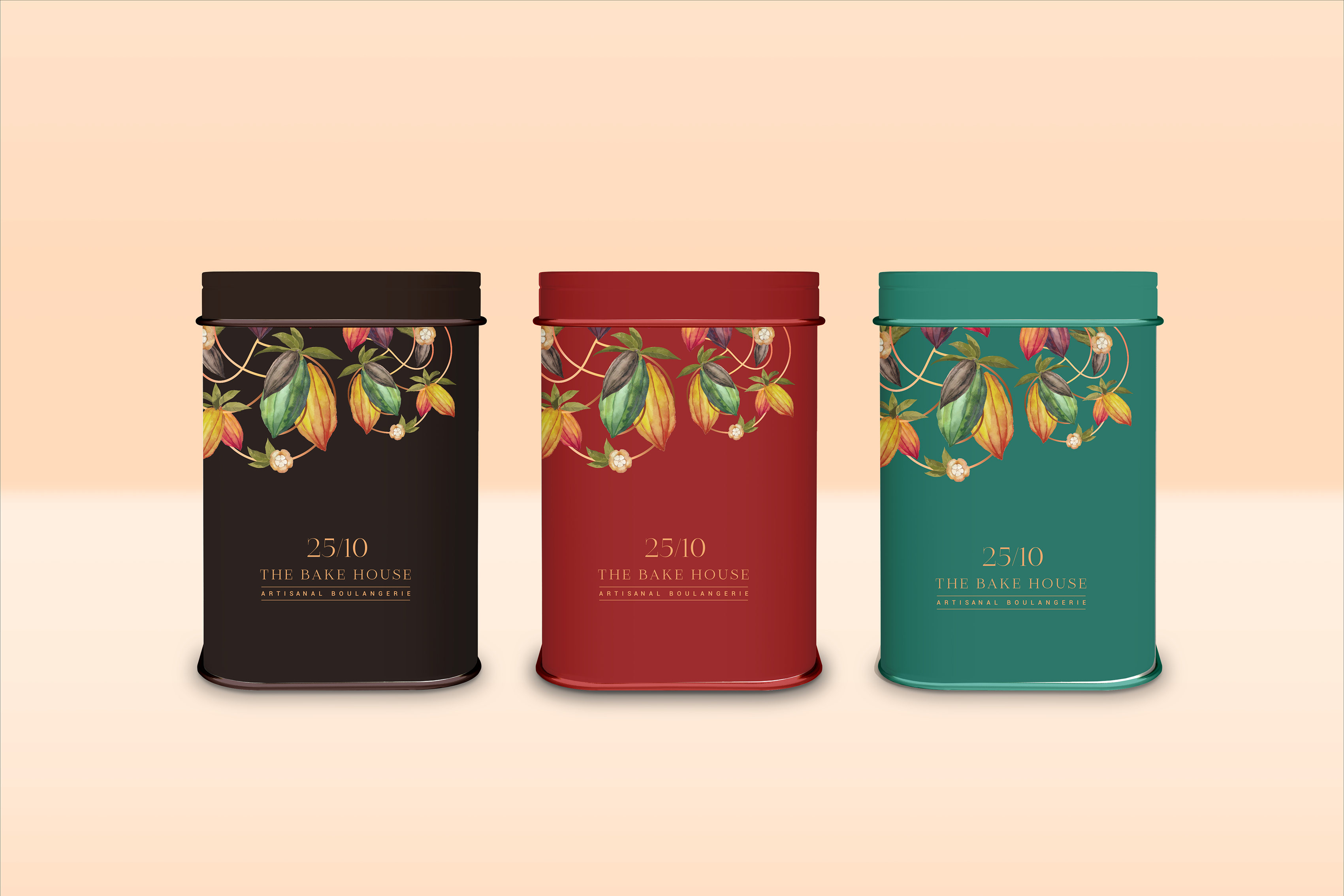
The menu at 25/10 The Bakehouse comes from a place of immense love and care accorded by the founders towards the brand. It is therefore only rudimentary that a part of the founders become part of the brand’s visual identity.
The S & S in the brand logo serve a multifold purpose – primary of which is imprinting the initials of the founders. These then also go back to the roots of the cocoa bean–quite literally-that give them life. Furthermore, when this delicious chocolate is melted and added to a variety of items, the swirl of the mixture is a sight to behold; which is another representation of the two S in the logo design.
This rich collection in the mnemonic is very beautifully contrasted with a sleek typeface that shines with luxury.

CREDIT
- Agency/Creative: 78 Design
- Article Title: 25/10 The Bakehouse Gets Their Brand Designed by 78 Design
- Organisation/Entity: Agency, Published Commercial Design
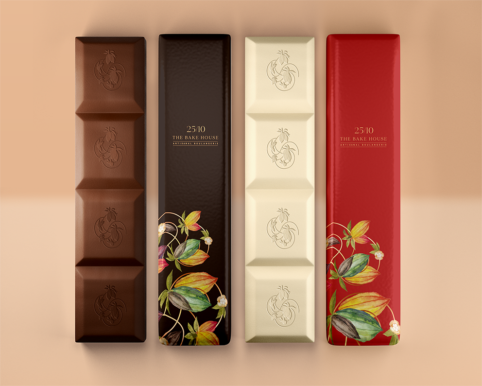
- Project Type: Packaging
- Agency/Creative Country: India
- Market Region: Asia
- Project Deliverables: Brand Identity, Brand Strategy, Branding, Packaging Design, Research
- Format: Box, Tin
- Substrate: Metal, Pulp Fibre
- Industry: Hospitality
FEEDBACK
Relevance: Solution/idea in relation to brand, product or service
Implementation: Attention, detailing and finishing of final solution
Presentation: Text, visualisation and quality of the presentation


