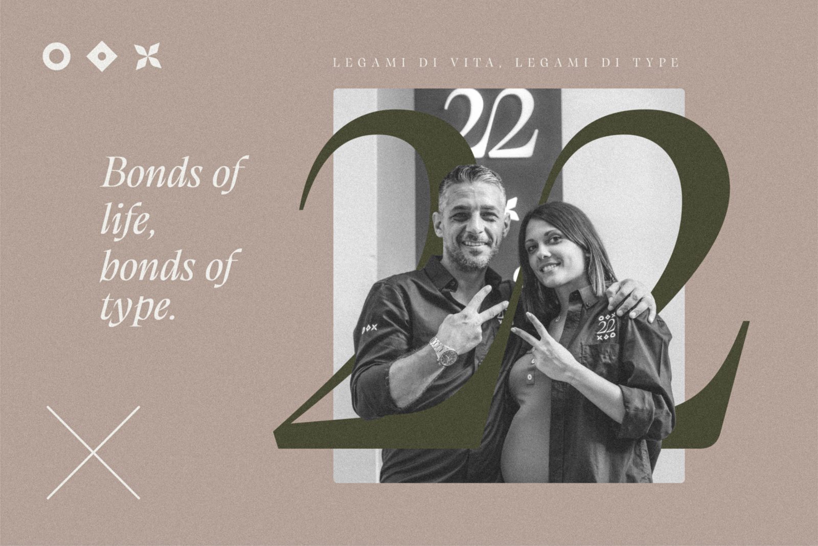
Bonds of life, bonds of type.
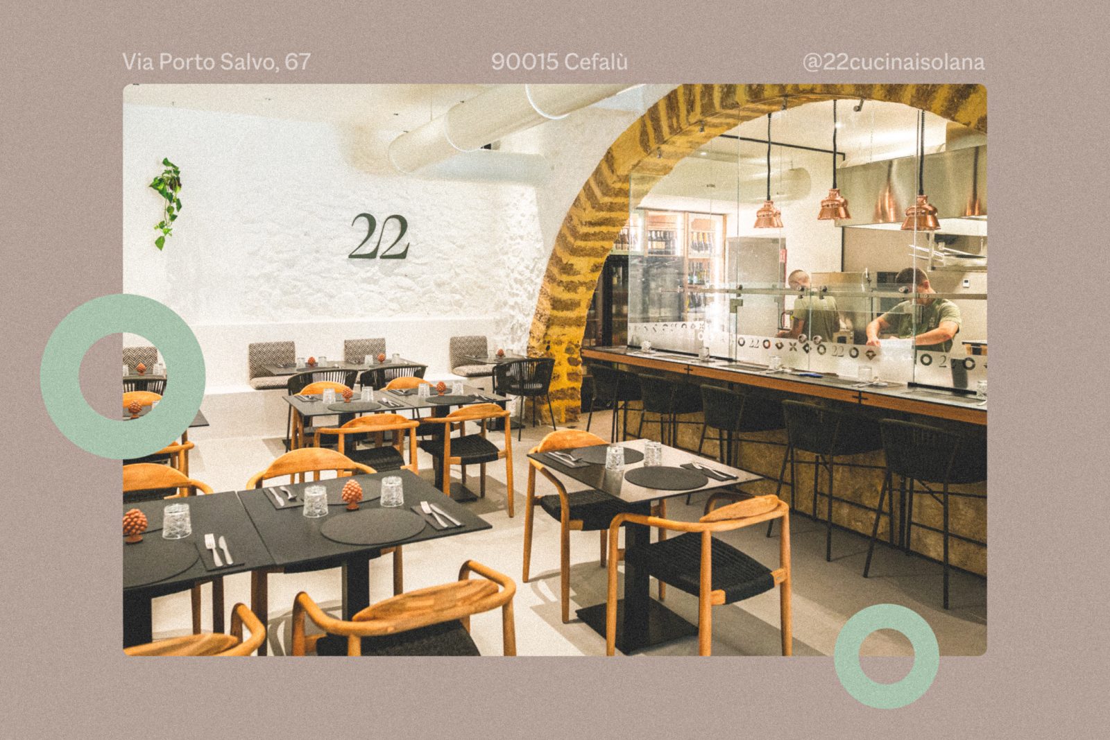
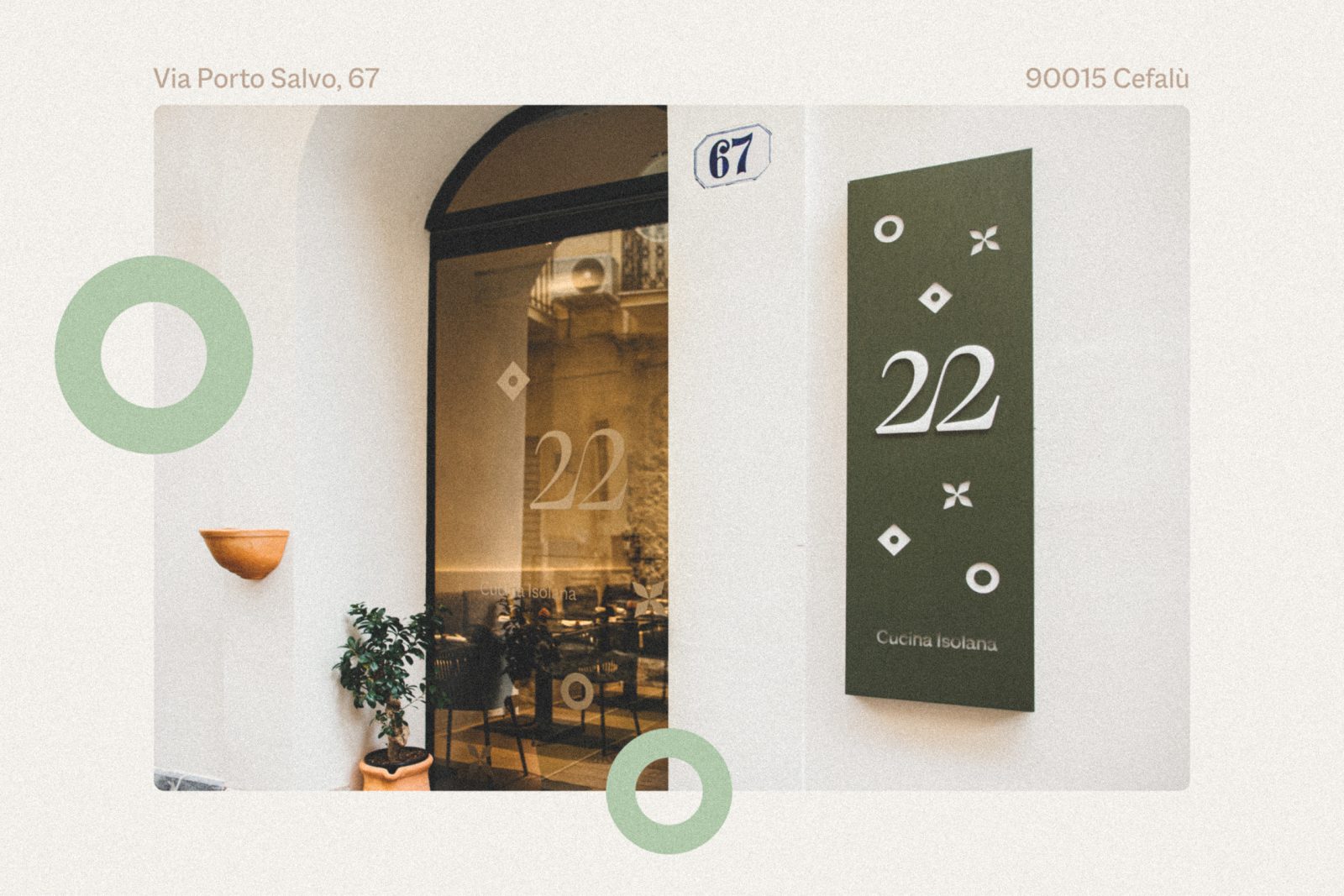
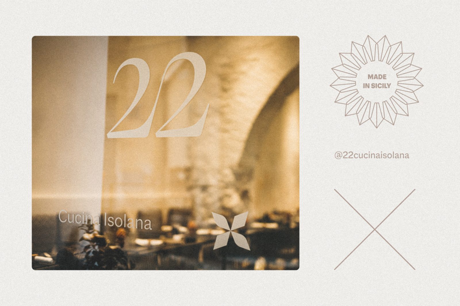
The restaurant 22 – Cucina Isolana is located in one of the most suggestive streets of the historic centre of Cefalù, on the ground floor of an ancient palace.
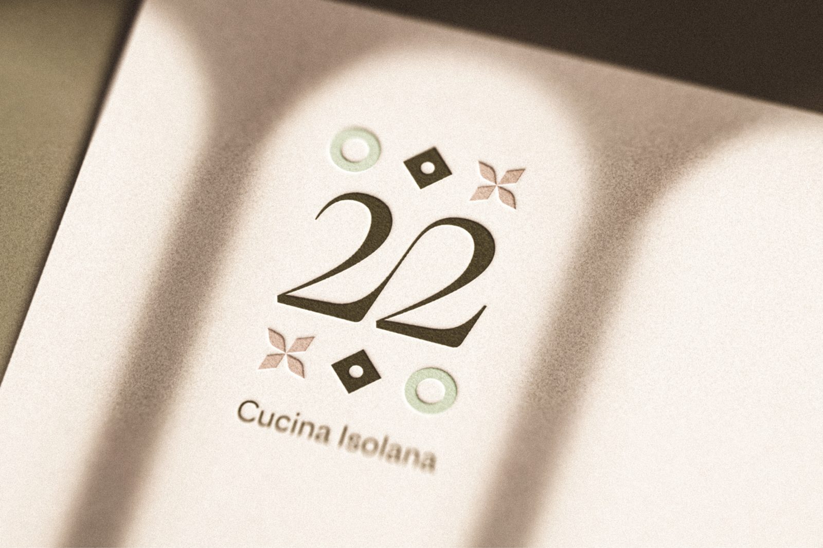
22 may simply look like a number but, for this young Sicilian couple, it is much more than that.
“22 is me and you, it represents us, it’s our union, it’s our struggles, it’s the passion for this project which we shared without ever giving up, always supporting one another”.
(Founder: Salvo)
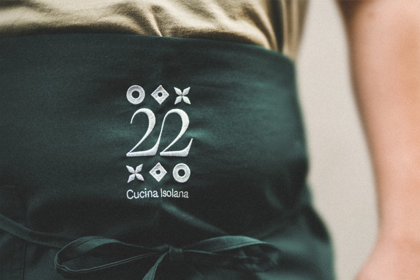
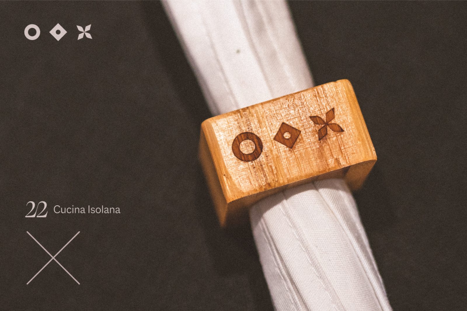
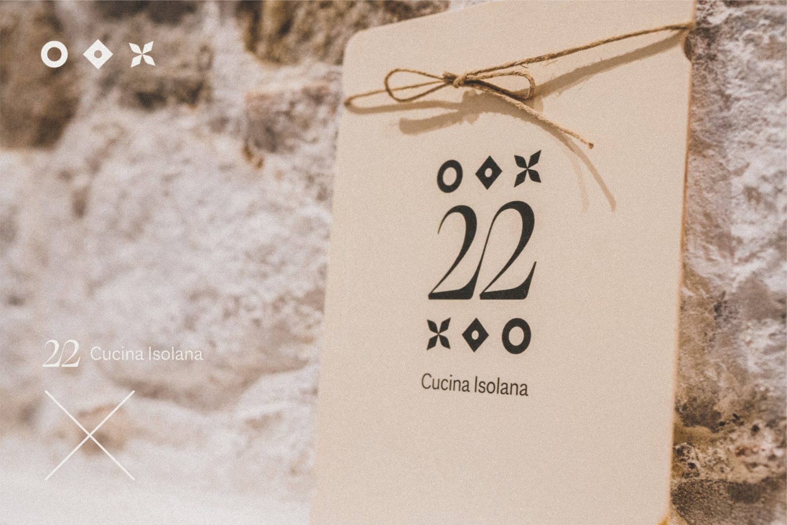
From here, the fundamental concept of this logo. A typographic ligature to fully instil the link between the 2 numbers, which are actually 2 people, Maura and Salvo, with their unshakeable connection.
As well as being a familiar place, 22 is also a refined restaurant aimed at making people feel at home through scents, flavours and colours.
“After a trip to the Aeolian Islands, we were fascinated by the simplicity and elegance of white colour which plastered both the dwellings and the large stone benches”.
(Founder: Maura)
To this date, the restaurant is characterised by stone walls covered with white lime, and by pressed bricks left with the original white lime; the dark resin floor serves as a background to the various areas which composes the restaurant, resulting into a single open space.
“We tried to create a strong contact with the existing architectural language to achieve a close link between old and new. For this reason, the choice of all materials and details for this very project was made to maintain the original features of the building, keeping its familiar character as if we found ourselves within the old grandma’s kitchen”. (Architect: Matteo Franco)
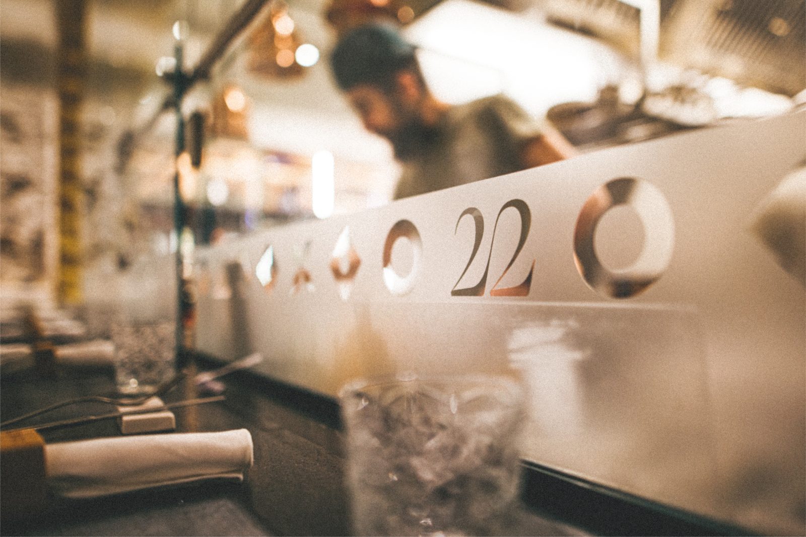
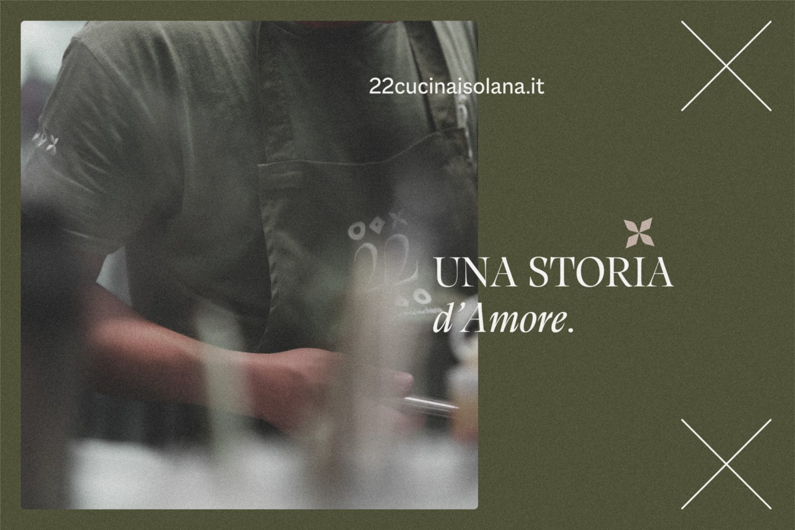
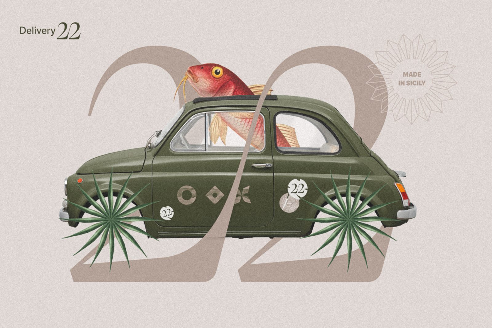
The graphic system is the result of all this. Simple and delicate. The colour palette is soft, and the proposed graphic symbols are attributable to the tradition of the Sicilian ceramics called majolicas.
The selected font is Calvino from Type Foundry Zetafonts, designed by Andrea Tartarelli and inspired by the famous Italian writer Italo Calvino in his masterpiece: “Sei Proposte Per Il Prossimo Millennio”. Such a font is characterised by highly readable letters despite it being strongly associated with a calligraphic hand.
To sum up, the combination of old and new created an evocative atmosphere which makes the restaurant 22 – Cucina Isolana look like it has always been in Via Portosalvo 67.



CREDIT
- Agency/Creative: HUB87 - Logo & Creative Studio
- Article Title: 22 Cucina Isolana Brand Design
- Organisation/Entity: Creative , Freelance
- Project Type: Identity
- Project Status: Published
- Agency/Creative Country: Italy
- Agency/Creative City: Roma
- Project Deliverables: Brand Design, Brand Identity, Branding, Logo Design
- Industry: Food/Beverage
- Keywords: WBDS Creative Design Awards 2022/23
-
Credits:
Type foundry: Zetafonts
Photographer: Armando Musotto
Architect: MF2Arch
Traslator: Samuele Brusca


