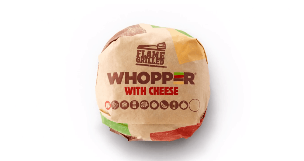
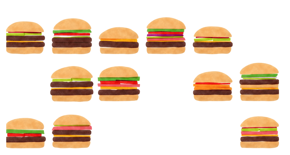
“Burger King’s new brand positioning is ‘Be Your Way’ encouraging customers to be themselves. Based on the fact that, because BK burgers are all flame grilled they all come out slightly different, all individual. All burgers are made to order therefore they can be customized. The packaging needed to be Instagram-worthy, fun and engaging, putting a smile on hungry customer’s faces!”
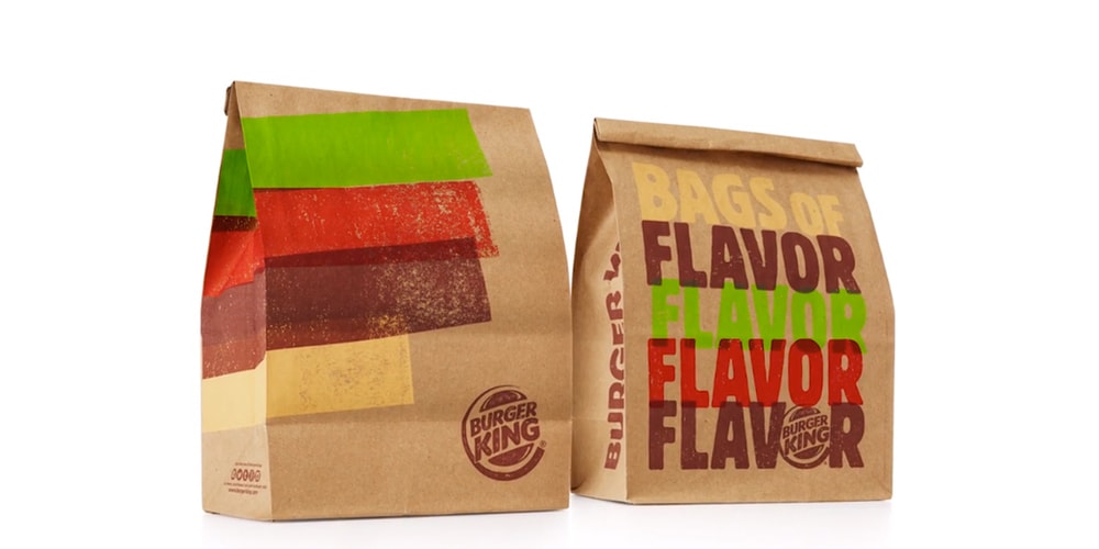
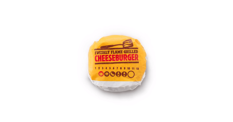
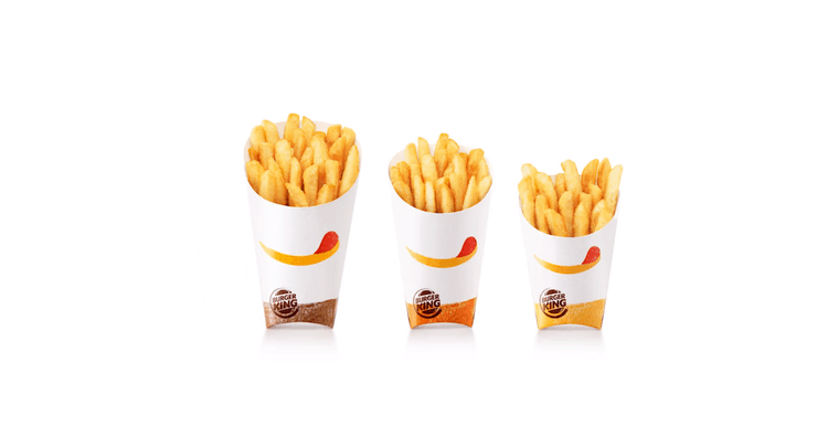
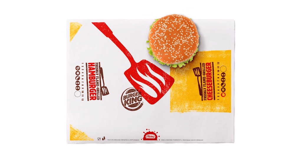
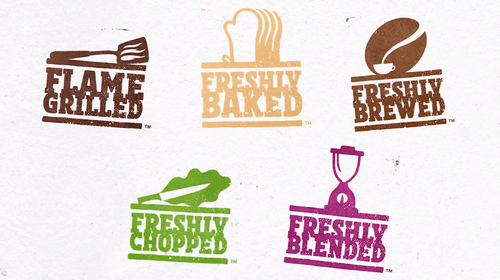
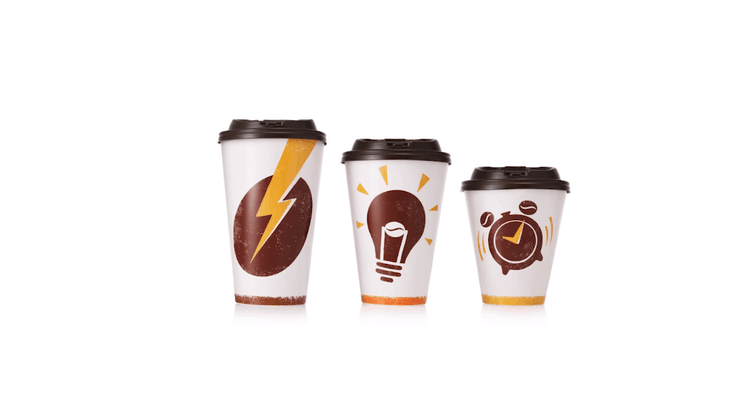
“All the packaging has a hand printed effect reminiscent of the marks on the burgers made by flame grilling imperfect perfection. Take away bags using the abstracted burger colors in a modern striking way to evoke big flavors. The fries have a witty idea of a chip with ketchup looking like a smile licking it’s lips, each bag comes with different fun phrases on the reverse. Depending on which way it’s orientated, the wrap can either say Cheeseburger or Hamburger. The flame grill burger flipper symbol helps staff locate the burger centrally on the wrap. The hot drink cups show ways of expressing the energy from a hot drink and the espresso cup is a mini battery to pick you up!”
CREDIT
- Agency/Creative: Turner Duckworth Design
- Article Title: Turner Duckworth Design – Burger King Rebrand
- Project Type: Packaging


