


With a narrowing audience appeal threatening a dramatic decline in category volume and value, The English Provender Company (EPC) asked us to help position a new product within their portfolio, putting a twist on chutney to engage a new consumer.
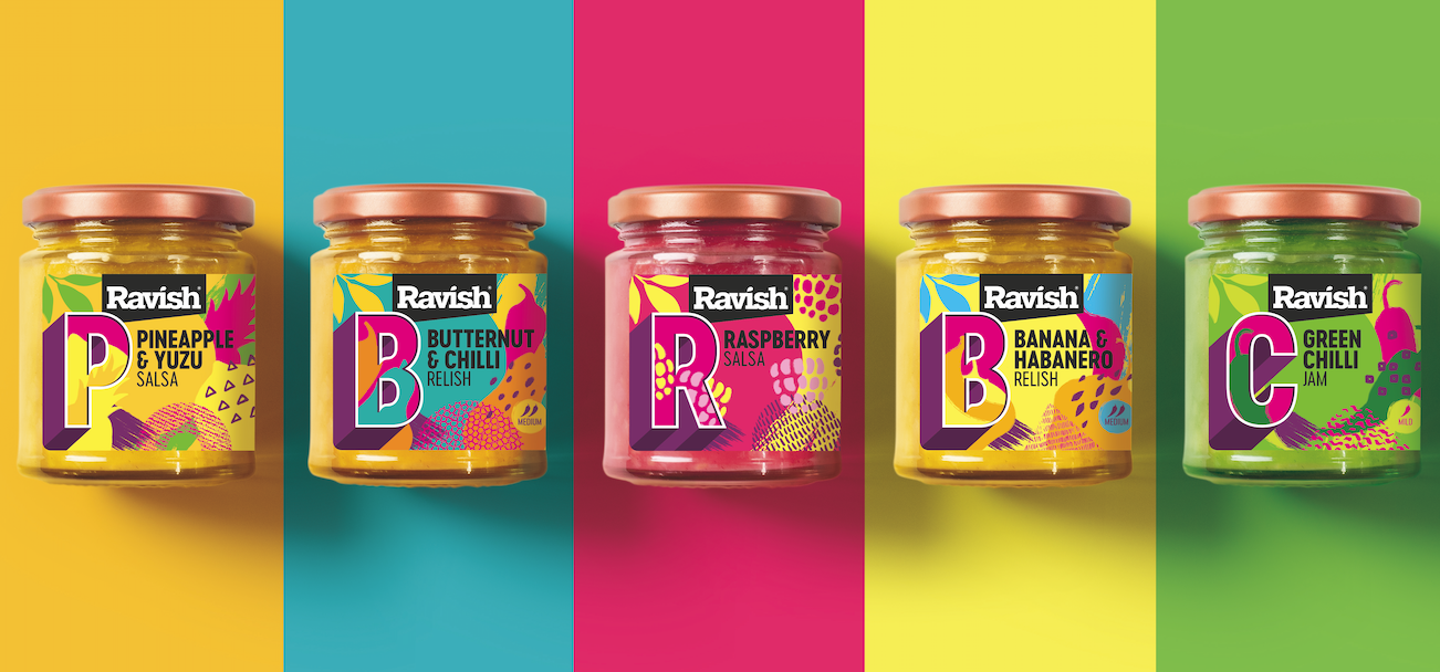
We helped to develop a pack design for a unique and vibrant chutney, launched under ‘Ravish’ a new brand specifically aimed at millennials, inspiring exotic but everyday meal occasions.
Undertaking a naming strategy process and research into typography from alternative categories, we worked to encapsulate the flavour variants through abstract patterns and bespoke lettering.
This bold typographic design broke category norms, yet remained true to The English Provender Company’s brand and portfolio, defining a pack that celebrates flavour and stands out in a sea of brown relish.


CREDIT
- Agency/Creative: 1HQ Brand Agency
- Article Title: 1HQ delivers bold new typographic design for Ravish
- Organisation/Entity: Agency, Published Commercial Design
- Project Type: Packaging
- Agency/Creative Country: United Kingdom
- Market Region: Europe
- Project Deliverables: Brand Creation, Brand Identity, Brand Naming, Branding, Graphic Design, Packaging Design, Product Naming
- Format: Jar
- Substrate: Glass Jar


