DS1 – Nasha Ptichka
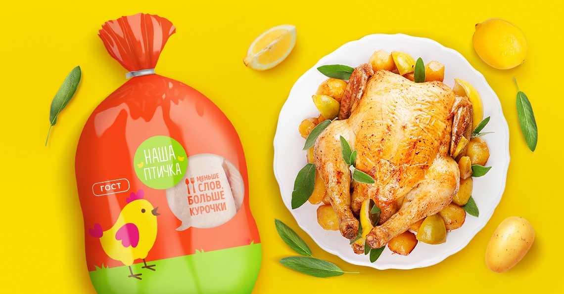
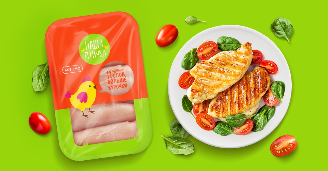
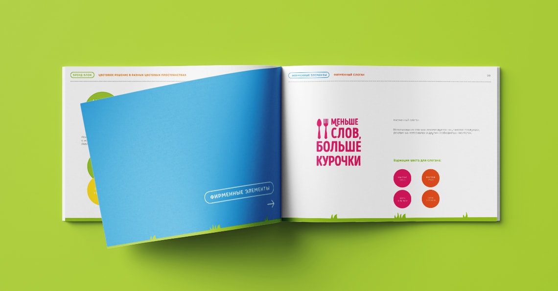
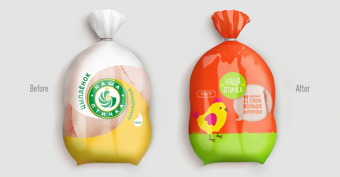
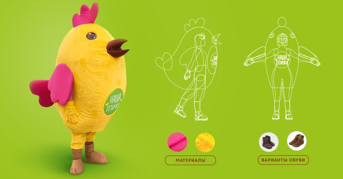
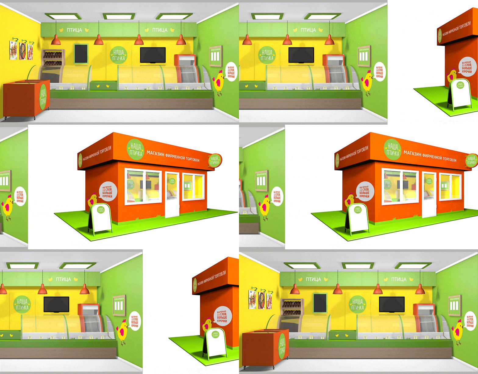
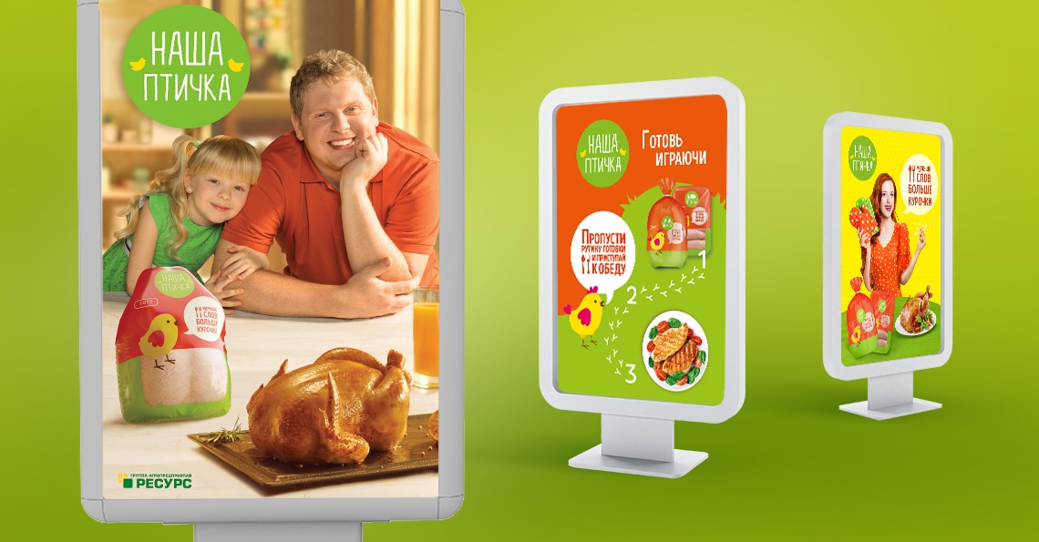
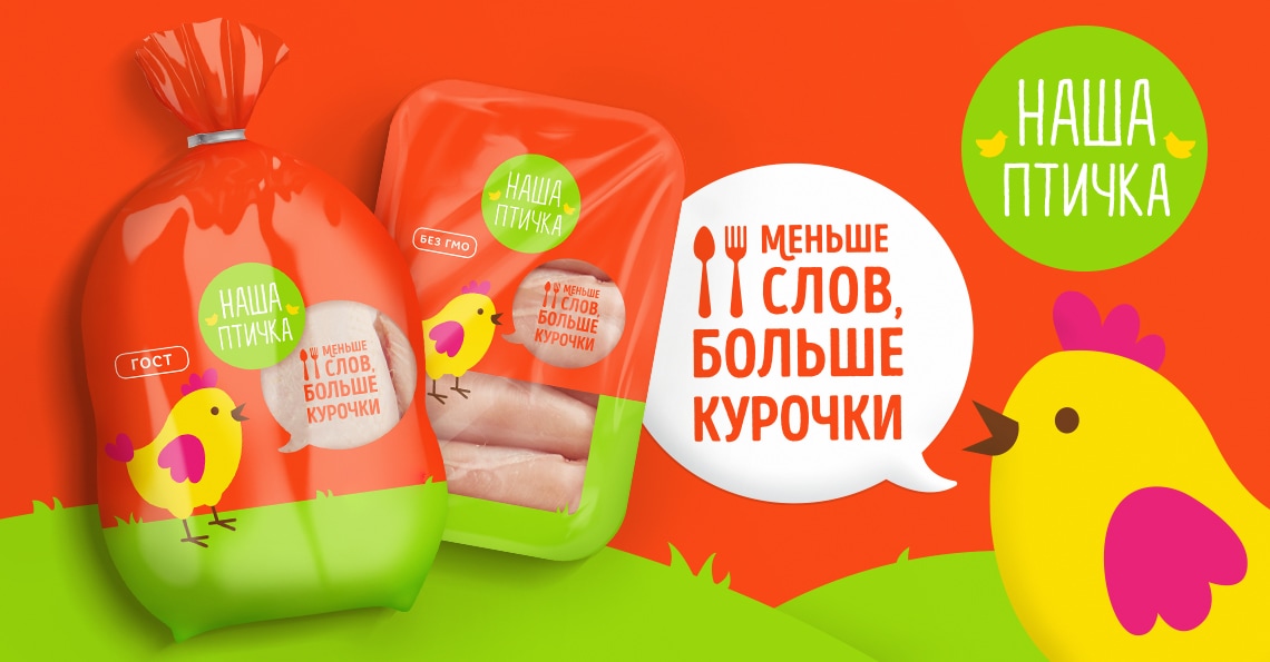
А bird in your hand! DS1 Agency has reviewed the image of «NASHA PTICHKA» brand by GAP RESOURCE.In summer 2018, GAP RESOURCE opened a creative tender to make verbal and visual concept of «Nasha Ptichka» brand.When the brand was launched, the Company initially was guided by key demands of the consumers: fresh Russian-make chicken meat, grown and packed with continuous quality control at every stage. The years-long experience in poultry breeding and use of advanced automated process lines allow the Company to build up its own expert potential and to structure the quality control in such a way that really safe and affordable goods are produced. The Company provides for full process cycle – from poultry breeding, to packaging and delivery to shops. The existing design did not really reflect this idea and did not allow achieving the desired degree of brand awareness among the target audience.The project has strategic importance for the Company. Therefore, a tender was launched among selected agencies with portfolios containing required vector of FMCG projects.The project tasks included the analysis of the competitive environment, development of the brand platform, verbal and visual brand identification, allowing easy adaptation of the concept to other formats and lines, as required. It was also important not to lose the USP – all brand products are bred without GMO and growth hormones, which makes the product an ideal component for a healthy diet of the whole family.The work started with the brand platform development: the brand should receive its voice, frame and advancement vector. The result was quite the deliverable required at the planning stage – clear understanding of risks, opportunities, and, as a consequence, vision of the way which will lead to the hearts of the target audience. It was decided not to act within existing solutions; instead, to take a “side” niche, i.e. to tune out from “kids” or “adult” products, and to pass into the “together” category. In this way, Our Birdie has acquired an image of a keen-witted helpful friend, which could help winning the cooking routine and feeling about the process with ease.Once the brand strategy was clear, the creative process has been started. First of all, visual ideas were filtered by the general design style, to evoke association with the “medium +” price level. The packing should look quite simple, but bright and emotional. The goods produced under such a strong control, in strict compliance with quality parameters, could not afford a faceless, ordinary packing.Visualization work started with pencil sketches and character workout. First options were complex but somewhat sophisticated; the agency team simplified the solution step-by-step, and has got the final visual representation of the birdie. This way, a cartoon-type character appeared, designed in line with the modern 2D-graphics trend. Simple forms and a small number of living, clear tints were chosen, which are easy-to-use in any promo material. For instance, costumed promo puppets look live exactly like on the packing, which allows the consumer to create a direct association and to decide on the Our Birdie brand products.The general design of the packing remains in the same framework – simple forms of fields and hills, communicating that the poultry is bred in close-to-natural conditions. A certain color palette was chosen both for the corporate identity and for the packing, to evoke interest and appetite. The logo was also subjected to modifications. It kept the recognizable color, but acquired up-to-date design – light type composition and lovely schematic figures of birds. A number of desk focus groups were held in the course of concept designing. The concept has shown excellent performance in terms of brand recognizability, and was presented to the Company’s brand team. After several iterated revisions, in close cooperation with the Company’s brand team, the brand’s visual and verbal languages have finally come together. A playful slogan was proposed and approved “Less words, more chicken”, which invites the consumer to take their child to the kitchen and pass time joyfully, usefully and tastefully. The concept was reiterated in key visuals, social media, and TV ads.The new brand image allowed expressing the spirit of the product, and has become the point of departure for strengthening the Company’s position in the product category.Client’s commentWorking with DS 1 is working with soul mates. We felt that the team really cares about Our Birdie brand. And the result exceeded all expectations – bright design, recognizable corporate character, adaptive patterns. Rebranding has evoked exceptionally positive response both among our staff, and among our partners.Marina ChernayaHead of the Marketing Department
