


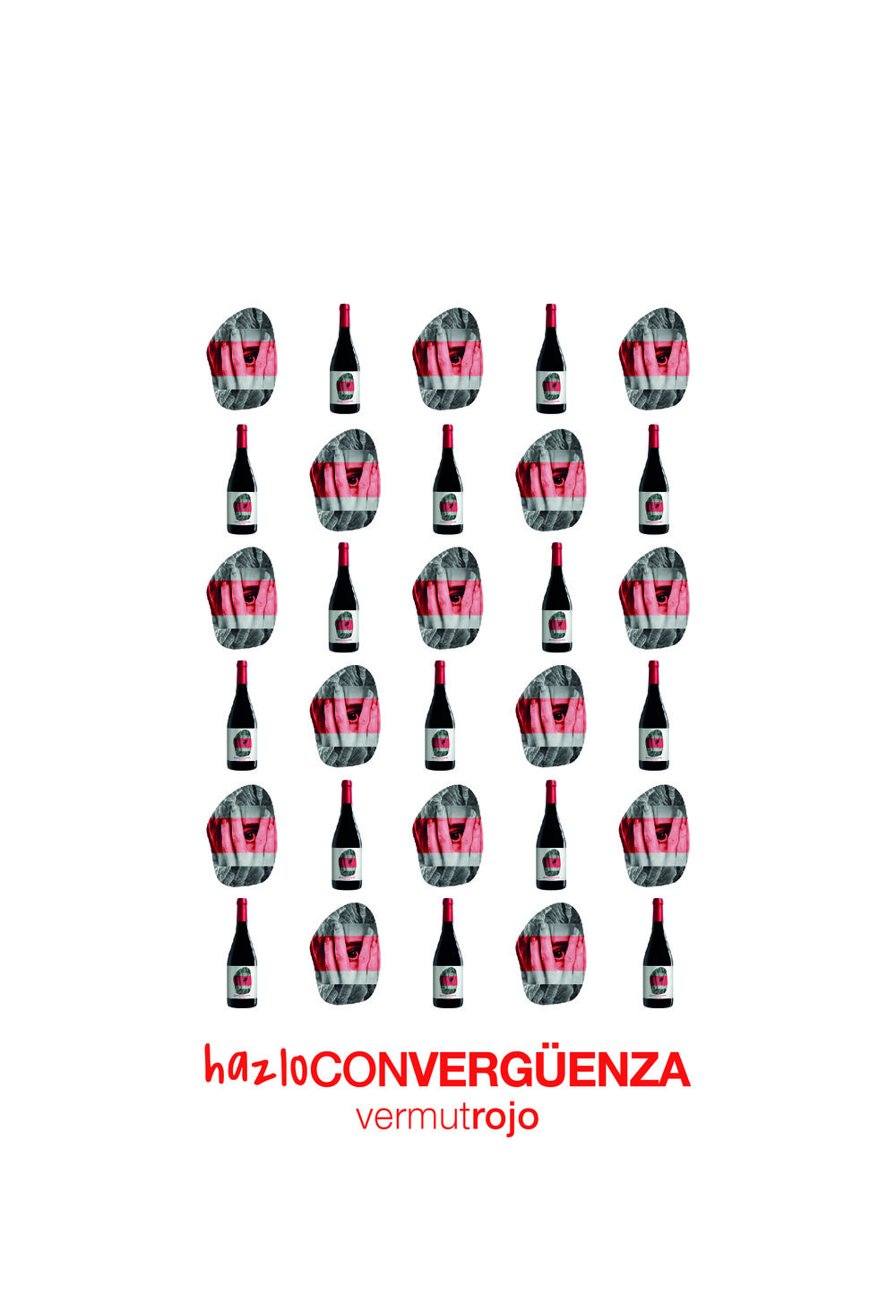
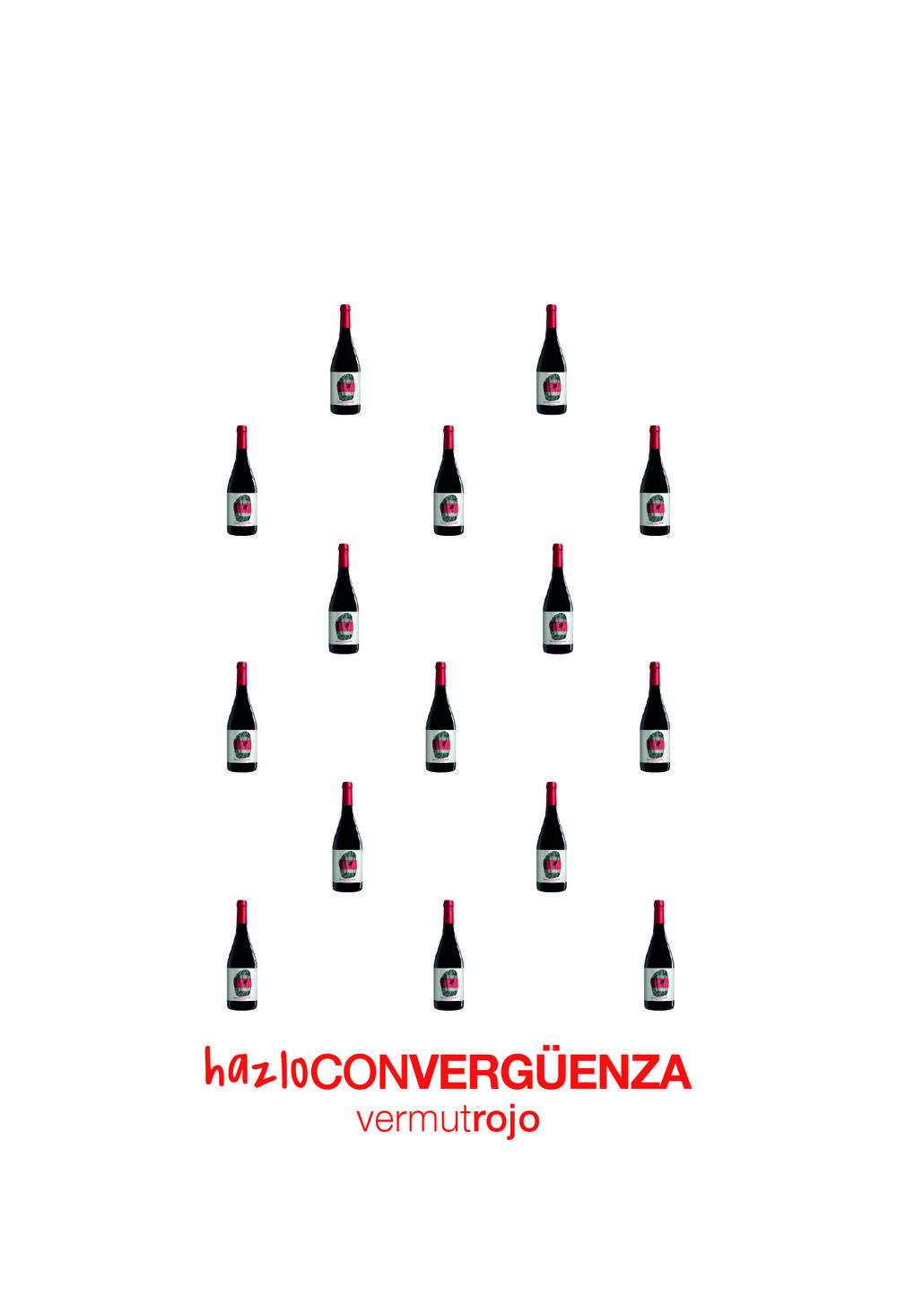
Marketing Bodegas Salzillo – New Vermut
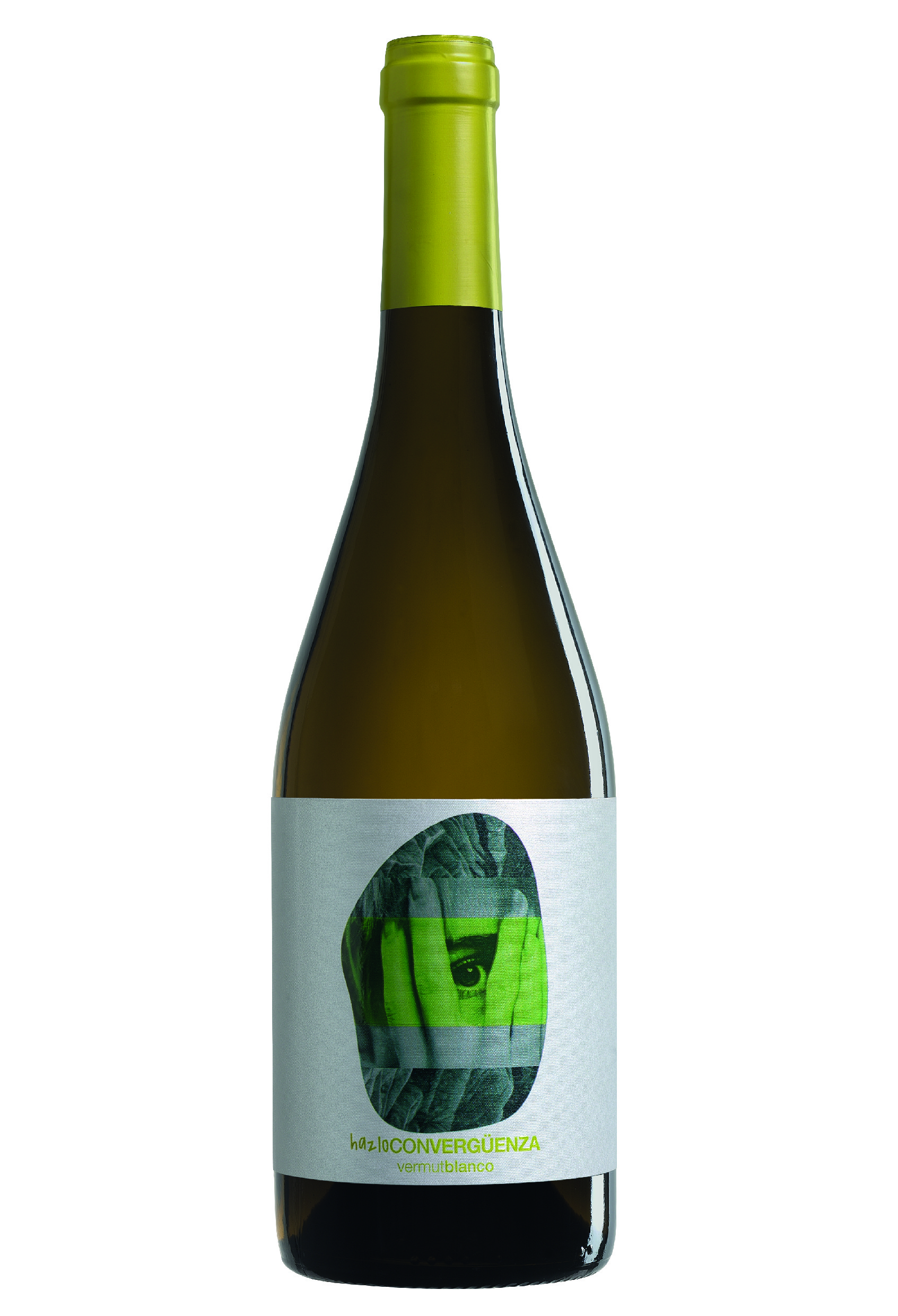
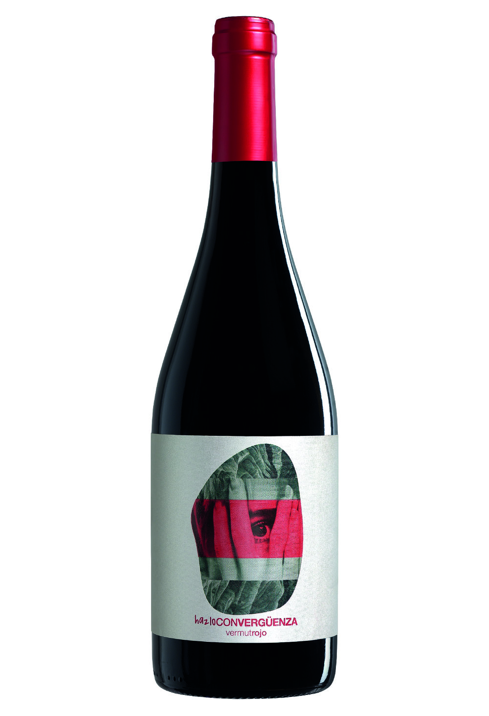
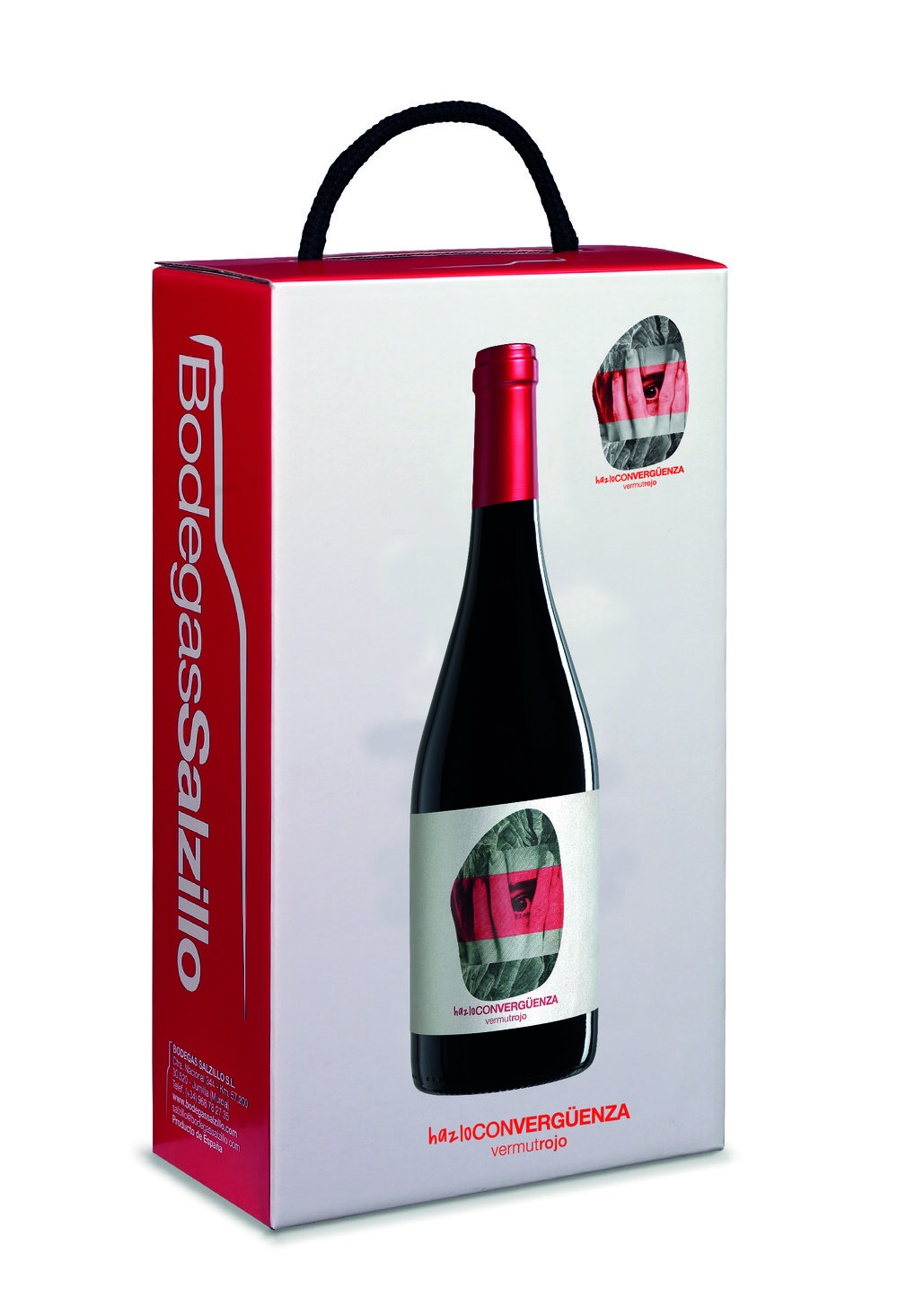
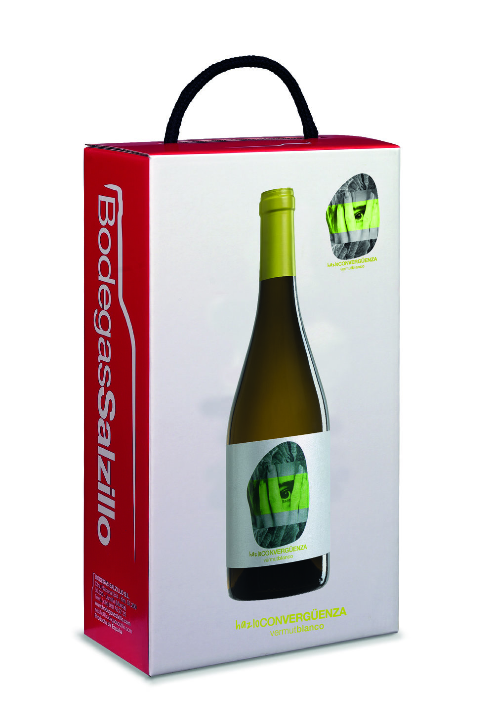
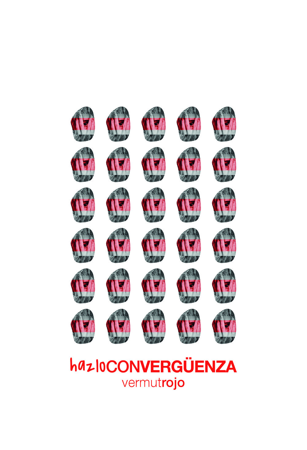
“ HAZLOCONVERGËNZA is a simple and elegant concept to tell what is inside this vermut bottle.
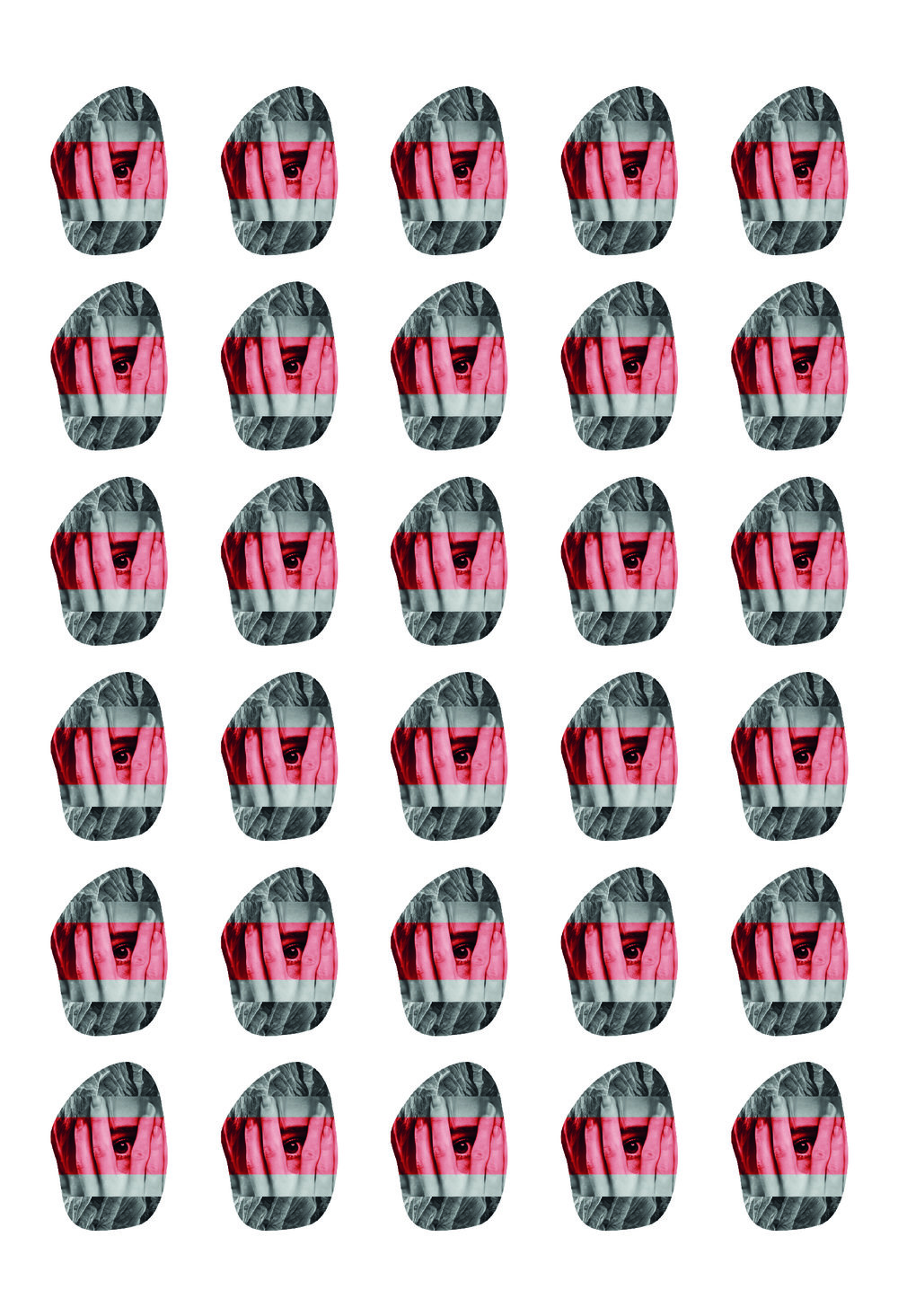
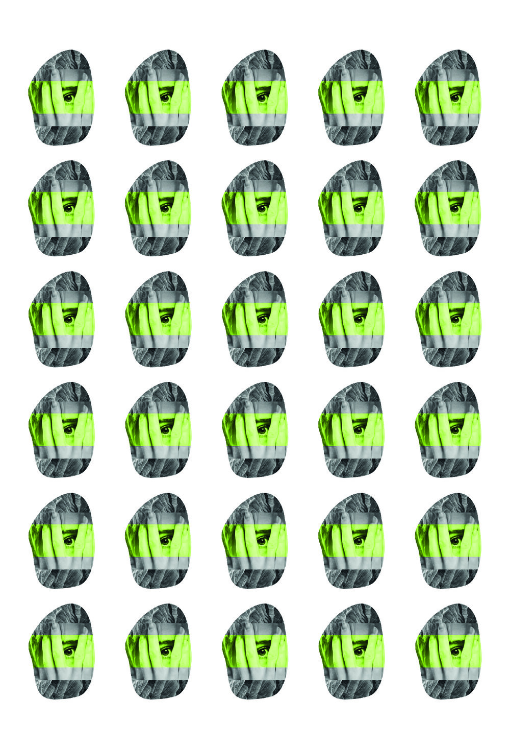
Inspired in Minimalism images, with plenty of details. This vermut collection have similar characteristics but different flavor white and red, mahogany colors, golden reflections, traditional and expressive, with ripe fruit, raisin and fig aromas…
For the design of its labeling we play with letter, typography and photomontage and we transformed to make it even more elegant adding floral details drawn by computer and photography. We finish the design with stamping details. The goal of this project was to make a simple and beautiful labeling at the same time.
Minimal, creative and beauty”


CREDIT
- Agency/Creative: Marketing Bodegas Salzillo
- Article Title: Wine Labelling that Play with Letter, Typography and Photomontage
- Organisation/Entity: Agency Commercial / Published
- Project Type: Packaging
- Agency/Creative Country: Spain
- Market Region: Europe
- Format: Bottle
- Substrate: Glass
FEEDBACK
Relevance: Solution/idea in relation to brand, product or service
Implementation: Attention, detailing and finishing of final solution
Presentation: Text, visualisation and quality of the presentation


