


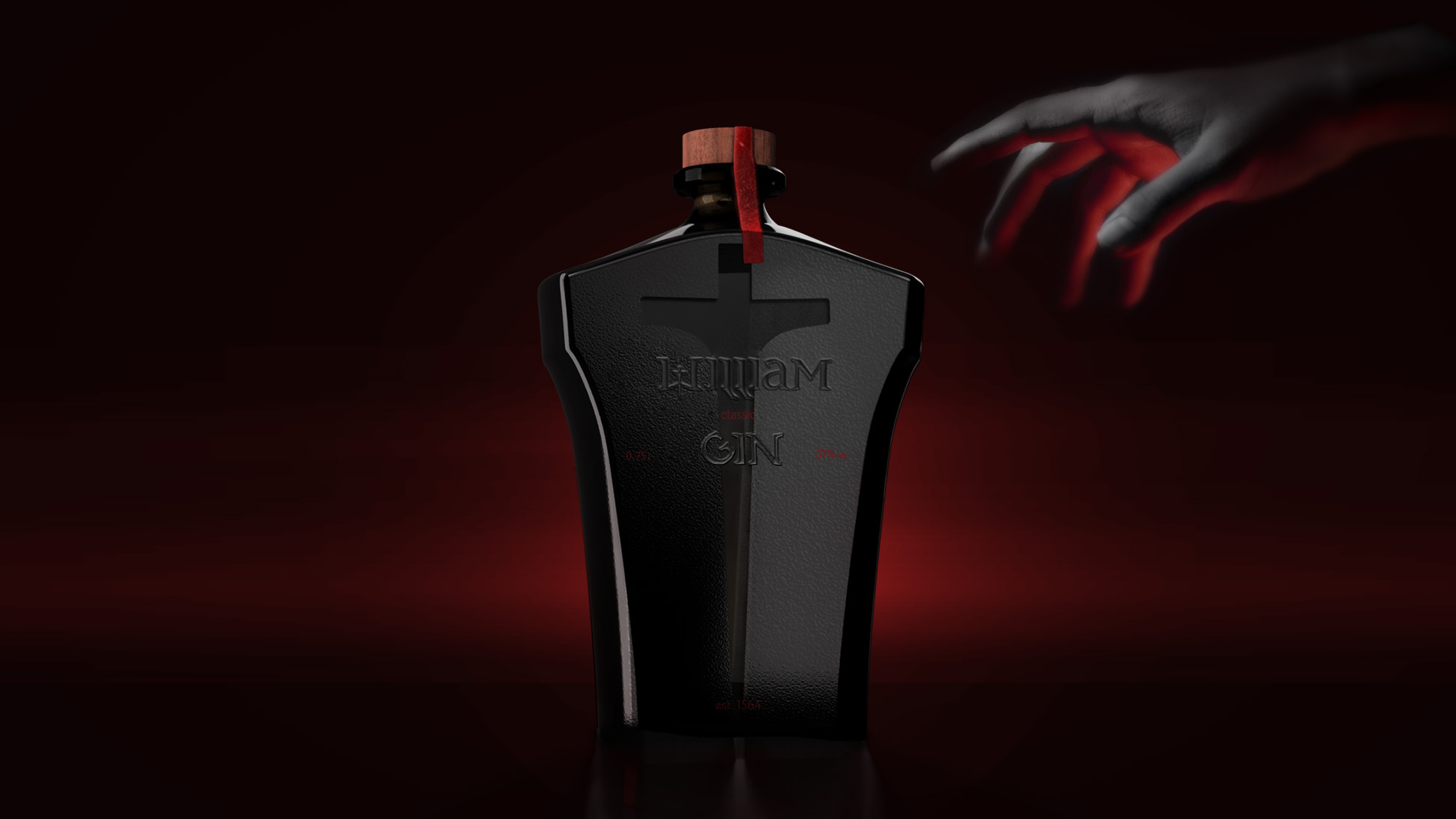
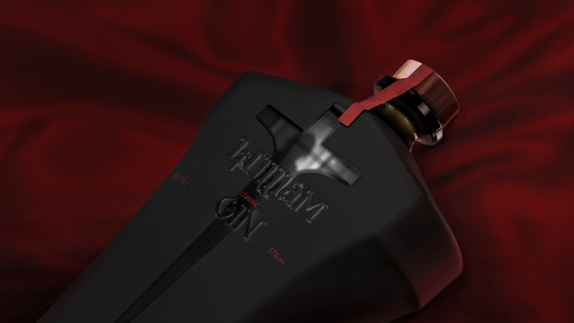
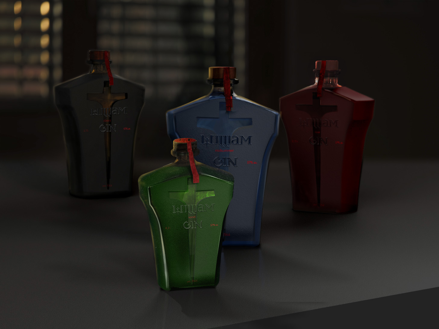
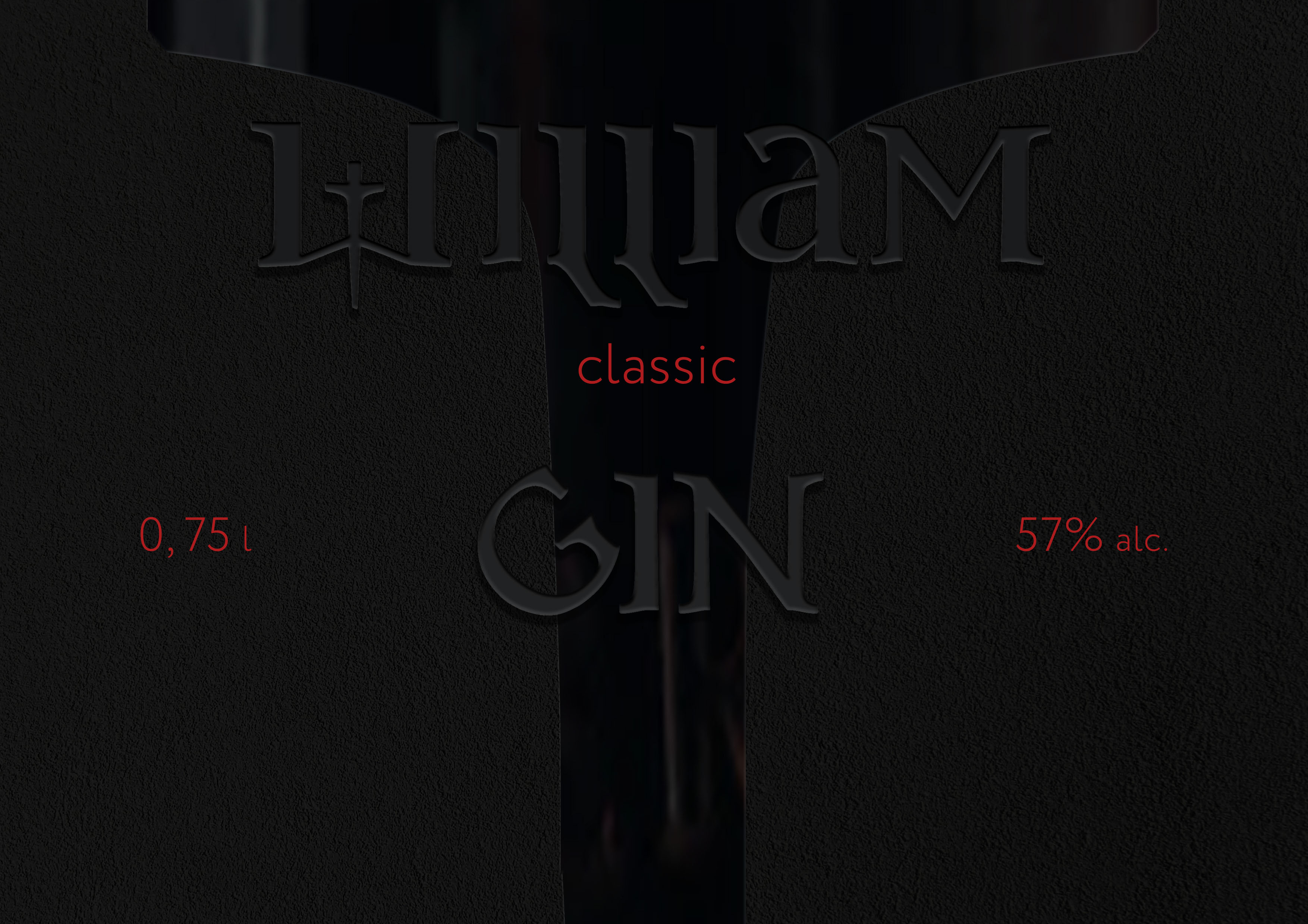
Feelings are what will determine your choice of drink. Every work of Shakespeare is filled with strong emotion and expression. A sip of real English gin is enough to ignite serious passion inside. The packaging is built on subtle dramatic sensations. You can feel them in full just by taking the drink in your hands. The blade-shaped cutout exposes the rough outer surface of the bottle and shines through. The cold glass “dissects” the matte textured body. This move allows you to keep an eye on the quantity of the contents.
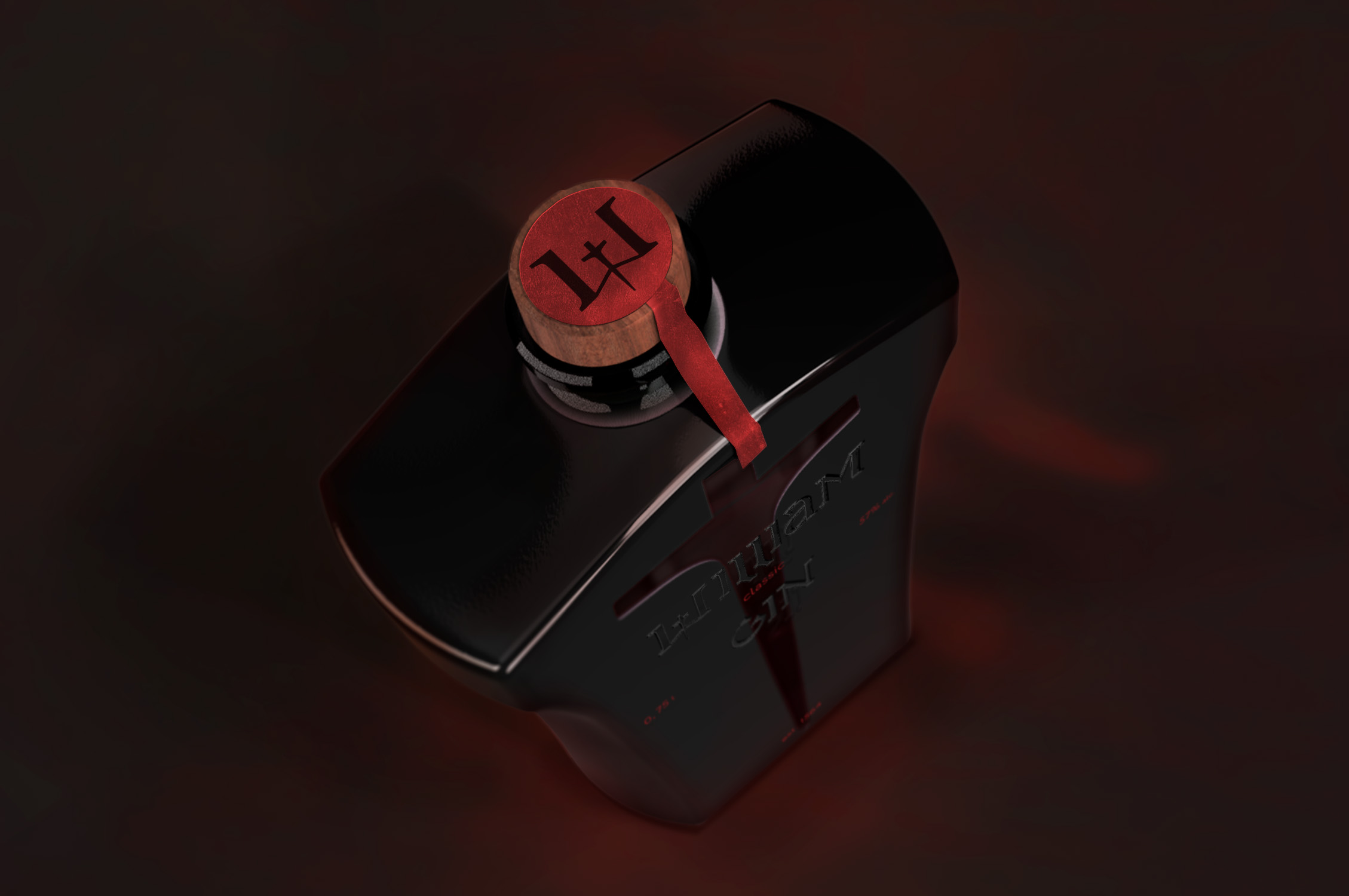
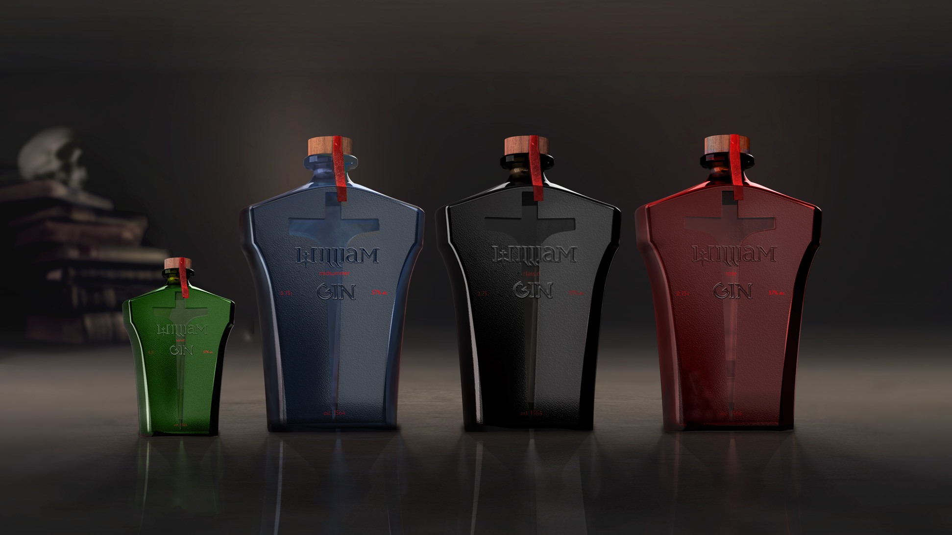
The name ‘William’ and the drink category ‘gin’ are printed with UV lacquer in a basic tone of flavour. Four main types are represented. The division is quite simple – by genre. Tragedy, comedy, chronicles and sonnets, all in liquid form, varying in softness and shades of flavour. (And the packaging is by colour coding and size, in the case of ‘sonnets’ a pocket-sized version of the bottle. Thus, tragedy corresponds to classic flavour and black, comedy to blue, chronicles to red and sonnets to green). The additional information printed in red, as well as the thick oak veneer stopper and the red seal remain unchanged. These seemingly inconspicuous details add drama and heighten the degree of sensation.
The concept of William’s Gin gift packaging is quintessentially Shakespearean. Endless tragedy, drama and death merge into one form. The outline of the bottle not only resembles a scabbard, but also refers us to a tombstone. Reminding us, so to speak, of Memento mori. The ergonomic shape of the bottle allows it to fit comfortably in the hand. The finger slides over the bottle, feeling the different textures, enhancing their effect. The true drink of Albion cannot be revealed to everyone at once. Its mystique appeals to many. But who truly dares to experience the unrelenting storm of the senses?
CREDIT
- Agency/Creative: Darya Lugovskaya
- Article Title: William Gin Student Packaging Design Concept
- Organisation/Entity: Student
- Project Type: Packaging
- Project Status: Published
- Agency/Creative Country: Russia
- Agency/Creative City: Москва
- Market Region: Europe, Global
- Project Deliverables: Art Direction, Packaging Design, Typography
- Format: Bottle
- Substrate: Glass Bottle, Pulp Paper
- Industry: Food/Beverage
- Keywords: Gin, Alcohol, Packaging, Moscow, Concept Design
-
Credits:
Tutor: Dmitry Chernogaev


