


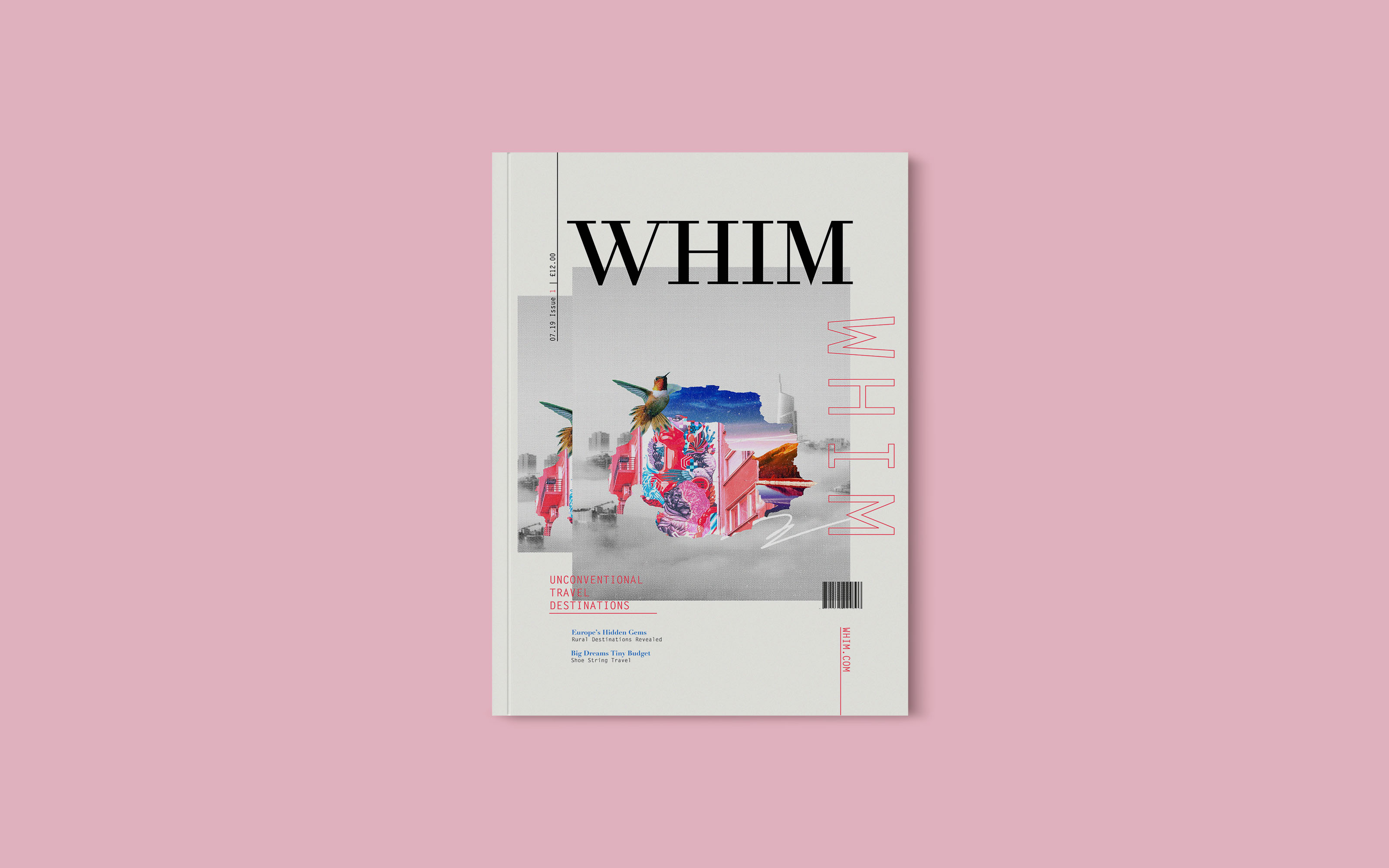
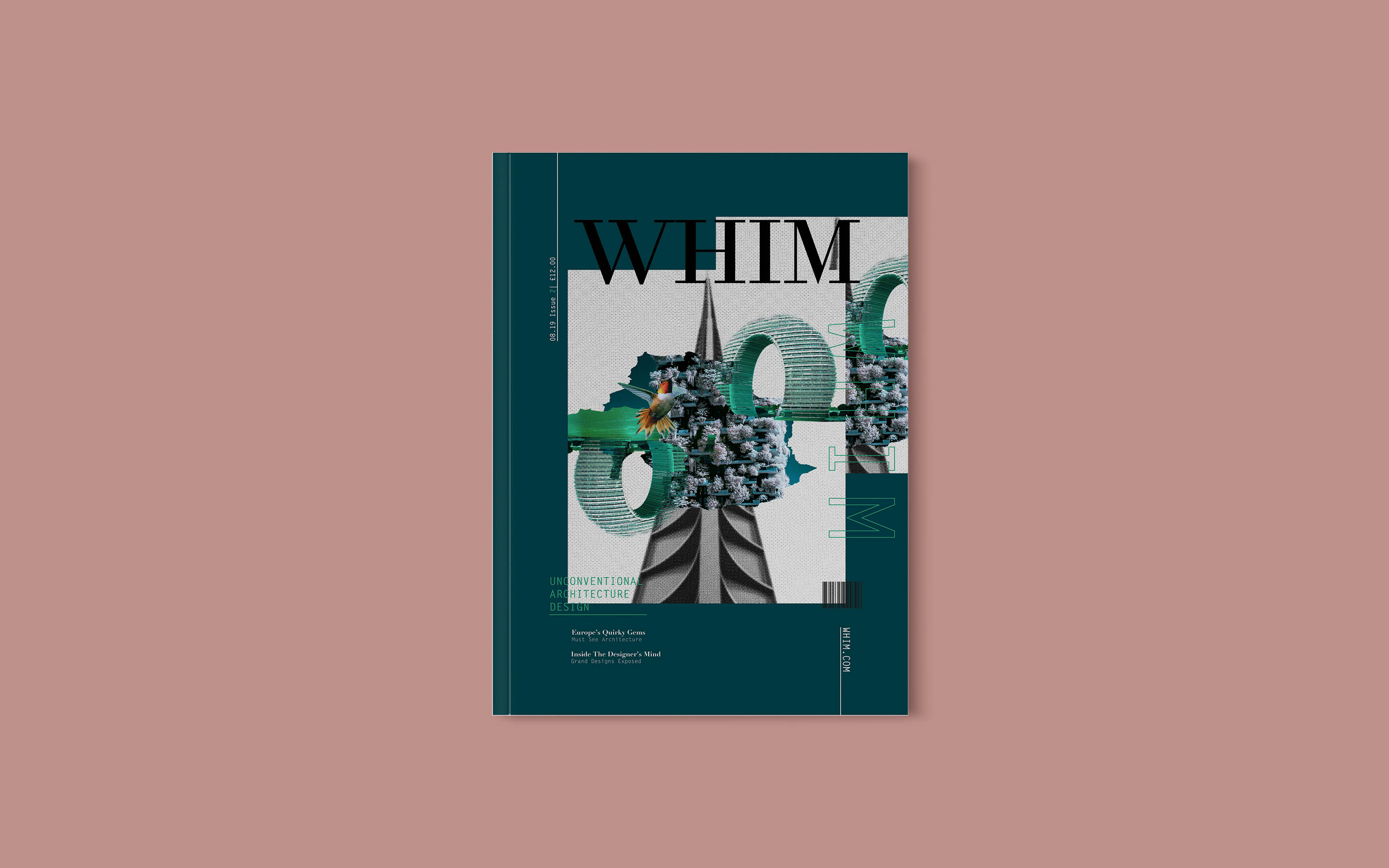
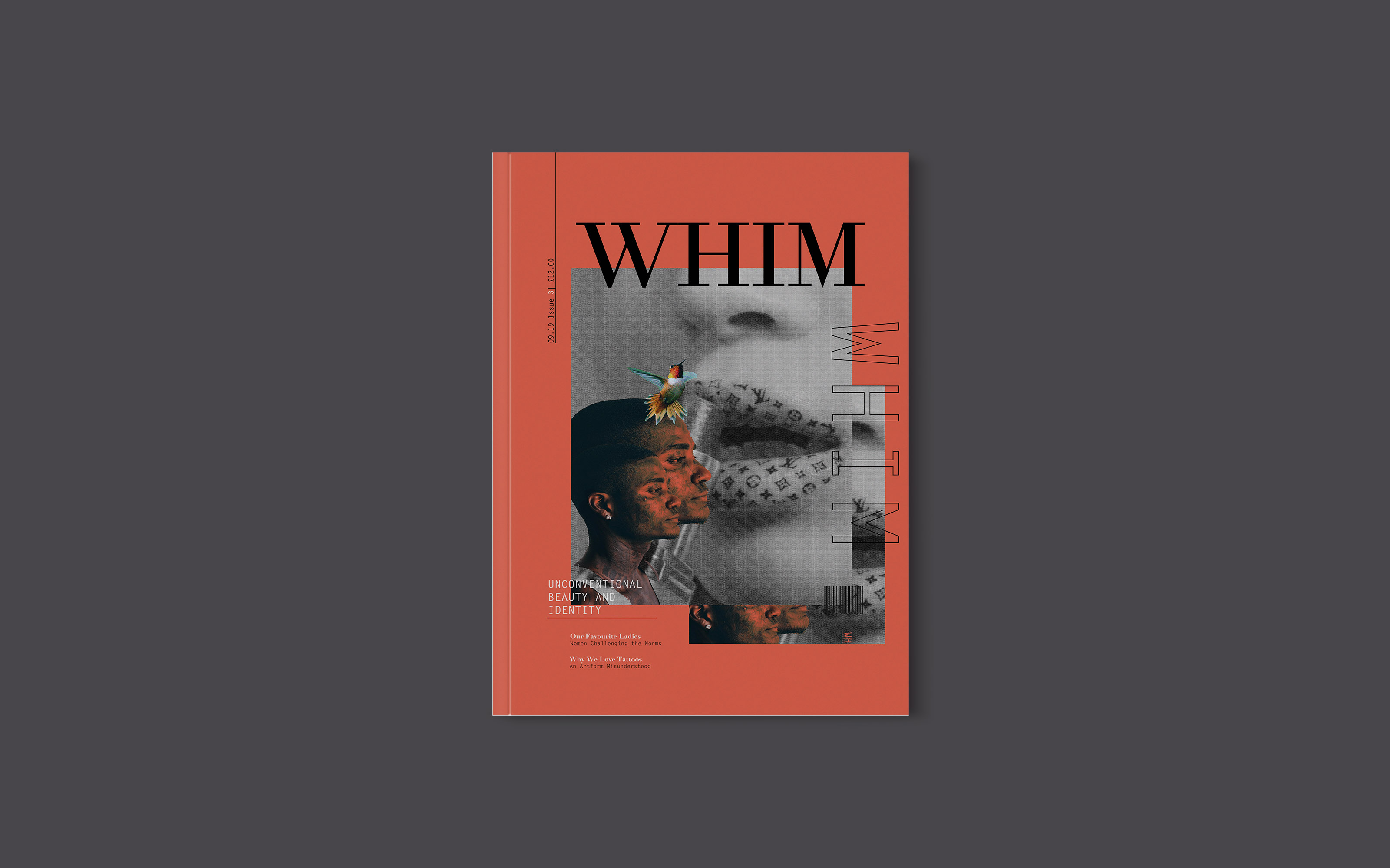
Whim is a magazine all about the unconventional. The design reflects this very ethos through the impulsive typography and the layered image treatment. The brand language conveys the addictive bliss of discovering beautiful, weird and wonderful things in the world, whether that’s beauty, travel or architecture.
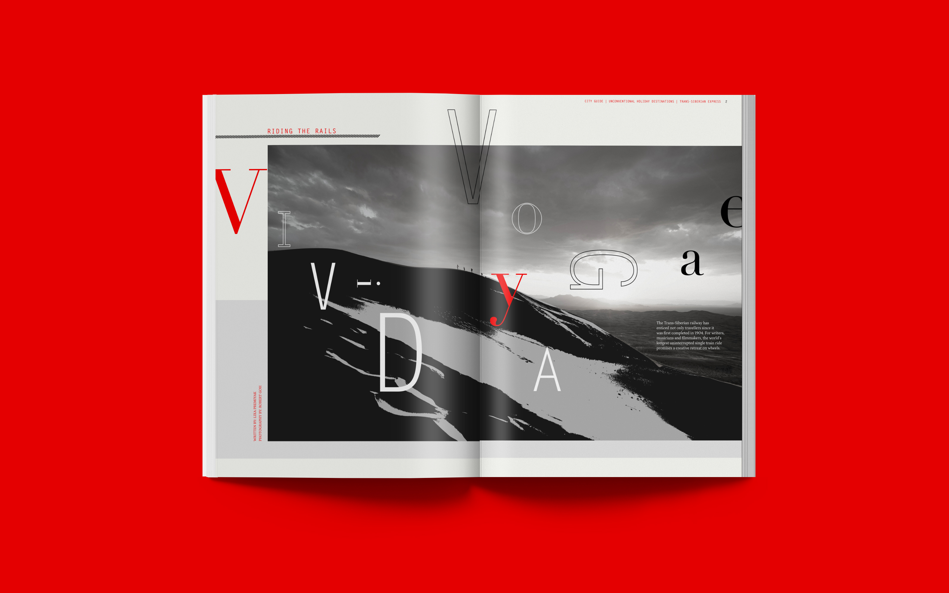
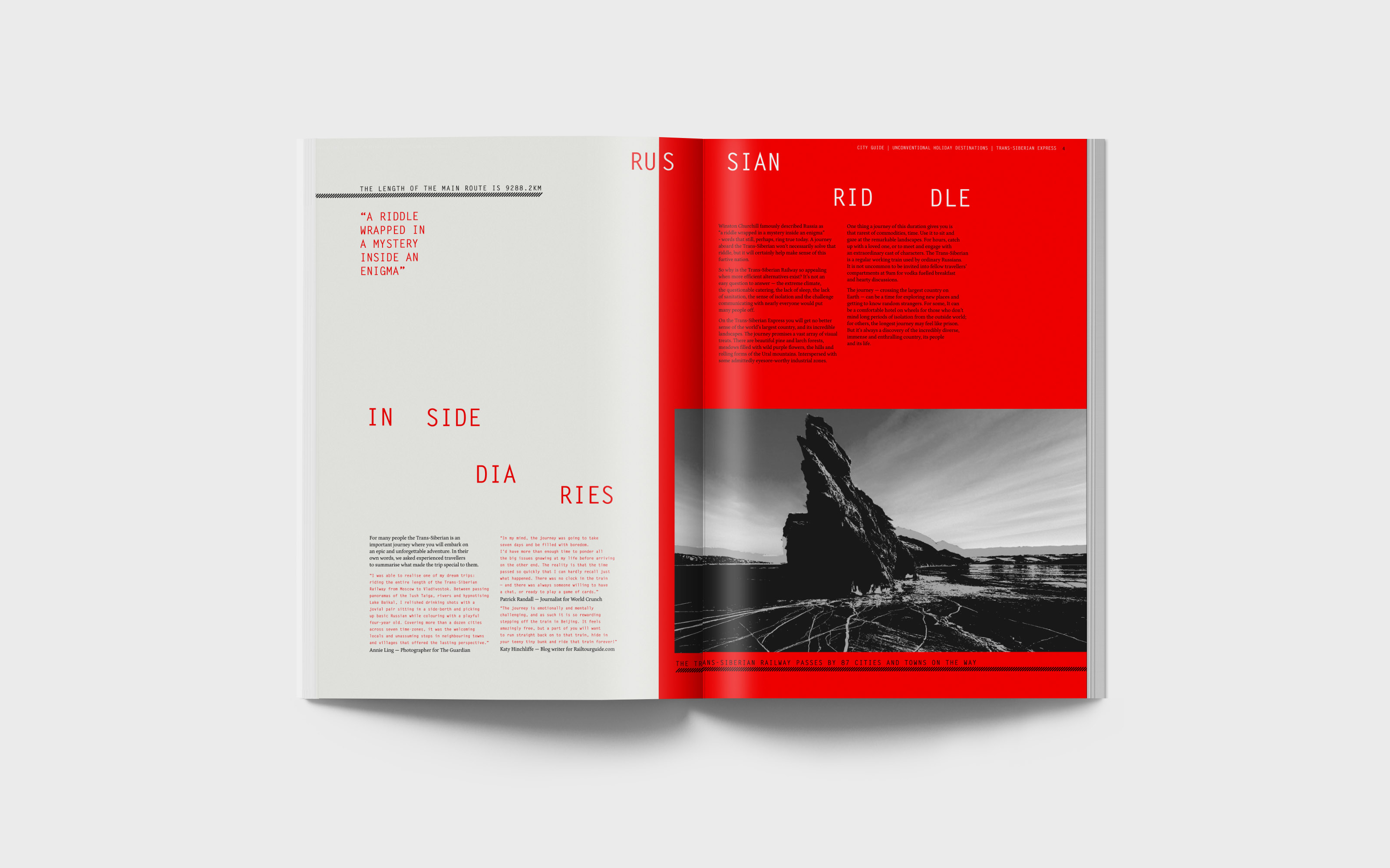
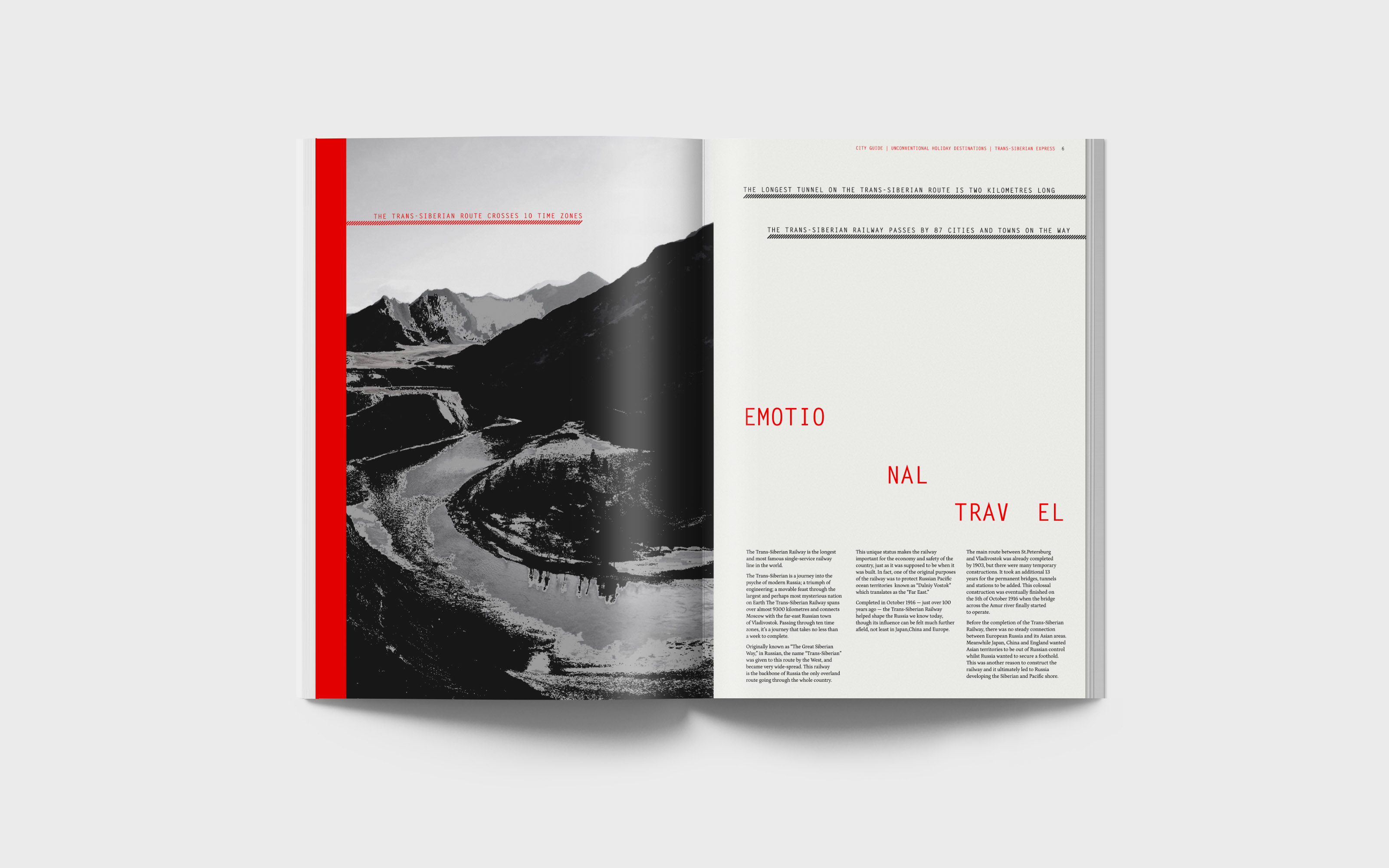
The travel spread is a feature on the Trans-Siberian Railway; a vivid, endless-feeling and emotional journey from Moscow to the Far East. The minimal colour palette with a punch of red symbolises the unique, intense and epic journey. The article also takes lead from the brand design with its unpredictable type treatment.
CREDIT
- Agency/Creative: Xa Studio
- Article Title: Whim – The Unconventional Series
- Organisation/Entity: Student, Non Published Concept Design
- Project Type: Identity
- Agency/Creative Country: United Kingdom
- Market Region: Europe
- Project Deliverables: Brand Creation, Brand Identity, Brand Naming, Branding, Graphic Design, Research
- Industry: Mass Media
- Keywords: branding, editorial design, magazine design, magazine covers
FEEDBACK
Relevance: Solution/idea in relation to brand, product or service
Implementation: Attention, detailing and finishing of final solution
Presentation: Text, visualisation and quality of the presentation


