


![We Are OSM Visual Identity and Website Design by [Studio] General Condition](https://worldbranddesign.com/wp-content/uploads/2021/06/weareosm-1.jpg)
OSM is a pack of creative, analytical, and organized individuals who work together to find the best solution for their clients. We are not ashamed to admit that combining design, development, and marketing often takes every ounce of strength, energy, and creativity. Connecting different worlds has never been an easy job.
Their visual story began as a fusion of color, pattern, and character. They started as a creative agency focusing only on design and then slowly including development – both web and mobile. The next chapter in their brand development history was the standardization of different IT services that they had already been providing to their clients as the add-on value to the already awesome design and development.
At that point, they realized that some clients could enjoy those IT services even if they do not need their design or development. The branching out of those additional IT services has been the first significant change to the OSM brand identity since 2010. That is when Avana, OSM Support, Paukhost, and Digital Signage have seen the light of day.
The new identity brings new colors, new patterns, and a new concept of the website and digital platforms. But of course, they have remained consistent with themselves.
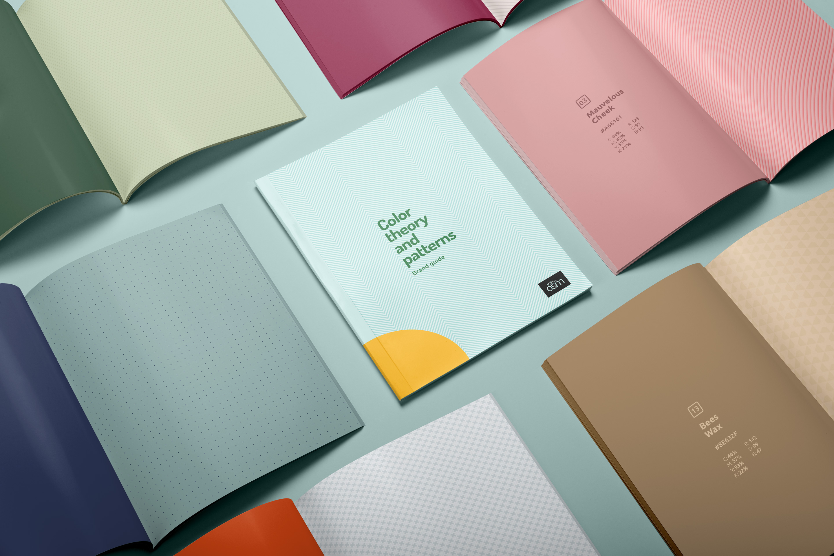
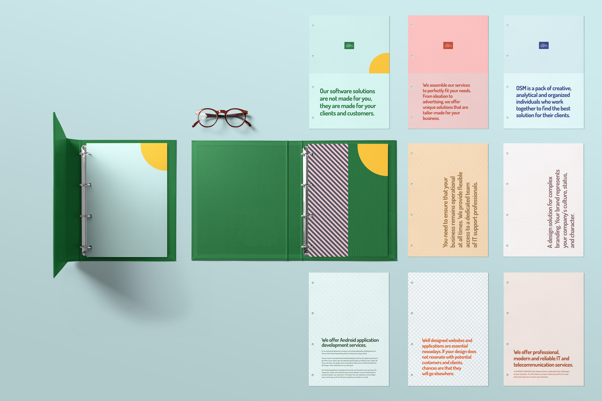
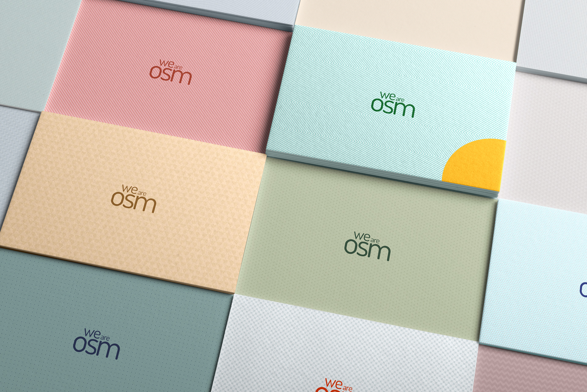
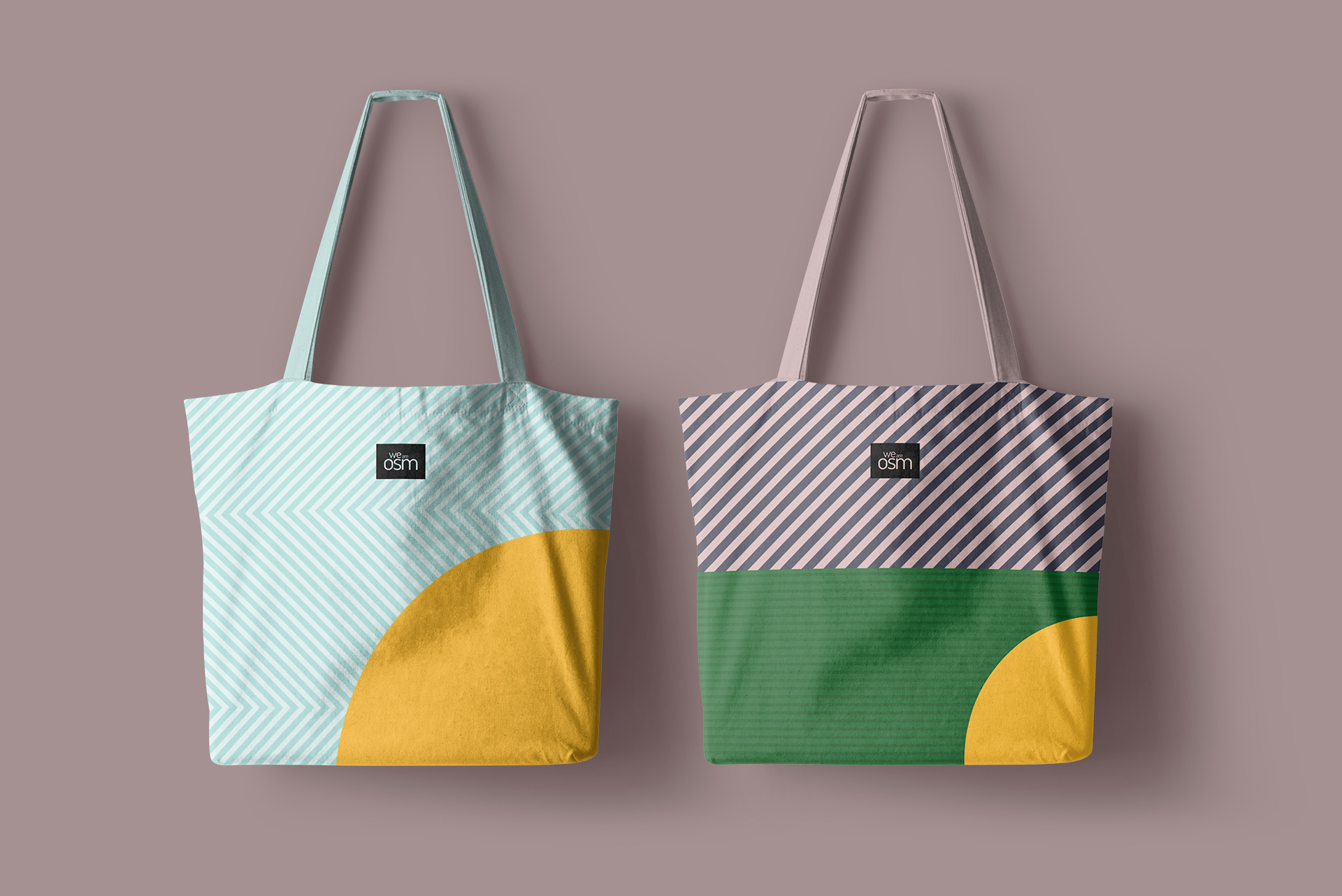
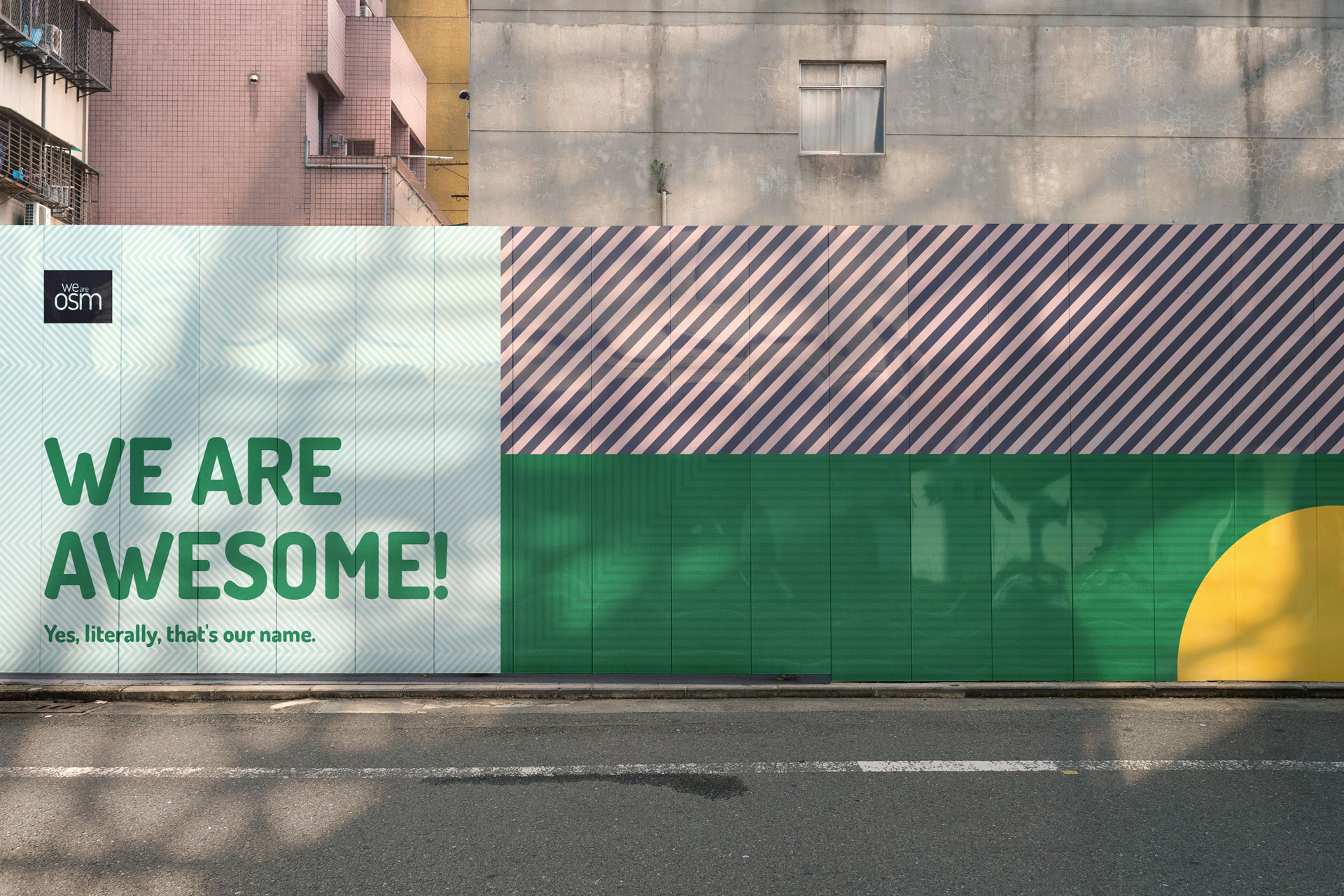
We have produced a remarkably bold and disciplined visual design system that manages to flex across an incredible range of strong tones and graphically detailed patterns. Each pattern and color combination is designed to differentiate each OSM service with its own color concept while still working with all the other services.
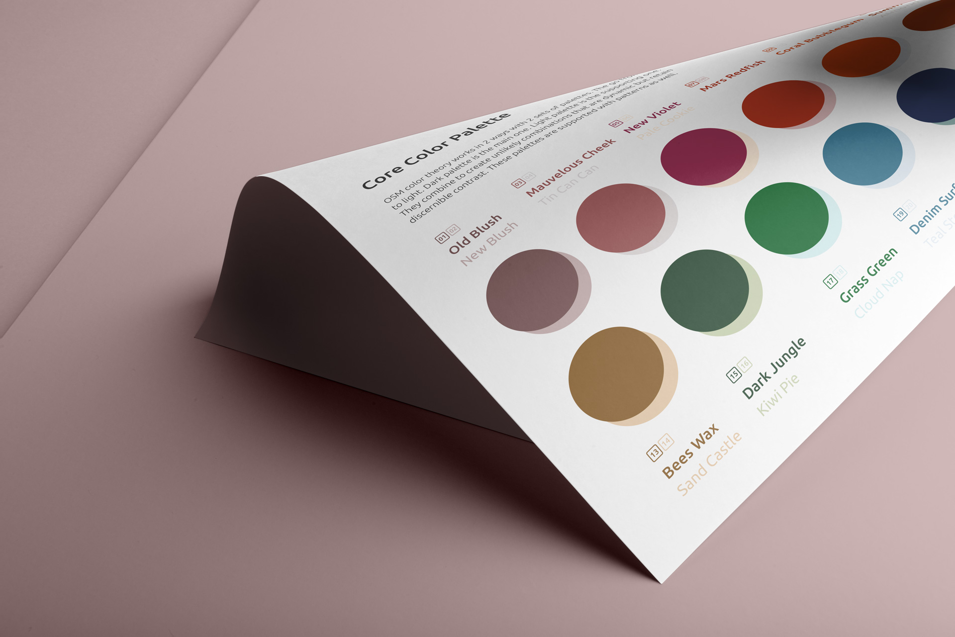
OSM color system works in two ways with two sets of palettes. The palettes go from dark to light. The dark palette is the main palette, whereas the light palette is the supporting one. They are combined to create unlikely combinations that are dynamic, yet manage to retain discernible contrast. There are a total of 24 colors in our system. During the process, each color has been given a name as well as each pattern. The color palette has been designed with this interplay in mind, although some color combinations work better than others. The new pattern version brings a clear pairing with certain colors from the system.
Apart from the logo, the brand typeface has remained unchanged. It has been part of the OSM brand identity from the very beginning and has shaped our craft in a certain way that they do not want to change. This time Dosis comes in its strongest option emphasizing each notion and setting a statement throughout the identity. Now Dosis is ideally paired with the new color system. We believe that it is extremely important to make a strong contrast between graphic elements because, otherwise, we could lose the message we are trying to convey. A small but significant refreshment comes from Ubuntu, a Sans-Serif typeface most commonly used for body text. Ubuntu’s philosophy, which states that every user should be able to use their software in the language of their choice, coincides with their strategy of presenting content in two additional languages – Serbian and French. Both languages are made up of scripts that imply special characters that Ubuntu fully supports.
Through a new brand identity, we also bring a system of characters designed to complete our story. The 24-character set is a mix of circular, square, and triangular shapes. The first association may be the signs and symbols that determine the way we process garments during washing. And most of the time we don’t know what they mean. On the other hand, some of these symbols date back 40,000 years. For centuries, the focus of paleoanthropology has been the representative art that our ancestors left behind in caves: eye-catching drawings of deer, horse, bison, and human figures. However, abstract signs such as disks, triangles, dots, circles, and lines were often overlooked.
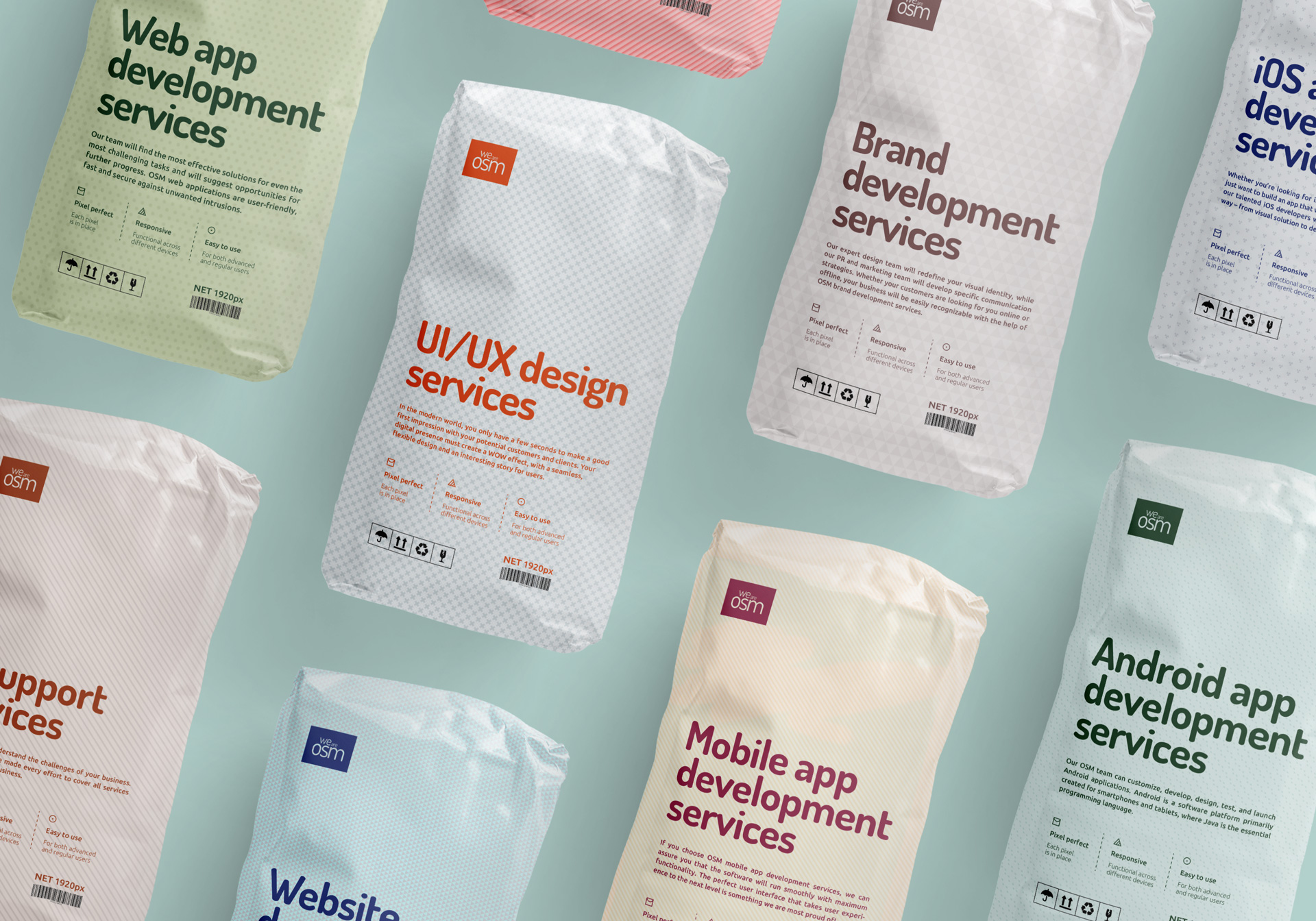
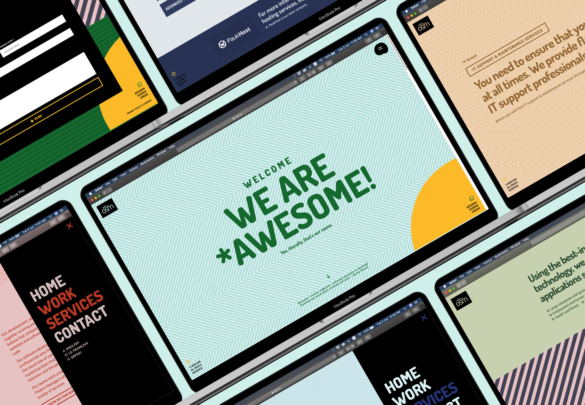
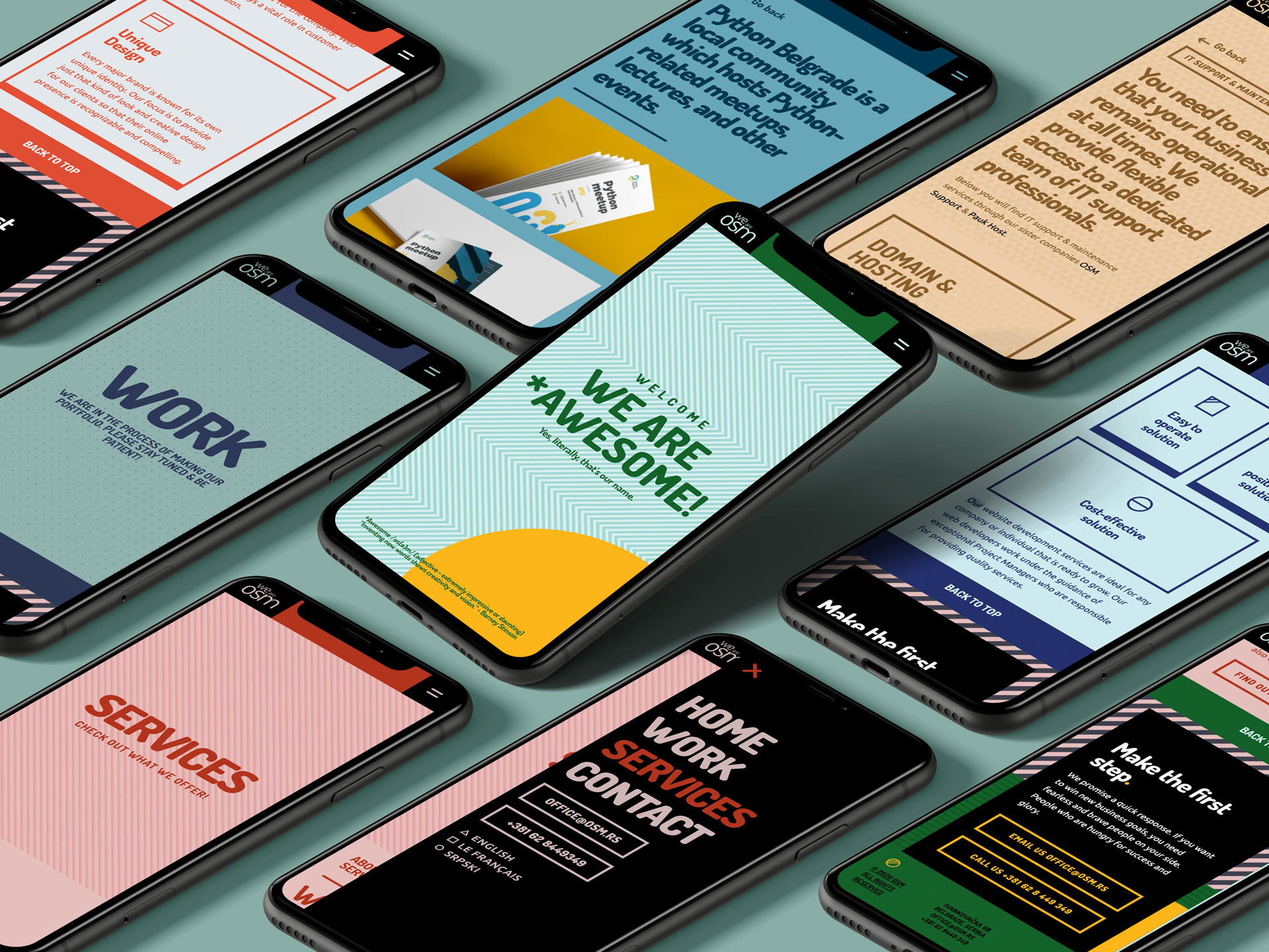
The changes to the website are significant. This time they have decided on a WordPress platform with custom development and design capabilities using the Elementor website builder, where we built a new platform for our content from scratch. The structure of the website has been expanded compared to the previous one. Additionally, the content is divided into four sections, where additional focus is placed on the Work and Services sections. We have presented in detail a large number of services through the mentioned graphic structure and system. Each service has its own color and pattern. This system is also transferred to the Work section where each of our projects is presented in a unique way. As a result, the presentation of our creative works evokes context and storyline.
CREDIT
- Agency/Creative: [Studio] General Condition
- Article Title: We Are OSM Visual Identity and Website Design by [Studio] General Condition
- Organisation/Entity: Agency
- Project Type: Identity
- Project Status: Published
- Agency/Creative Country: Serbia
- Agency/Creative City: Belgrade
- Market Region: Global
- Project Deliverables: Art Direction, Brand Design, Brand Redesign, Brand Refinement, Brand Rejuvenation, Branding, Character Design, Creative Direction, Design, Web Design
- Industry: Technology
- Keywords: software, apps, website, design, development
-
Credits:
Brand tone of voice: OSM team
Brand/website copy: OSM team


