


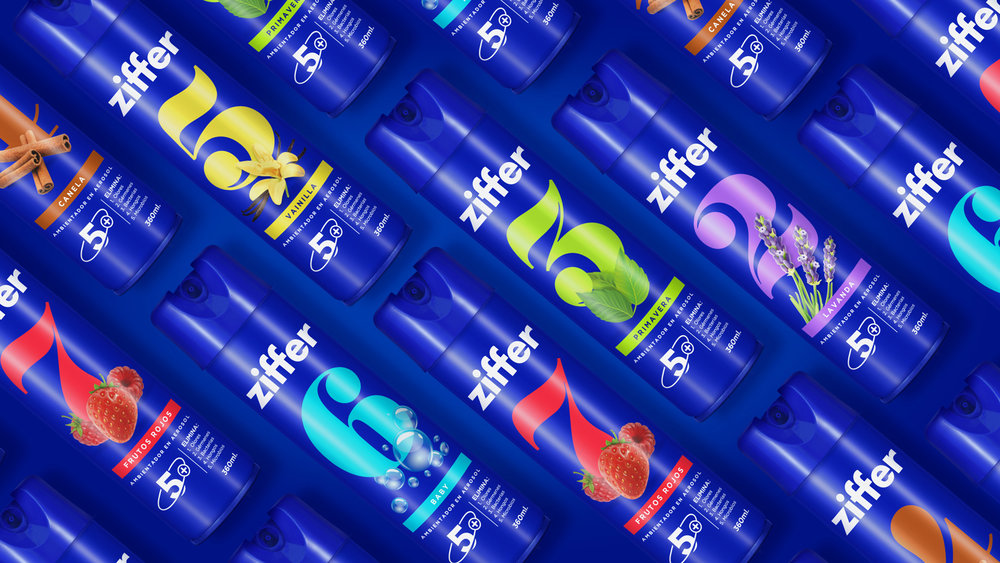
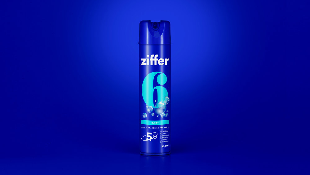
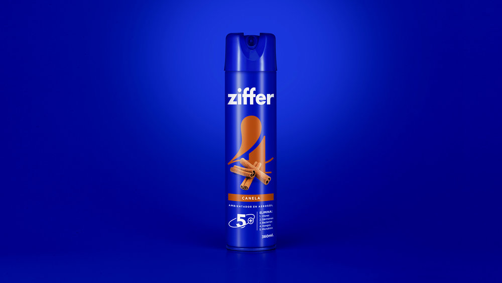
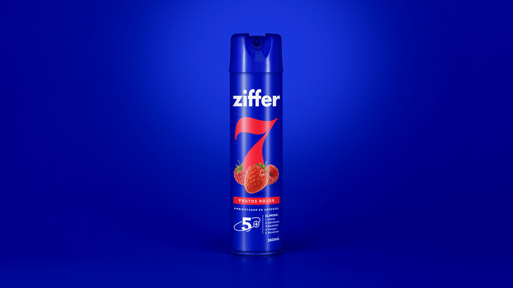
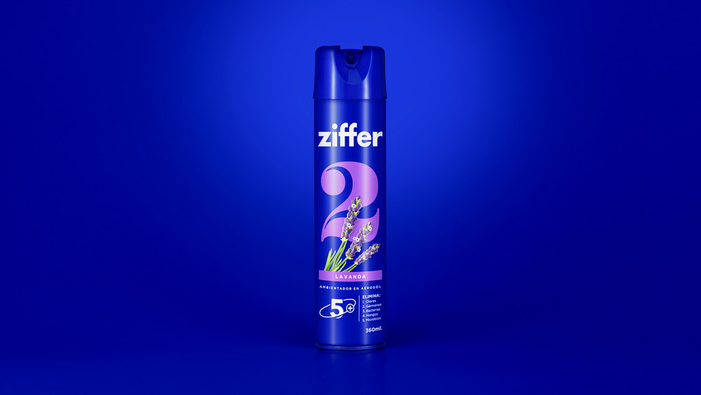
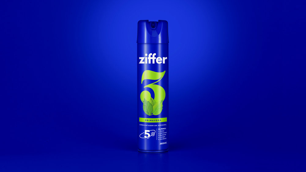
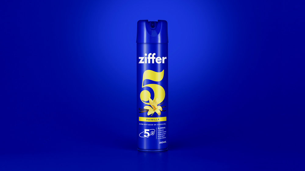
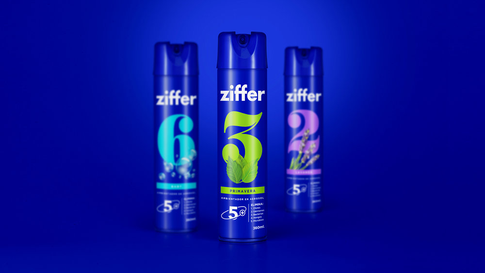
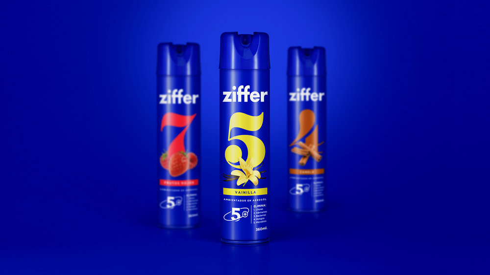
” ZIFFER is a new line of air freshener which is looking forward to opening it’s space on a very traditional category on what visual codes refer to; for this reason and also to stablish a notable difference towards our competitors, it was decided to use as a main idea for the brand building, a serial codification proper of editorial design.
In order to define this concept it was used the German word ZIFFER (number) as a denominator and each of the fragrances was enumerated to turn them into “collectible exemplaries” such and how it happens on recurrent publications, magazines, encyclopedias etc.
The blue color which was previously on the cap of the structural package, was adopted as color brand by this generating a chromatic contrast and a clear identifier on the sales point.”

CREDIT
- Agency/Creative: Vórtice Estudio
- Article Title: Vórtice Estudio – ZIFFER
- Project Type: Packaging
- Format: Bottle
- Substrate: Metal, Plastic


