


During the lockdown, we were approached by entrepreneurs who were planning to launch a food delivery service in the main cities of the Ural region. Upon completing the brand strategy and positioning development stage we started working on the brand name. It had to be simple, bold, positive and a bit ironic. Preferably in Russian, due to the brand’s geography. Finally, we found Vkusolyot ( or Tasteship, if translated literally). The taste that delivered.
Teamwork has always been key for all successful businesses. One would never doubt a team member on an aeroplane or a spaceship. Sharing responsibilities and always acting as planned guarantee a successful outcome. Vkusolyot would always come to rescue those who are starving and need something tasty right now.
The logo turned out to be as dynamic as the brand itself. A unique typeface with playful details added expressiveness, and an optional oval plate made it readable against any background.
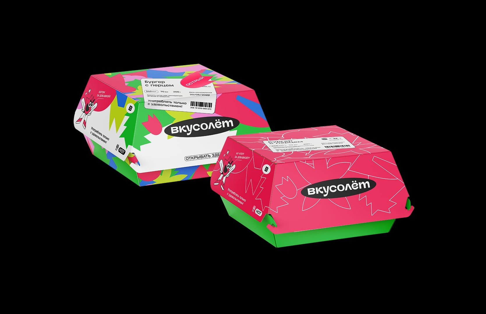
An indispensable crew became the brand mascots. Each character was a reflection of a certain taste and had its own main emotion. All those tastes and emotions characterized the full experience from your Vkusolyot order.
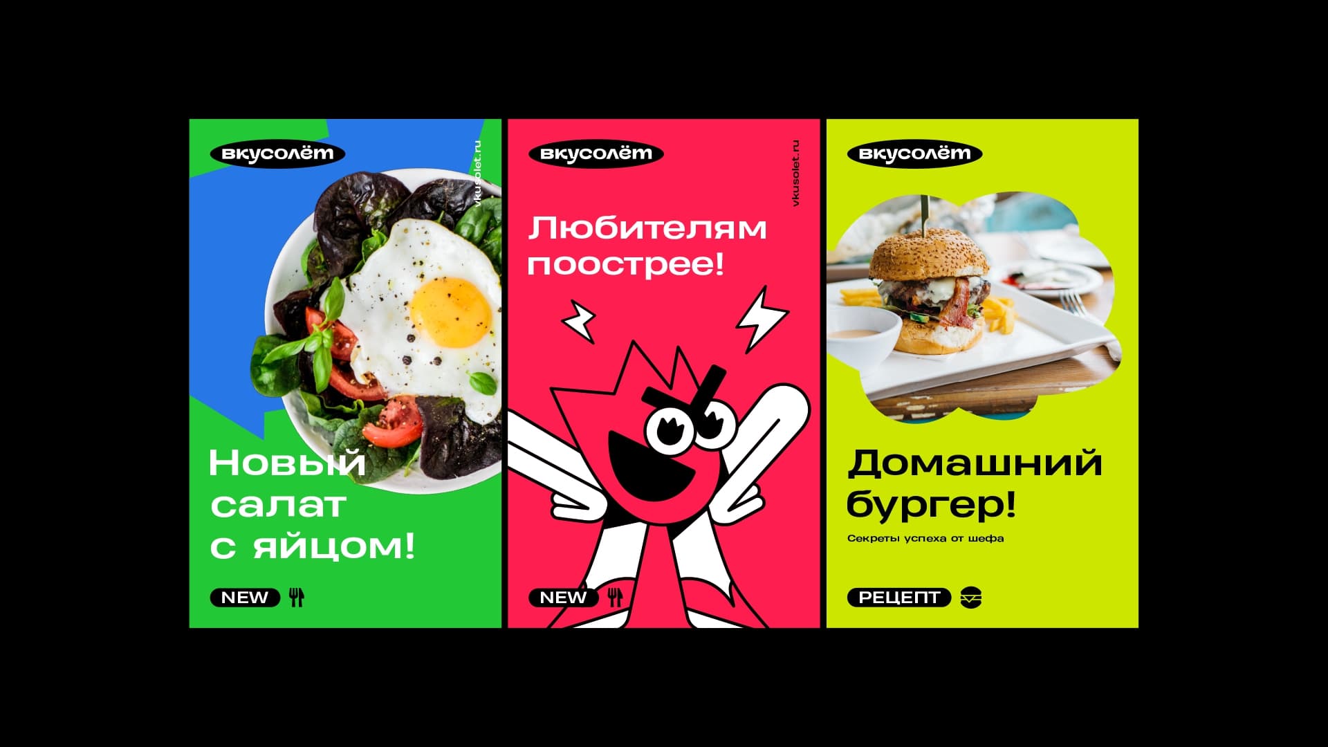
We drew Hot as a reckless bully, Spicy as a snob, Sweet as a careless nerd, Sour as a typical drama queen and Salty as a slightly dumb bodybuilder. Together they made a perfect taste team. Each had his own character and tone of voice as well as an abstract shape that could be used instead.
While the tasting crew was responsible for emotions, stickers, bubbles and icons were added as part of the space/plane technical aesthetics to support the name.
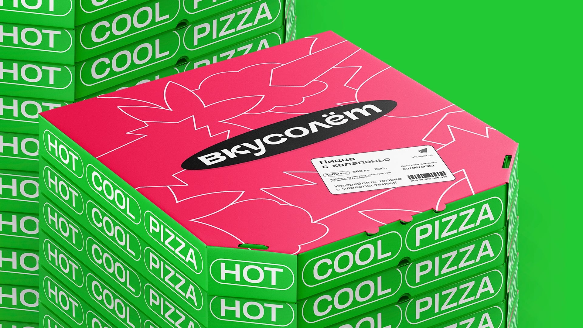
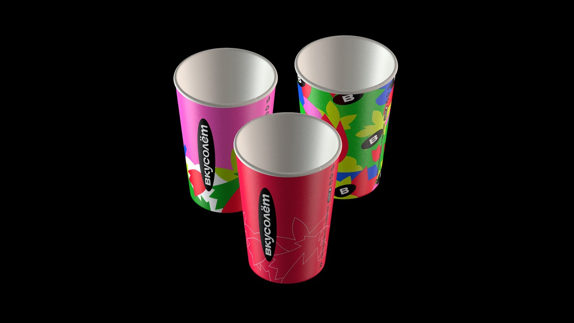
The brand mixed bright and emotional with practical and informative creating a contrast that worked great for all media. The packaging could feature a colourful brand pattern as well as a combination of just two colours – pink and green.
Brand graphics and mascots together allowed us to create tons of posts and banners. Mascots could either communicate with the audience or morph into their abstract form and become more secondary.
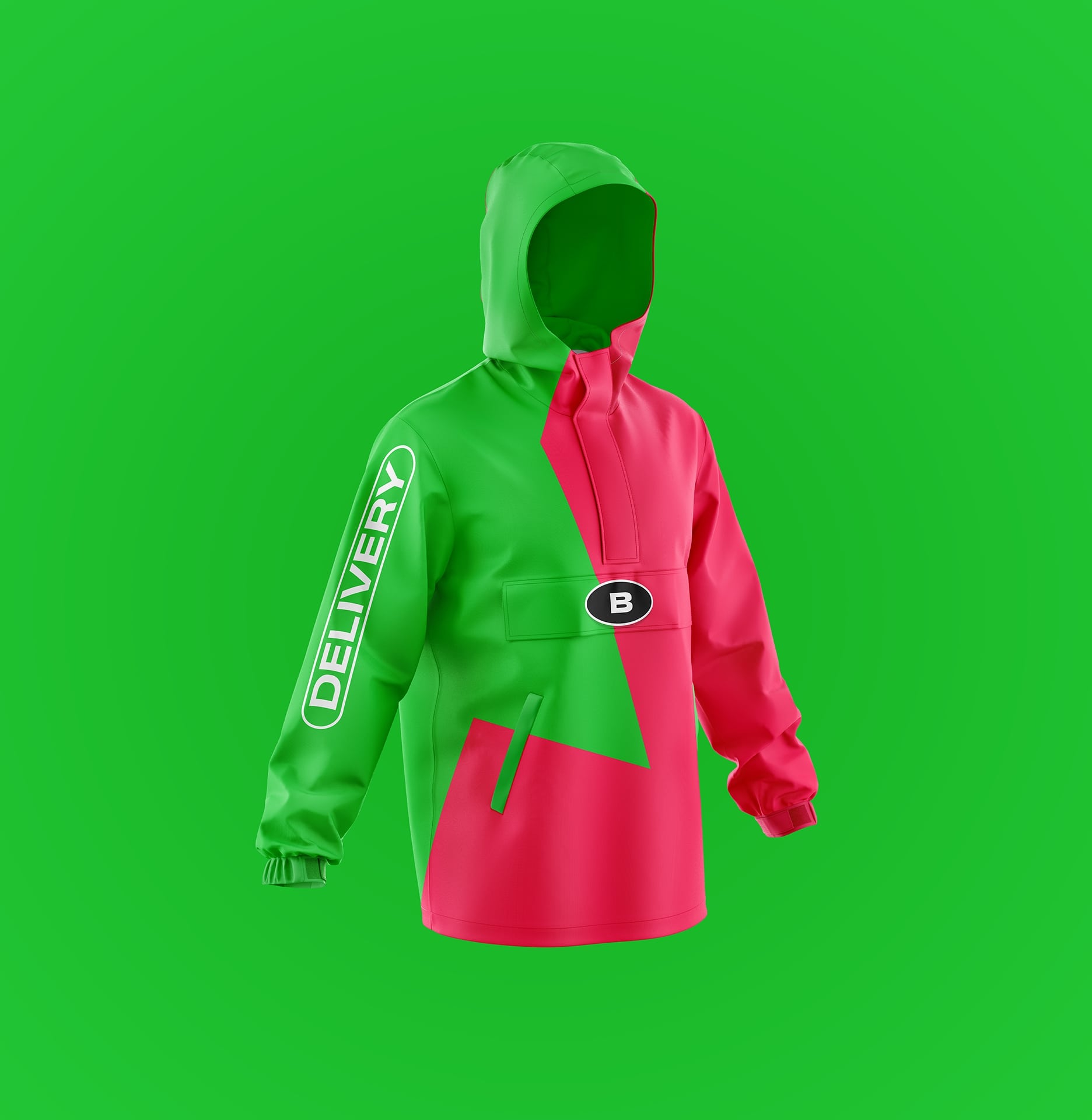
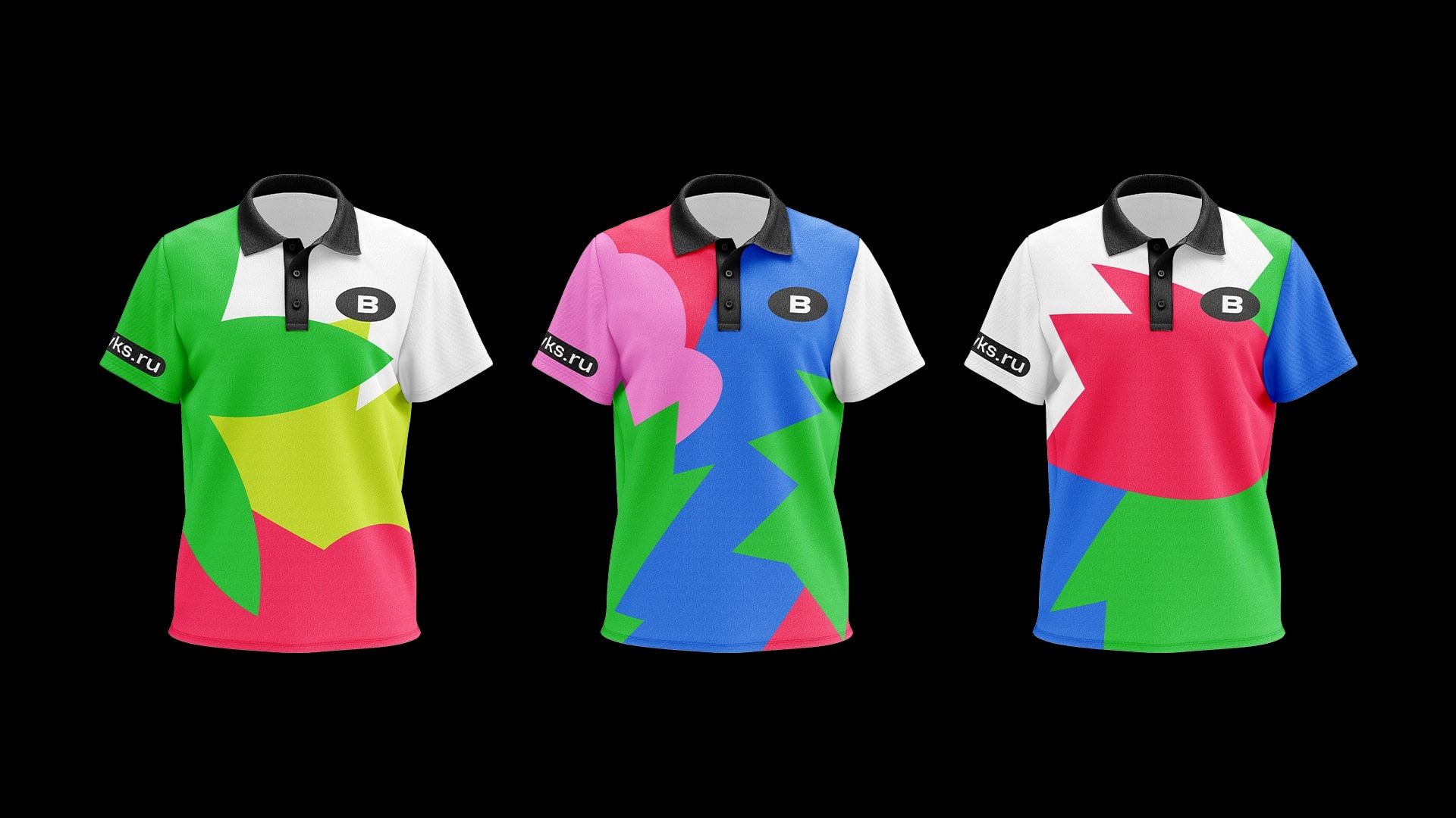
The staff uniform looked more minimalist: we used two main brand colours to make it recognizable and dynamic. The polo shirt was more elaborate and could be chosen by the delivery staff themselves.
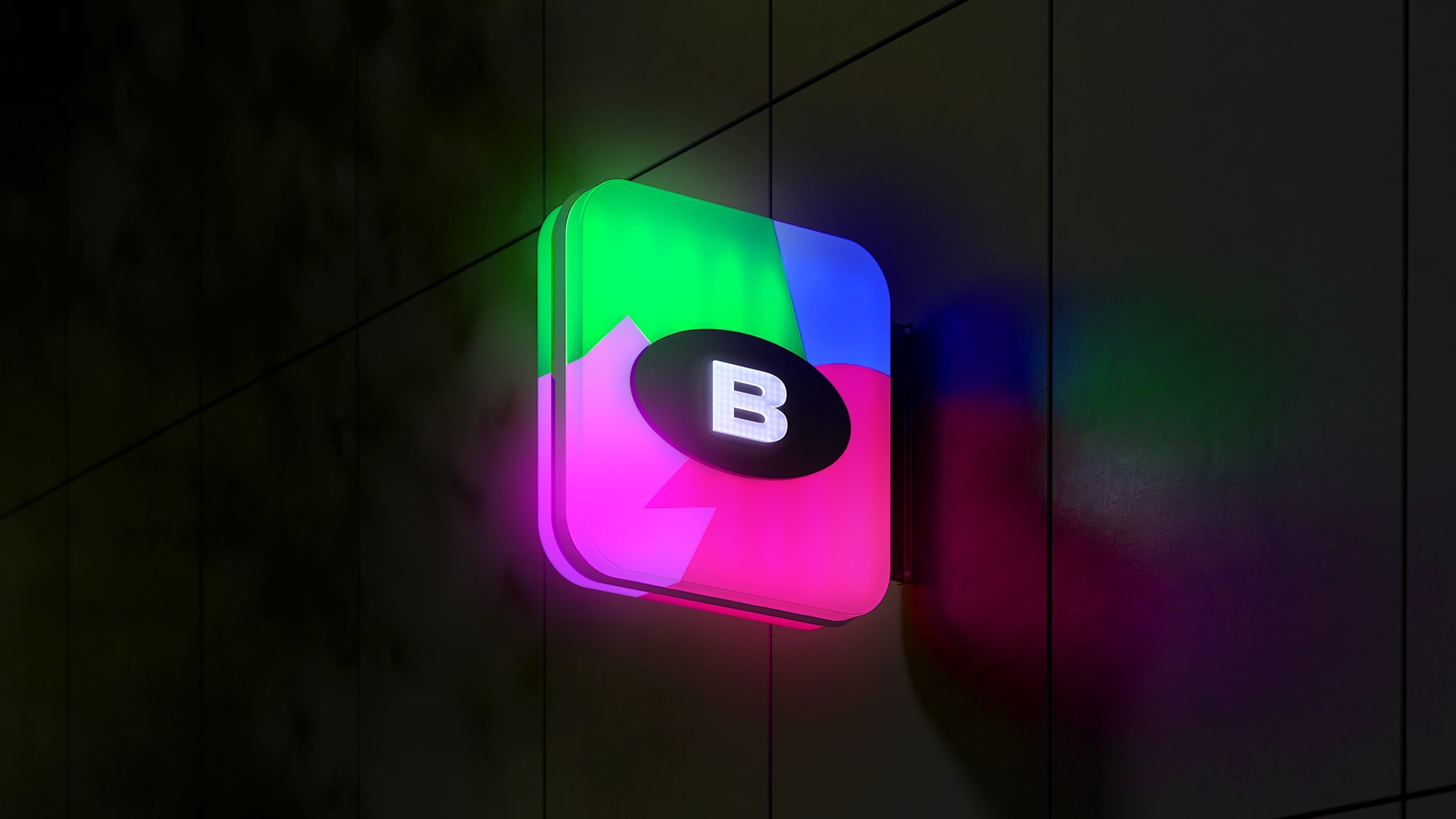
The street sign looked exactly like the app icon to highlight the brand’s digital character. The logo turned into a simple sign with the first letter of the name.
CREDIT
- Agency/Creative: Plenum
- Article Title: Vkusolyot Flying Food Delivery Service Branding by Plenum
- Organisation/Entity: Agency
- Project Type: Identity
- Project Status: Published
- Agency/Creative Country: Russia
- Agency/Creative City: Moscow
- Market Region: Europe
- Project Deliverables: Animation, Art Direction, Brand Creation, Brand Design, Brand Guidelines, Brand Strategy, Character Design, Copywriting, Logo Design, Packaging Design, Tone of Voice
- Industry: Food/Beverage
- Keywords: food delivery, brand character, food tech, mascot, identity, brand strategy
-
Credits:
Creative Director: Egor Myznik
Art Director: Maria Pechkurenko
Head of Strategy: Ekaterina Palshina
Strategist: Ekaterina Avteykina
Producer: Darya Bizyaeva
Designer: Alia Karnaukhova
Designer: Irina Purtova
Designer: Anna Volkova
Illustrator: Anna Derevyanko
Architect: Nikita Boldyrev


