


At Buenaventura, we believe in creativity and design as a means of social transformation. Likewise, we believe, trust and especially enjoy when we have the opportunity to work on design projects that generate a positive impact for the community. And in this sense, Loxa is a magnificent example. A cooperative that functions as a social network, which generates resources by and for society.
Typographic recovery; travel in the time
Trips are always more enriching if you have good companions with whom to share experiences. The same thing happens in design. To start our journey towards typographic recovery, in Buenaventura we have counted on Ana Moliz, an expert graphic designer in typography and a regular collaborator.
She was in charge of creating a complete alphabet for the brand. To do this, Ana carried out complete research work. There was no data collected from who developed that lettering, nor what typeface it was. Therefore, another way had to be found. For example, Ana Moliz investigated possible typographical references of the time to try to find out those that the artist who made the lettering could have been inspired by.
She so she started working on typography. The analysis of the lines, the definition of the features, the application of metrics to seek balance and harmony, the search for modularity and geometry … Step by step, the development of the font was gaining body and balance. A fine work of investigation and refinement of lines, until, finally, we saw that in addition to a brand we had a system with which to express Loxa’s roots.
A natural process as a concept: Envero, a chromatic process
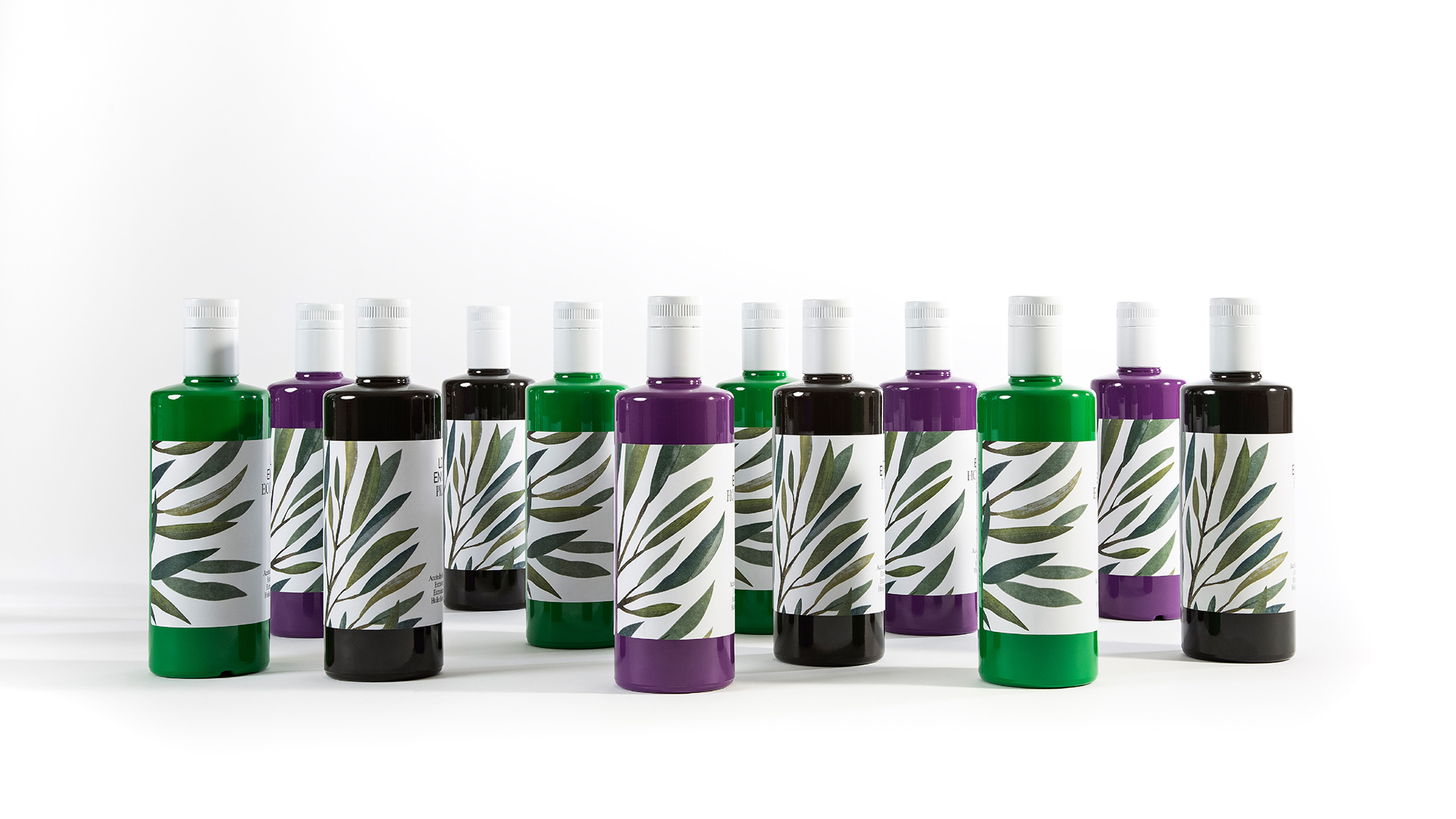
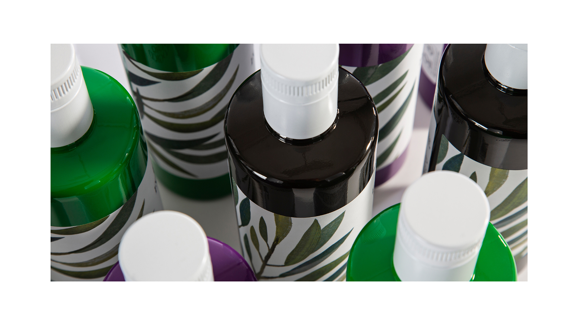
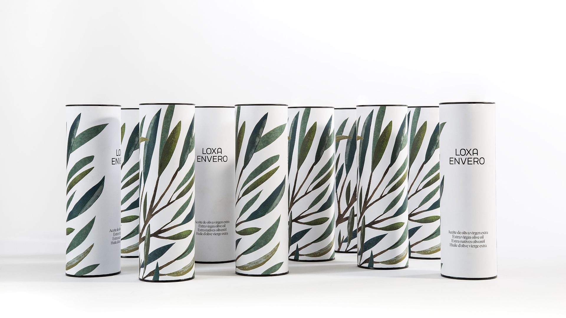
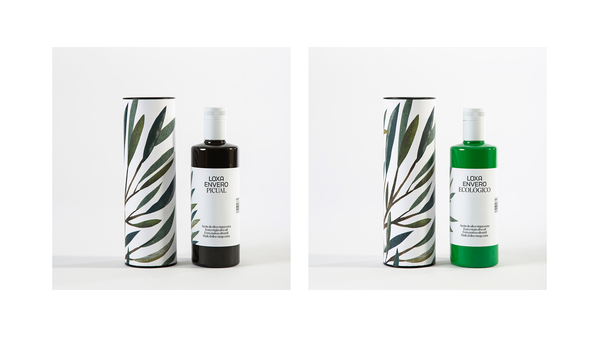
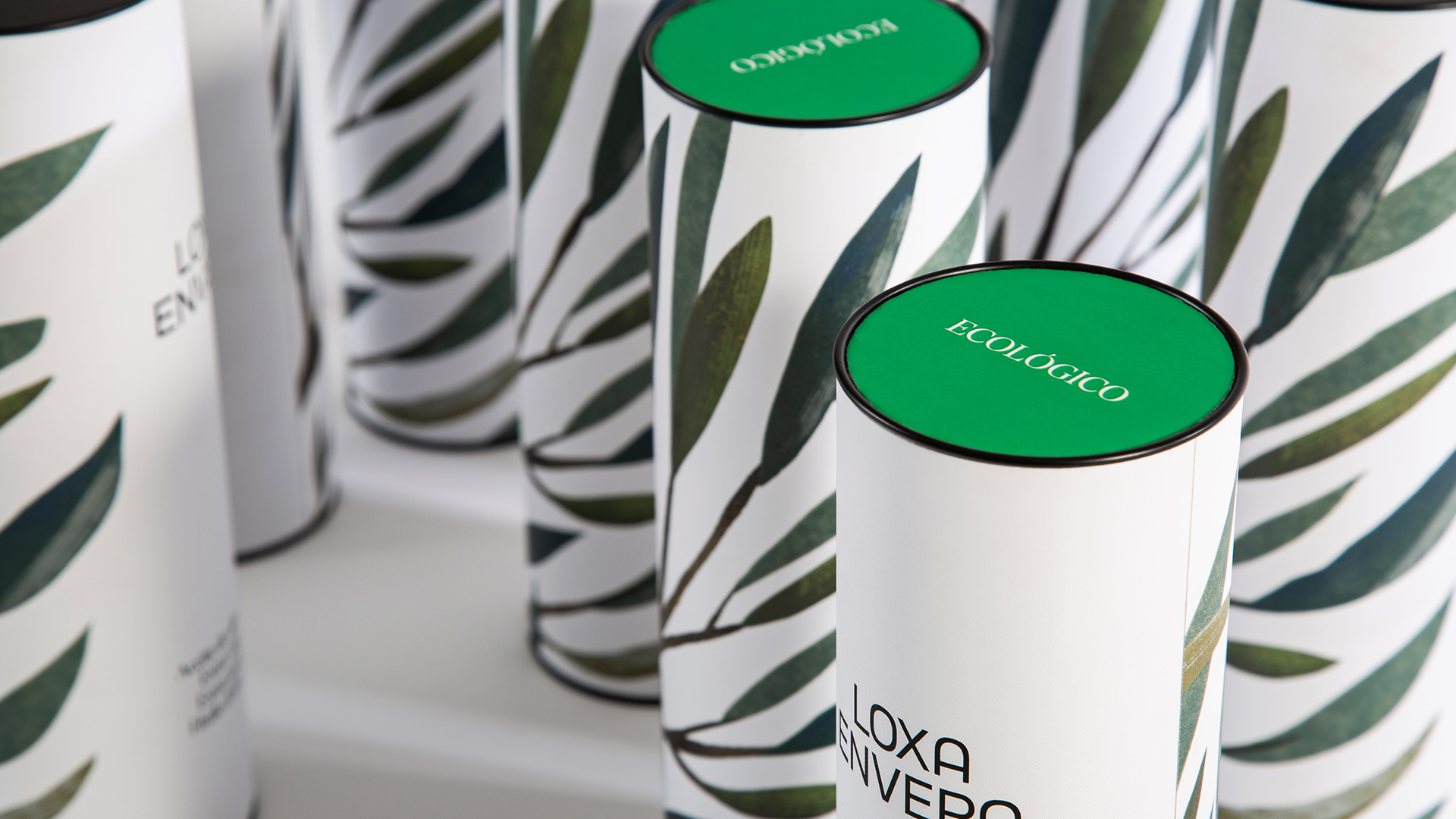
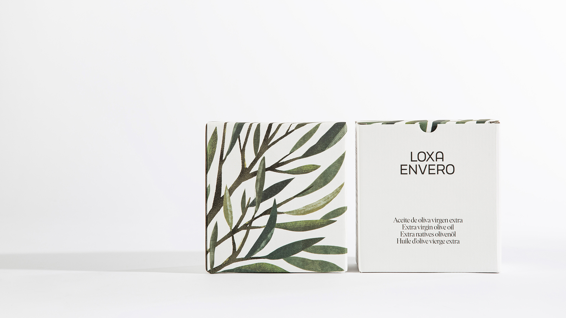
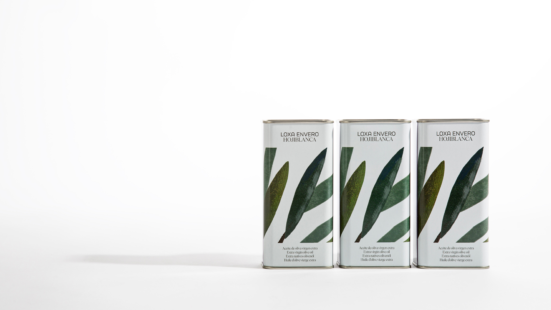
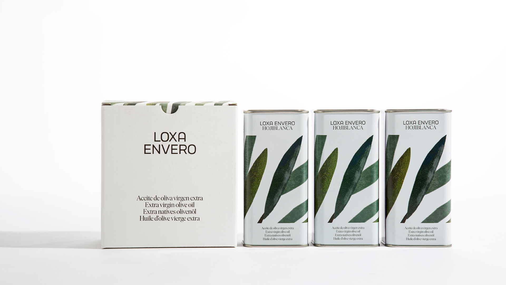
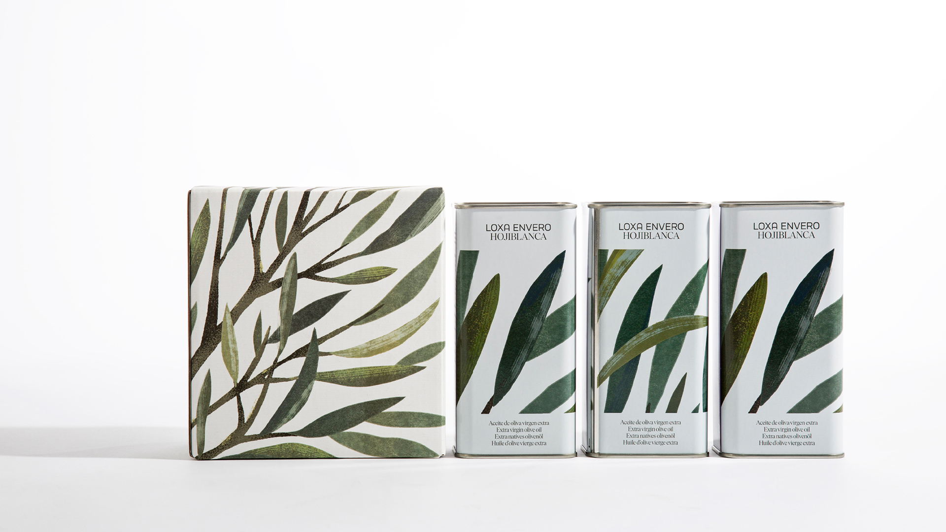
Extra virgin olive oil is obtained exclusively at the beginning of each harvesting campaign, when the olives are still green but starting the ripening process, what is called here “envero”. Completely cold extracted with mechanical procedures immediately after harvesting and packed “in the branch” after decantation and meticulous grinding, we get an excellent natural juice. Loxa Envero arises from this respectful process. We focus on the three main colours of the ripening process (green, purple and black) to code the 3 products in the range (organic, hojiblanca and picual). In a clear tribute to the olive tree and to back up the range, we turn to an illustration by Vanesa Zafra to represent the fruitless tree, it goes inside.
If we look at the whole project together, we discover that Loxa is not a logo. The brand is a sum of many factors that enrich this visual system, to give it a unique and non-transferable character.
Loxa is a language of broad formal coherence, flexible and adaptable to different formats, that uses the codes of the field and that maintains its historical legacy from its roots.
From the Buenaventura team, we want to underline the importance of this project for us. It is an immense pleasure to see how Loxa’s visual identity grows in the wide range of products and joins the founding principles of this cooperative. This is not just a brand identity project. It is a fusion of design, culture, nature and business as part of that great network that is Loxa. A network that generates an important positive impact for society.
CREDIT
- Agency/Creative: Buenaventura Studio
- Article Title: Visual System and Packaging Design for Loxa Envero Extra Virgin Olive Oil by Buenaventura Studio
- Organisation/Entity: Agency
- Project Type: Identity
- Project Status: Published
- Agency/Creative Country: Spain
- Agency/Creative City: Loja
- Market Region: Europe
- Project Deliverables: Art Direction, Brand Design, Packaging Design
- Industry: Agriculture
- Keywords: #identity #packaging #tipography #illustration
-
Credits:
Creative director: Ramón Soler
Production director: Rafa Mateos
Typography: Ana Moliz
Illustration: Vanesa Zafra
Photo: Cristina Beltrán
Video: Adrián Cecilio + 2041


