


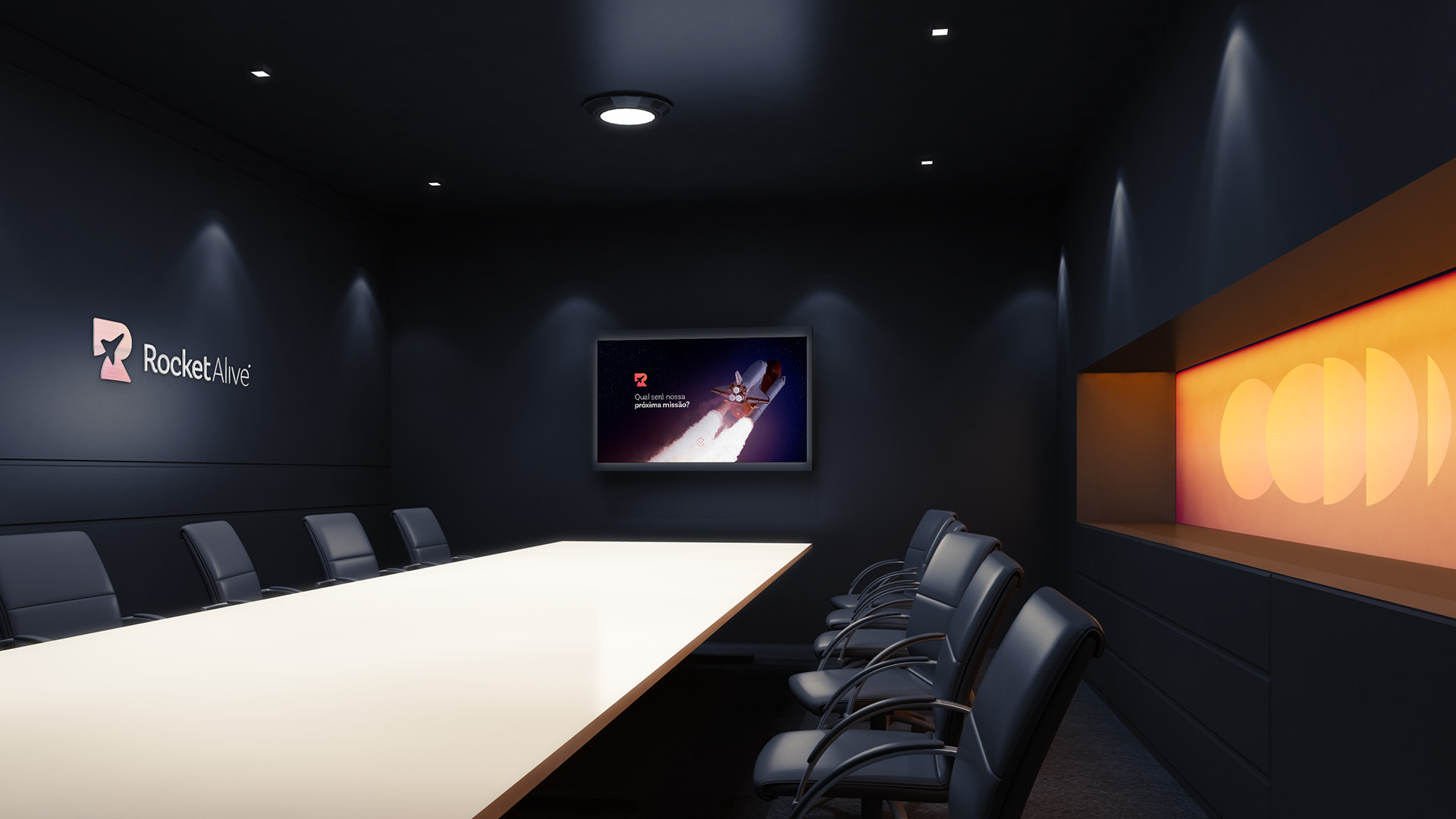
Rocket Alive is a digital product launch agency that launches workers in the online course market. Some of the services offered are: structuring, planning, recording and editing online classes, programming the sales platform, websites, Facebook ads, email flow, personal marketing, social media, etc.
Their mission is to spread the message of an expert or a person who already has authority on web to millions of people. This is done through network marketing and digital communication. What’s the difference from the competitors? The quality of cinematic video in 4k and the excellent support in the visual communication of the professionals.
Project objectives:
• Identify the main characteristics that make Rocket Alive who they are, develop a clear personality and transform these attributes into visual elements;
• Create a standardized visual language that facilitates identification, promotes recognition and connection with the public through affective memory;
• Develop solutions that support a new phase of the company in the digital environment and enhance its presence on social networks.
Creative solutions:
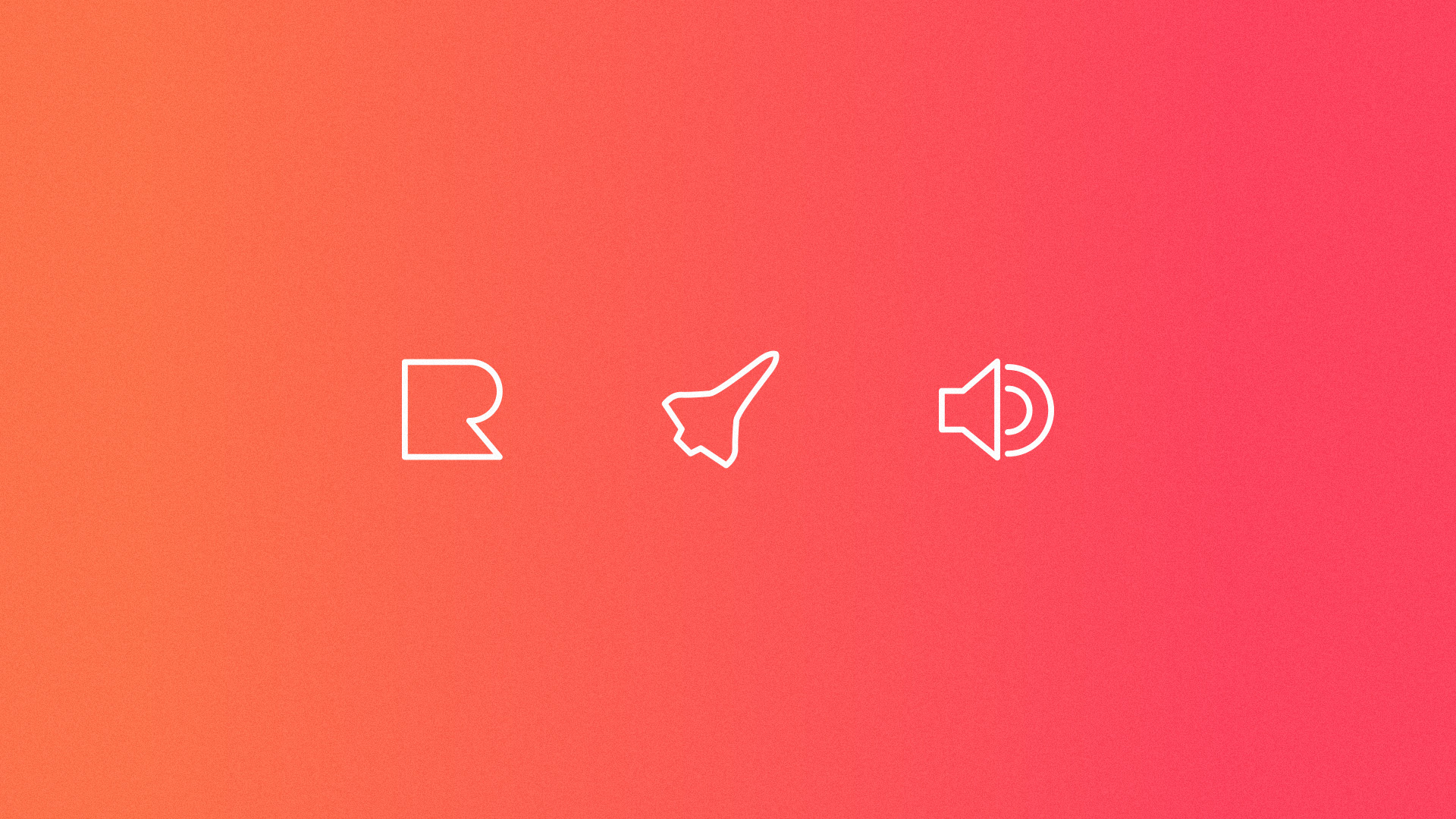
1. Explicitly represent the initial of the company name, recalling the visual and verbal aspects of of the brand;
2. Attribute the meaning of the brand name itself, representing the company concepts and strategies, which is the launching of digital products;
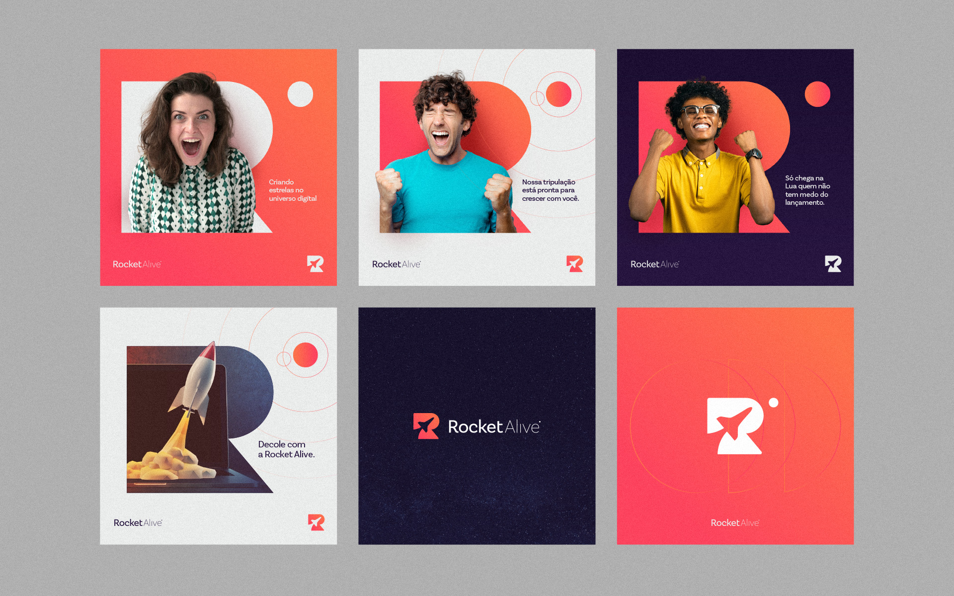
3. Emphasize the service’s scope through promotional, informational and digital communication actions.
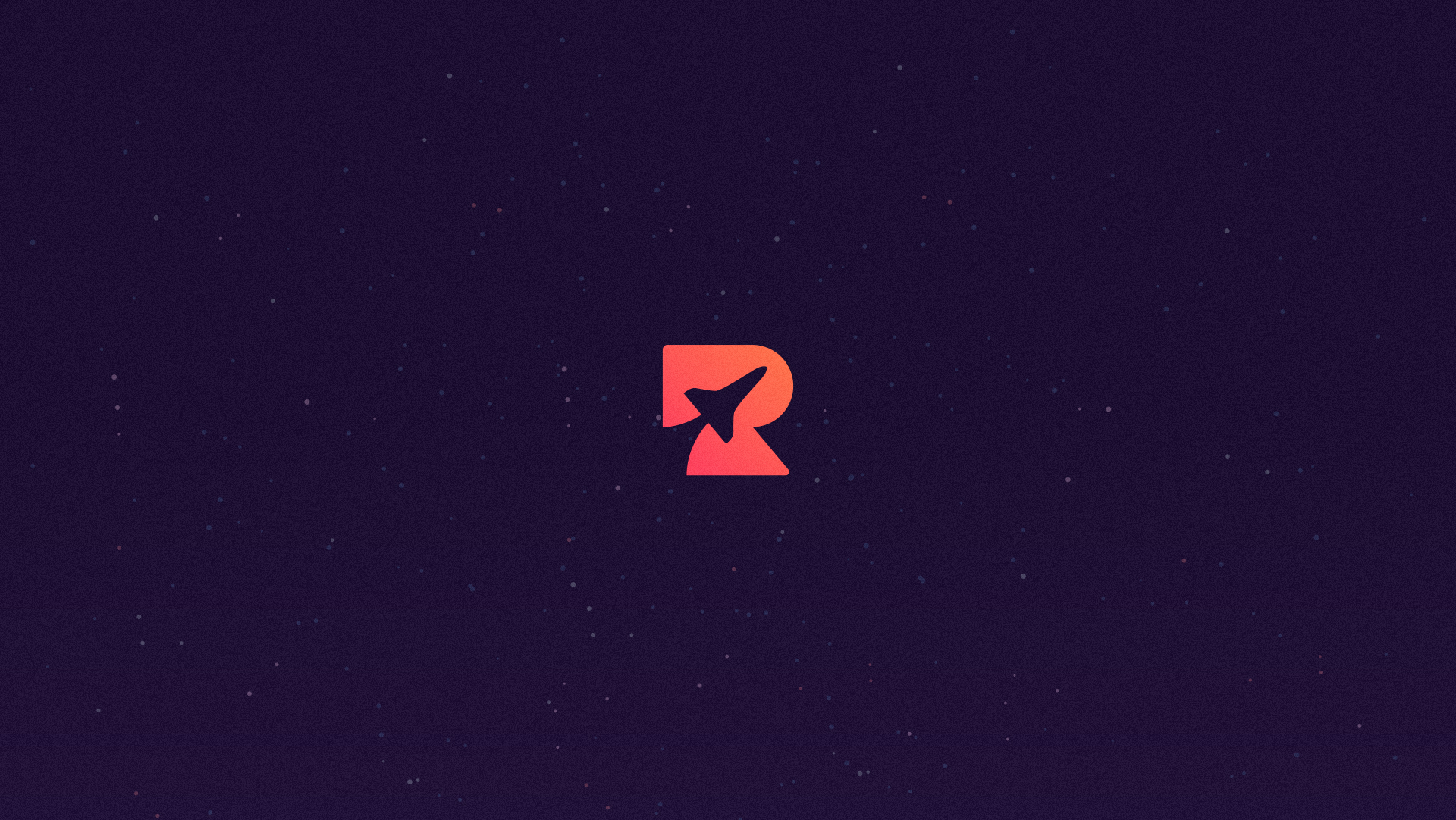
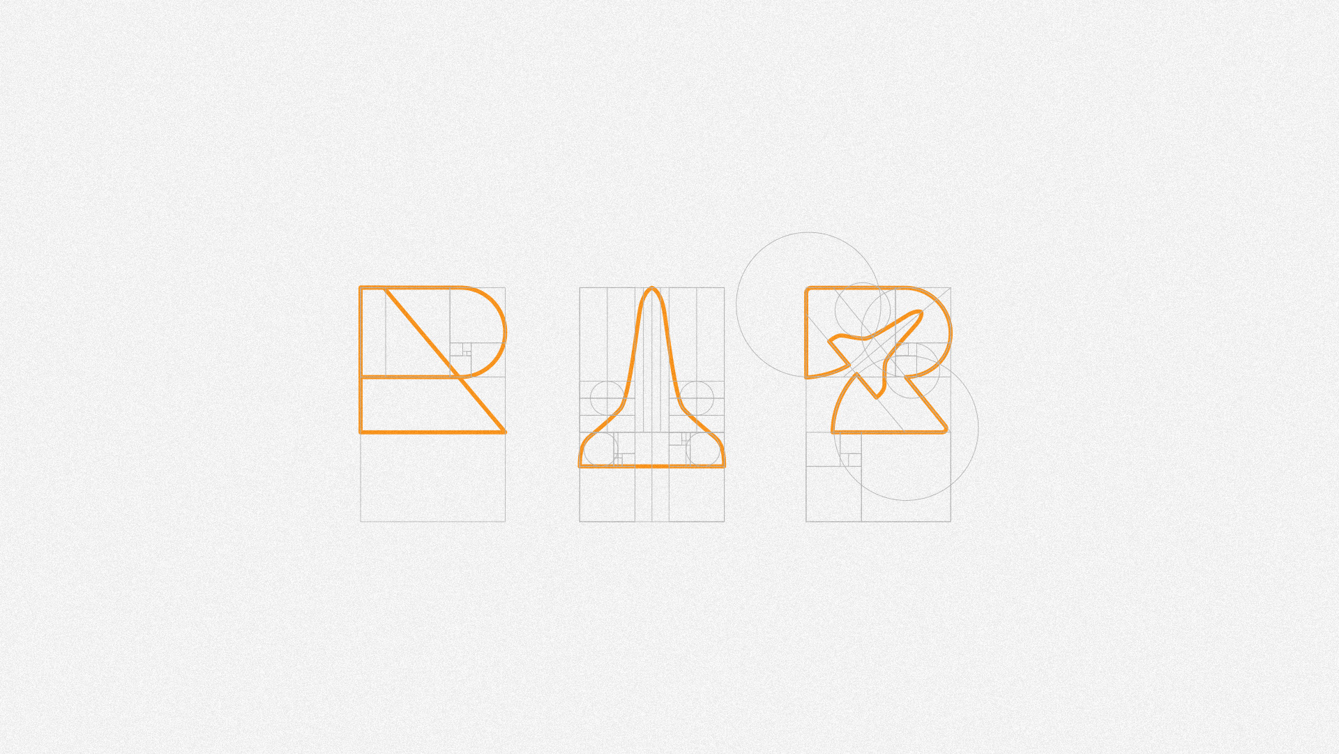
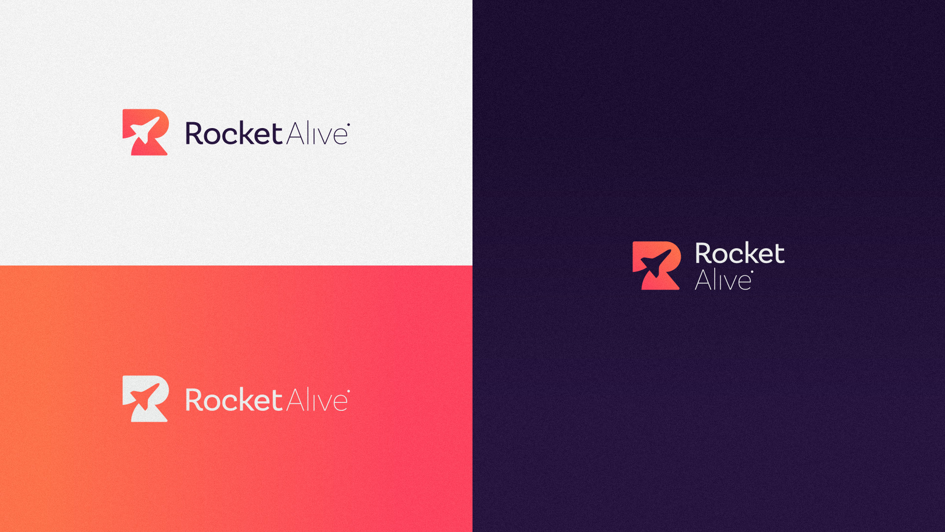
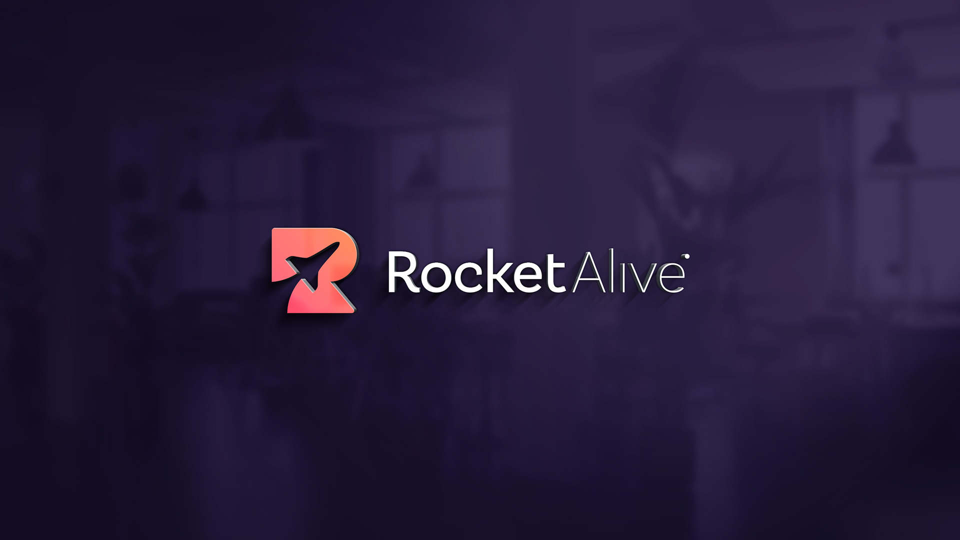
Based on the idea of it’s symbol, the process of building the grid first began with circular shapes and straight lines to arrive at a pleasant and visually harmonious result. Each brand element was created on top of the golden rectangle, the letter “R”, the rocket or the complete symbol. In this symbol we can see both the letter “R” as a base and inside it we can see the silhouette of a rocket at an angle of 45º.
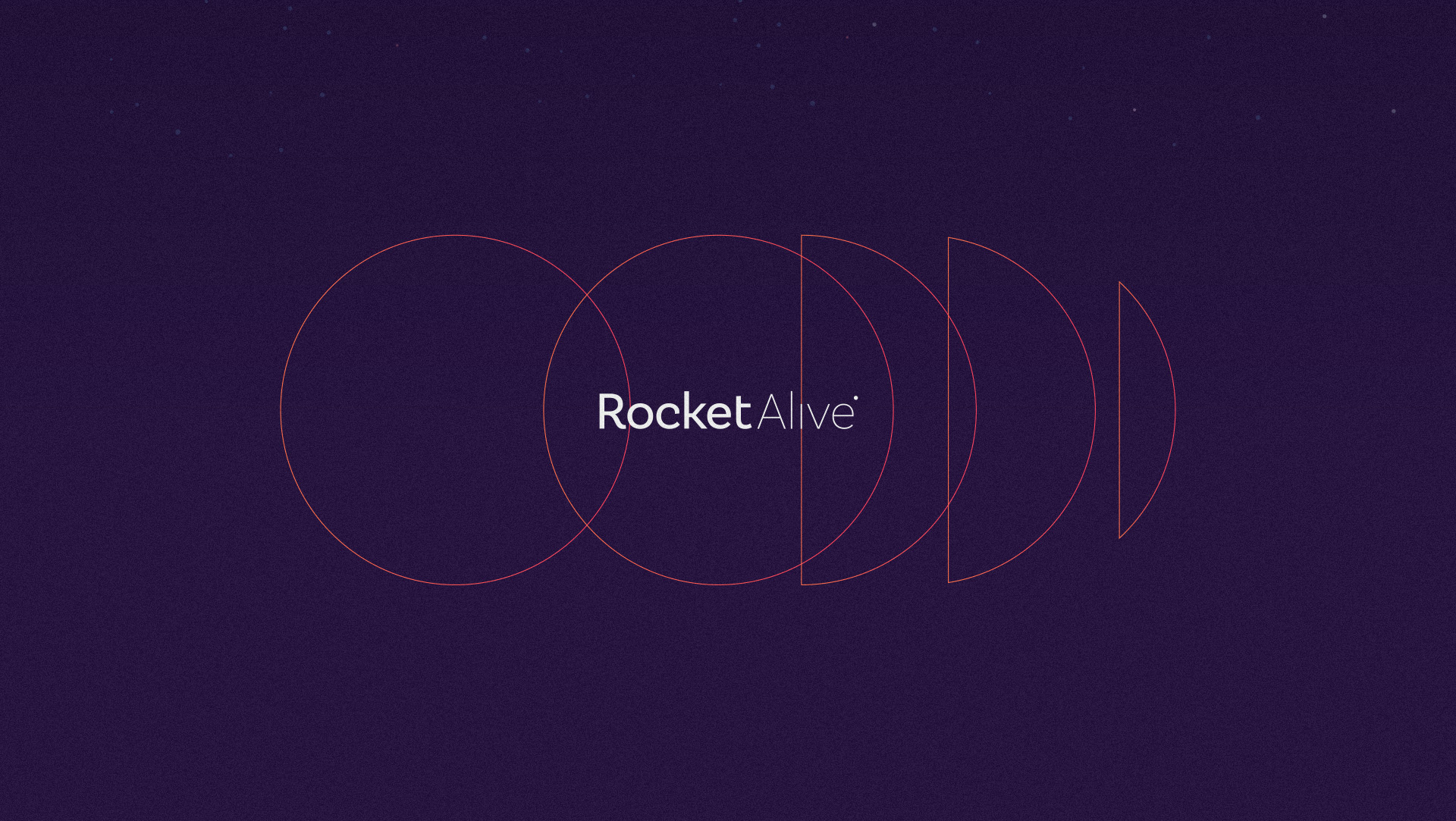
A typography chosen to compose the logo is a Sans Serif called “Basic Sans”. The font was modified seeking to maintain shapes that represent the idea of a more modern, professional and flexible brand. The optical adjustment between the letters was also applied, visually forming a fit between them and making reading more pleasant. If we focus on this logo, we can notice the “drop” of the letter “I” shifted on purpose. So, together with a symbol, it looks like a new planet to be explored.
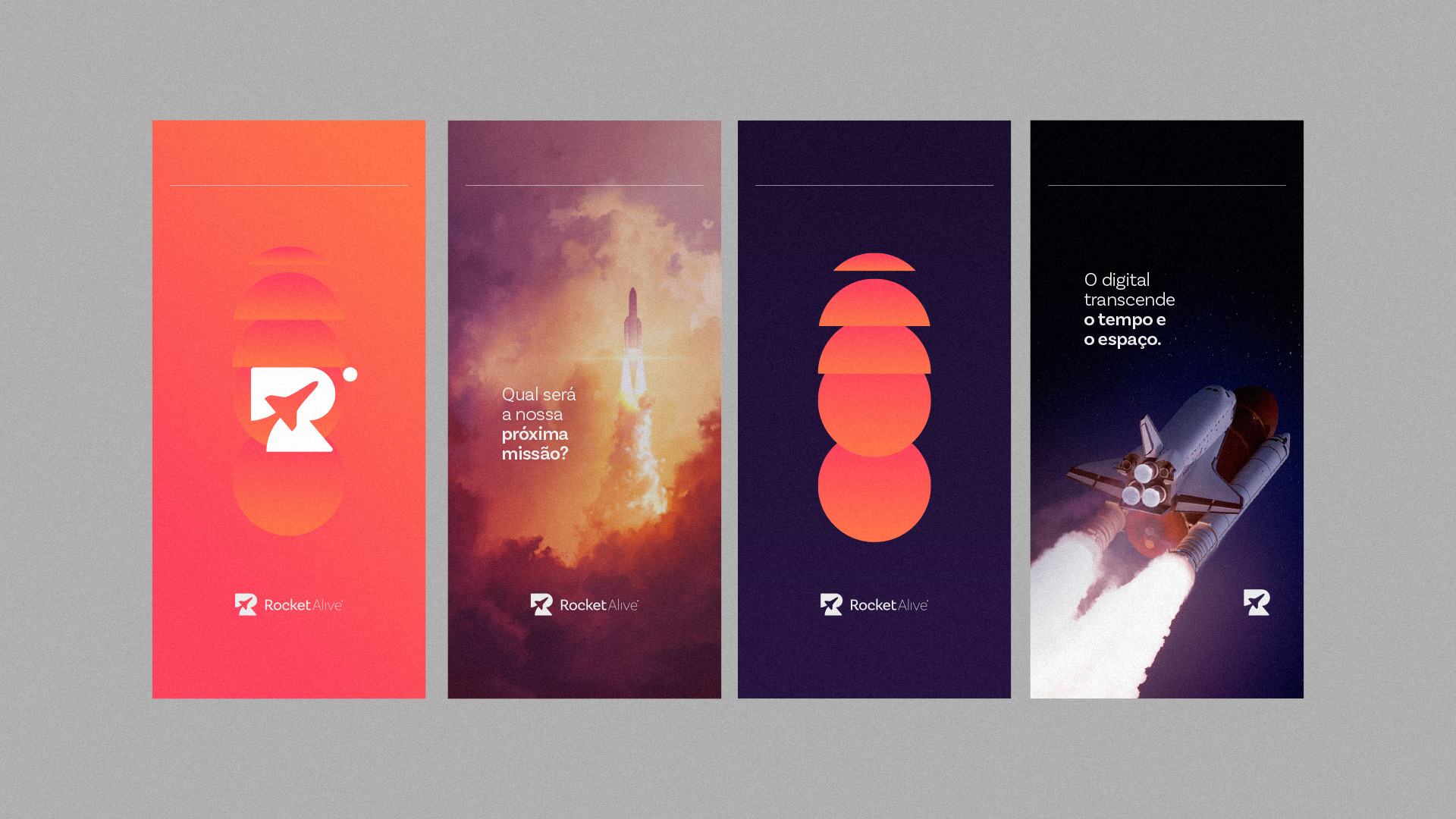
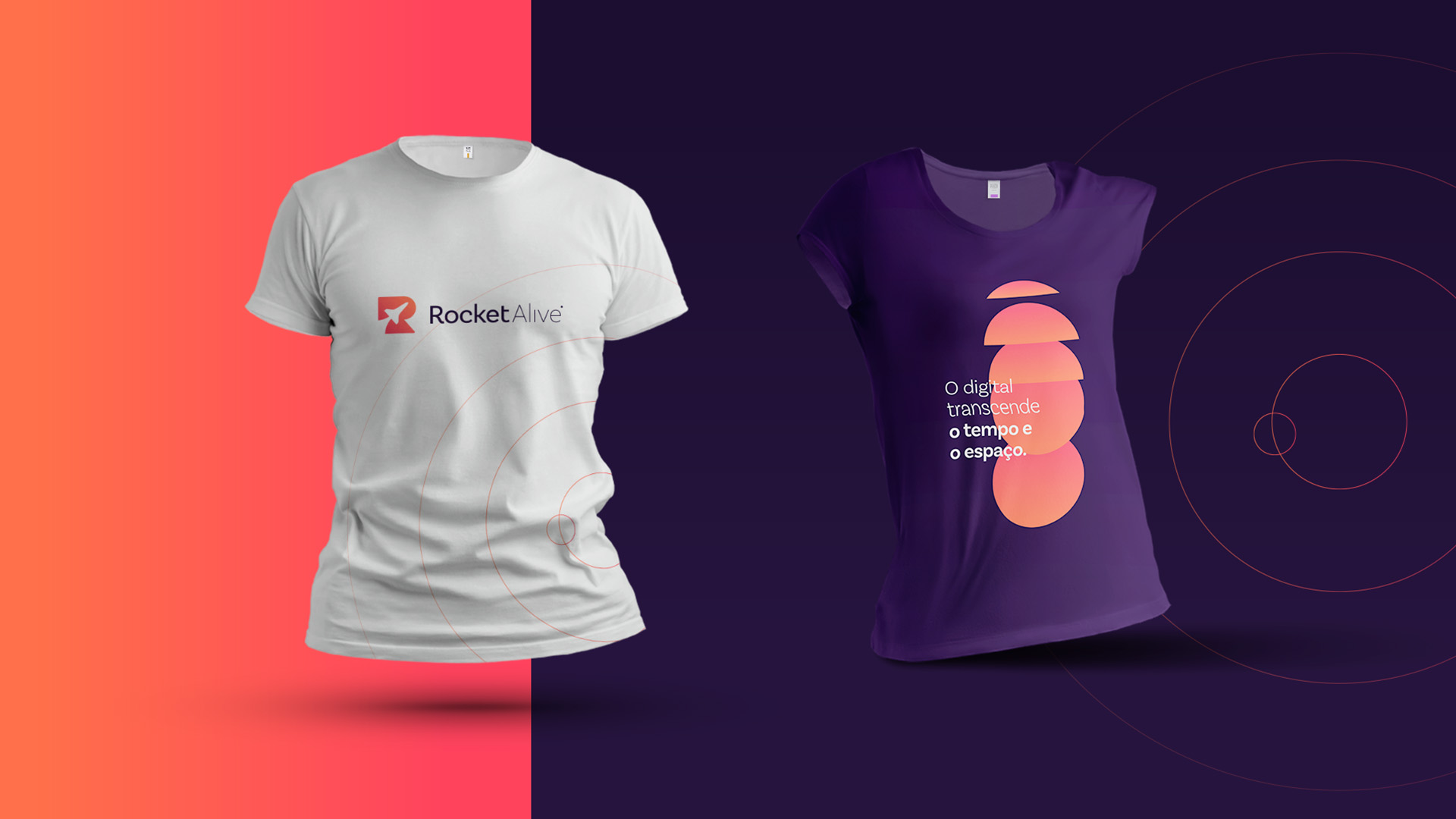
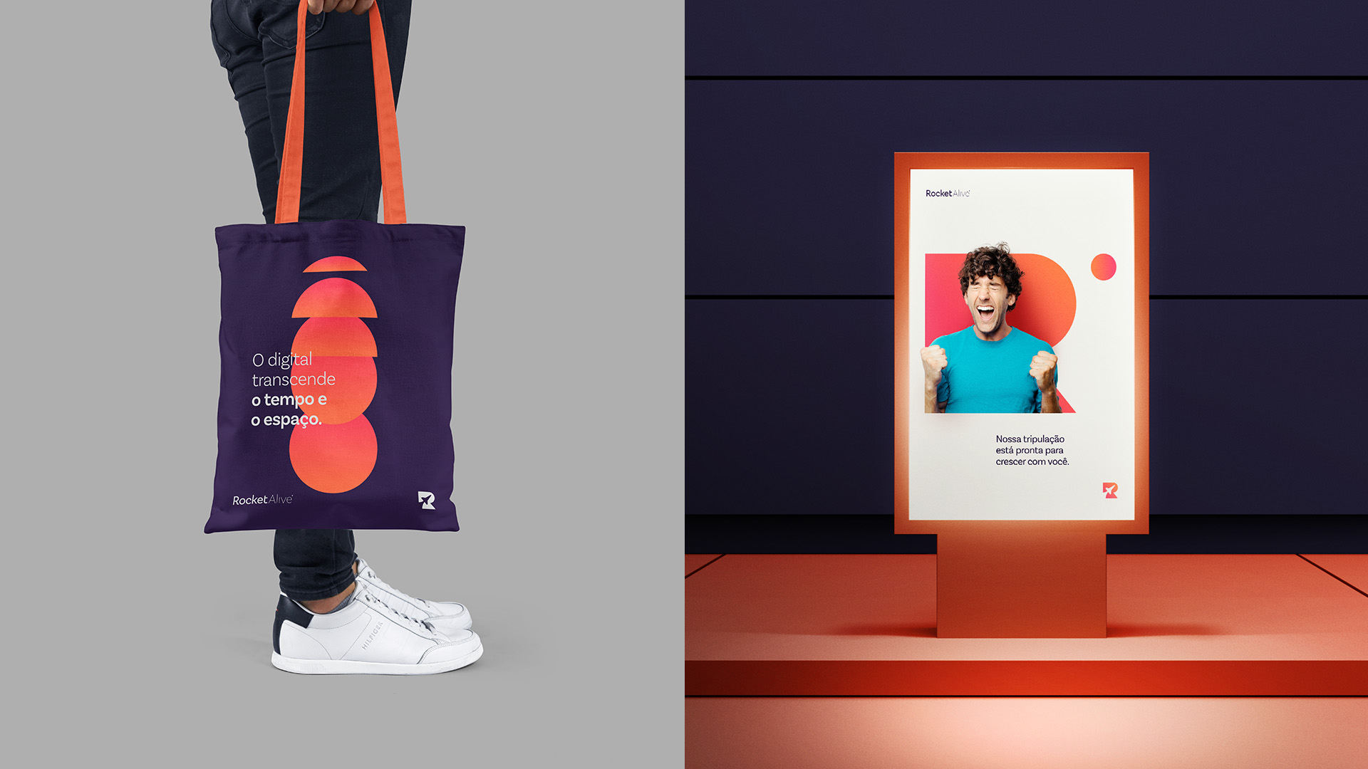
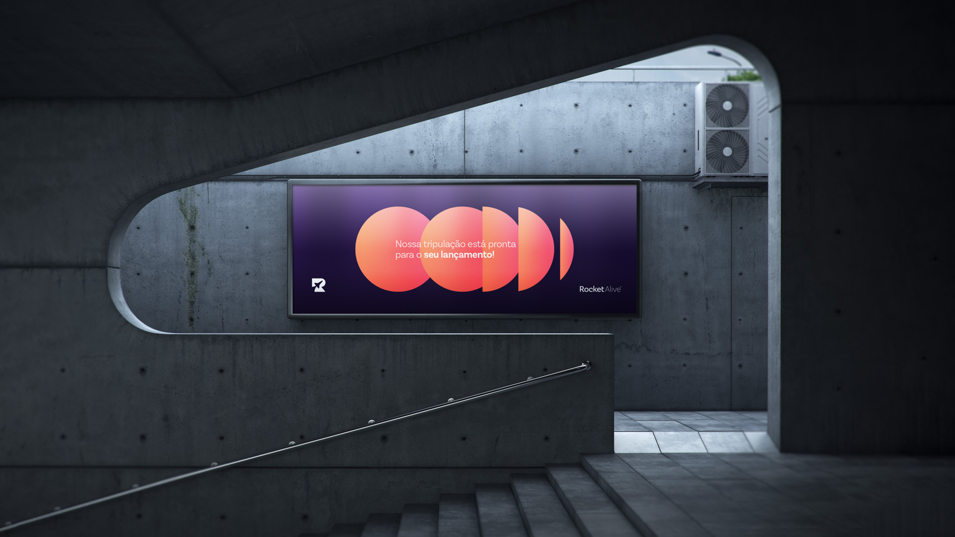
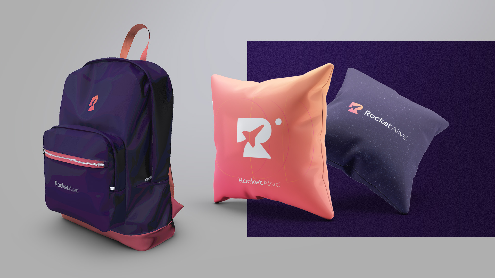
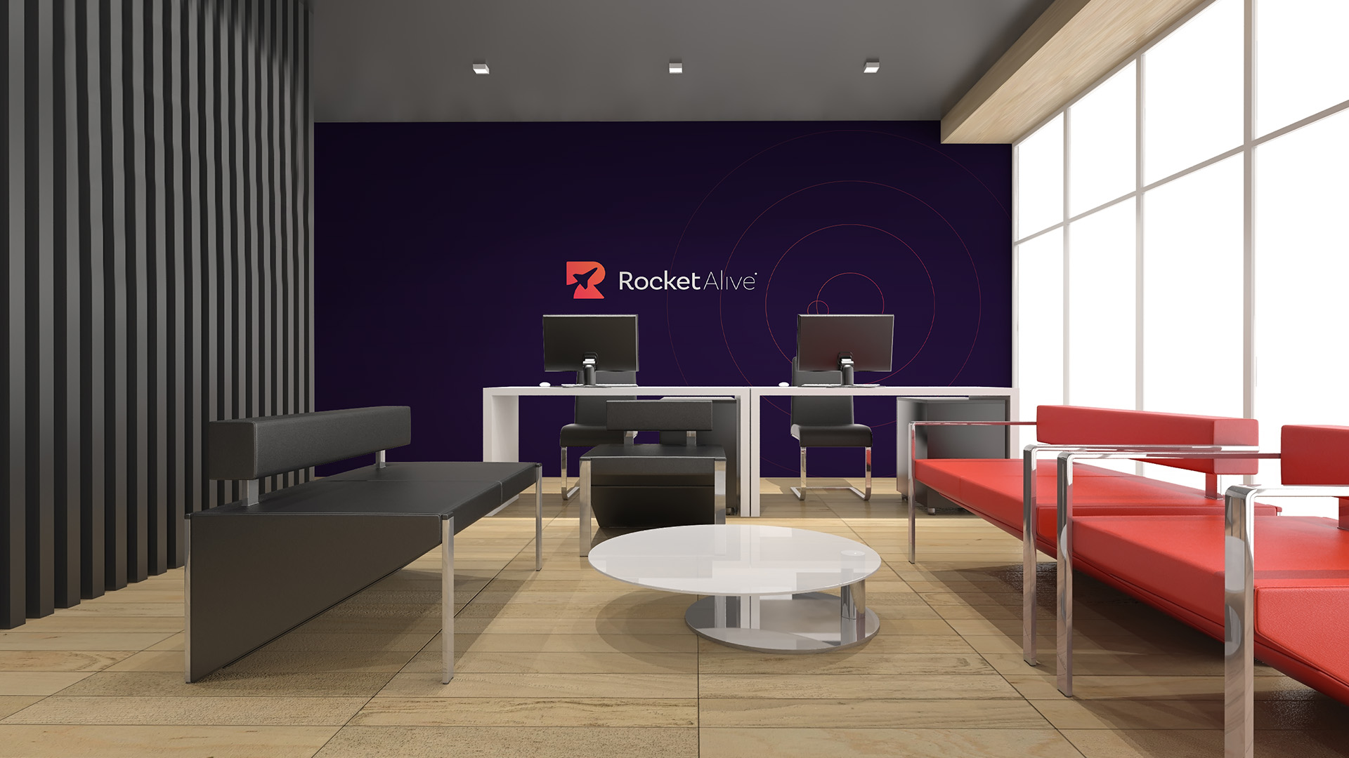
Based on market research and focusing on Rocket’s current positioning, the main palette chosen to compose the brand is based on shades of Purple and Orange. They are colors that transmit energy and heat, however, we also have the feeling of something related to the universe. A secondary palette based on these colors was also defined, which serves as support to compose the request for the visual identity, especially in digital media.
CREDIT
- Agency/Creative: Vitor Linhares Design
- Article Title: Visual Identity for Rocket Alive by Vitor Linhares
- Organisation/Entity: Freelance, Published Commercial Design
- Project Type: Identity
- Agency/Creative Country: Brazil
- Market Region: South America
- Project Deliverables: Brand Guidelines, Brand Identity, Branding, Graphic Design, Identity System, Tone of Voice
- Industry: Entertainment
- Keywords: Branding, Golden Ratio, Logo Inspiration, Logofolio, Marketing, Rocket Logo, Symbol, Visual Brand, Visual Identity


