


CFC – Vivevive
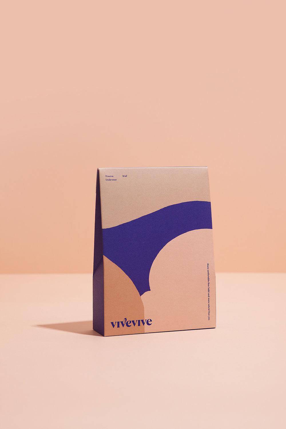
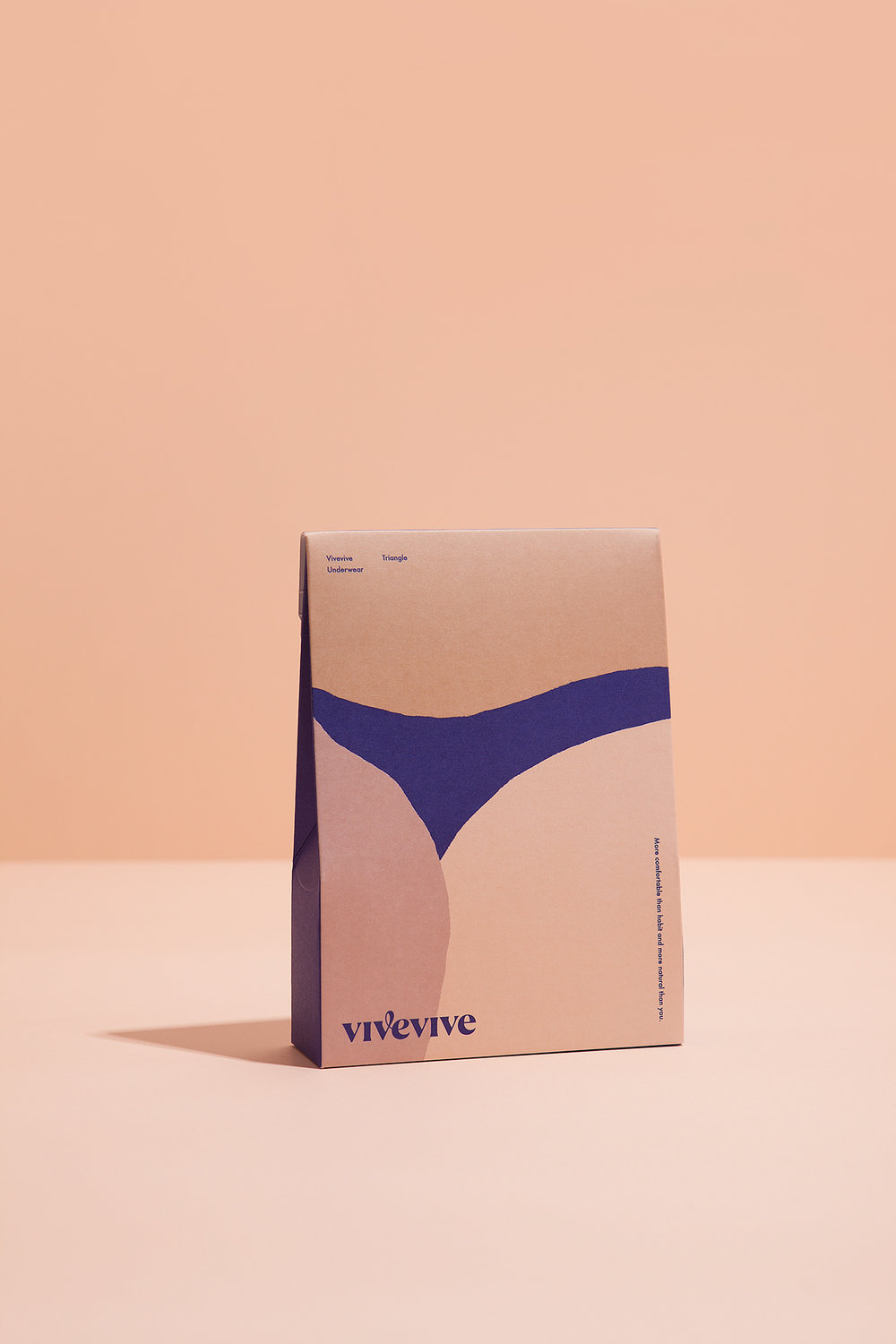
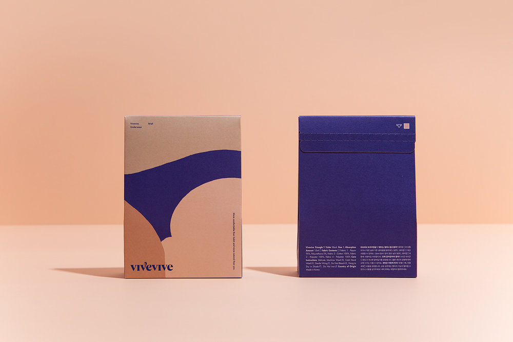
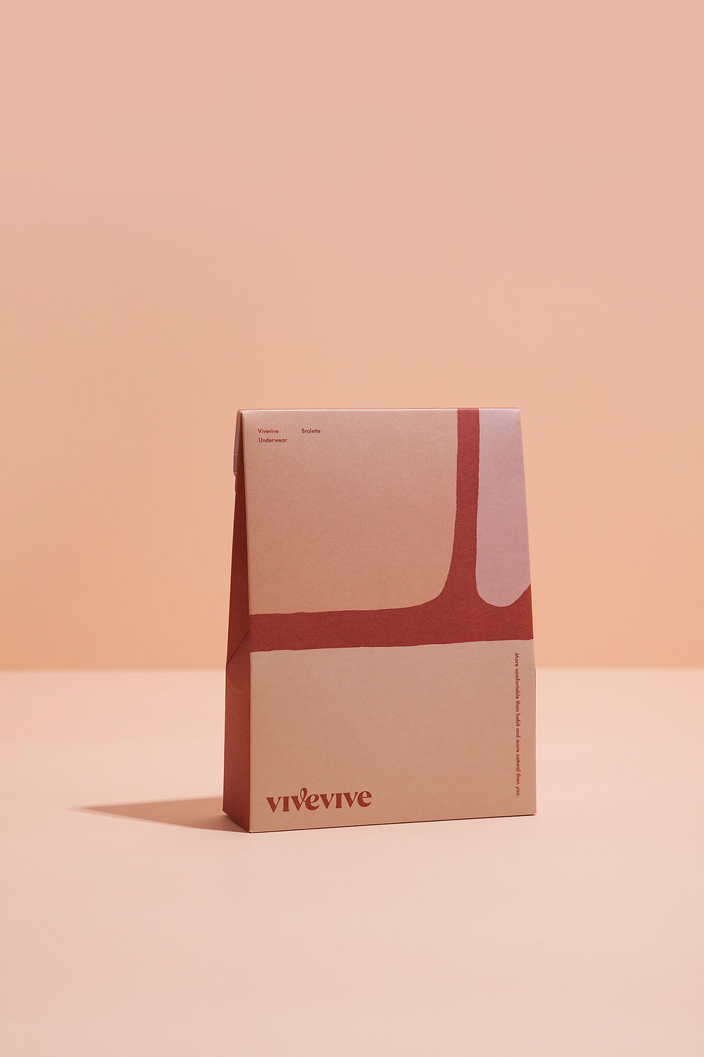
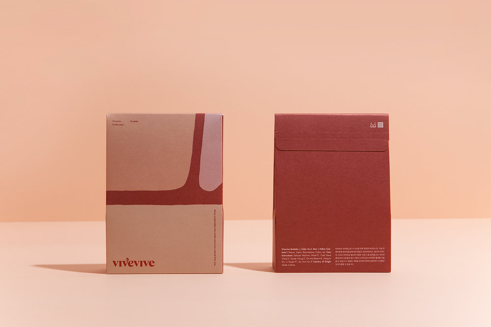
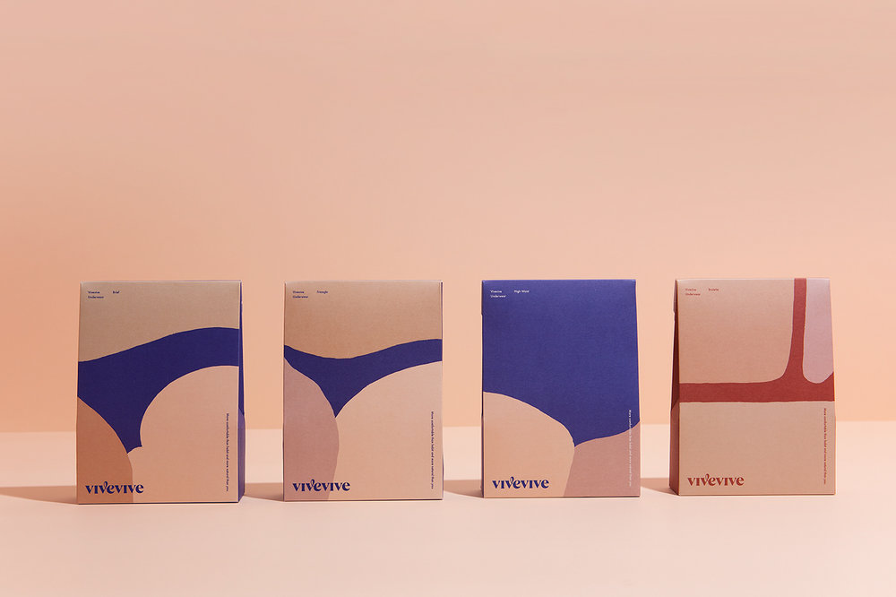
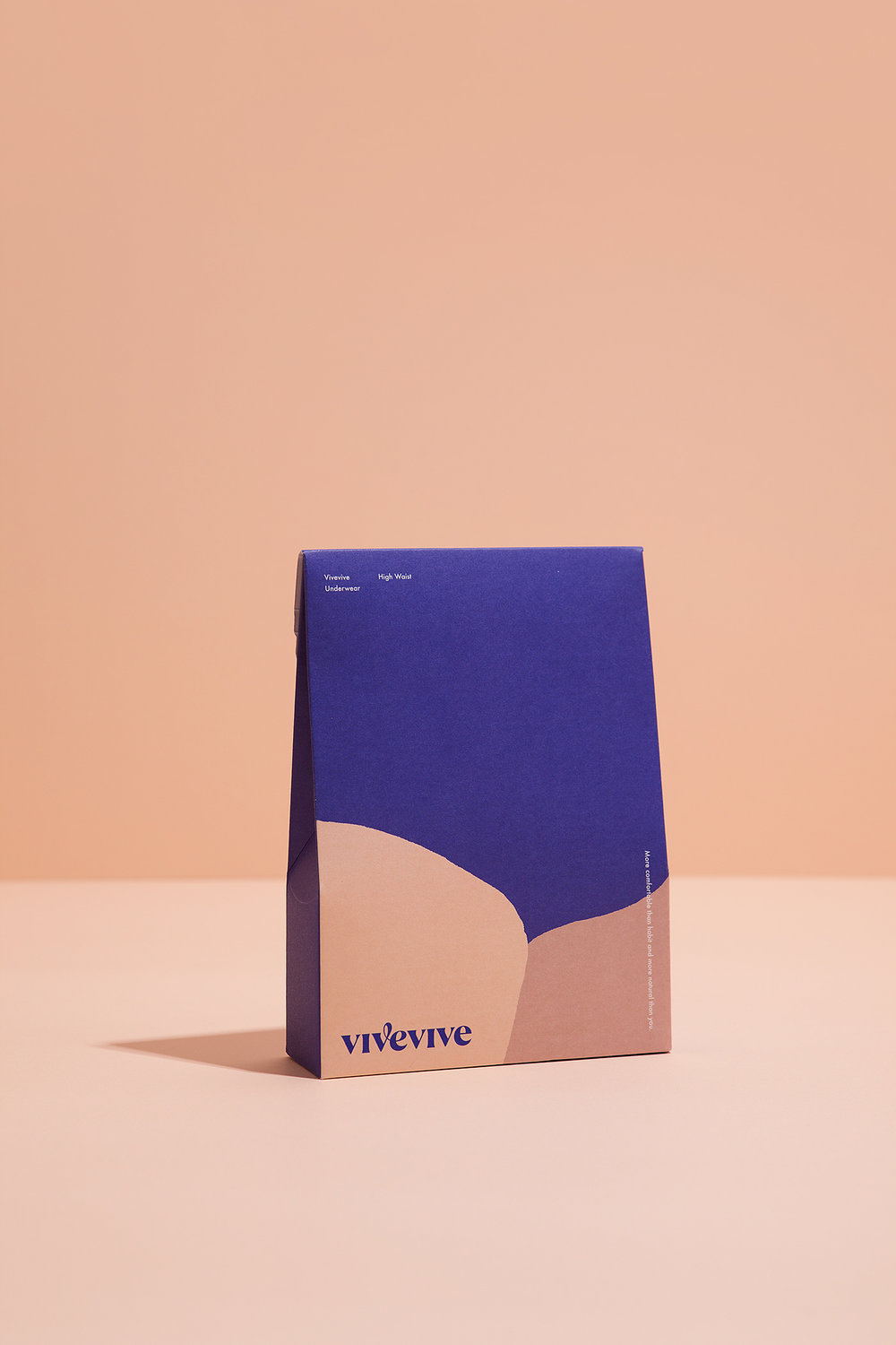
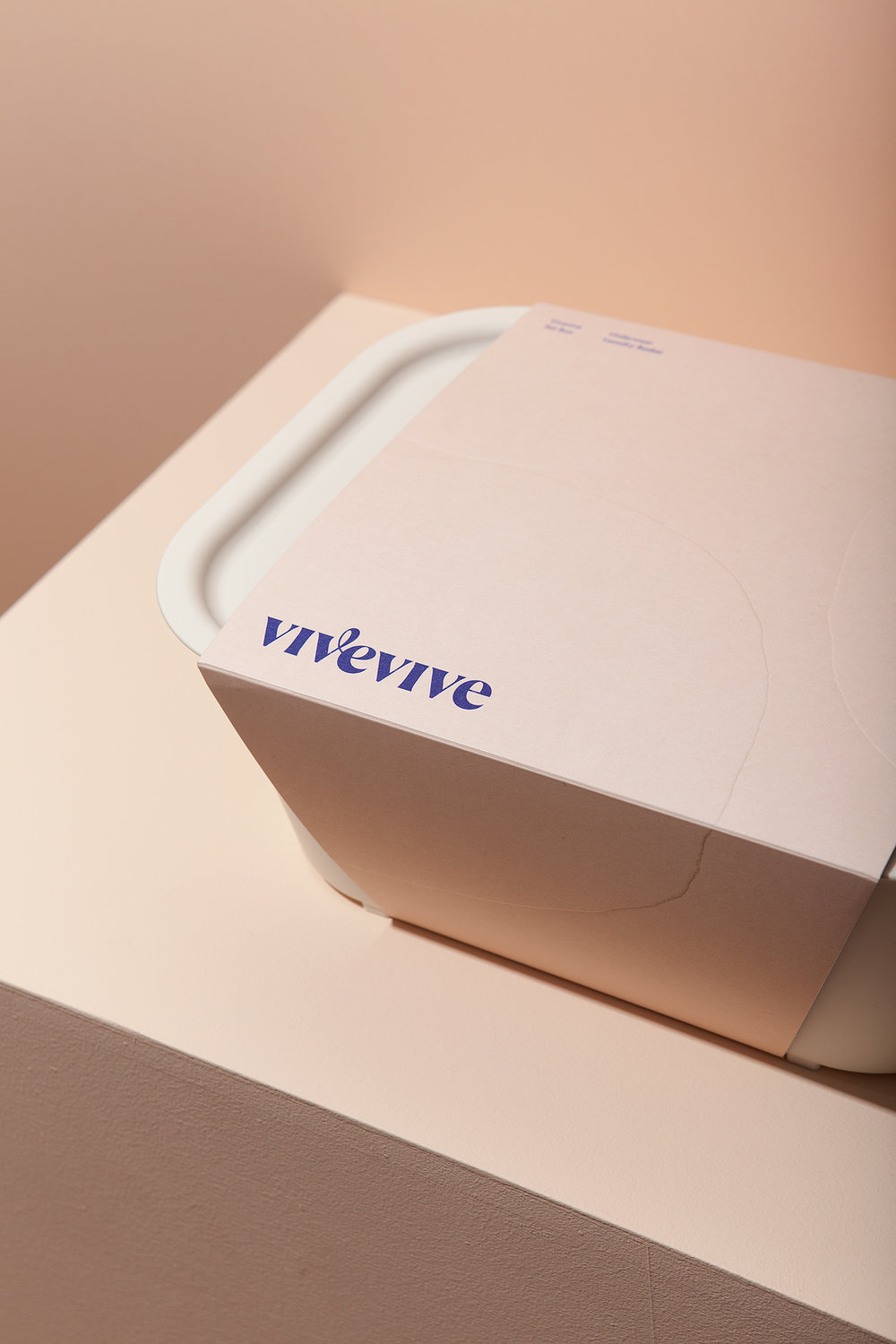
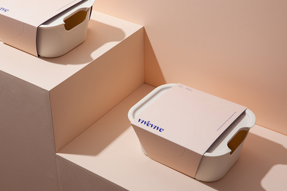
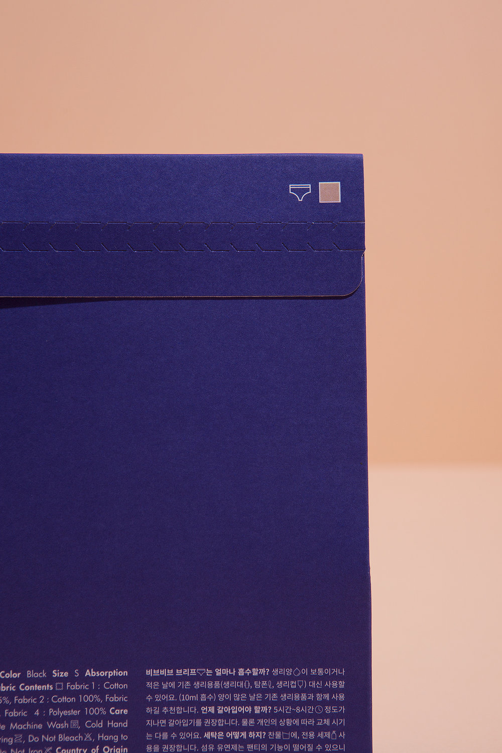
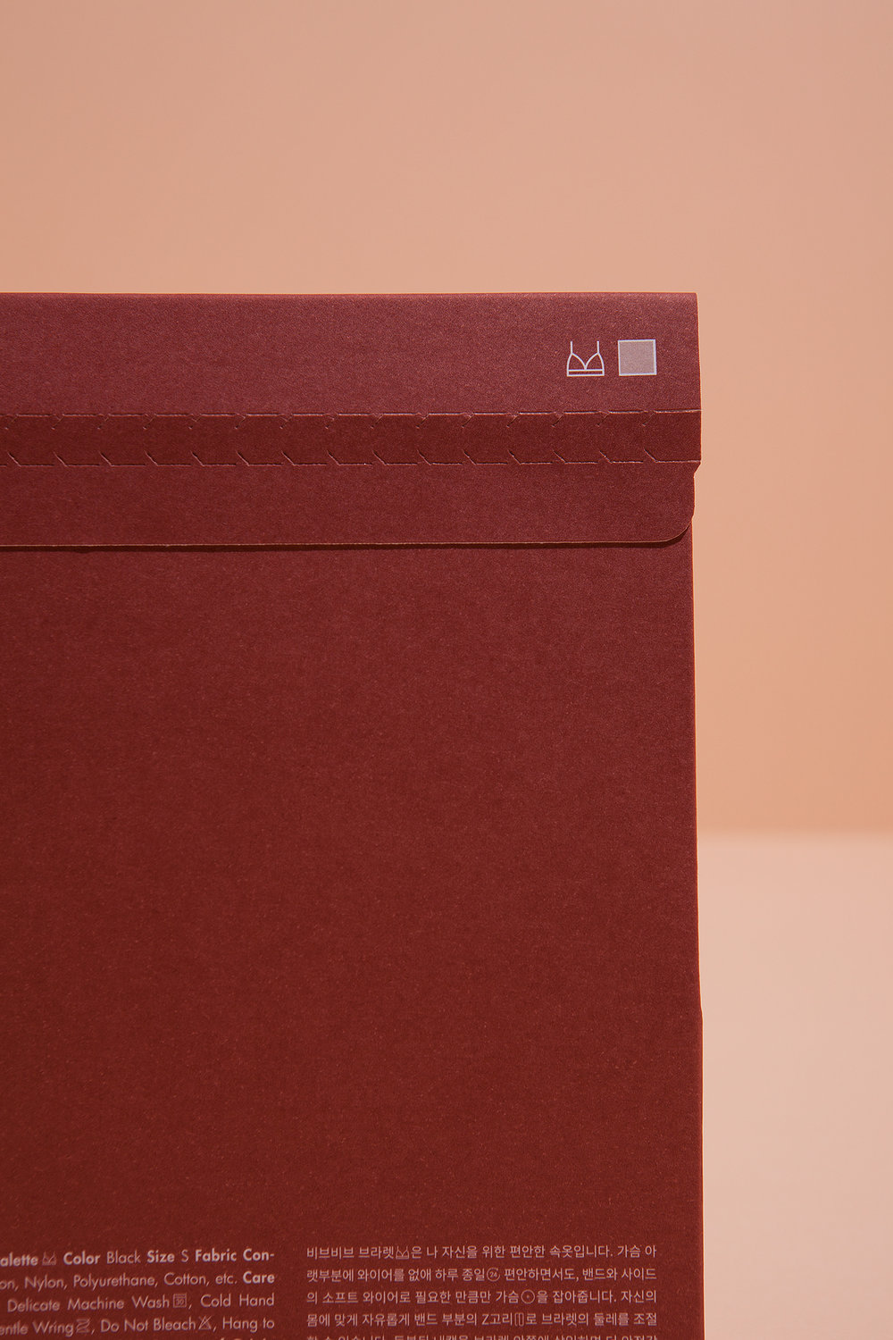
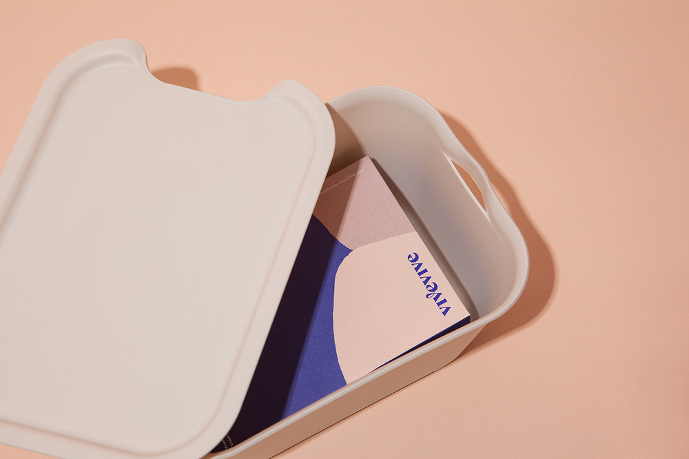
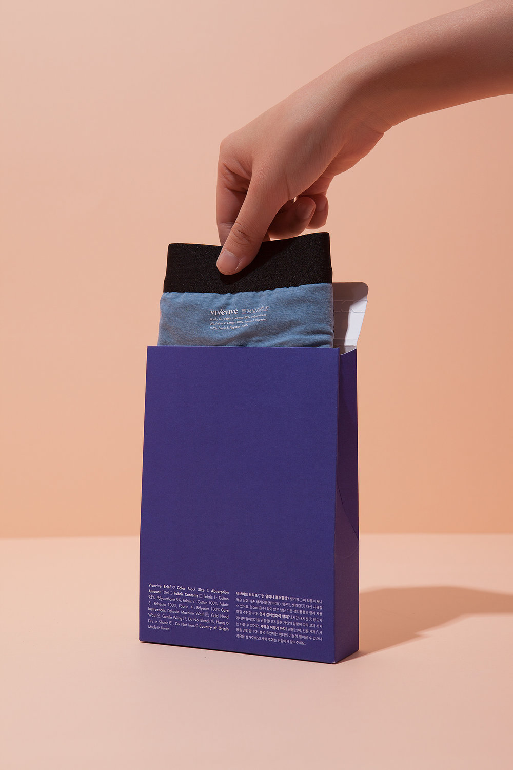
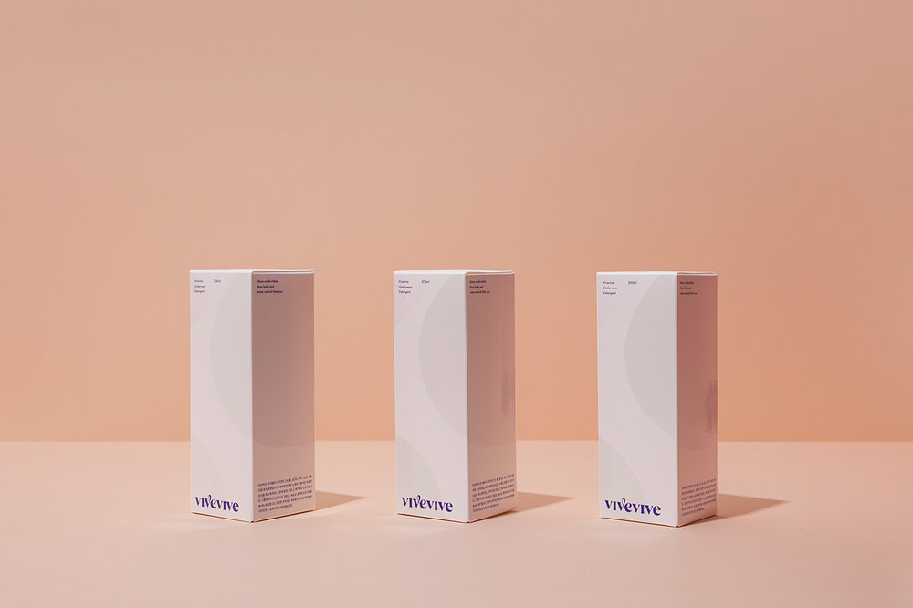
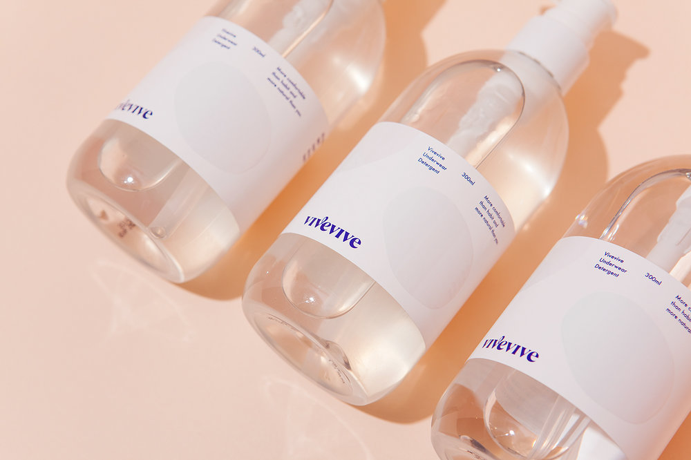
CFC has developed visual Identity and packaging design for women’s period-proof underwear brand ‘vivevive’.
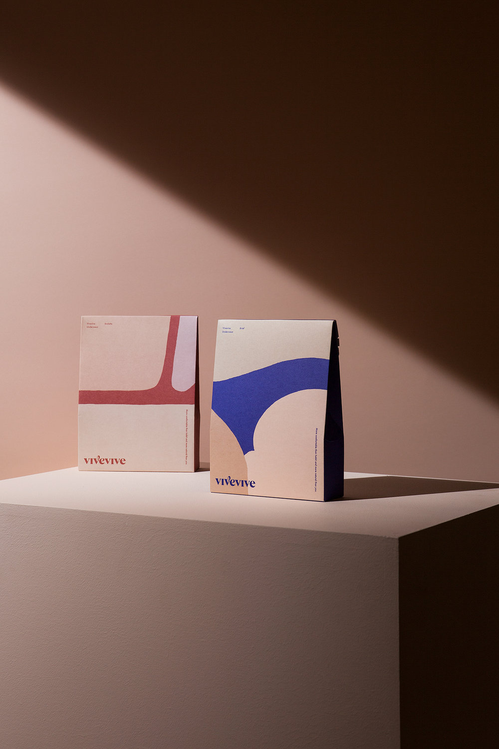
‘vive’ is a word that means ‘hurrah’ in French, ‘life’ in Spanish.
Design keywords for the brand mood was simple.
1. sophisticated yet joyful
2. elegant yet witty
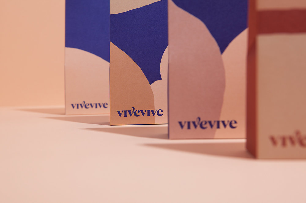
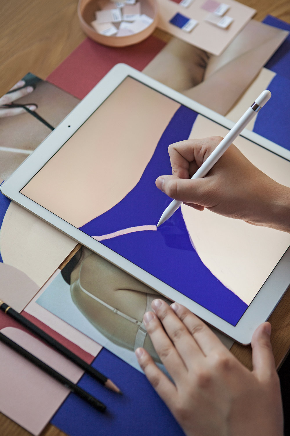
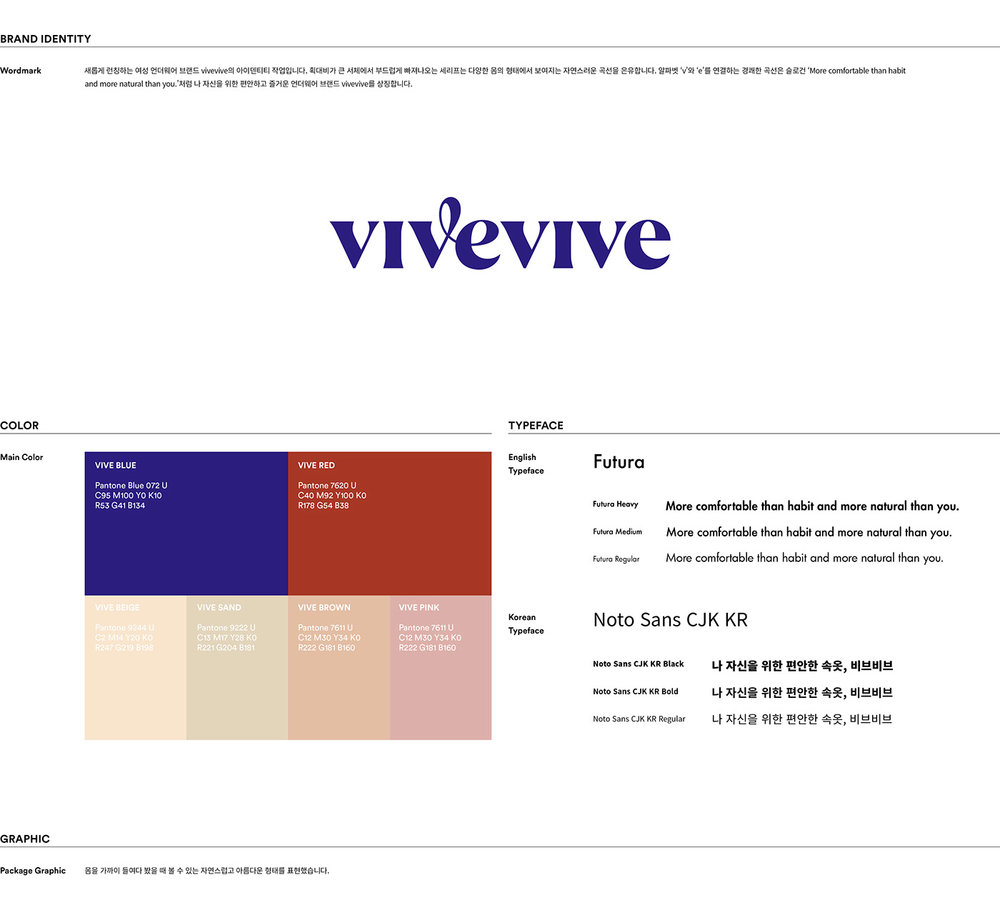
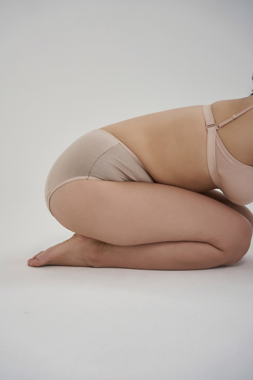
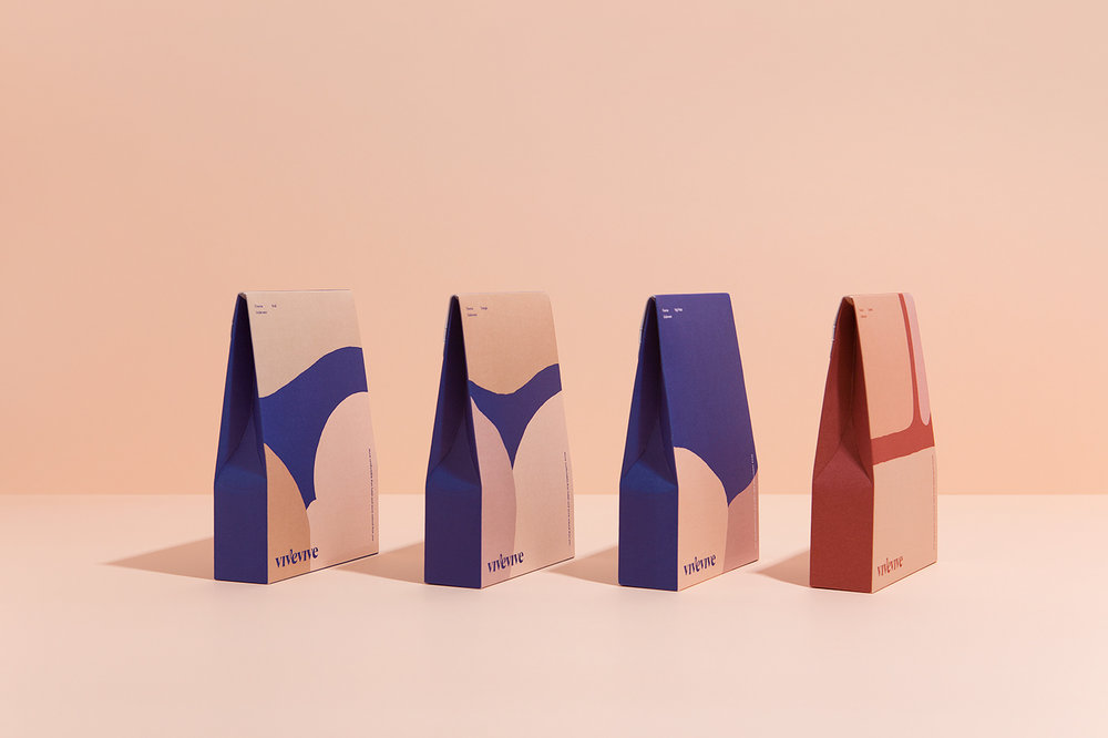
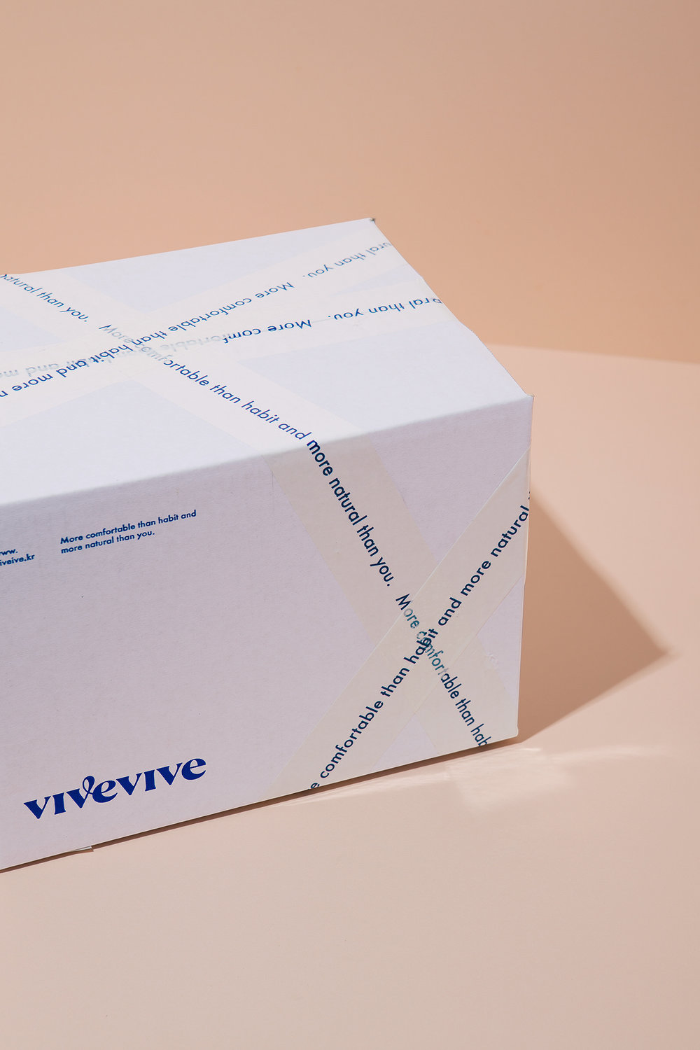
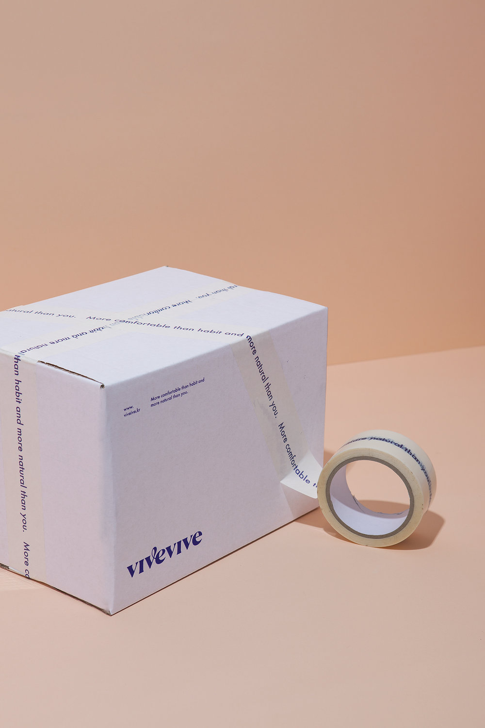
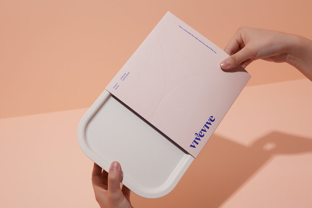
Starting from the belief that the most natural body is the most beautiful, we created a graphic that abstractly expresses the natural curve of the female body. The cheerful curve that connects the letter ‘v’ and ‘e’ in wordmark symbolizes positive mind, like the slogan ‘More comfortable than habit and more natural than you.’


CREDIT
FEEDBACK
Relevance: Solution/idea in relation to brand, product or service
Implementation: Attention, detailing and finishing of final solution
Presentation: Text, visualisation and quality of the presentation


