


Kozus is a company that is dedicated to the production and sale of milk-derived products, in this case developing a more natural ice cream focused on new consumer and personal care trends.
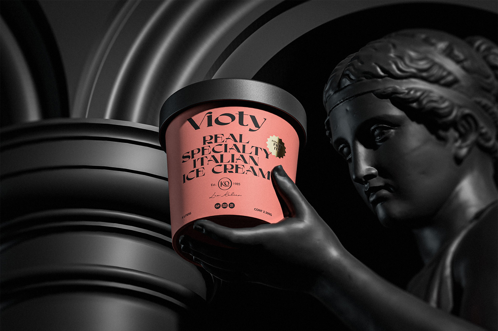
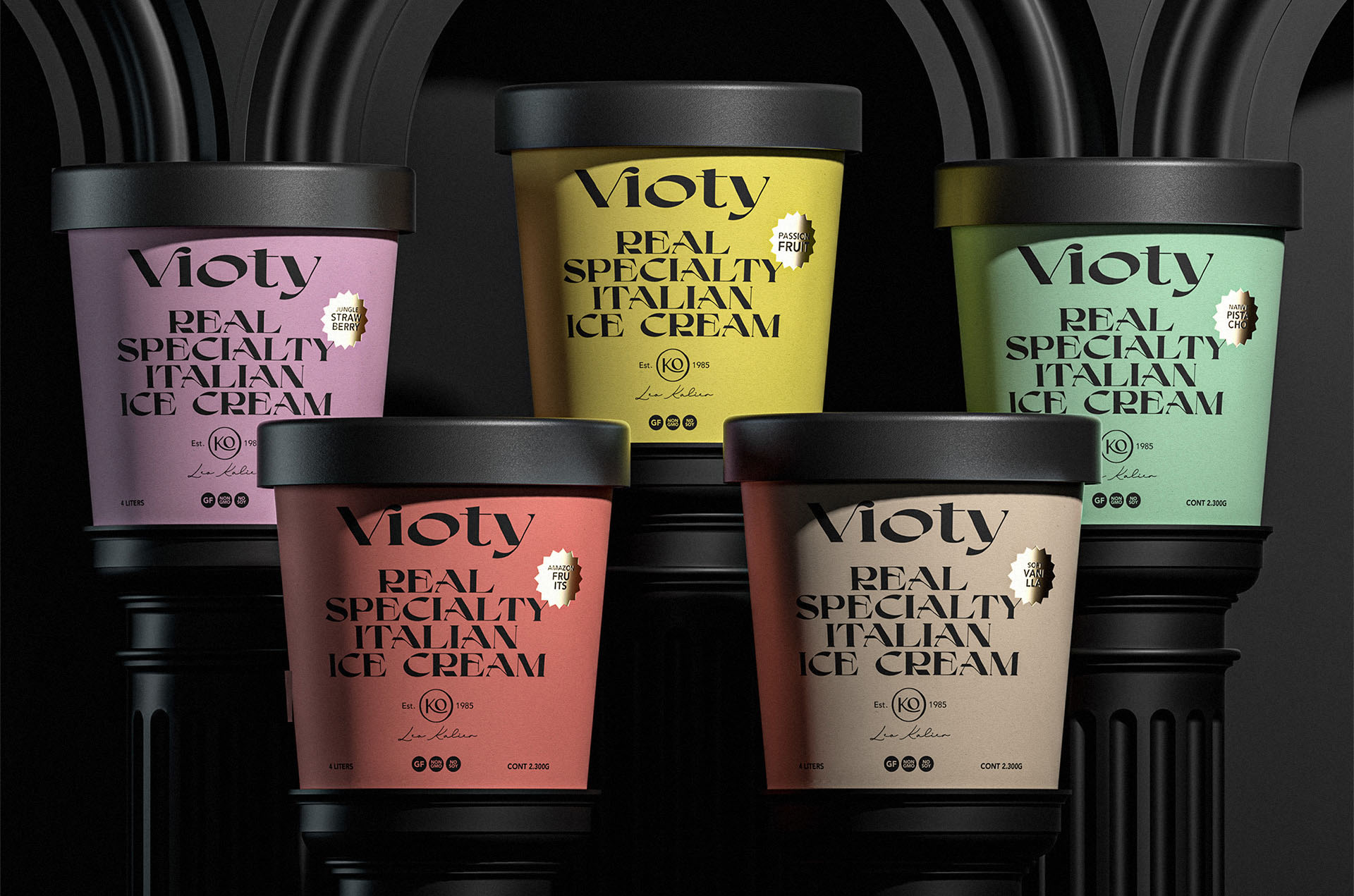
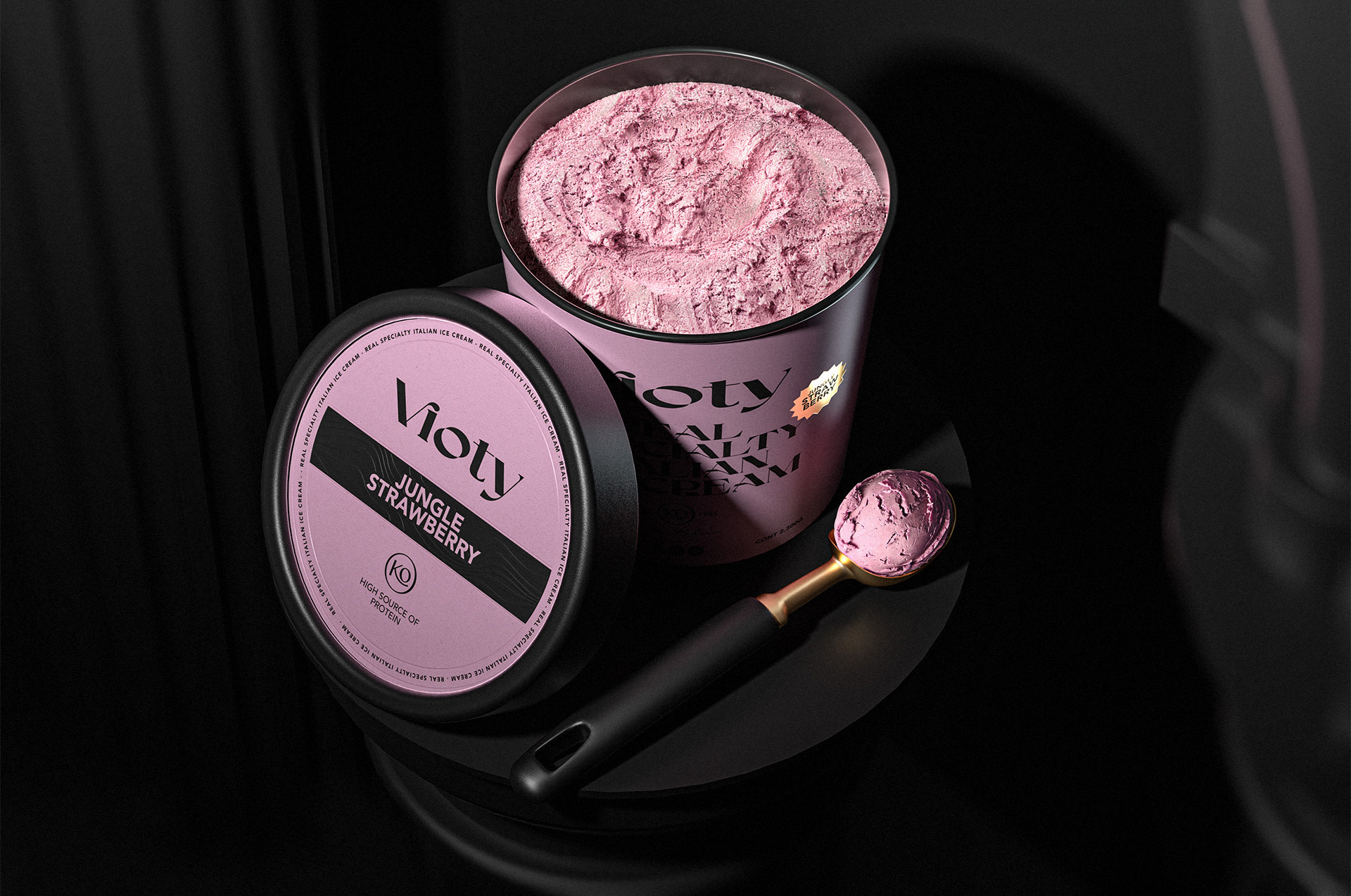
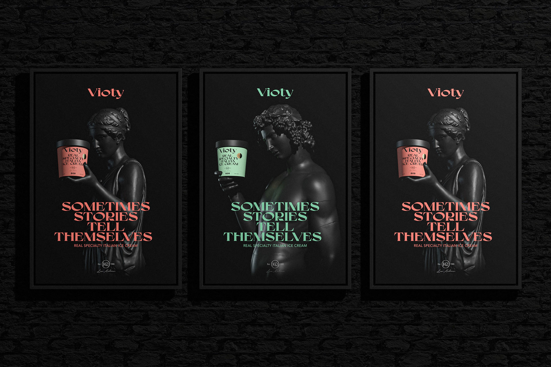
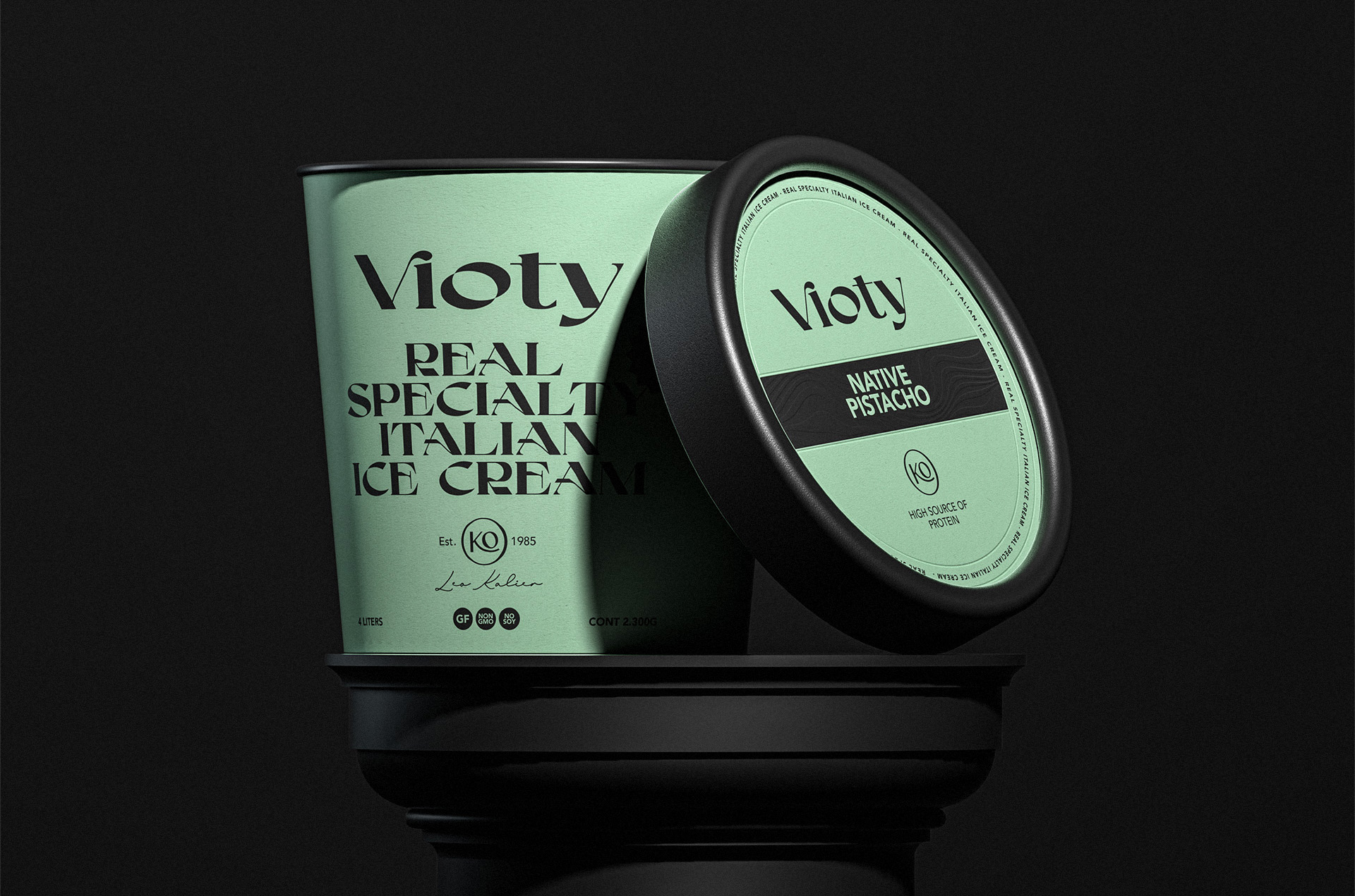
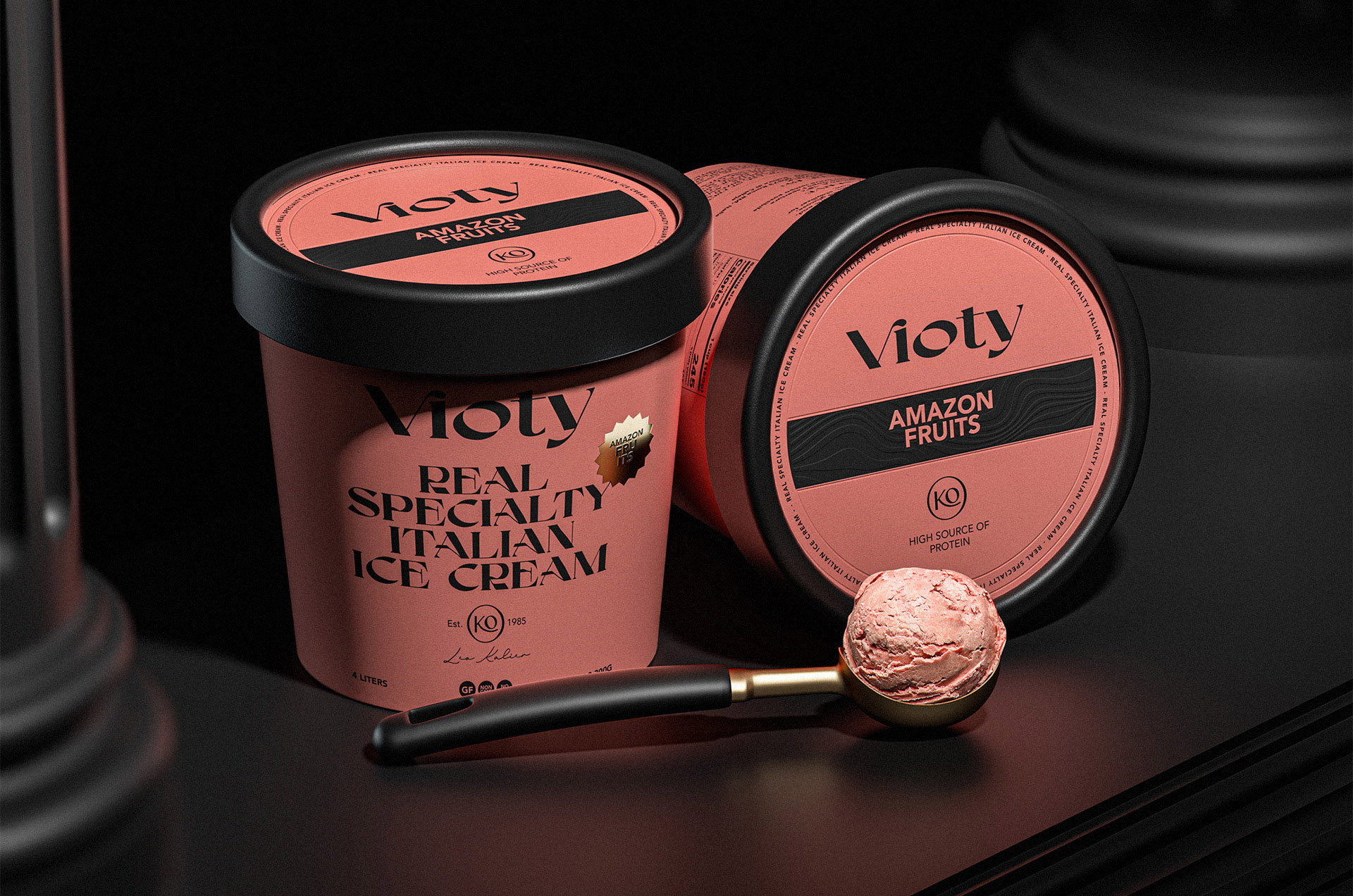
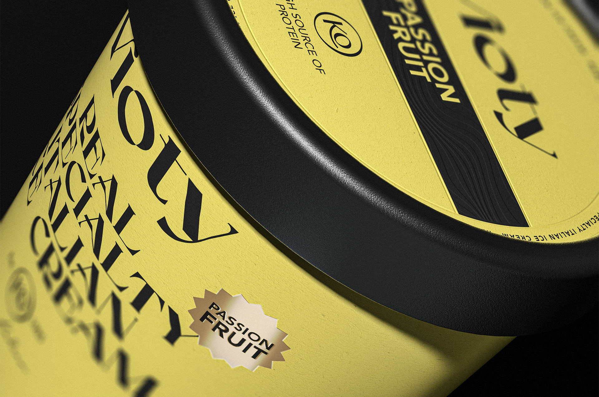
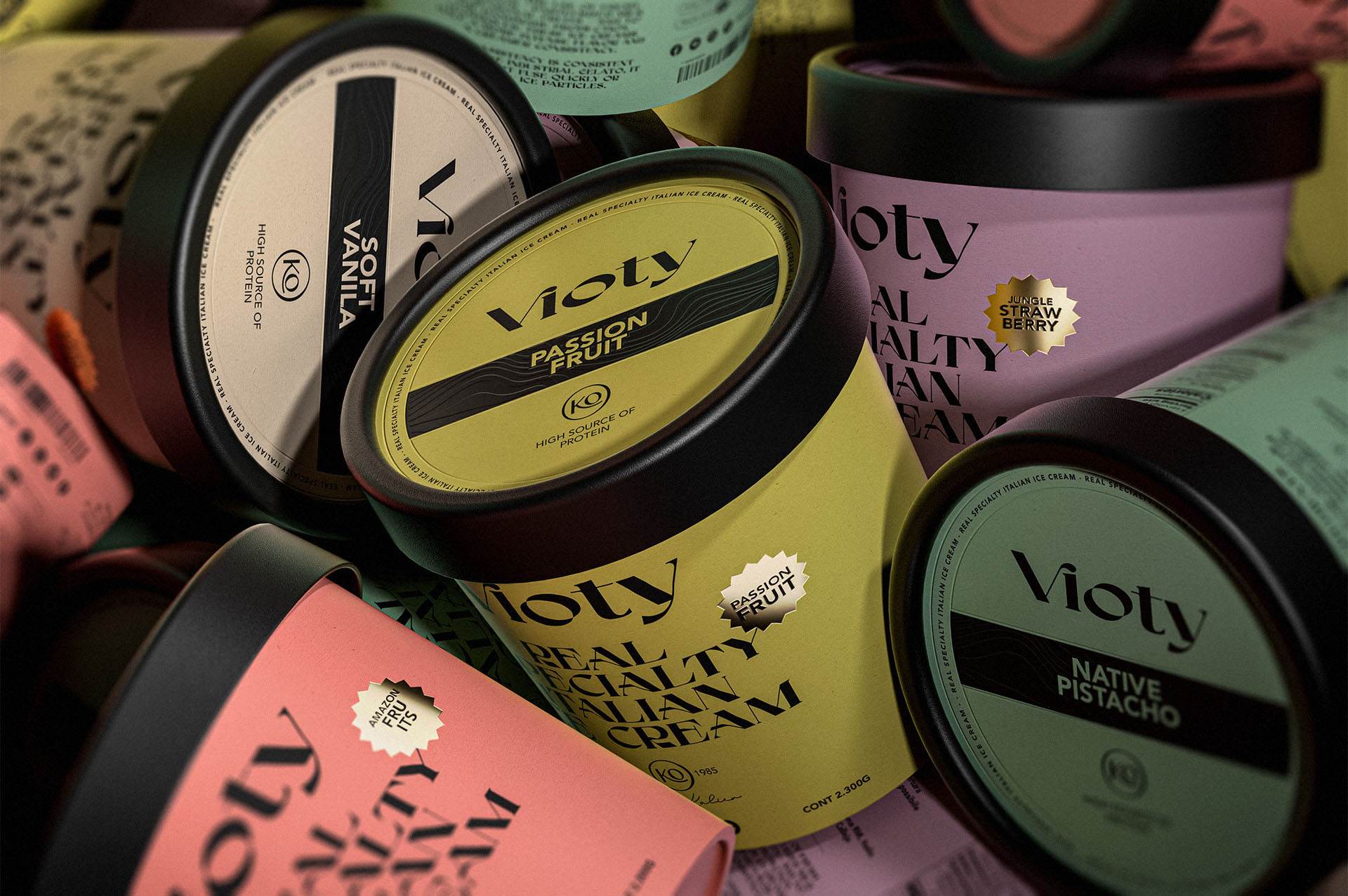
Our job consisted of creating a brand and its packaging for a product based on artisanal and more natural ice cream developed and focused on the new awareness of caring for our body as a container of life; From this word Vida the name for the Vioty brand was derived, then this was transferred to the logo that consists of a very expressive and classic typeface that makes memory of the great masters and manufacturers of Italian ice cream, after this the packaging was made in the Which we reinforce the concept with very striking flat colors with large texts in black to have a powerful contrast accompanied by small golden details to achieve a classic and fine looking packaging.
CREDIT
- Agency/Creative: David Espinosa IDS
- Article Title: Vioty Ice Cream Packaging Design Created by David Espinosa
- Organisation/Entity: Agency
- Project Type: Packaging
- Project Status: Non Published
- Agency/Creative Country: Colombia
- Agency/Creative City: Bucaramanga
- Market Region: South America
- Project Deliverables: 3D Design, Art Direction, Brand Design, Packaging Design
- Format: Cup
- Substrate: Pulp Carton
- Industry: Food/Beverage
- Keywords: ice cream, frozen, natural, fruit, colors, handcrafted
-
Credits:
Designer - Art Director: David Espinosa


