


PetChoy provides delicious meal plans for cats and dogs in Saigon, Vietnam. Founders think pets should be served as their owners. PetChoy aims to educate and empower the pet-loving community with an accurate and comprehensive understanding of pets’ nutrition and health. Since rebranding, PetChoy has been grown quickly with completely outstanding packaging on shelves.
Our approach is a complete transformation for local pet food brands to compete with international ones in visual and content direction, and targeting new customer types like urbanist and GenZ.
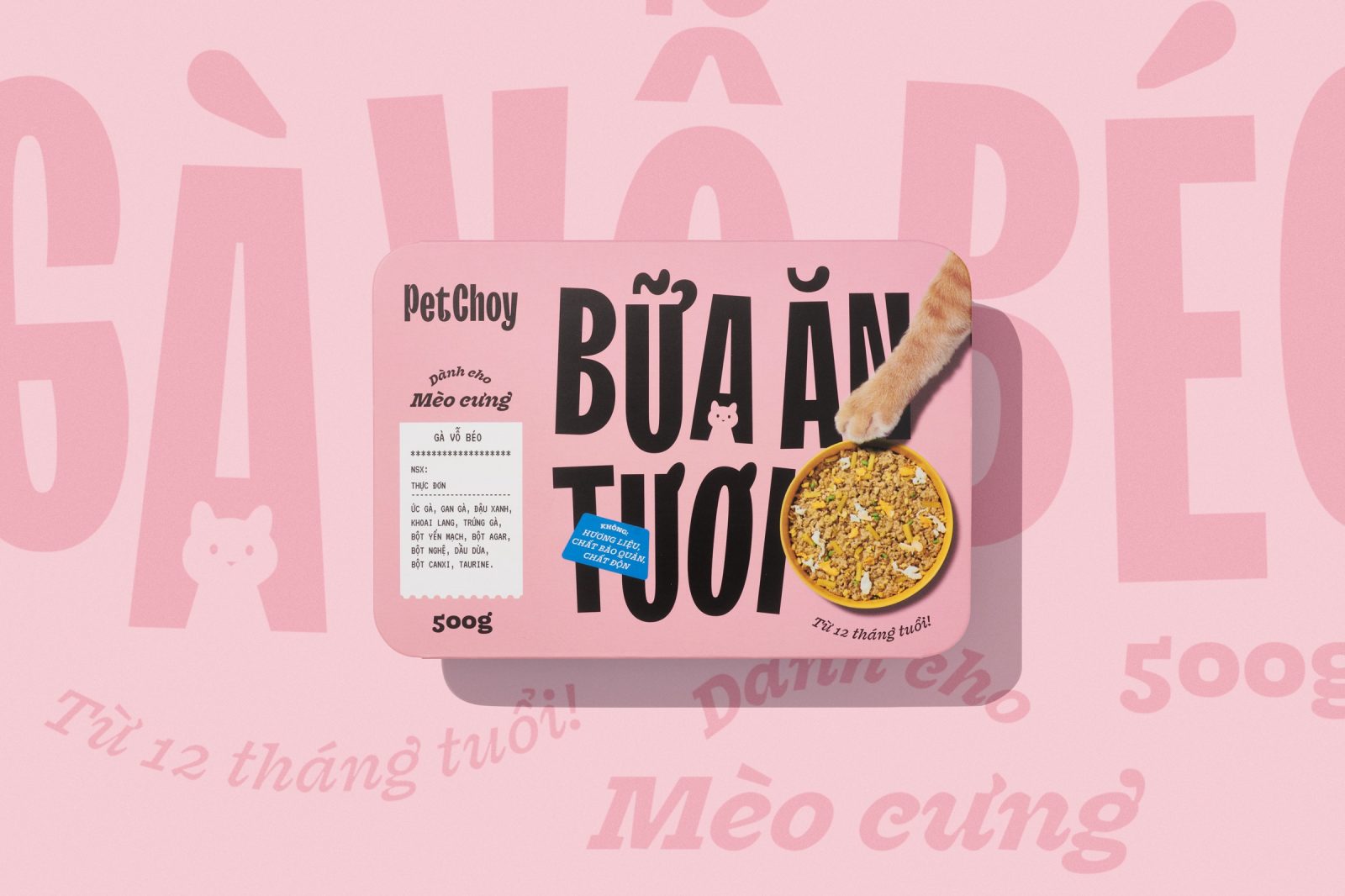
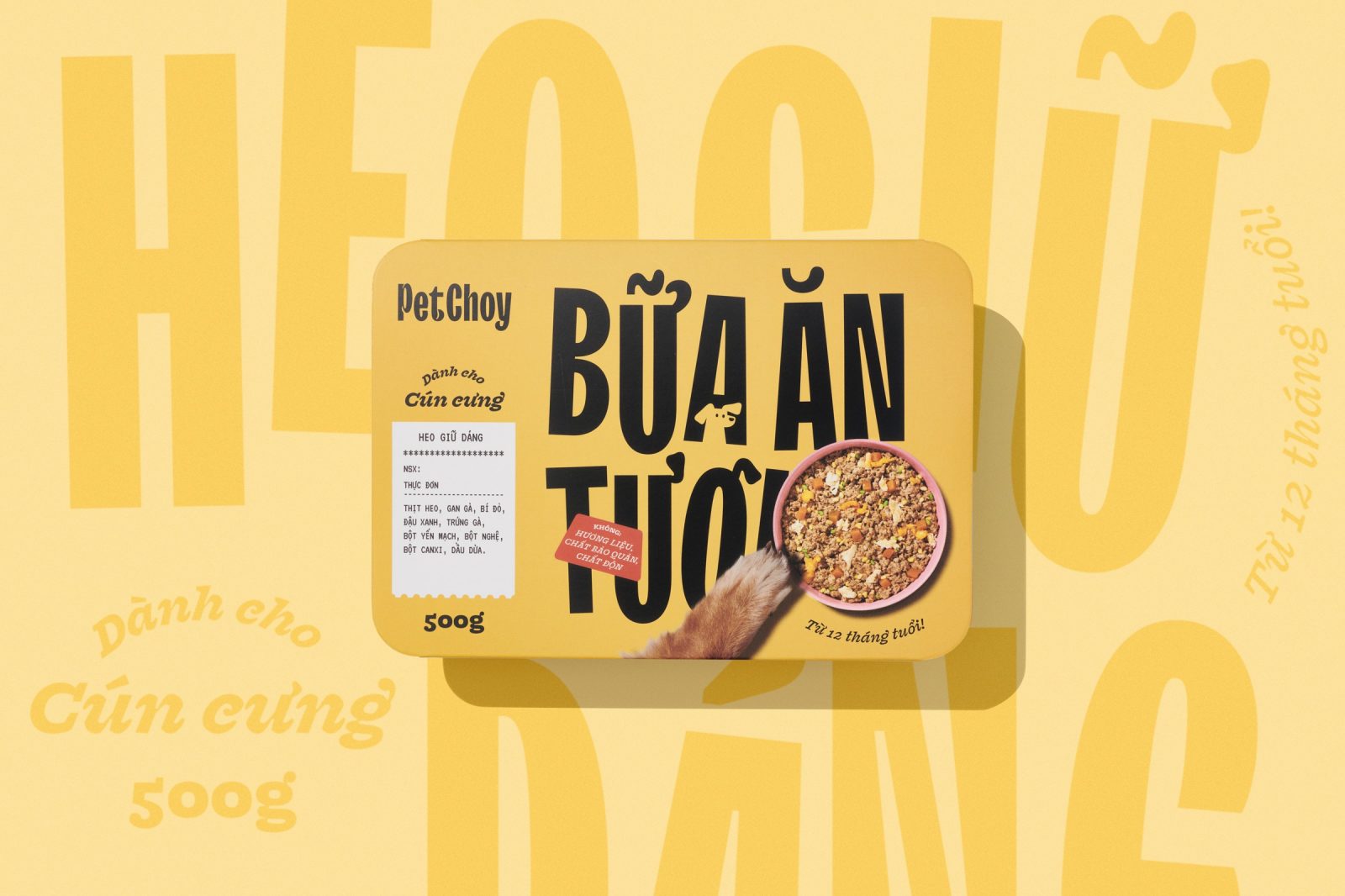
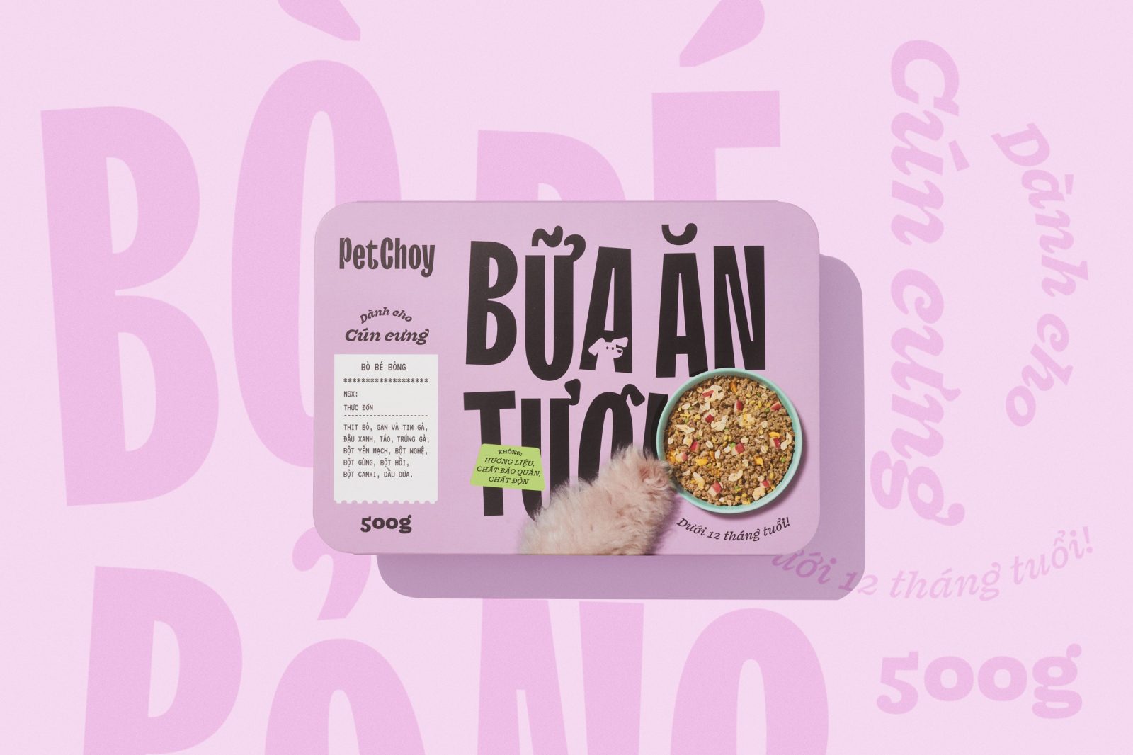
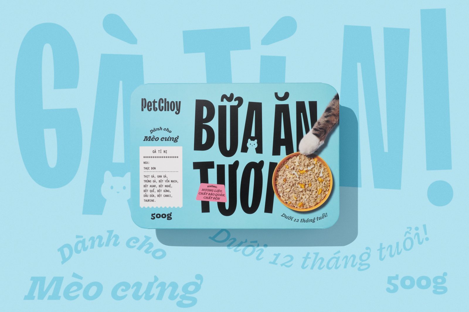
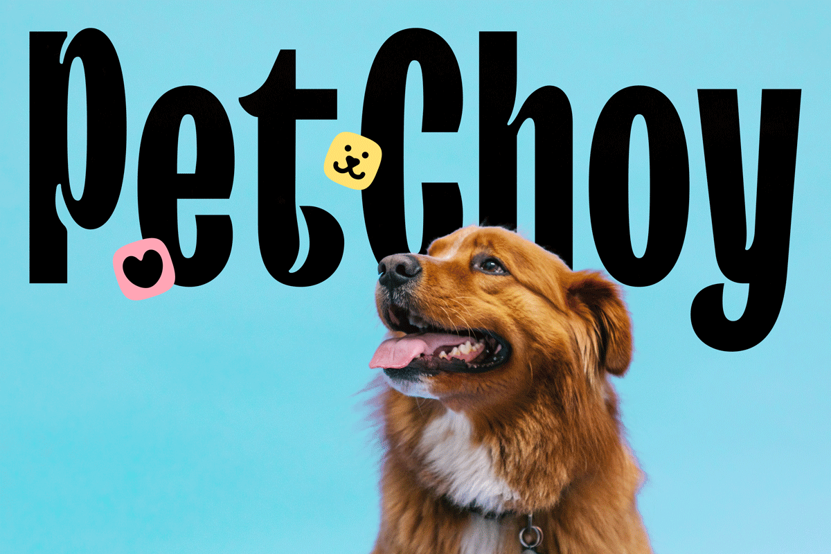
The new logo is a purely typographic design from TT Trailers with characteristic inktraps inspired by happy wagging tails. Combined with “pet’s choice” and “pet’s joy”, we want to visualize the happy choice of a pet when knowing they’re getting PetChoy for mealtime
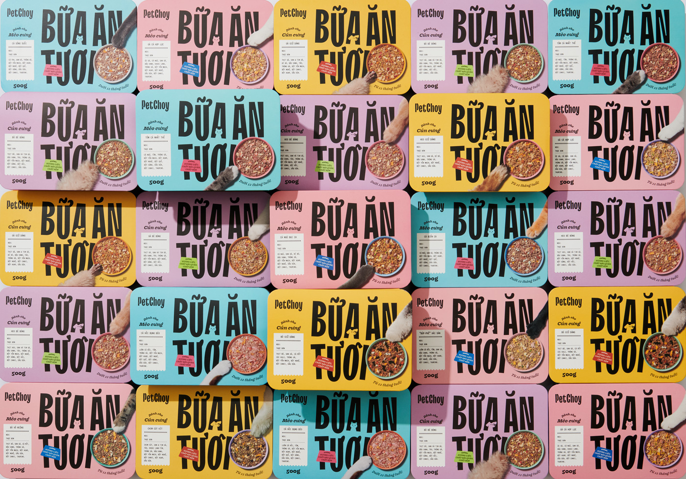
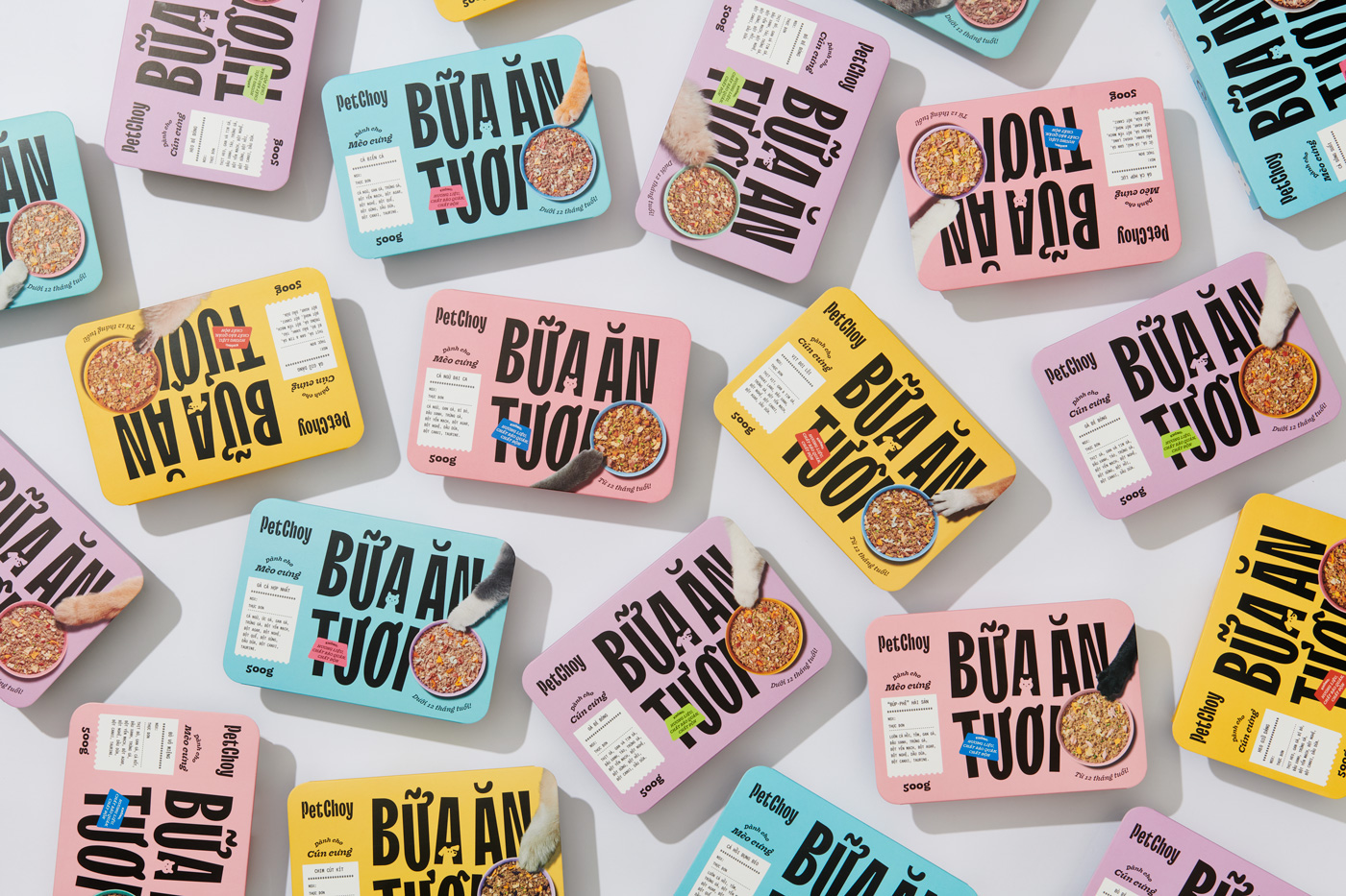
Inspired by core ingredient colors: seafood, meat, chickens, and vegetables
To define from the cat and dog product line, we designed cat and dog characters minimally and brought them subtly into letter A’s negative space. Also, the icon set was designed solid and recognizable to easily differentiate between products
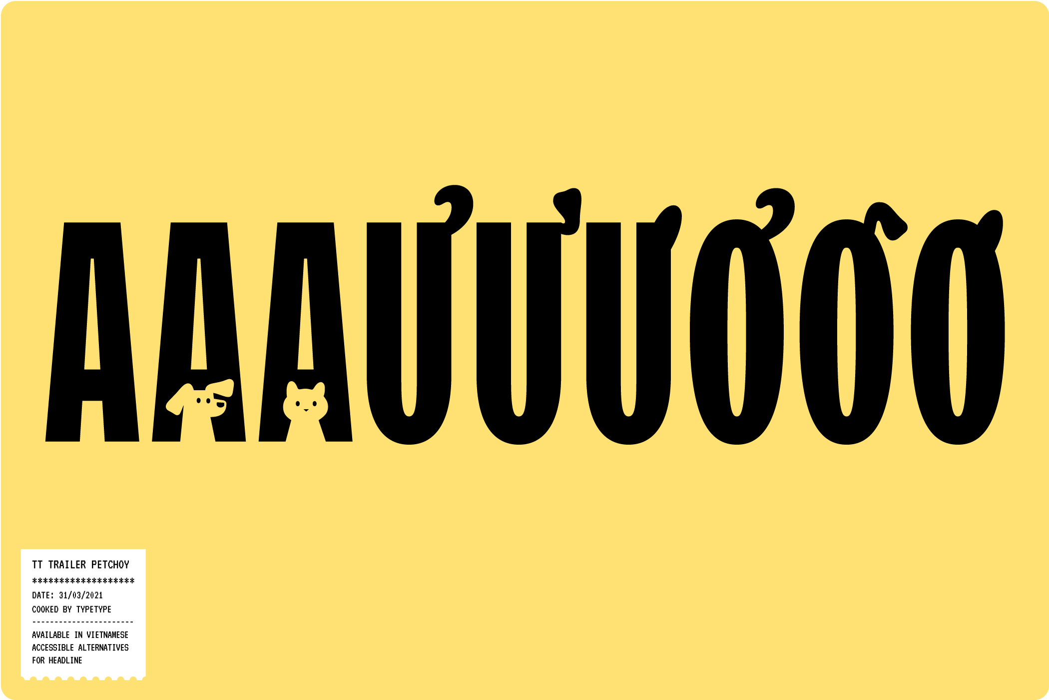
Taking PetChoy from a blank generic brand, TT Trailers was chosen by its great fitted personality, through inktrap, funky narrow shape design. Working closely with TypeType, we developed into TT Trailers Petchoy with happy tail-and-ear-inspired Vietnamese diacritical details. This approach brought more fun, exciting characteristics, and bold statements to distinguish the brand from the market.
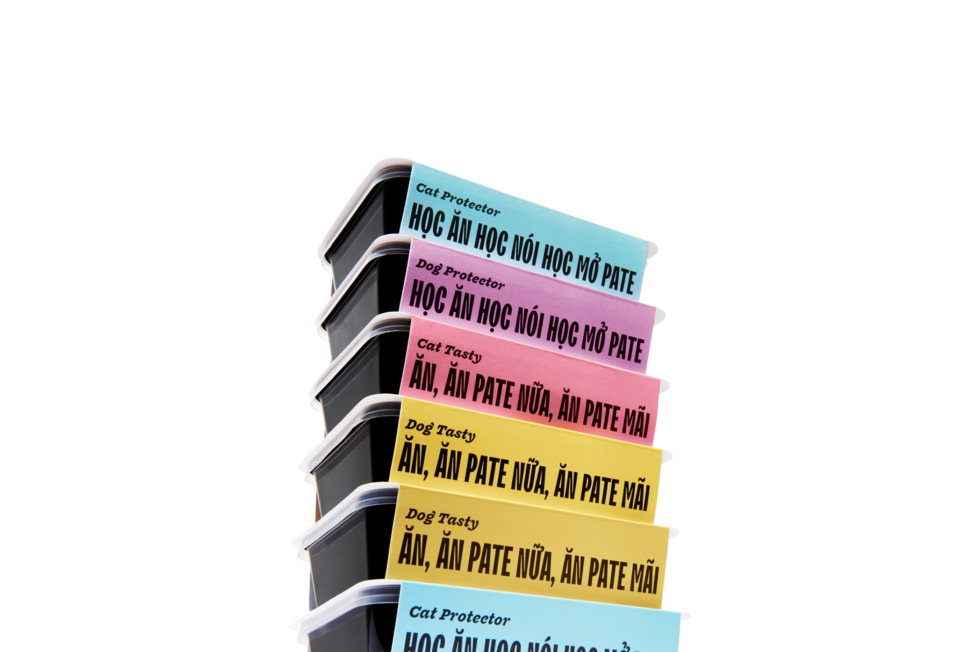
Pairing with Fragen Italic for sub-headlines, VT323 for menu description, and Nunito for body content, the new font systematic approach elevated health and flavor strategy for PetChoy as customers expect
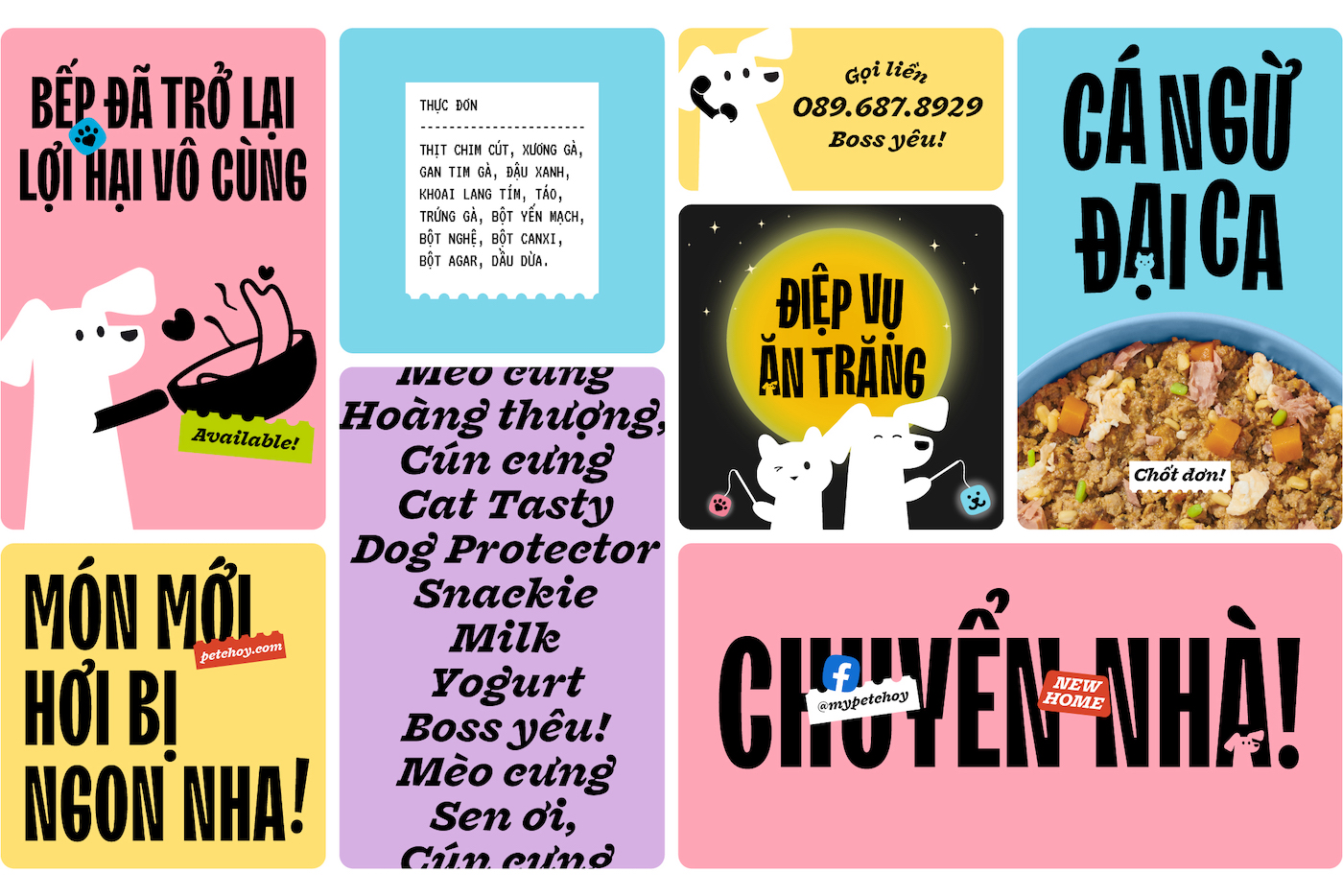
The main pate product’s name (wet food) is changed from “Thức Ăn Tươi” to “Bữa Ăn Tươi” strategically to push brand vibe further into restaurant feel, making customer and their pet feeling more well-treated than feeling buying nutrition food.
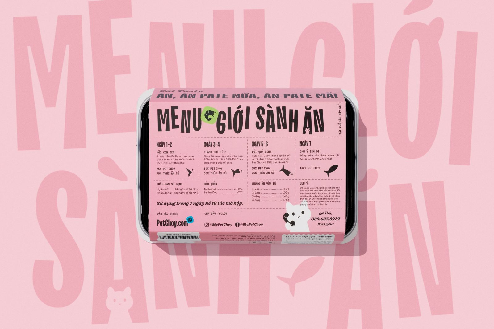
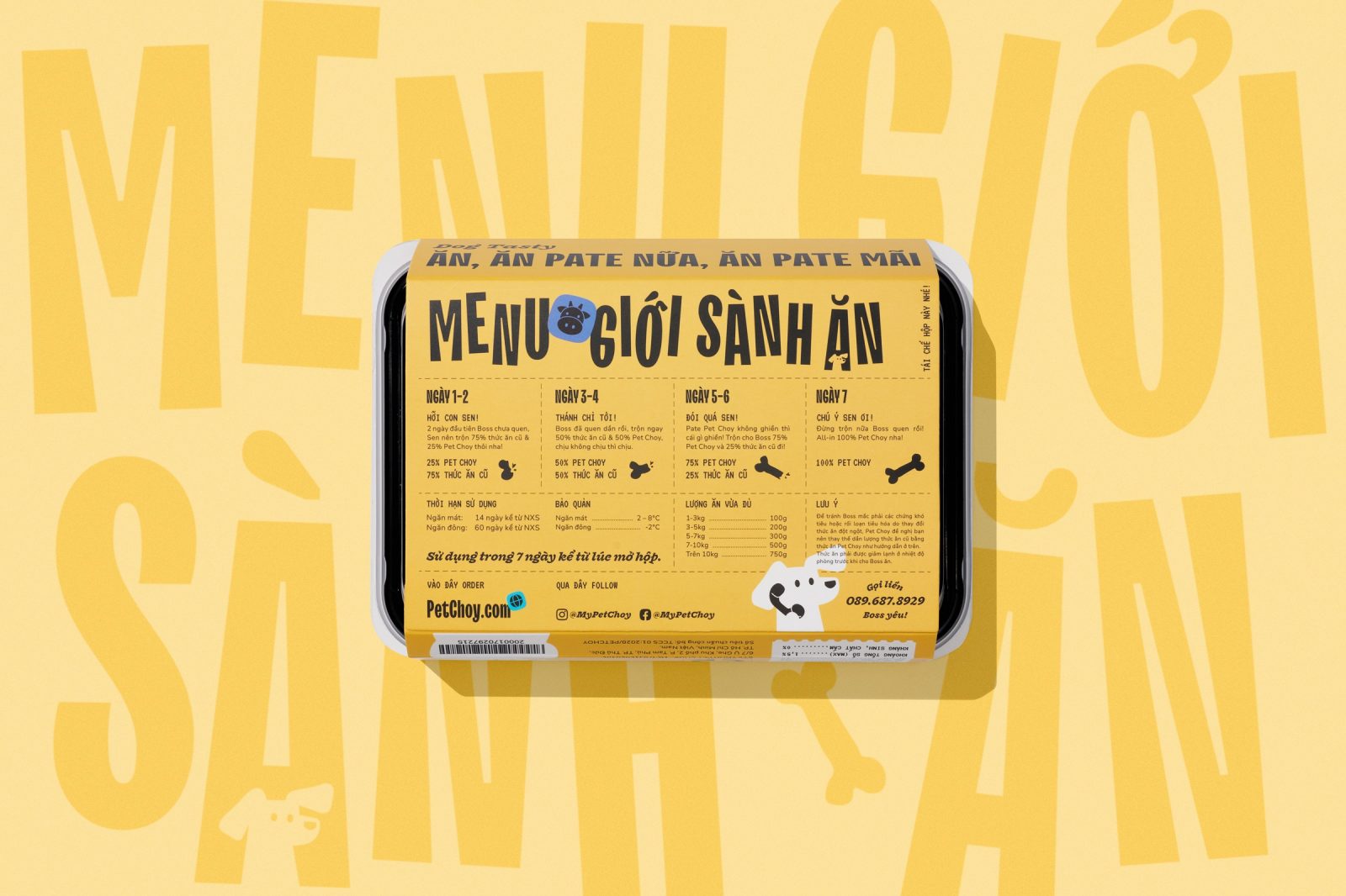
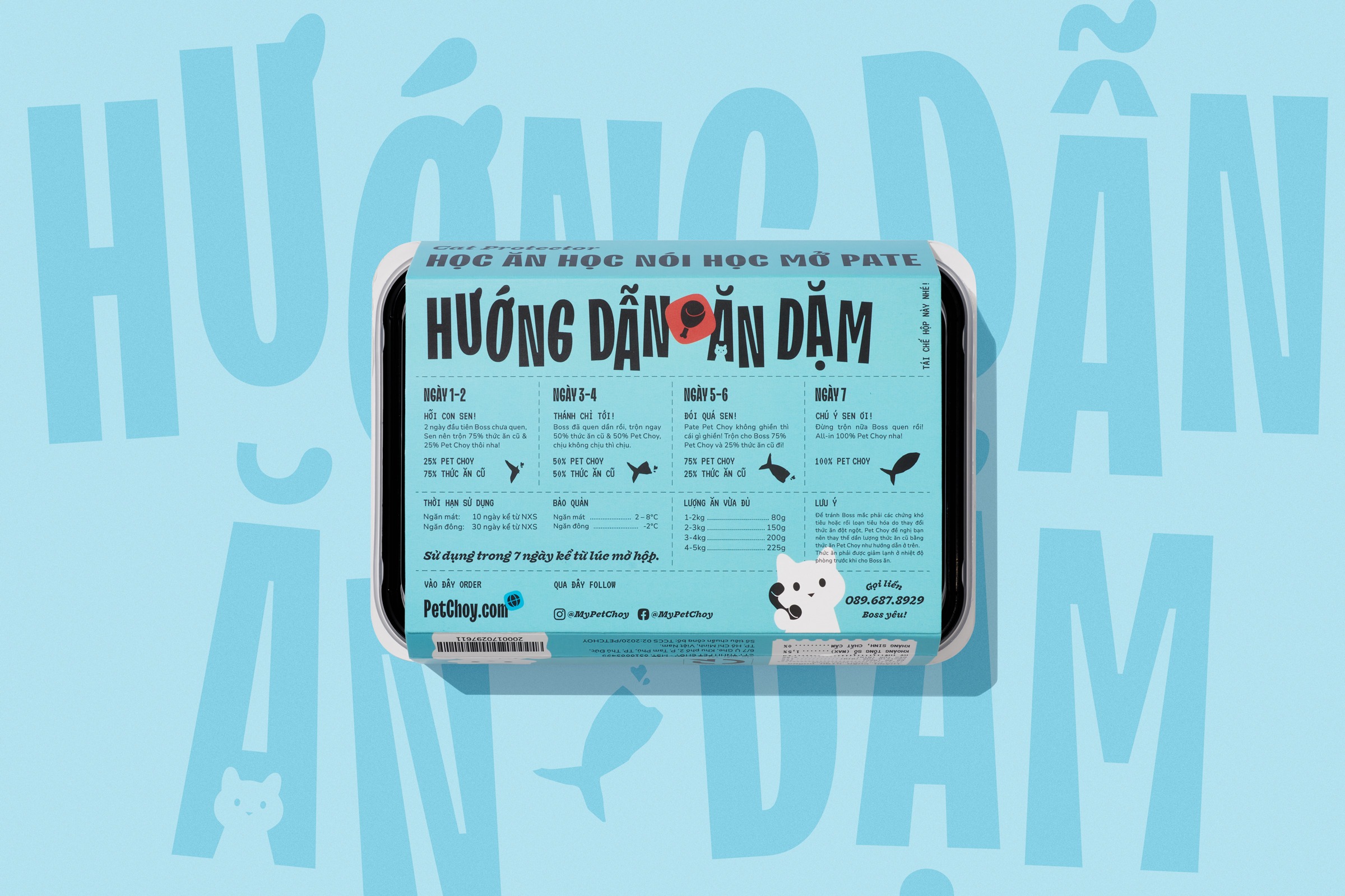
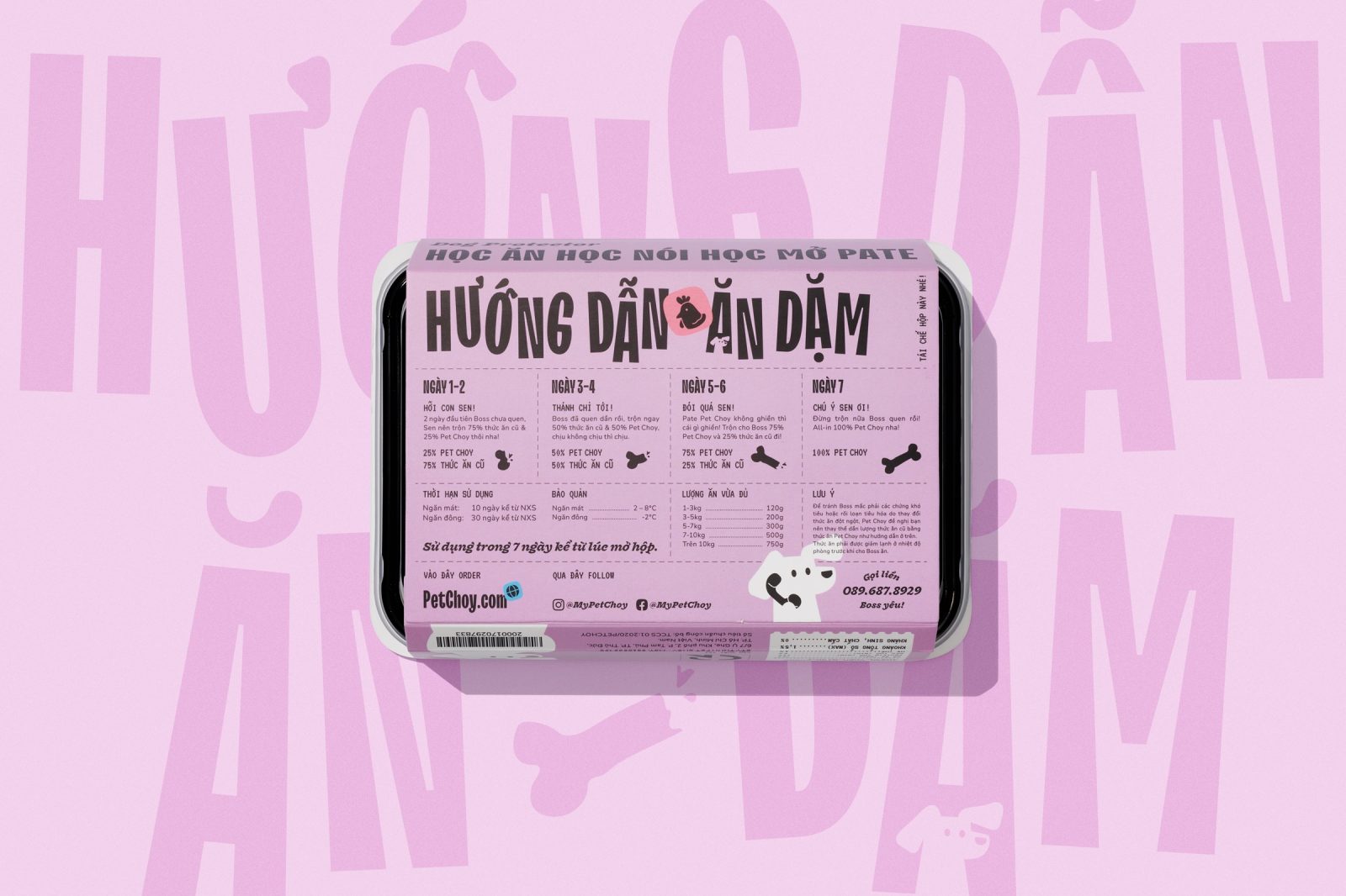
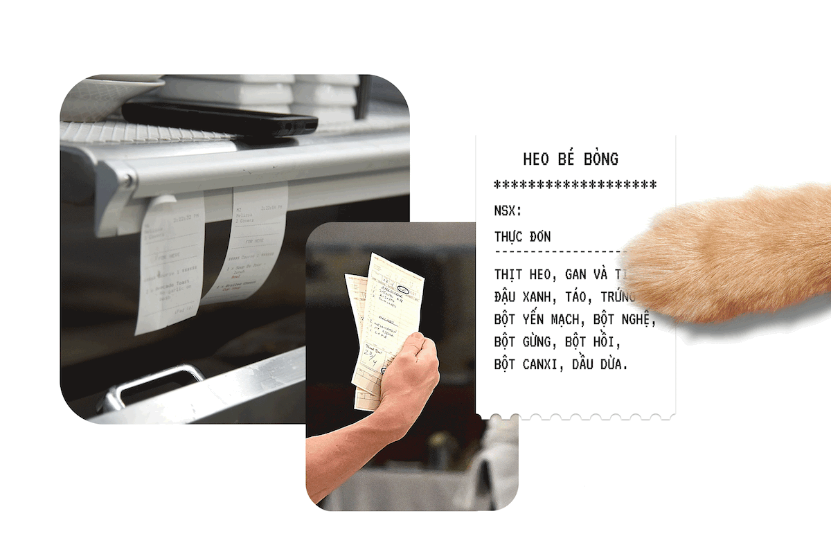
The menu receipt for each flavor was designed as a high-end restaurant ticket combined with the usages of paws to hint at pet-wanted delicious food. This represents the meaning of high-quality, nutritious, well-prepared meals ready for every beloved pet.
In contrast with the usual market standard, we took the packaging to a typographic-based layout that “Bữa Ăn Tươi” becomes the main element, giving a strong message to define the product and distinguish PetChoy on shelves with others that use pet images. The paw and the dog/cat icon will describe what the product is for, complementing with restaurant ticket gives full information about the meal
Backside is usage instruction that provides steps of changing from old food, caution, storage instruction, and contact / social information of the brand.
Providing the essence of authentic selected raw materials and the joyful moments of PetChoy customers, and completing the brand vibe, we collaborated with Wing Chan & Thùy Dương for material styling photoshoot and lifestyle imagery.
CREDIT
- Agency/Creative: M — N Associates
- Article Title: Vietnamese PetChoy Rebranding and Packaging Design by M – N Associates
- Organisation/Entity: Agency
- Project Type: Packaging
- Project Status: Published
- Agency/Creative Country: Vietnam
- Agency/Creative City: Ho Chi Minh City
- Market Region: Asia, Global
- Project Deliverables: Advertising Photography, Brand Architecture, Brand Creation, Brand Design, Brand Identity, Brand Mark, Brand Redesign, Brand Strategy, Brand Tone of Voice, Brand World, Branding, Character Design, Copywriting, Food Photography, Food Styling, Packaging Guidelines, Rebranding, Typography, Web Design
- Format: Bowl, Case, Sleeve, Wrap
- Substrate: Plastic, Pulp Carton
- Industry: Food/Beverage
- Keywords: WBDS Agency Design Awards 2021/22
-
Credits:
Creative Director: Duy — N
Design Director: Anh Nguyen
Social Art Director / Designer: Anh Pham
Content Director : Quan Nguyen
Designer: Quan Nguyen, Anh Pham
Web Designer: Anh Nguyen
Photographer: Wing Chan
Stylist: Thuy Duong
Social Art Director / Designer: Anh Pham
Project Manager / Producer: Quan Nguyen, Lan Ma
Type Foundry: TypeType


