


Transmesa is a company that has been manufacturing cold-drawn tubes for 75 years. After so long, its logotype had become obsolete, it was static, coarse and clumsy-looking. But Transmesa is none of these things. Yes, it is an industrial company. But it is not heavy industry. It makes precision-drawn tubes. They are thin and very ductile. They are also very strong. Transmesa is not even half the size of the holdings that it competes against. This makes it closer and more human, it has its own special way of doing things and its own identity.
Good branding transcends the logotype, which is why we have created a rich visual world that conveys the brand’s positive values in each and every one of its embodiments.
Transmesa is “industrious” and hard-working, agile and adaptable, smart, efficient and pre-emptive. We translated all this into the company values: tenacity, ductility, wisdom.
We designed the logotype focussing on the graphical aspect. As we gradually worked on possible logotypes, we tested them on posters or on other sales material. The identity and the logotype had to “be born” in parallel. We read up on brutalism, avant-gardes and classic logotypes, unchanging over time.
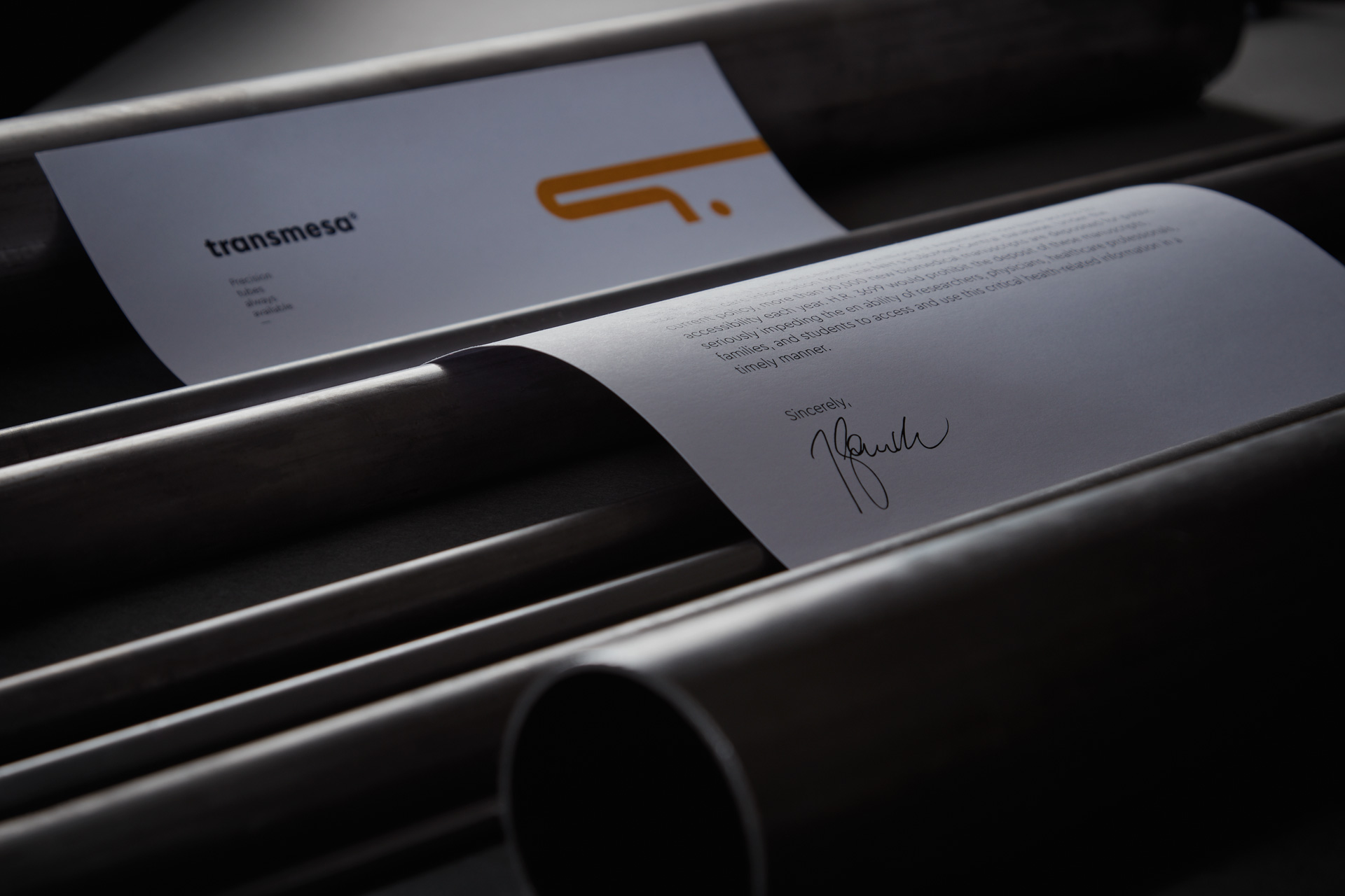
We were amazed at just how long the plant, the tubes and the brand name were. Transmesa draws out everything. We embodied this in the isotype, a very long T which stands for a tube. This in turn is complemented by a dot, which is a tube seen from the front. The logotype is made using a geometric typography that we build to make the negative shapes round as the frontal view of tubes. Always tubes. Moreover, the logotype is a contrast between lines (ductility) and right angles (tenacity).
The colours chosen are a triad closely related to industry, machinery and the company’s cold-drawing plants. These colours were already present at its facility, and now they also preside the corporate identity and the website.
We decided to go for a very clear, direct and visual website. With plenty of photographs. The photo shoot was a bit of a challenge because taking photographs of such a vast area is no easy task. That said, it was very rewarding, because the factory and the warehouse pack a stunning visual plasticity. This photo shoot was indispensable in explaining what Transemsa is like on the inside. A clean, efficient and colourful factory.
Industrial companies also deserve a good branding, or what is more, they need it. Transmesa was well aware of this, which is why they allowed us to turn their brand on its head, using strategy and creativity. Now the brand is ready to compete for at least another 75 years.
CREDIT
- Agency/Creative: Vibranding
- Article Title: Vibranding designs the branding for a company that makes tubes
- Organisation/Entity: Agency, Published Commercial Design
- Project Type: Identity
- Agency/Creative Country: Spain
- Market Region: Multiple Regions
- Project Deliverables: Brand Architecture, Brand Identity, Brand Redesign, Brand Strategy, Brand World, Branding, Graphic Design, Identity System, Photography, Rebranding
- Industry: Manufacturing
- Keywords: industrial company, tubes, design, photography, branding, brand, design, brand architecture


