


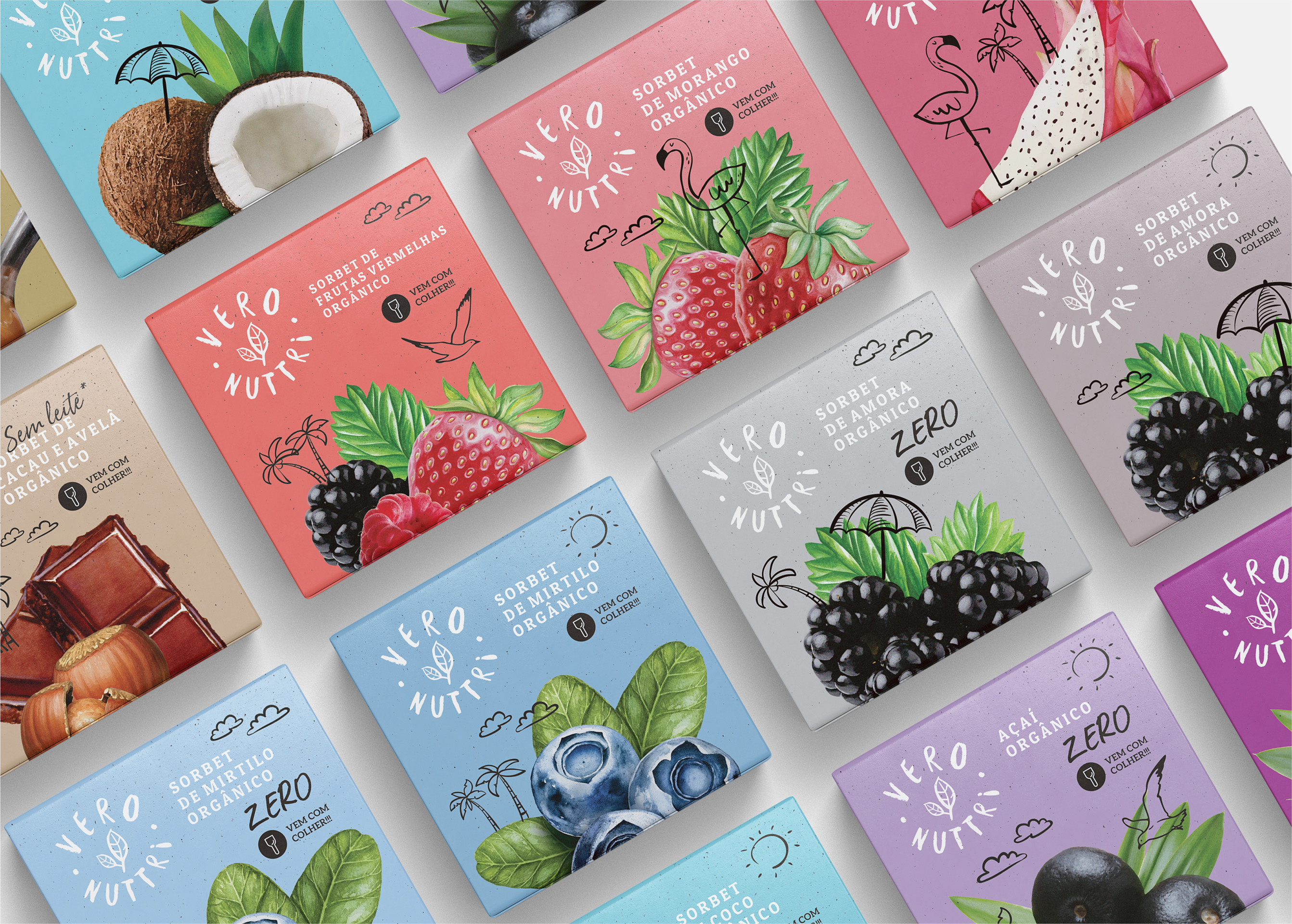
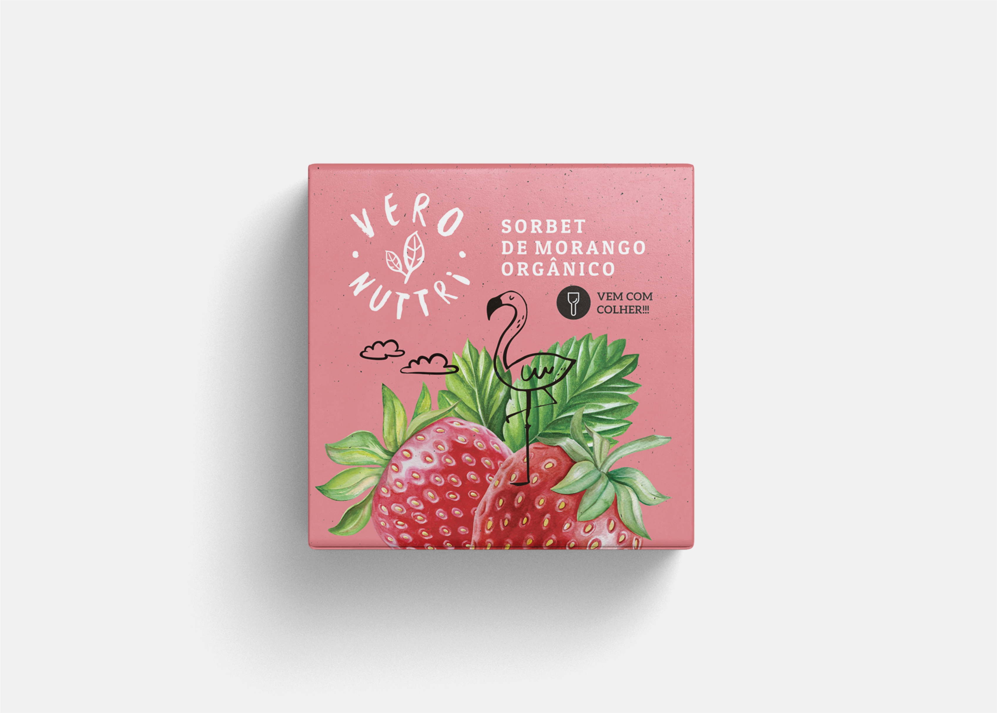
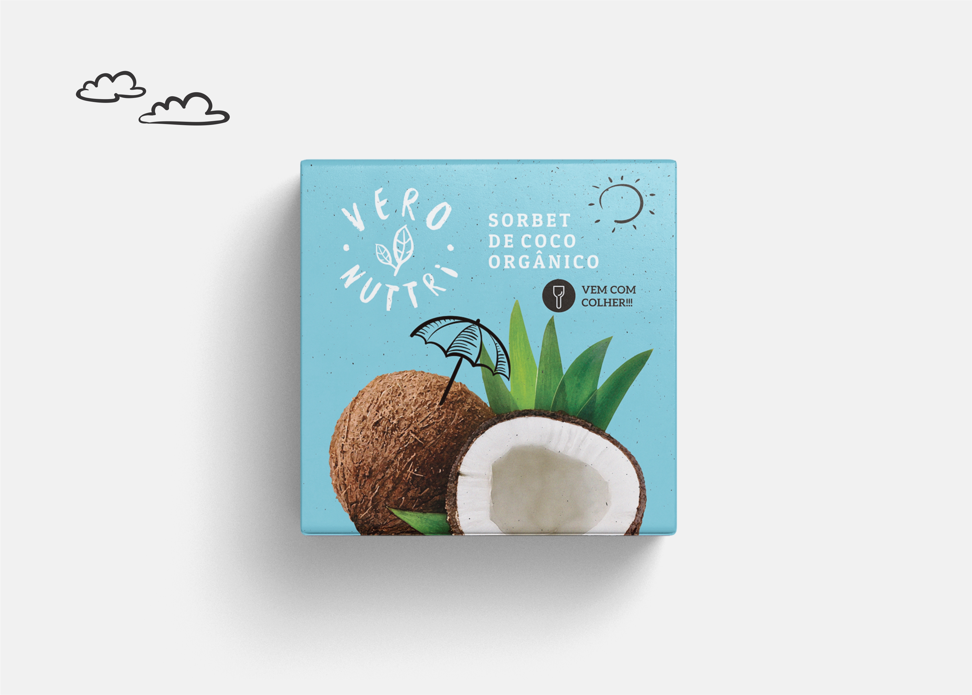
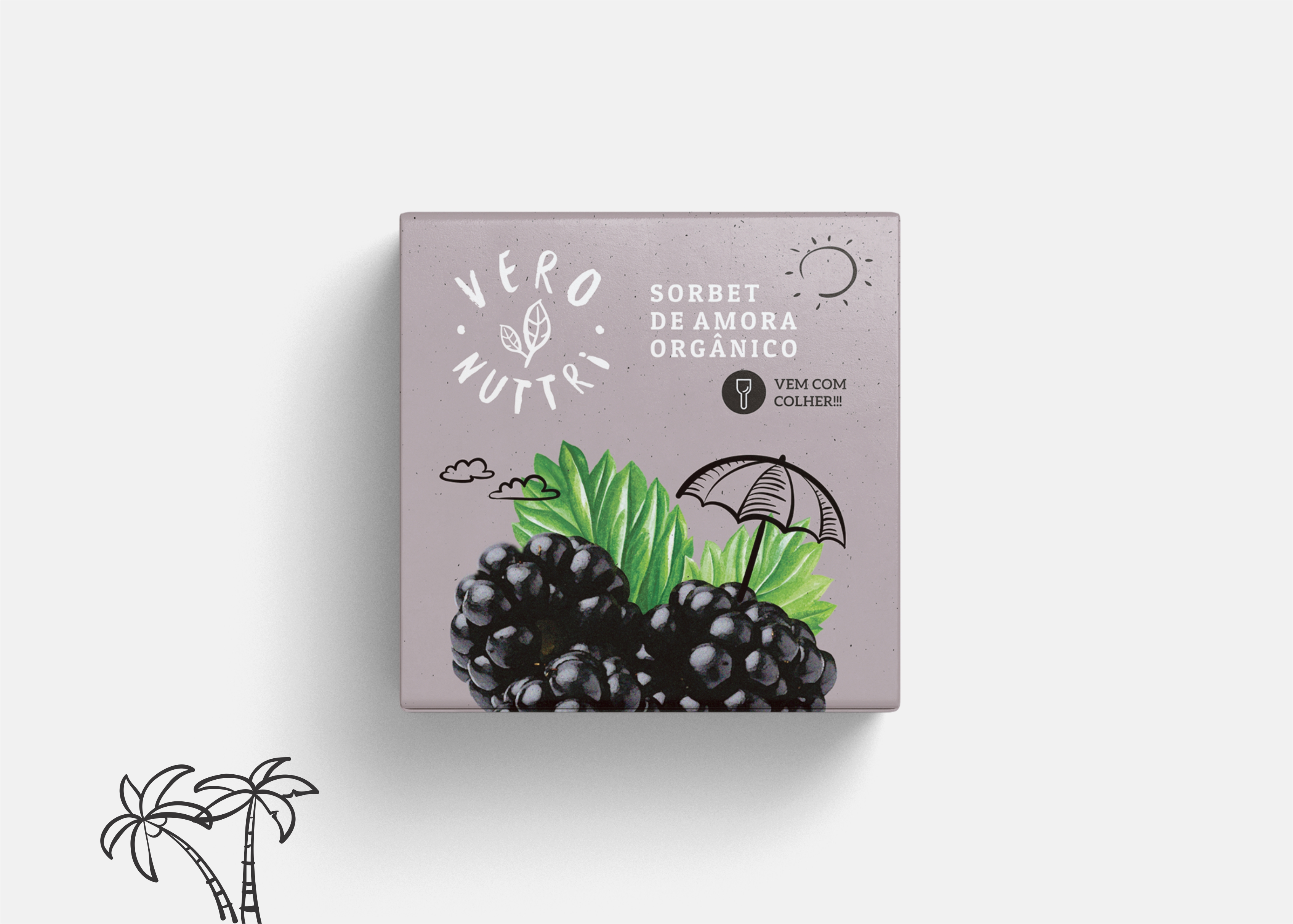
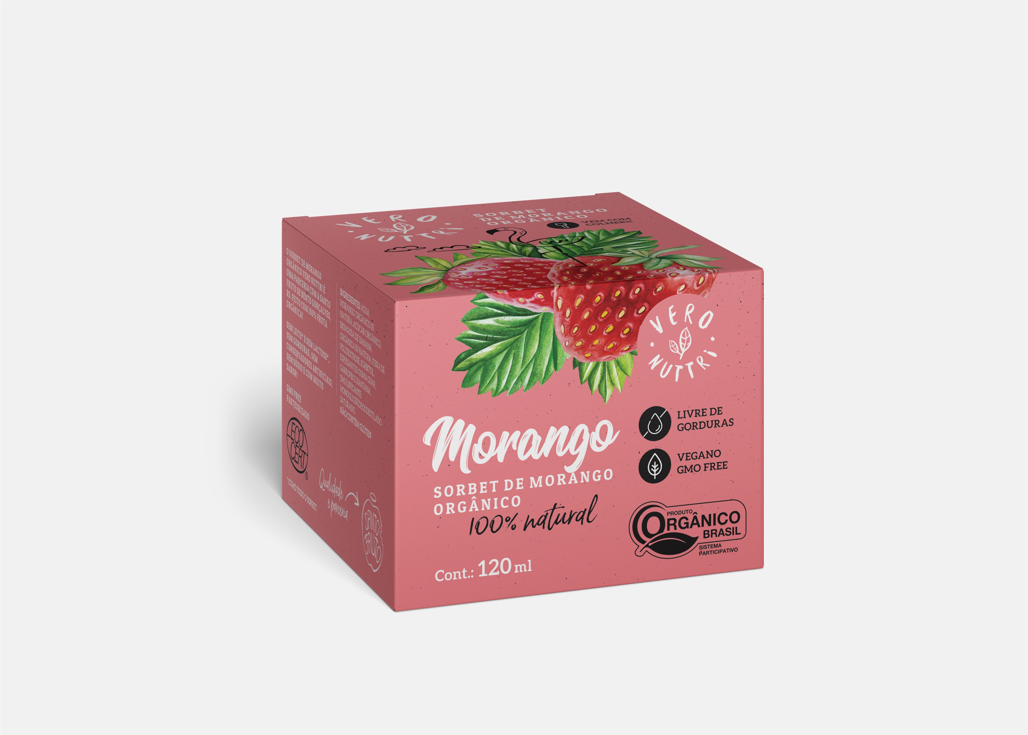
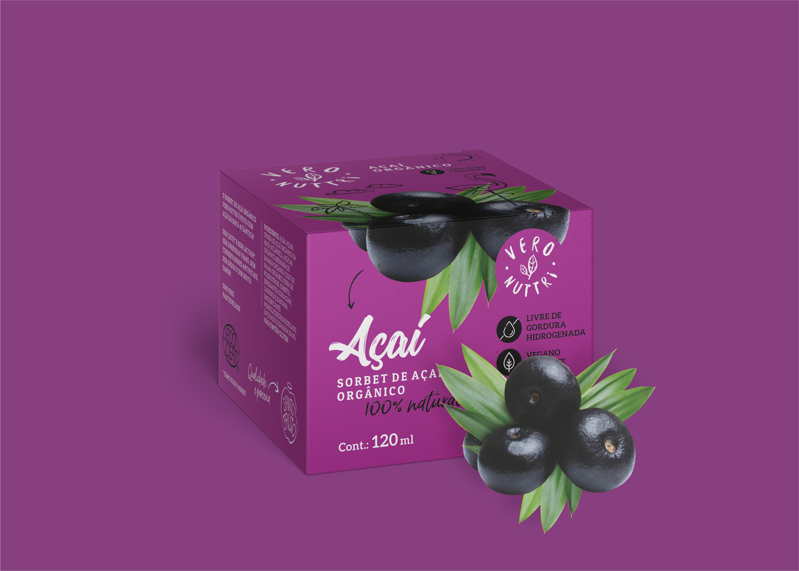
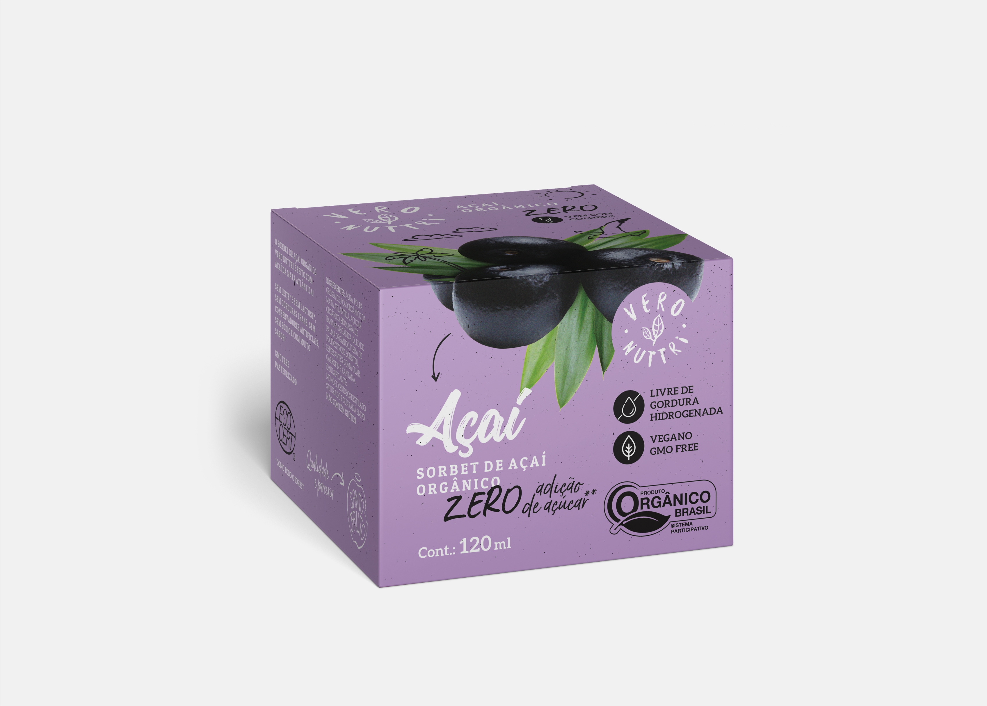
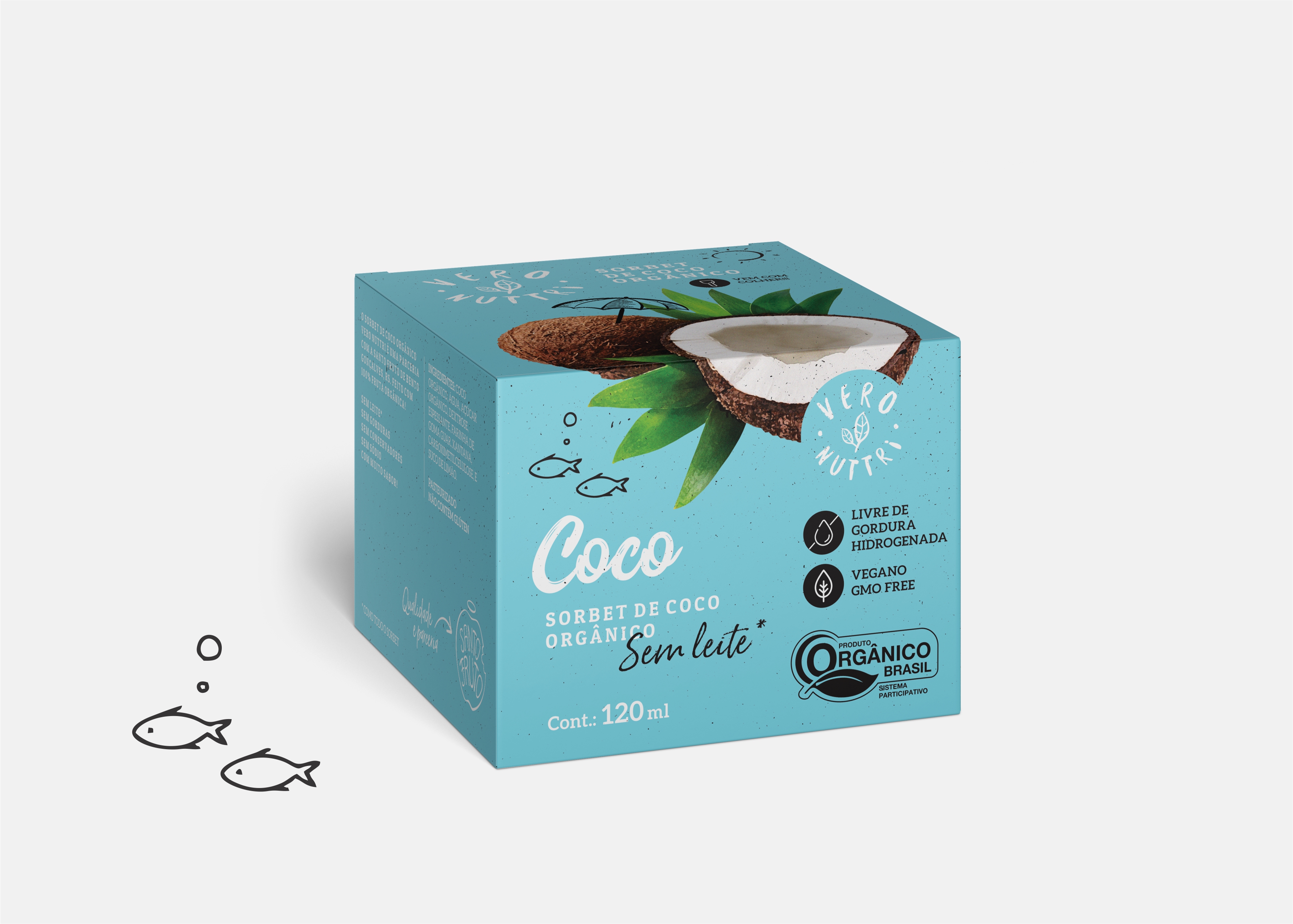
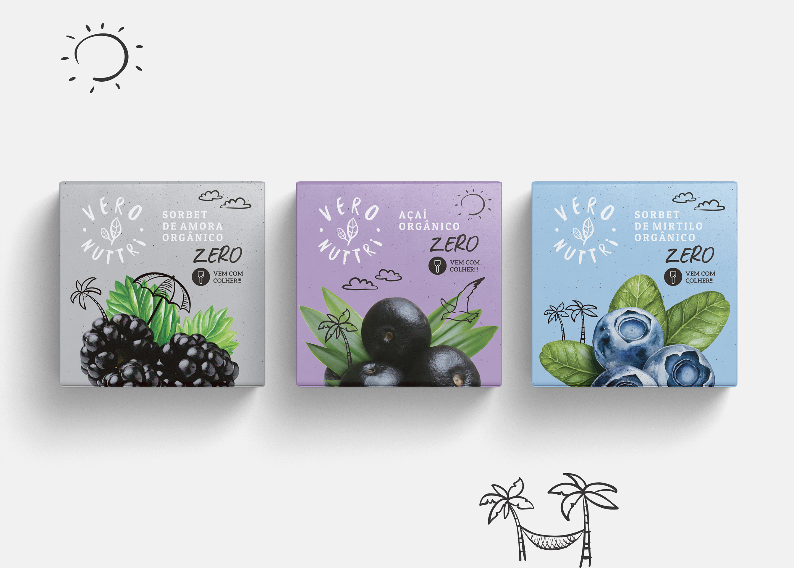
Different from Ice Cream, Sorbet is a frozen dairy-free delight that contains mostly fruit, sometimes sugar or sweetener is added to it. It’s often stirred in an ice cream maker, which makes it scoopable, not creamy, but extremely light. Veronuttri Organic Sorbets represents this natural light feeling in individual portions that can be consumed immediately since the little boxes bring a wood recycled spoon.
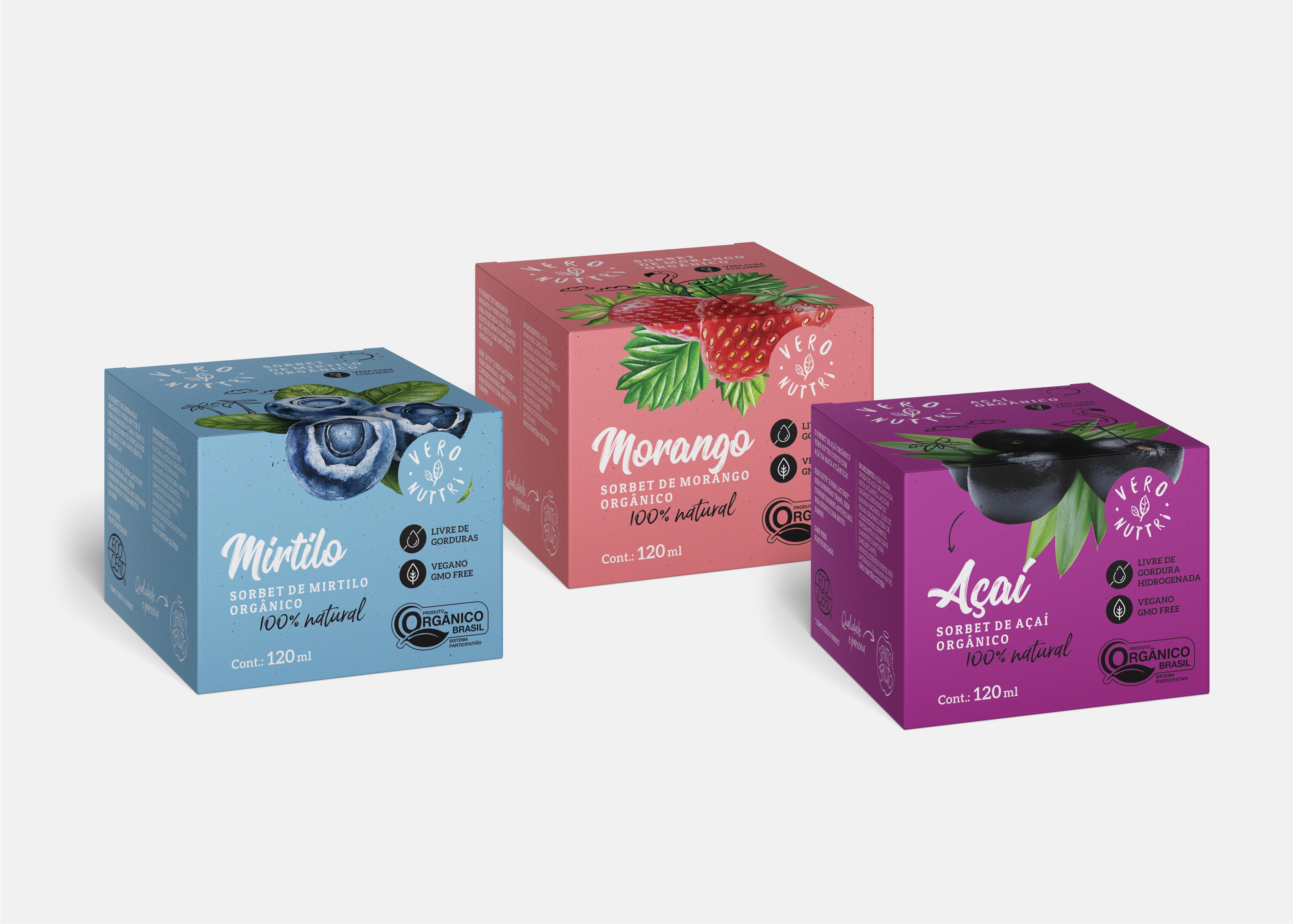
The decision to use paper boxes for the individual portions allowed us to maximize the use of a small package, expanding the visual area which improves the product presentation at POS, besides supporting our green approach. Other key factors when deciding the material were the total cost of the package, including printing costs, and agility to launch and test new flavors.
Once Veronuttri Organic Sorbets offers several flavors, the easy identification of them by the consumer was a must-have. We addressed that need through a graphic design approach that combines pictures of fruits and a soft color palette, yet impactful and attractive. The fruits images bring up an organic feeling, and the soft color palette expresses the lightness of the products, driving customers to a relaxing, sunny summer day feeling.
CREDIT
- Agency/Creative: RPD Design
- Article Title: Veronuttri Organic Sobert
- Organisation/Entity: In-house, Published Commercial Design
- Project Type: Packaging
- Agency/Creative Country: Brazil
- Market Region: South America
- Project Deliverables: Brand Identity, Brand Strategy, Graphic Design, Packaging Design
- Format: Box
- Substrate: Pulp Carton


