


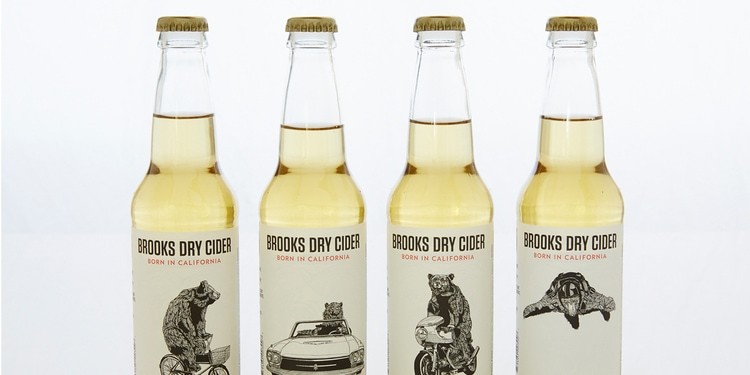

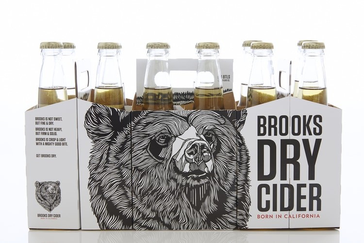
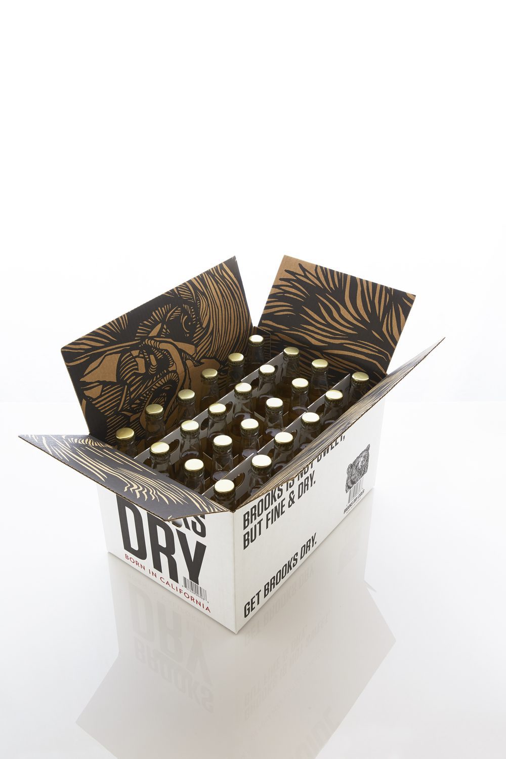
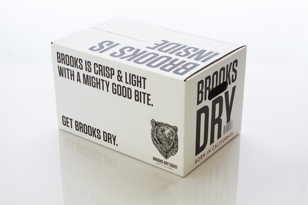
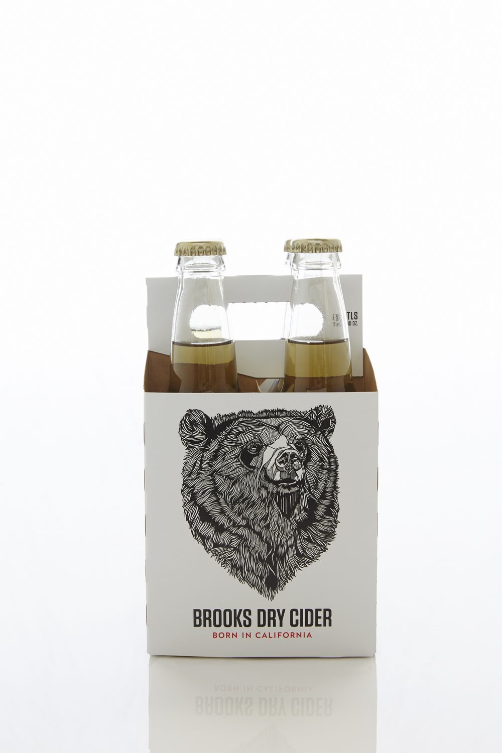
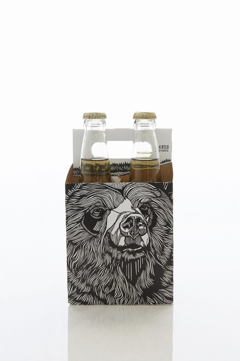
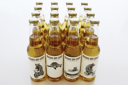
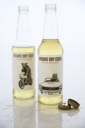
“In a given label Brooks is actively enjoying the State’s near-perfect weather by skydiving, cycling, riding a motorcycle or cruising in a convertible. The four-pack design wraps around the box and forms a seamless banner with the mascot when placed side by side. Opening the case reveals a larger print of the bear while the outside succinctly describes the cider: Brooks is crisp and light with a mighty good bite.”A bold typography using straightforward black and white colours works successfully on the beer carriers and cartons. The distinct traits of the cider need nothing more than a simple but impactful attention grabber.
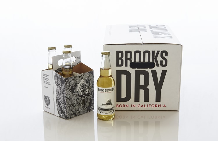
What is really interesting in this packaging is how the very bold and serious iconography of Brooks the Bear on the outer pack contrasts with the very sweet and funny illustrations on the labels.
Designed by Tosh Hall
CREDIT
- Agency/Creative: Tosh Hall
- Article Title: Tosh Hall – Brooks Dry Cider
- Project Type: Packaging


