


Within the recent 19 years the company ‘Three bears’ has considerably increased its assortment and become one of the TOP 3 industries of Ukraine. However, a certain problem arose. The audience recognizes ice cream but not the entire brand. In 2019 it was decided to consolidate the ‘Three bears’ umbrella brand and unify all its products within a new integral recognizable style. Bringing people together at the same table, walk, hobby activities is the social mission of the brand. It is simply to drag us out of the virtual world and get back to the real one. So, it is the ice cream that gives happiness and it is of great importance to share it.
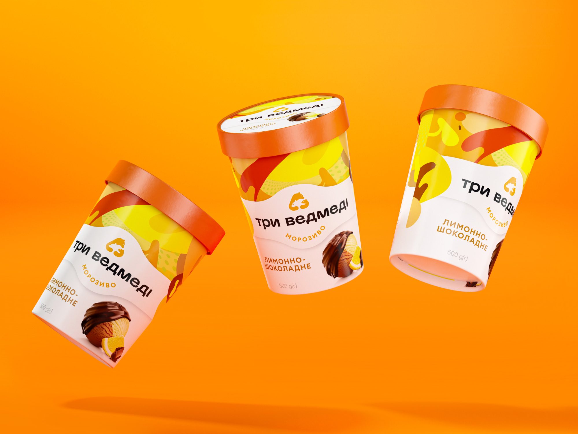
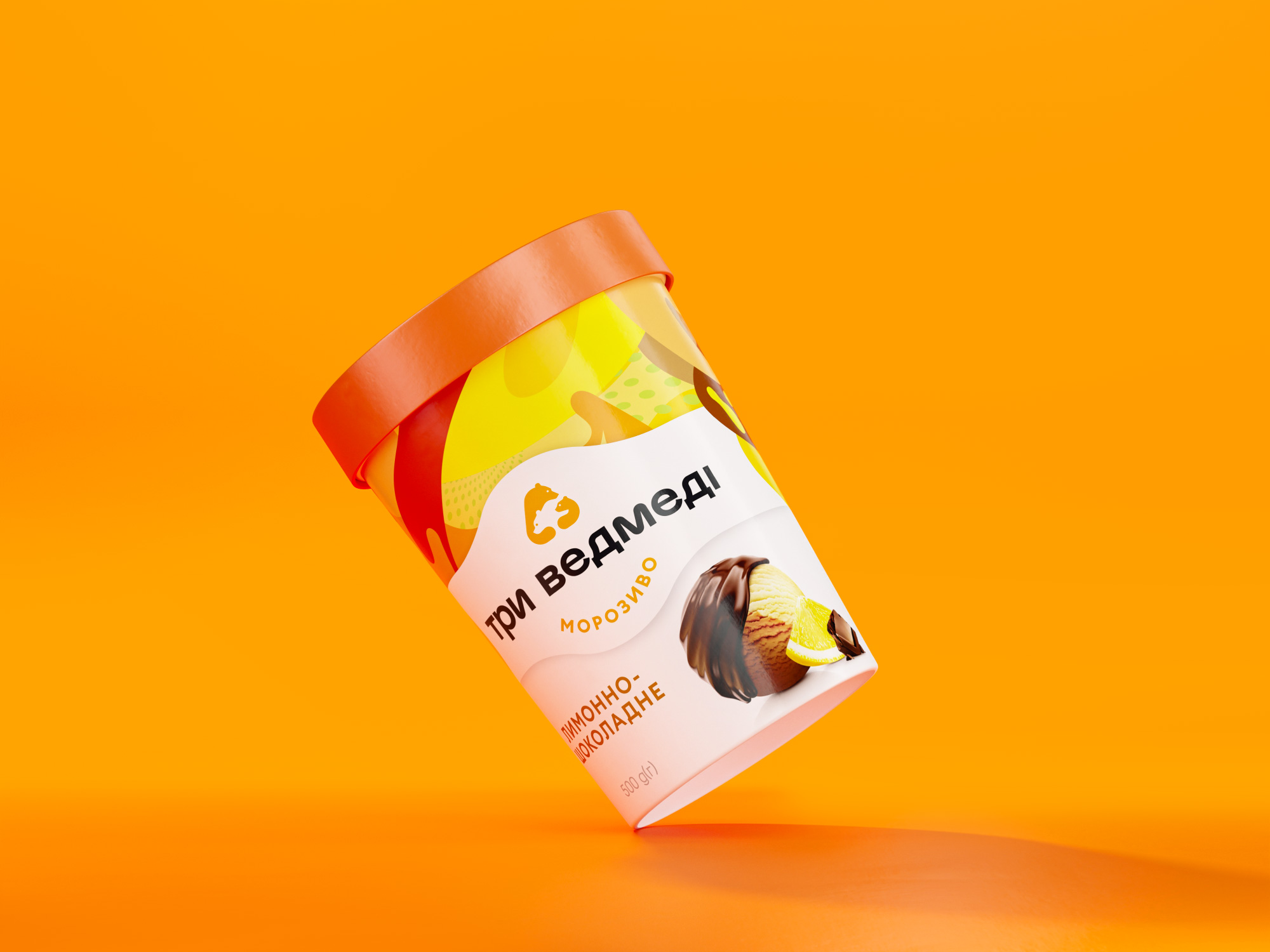
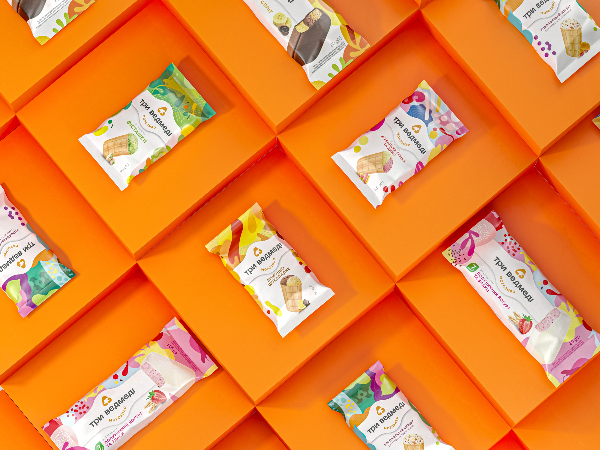
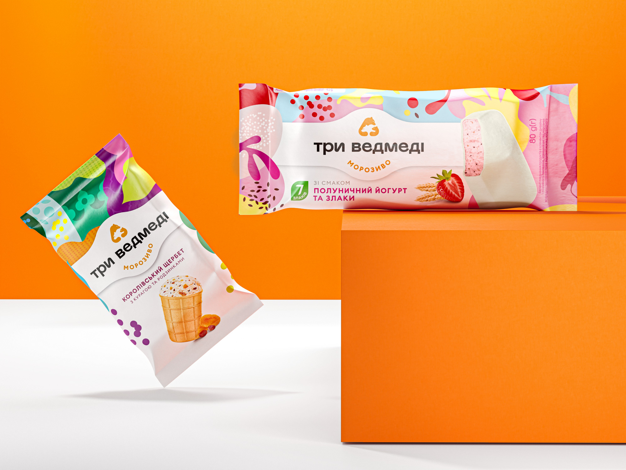
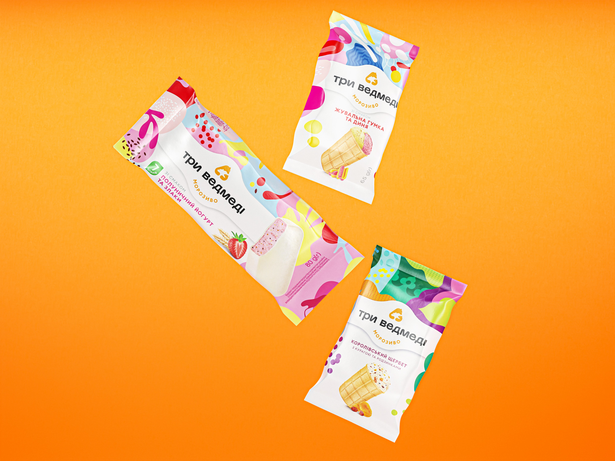
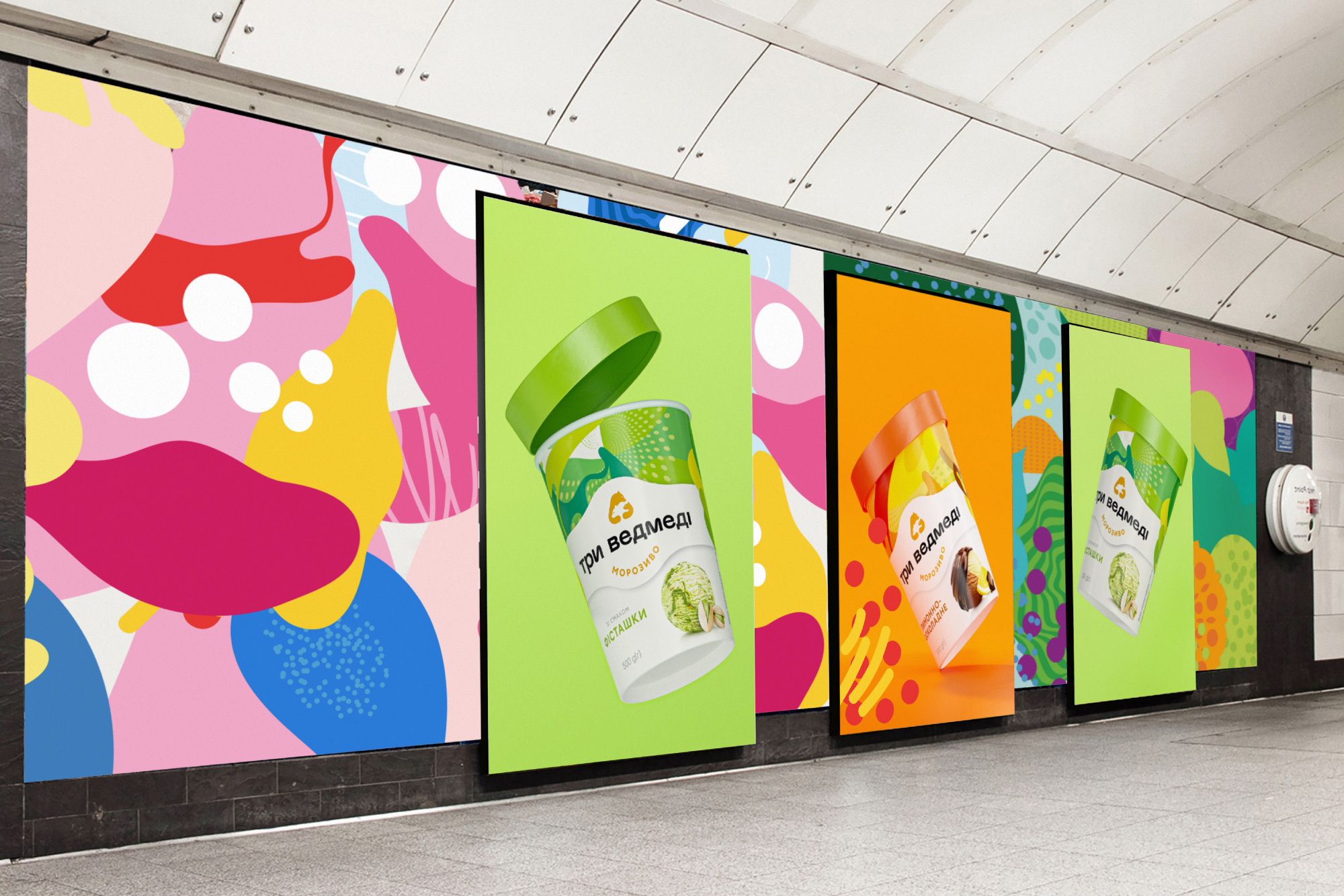
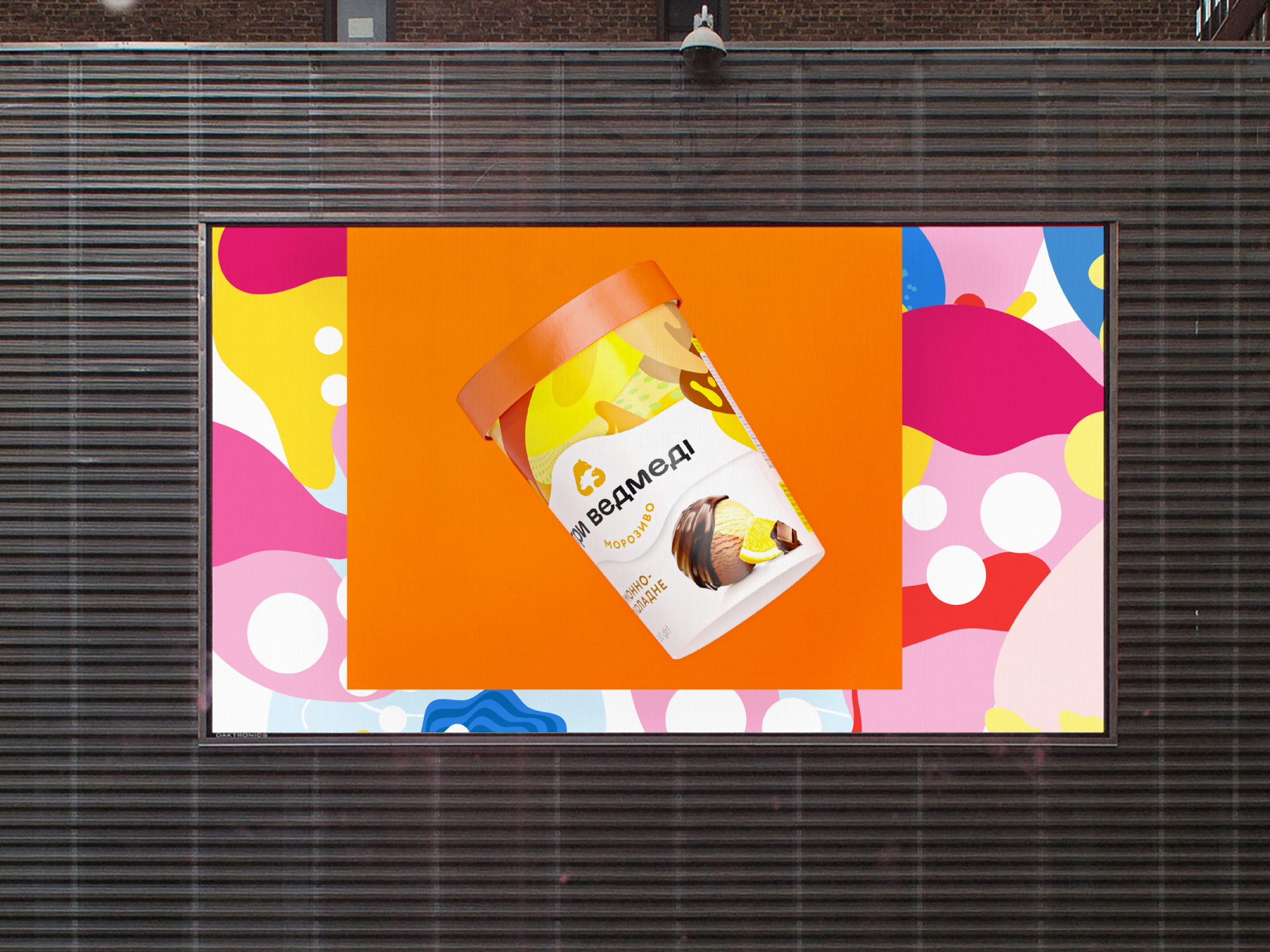
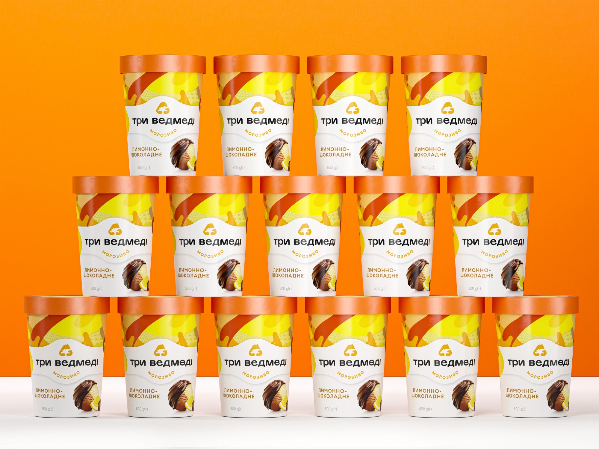
The key task of the agency was to integrate SKU designed in a diverse way and deliver the emotions that arise when eating an ice cream through the packaging. This is how the clear graphic hierarchy was born. We just gave larger space to the bright patterns, placed the updated logo on a white billet in a close-up way with the most delicious, the ice cream, being on the white background. Paired with the product image, the patterns stand for taste indicators. This is how we solved the issue of the packaging functionality. They metaphorically transfer both, the feelings when eating an ice cream, and qualities of the products. It appeared to be bright and emotionally rich, and what is more important, distinguishing among the competitors.
Special attention is paid to the tastes’ images and we reached the best fit to the packaging content. Images of the ice cream are highlighted by the graphic presentation of the ingredients. This meets the two-fold concern, suggests the taste to a customer and makes one want to taste it immediately. Being in the medium-price segment, the ‘Three bears’ ice cream is now looks more premium than ever before. Now it is the delicious packaging for the delicious ice cream. So be aware not to eat the whole lot at once!


CREDIT
- Agency/Creative: Reynolds and Reyner
- Article Title: Three Bears Ice Cream Redesign of Packaging by Reynolds and Reyner
- Organisation/Entity: Agency, Published Commercial Design
- Project Type: Packaging
- Agency/Creative Country: Ukraine
- Market Region: Europe
- Project Deliverables: Brand Architecture, Brand Identity, Brand Redesign, Branding, Rebranding
- Format: Basket, Flow-Pack
- Substrate: Plastic


