


Shoobs is the UK’s leading online destination for black culture events and content. Established in 2014, the brand has grown as urban music has become the dominant genre globally, and at the same time has played a significant role in the emergence of todays hugely successful black British music scene.
Initially the platform solely had a clubbing focus, which led to the formation of the brand name, as ‘Shoobs’ derives from a slang term for ‘party’. However, since those early formative days, the business has grown exponentially, expanding its offer to provide tickets and experiences across multiple event types, from dating and comedy, to brunches and festivals.
With ambitions to grow in the US and Africa, as well as moving into content creation, we needed to take a holistic look at the Shoobs brand and ensure it reflects this more diverse offer.
After speaking to event-goers and promoters who use the platform, it was clear that Shoobs was seen as the go-to destination for urban experiences. Since its inception, Shoobs has built strong customer loyalty, and has a reputation as a trustworthy place to make transactions.
Furthermore, the business is founded and ran by people who are passionate about the scene, and are focused on doing it for the culture.
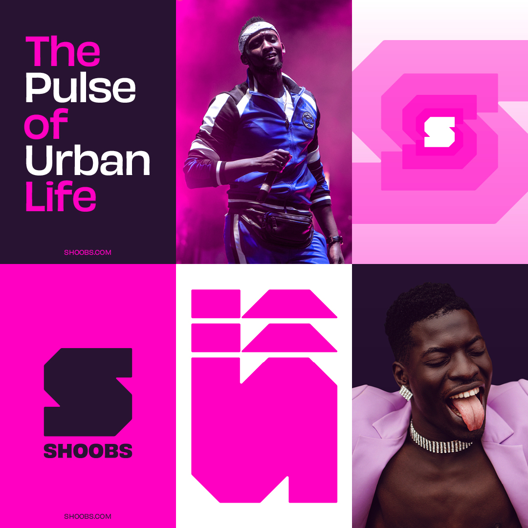
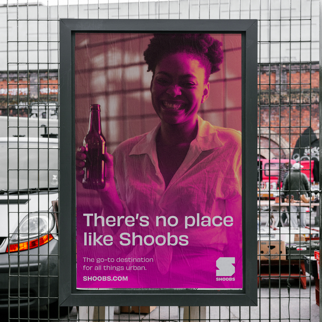
We developed a brand positioning entitled ‘The Pulse of Urban Life’. The idea was to put experiences and people living their best life at the heart of the the brand. Moving from ticket transactions to social interactions. It also reflects Shoobs’ knowledge and experience of the scene, having been part of it from the start. Thus giving the brand an authoritative voice, and positioning it as the living, beating heart of black culture.
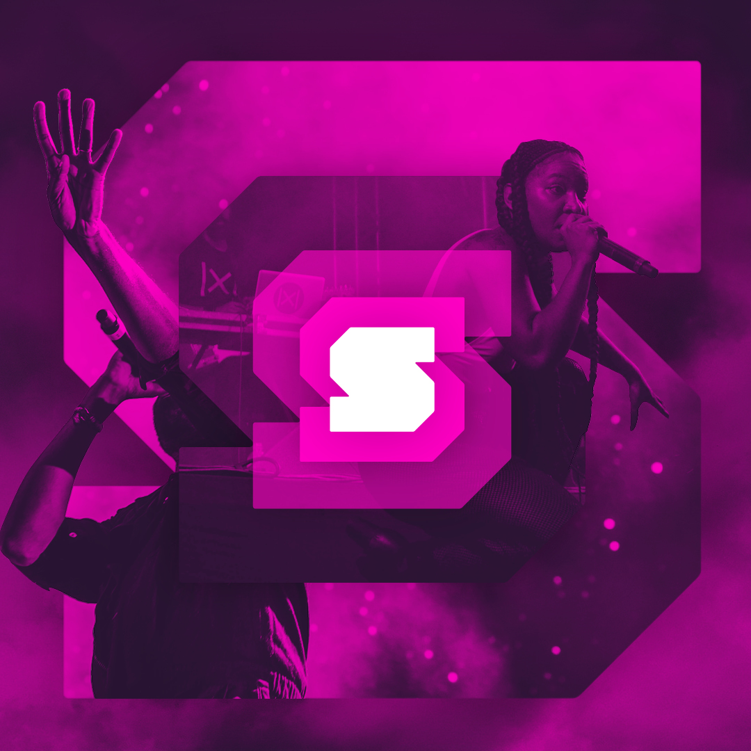
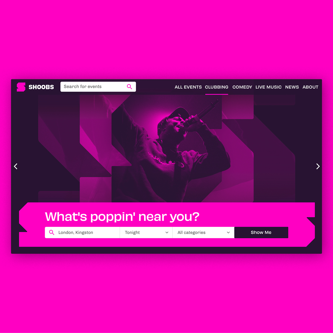
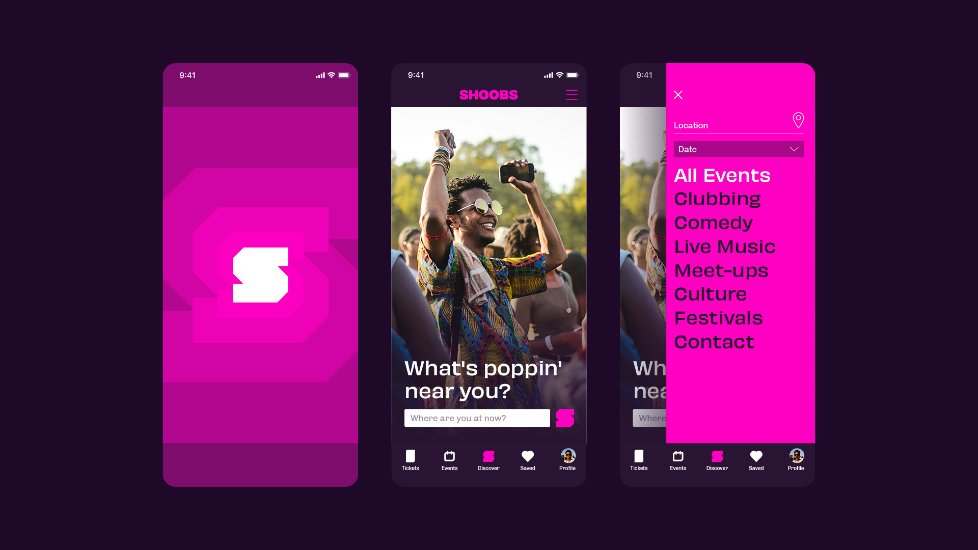
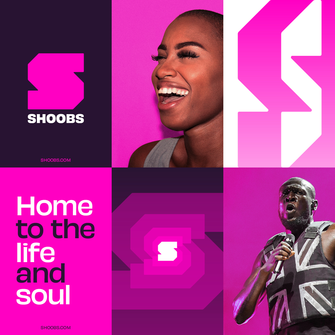
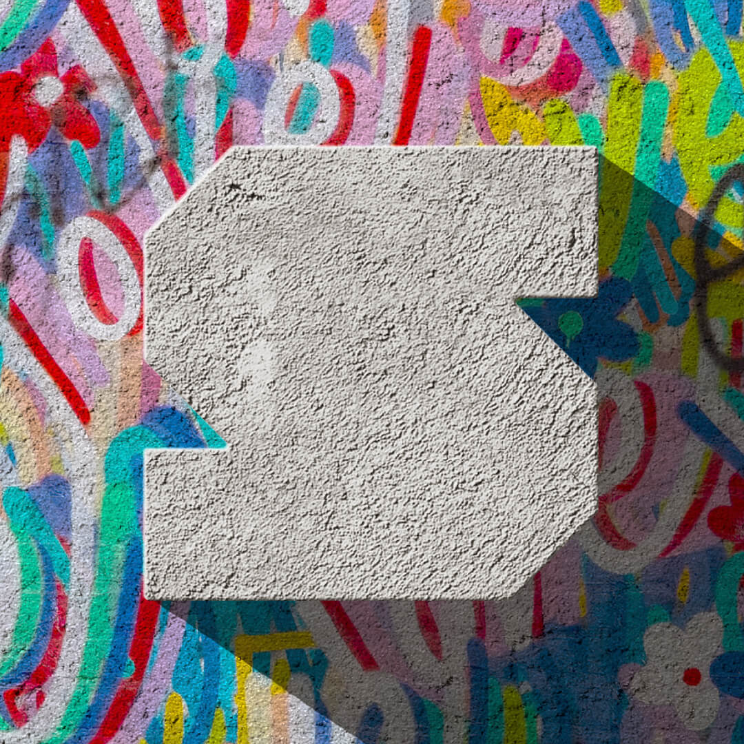
To reflect the brand positioning we created a bold, geometric, button-like logo, and put this at the heart of the identity. The idea being that the logo creates a feeling where upon pressing it you activate amazing experiences.
We also wanted to use the bold nature of the logo as an ever-changing canvas to communicate and showcase the different type of events available on the platform, whilst also taking inspiration from the visual world of urban event flyers.
Using the shape of the logo, we created a variety of pulsing patterns to be used as background textures, and to house house content. The logo also informed the design of event category icons.
After speaking to existing Shoobs customers, it was clear that the pink colour was synonymous with the brand. It also stood out massively against other competitors. Therefore we retained it as the main brand colour (albeit with a slight tonal tweak), and used it to build out a rich but vibrant colour palette.
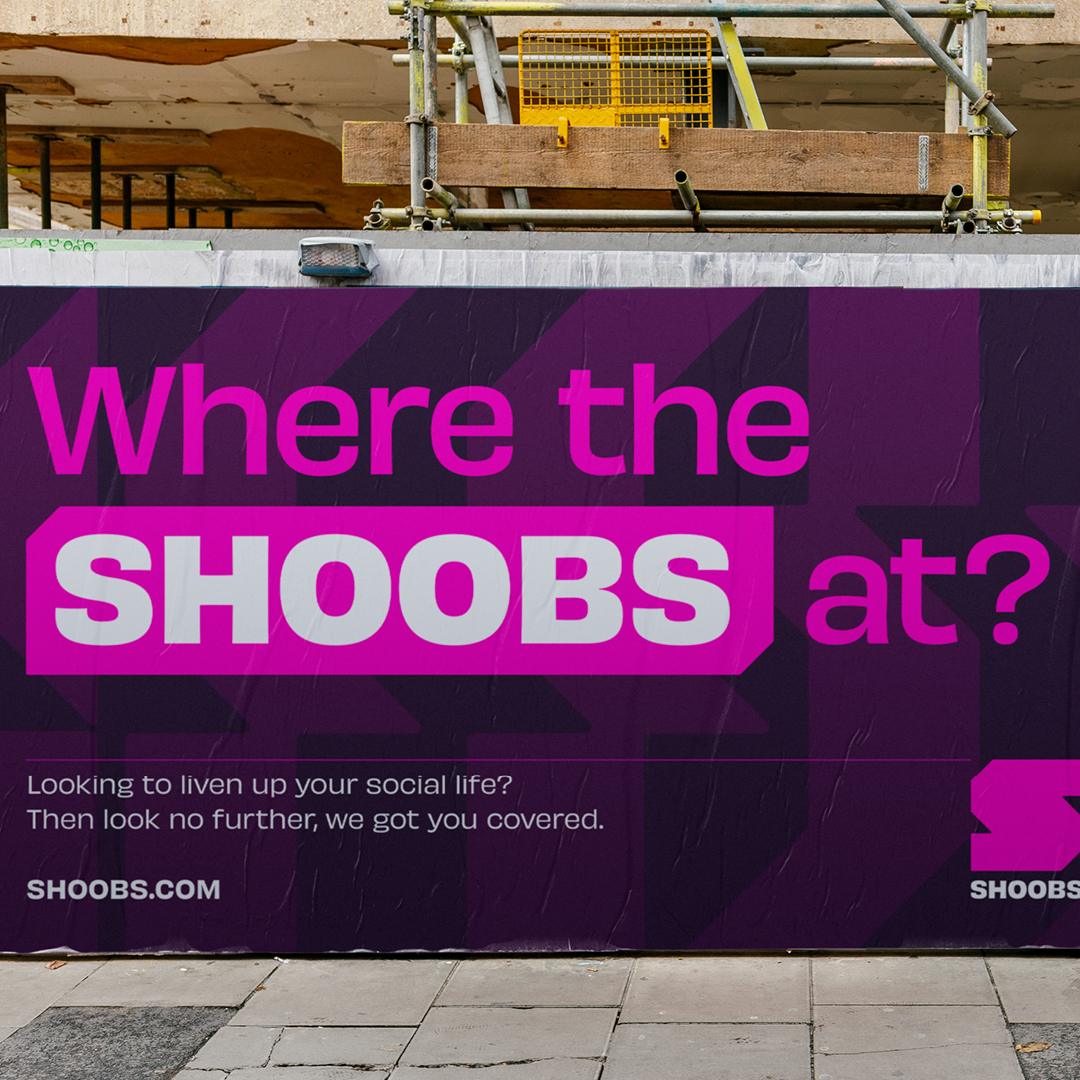
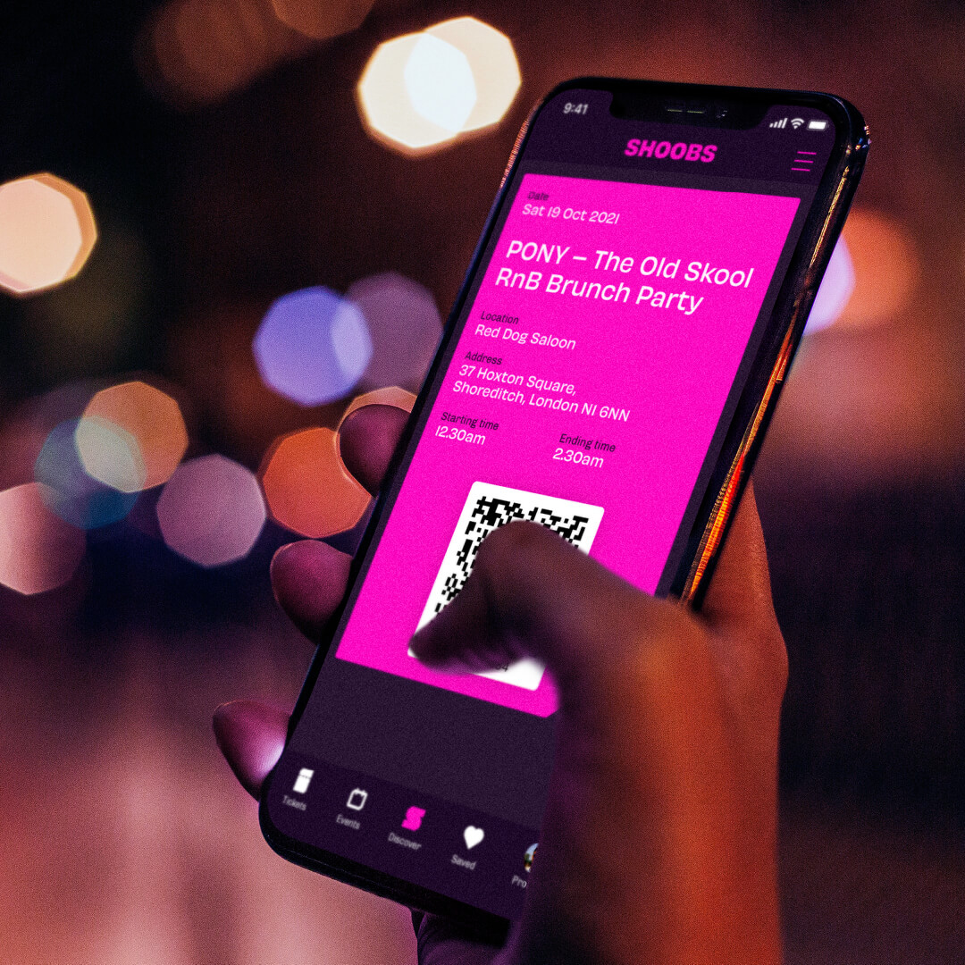
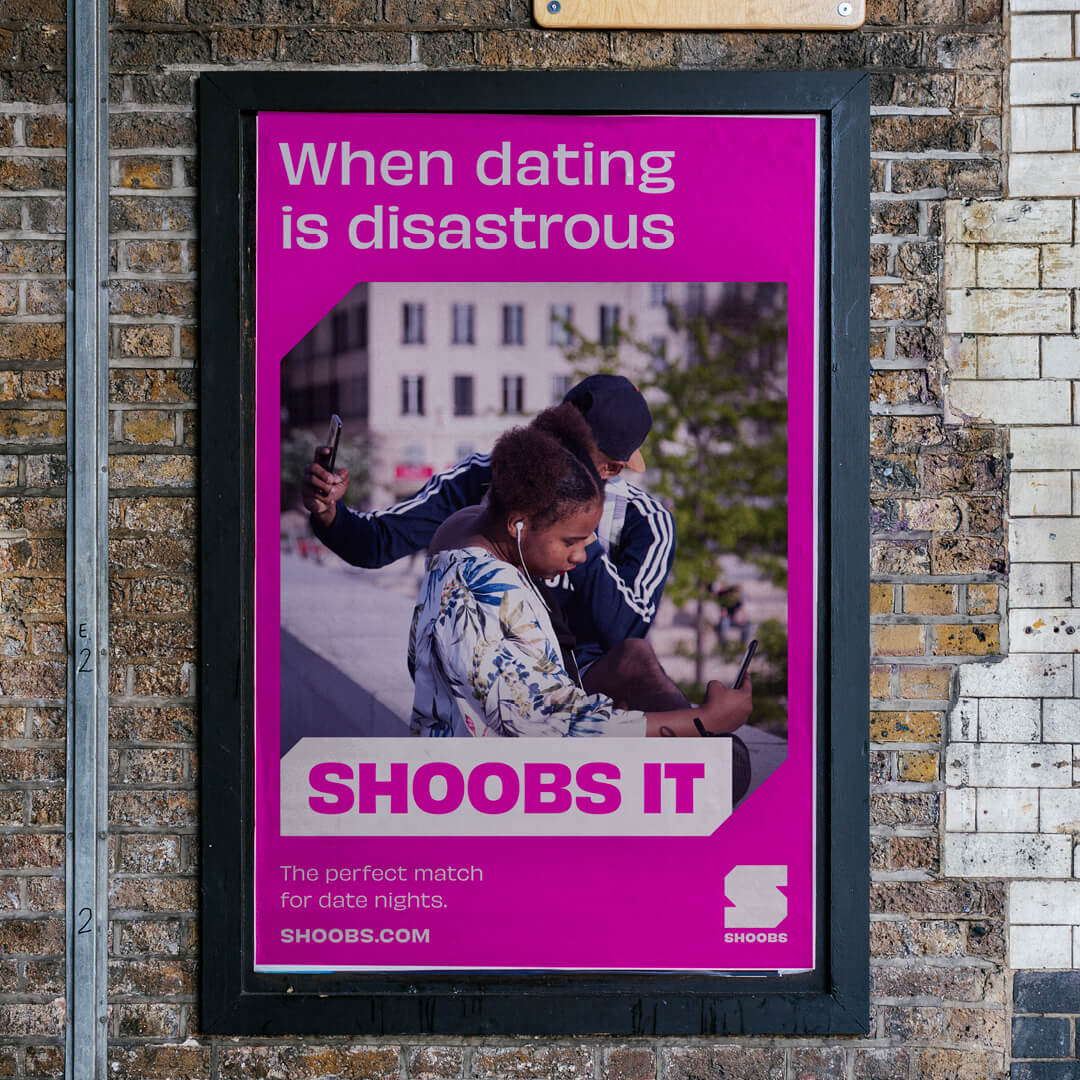
We saw the abstract nature of the name as an opportunity to build more meaning into it. Our idea was to make the name into a verb, whilst also helping to communicate the discovery element of the brand. So if you’re looking for something to do at the weekend, just go on the platform and ’Shoobs it’.
We also used the name as a way to identify the brands mailing list audience. Users that sign up to the monthly newsletter become ‘Shoobscribers’, and are first to receive alerts about about upcoming events that suit their preferences.
To build further equity in the name, we used it as a way to name and categorise different content produced by Shoobs. Album, book and gig reviews are called ‘Shoobs Says’. Gigs and albums of the month fall under ’Shoobs Recommends’. Bespoke Spotify playlists are known as ‘Shoobs’Sounds’, and exclusive artist performances are called ‘Shoobs Sessions’.
To aid navigation on the platform, each category features a different brand colour that works tonally with the primary pink.
CREDIT
- Agency/Creative: Thisaway
- Article Title: Thisaway Rebrands Events and Experience Platform Shoobs
- Organisation/Entity: Agency
- Project Type: Identity
- Project Status: Published
- Agency/Creative Country: United Kingdom
- Agency/Creative City: Bath
- Market Region: Global
- Project Deliverables: 3D Motion, Brand Design, Brand Guidelines, Brand Identity, Brand Mark, Brand Redesign, Brand Strategy, Brand Tone of Voice, Branding, Copywriting, Design, Graphic Design, Icon Design, Identity System, Logo Design, Motion Graphics, Music, Pattern Design, Photography, Rebranding, Tone of Voice, Typography, Web Design
- Industry: Entertainment
- Keywords: Events, Experiences, Gigs, Music
-
Credits:
Agency: Thisaway


