


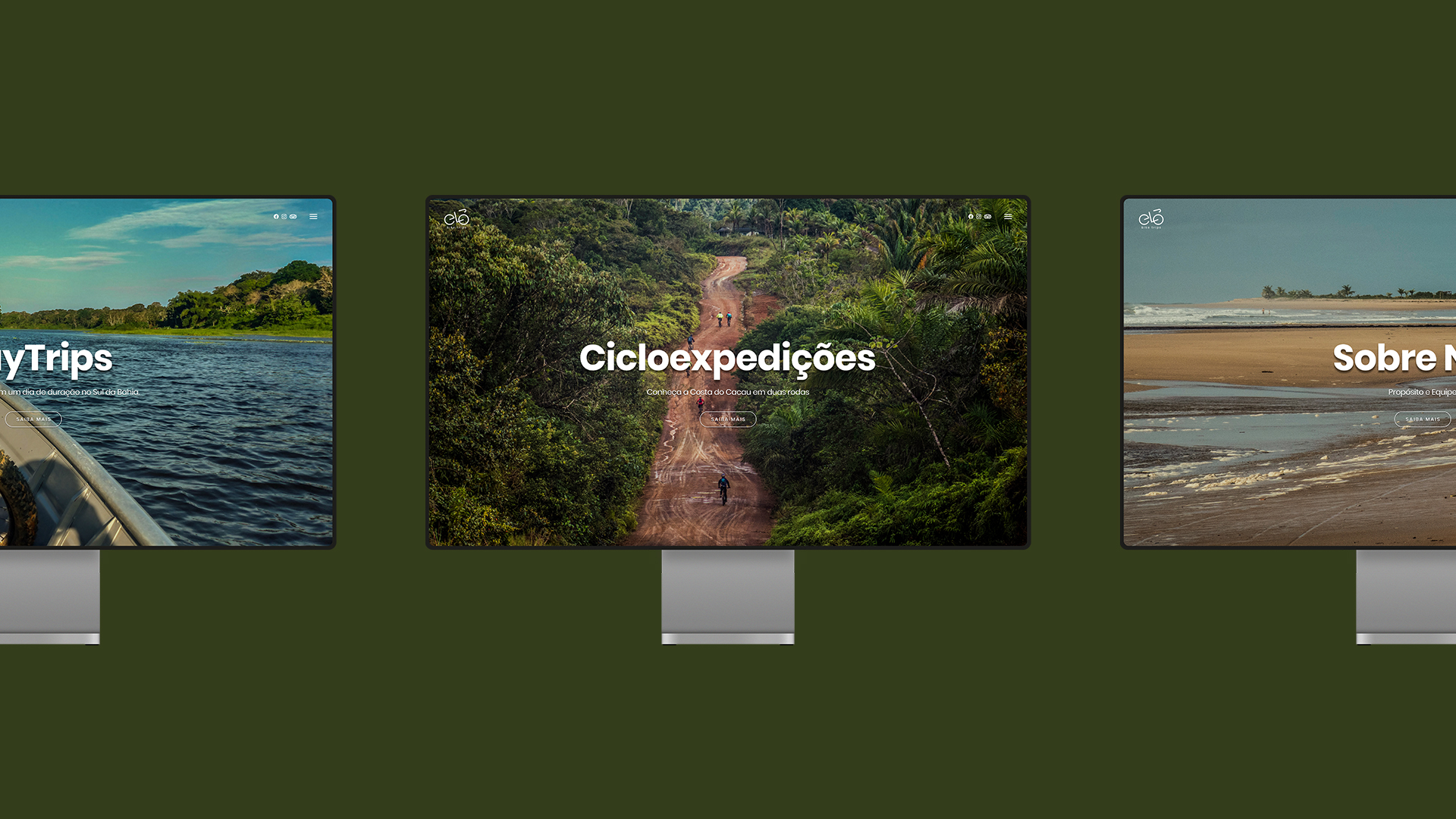
Elo Bike Trips is a tour company that provides authentic and unforgettable cycling experiences in southern Bahia, with a positive social impact, safety and comfort. The company promotes tours throughout the Costa do Cacau region, with DayTrips and Cicloexpedições, which are tours that can last up to 8 days for more experienced cyclists. A unique experience in the south of Bahia, experiencing the strength and diversity of the Atlantic Forest, living with local residents, its history and architectural heritage related to cocoa farming, with bucolic centennial farms, which mark the landscape of this region and invite us to a immersion in this fantastic universe of cocoa and chocolate. Immortalized by the literature of Jorge Amado, the region known as the land of cocoa today lives a virtuous cycle of production of high quality fine chocolates, with certification of origin and sustainable management (agroecological), proving that it is possible to reconcile production, generation of income and conservation of the Atlantic Forest.
Inspiration in the Brazilian Atlantic Forest.
The Atlantic Forest is a biome composed of a set of forests and ecosystems that corresponds to 15% of the Brazilian territory. Considered one of the richest biomes on the planet, that is, with greater biodiversity, the Atlantic Forest is the second largest forest in extension in Brazil, consisting of plateaus and mountains.
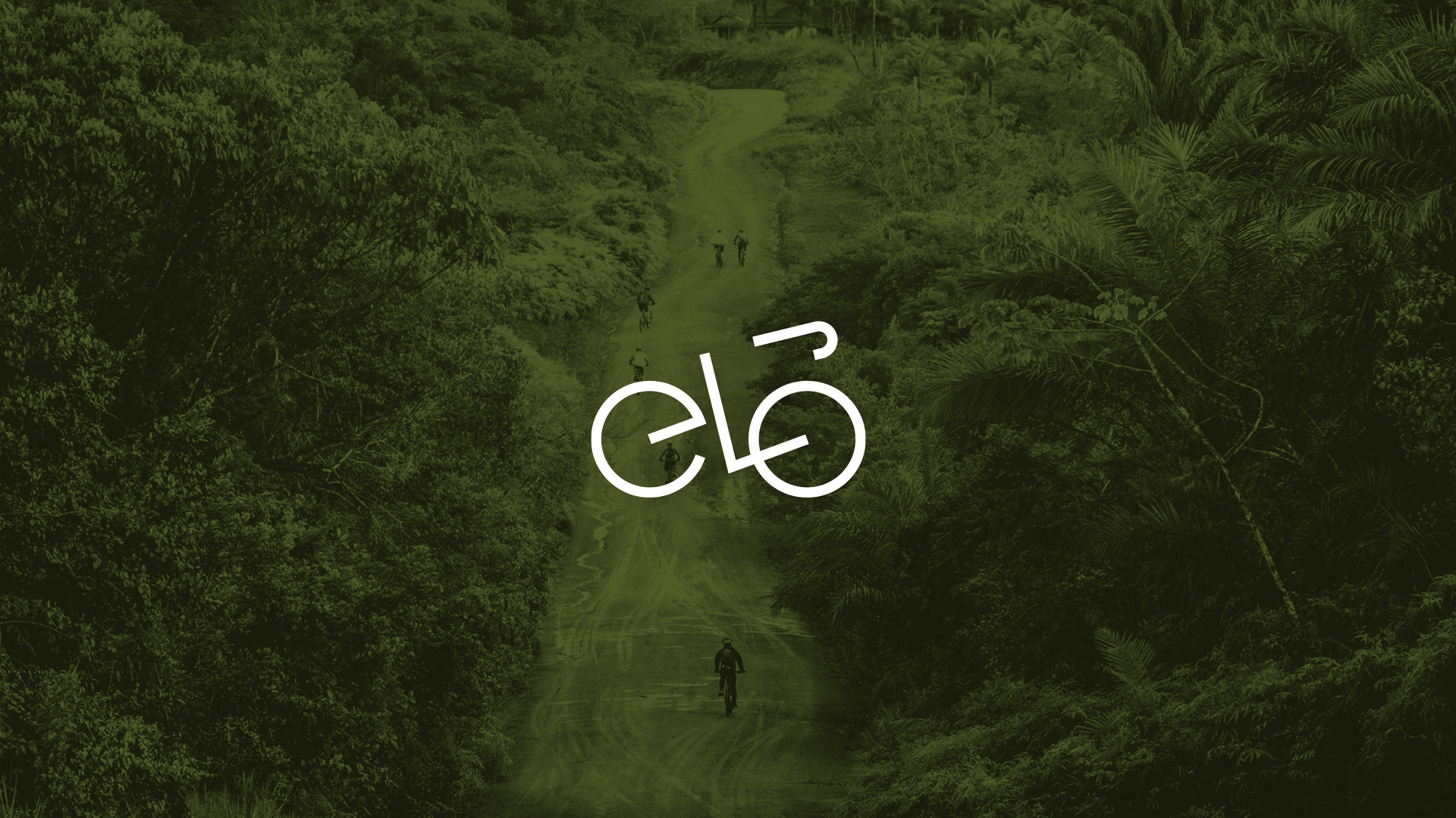
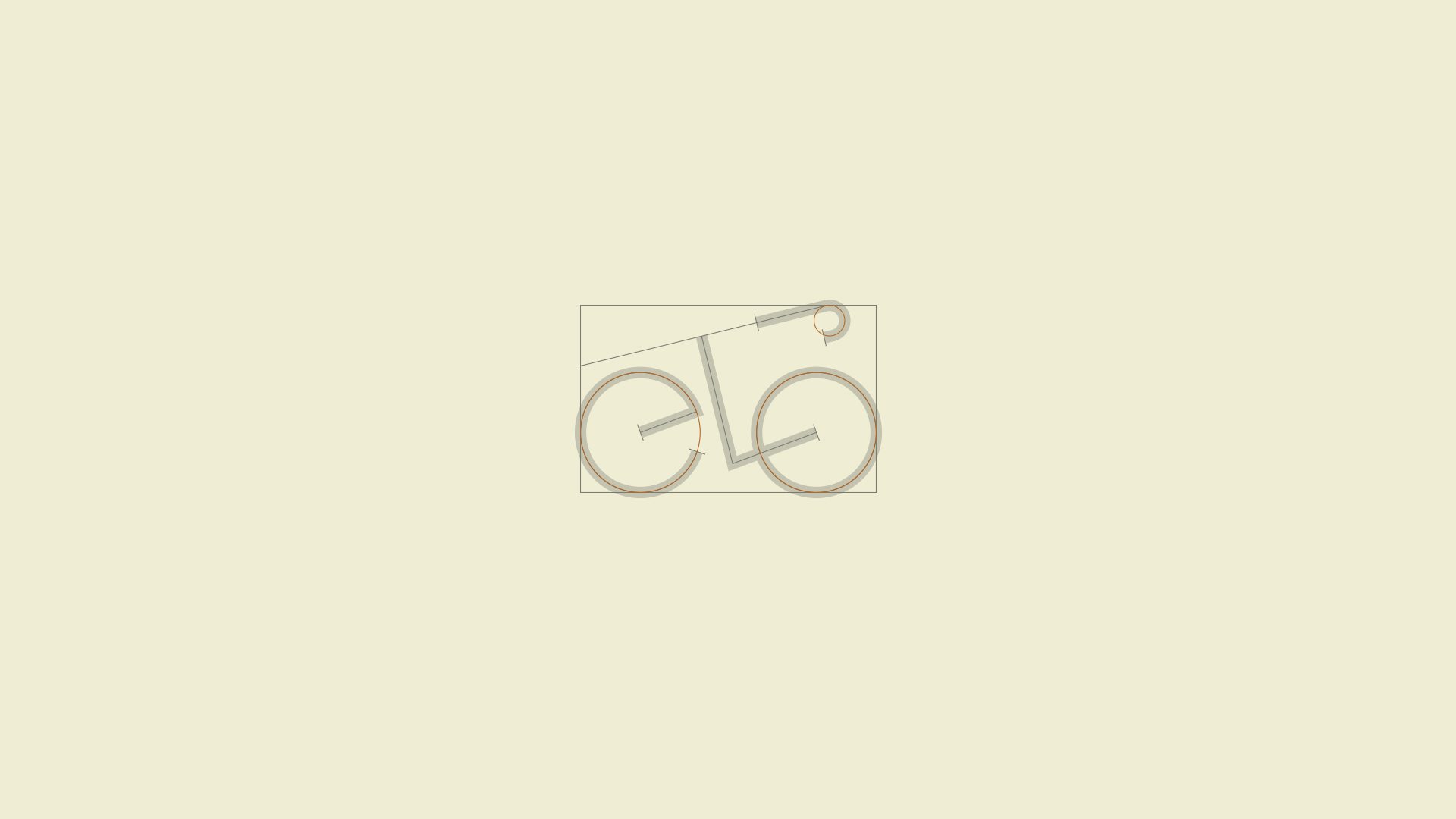
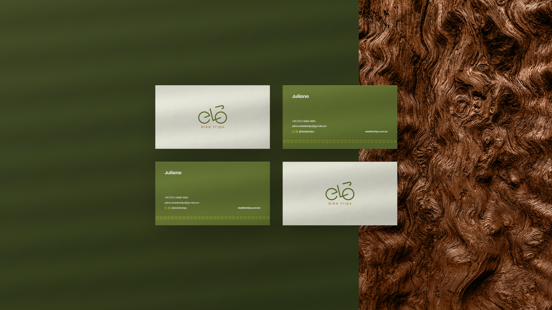
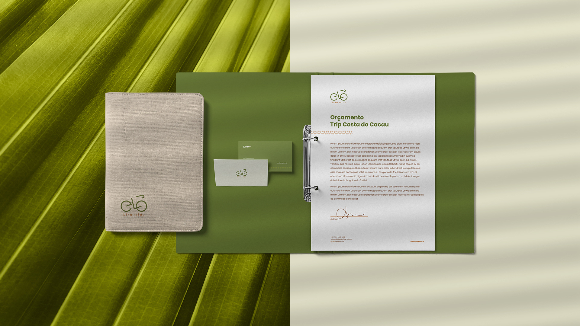
Playing with geometric shapes and lots of doodles, we achieved a simple result, but with a lot of personality. The letters E, L, O form the silhouette of a bicycle.
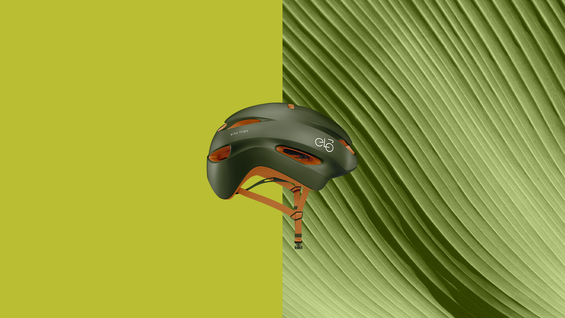
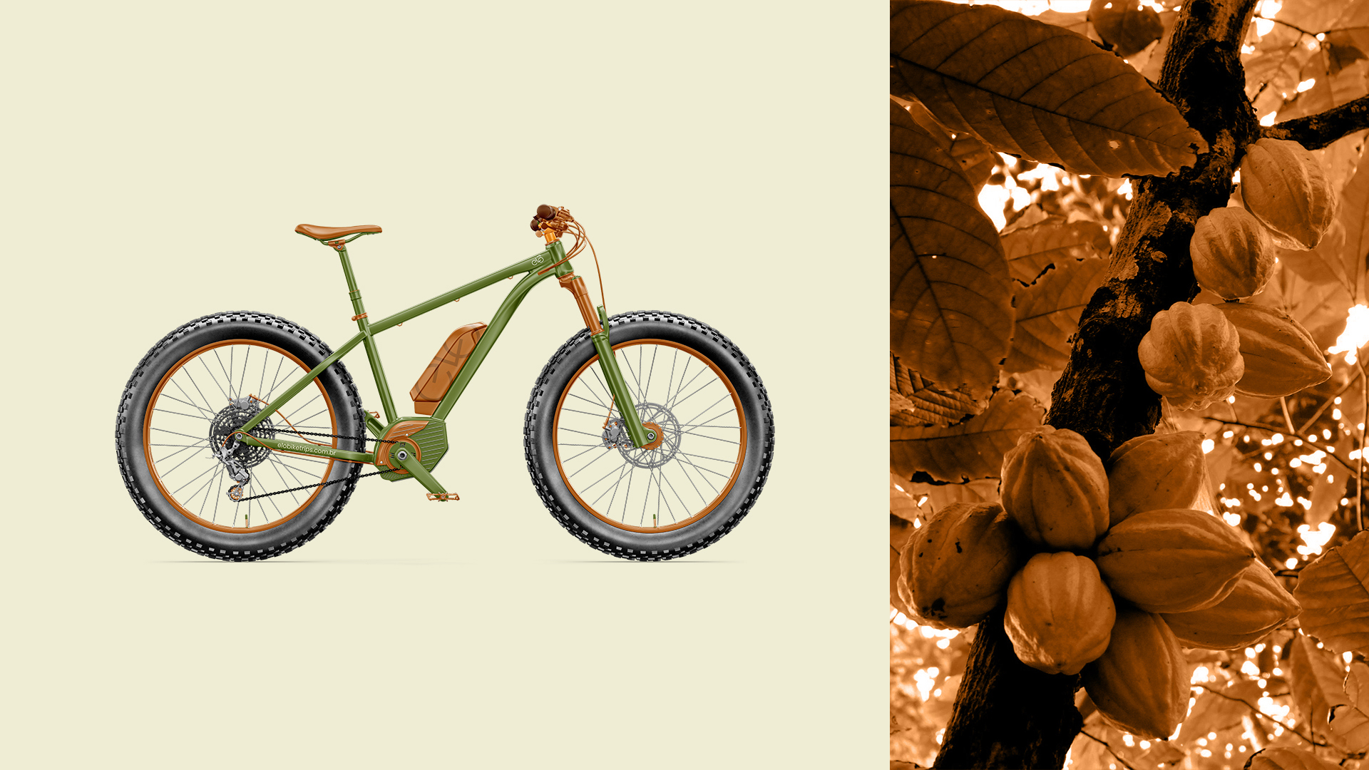
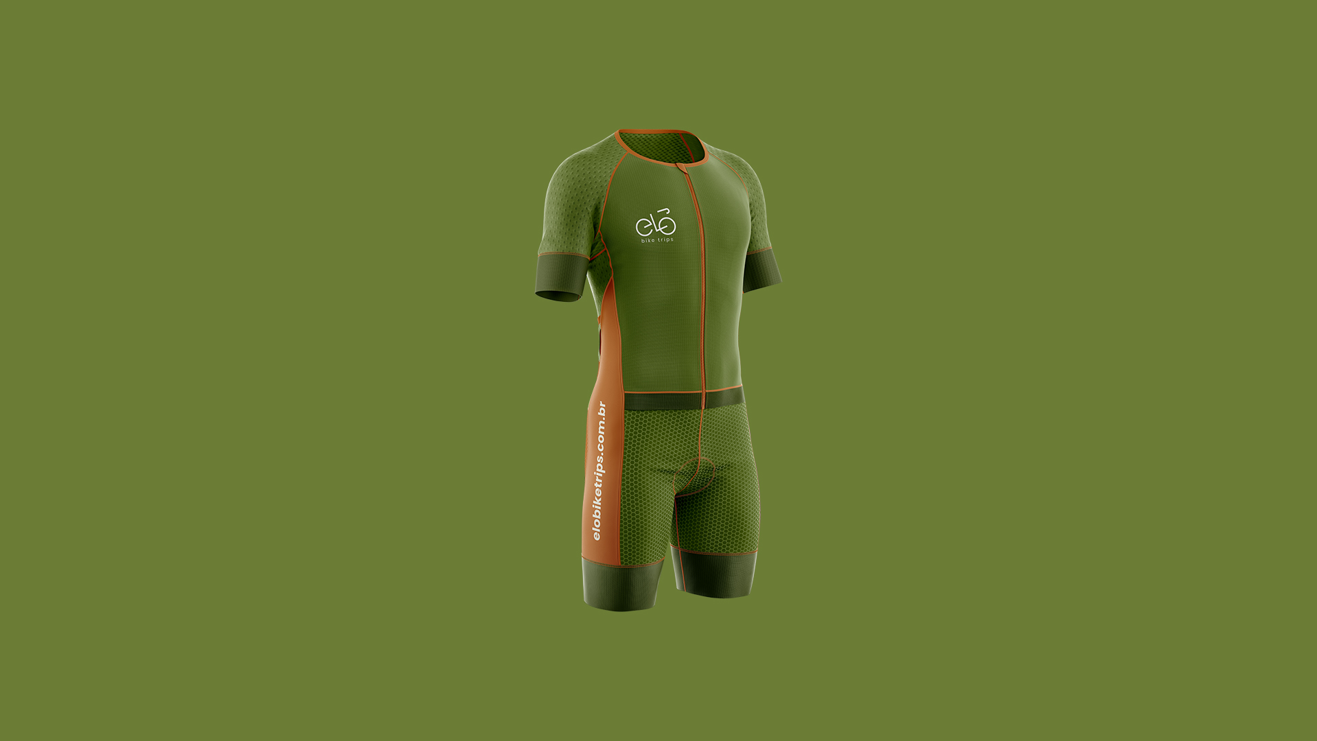
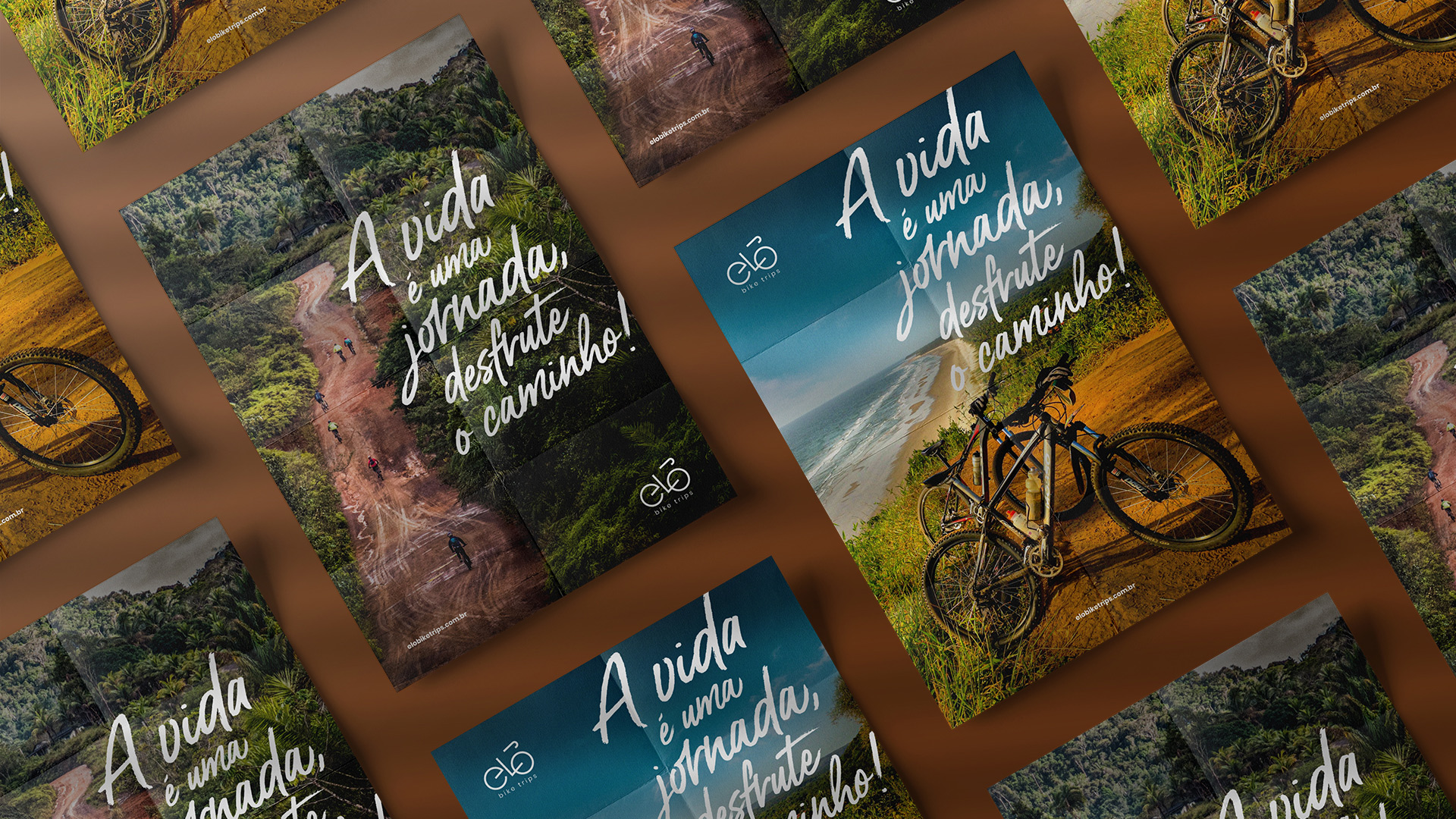
The colors of the identity were extracted from a photograph of one of the tours. Elements that are experienced during bicycle trips: earth, mud, vegetation and the sky.
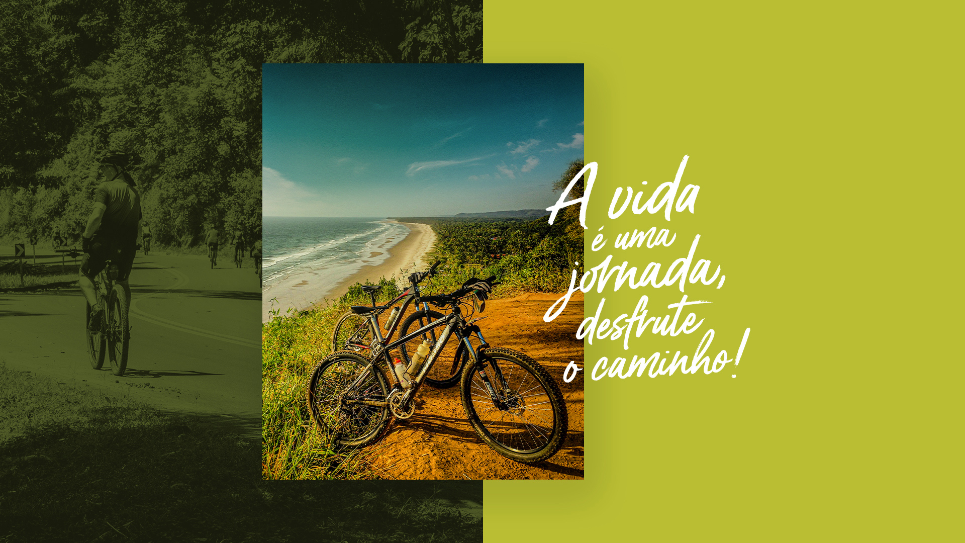
In the typographic part of support, we needed a font that had a good combination with the logo and that could be used, also, on the website. We chose Poppins, a geometric, simple and very modern sans serif. Fortunately, it harmonized very well with the geometric details of the logo. For titles and other compositions, we chose Gotcha, a handwritten brush-style font that conveys a more natural and authentic personality to the pieces.
We have also developed a modern and responsive website with information and details about the tours and itineraries promoted by the company.
CREDIT
- Agency/Creative: Thiago Leonel
- Article Title: Thiago Leonel Creates Brand and Visual Identity for Elo Bike Trips
- Organisation/Entity: Freelance, Published Commercial Design
- Project Type: Identity
- Agency/Creative Country: Brazil
- Market Region: South America
- Project Deliverables: Brand Architecture, Brand Design, Brand Identity, Branding, Graphic Design, Identity System, Rebranding, Research
- Industry: Entertainment
- Keywords: Brand Design, Logo, Logotype, Website, Brazil, Bahia, Bike, Bike Trail, Cocoa, Atlantic Forest


