


The Introduction
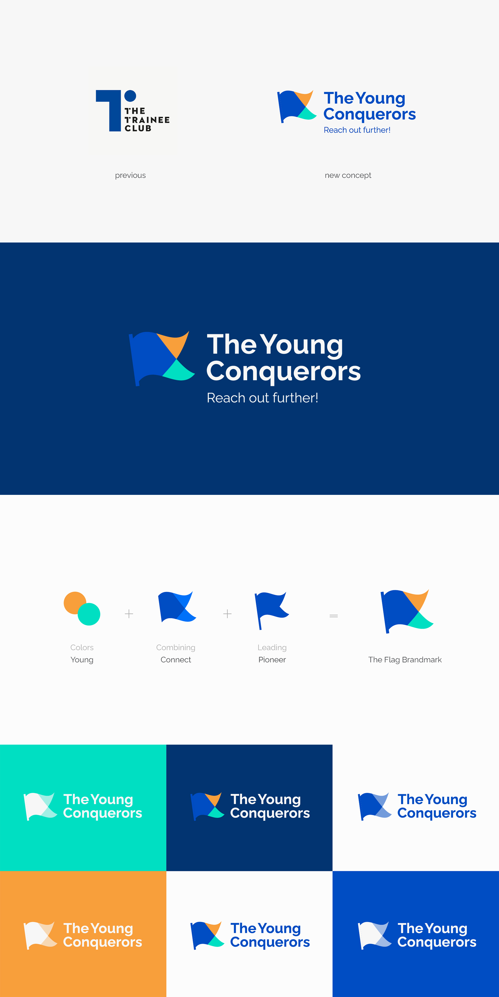
The Trainee Club wanted to rebrand, and maybe, rename for a new stage in their business journey. They were a 1 year-old startup based in HCM City, Vietnam. They are responsible for helping graduating students accomplish essential skills to apply for a management trainee position in multinational corporations and top class companies in Vietnam.
The Approach
Objective: I was asked to create a new identity, which is well-told the brand’s core values and vision; including a visual toolkit to communicate with their audience on social media consistently and professionally. Issues: The old identity doesn’t have any general concept that reflects the brand’s story. Which causes the previous logo to fail to contain any specific meaning or to evoke an intended feeling, despite having been designed in a clean and simple way. Insight: The team’s vision is to become a top-of-mind brand in their target audience within the marketplace. Students who want to become a management trainee in top companies will think of them. Big companies who want to find talents for recruitment will think of them. They want to build an image of a youthful, helpful and leading brand through their core values: Young / Connect / Pioneer. Challenge: As an identity designer, I had to do visual research to find a concept that is suitable with their vision and core values.
The Solution
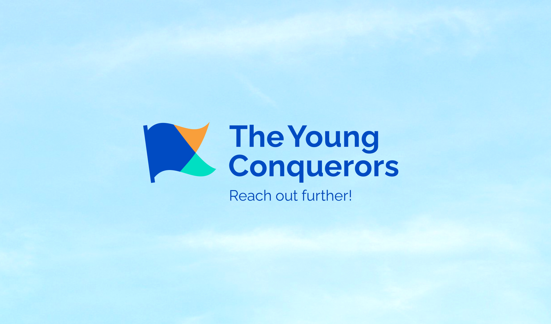
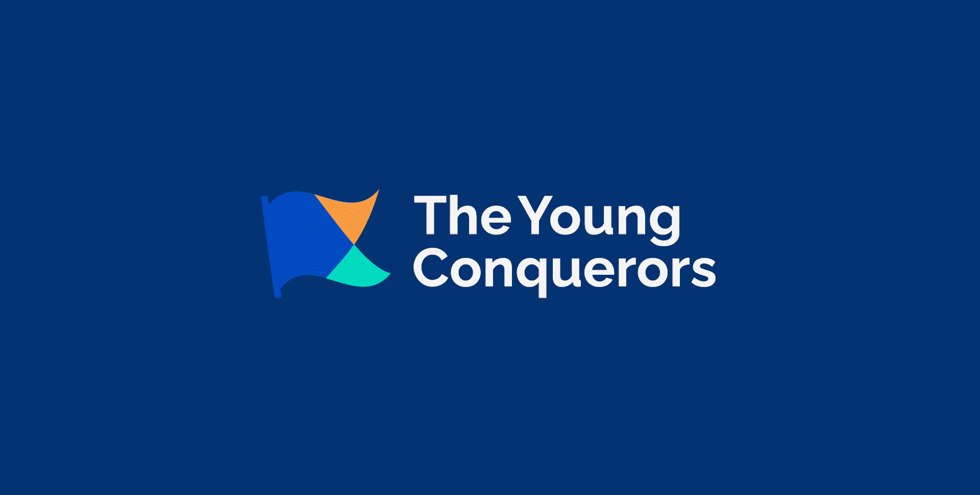
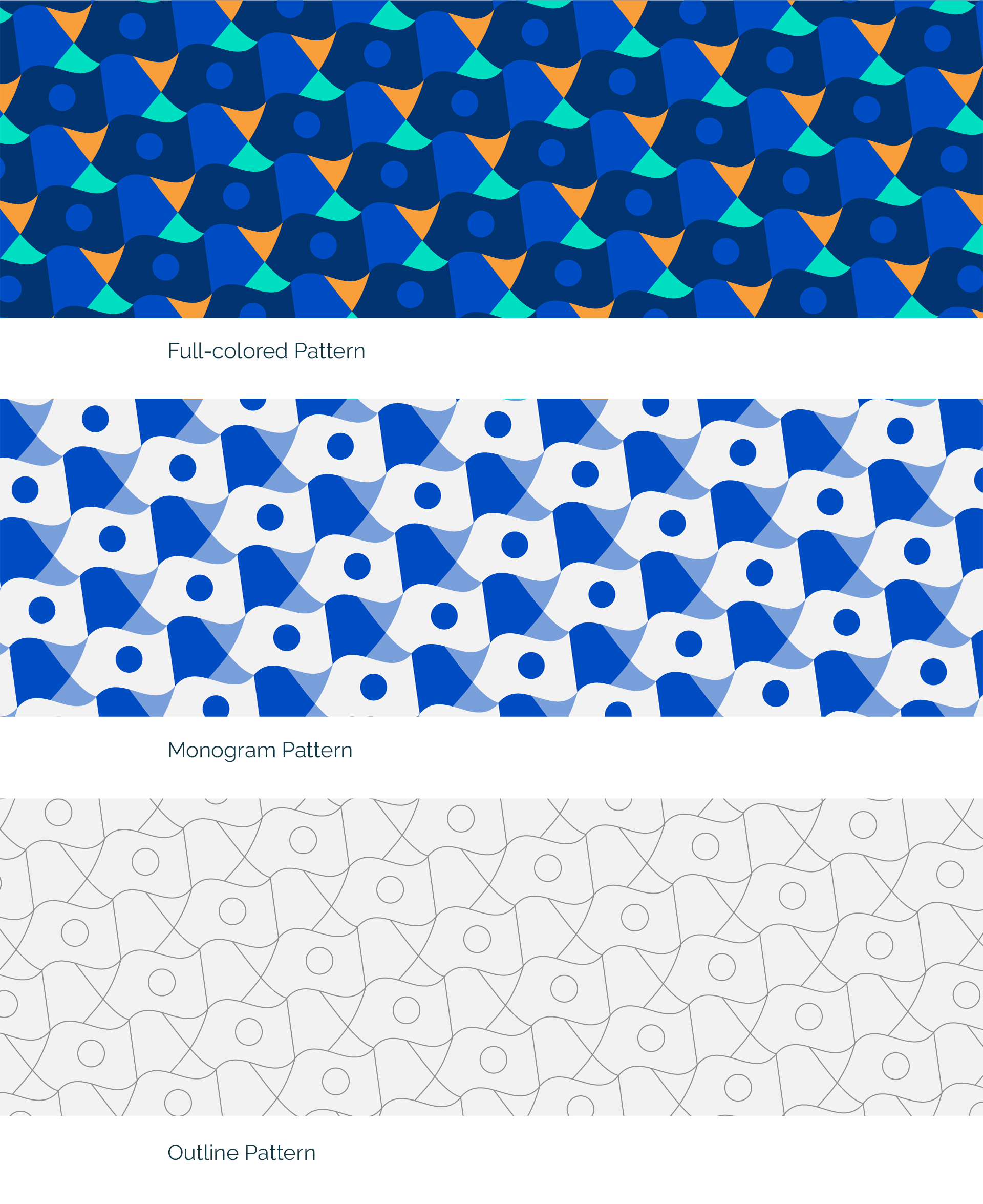
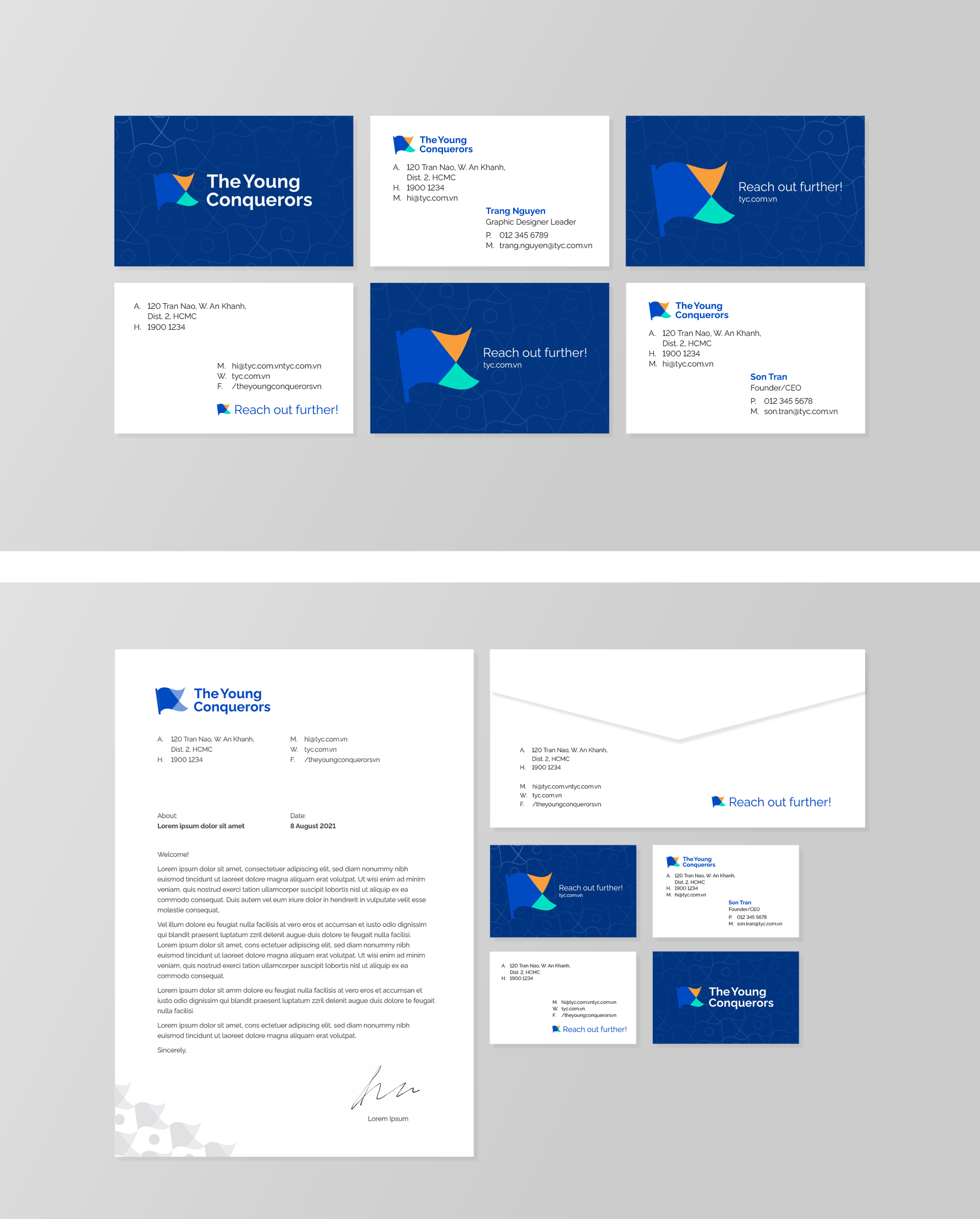
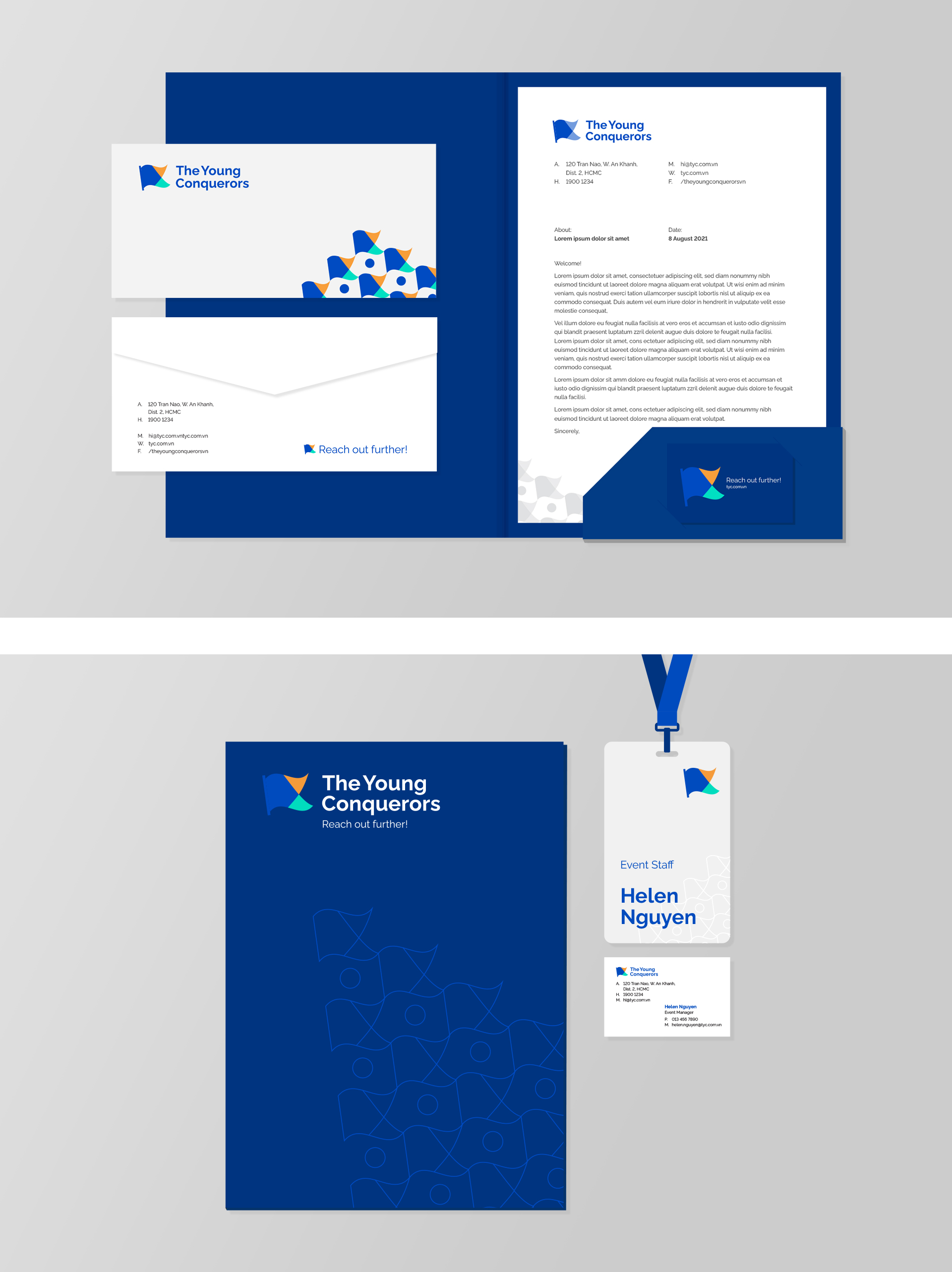
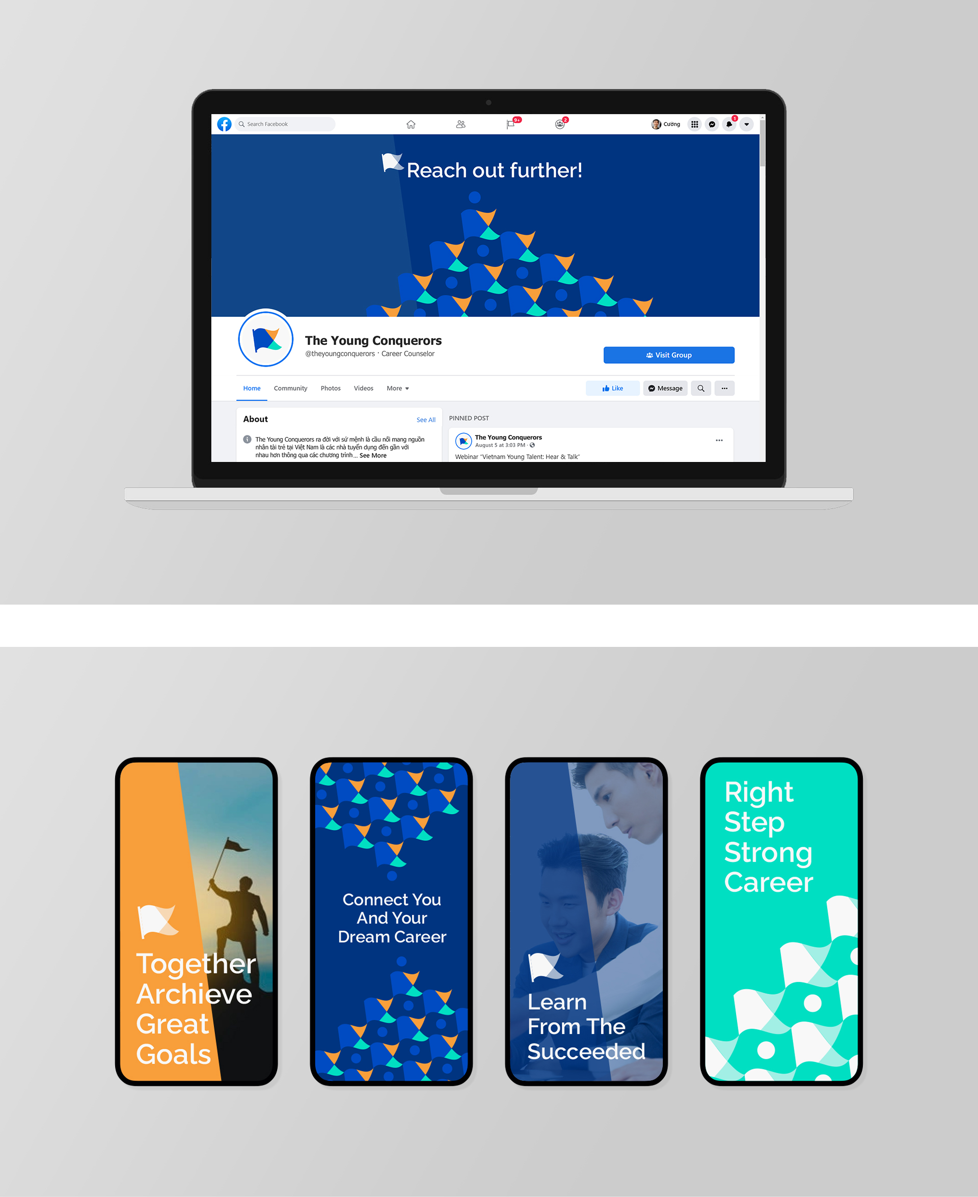
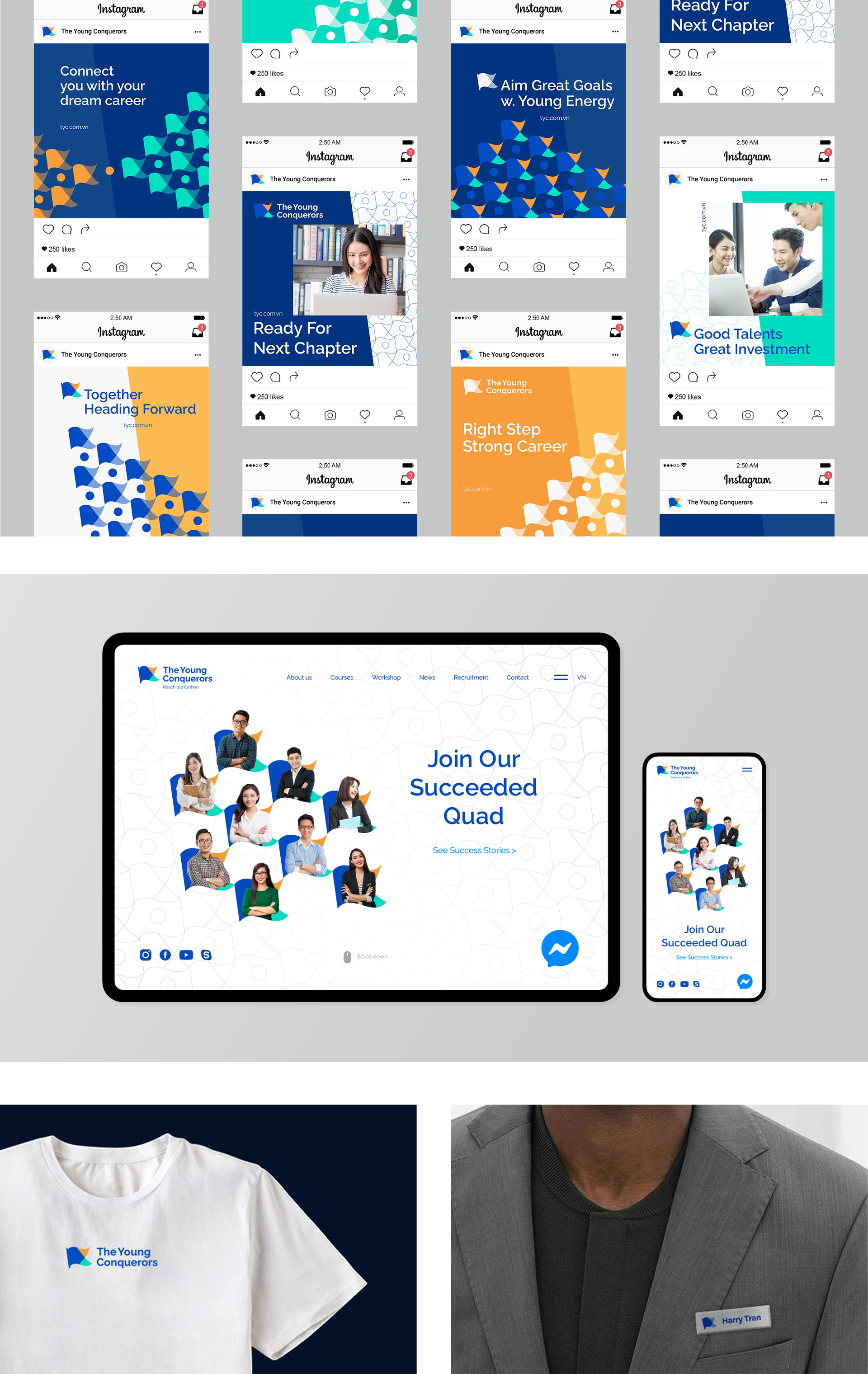
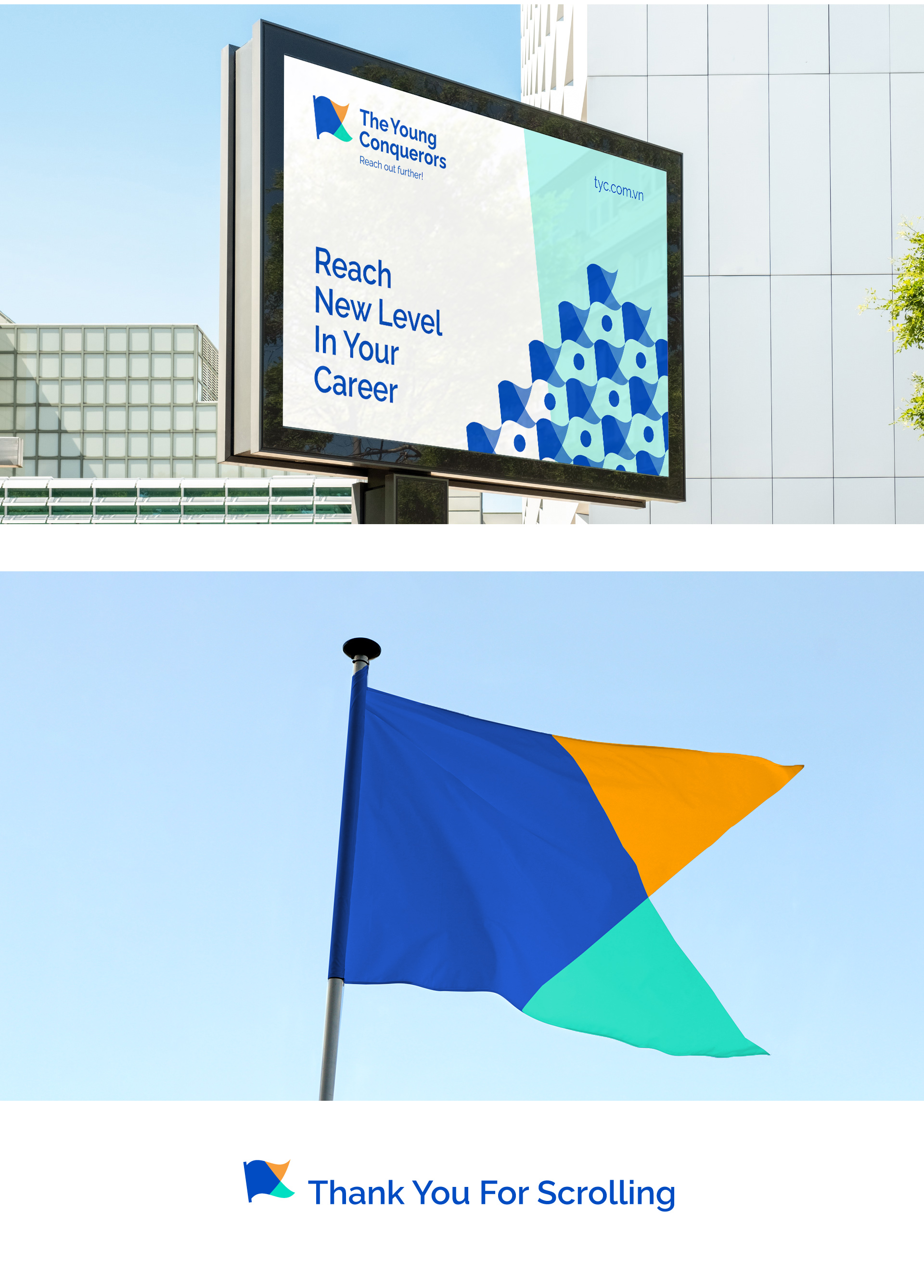
Concept: In the result of researching, I ended up using a metaphor to tell the story of the brand: Imagining the talented students are raising their flag on the way of accomplishing their goals – trainee position in top class companies; Imagining the client’s team is raising their flag on the way to become a top-of-mind brand in the marketplace. Those led me to think of a group of youthful conquerors raising their flag for a passionate adventure. Naming & Brandmark: The new chosen name, The Young Conquerors, is simple and well-reflected our concept. Meanwhile, the symbol of a slanted flag evokes the feeling of moving on, and also, represents a young and pioneer spirit. The flag was coloured to create the effect of 2 pieces blending together, which represents the team’s help to connect talented students and big companies. Communication toolkits: To communicate in variable context, I created patterns from the logo that could be used with background or, flexibly build up some constructions that tell desired messages. Alongside with slanted shape in the background, the patterns create a deep, flexible and creative usage.
CREDIT
- Agency/Creative: Xuan Cuong Do
- Article Title: The Young Conquerors Visual Identity by Xuan Cuong Do
- Organisation/Entity: Freelance
- Project Type: Identity
- Project Status: Published
- Agency/Creative Country: Vietnam
- Agency/Creative City: Nha Trang
- Market Region: Asia
- Project Deliverables: Brand Identity, Brand Naming, Brand Redesign, Graphic Design
- Industry: Education
- Keywords: Education, Rebrand, Flag, Internship, Connect, Young, Pioneer
-
Credits:
Graphic Designer: Xuan Cuong Do


